建筑师:Ramon Esteve
地点:西班牙,Valencia
项目主管:Gonzalo Llin
电气设备:Antonio Morales
建筑面积:1855平米
项目年份:2010
摄影:Xavier Molla
合作建筑师:Maria Daroz, Ruben Navarro, Olga Badia, Anna Bosca
其他合作者:Silvia M. Martinez, Patricia Campos, Rafael Codina
客户:Caixa Ontinyent. La caixa de les Comarques
结构设计师:Construcciones Frances SL
Architects: Ramon Esteve
Location: Valencia, Spain
Site Manager: Gonzalo Llin
Technical Architect: Antonio Morales
Project Area: 1,855 sqm
Project Year: 2010
Photography: Xavier Molla
Collaborators Architects: Maria Daroz, Ruben Navarro, Olga Badia, Anna Bosca
Collaborators: Silvia M. Martínez, Patricia Campos, Rafael Codina
Client: Caixa Ontinyent. La caixa de les Comarques
Construction: Construcciones Frances SL
来自建筑师的描述。这座建筑的用途主要在文化方面,主要致力于推广各种能够代表企业文化的活动,如比如展览,表演,演唱会,座谈会。
建筑的正背两侧有特色的立面,一侧具有历史感,使人联想到城市记忆,另一侧具有现代感,在Clariano河的映衬下远远望去是一片绿色坡地。
From the architect. The characteristic use of the building is cultural, mainly dedicated to the promotion of all kinds of cultural activities such as exhibitions, performances, concerts, conferences, representing the entrepreneurial spirit of the company.
The building has two significant facades, one is historic and linked to the memory of all citizens, and the other is contemporary, overlooking a green slope, with the Clariano river as backdrop.
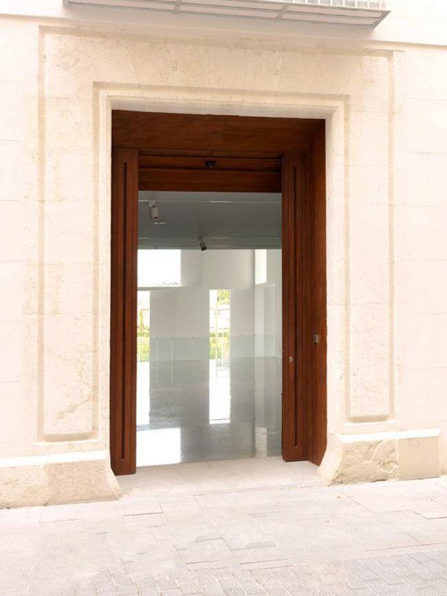
项目是由一对相似的大体量建筑构成,穿过建筑可通向建筑后面的绿地和Clariano河。建筑的主入口是位于具有Casa Llorens历史感的正立面一侧,进入建筑,是一个能够看到二层或三层空间内所有房间的共享大厅。这是一个多功能大厅,既可作为接待空间,同时又具有展览展示和表演等多功能。
The project consists of two large twinned volumes, turned onto a private garden and through it, to the Clariano river. The main entrance to the building is through the historic facade of the Casa Llorens, and through a controlled height gives way to a large foyer with double and triple heights, which all rooms overlook. It is a multifunctional hall, it acts as a reception area, foyer, and at the same time as a multi-purpose hall for exhibitions and performances.
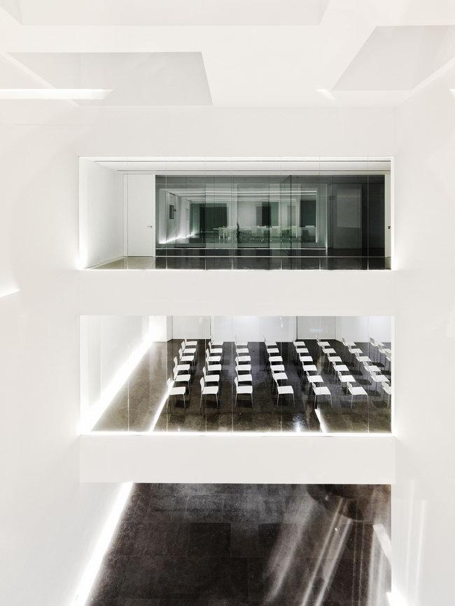
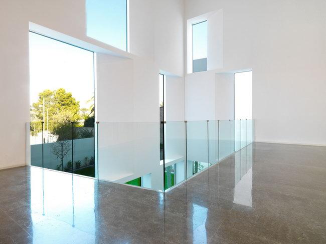
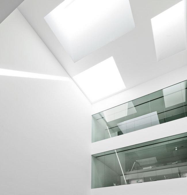
从大堂依次可以看到不同的建筑空间映入视线,咖啡厅、办公室、贵宾室、展览室、会议室等,虽然同处于一个视线空间中,但仍保持各自独立的使用功能。共享大厅上空的类似喇叭收缩形的天窗,投射到水泥墙面上产生了很多的光影效果,为整个空间带来了特色。这种手法同样应用到了靠近草地的一侧立面上,透过有特色窗框的墙体,使眼前的绿地产生了延伸的感觉。
From the lobby there are different crossed views with the different parts of the building, such as the cafeteria, offices, boardroom, exhibition room, meeting room… creating a visual link between them while maintaining their functional independence. A large central horn-shaped skylights, produce some significant pockets of light, that flows through the concrete walls and give a special character to the space. This treatment is also applied on the facade facing the courtyard, creating large gaps, giving depth and framing the views through the facade.
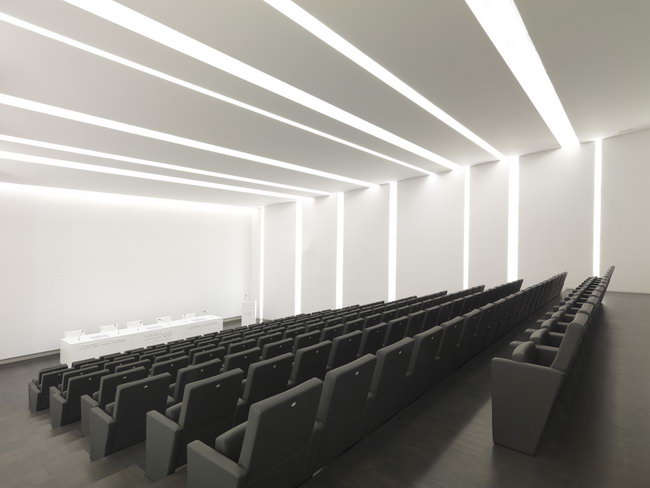
建筑的层次结构由不同空间层高来表现。花园被作为背景,天窗则作为整个项目的焦点,成为值得借鉴之处。
The hierarchy of spaces is perceived through a play heights of the different areas. The garden as background and the skylights as zenith focus points, are clear references of the project.

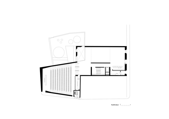
Ground floor plan地平面图
Basement floor plan地下室平面图
Cross section剖面图
本文源自:http://www.archdaily.com/438544/caixa-ontinyent-cultural-center-ramon-esteve/
特别鸣谢翻译一组7号 叶闻博 提供的翻译,译稿版权归译者所有,转载请注出明处。 |
|
 WasserserkAndritz大楼/hohensinnarchitectur事务所/WasserwerkAndritz / hoh......
