由专筑网CYY,卢荣姝编译
我很乐意分享基于SU+V-Ray的另一个场景,来自Javier Wainstein。他在这篇文章中描述了文艺复兴的形成,并开始参考The Jane建模,该建筑曾是安特卫普的一个军事教堂,并由Piet Boon将其改造成一间餐厅。
I’m very happy to share yet another behind the scenes based on SketchUP + V-Ray. This time by Javier Wainstein. Follow him in this article as he describes the making of Renaissance, which he started to model referencing The Jane – A military church in Antwerp reinvented as a restaurant by Piet Boon.
简介
大家好!
首先,要感谢Ronen邀请我在ronenbekerman这个非常棒的社区和博客展示我的作品。同时,这个地方也是我日常灵感来源之一。
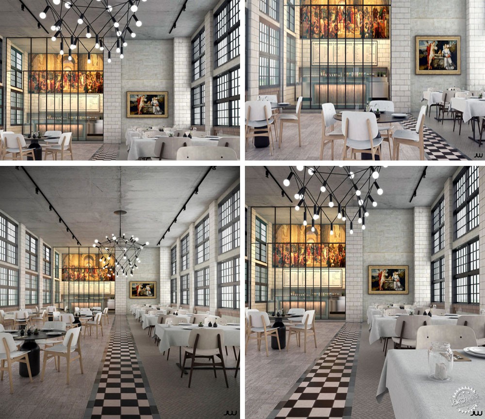
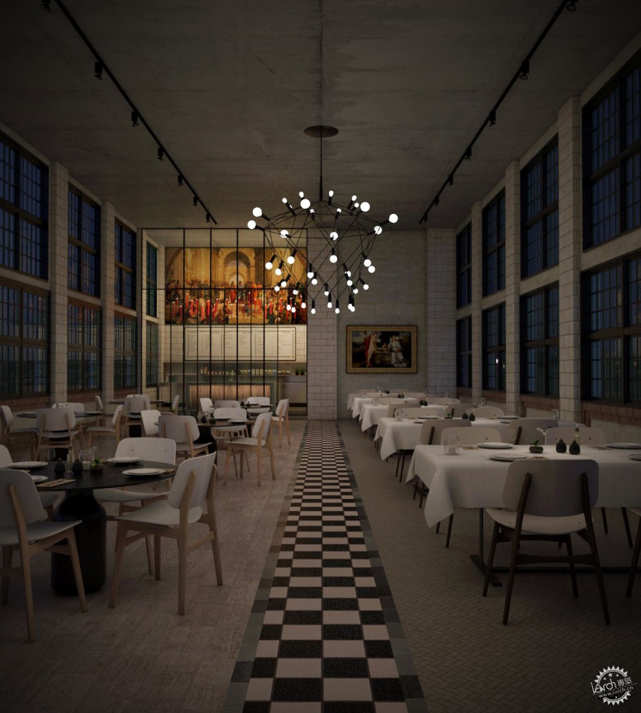
我最近做的其中一个项目,也是我十分引以为豪的,就是“Renaissance”。这里你可以看到我不久前上传到博客上的最终图片。
Introduction
Hello All!
First of all, I would like to thank Ronen for inviting me to showcase my work in this great community and its blog, which I consider part of my daily inspiration dose.
One of the last projects I did, and of which I am most proud of is “Renaissance”. Here you can see the final images I uploaded to the blog not long ago.
©JayierWainstein
©JayierWainstein
灵感
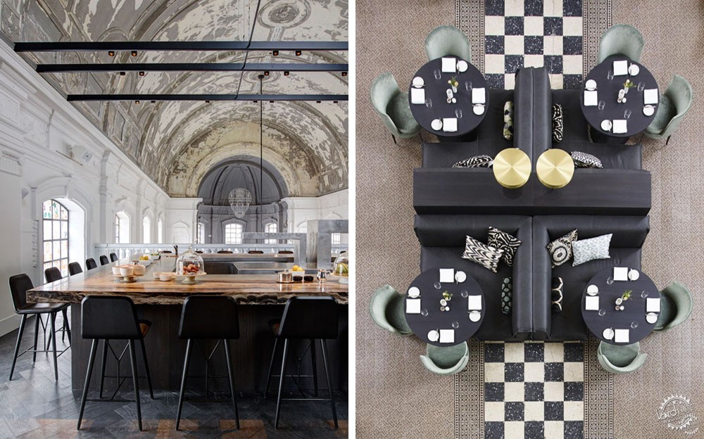
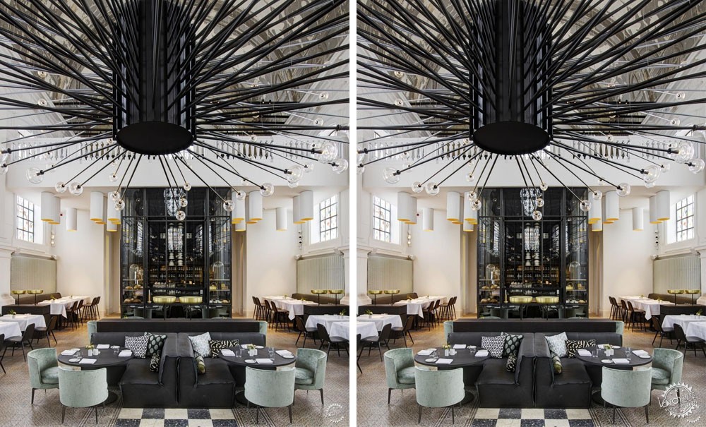
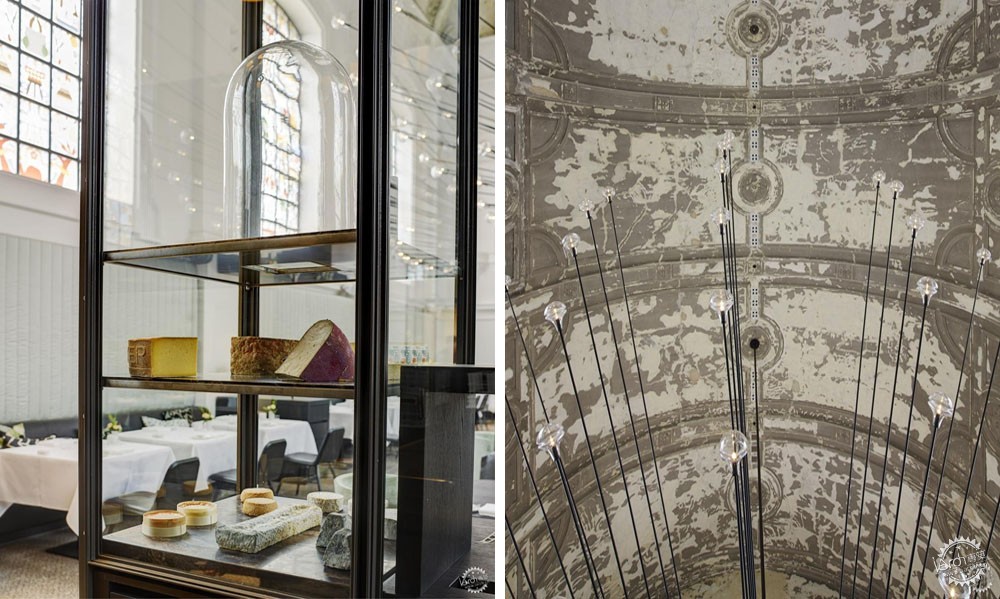
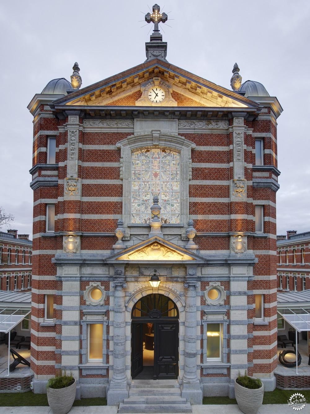
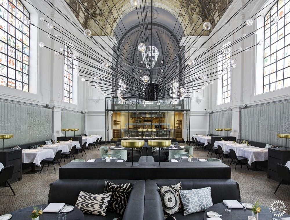
我十分欣赏设计师Piet Boon的作品,包括他的家具设计和建筑设计。其中一个一直吸引我的项目是The Jane餐厅设计,位于比利时Antwerp的一座老教堂内。
Inspiration
I am a great admirer of works by designer Piet Boon, with furniture just as much as the architecture. One of the projects, which I always felt captivated by, was the design of the restaurant The Jane in an old church in Antwerp, Belgium.
©JayierWainstein
©JayierWainstein
©JayierWainstein
©JayierWainstein
©JayierWainstein
3D建模
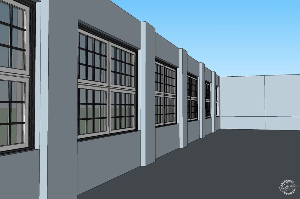
带着这个想法,我开始进行餐厅的3D设计。我发现,在Sketchup软件的3D Warehouse中,有一个非常普遍的,使用者称之为“Loft”的基础模型。由于这个模型与餐厅特征相似,所以我选择它作为着手点。
3D Modelling
With this idea in my head, I began to take shape the 3D design of the restaurant. I found, in the 3D Warehouse of SketchUP, a very basic model of what the user called “Loft”. I chose this model as a starting point because it had similar features.
©JayierWainstein
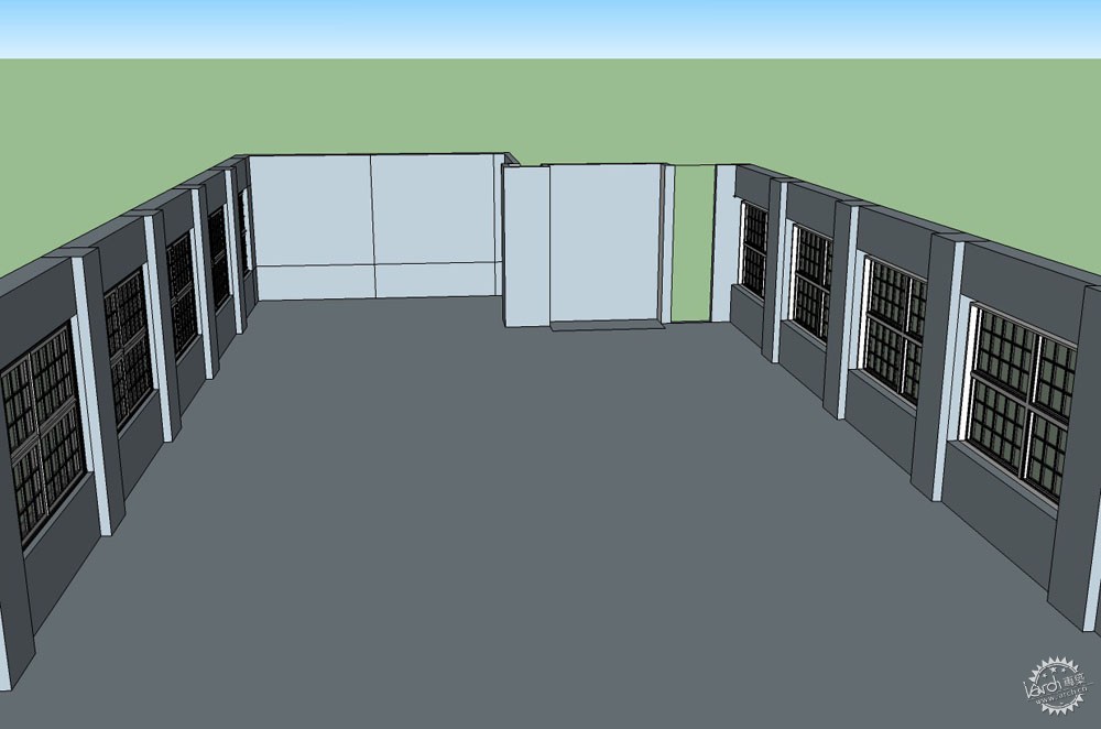
©JayierWainstein
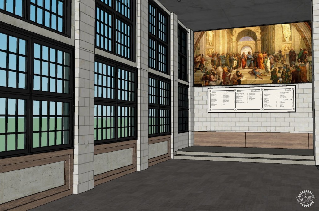
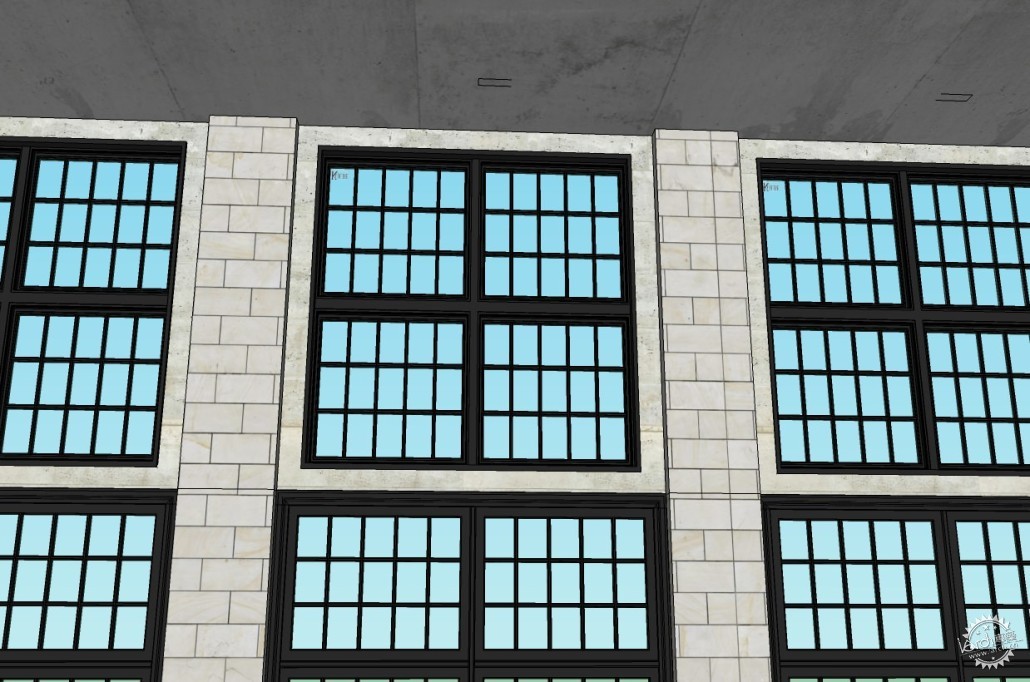
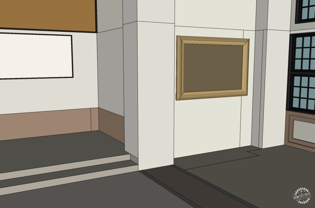
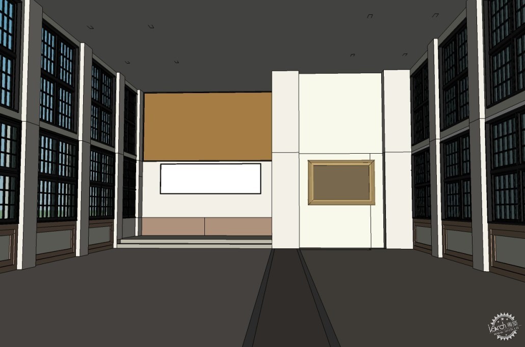
我想说明的是,我从未想过在3D模型中建立一个完全相同的餐厅,而是仅仅将它作为一个开始参考点。随着设计的深入,我开始修改3D模型,根据自己的想法调整设计。
I would like to clarify that I never tried to do exactly the same Restaurant in the 3D version, just used it as a starting reference point. I began to edit the 3D model, and adapt the design I had in mind as I went along about it.
©JayierWainstein
©JayierWainstein
©JayierWainstein
©JayierWainstein
室内陈设
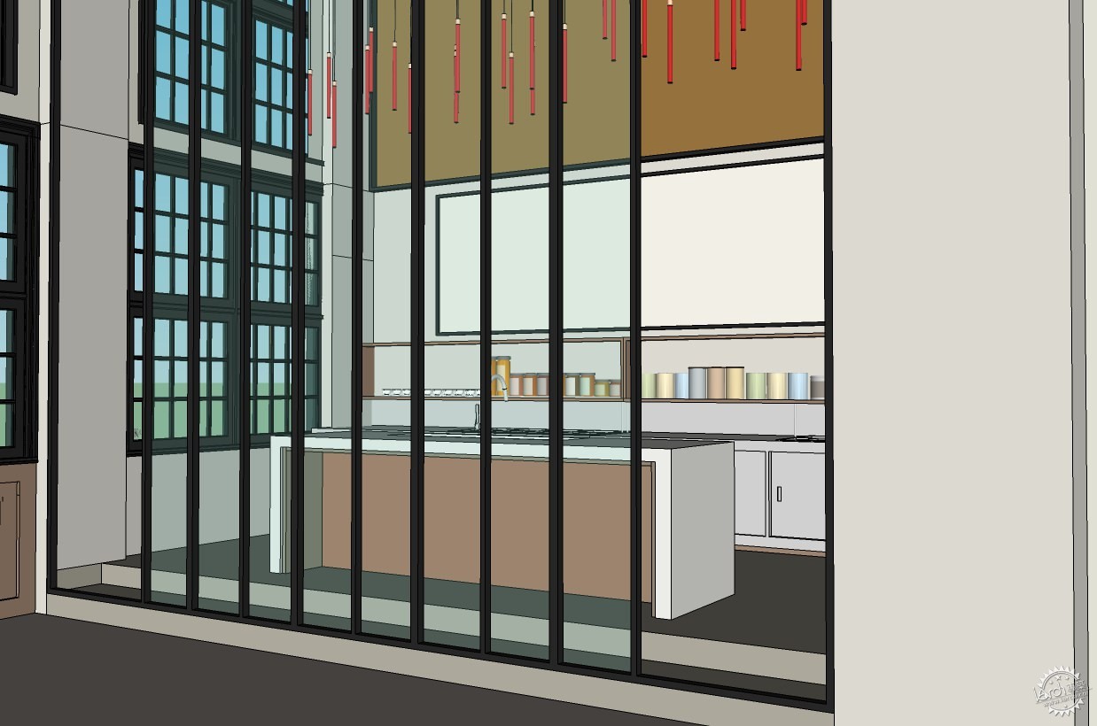
一旦空间确定,我便开始自己最喜欢的部分——布置空间!
我主要使用从3d Warehouse下载的免费物件模型,少数模型从Design Connected 和 model+model网站上付费下载。
Furnishings
Once the space was defined, I started my favorite part… furnish the space!
I mostly used free items I found on the 3d Warehouse, and a few that I payed for on Design Connected and model+model.
©JayierWainstein
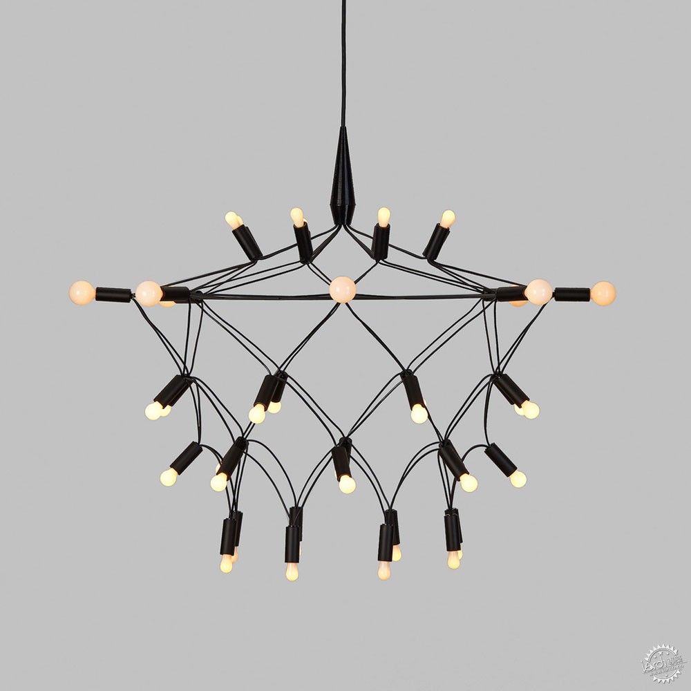
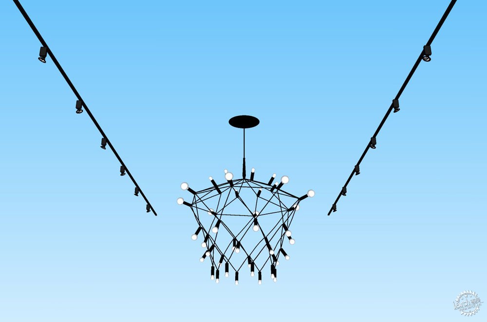
当然,我希望使用一件令人印象深刻的家具,正如在实际项目中那盏尺度巨大的灯具。我在 Design Connected网站上找到了一个理想之选,就是下方图片所展示的——Townsend Design出品的轨迹枝形吊灯。
Naturally, I wanted to use an imposing piece of furniture, such as in the actual design, a lamp of great size. I found an ideal one on Design Connected… the one in the image below. It is theTownsend Design Orbit Chandelier.
©JayierWainstein
在 Townsend Design网站上也可以看见。
See it on the Townsend Design website as well.
©JayierWainstein
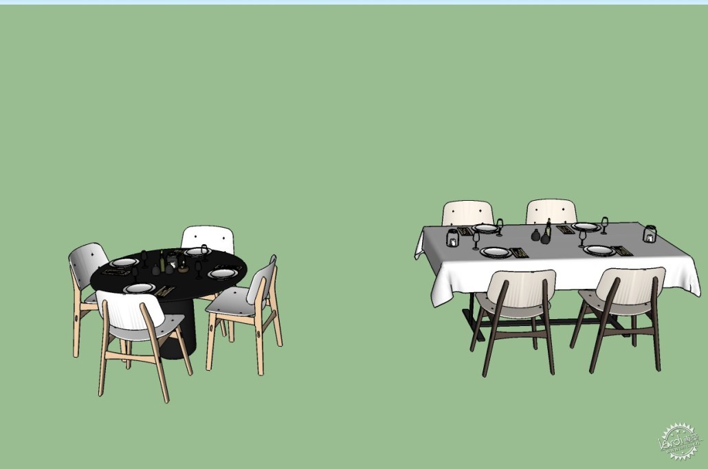
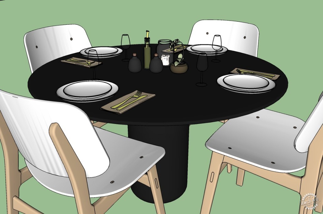
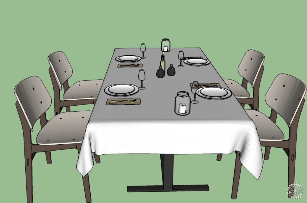
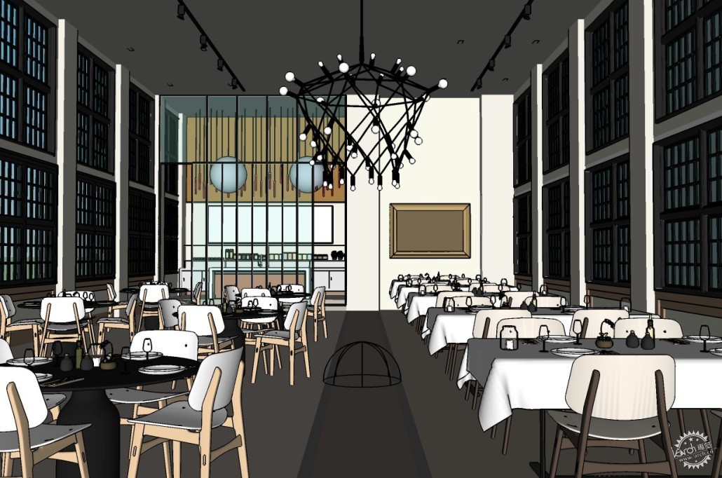
我选择了两种类型的餐桌,主要搭配使用Fredericia的Soborg椅。
I set up two typologies of tables, using mainly SoborgFredericia chair.
©JayierWainstein
©JayierWainstein
©JayierWainstein
©JayierWainstein
纹理与材质
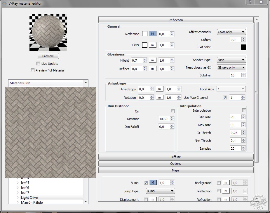
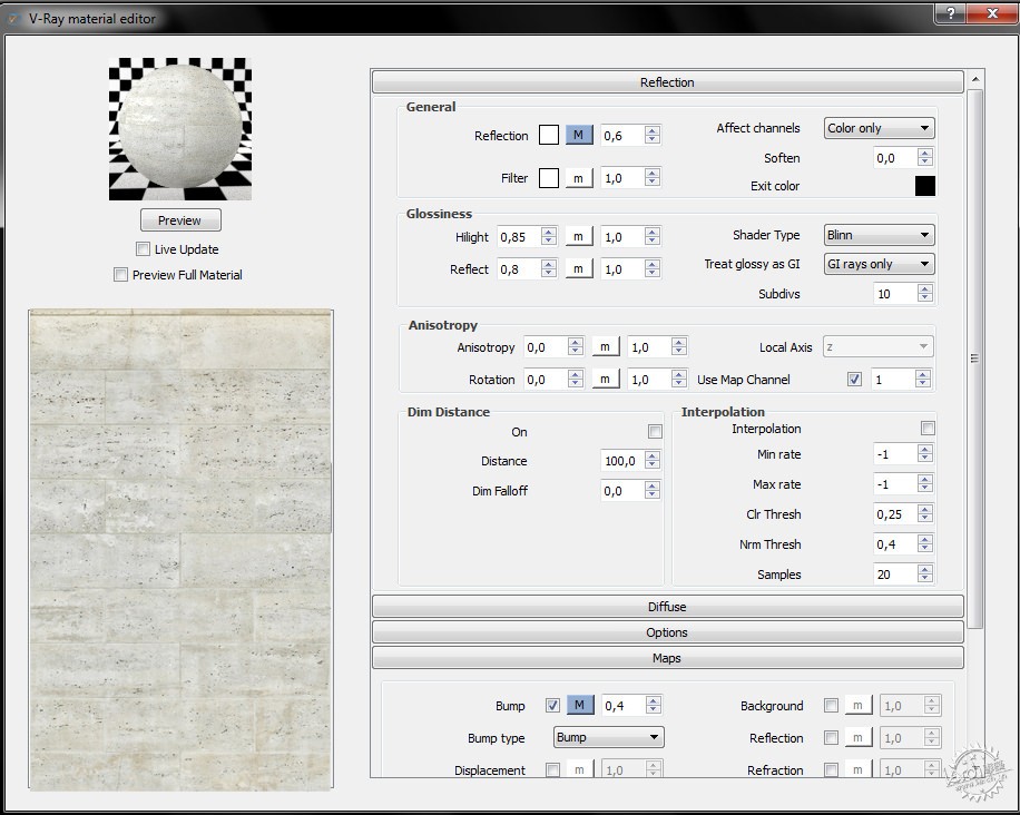
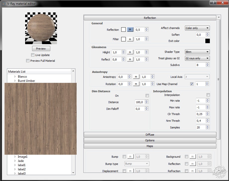
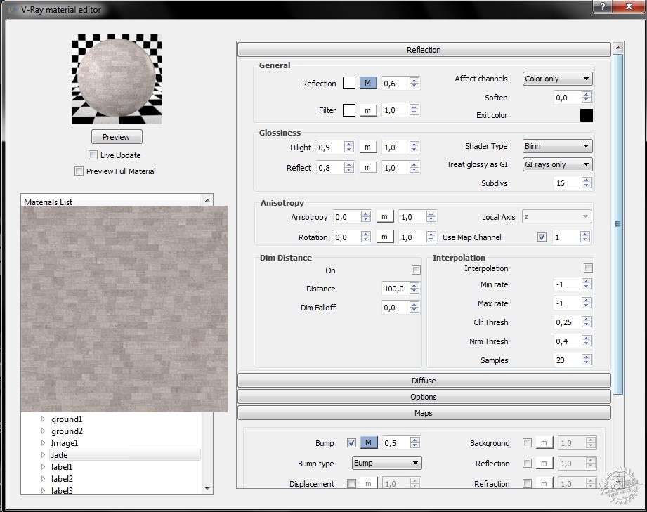
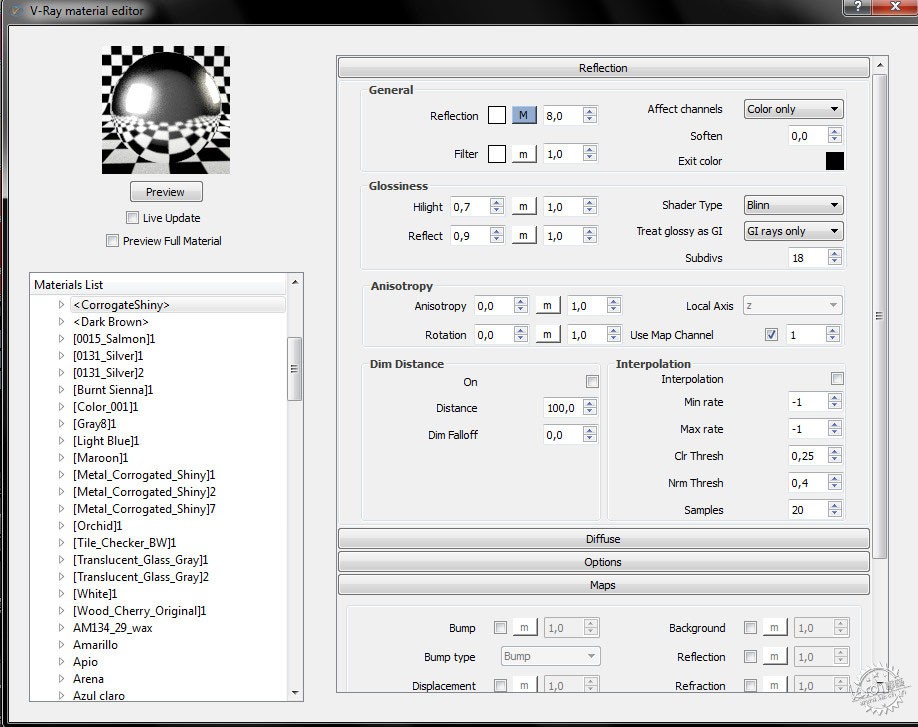
然后我开始选取材质,在V-ray材质编辑器中调整参数。
Texturing and Materials
Then I went choosing materials and working them with the editor of V-Ray materials.

©JayierWainstein
©JayierWainstein
©JayierWainstein
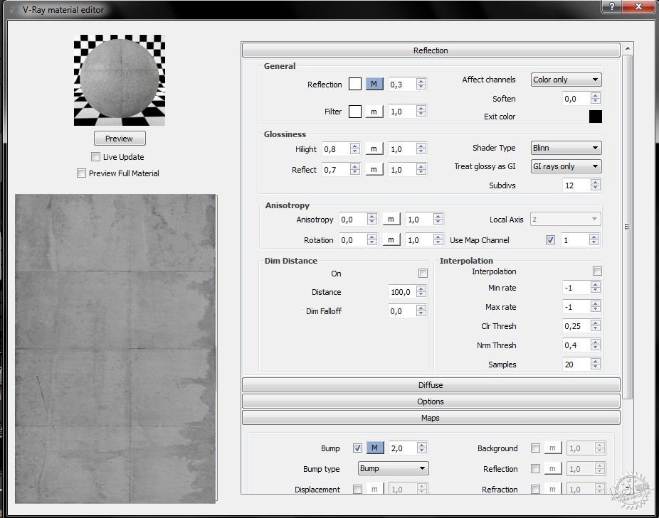
与大多数Sketchup使用者不同的是,我更倾向于亲自设置每一种材质,而不是使用类似Vismats的预设材质。
Unlike many SketchUp users, I prefer to assemble each material on my own. I do not use pre-assembled materials, known as Vismats.
©JayierWainstein
©JayierWainstein
©JayierWainstein
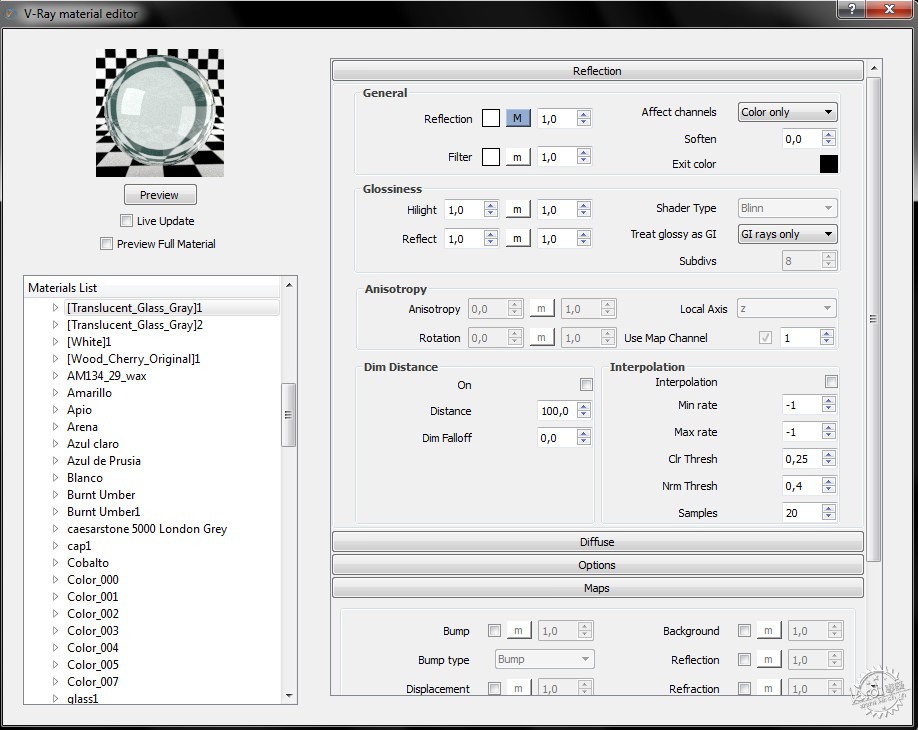
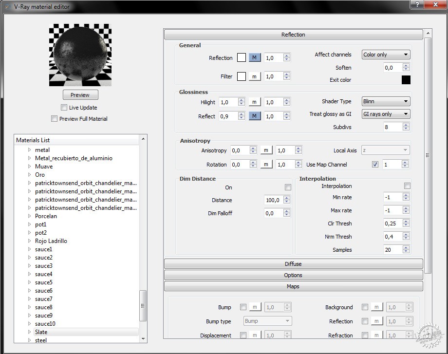
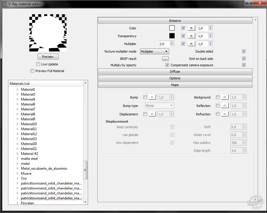
大部分纹理来源于Google图片,部分来自Evermotion、Arroway Textures一类的网站。
The textures came mostly from Google Images, and some from sources such as Evermotion and Arroway Textures.
©JayierWainstein
©JayierWainstein
©JayierWainstein
©JayierWainstein
菜单是我在Photoshop中制作的。
The menu was made by me in Photoshop
灯光
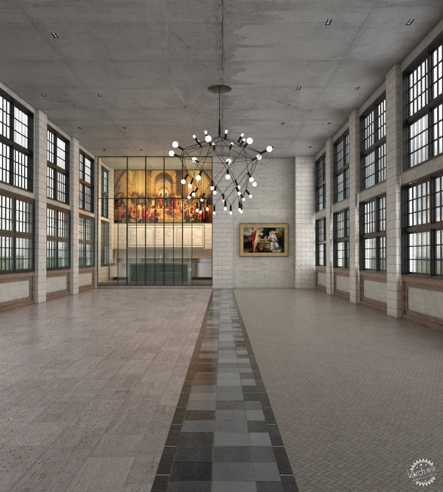
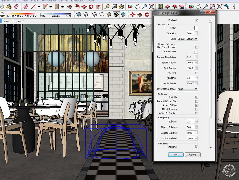
在渲染中,灯光是最重要的部分,它直接决定最终效果的好坏。经过多次实践,我发现在室内中使用HDRI十分有效。我尤其偏爱VIZPARK的HDRI NO. 19
Lighting
Lighting is the most important part of a render. Get this bad and all is bad. After much practice, I found it very useful to use HDRI in interiors. I love to use one in particular by VIZPARK – HDRI NO. 19
©JayierWainstein
我所追求的是一种柔和的氛围,没有直射的阳光,没有清晰的阴影。
I aimed for a soft mood, without direct sunlight coming in and sharp shadows.
©JayierWainstein
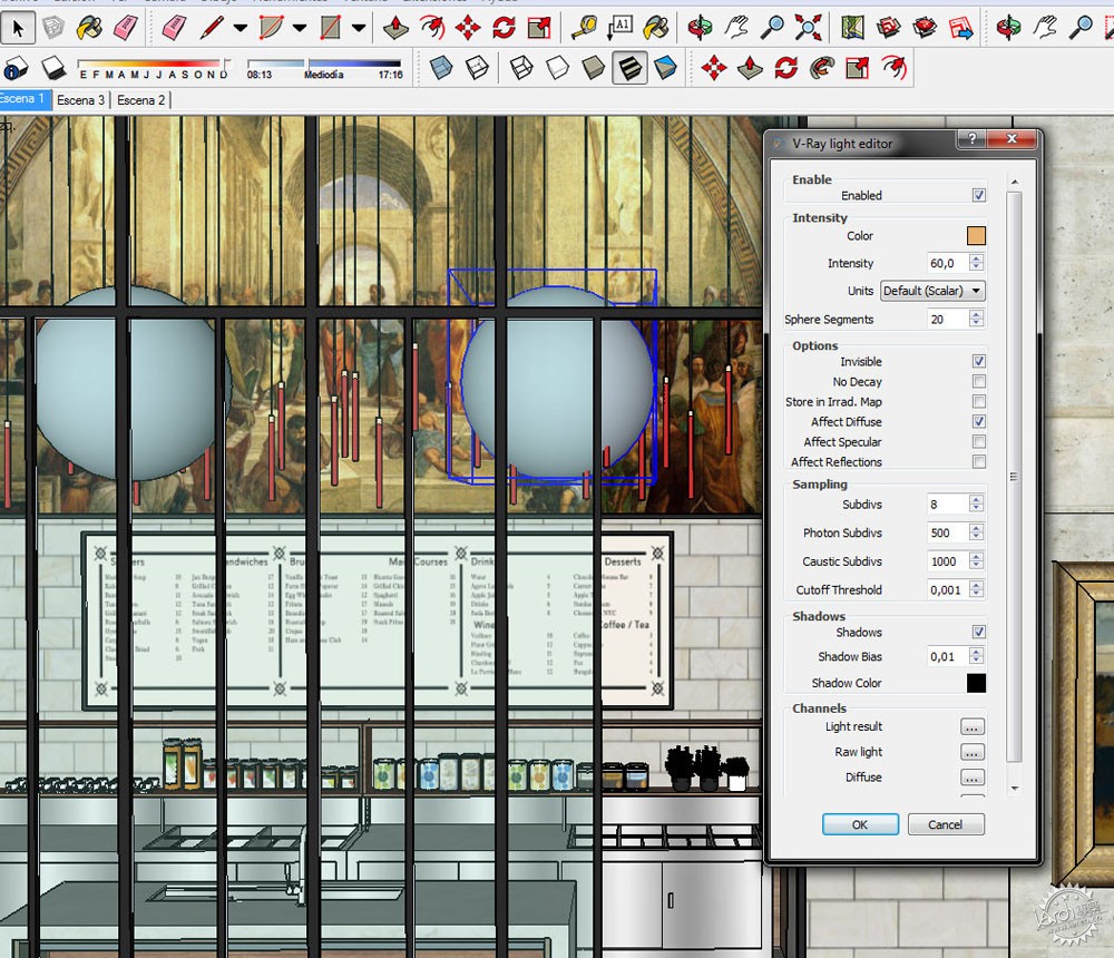
为了营造厨房温暖的气氛,我使用了两个球状V-Ray光源。
To create the warm atmosphere of the kitchen, I used two spherical V-Ray lights.
©JayierWainstein
最后,我使用矩形光源为吧台增加一些小点缀。
Finally, I used a rectangular light for adding a small touch on the bar.
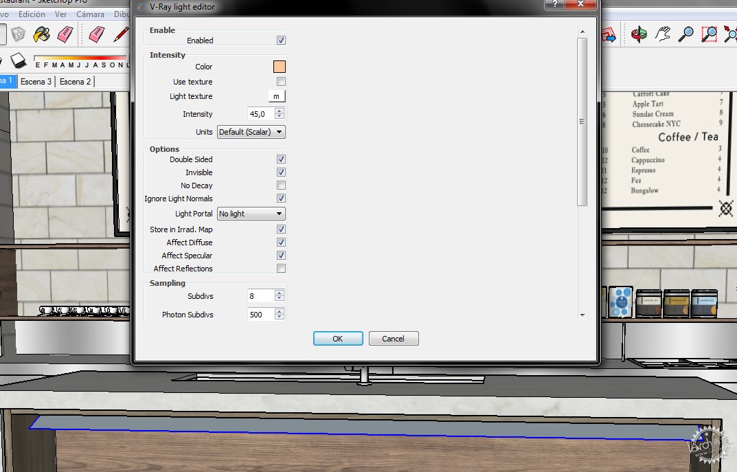
©JayierWainstein
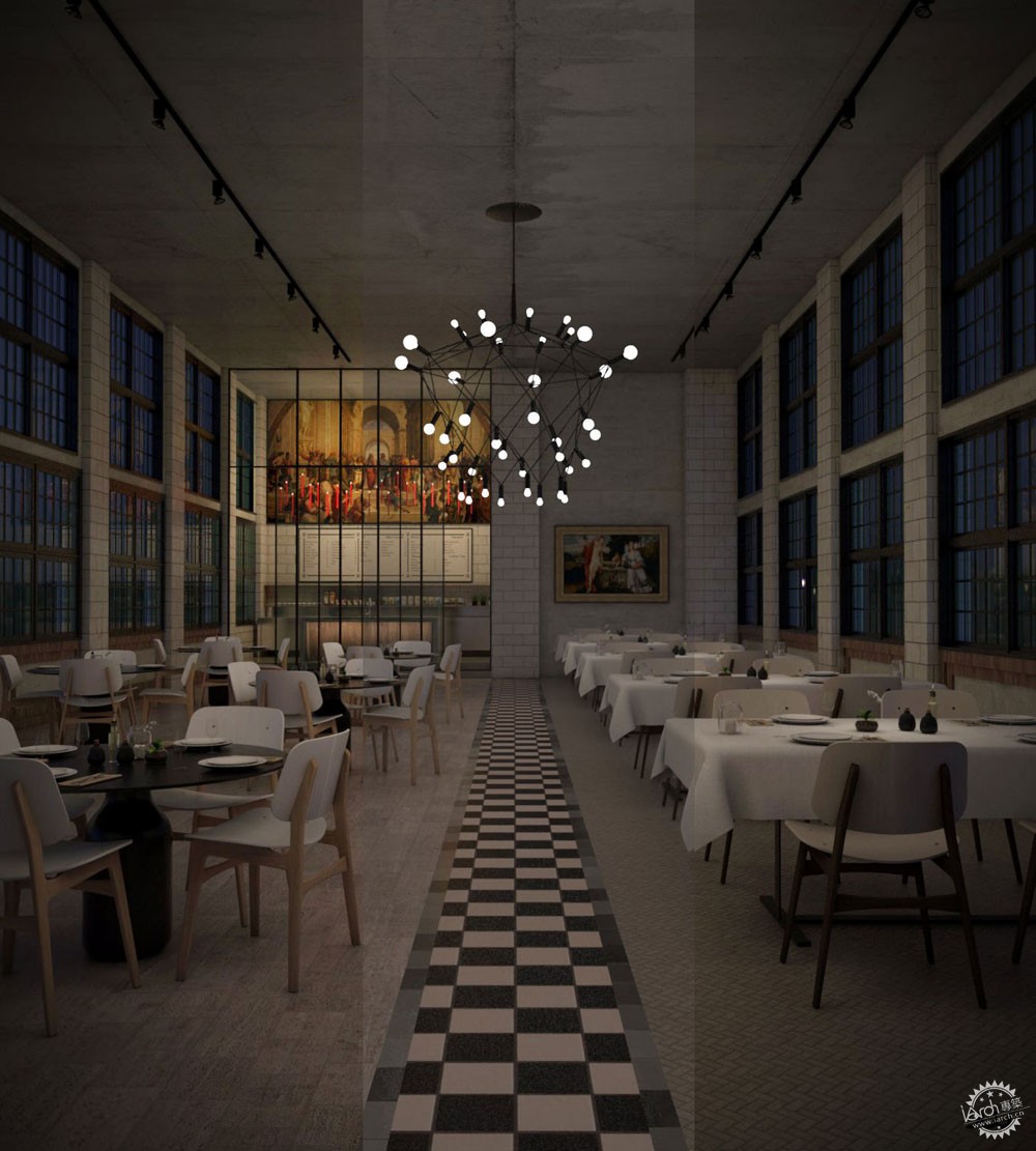
实际上是相当简单的设置。对于夜景,我使用了VIZPARK的HDRI No. 04
Pretty simple setup actually… For the night version, I used HDRI No. 04 from VIZPARK.
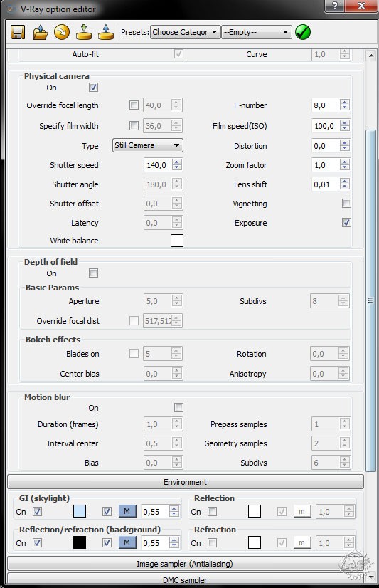
©JayierWainstein
对于整体照明,我使用了一个大型球状总光源,暖色调,同时在餐桌上增加了小光源。
For the overall light I use a big general spherical light, warm color. And small lights on the tables.
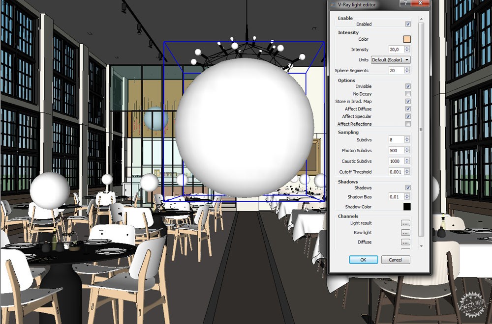
©JayierWainstein
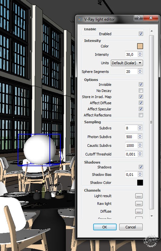
©JayierWainstein
渲染
这些是我所使用的参数。
Rendering
These are the parameters that I use.

©JayierWainstein
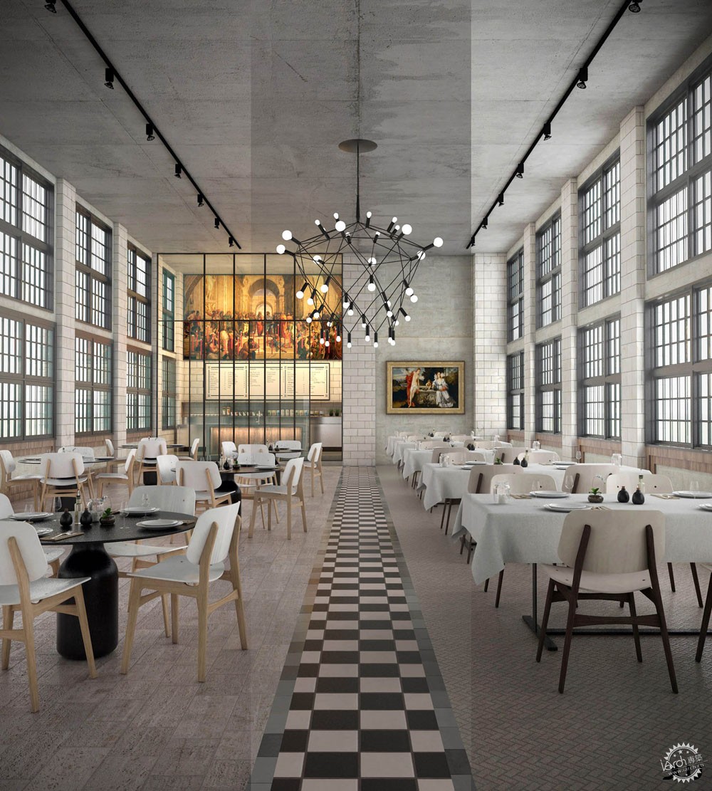
后期处理
通常在后期处理上我尽量保持简洁简单。我往往着力于在渲染阶段完成大部分的工作。而在后期仅仅是简单地调整色相,色调和对比度。
在一些特殊的图片上,我也会增加一些光晕。
Post Production
In usually keep it very simple and minimal in post. I always aim to get it mostly done in the render. In post I simply adjust colors, tones and contrasts.
In these images in particular, I also added some light glows.
©JayierWainstein
©JayierWainstein
出处:本文译自www.ronenbekerman.com/,转载请注明出处。
|
|
