查看相册 View Gallery
Making of Simple Interior
由专筑网刘庆新,vigo编译
2016年第一篇制作博文是Danny Kai发出的,而且他获得了2015年21周最佳“简单室内”视觉化称号。
First making-of for 2016 is by Danny Kai, diving into the creation of his Best of Week 21/2015 “Simple Interior” visuals. A simple residential project in Oklahoma that Danny worked on at Vizorium. For me it looks like chiaroscuro paintings, and captured my attention looking into how they were made… Enjoy!
Introduction/简介
大家好!
我成长于舒适地带,我去过的每个地方也是如此。以前我努力寻找营利和非营利项目之间的平衡,特别是开始一个项目时,考虑最初的心态。现在我会说服自己不要把钱看在首位,因为这样我就会用100%热情投入到项目中,而且,我相信自己所站的角度是正确的。
这个项目是和我目前所在的团队Vizorium一起完成的。最初的想法是创建一个短动画,但是因为合约和截止期限,我只能完成现在的图片阶段。
感谢 Ronen将这个项目发表出来。
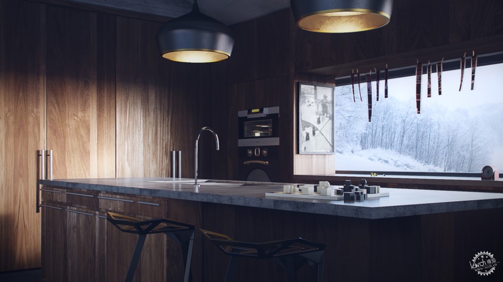
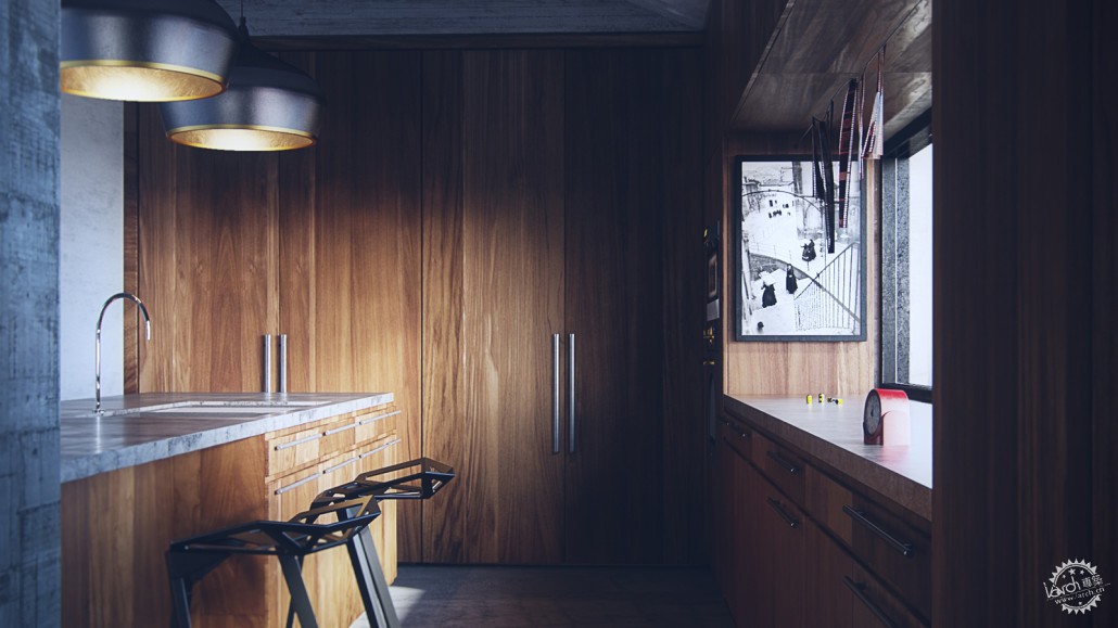
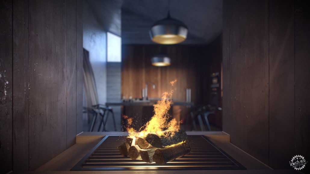
这一组有9张图:
Hello!
I grew up in a place where comfort zone seems to be everywhere I go. I’ve previously struggled with the balance between profit and non-profit driven projects, especially considering the initial mindset when starting a project. At this moment I do like to think that I’m in the right place in terms of convincing myself not to look at the money first because that way I would be able to put in 100% of passion into projects.
This is a project I’ve done with the company I’m currently attached with, Vizorium. The initial idea was to create a short animation, but due to the commitments and deadlines I’ve only managed to complete the still images stage.
Thank you Ronen for featuring this project!
Here are the 9 Images in this set :

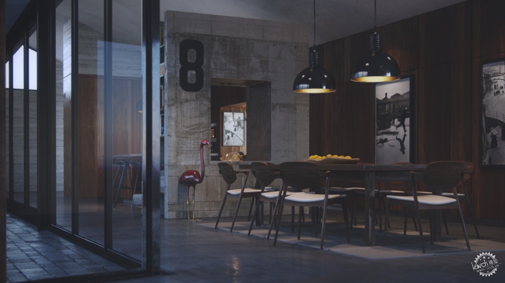
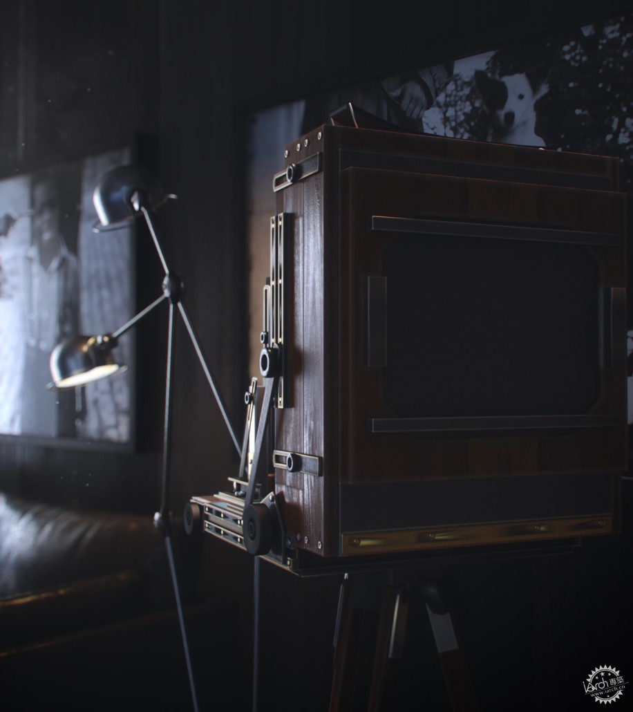
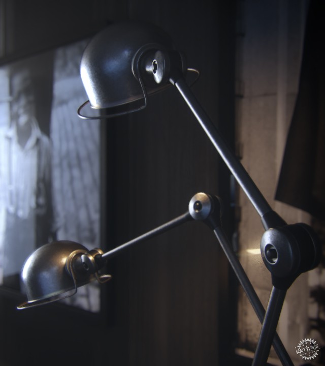
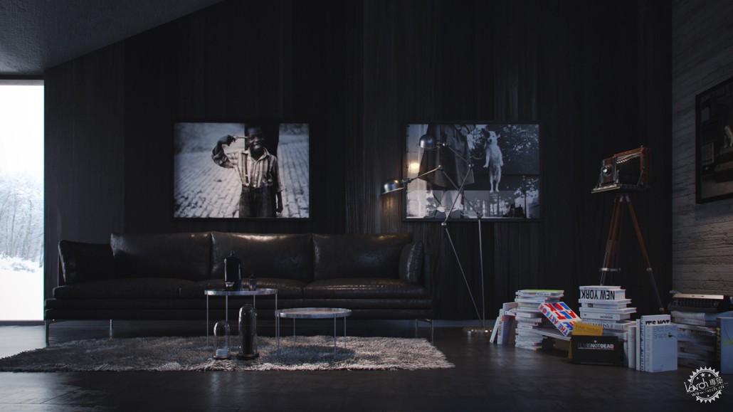
Getting into the Moment/进入情节
开始一个项目之前,我喜欢花一点时间重温我喜欢的电影里的一些情节,从而来获得我想要的配色方案和构成元素。
在这个案例中,我选择的电影是“白日梦想家”。
Before starting a project, I like to spend a little time re-watching some of my favourite movies to study color schemes and compositions that I would like to achieve.
In this case the movie I’ve chosen to watch was “The Secret life of Walter Mitty”.

作为一个影片摄影爱好者,我经常找寻一些可以灌输给我的灵感,然后,将其用到我的项目中。在我看来,这部电影摄影指导确实做的很烂。但是我喜欢这部影片的拍摄的场景和景色。它们虽然极简极抽象,但是仍然很有力。
在整个项目中,我经常提醒自己创建这些极简极抽象但仍充满力量的场景。
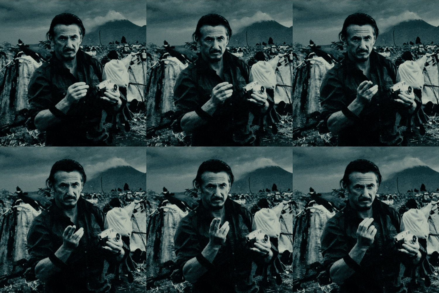
当Walter Mitty无意中拍摄的Sean Penn这张照片出场时,虽然是微小的举动但是影响力却很大。
As a film photography lover I often seek for inspirations that I could instill, in turn, into my projects. In my opinion, the director of photography for this movie has done an awesome job! One thing I like about this movie very much are the scenic and landscape cinematographic shots. These are often very minimalistic but still powerful.
Throughout the whole project I’ve often remind myself to create these minimalistic scenes but still powerful just like :
The moment Walter Mitty zoned out to this photo of Sean Penn, subtle movement yet the impact was amazing.
或者当Sean Penn引述时
Or when Sean Penn quoted
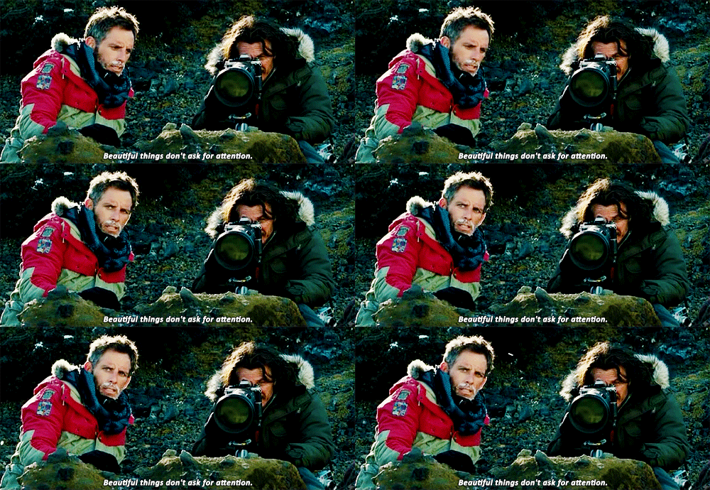
像这样简单的动作起到的影响却很大。
说得够多了!
如果觉得以上说法显得陈词滥调,我只能说声抱歉啦,但是这就是我怎么工作的过程。我相信每一位艺术家有他们自己的方式获得他们的灵感。
t is simple gestures like this that comes with a powerful impact.
Nuff said!
I’m sorry if the above sounded cliché but that is how I work and I believe every artists have their own way of getting their inspirations.
Modelling, Cameras & Composition/建模、相机&构成
我们的委托人已经给我了基本的3D SU模型,但是并不详细,大部分是堆叠的。所以在我对构成进行设计的时候,我加入了一些细节。下面是所有相机和一些额外情景的截图。
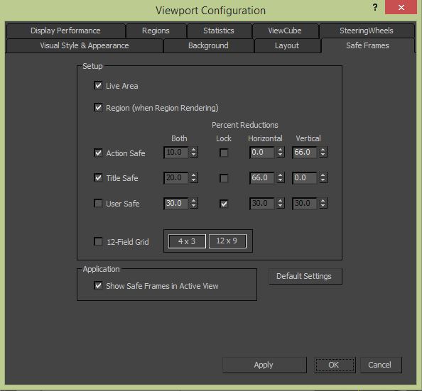
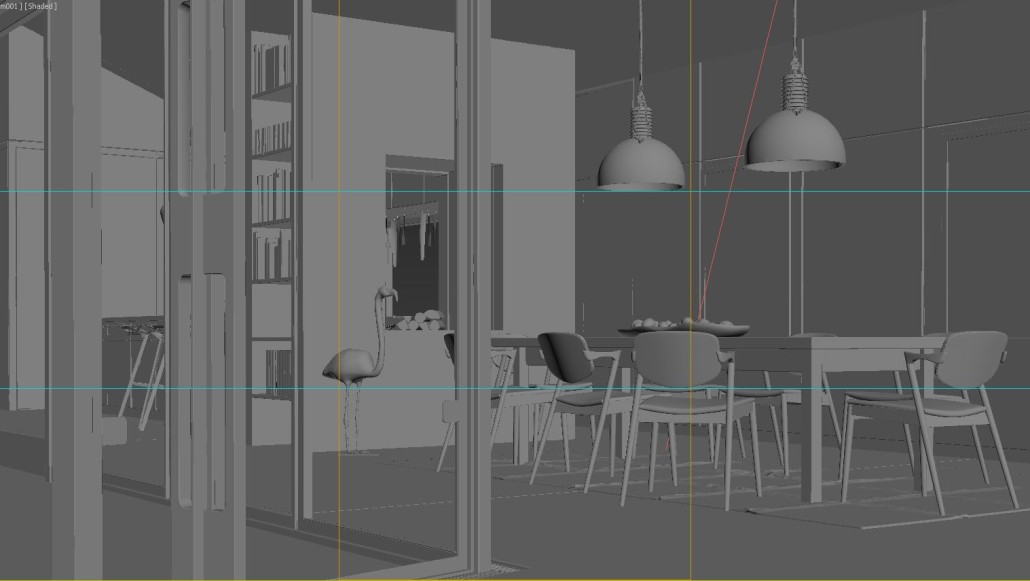
我也学习使用视窗安全框架设置,下图是“三分法”的代表,它在元素构成中起到了作用。
I was given the basic 3D SketchUp model by our client. It wasn’t that detailed and most of them have double stacked objects. Some details are added while working with the compositions and below are the viewport screenshots for all the cameras and some non-included views.
I’ve also learnt to use the viewport safe frame setting as below to represent “Rule of Third”‘s so it helps during composition.
它们建立的框架
And the frames as they were setup
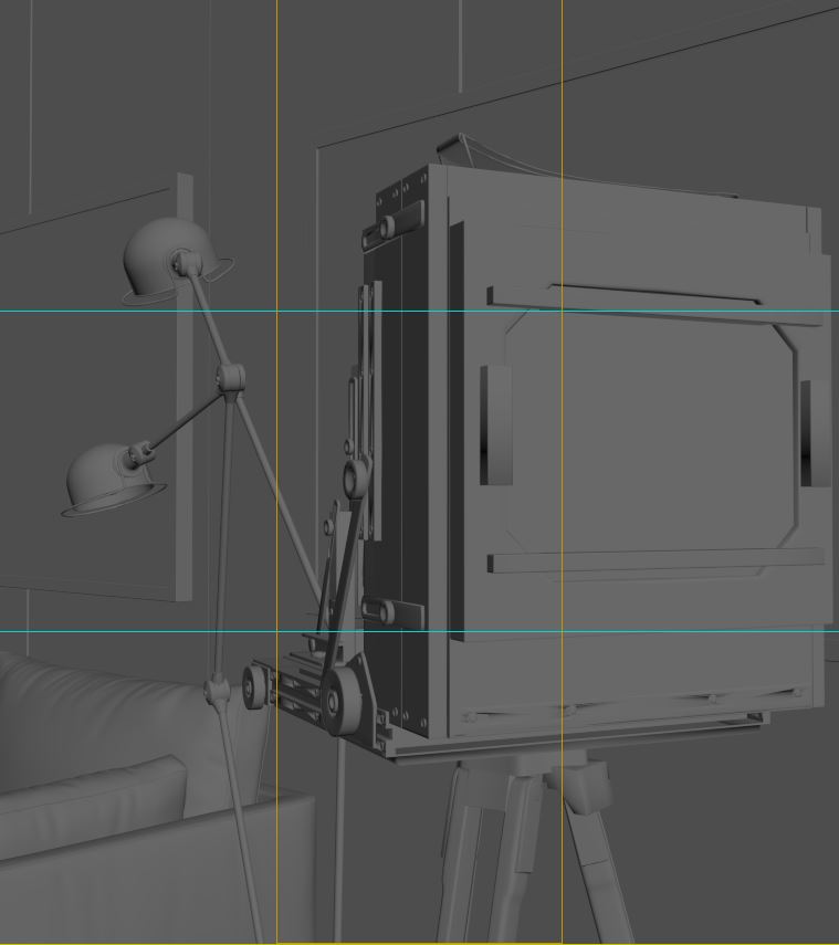
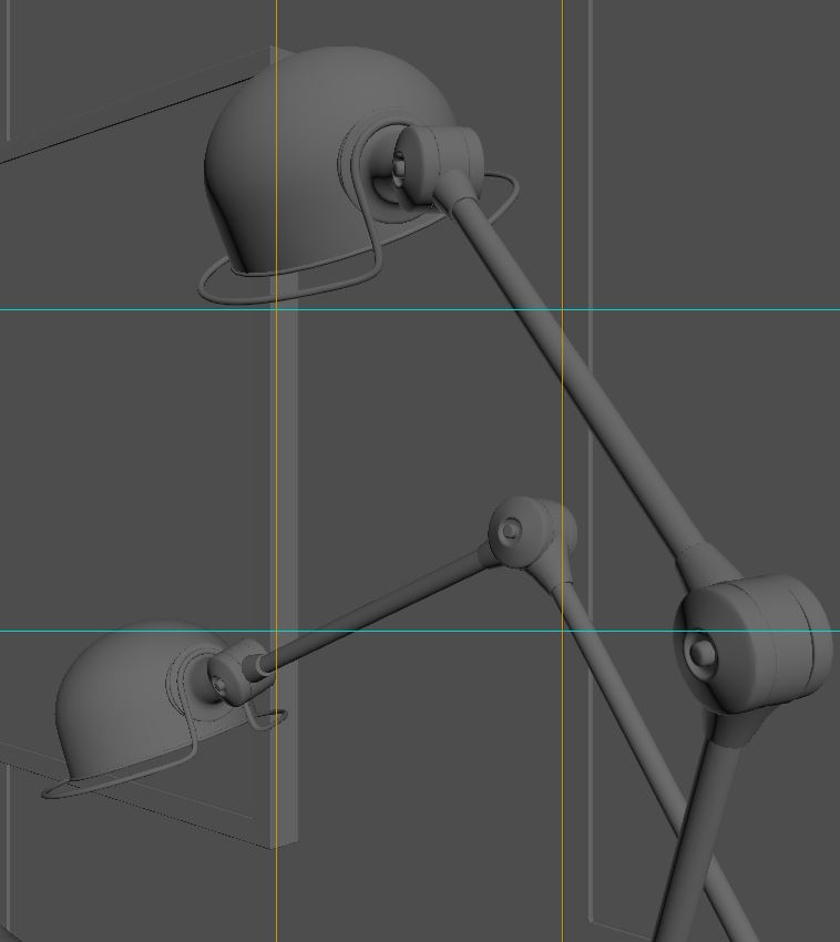
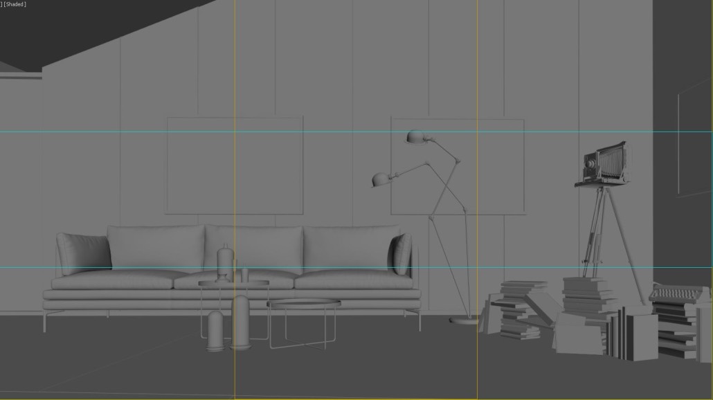
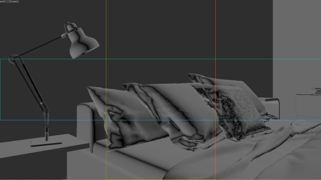

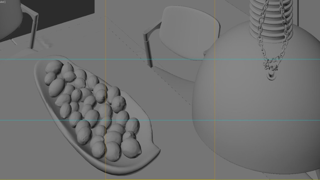

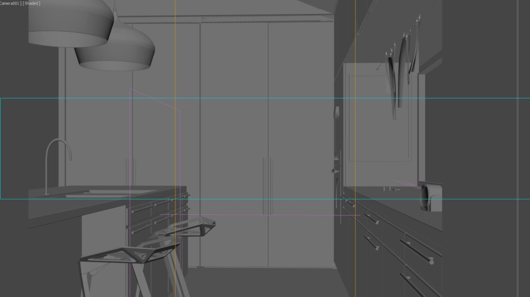

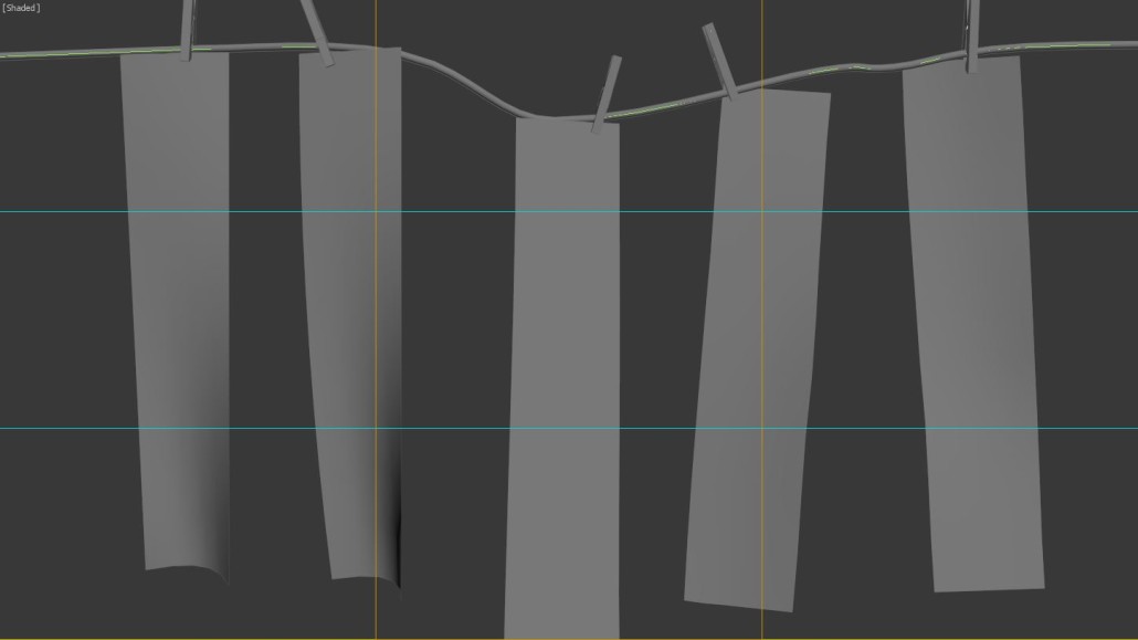
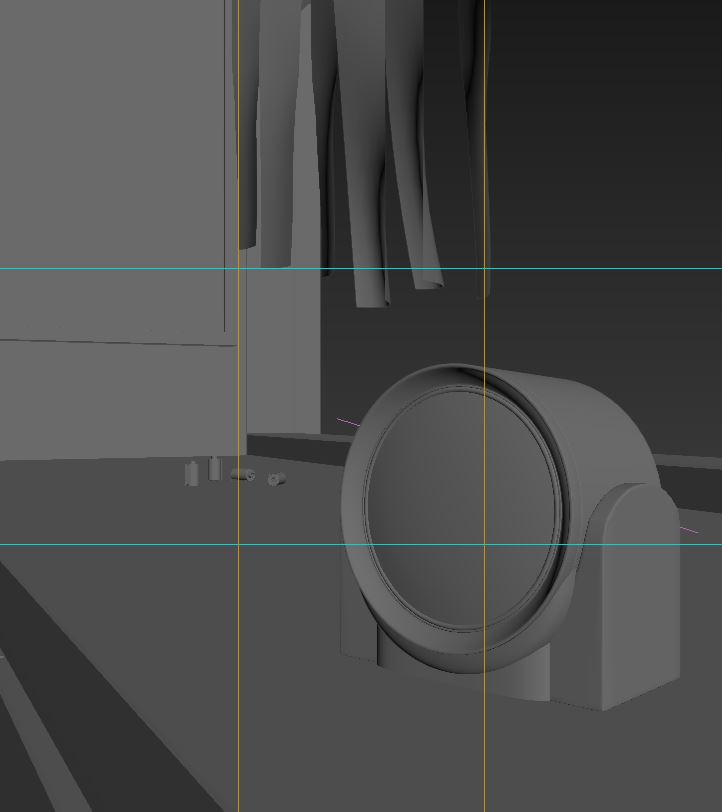
所有的模型都是用曲线和传统盒子建立的。因为这里我还没有添加很多分支,所以不会谈论很多建模。一些模型如老式照相机是我的同事制作的。
窗帘使用了一个简单的风模拟,主要用于胶卷条。
All models are built mainly with splines and typical boxes. I try not to talk a lot about the modeling since there isn’t much I can add in that department. Some of the models like the vintage camera are courtesy of a colleague of mine.
A simple wind simulation was used for the curtains and mainly for the Film strips.
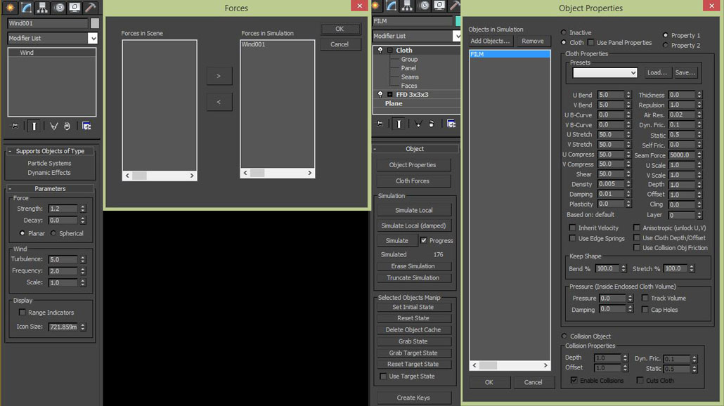
关于随机胶片方向,我只是使每一个的风力不同。
For random film orientation I would just differ the amount of wind strength for each of them.
Materials/材质
在这个特别项目中我使用了Mr.Grant Warwick在他的Mastering CGI 课程中使用的工作流程。最初,我努力使用高细分材料工作流,但是最近GW引进了一个新的课程处理这个问题,大家都可以来看一下。
In this particular project I used the workflow taught by no one else other than the master Mr.Grant Warwick in his Mastering CGI courses. Initially, I’ve struggled with the high subdivs material workflow but recently GW had introduced a new lesson which tackles that issue and I think everyone could take a look at it.
Timber Walnut/核桃木材质
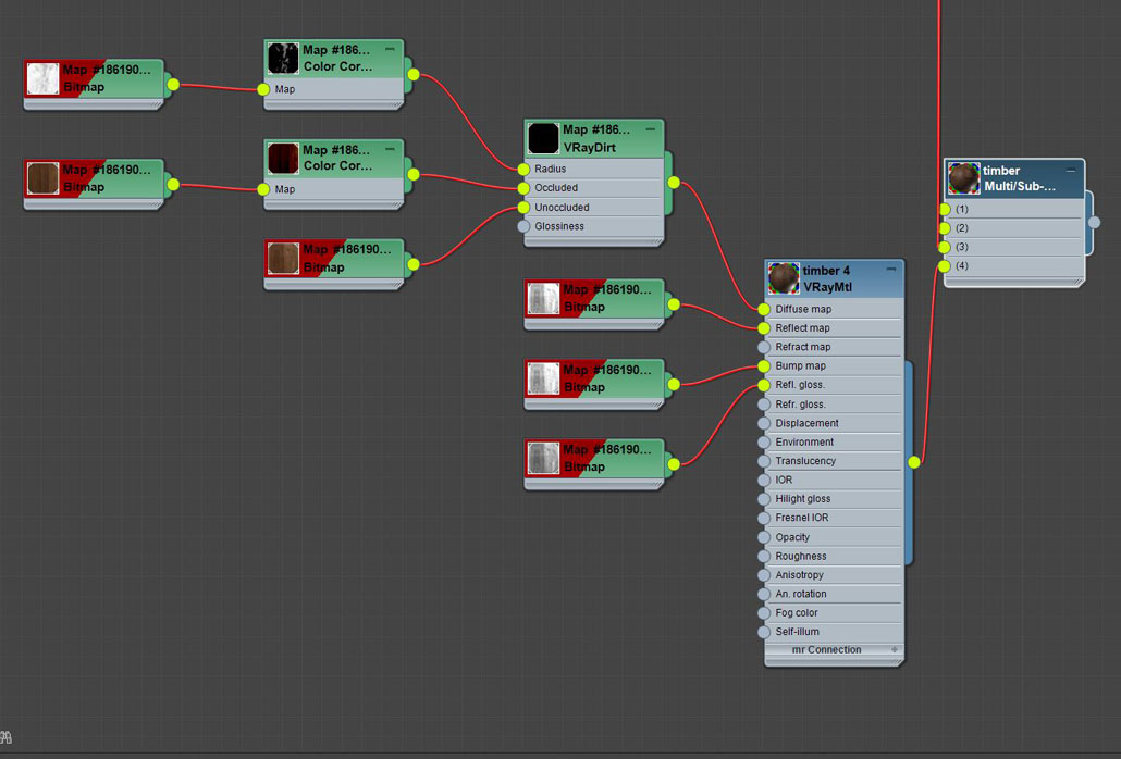
为了避免重复,我使用多重/次物体材质作为组件创建了四个不同的核桃木材质。
In order to avoid repetition I’ve created four different walnut materials using the Multi/Sub-object as the Parent.

Film Strips /胶卷条
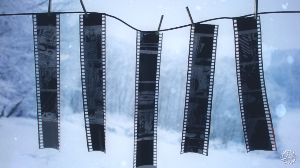
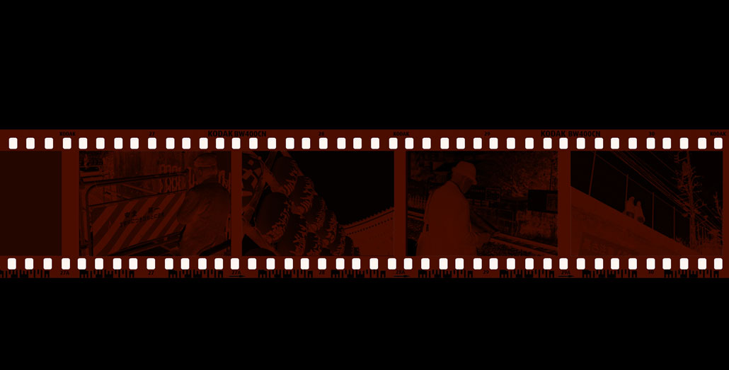
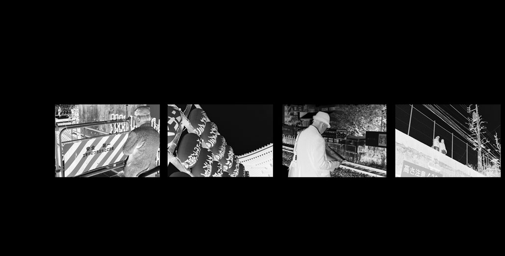
我曾将我之前去东京旅行时用Leica M3拍摄的照片自己制作成胶卷。将其转化成简单的黑白色,然后,反转图象获得底片效果。
I’ve customised the films using my own photos I’ve shot with my Leica M3 during my previous trip to Tokyo. Simple conversion to black & white then inverse the image to get the film negative look.

Diffuse/散射贴图
Refractio/折射贴图
Opacity/不透明贴图
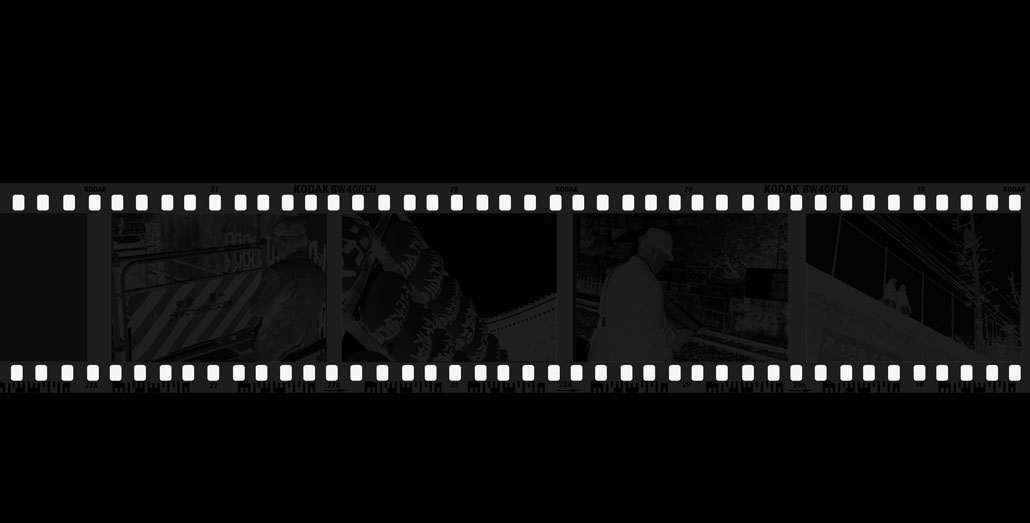
这是我在影片中拍摄的一些材料:http://dwhiskers.tumblr.com
Here are some of the stuffs that I’ve shot in film : http://dwhiskers.tumblr.com
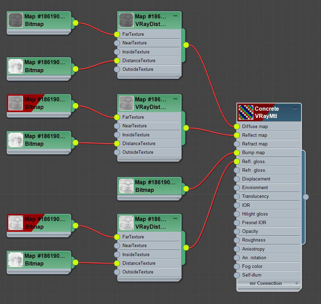
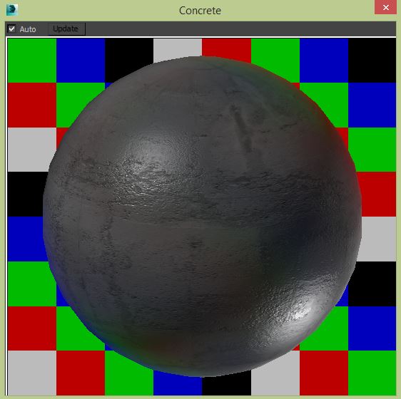
Concrete/水泥材质
Black Coated Metal/黑色涂层金属
餐桌上的吊灯所使用的黑色涂层材料来自Betrand Benoit的Loft场景,我只是将BRDF换成GGX。
The black-coated material used in the dining tables pendant lights is from Betrand Benoit’s Loft scene just that I’ve changed the BRDF to GGX.

Lighting/灯材质
灯的制作工程是我最喜欢的部分!
我的想法是努力获得简单抽象但是有力的效果和感觉。场景使用带有HDRI的传统V-Ray半球灯点亮。关于HDRI,我更喜欢Peter Guthrie – PGSKIES。
The lighting process is the part I enjoy doing the most!
The idea was to try to achieve a minimalist yet powerful overall look & feel. The scene was illuminated using the typical V-Ray Dome Light with an HDRI. When it comes to HDRI’s I prefer the trusty ones by Peter Guthrie – PGSKIES.

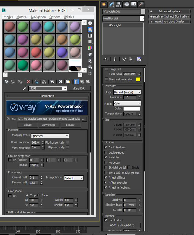
我处理照明的方法是首先关注阴影,而不是“点亮场景”。
下图是其中一个例子:
The way I do lighting is usually to focus on the shadow first instead of “Lighting up the Scene”.
Below is one of the examples :
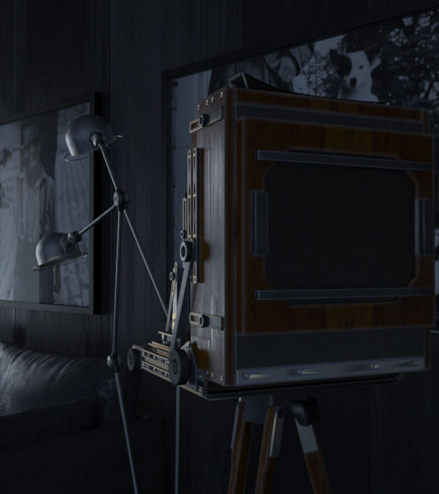
用HDRI照明
Lighting with just HDRI

用冷补光照明
一旦我对环境中照明的密度和阴影满意,然后我就在场景中加入冷补光效果,影响了反射贴图和反光贴图,从而加强场景中的加亮区。
Lighting with cold fill lights
Once I’m happy with the density & shadow of the environment lighting, I then fill in the scene with cold fill lights that affects the reflections & Specular to enhance highlights in the scene.

最后也是最重要的,我添加了暖补光,来增加一点温暖的模糊感觉。这样在后期制作中很容易控制。
Last but not least, I’ve added the warm fill lights just to add a little warm fuzzy feeling to the mix. Just enough for easier control in post production.
Rendering/渲染
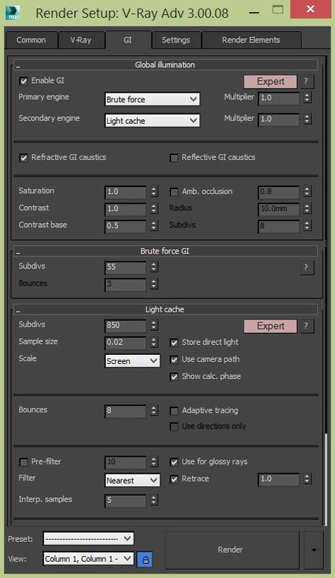
我使用了Brute force + Light cache,每一次渲染在一台电脑上花费5-7小时。我使用的PC是i7,内存为2GB,显卡为GTX 760。
最初,我想在相机中渲染DOF,但是由于噪音量,我会通过高分辨率来补偿。我决定用使DOF,从而避免更长的渲染时间。
其中一个场景的渲染设置样例:
I’ve used Brute force + Light cache and each render took around 5-7 hours on one computer. The pc I’m using is as an i7 with 32GB RAM packing a GTX 760.
Initially, I wanted to render the DOF in Camera, but due to the amount of noise forcing to compensate in terms of higher subdivs, I decided to go with postwork DOF to avoid longer render times.
One of the scene’s sample render settings :


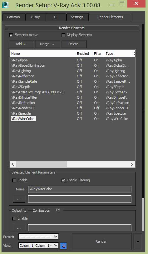
我使用到的渲染元素非常常见,但是我喜欢其中的V-Ray Sample Rate,它让我对渲染场景背后的V-Ray有了一个全新的了解。
The render elements I’ve used are pretty much the common ones but I’m in love with one particular pass which is the V-Ray Sample Rate which gives you a whole new understanding towards V-Ray goings behind the scenes of the render.
Post Production/后期制作
在后期制作中我用到了一些软件,比如Frischluft for Depth of Field & Magic bullet插件用于颜色分级。
这里也没有什么特别的。
The software I’ve used for post productions are such as Frischluft for Depth of Field & Magic bullet for color grading.
Nothing too special there too.
非常感谢Ronen Bekerman邀请我写这篇博文,希望大家能喜欢。
我就讲这些吧。我们在座谈会上再见!
Big thanks to Ronen Bekerman for the invite to write this behind the scenes and I hope you guys found it interesting.
See you on the forum
出处:本文译自www.ronenbekerman.com/,转载请注明出处。
|
|
【专筑网版权与免责声明】:本网站注明“来源:专筑网”的所有内容版权属专筑网所有,如需转载,请注明出处
专于设计,筑就未来
无论您身在何方;无论您作品规模大小;无论您是否已在设计等相关领域小有名气;无论您是否已成功求学、步入职业设计师队伍;只要你有想法、有创意、有能力,专筑网都愿为您提供一个展示自己的舞台
投稿邮箱:submit@iarch.cn 如何向专筑投稿?
扫描二维码即可订阅『专筑』
微信号:iarch-cn

