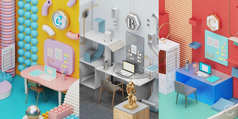
这些室内设计灵感来源于众所周知的字体
These Office Interiors are Inspired by Well-Known Fonts
由专筑网邢子,李韧编译
正如许多建筑师所知,每种字体都有自己的个性,所以把它们用作办公室装饰的灵感并非实现。字体能够在读者阅读文字之前传达直观的感受,因此我们应当重视在项目或方案中的字体运用。字体在平面设计和建筑排版中显得至关重要,因为我们经常会发现,如果字体效果不好或不成比例(例如漫画),阅读者会有不舒适的感觉。
下面的每个室内设计风格都使用了一种独特的标志性字体作为基础。HomeAdvisor利用自己的风格特点,将每个房间风格化,以体现各自的独特之处,并让我们更好地感受它们的性格特征。
As many architects know, fonts have their own personality - so to use them as inspiration for office decors isn’t as crazy as you might think. Typography has the ability to instantly tell a narrative to the reader before needing to read the words, hence why we can take the decision-making behind which font to use in a project or scheme very seriously. They can hold the utmost importance in graphic design and architecture, as we often find ourselves displeased if the font is inefficient or disproportionate (take comic sans for example).
Seven unique, iconic fonts have been used as a base for each of the interior design projects below. Using their heritage, connotations, and style of the typography, HomeAdvisor have stylised each of the rooms to embody their identities and make us question their character.

Courtesy of HomeAdvisor
Helvetica
如今广泛使用的Helvetica(没有衬线字体)开发于1957年,几乎所有印刷项目都可以使用,包括企业标志、税务报表,甚至美国太空总署的飞行器。对于经典、干净的字体,办公空间纳入了原色的直线和曲线的组合,创造新鲜微妙的观感。
The widely used sans-serif (without serif) typeface was developed in 1957 and has since been used by almost every typographic project imaginable, including corporate logos, income tax forms, and even NASA space shuttles. For an interior inspired by the classic, clean font, the office space has incorporated primary colors and a combination of straight and curved lines for a fresh and minimal look.
Courtesy of HomeAdvisor
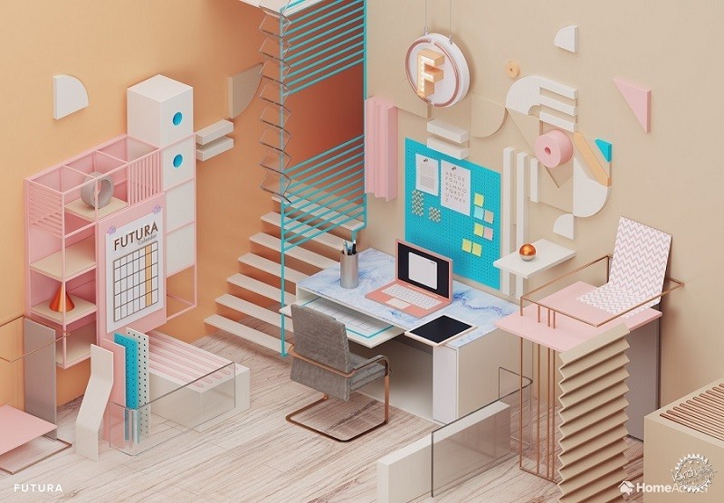
Futura
几何空间内部采取Futura字体创造引人注目和有品位的房间,是与包豪斯时期类似的设计风格。无杂乱的空间至关重要,就像类型学一样,追求高效和简约。设计师通过将房间的元素组织成线条而实现,运用简约的单色配色打破了侧重于对比的流行色彩风格。
The geometric interior takes the timeless font Futura to create a striking and tasteful room, with a similar design style to the Bauhaus period. The clutter-free space is important to the scheme, as like the typology, it’s efficient and simple. This has been achieved by organizing the elements of the room into lines with a simple monochromatic color scheme broken up by a contrasting pop of color.
Courtesy of HomeAdvisor
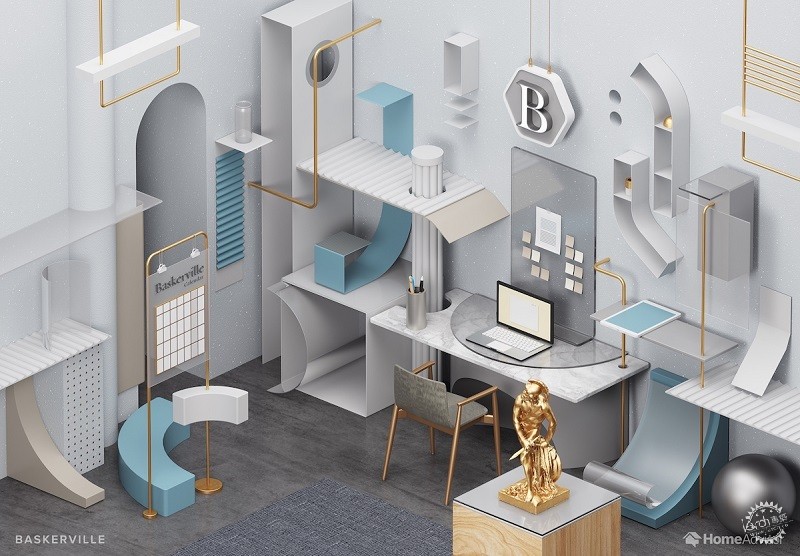
Baskerville
设计基于Baskerville1929年更新的版本,融合了巴洛克和现代风格的豪华和丰富,并且表现出柔和的蓝色金属质感。设计最初起源于1754年,房间采用精致的典雅几何经典家具与清晰利落的边缘形成宁静和成熟的工作空间。
Based on the updated Baskerville 1929 version, the design fuses Baroque and modern styles for a lavish and rich scheme that introduces metallics within muted light blues and beiges. Originally designed in 1754, the room draws on the typeface’s refined elegant geometry for classic furniture with crisp edges to create a serene and mature workspace.
Courtesy of HomeAdvisor
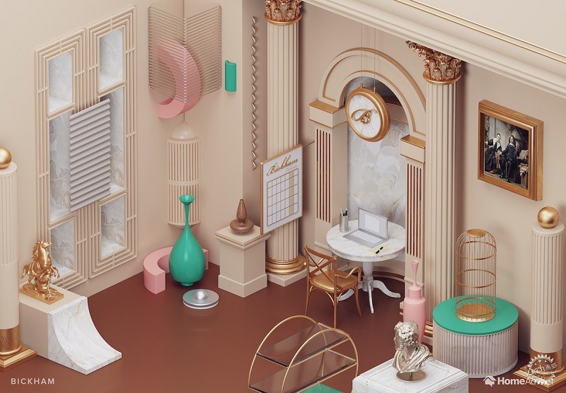
Bickham Script
这个华丽的室内空间展现了Bickham Script字体的尊贵和正式,房间内布满了富有装饰感的墙壁和家具。18世纪的文字多年来主要用于展览、菜单和婚礼请柬,所以豪华的房间里装饰着丰富的饰品,科林斯柱式体现着装饰性。
This ornate interior applies the distinguished and formal style of Bickham Script to adorn the walls and furniture. The 18th Century lettering for many years has been used primarily for display, in menus and wedding invitations, so the lavish room is rich with ornament and decorative features are seen particularly in the Corinthian columns.
Courtesy of HomeAdvisor
Cooper Black
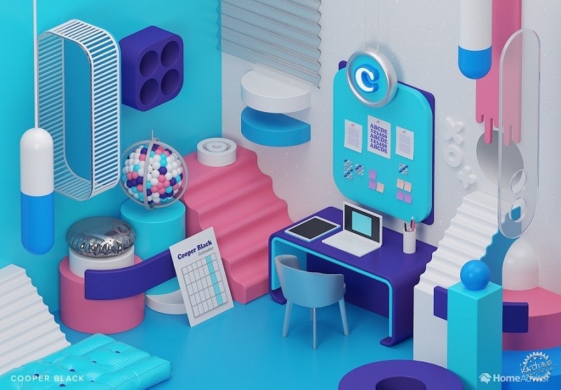
这个复古风格的工作空间采用了与Cooper Black字体相关的20世纪60年代和70年代的文化,并赋予其现代感。在过去的几十年,这种字体主要运用于专辑封面和电视节目,加上最近又被大力推广,该字体已成为2017年最时尚的字体。在这个房间内部可以找到中世纪的家具样式和明亮的流行色彩。
This retro-inspired workspace has taken the 1960s and 70s culture associated with the Cooper Black font and given it a modern spin. Throughout both the decades it could be found on album covers and TV shows, although it has recently been popularised, being named the most fashionable font of 2017. Mid-century furniture and bright pops of color can be found in this interior.
Courtesy of HomeAdvisor
Courier
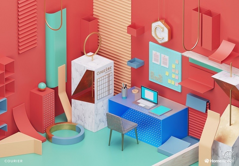
由于几乎所有的打字机公司都使用Courier字体,所以在最初运用该字体的IBM公司之后, Courier字体成为了办公室的必需品。这个工作空间的设计灵感便来源于此,旨在用功能性家具和清晰的工作空间来激发员工的工作动力和生产力,墙上有明亮的珊瑚色调,说明其外观也已经随时代变迁而加入新的特色。
As almost every typewriter company used Courier, following IBM who initially started the trend, the monospaced slab serif “typewriter” font represented a vintage necessity for the office. This workspace inspired by Courier has been designed to provoke hard work and productivity with functional furniture and a clear space to work, although the look has been updated with a bright coral shade on the walls.
Courtesy of HomeAdvisor
Comic Sans
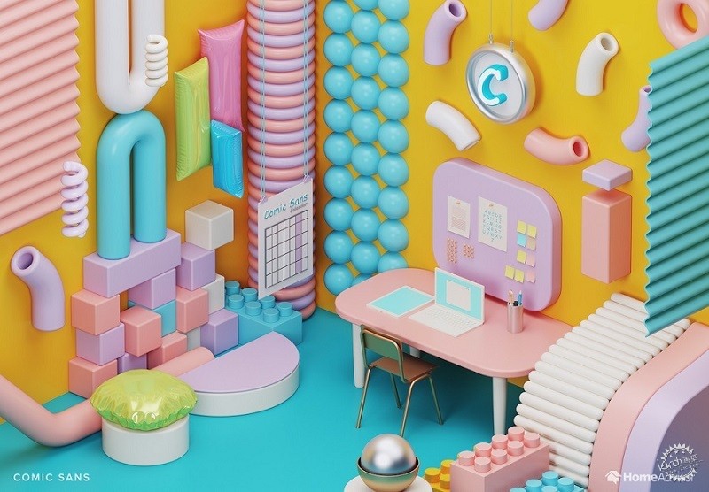
由这种字体而产生的工作空间看上去更加随意一些,充满了明亮的色彩和纹理,像是儿童的游乐场。改装旧玩具的趣味形状产生了令人满意的装饰效果。 虽然这种字体在设计时运用较少,但人们还是能从这个空间中享受到愉悦的时光。
The casual font makes for a more informal workspace, teeming with bright colors and an array of textures for the child at heart. The fun shapes from repurposed old toys produce decorative items that give this satisfying room character. Whilst the font itself is generally hated by most of the design community, you can’t help but enjoy this cheerful interior.
出处:本文译自www.archdaily.com/,转载请注明出处。
|
|
专于设计,筑就未来
无论您身在何方;无论您作品规模大小;无论您是否已在设计等相关领域小有名气;无论您是否已成功求学、步入职业设计师队伍;只要你有想法、有创意、有能力,专筑网都愿为您提供一个展示自己的舞台
投稿邮箱:submit@iarch.cn 如何向专筑投稿?
