2019 Graphic Design Trends You Need to Know
由专筑网王雪纯,李韧编译
在年度趋势报告中,小编们提出了对2019年平面设计趋势的预测。
这些是未来将在打印和网页设计中随处可见的样式,因此您可以快速了解这些在2019年具有影响力的设计趋势。
In our annual trend report we present our predictions for the biggest graphic design trends for the year ahead.
These are the styles which we think you’ll see everywhere across print and web design, so it pays to get ahead and tap into these trends while you can.
From the welcome return of serif fonts to rich blue palettes, these are the trends we’re tipping to be influential in 2019.
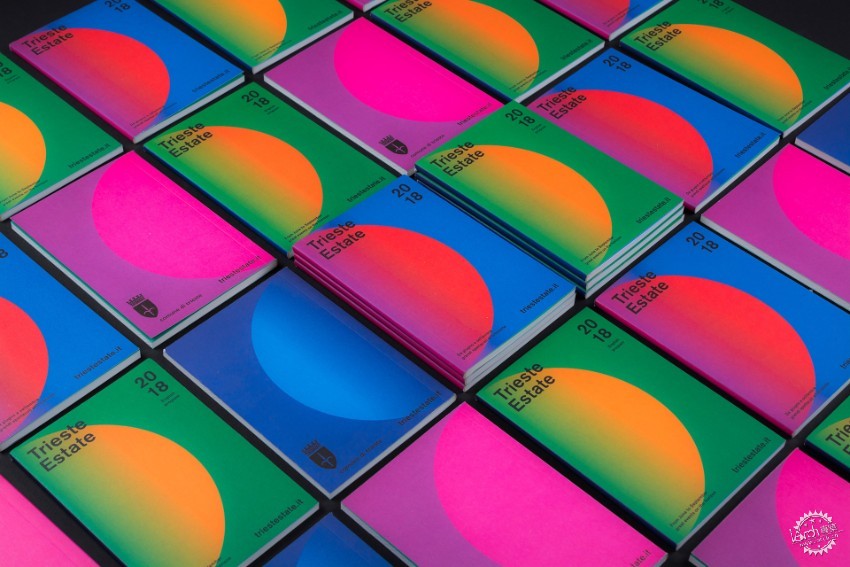
Trieste Estate Summer Festival branding by Studio Mut
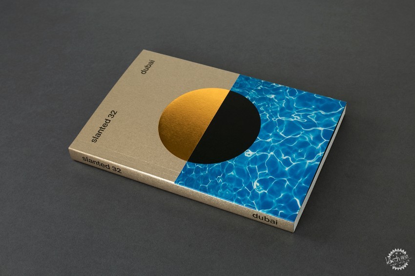
Cover design for slanted32 magazine by Slanted Publishers
1. 圆形
如果您想要在2019年设计出前卫又新潮的海报和传单,以圆形为设计灵感是不错的选择。
这个搭配彩色渐变的简单设计看起来很棒,比如Studio Mut为Trieste Estate夏日派对设计的海报。
将圆形打碎、分割,并设计不同的颜色和纹理。在Slanted Publishers的封面设计中,设计师们用金属黑色和照片图像组合金属箔,创造出七十年代风格的外观。
1. Circles
If you want an edgy, trend-forward look for your poster and flyer designs in 2019, the lesson for next year is to use circles as your starting point.
This simple shape looks fantastic paired with colored gradients, like in these poster designs for Trieste Estate Summer Festival by Studio Mut.
Be playful with splitting your circle designs and bringing in different colors and textures. In this cover design by Slanted Publishers, the designers team metallic foiling with inky black and photographic images to create a Seventies-inspired look.
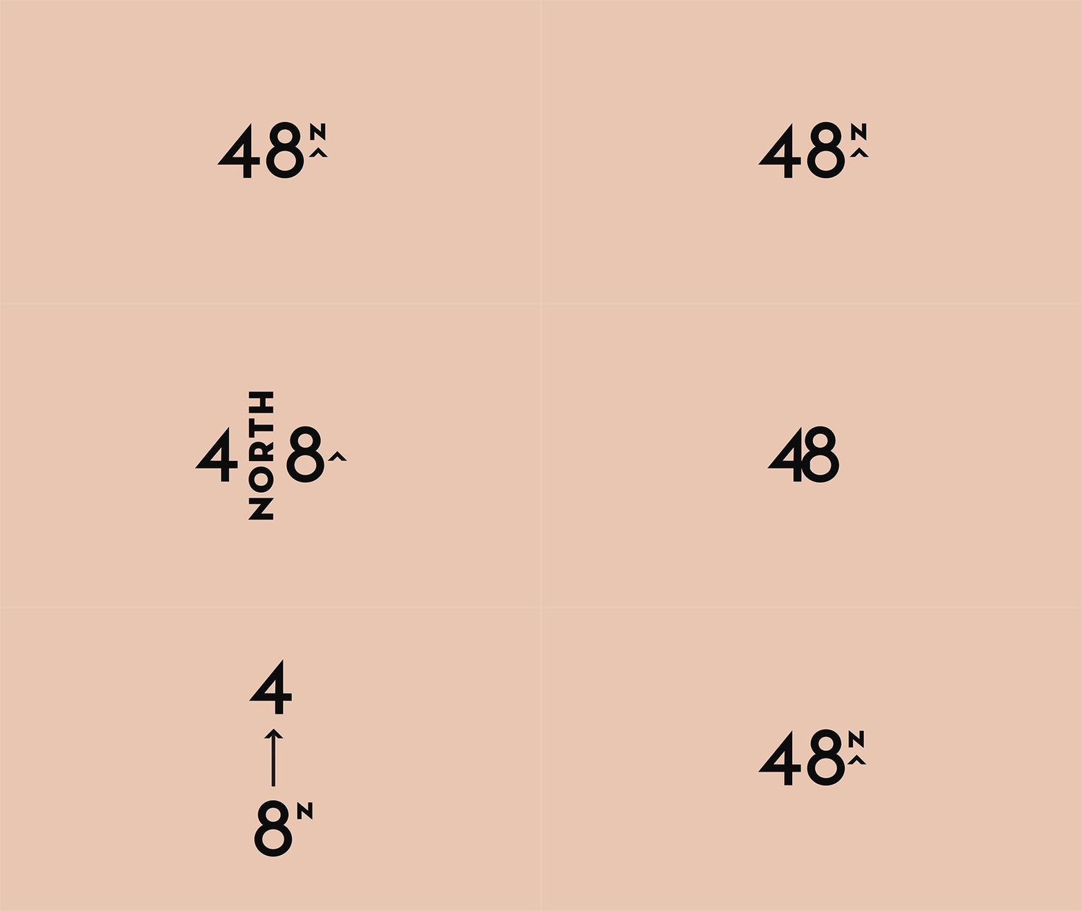
Logo design for 48North by Blok Design
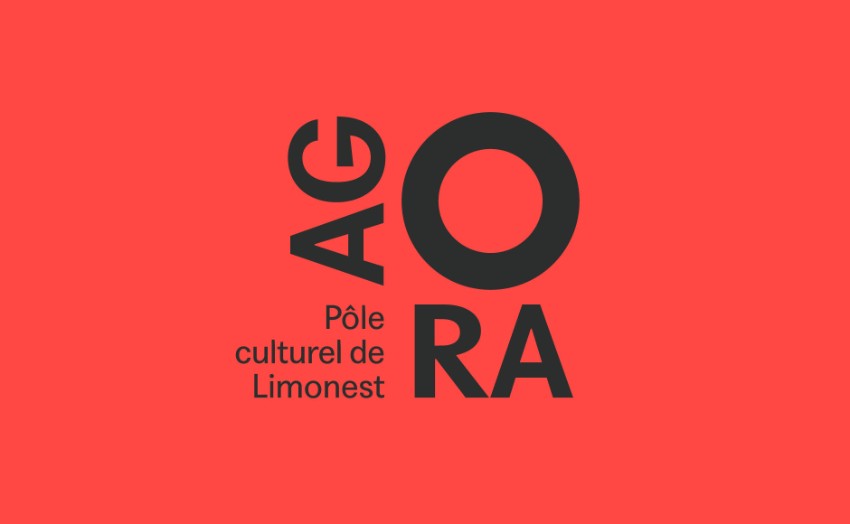
Logo design for Agora by Graphéine
2.自由组合Logo
2019年,各品牌会相继对其Logo设计提出更多要求,主要是为了响应数字平台的需求。设计灵活组合的Logo,其字母可以旋转和切换位置,向品牌展示Logo设计的多样性。
无论是创建动画版本,还是只在APP设计的有限空间内使用,这些灵活类型的Logo将在2019年成为重点,因为它们让品牌看起来更加具有吸引力。
2019年平面设计“灵活型”趋势案例,例如Graphéine设计的 Agora、Blok Design设计的48North Logo。
2. Flexible Type Logos
2019 will see brands continue to demand more from their logo designs, mainly in response to digital platforms. Flexible type-based logos, in which letters can rotate and switch position, give brands more freedom with how a logo can be used.
Whether it’s creating an animated version or adapting to limited space on an app design, these flexible type logos are going to be big news next year because of the exciting options they present for brands.
2019 graphic design ‘flexible type’ trend examples: Look to the visual identities for Agora by Graphéine and 48North by Bloc Design for flexible logo inspiration.
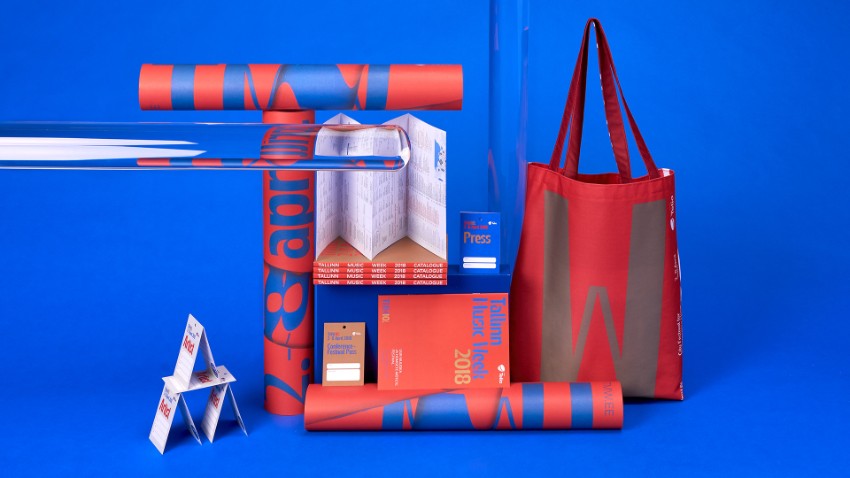
Visual identity for Tallinn Music Week by AKU
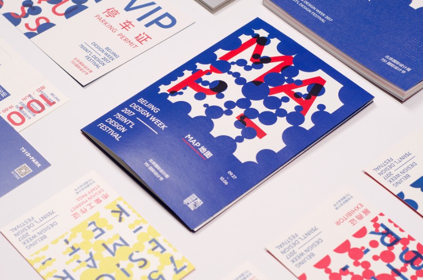
Brand design for the 751 International Design Festival by Zhu Chao
3. 50 度蓝
如果有一种颜色会在2019年主导图形设计,它将是蓝色。任何一种蓝色,无论从浅至深都恰到好处,它们有着强烈又丰富的色调,比如钴蓝和靛蓝,因此将成为最具潮流的设计色彩。
AKU的塔林音乐周周边设计,以及Zhu Chao在751国际设计节的海报设计都将蓝色与霓虹灯、金属色或与珊瑚红搭配,形成美丽的对比。
3. 50 Shades of Blue
If there’s one colour that’s going to dominate graphic design in 2019 it’s blue.While any shade of blue, from pale sky to deep teal will hit the spot, it’s the very strong, rich shades of blue like cobalt and indigo which are going to look the most trend-forward.
Team with neons or metallics for beautiful contrast, or pair up with coral reds like in these brand designs for Tallinn Music Week by AKU, and poster designs for the 751 International Design Festival by Zhu Chao.
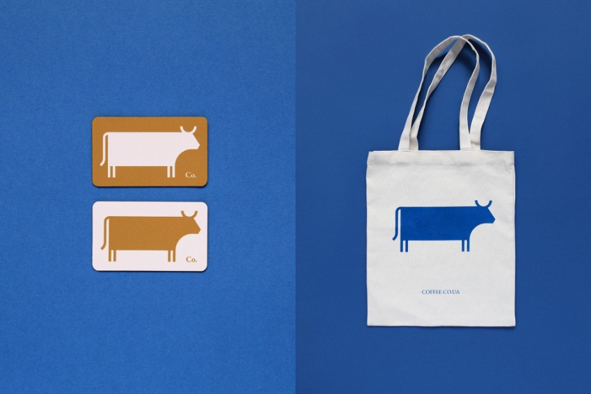
Logo design for Co. Means Coffee by Canape Agency
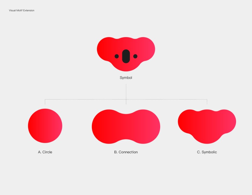
Logo design for NetEase Kaola by Plus X
4. 象形Logo
象形Logo对于大家来说并不陌生,但在2019年,人们会看到更多品牌采用象形图风格Logo,这些Logo会更具象征性地表达概念或主题。它们意图与文字隔离开,所以在视觉上的表达必须非常突出明显。
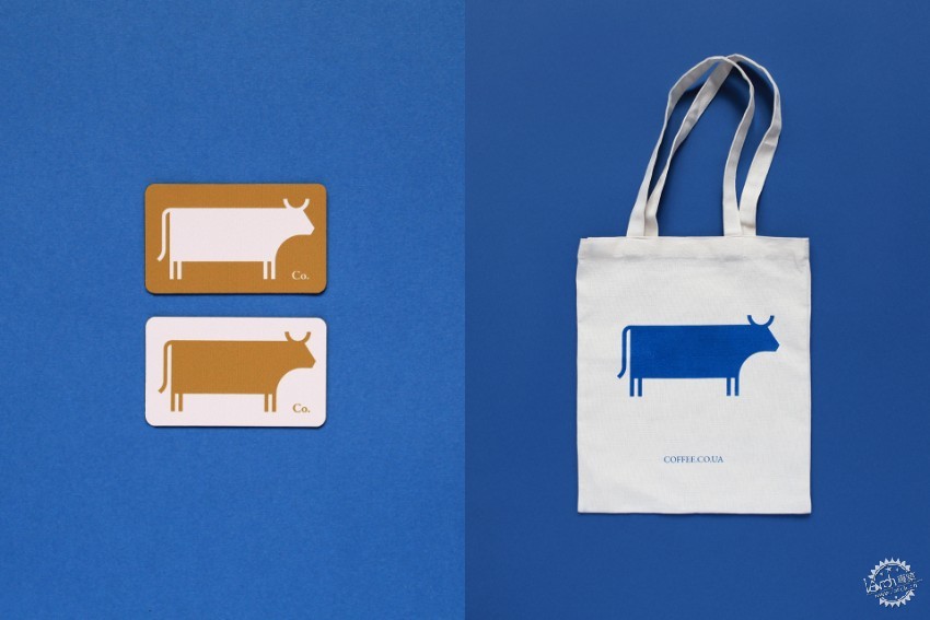
用柔化的简单轮廓来创造诙谐的动物设计,例如Canape Agency的Co Means Coffee和David X的NetEase Kaola的Logo设计。
4. Pictogram Logos
Icon-based logos are nothing new, but in 2019 we’ll start to see more brands adopting pictogram-style logos which express a concept or theme more symbolically. These logos are designed to work in isolation from text, which means they have to be very strong visually.
Simple silhouettes are softened to create witty animal-based designs, like in these logo designs for Co. Means Coffee by Canape Agency and for NetEase Kaola by Plus X.
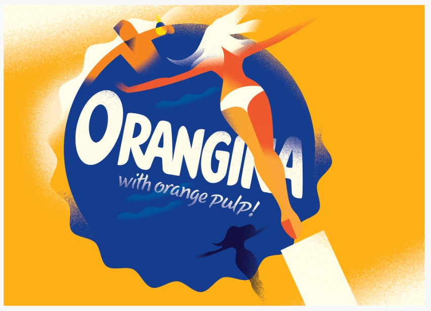
Illustration for Orangina by Mads Berg
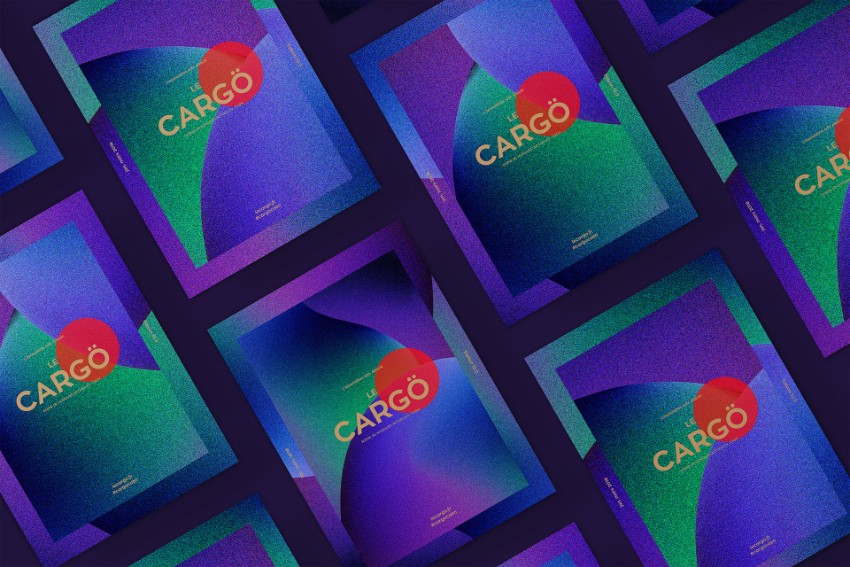
Season identity Le Cargö by Murmure
5. 上世纪30年代的插画风
如果你喜欢复古风格,那么你一定会喜欢20世纪30年代的插画风格。受苏联时代和晚期装饰艺术海报艺术的启发,设计师们开始重新审视那个时代插画的颗粒状渐变和强烈抽象的形状。
为插画打造粗糙的质感,用更为浓烈、现代化的色彩来保持设计的新潮。
这些是Mads Berg为Orangina创作的戏剧插图和Murmure乐卡戈音乐厅的季节表演,展示了渐变和噪音纹理的结合方式,创造出复古风格的精美图形。
5. 1930s-Inspired Illustration
If you’re a fan of vintage design, you’ll love this 1930s-inspired trend for illustration. Inspired by Soviet-era and late Art Deco poster art, designers are starting to revisit the grainy gradients and strong, abstract shapes of this era of design.
Add extra noise to your illustrations to nail the look, and bring in richer, more modern color palettes to keep the designs feeling fresh.
These advertising illustrations by Mads Berg for Orangina and season identity for Le Cargö concert hall by Murmure show how gradients and noise textures combine to create beautiful graphics with a vintage edge.
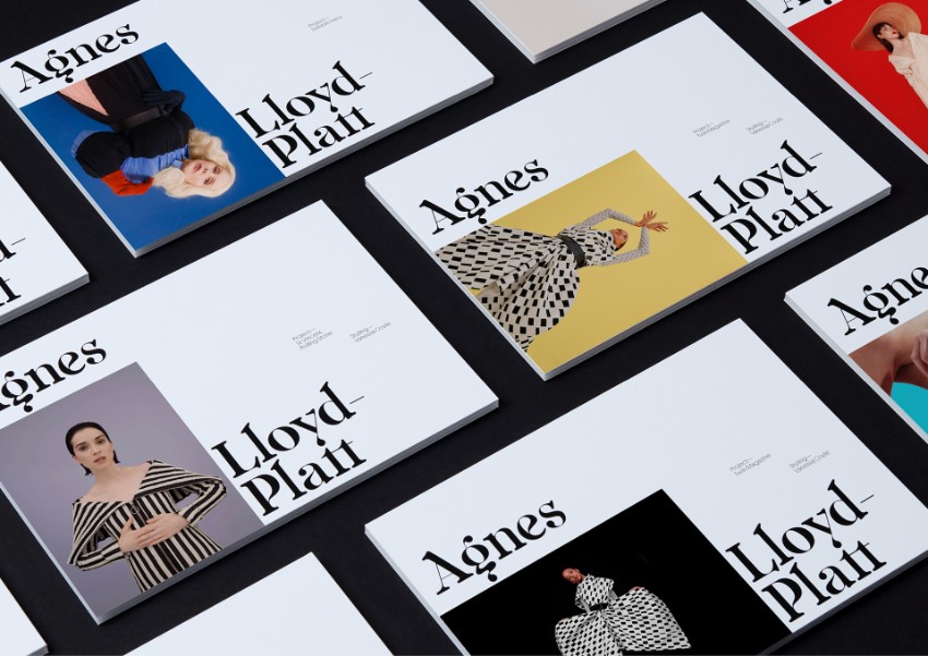
Visual identity for Agnes Lloyd-Platt by Seachange Studio
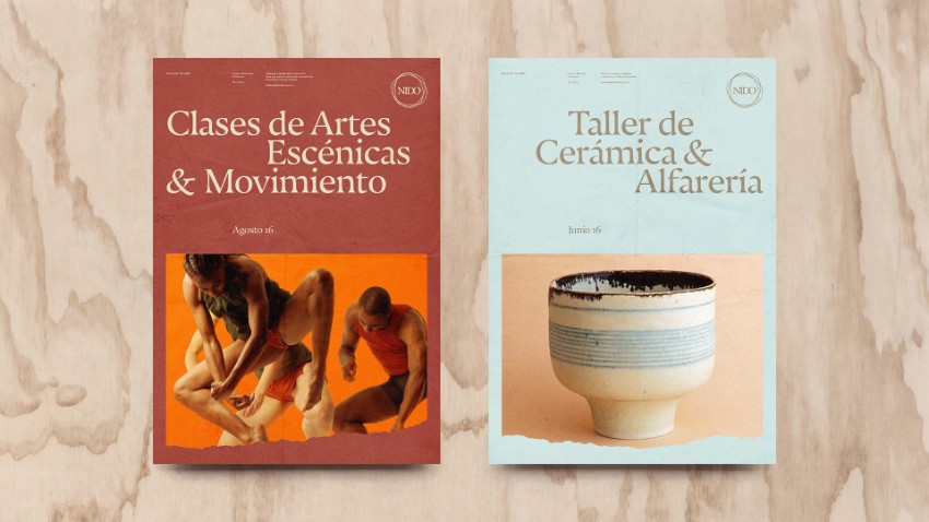
Magazine design for Nido by Asís
6. 弯曲的衬线字体
衬线回归了。经过数十年的无衬线主导,衬线开始重新成为人们关注的焦点。斑点衬线字体的新化身比传统的Didot和Garamond更加曲折和生动。
了解新艺术风格来反应2019年的潮流。其中的编辑设计十分精美。由Seachange Studio为伦敦摄影师Agnes Lloyd-Platt设计的封面和NidobyAsís的杂志设计展示了全新的曲线衬线与华丽摄影和简约色彩的相互融合。
6. Curvy Serif Typefaces
Serifs are back, big time. After decades of sans serif dominance, serifs are starting to take back the limelight. The new incarnation of spot-on serif typefaces are curvier and more organic than traditional Didot and Garamond.
Look to Art Nouveau-inspired styles to tap into this 2019 trend. They work particularly beautifully for editorial design. This brand design for London-based photographer Agnes Lloyd-Platt by Seachange Studio and magazine design for Nido by Asís show how the new curvy serifs go hand-in-hand with gorgeous photography and pared-back color palettes.
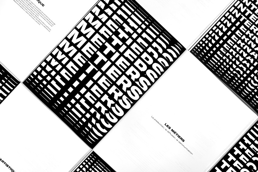
Poster designs for Trempolino by Murmure
7. 实验字体
2019年的平面设计会继续用排版来突破界限。人们要吸取的教训就是任何事情都可能会发生。说不定大众审美也会发生巨变。
这就好像 Murmure为音乐园Trempolino设计的海报那样,设计师结合了扭曲、拉伸,以及重叠字体,来呼应潮流。
7. Experimental Type
In line with the leaning towards all things maximalist, 2019 will be the year that designers continue to push the boundaries with typography. The lesson to take away is that anything goes. Good taste and/or legibility be damned.
Warp, stretch, distort and overlay your type, like in these poster designs for Nantes-based music campus Trempolino by Murmure, to tap into the trend.
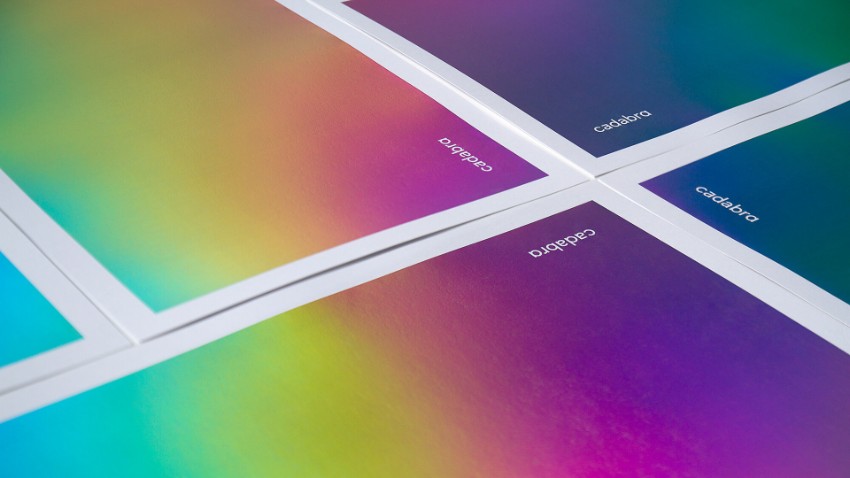
Visual identity for Cadabra by byHAUS Studio
8. 彩虹渐变
渐变已成为今年的巨大趋势,设计师发现多色背景和类型看起来既有趣又积极。在2019年,设计师受到彩虹的启发,这一系列彩虹色的趋势呈现出复古的意味。
当彩虹渐变结合金属印花纹理,会产生加分的效果,就像由HAUS Studio为Cadabra的设计一样。
8. Rainbow Gradients
Gradients have been a huge trend this year, and designers are still finding that multi-colored backgrounds and type looks fun and optimistic. in 2019 the trend takes on a retro spirit with a spectrum of rainbow colors. Be inspired by the rainbow iridescence of petrol to really nail this style.
For extra brownie points incorporate metallic print textures, like in this visual identity for Cadabra by byHAUS Studio.
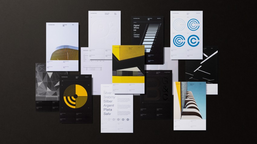
Gmund Bauhaus Swatchbook by Tolleson Design
Adobe Hidden Treasures: Bauhaus Dessau Project
Visual identity for the BunkerToren building by George&Harrison
9.包豪斯风格
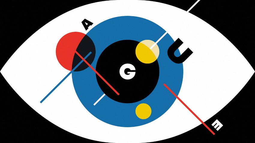
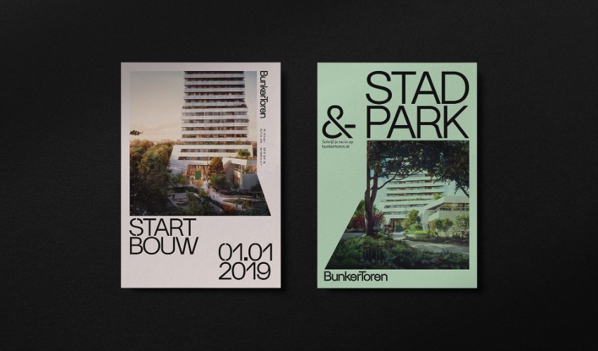
德国将在2019庆祝包豪斯学校成立100周年。显然柏林将会举办包豪斯百年活动,而平面设计师也必然会在包豪斯运动中找到设计灵感。
在包豪斯风格中,会结合有原色调色板、野兽派风格造型和现代主义形态。
9. Bauhaus Revisited
Germany is celebrating the 100-year anniversary of the founding of the world-famous Bauhaus school in 2019. While Berlin will be hosting a centenary event next year, graphic designers will also find fresh inspiration in the Bauhaus movement for their designs.
Look to primary color palettes, Brutalist-inspired styling and modernist fonts to give your layouts a Bauhaus-worthy look.
Business card designs for ArchitectsEAT by Hue Studio
Poster designs for Théatre de Quat’Sous by Maxime David
10. 删掉边界
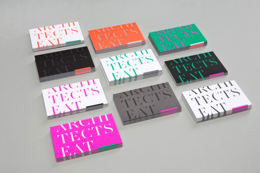
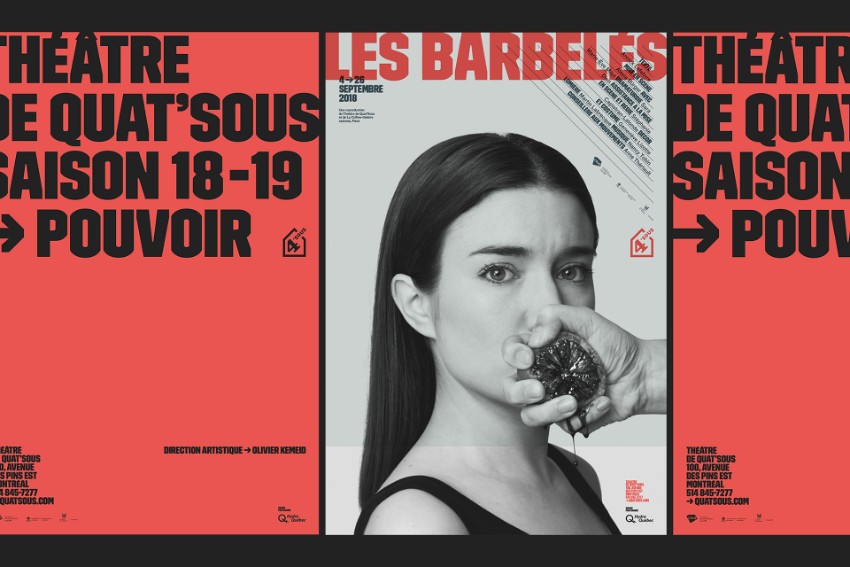
抛弃你遵守的边界规则。2019年,实验字体将与有趣的无边界设计结合产生和谐的效果。
设计师可以将字体与修剪边缘重叠,例如Hue Studio为ArchitectsEAT做的名片设计。或者将文字推到海报布局的边缘,就像Maxime David为ThéatredeQuat'Sous设计的那样。
10. Margins Be Gone
Throw the grid rules you know out the window. Next year, experimental type (see Trend 7, above) goes hand-in-hand with a playful dismissal of margins.
Allow your type to overlap the trim edge, like in these business card designs for ArchitectsEAT by Hue Studio. Or push your text to the very fringes of your poster layouts, like in these designs for Théatre de Quat’Sous by Maxime David.
|
|
