虚拟空间下的专题研究住宅
A Virtual Look Inside Case Study House By Kemper Nomland & Kemper Nomland Jr
由专筑网陈寰,李韧编译
该项目完成于1947年,它拥有经济、简约、新材料和新技术以及室内外一体化的特点,这些要素让它经久不衰。许多住宅项目都是服务于单个家庭,而这次的案例对象则服务于二人之家,所以布局也有相对应的调整。
在这个设计里,设计者提出了一个不同寻常的概念,让生活方式发生了有趣的变化。让卧室有更大的空间,这样可以结合客厅和工作区域,还有随时可以改造为儿童空间的客房和工作室。在这之前许多的设计都致力于在生活和睡眠空间之间建立一个清晰的界限,希望能在和吵闹的环境、凌乱的孩子们之间创造一个缓冲空间。但是这种设计方式让你能够更好地享受生活。
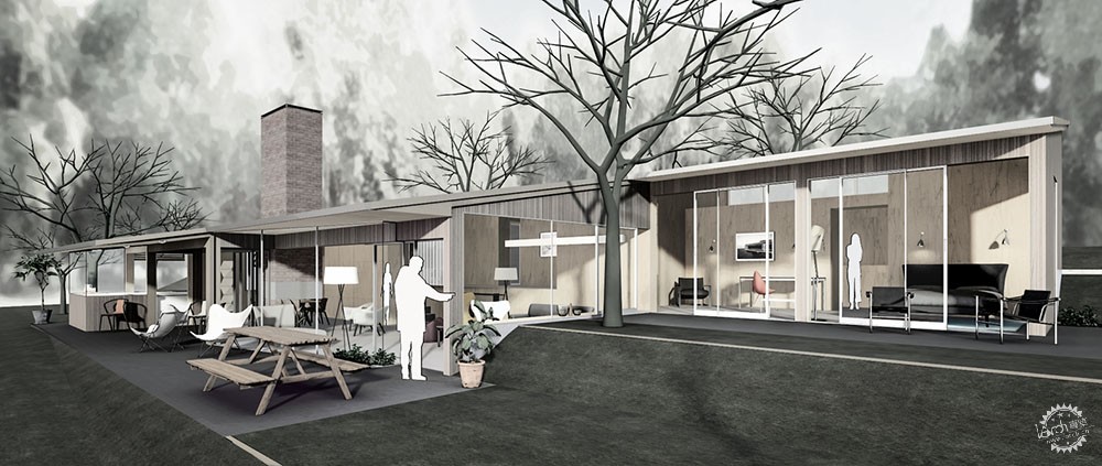
这座经典的房屋位于山脚下,周围桉树环绕(低于街道高度),这座建筑的设计风格与这一景观完美融合。房子共三层沿着山坡分布,屋顶(人口处)与倾斜的山坡平行。建筑的沿街面由胶合板建造而成,并且点缀有一些开窗,还有一面与街道几乎呈直角的卵石玻璃墙和前门旁边的玻璃板。由于窗户少和高大的桉树环绕,房子具有极强的隐私性。
The tenth Case Study House wasn’t actually intended for the Arts & Architecture programme. It was added on its completion in 1947, to fill out the roster, as many houses remained unbuilt. Clearly, the Nomland design earned its place on the list, having many features in common with other Case Study homes and, most importantly, meeting the stated aims of economy, simplicity, new materials and techniques, and indoor/outdoor integration. The different departure point, however, can be seen in the layout. Whereas Case Study homes were designed primarily for families, this plan is for “a family of adults”—which is to say, a childless couple.
This concept—unusual in the context—makes for an intriguingly different living arrangement, with the luxury of more space allowing for a sitting and working area to be included in the main bedroom as well as a separate study. There’s also a guest room and studio, each of which could conceivably be put to children’s use, but all in all it’s a refreshingly grown-up home. Where many Case Study houses worked to create a clear division between living and sleeping space—effectively creating a buffer around the potentially noisy, messy kids’ zone—here, whichever direction you head from the central entrance, it’s all living space.
The house was sited on a sloping corner plot filled with eucalyptus trees, and (again, as is typical for Case Study homes) the design works in harmony with this landscape. The floorplan was spread over three levels going down the mountainside, with a shed roof parallel to the slope. At street level, the house presents an almost solid plywood front, broken only by a few clerestory windows, a wall of pebble glass at right angles to the street, and glass panels flanking the front door. Between the relative lack of windows and the tall eucalyptuses in front of the house, the impression is strongly private.

Courtesy of Archilogic
走进去能感受到明显的不同,由于空间没有完全封闭,因此阳光能够直接进入室内,阳光从滑动玻璃照射进来,让每个房间和被大面积悬崖遮挡住的露台都有充足的光线,高大的榕树也沐浴在阳光之下。自然的饰面有助于建筑和自然的连接,水泥板也从每个房间的屋顶延伸到露台、门厅和室内外种植区域。一个长条形波纹玻璃墙间隔开客厅与私密空间,且不会阻碍光线的流动。
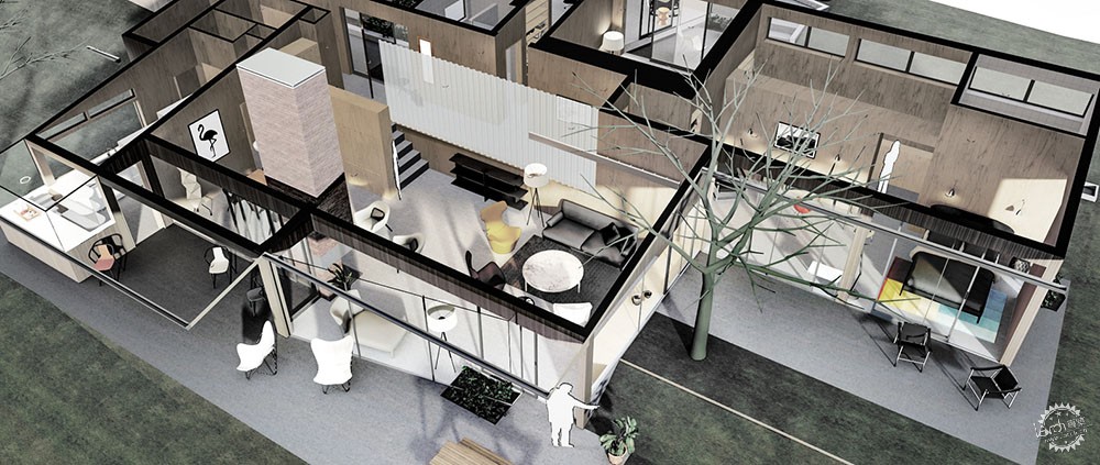
无论是从前门还是从车库进入房屋,在入口的左边,客房和浴室之间有几个台阶通往工作室。这些和车库组成了整个房屋的第一层,并在沿街立面上突出出来。在车库和入口对面的房间有着三面落地窗,下面几层的房间由于三面光线的照射而十分明亮但却仍够私密;沿街面的高窗、面向小露台的滑动玻璃门让使用者的视线不受地形变化的影响。
Walk in, however, and the feeling changes. This is no enclosed box, but a light-filled home at ease with its surroundings. Every room enjoys ample light from full-length sliding glass, and direct access to outdoor terraces shaded by generous overhangs, not to mention those tall trees. Natural finishes (birch, mahogany, and white-painted Douglas fir ceilings) contribute further to the outdoor connection, as do the solid cement floor slabs extending from each room to its terrace, and the shared indoor/outdoor planting area in the entrance hall. A long corrugated glass wall separates the living room from the more private areas without impeding the flow of light.
To the left of the entrance—whether coming in from the front door or the garage side entry—a few steps lead up between the guest room and bathroom to the studio, which along with the garage forms the entire first level of the house, jutting out from the facade. This light, bright and yet private room enjoys light from three sides, with more floor-to-ceiling pebbled glass facing toward the entrance and garage; high windows onto the street; and sliding glass doors that open onto a small terrace, protected from view by the natural drop in ground level as well as the acute angle of that glass wall.

Courtesy of Archilogic
客房在二层,滑动玻璃门变成了巨大的窗户,沙发和床放在适当的位置,这让房间在使用时有更多的灵活性。主卧和客房都没有浴室,也没有专门给孩子设计的房间。
在客房的左边设计了一个充满阳光的豪华空间,供人享受昼夜。靠街道的一边是浴室和更衣室,并且前面有一个包括书架、书桌和沙发的特色空间。这就是整个二层。当使用者位于起居室时也能够看到这个坐卧皆宜的空间,但二者并不相通,就像客房的屋顶是工作室的露台一样。
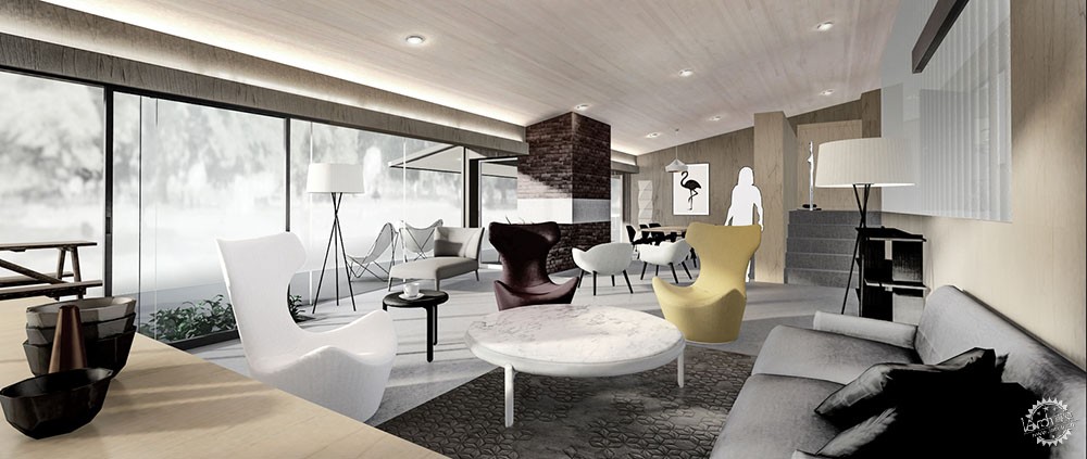
接下来是建筑中最精彩的部分,休息区和用餐区都在一个宽敞的空间中,仅由砖砌的壁炉相隔开。并且与主阳台和花园都有着通透的视线连接。滑动门在壁炉后方,让餐厅的空间可以向外延伸,也可以从厨房进入露台。
The guest room sits just below this terrace, on the middle level. This turns the sliding doors into outsized windows, and allows couch beds to fit beneath them, creating further flexibility in the use of this room. The guest bathroom opposite has no bath—nor does the master bathroom—another tell that this house was not built for children.To the left of the guest room is that luxuriously long, sun-filled space designed for the house owners to enjoy both day and night. The street side is occupied by bathroom and dressing room, in front of which is a private sitting area, including recessed bookshelves and space for a desk and sofa. The front of this “bed and sitting room” opens onto a terrace visible from the living room—but not shared by it, because, just as the guest room was a step down from the studio terrace, that is on a lower level.This lowest room is, without doubt, the showstopper. A wide open space includes both lounge and dining areas, divided only by the brick fireplace, and with an uninterrupted view onto the main terrace and garden. Sliding the doors open behind the fireplace enables the dining room to be extended out for entertaining, and also allows direct access from the adjacent kitchen to the terrace.

Courtesy of Archilogic
因为没有孩子,所以厨房面积很小,但是设计师设计了一个由三面玻璃围合而成的早餐吧台,像一个有趣的泡泡,可以在里面做饮食计划、打电话或者吃零食。
在它建成后的几十年里,这所房子已经发生了很多变化,增加了房间(有一些后来又拆掉了),更新了卧室和厨房的用品,立面也进行了装修,甚至还增加了一个游泳池。去年出售的时候,房屋又经历了另一次重大改造,此次的改造则恢复了众多原有设计。你喜欢这样的空间吗?
The kitchen is small (though with carefully thought out storage), again reflecting the needs of a household without children. But it does include a breakfast bar enclosed in glass on three sides, creating a charming bubble “for meal planning, phoning or snacks,” according to the architects.
In the decades since it was built, this house has seen many changes, with rooms added (and some taken away again), bathroom and kitchen fittings and surface finishes updated, not to mention the addition of a swimming pool and pool house. It was most recently listed for sale just last year, after another major renovation, intended to restore much of the original design. What would you prefer—the original, fully adult concept, or the extra family space?
|
|
