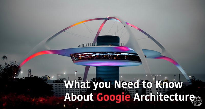
你需要了解的Googie建筑风格
What you Need to Know About Googie Architecture
由专筑网李佳琪,李韧编译
如果你了解20世纪50年代的美国,那么你很可能会在一家类似太空的咖啡店里吃早餐,这些咖啡店通常会提供美味可口的事物,而你也很可能注意到宇宙飞船式的屋顶、未来派元素的建筑,以及带有Googie建筑风格的天线标志。然而,你是否思考过这种建筑风格的演变过程?
Googie其实是一种独特的建筑风格,多年来一直为人们所关注。看着Googie风格的建筑,你可能会对20世纪50年代的美国咖啡店和餐馆萌生怀旧感,或者,你会认为它过于夸张或俗气。
无论你讨厌或是欣赏,以下关于Googie建筑风格的内容,也许你应该了解。
1. 未来的象征
作为南加州标志性风格的“Googie”象征着未来,并且将未来带入现实世界。这种理论出现在战后。随着时间的推移,它逐渐反映了20世纪50年代和60年代人群对未来的看法和含义。
回顾历史,“Googie”风格常常被列入后现代以及异想天开的建筑之列,而不是为大多数建筑师所用的主流建筑风格。
20世纪50年代,登月之旅逐步热门,这让人们着迷于未来和空间,而建筑师们也开始跟随这股热潮。该风格的设计方式以悬臂板为特征,看上去几乎脱离重力。除此之外,建筑师们还向公众展示了Jetsons式拱门和倾斜的屋顶,而这些也是未来主义的元素,同样也可以让人联想到太空。然而,在1969年尼尔•阿姆斯特朗(Neil Armstrong)登上月球后,这股热潮逐渐褪去。
If you are an average American in the 1950s, you would probably be having your breakfast in one of those space-like coffee shops which usually serve tasty comfort food. You have most likely noticed the spaceship-like roofs, the futuristic elements, and the antenna signs that characterize Googie architecture. However, have you ever given thought to how this architectural style evolved?
Googie is a distinctive architectural style that was a center of attention for many years. Looking at Googie architecture, you may get a sense of nostalgia for the 1950s American coffee shops and restaurants. On the other hand, you may find it too exaggerated or tacky.
Whether you hate it or appreciate it, here is what you need to know about Googie architecture.
1. It Represented the Future
Known as South California’s signature style, “Googie” symbolized the future, bringing it to the present. This theory emerged post-war. As time went by, it came to reflect the 1950s and 60s’ perception of the future and what it meant.
Historically speaking, “Googie” is not considered an official architectural style by most architects. It is usually classified as post-modern architecture and whimsical architecture.
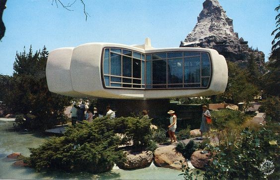
In the 1950s, traveling to the moon was a new event which made quite a buzz. It got people obsessed with the future and space, and architects went with the flow. Their designs featured cantilevering slabs which almost defied gravity. They also displayed the Jetsons aesthetic arches and angled roofs, which are also futuristic elements reminiscent of space. However, after Neil Armstrong landed on the moon in 1969, that infatuation slowly decreased.
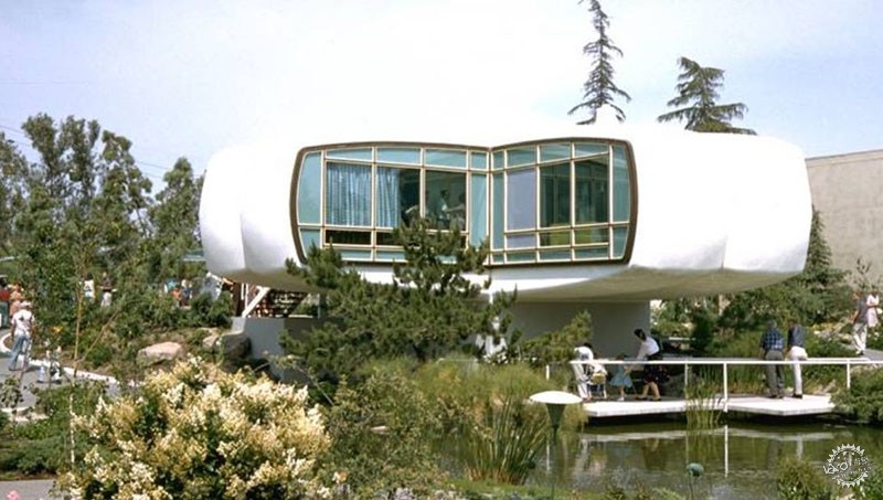
Photo via Twitter - Eduardo Noriega
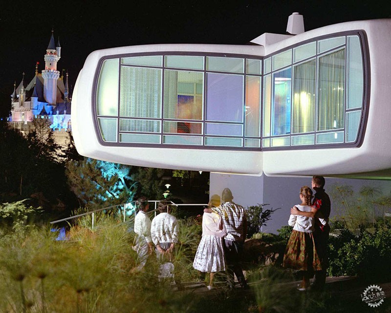
Photo via Pintrest - Theresia Katona
Photography : Flickr user William Bird
2. 每个人都可以拥有“Googie”风格
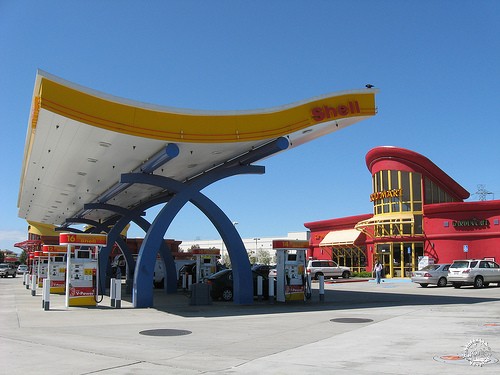
Googie风格建筑并不是富人项目的代名词,而同样可以用于咖啡店、加油站和洗车店,这些是那个时期人们在生活中的常用建筑。虽然如今看来已经过时,但Googie风格已经把现代精神带入到了人们的日常生活中。
2. Everybody can “Googie”
Googie architecture was not about making custom houses for wealthy people. Instead, it was for coffee shops, gas stations and car washes; the average buildings of that people of that period used in their daily life. Although it seems vintage now, it has brought that spirit of the modern age to their daily lives.
Photography: Flickr user Charles Hathaway
3. 备受争议的建筑风格
Googie建筑风格受到了很多争议,既有赞同者,也有反对者。许多设计师认为这种异想天开的古怪风格过于夸张,评论家们也对此争论不休。
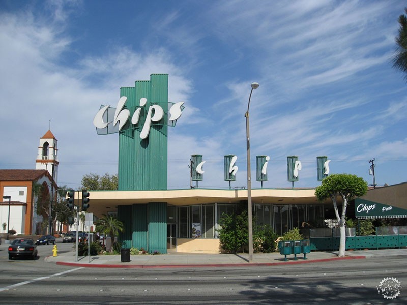
3. It is very debatable
Googie is controversial and has many enemies. Many designers perceived this whimsical quirky style as “fake” and exaggerated, and critics debated it.
Photographs: Don Barrett
4. 商业的产物
建筑师有意设计Googie风格的咖啡店,让顾客尽可能快地进入、就餐,然后离开。他们以这种风格为营销策略,事实上,这就是其成功的原因。
设计师们用这些高耸的标志作为地标,以空间外表作为视觉焦点,让人们进入建筑之后再享受复古的家具和内部空间。然而,这种设计方式会刻意地加速使用者的离去,这使得更多的人能够在很短的时间内参观这座建筑,从而增加销量。因此,即使是上世纪五六十年代的麦当劳也采用了Googie风格。这种风格所带来的巨大营销效益,在当时不可否认。
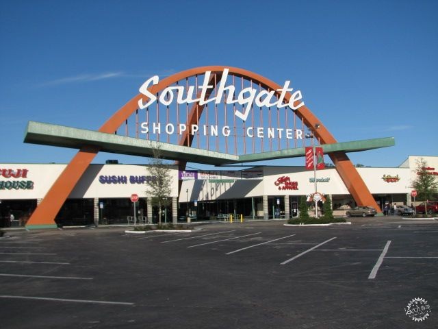
4. It’s a Business after all
Architects intentionally design Googie style coffee shops for customers to come, eat, and leave as quickly as they can. Designers extensively used that style as a marketing campaign. In fact, this is what made it successful.
Designers used the tall signs as landmarks that act as visual attractions with their spacey exterior, allowing people to then enjoy the retro-looking furniture and interior. However, the design intentionally does not allow them to get too comfy, prompting them to leave. This allows more people to visit the building in a short amount of time. Therefore, it increases sales.
Accordingly, even the McDonalds of the 1950s and 60s famously adopted Googie style. The tremendous marketing effect of the style, back in the time, is undeniable.
Photography : Flickr user Andy Callahan
5. 世界上第一座麦当劳餐厅是Googie风格建筑
1953年在Downey开设的麦当劳是古老的大型连锁餐厅。它的设计师将著名的金拱门融入建筑结构本身,使得外观非常引人注目,人们在街道上就能一眼看到它,这便是典型的Googie风格建筑!
这座Googie风格标志建于1953年,由两个30英尺长(约9.2米)的抛物线拱组成。每个结构都由金属片制成,闪光的粉红色霓虹灯勾勒出屋顶,营造未来的氛围,并向其致敬。
麦当劳兄弟非常喜欢他们的食品准备技术,所以向公众公开了做法。他们委托Fontana的商业建筑师 Stanley Clark Meston在Downey设计了这座新建筑,以便让特许经营商模仿。而这位建筑师擅长设计汽车陈列室,甚至曾与Googie建筑风格之父、即建筑师Wayne McAllister共事。
他采用了一种独特的方法,其根本是向公众公开烹饪过程,其中包括厨房周围的透明玻璃。这让人们可以直接看到其内部空间,而在外面的人也可以观察食物准备的过程。
1959年,设计师用一个定制的模型取代了原来的粉红霓虹灯标志,它的特点是将最初的吉祥物Speedee置于60英尺高的金拱上。
5. The world’s first McDonalds was Googie
The 1953 McDonald’s in Downey is the oldest restaurant in the massive chain. Its designers, then, incorporated the famous golden (M) shaped arches into the building’s structure itself, intentionally making the exterior very eye-catching, and it could easily be seen from the road. Typical Googie!
Established in 1953, this Googie icon housed two parabolic arches, each thirty feet in length (about 9.2 meters). Each of these catchy structures is made of sheet metal pieces. Flashy pink neon outlines the roof and compliments the futuristic vibes.
Since the McDonald’s brothers were so fond of their food preparation techniques, they exposed them to the public. They commissioned Stanley Clark Meston, a commercial architect from Fontana to design the new building in Downey so that it could be replicated by the franchises. The architect specialized in auto showrooms and used to work for architect Wayne McAllister—father of Googie architecture.
He employed a unique approach which is based on exposing some of the cooking processes to the public. The design included transparent glass around the kitchen. This consequently permits a view from all sides so outsiders can observe the food preparation in process.
In 1959, they replaced the original pink neon sign with a custom model. It features the original mascot Speedee running atop a 60-foot golden arch.
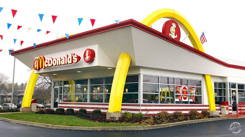
Photo via gettyimages.com
6. 代表南加利福尼亚文化
南加州的建筑丰富多样,而Googie 风格则是一个全新的面貌,同时也深受当时汽车革新的影响。当然,Googie在很大程度上代表了加利福尼亚南部的文化。这几乎成为了该地区的标志性风格。
若提及著名的 Googie 风格建筑地标,其中必有 LAX的飞碟式主题建筑。
建筑部分如飞船,部分如飞碟,有着独特的圆形结构,一些人会错把它认为是LAX 控制塔。毫无疑问,这座主题建筑现在是洛杉矶最具标志性的建筑之一。对于洛杉矶的居民来说,它代表了童年的记忆。这是因为它第一次播出了带有虚构人物的未来派动画片——“杰特森一家”(The Jetsons)。
多年来,就像好莱坞的标志一样,这座主题建筑也成为了洛杉矶的标志。
这座LAX主题建筑突出了整个地区的特色,吸引了很多游客。
就建筑而言,它既代表了战后机场的大规模扩张,又带有缩小版本的原始视觉感受,原来的LAX 带有巨大的玻璃圆顶,这是候机楼和停车场的中心枢纽。
建筑公司Pereira和Luckman共同进行了方案设计和修订设计,他们也因总体规划以及公共和私人建筑而闻名。
6. It represents South Californian Culture
While Southern California is rich in architectural variation, Googie gives it a new dimension. It is deeply affected by the innovations of cars at that time as well. Certainly, Googie largely represents the cultural identity of Southern California. No one can deny that it is the signature style of the region.
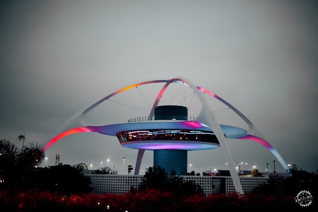
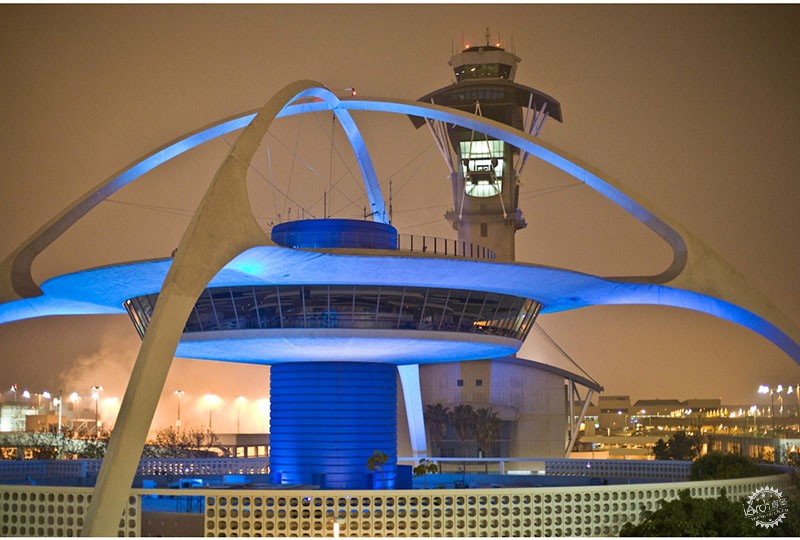
One of the prominent Googie landmarks must be LAX’s flying-saucer-like Theme Building.
Part spaceship, part flying saucer, the unusual-looking circular structure, some mistake it as the LAX control tower. No doubt this Theme Building is now one of L.A.’s most iconic buildings. For L.A inhabitants it represents childhood memories. This is because it aired the futuristic animated show with fictional characters; “The Jetsons” for the first time.
Over the years, the Theme Building became as much an iconic symbol of Los Angeles as the Hollywood sign.
The LAX Theme Building lifts up the whole character of the area and attracts a lot of tourists.
In terms of architecture, it represents part of a major postwar expansion of the airport and represents the scaled-down version of an original vision. The original LAX is an enormous glass dome which served as the central hub for the terminal buildings and parking structures.
The architectural firm Pereira and Luckman designed both the original and revised designs. Accordingly, they have become well known for designing its master plans as well as institutional buildings both public and private.
Photography : Flickr user thomashawk ( CC BY-NC 2.0 )
这座主题建筑建造于1961年,形似UFO,餐厅悬挂在两座巨大的灰泥覆盖交叉钢拱的中心。一堵由装饰混凝土砌块组成的屏风墙环绕着这座建筑,为其增添了中世纪时期的气息。
这座形似蜘蛛的主题建筑有意被设计为未来主义风格。它摆脱了过去的束缚,标志着洛杉矶明日之城的发展趋势。
当然,这种异想天开、以及太空时代的现代感似乎是在向南加州有趣的生活方式和文化致敬。
Built in 1961, the Theme Building features a UFO-like restaurant suspended from the center of two massive crossed arches of stucco-covered steel. A screen wall of decorative concrete block surrounds the building, adding another Mid-Century Modern touch.
Intentionally, the spider-like Theme Building is playful and futuristic. It sheds away constrictions of the past signaling Los Angeles’ mid-century drive to be the city of tomorrow.
Surely, this style’s whimsical, space-age modern look strongly compliments Southern California’s fun-loving lifestyle and culture
Photography: monkeytime | brachiator – via Wikimedia commons ( CC BY-SA 2.0 )
|
|
