查看相册 View Gallery
Choosing a View: Philly Bridge
由专筑网李韧,吴静雅编译
费城大桥项目的图像一开始并没有人行桥体南侧的视角。在这里,桥体有着如公园般的环境,这里种植有许多树木与植物,还有连接着街道的大型台阶。这是重要的角度,因为桥体在这里和会议中心连接在一起,并且促进了一系列室外活动的举办。因此我会通过透视图来表达这个场景。但是由于板面原因,视角的选择不容易确定。那么下文便是我选择视角的具体原因。
One of the images not initially generated for the Philly Bridge Project was the south side of the pedestrian bridge. Here, the bridge turns into a park-like setting with lots of trees, vegetation, and a grand stair connecting down to the street level. This was an important view because of the bridges connection to the convention center and the activities that are formed around this relationship. I therefore started looking at potential views that would tell the story of this place. I struggled deciding on a single view because of all of the information this illustration needed to convey. Below are some of the options that I looked and my thinking behind them.
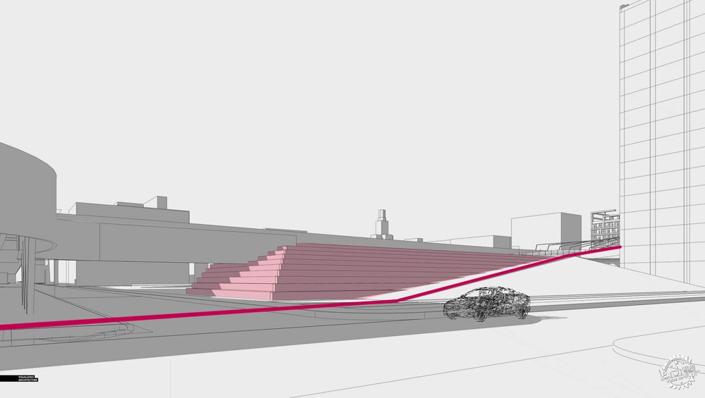
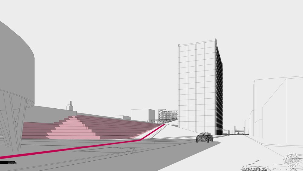
视角选择01与02:朝向北侧与西侧的街道
第一组视角是位于街道平面,面向大台阶。这个角度的问题在于,上部的大台阶无法看到。我更喜欢在街道平面上能看到更远一些的空间,但是这两个视角无法满足这个要求,构图上很不错,但是没办法很好地讲述这个空间的背景。
View Option 01 and 02: Street Level Looking North and West
The first set of views that I looked at were at street level looking up the tiered seating. The problem with these angles was that too much of the upper level was out of view. The view looking more down the street was more interesting to me, but both images felt too disconnected from the “action” happening at the upper level. Compositionally I liked them. They just were not succeeding in telling the story of this area.
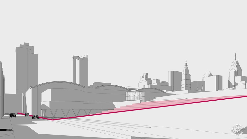
视角选择03:南向的街道
人行天桥的重要概念是,大部分的人行流线会不断地经过道路的上下部分,并且环绕着会议中心,在图中表示为暗红色区域。这个视角能够很好地表达这个关系,同时我比较喜欢将大面积的绿地区域放在前景中的想法。但是,与其他街道视角类似的是,我始终觉得这样与上部露台的联系太弱。
View Option 03: Street Level Looking South
A key idea of this zone of the pedestrian bridge is how a large proportion of the foot traffic will flow up and down the ramp and wrap around the convention center as marked by the dark red line. This view shows this relationship well and I liked the idea of placing the large sloped grassy area in the foreground. However, similar to the other street level views, I still felt it was too disconnected from the upper terrace.
视角选择04与05:鸟瞰
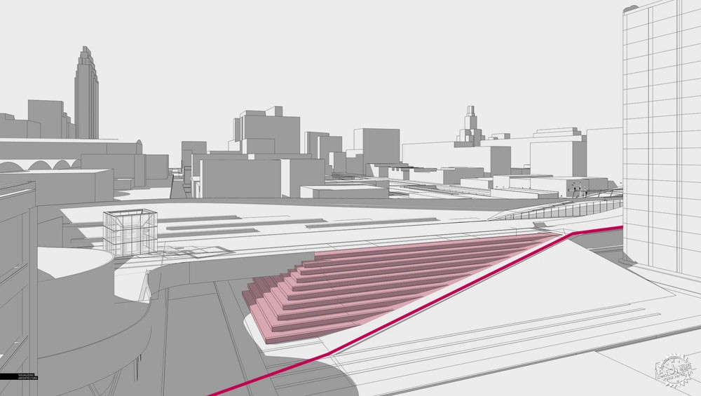
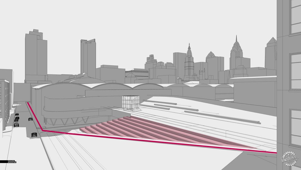
接下来,我选择了一些鸟瞰视角。这些视角能够很好地表达几何空间关系,也能很好地表达场地空间。但是还是有两个问题,其一是这里有很多背景环境,但是我没有那么多时间来处理这些细节,另外,鸟瞰的感觉看起来有些高冷,其实鸟瞰图就有这样的特点,但是我更想让人们感受到亲密,让他们感觉置身其中。这些鸟瞰图的构图很有趣,但是没有亲切感,只会让人感觉很有空间感。
View Option 04 and 05: Aerials
Next, I looked at some aerials views. The aerials did a good job of clarify all of the geometry and probably explained this area of the site the best. However, there were two problems. First, there was a large amount of context that I would need to define. I had limited time to generate this image and I couldn’t spend all of it on the city in the background. The other problem was that the aerials did not feel intimate enough. This is the case in general with most aerials. I wanted the viewer to really connect with the space and feel like they were there. These aerial options, while compositionally interesting, would not have provided that intimacy I was looking for but instead, would have felt more diagrammatic.
视角选择06:上部空间
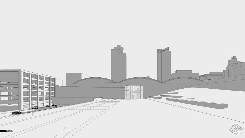
我把镜头移到了上部楼层,这里有很多的场景,但是空间看起来比较陡峭,实现会被阻断。我必须得将镜头拉近才能表达大台阶。我把镜头放在右侧,但是视角仍然不够高,看不到大台阶。
View 06: Upper Level
I moved the camera to the upper level since this is where a lot of the action would be happening, but the tiered seating ended up being steeper than expected and was completely cut out of the view. I needed to get pretty close to the edge for the seating to appear again. I looked into placing the camera on the hill to the right, but it still was not high enough to capture the seating.

视角选择07:抬高上部空间
为了让大台阶进入视线,那么有一个办法就是抬高镜头位置。这样会比其他鸟瞰图更接近地面一些,但是问题同样存在,那就是视线看起来和场地的关系不大,无法很好地表达人们的感受。
View 07: Raised Upper Level
One option to get the tiered seating into view was to raise the camera. While this was closer to the ground than the other aerials, the same problem remained. The view felt too disconnected from the project and was at a vantage point that visitors would not experience.
视角选择08:视角确定
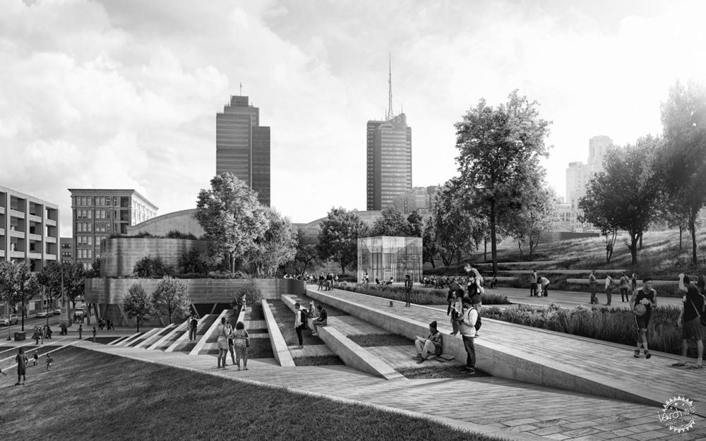
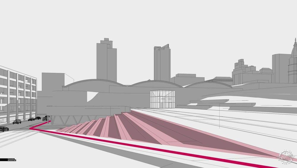
最后,我选择了这个视角。构图并不是我最喜欢的形态,但是这能很好地表达场地关系。穿行场地的坡道环绕着会议中心。大台阶和巨大的草地都在视野之中。人们可以感受桥体和建筑的关系,在这里桥体仍然是重点。另外,我还可以利用植物和人物来增强画面感。
View 08: The Chosen One
Ultimately, this view checked all of the boxes. Compositionally, it wasn’t my favorite, but it told the best story. The ramp cuts across the scene and wraps around the convention center. The upper level is in view as well as the tiered seating and large grass hill. The viewer can see the relationship of the bridge to the Convention center but the bridge is still the focal point. I also knew that I could use the trees and people to help frame the view and strengthen the composition.
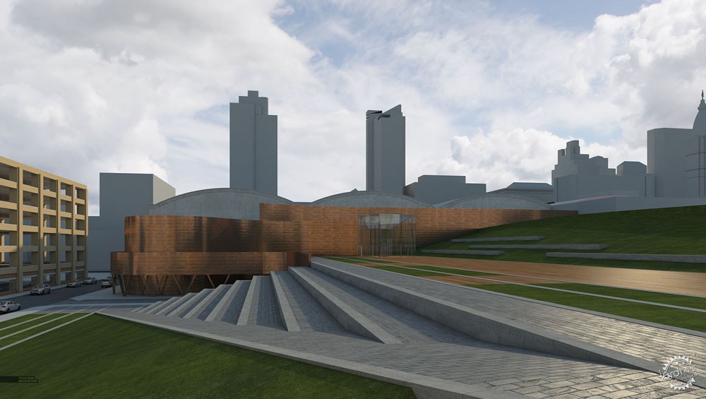
V-Ray渲染图
视角确定之后,我渲染出基础图像。我之前说过的,我没有太多的时间,因此模型很简单,我只是在地面上增加了一些细部,例如石材的边缘等等。其他的都只是在后期进行处理。
V-Ray Rendering
With the view decided, I rendered out the base image. As I mentioned before, I didn’t have a lot of time to piece this illustration together. The model was simple, but I did take some time to add some details to the ground plane such as the stone edging. Most everything else would be handled in Photoshop.
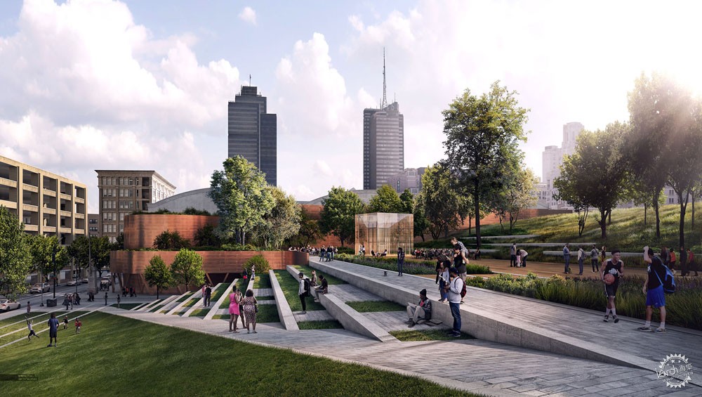
后期处理
这个图像中后期进行了很多处理。图中应用了很多植物,让画面看起来更有肌理感。我想让画面更有活力,但是没有用太多的人物,因为画面中已经有很多事件了,如果人太多会影响场景的流畅性。
Photoshop
There was a lot of Photoshop that went into this illustration. The vegetation was intense, but helped add lots of texture to the image. I wanted the space to be activated, but I didn’t over-do it with entourage. With so much going on in the image, too many people could have hurt the flow of the scene.
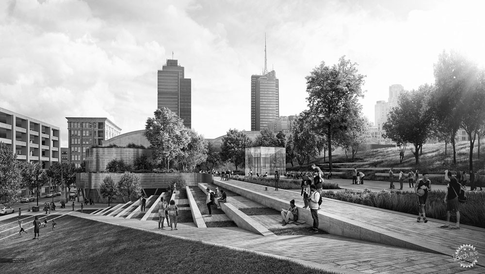
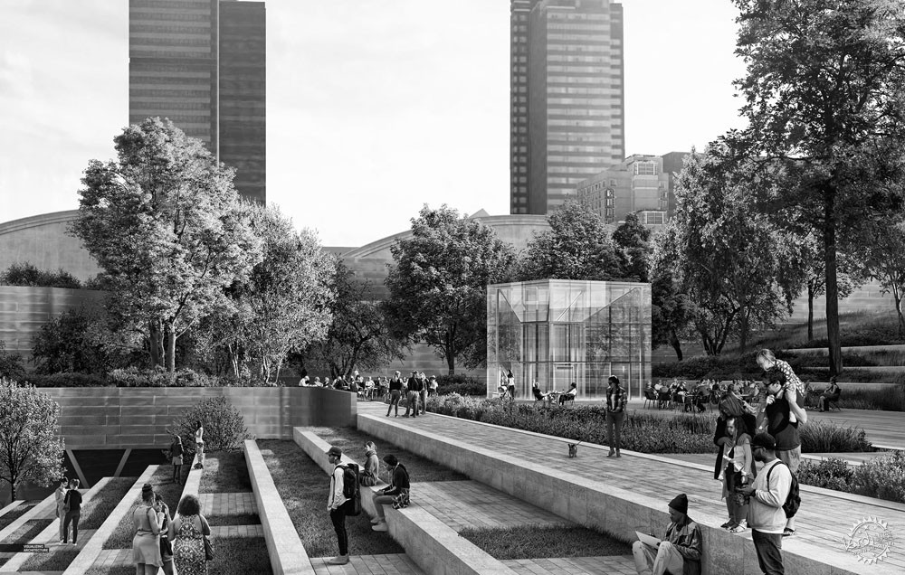
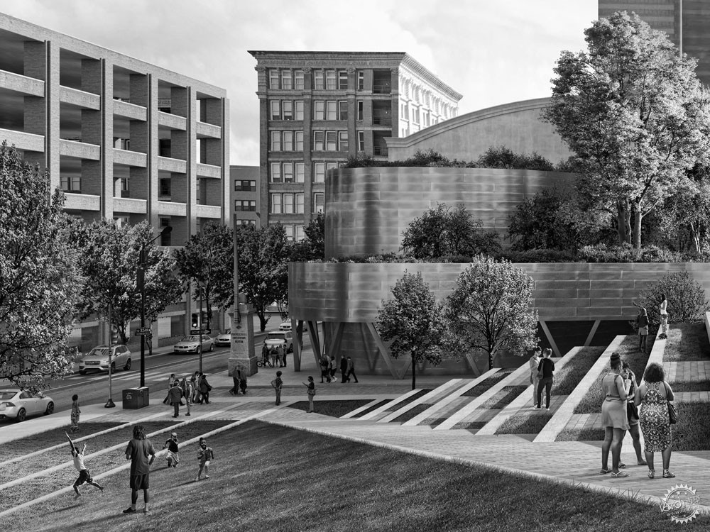
黑白图像
我无所谓色彩,我也很喜欢黑白图像。我认为,这样能更好地表达光影效果,不过,我还没决定最终的版本。
Black and White
I didn’t mind the color version, but I really liked the image in Black and White. The light and shadow reads better in my opinion. I still haven’t decided which option will go in the portfolio though.
|
|
【专筑网版权与免责声明】:本网站注明“来源:专筑网”的所有内容版权属专筑网所有,如需转载,请注明出处
专于设计,筑就未来
无论您身在何方;无论您作品规模大小;无论您是否已在设计等相关领域小有名气;无论您是否已成功求学、步入职业设计师队伍;只要你有想法、有创意、有能力,专筑网都愿为您提供一个展示自己的舞台
投稿邮箱:submit@iarch.cn 如何向专筑投稿?
扫描二维码即可订阅『专筑』
微信号:iarch-cn

