
空间是产品的盒子,抛开风格的界定,不依附于当下、风格的流行,任由时光变迁,而自成一派。
Space is the box of products. It sets aside the definition of style, does not attach to the current and popular style, and allows time to change, and becomes its own style.
▼项目与周边城市环境鸟瞰,aerial view of the project and surrounding environment
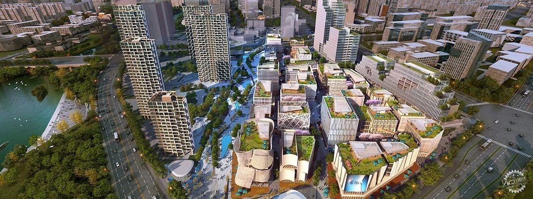
项目位于杭州市临平区临平新城艺尚小镇,艺尚创谷中心19幢,区域以时尚服装等产业为主体,兼具时尚、设计发布、教育培训、时尚产业拓展、时尚旅游休闲、跨境电子商务和金融商务等六大功能,把推进国际化、体现文化特色与加强互联网应用相结合,打造集高端设计研发、智能生活制造、时尚、艺术传播、展示体验消费及人才创业创新为一体的时尚中心。
The project is located in Yishang Town, Linping New Town, Linping District, Hangzhou City, Building 19, Yishang ChuangValley Center. The area is dominated by fashion clothing and other industries, and has six functions including fashion, design and release, education and training, fashion industry development, fashion tourism and leisure, cross-border e-commerce and financial commerce. It combines promoting internationalization, reflecting cultural characteristics and strengthening Internet application. To build a fashion center integrating high-end design and development, intelligent life manufacturing, fashion, art communication, display experience consumption and talent entrepreneurship and innovation.
▼项目概览,Overall view
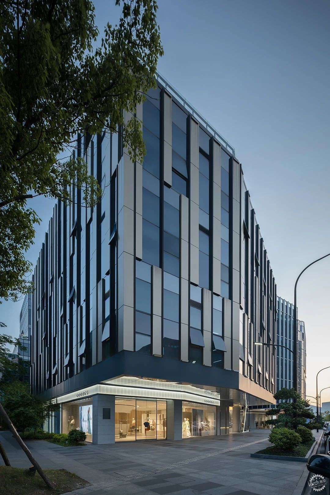
鸟瞰区位优势,双立面都是临街展示店面,在设计时需要充分关注对外展开的形象,有调性的同时兼顾品牌本身大气、简约的形象,引导顾客的同时要体现品牌大气 简约 精致的终端形象。
A bird's eye view of the location advantage, the double facades are street display stores, in the design need to pay full attention to the image of external development, tonality while taking into account the brand itself atmosphere, simple image, guide customers at the same time to reflect the brand atmosphere simple and exquisite terminal image.
▼店铺正面,Storefront
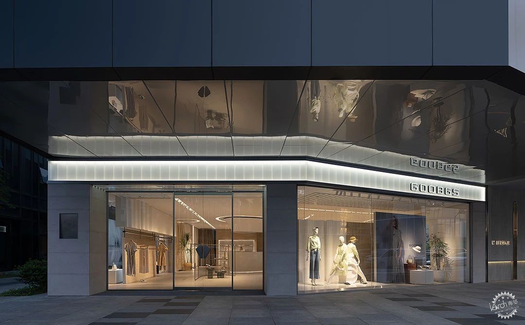
白天的时候,透光的艺术玻璃像高级白装层层叠叠的裙褶。顶上长挑的屋檐顶面采用镜面材质,将室内场景向外延伸。
During the day, the transparent art glass is layered like the pleats of haute white.The roof of the long cantilevered eaves is made of mirror material, extending the interior scene outward.
▼店铺入口,the store’s entrance
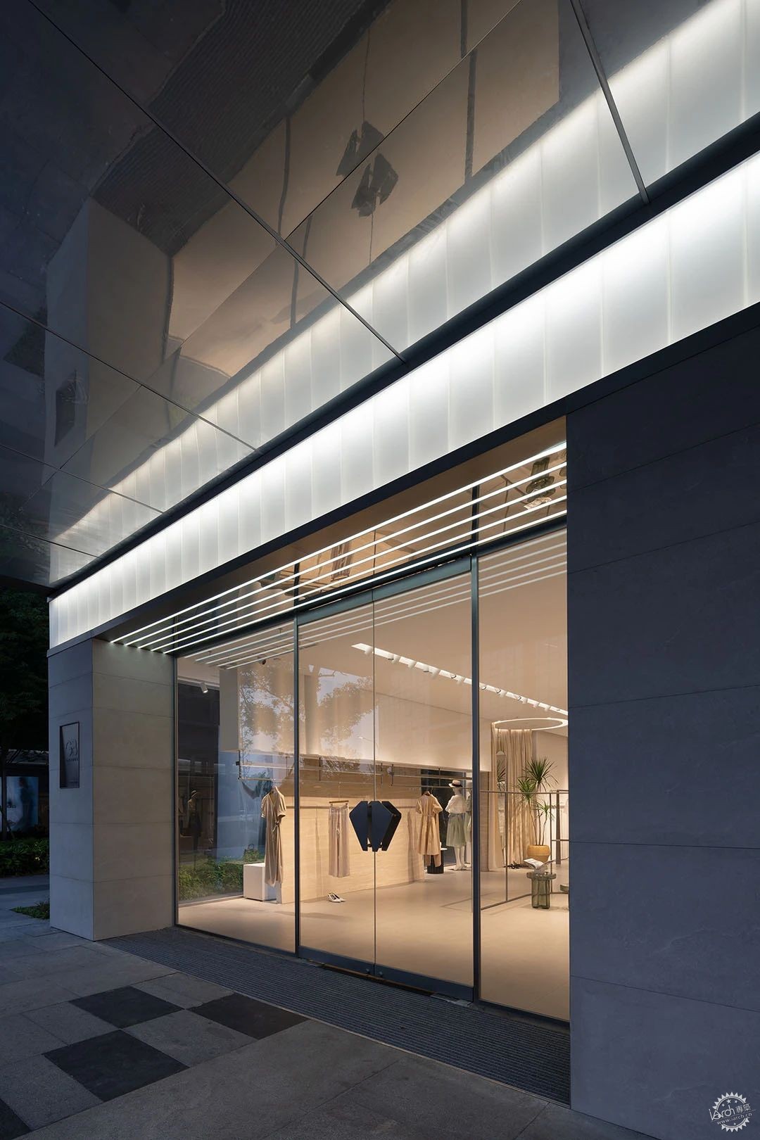
入口采用倒退空间,以退为进,经由地垫过渡进入室内。采用柔和光线,先抑后扬的空间处理方式,让进店的顾客有种豁然开朗的感受。设计师希望顾客在进入GOOBGS空间时,能同时享受品牌特有的情绪氛围,这种氛围设计师希望是气质与气场并存的,而非特定的颜色与造型。
The entrance adopts the backward space to enter, and enters the room through the transition of the floor mat. The use of soft light, the first suppression after Yang space treatment, so that customers have a sense of enlightenment. The designer hopes that when customers enter the GOOBGS space, they can enjoy the unique emotional atmosphere of the brand at the same time. This kind of atmosphere is expected to coexist with temperament and aura, rather than specific colors and shapes.
▼展示区一览,display area
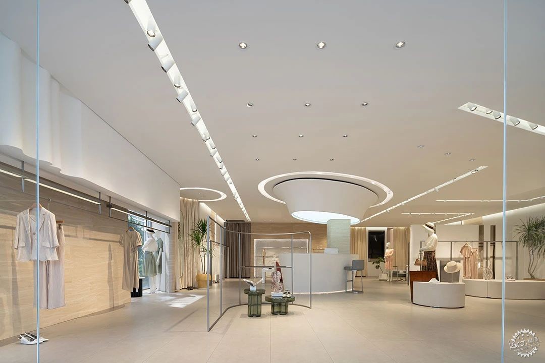
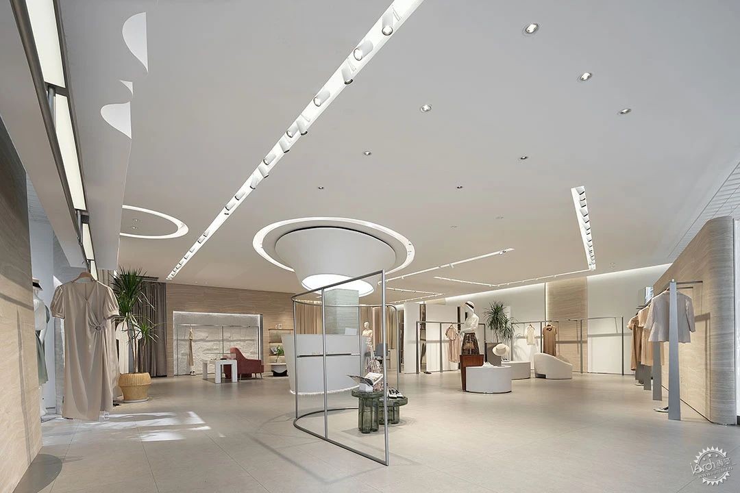
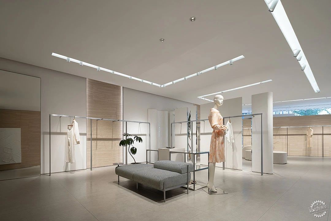
空间色调主体以米白色为主,局部采用洞石板作点缀,简洁、纯净的空间对产品有更好的包容力,白色是一种极简及百搭的颜色,同时也是令所有色彩都出彩的颜色,带来、轻松、舒适并有松驰感的空间。通过大体块的造型与简洁、利落的线条给空间带来独有的品牌视觉,避免流行带来的转瞬即逝,塑造独特的品牌形象,历久弥新。
The main body of the space color is off-white, and the local use of cave flagstones for embellishment. The simple and pure space has better tolerance for the product. White is a minimalist and versatile color, and it is also the color that makes all the colors brilliant, bringing, relaxed, comfortable and relaxed space. Through the shape of the general block and simple, crisp lines to the space to bring unique brand vision, to avoid the fleeting fashion, create a unique brand image, lasting.
▼不同角度,Views from different angles
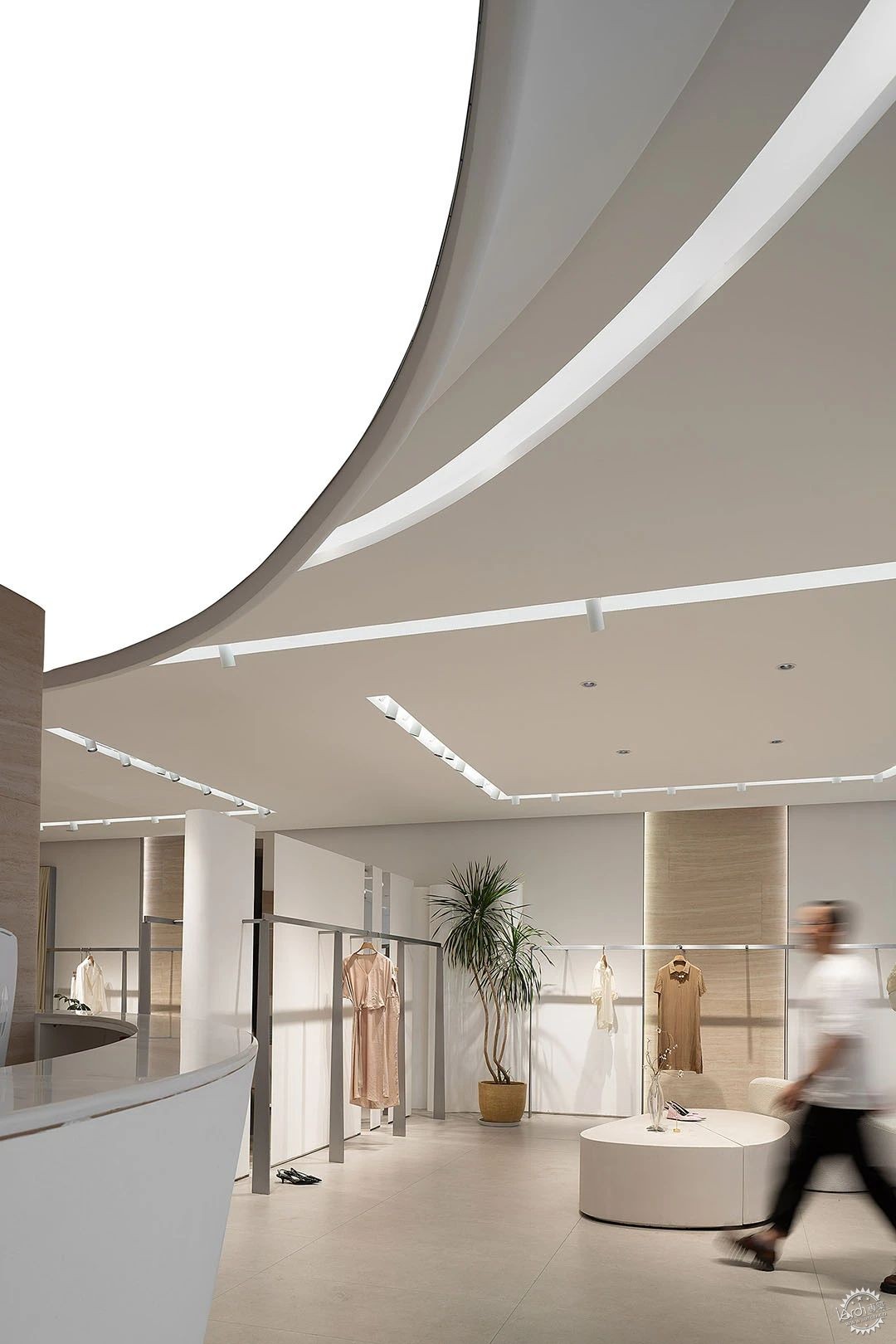
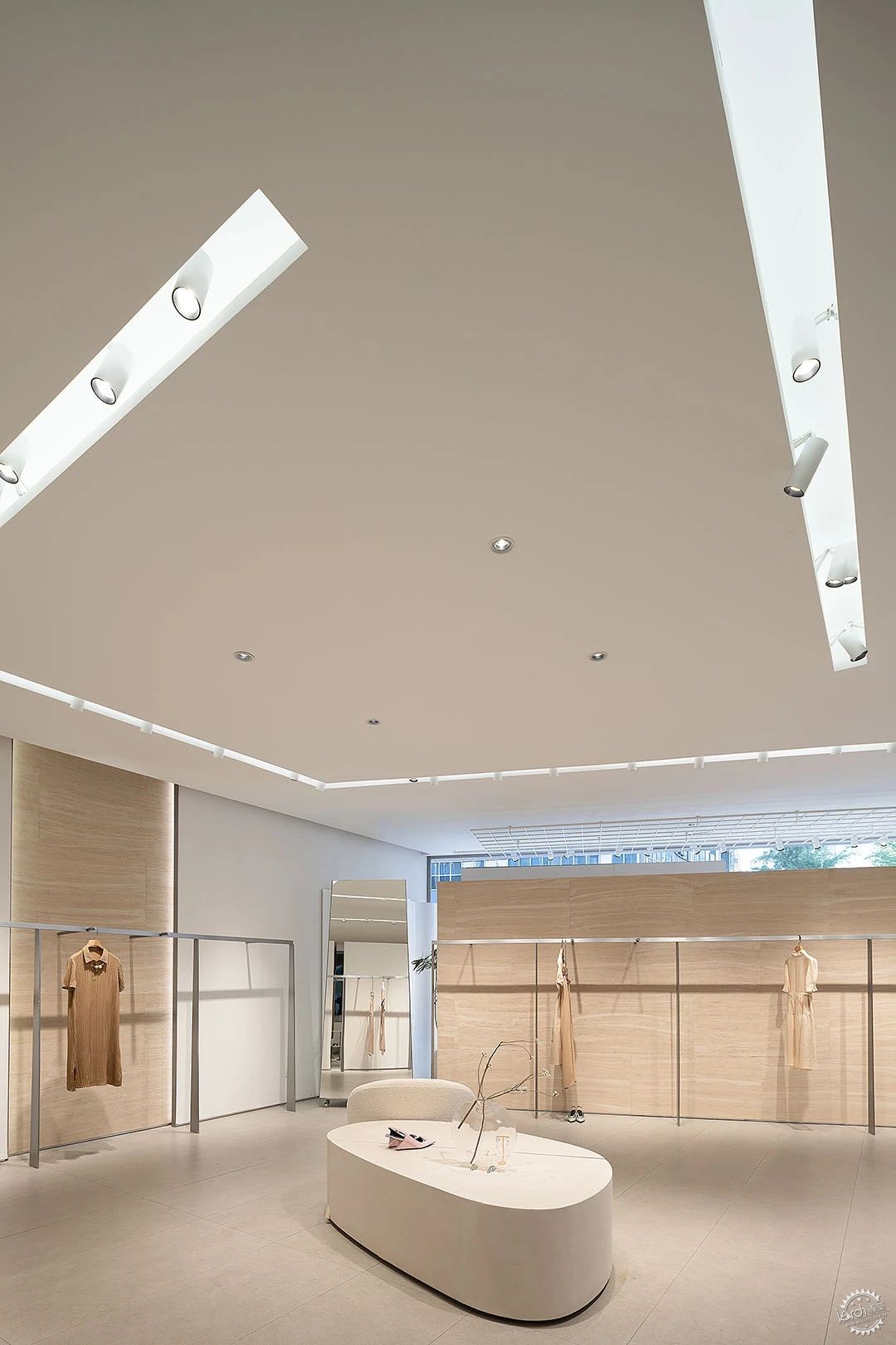
天花灯槽内的灯带的设计除了增加美感的体现外,也增加了整个空间光的漫反射氛围,间接照明带来了轻松与高雅的空间感受。
The design of the lamp belt in the sky flower lamp slot not only increases the expression of beauty, but also increases the diffuse atmosphere of the whole space light. Indirect lighting brings a relaxed and elegant space feeling.
▼服务台,service counter

作为品牌旗舰店,服务至关重要,设计时将服务台置于空间中心位置,像一颗心脏服务于全身,下面呼应的曲面形状,近似元宝的造型,给予全身支持,作为空间的视觉焦点。
As the flagship store of the brand, service is very important. The service desk is placed in the center of the space in the design, serving the whole body like a heart. The curved surface below, similar to the shape of ingot, supports the whole body and serves as the visual focus of the space.
▼软膜灯光,Soft film light boxes
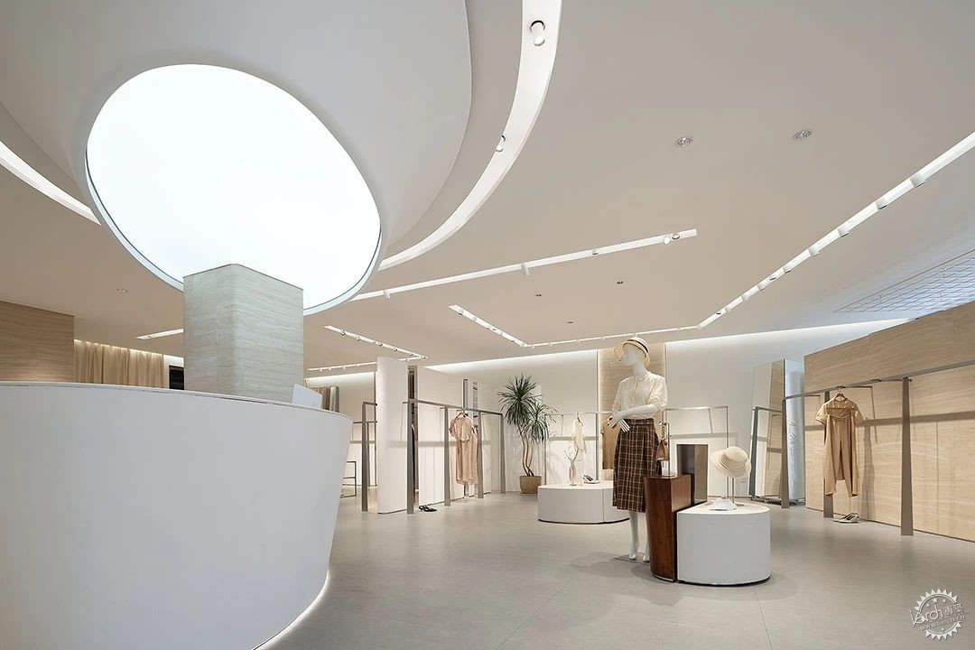
▼空间细部,spatial details
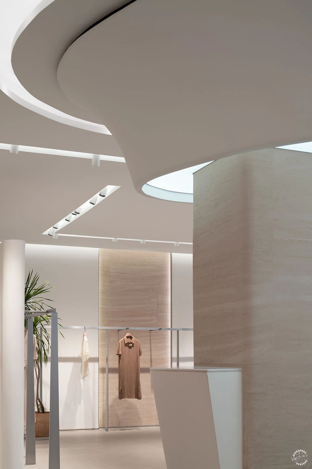
开票台的立面,优雅的曲线造型。
The facade of the cashier, the elegant curve shape.
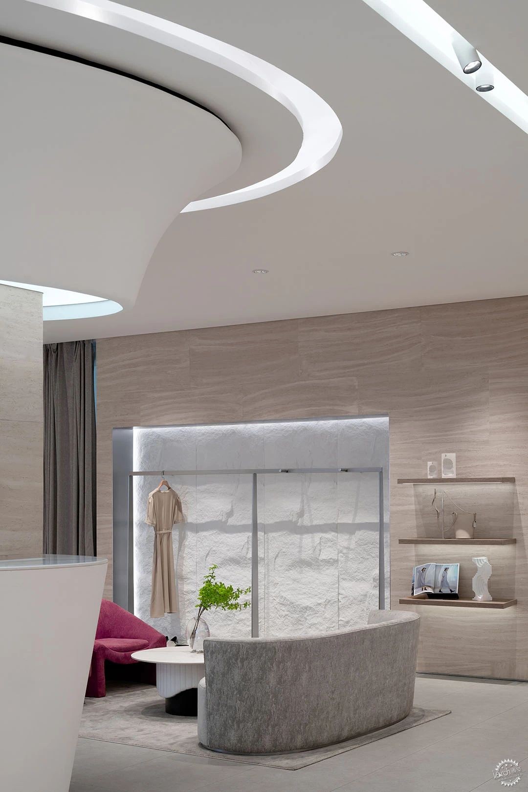
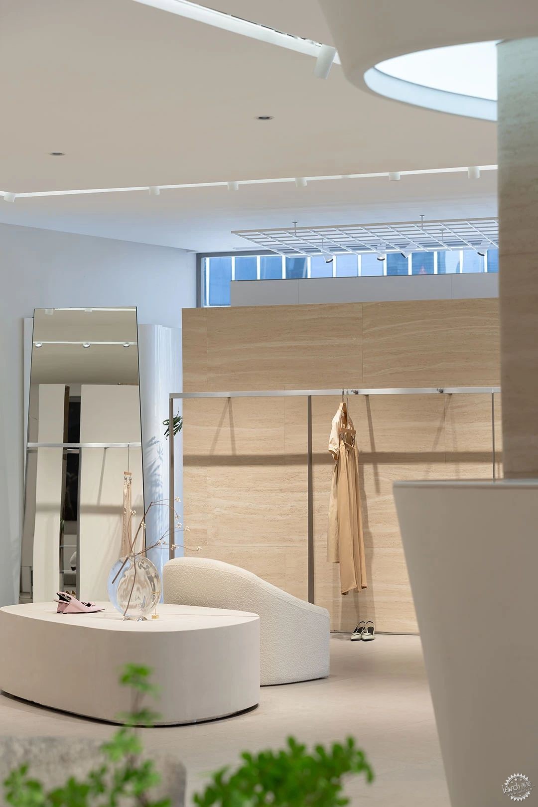
墙面设计过不同材质与造型的处理方式给陈列带来了多样性。
The treatment of different materials and shapes in the wall design brings diversity to the display.
▼区域隔与连接,Area separation and connection

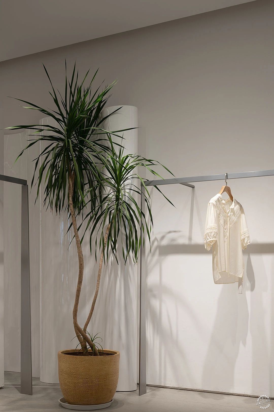
区域隔断以建筑体块构成,同样都是浅色系,优雅的钢琴烤漆曲面造型让墙面过渡更为丝滑,不同的倾斜角度通过镜面材质相互咬合,不到顶的设计形式释放了立面与天花的衔接,空间得以释放与独立,似断非断。
The regional partition is composed of building blocks, which are also light colored. The elegant piano paint curved surface modeling makes the wall transition more silky. Different angles of tilt are intergrated by mirror material, and the design form that does not reach the top releases the connection between the facade and the ceiling.
▼细节,Detailed view

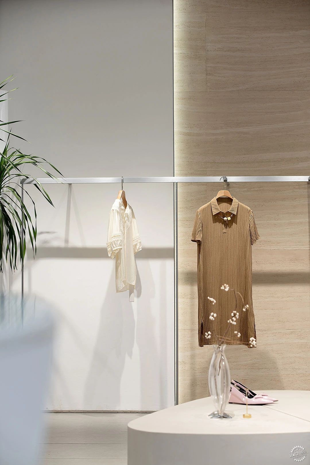
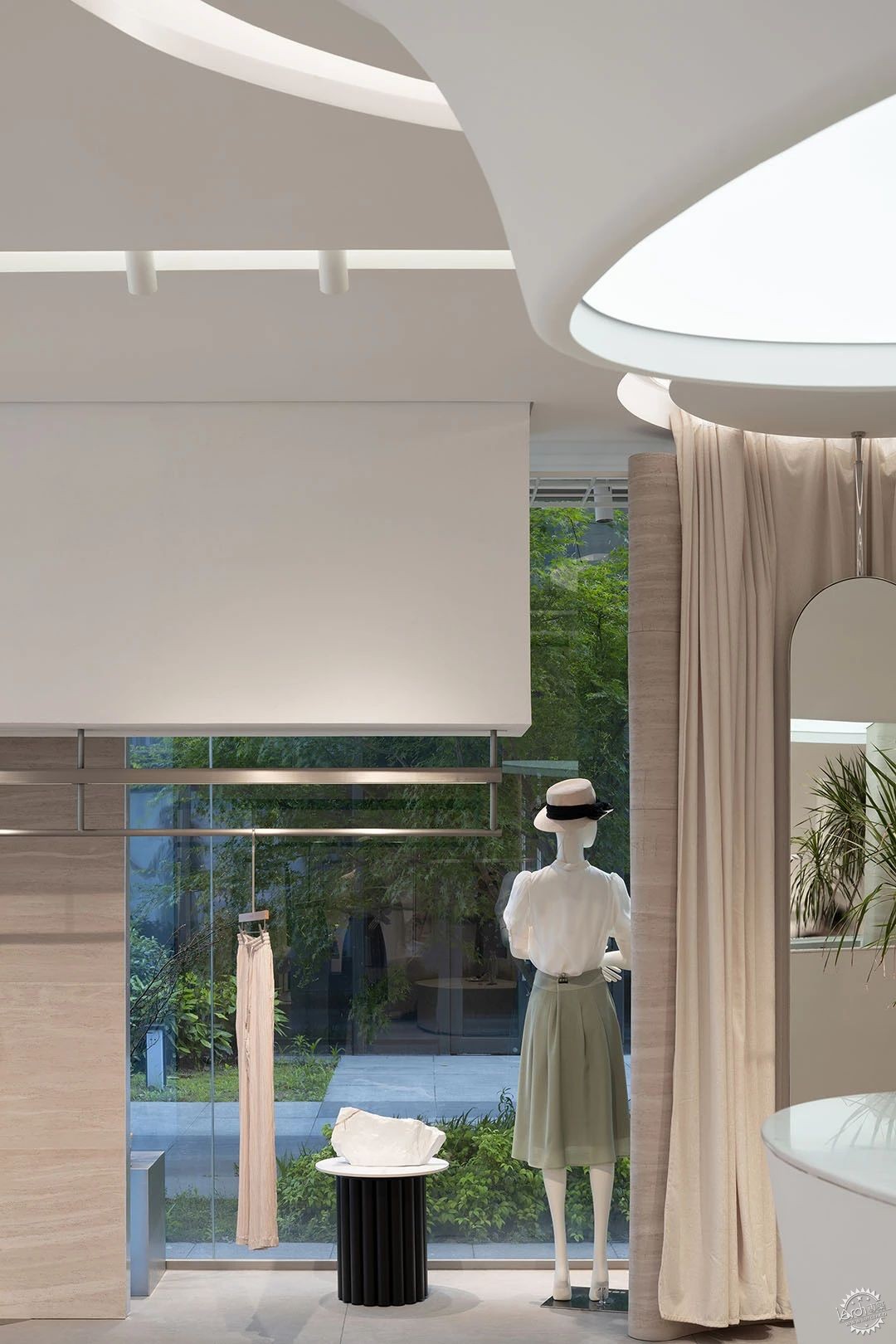
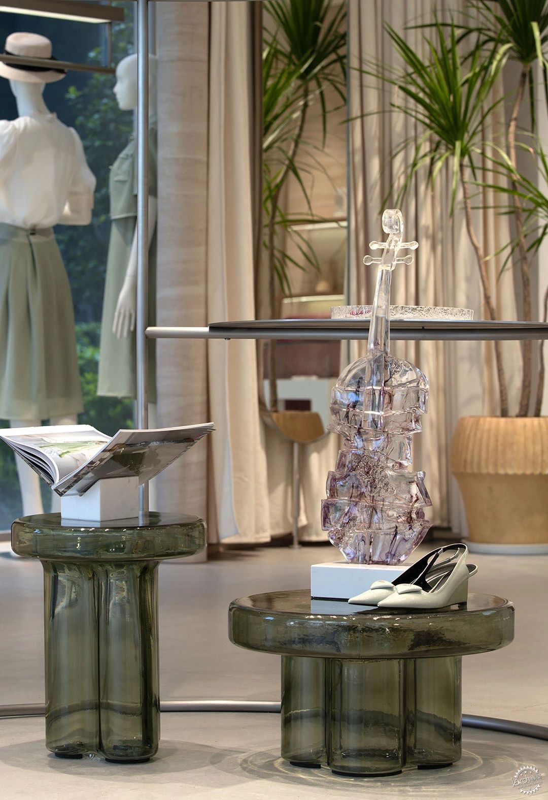
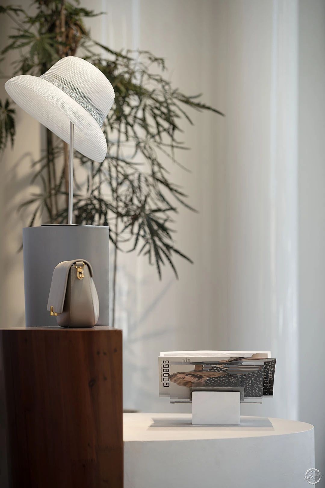
硬装上面讲究自然、品质、纯粹,耐得住时间的检验,软装增加一点跳色与装置品,空间多了一些趣味性,为后期带来更多的灵活性。
Hard installation above pay attention to nature, quality, pure, withstand the test of time, soft installation to increase a little jump color and device, more interesting space, bring more flexibility for the later period.
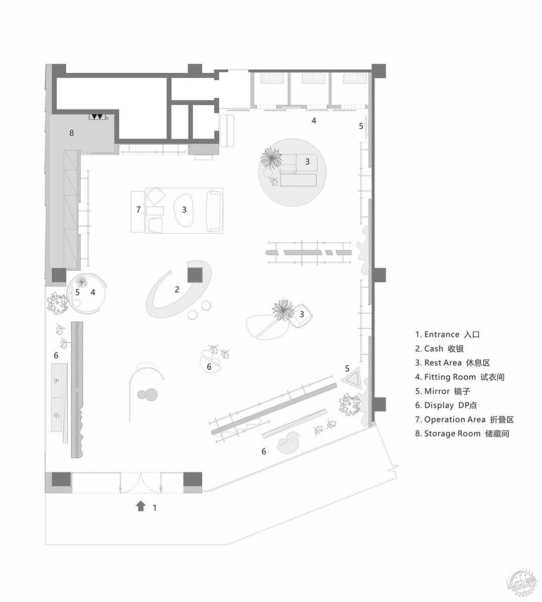
▼平面图,PLAN
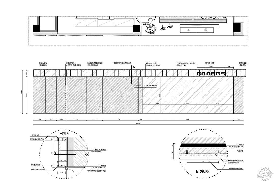
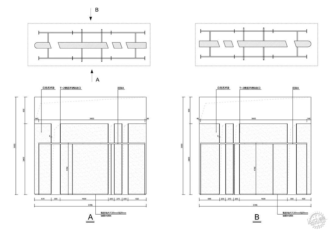
▼室内立面图,interior facade
INTERIORS: TIZI DESIGN梯子设计
PHOTOS: 艺间访建筑空间摄影
来源:本文由杭州梯子室内设计有限公司提供稿件,所有著作权归属杭州梯子室内设计有限公司所有。
|
|
