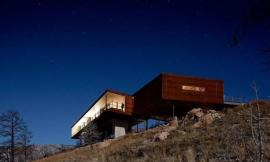
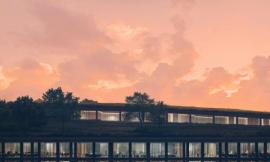
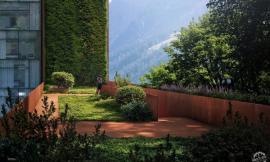
I wanted to have some fun with this image and create something that conveyed the scale of this project. Sort of a grand finale image. I have already generated a lot of close-up vignettes, but nothing really showing the project its totality. I chose a view that would grab some of the horizon, but also show the cliffs crashing into the water below. Because of the parameters of the view, I didn’t have an aerial image that I could just patch my project into. I had to create something from scratch by stitching many context images together. Below is a quick break down of the illustration.
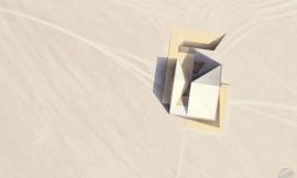
1. SU建模/1. Sketchup Model
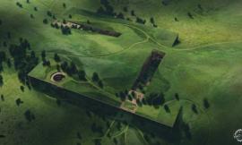
以上SU模型展示了整个悬崖的高度,这有助于我在PS中正确地框选纹理的尺寸。
Above is the Sketchup model showing the full height of the cliff to help me scale textures properly in Photoshop.
2. V-Ray 基础渲染图/2. V-Ray Base Rendering
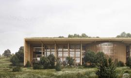
以上是由V-Ray直接渲染的基础图片。我增加了几个点光源来照亮建筑室内以及一些外立面。最终的渲染分辨率达6000px X 3333px。这个分辨率高于我以往的渲染设置,这是因为我希望尽可能地保留建筑的细节,尽管在这个图片中建筑非常小。
Above is the base rendering straight out of V-Ray. I dropped in a few omni lights to light up the interior and highlight some of the exterior facades. The final rendering had a resolution of 6,000px X 3,333px. The resolution is a little higher than I normally render because I wanted to maintain as much detail as I could with the architecture being so small in the image.
The first step in setting up the context is collecting a ton of images. I collected about 50 images of the Iceland cliffs that covered all of the different scenarios in my scene. I spent more time looking for images than I actually did piecing them together in Photoshop.
I started with the foreground cliff since this interacts the most with the architecture and will inform how the rest of the image would be composed. The hardest part was finding an image at a high enough resolution and at the correct angle. I ended up using three different images and distorting them quite a bit to match the perspective.
A very important part of this image was the waves crashing at the base. Again, it was difficult finding something at the correct angle and with the right amount of wave energy. I combined two different images of the ocean to get the look that I wanted. I also added some background cliffs to break up the horizon line and give some depth to the illustration.
The grass was added towards the end to tie all of the different cliff textures together. The grass itself was made up of three different images copied and cloned many times. A simple dusk sky was added to complete the context.
After completing the context, I could start adjusting the overall tones. I added a grey/blue overlay to darken everything except for the sky. I also adjusted the levels of the base rendering architecture to darken the exterior and punch up the light in the interior. A better description of this darkening technique can be found in this Post
In this step, I spent some time tweaking facade tones, and manually adding in new lights. This helped to highlight slits in the ground as well as activate important spaces such as the grand stair going down to the lookout platform. I also added people, the garden on the balcony, more texture to the interior, and paths leading off into the distance. More on the technique of manually adding light can be found HERE.
With the details in place, I experimented with different atmospheric conditions. The key here is to be subtle. It’s easy to overdo it with the fog and clouds, but with this image, I just wanted to give the hint of some fog rolling in from the ocean. I also inserted more color overlays and moved away from the purple tones to blue tones. I go into more depth with techniques of adding fog and atmosphere in my Foggy Wharf Post and my Atmospheric Fog Tutorial.