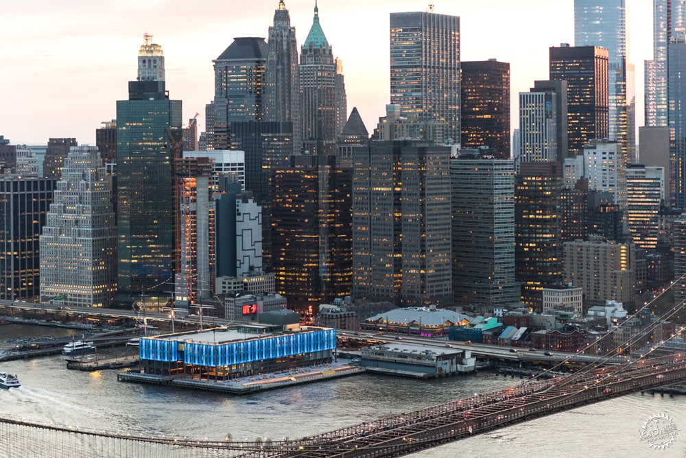
Pier 17 South Street Seaport. Image Courtesy of Bendheim
Glass in Retail & Commercial Architecture: Texture, Brightness and Color
由专筑网李韧,王雪纯编译
当前,玻璃处理的新技术在建筑应用中十分广泛。尤其是零售店等商业室内空间,通过赋予玻璃不同的质感、亮度、色彩、表面、透明度,让空间的视野更加通畅,这能够有效地分隔空间,但是不影响自然采光,同时还能吸引使用者,满足了诸多功能。
以下是玻璃在商业建筑中的应用。
Nowadays, new technologies for the treatment of glass provide new ways to use this material in architecture. Applied indoors, specifically in retail stores, glass in its different textures, colors, finishes and levels of transparency can allow the unobstructed view of certain products, hide more private areas without blocking the passage of light, and attract the attention of customers as focal points, among many other uses.
Review below a selection of applications in commercial projects.

Different types, textures, colors, finishes and levels of transparency. Image Courtesy of Bendheim
肌理:隐私、柔和光线、装饰产品
商业空间中总有一丝神秘色彩。在橱窗中只需要产品展现出来,而其他部分则应该隐藏。有肌理的玻璃则能达到这些效果,甚至可以通过不同肌理的混合,产生具有美学意识且丰富的效果。
Texture: Privacy, Soft Lighting and Camouflaged Products
Commercial stores always present some mystery. In its showcases, carefully chosen products are exposed but the rest is insinuated to be discovered by the client. Textured glass can generate these effects, and it's even possible to mix different textures in a single project to generate something even more beautiful and complex.

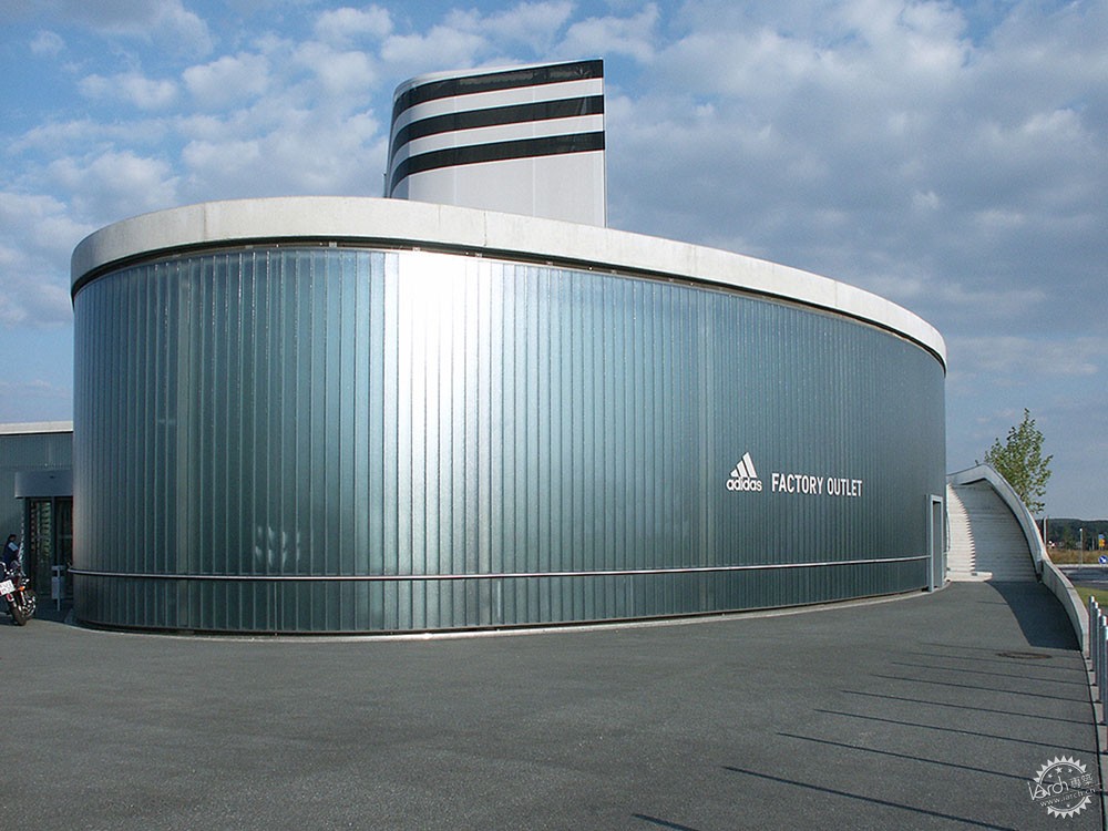
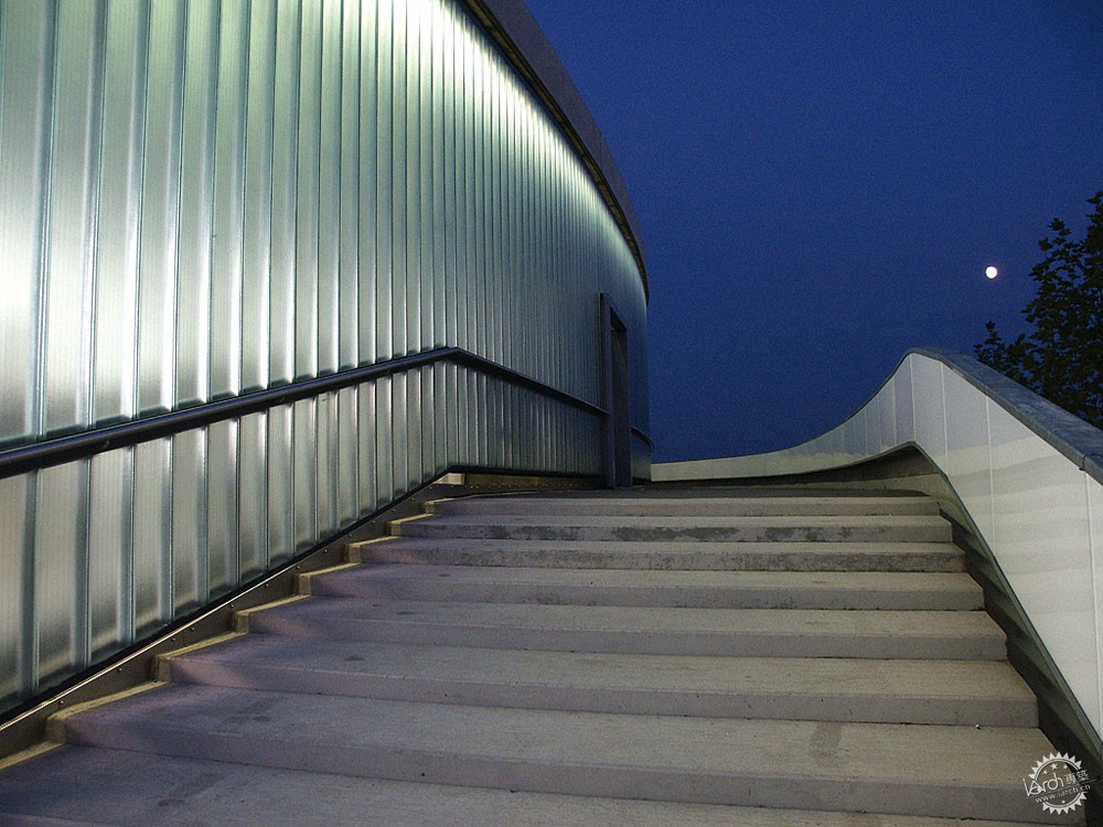

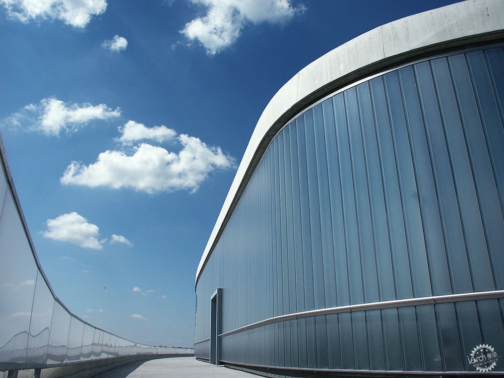
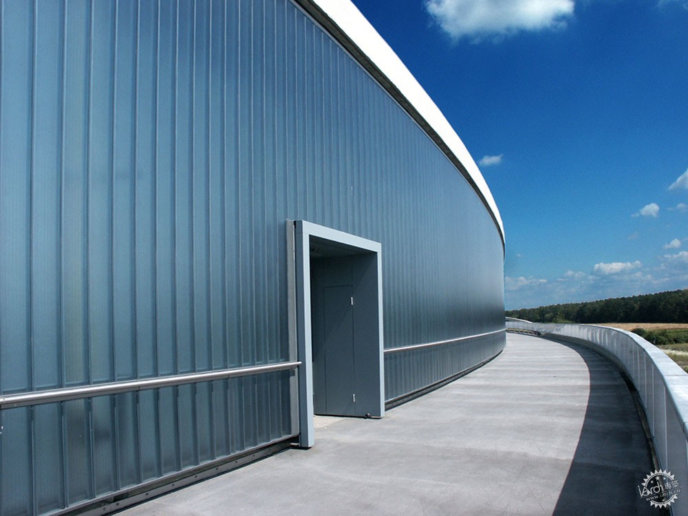
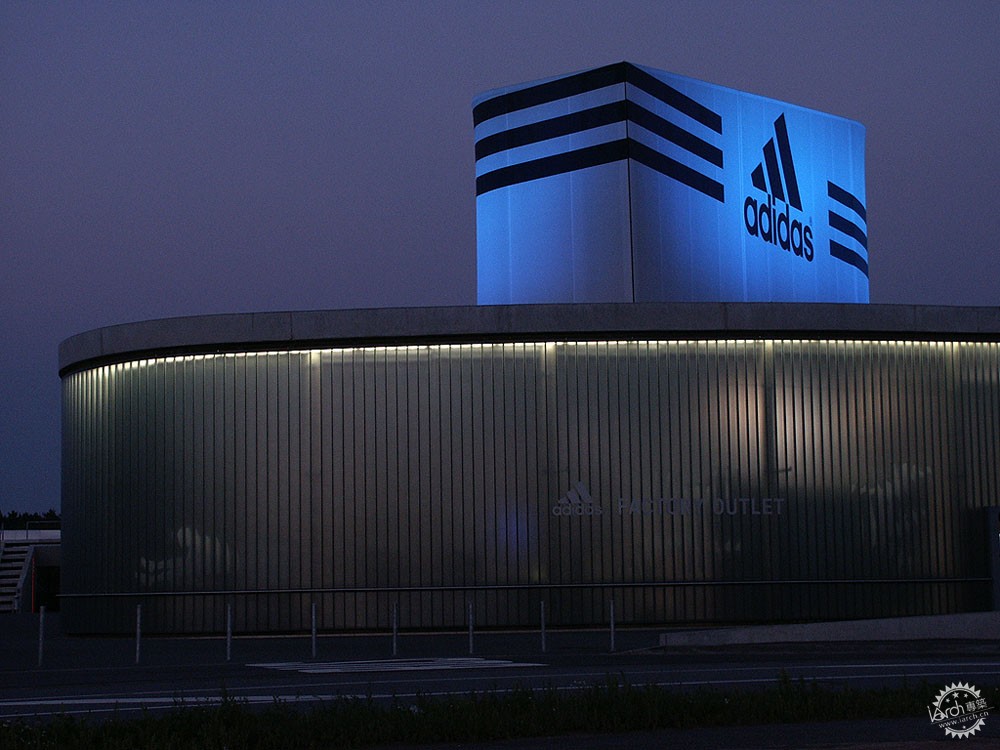
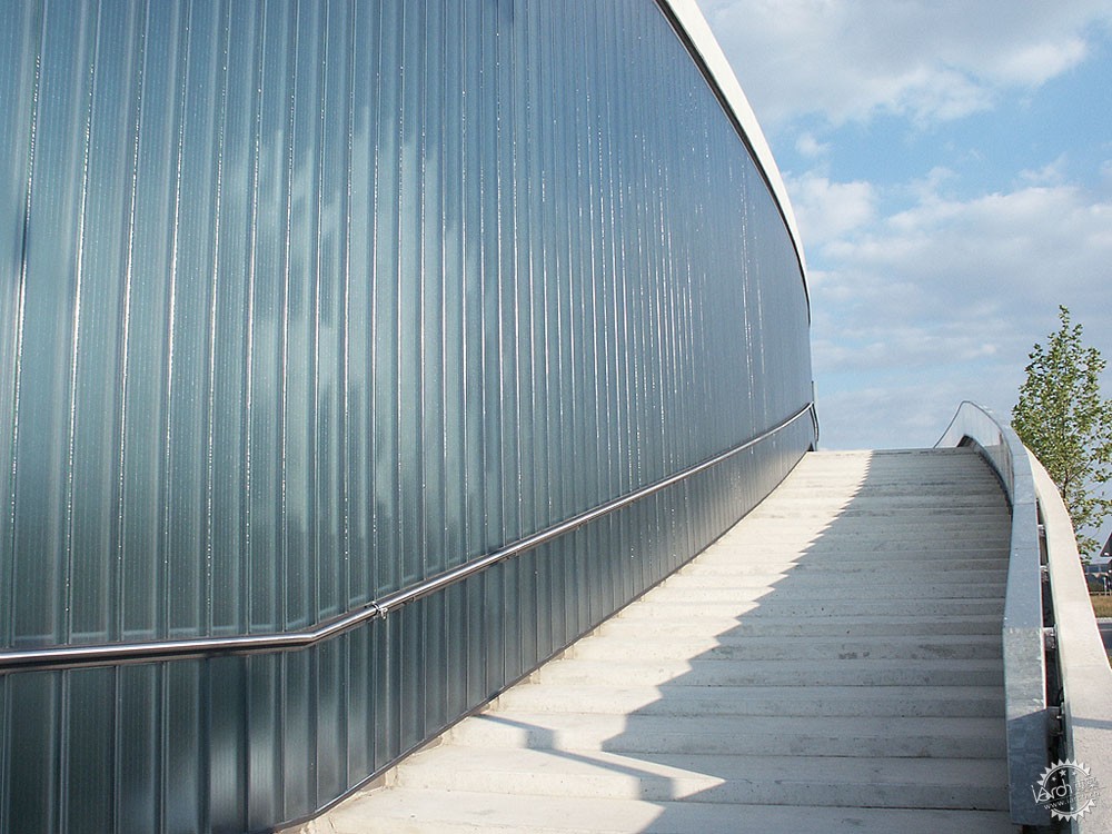
Adidas Factory Outlet . Image Courtesy of Bendheim
Adidas Factory Outlet项目由Wulf & Partner设计,建筑师应用了双层曲面玻璃,玻璃有着肌理,其表面覆盖着Azur热涂层,提高了玻璃性能,同时让玻璃呈现一定的色彩。这样光线能够均匀地在室内扩散,并且遮盖隐蔽的部分,成为产品的柔和背景。
Using curved double-glazed channel glass, the Adidas Factory Outlet project, designed by Wulf & Partner, is almost entirely wrapped in textured glass covered with a thermal coating called Azur, improving its performance alongside a bluish tint. Through it, the light diffuses steadily throughout the interior, hiding the direct views and working as a soft backdrop for the products presented in front of them.
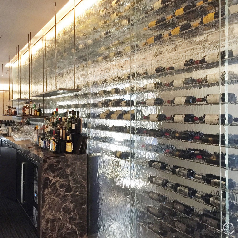

Knickerbocker Hotel. Image Courtesy of Bendheim
Knickerbocker Hotel由Gabellini Sheppard Associates事务所设计,酒吧的葡萄酒在半透明水纹玻璃的衬托下显得更加神秘,其背景的色彩与亮度都取决于玻璃的各项元素。
In interiors, the wines of the Knickerbocker Hotel Bar, designed by Gabellini Sheppard Associates, appear mysterious behind a translucent, textured and 'watery' screen, which varies its color and brightness depending on the elements located behind it.
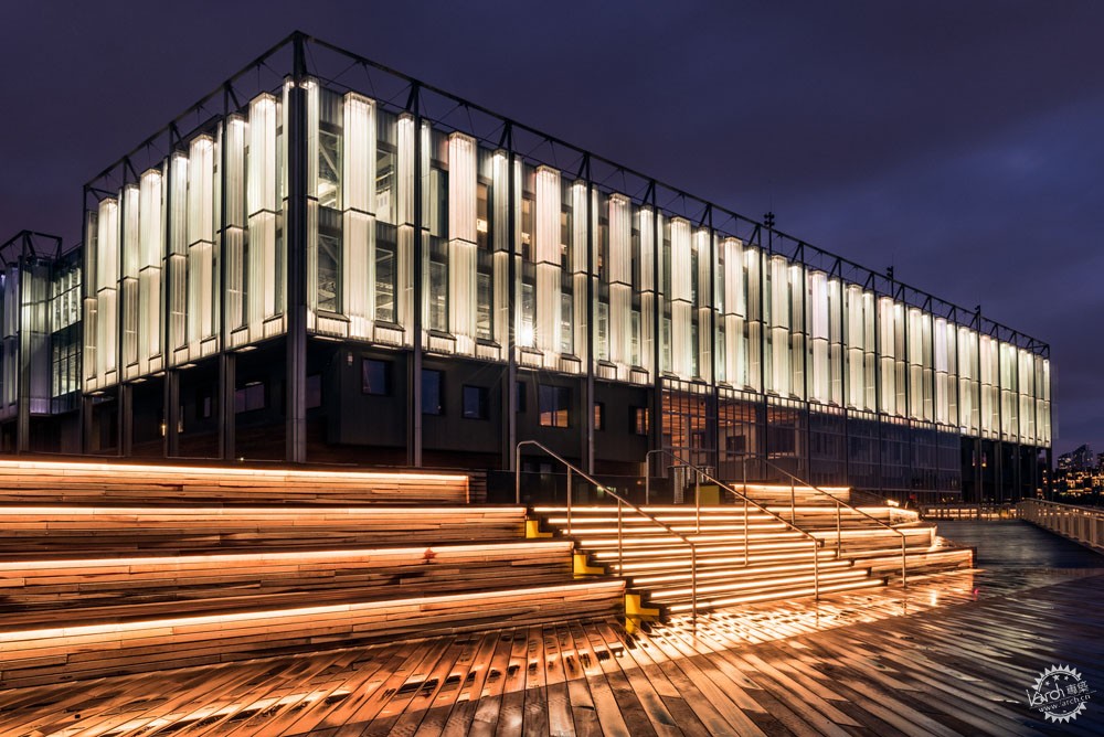
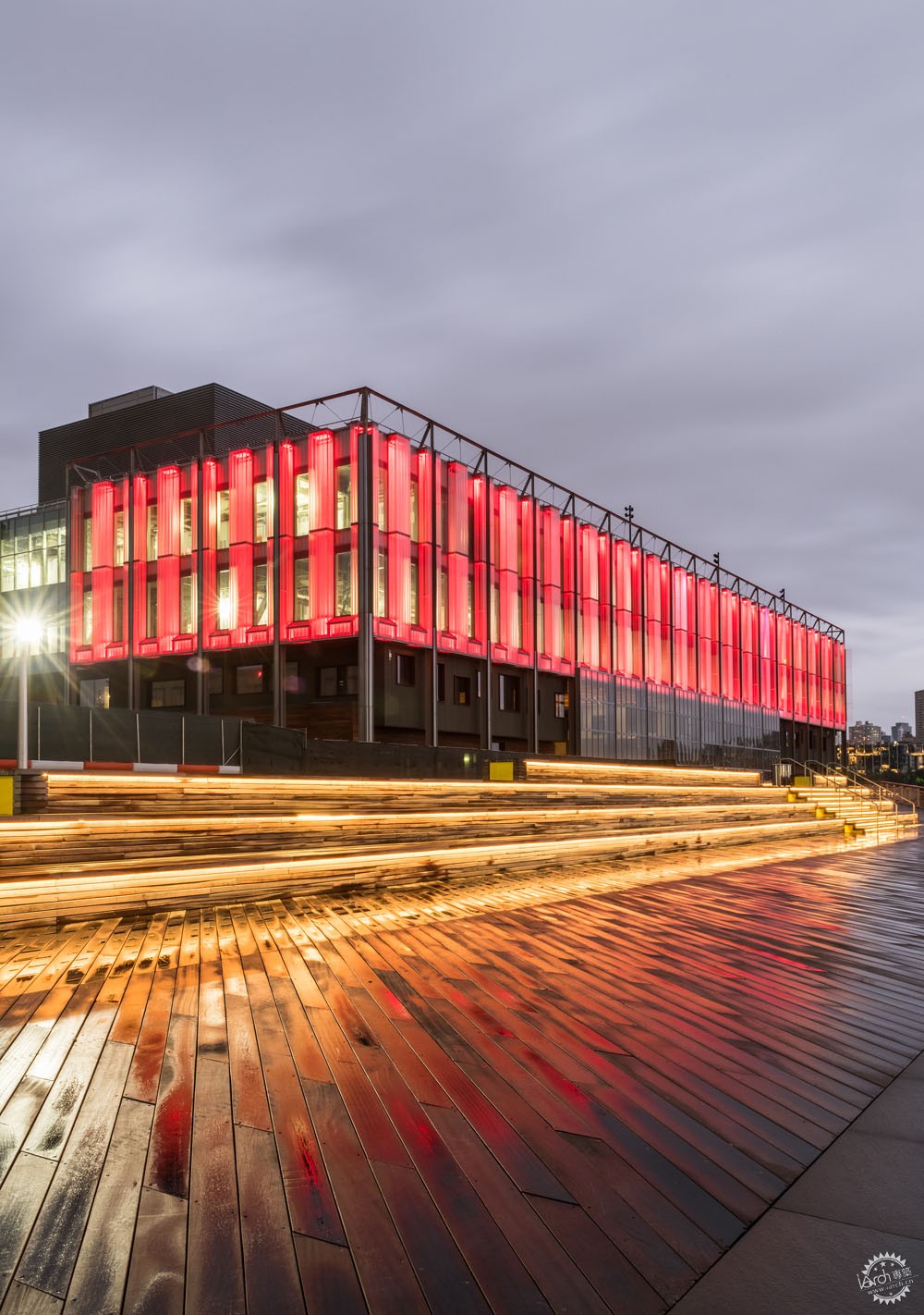
Image © C. Taylor Crothers Photography
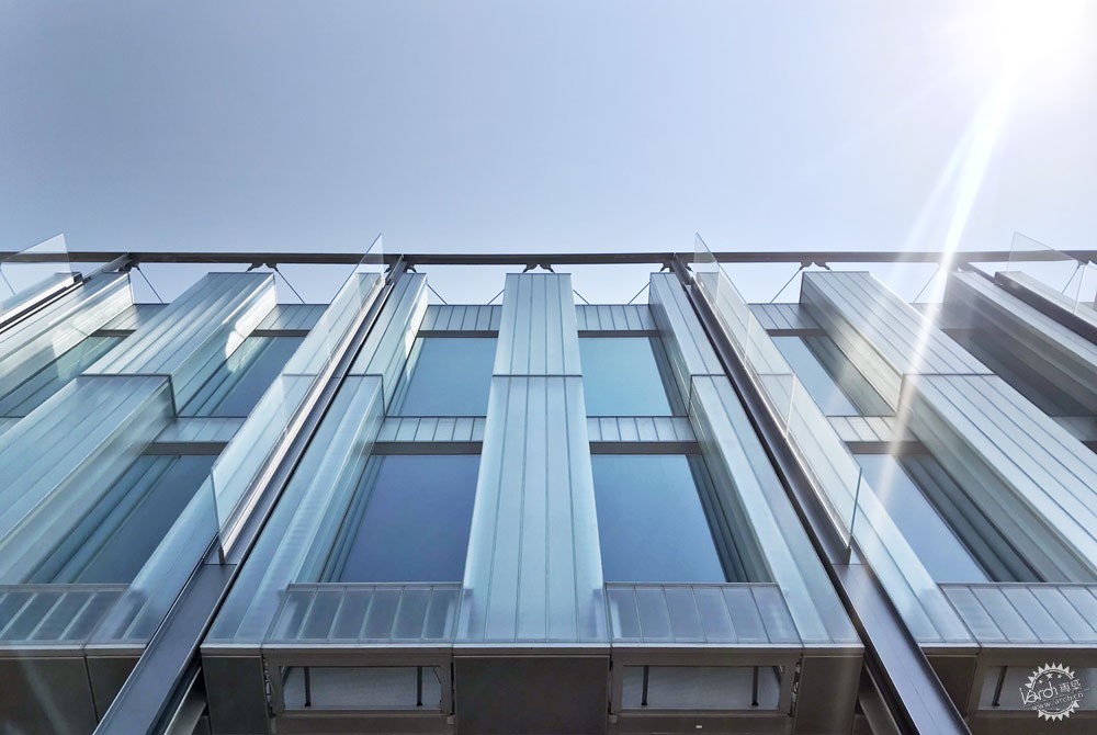
Pier 17 South Street Seaport. Image Courtesy of Bendheim
亮度:强调性与吸引注意力
建筑师们会将玻璃与背光体系结合应用,让商业空间更加有吸引力,这也有益于城市环境。
SHoP Architects & R. A. Heintges and Associates事务所于2017年设计了曼哈顿南街海港17号码头(Pier 17 South Street Seaport)项目,建筑师应用了横跨20英尺(约6.1米)的三维玻璃,此玻璃能有效地抵御来自美国哈德逊河与东河的强风。“丝带”保护着上部楼层,让建筑看起来犹如能够变换色彩的灯箱,这也是一座与纽约城市相呼应的标志。
Brightness: Highlight and Attract Attention
By incorporating glass with backlighting systems, commercial spaces can creatively draw the attention of potential customers, and they have the potential to contribute to the urban environment.
In the project Pier 17 South Street Seaport (2017), designed by SHoP Architects & R. A. Heintges and Associates, three-dimensional channel glass was used to reach continuous spans up to 20 feet, resisting the strong winds of the Hudson and East River. The 'ribbon' protects the upper levels and becomes a light box that changes color, turning the building into a beacon against the city of New York.
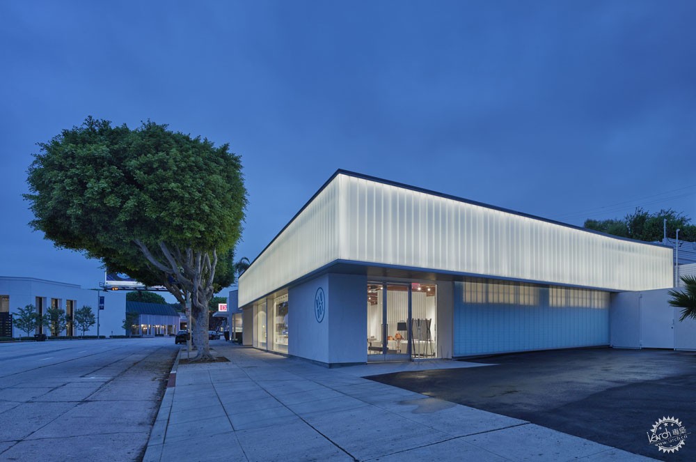
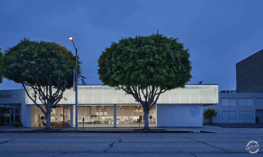
Blu Dot Showroom. Image © Benny Chan
Blu Dot展厅由Standard Architecture事务所设计,建筑师对一座70年的老建筑进行了改造,他们应用了漫反射玻璃,不仅吸引人们的视线,而且能有效地控制湿度。建筑甚至照亮了周围的公共空间。
In the case of the Blu Dot Showroom by Standard Architecture, an existing building, 70 years old, has been remodeled, incorporating a diffused glazed screen that attracts views and blocks humidity. Its superior bright 'volume' helps delicately illuminate nearby public spaces.


Row Hotel Lobby. Image Courtesy of Bendheim
色彩:通过概念与特征照亮物体与元素
玻璃可以成为空间的部分特征,通过二向色系,结合镜面、风化、烧结、背漆、色彩改变等性质。色彩加上灯光之后能够突出品牌效应,吸引路人的眼球。
Color: Spotlight Objects and Elements Through a Concept and Identity
Glass can be part of the identity of a space, incorporating mirrored, etched, fritted, back-painted, fixed or changing colors through dichroic systems. The color, added to the lighting, can highlight even more of the presence of a brand and attract the gaze of passersby.
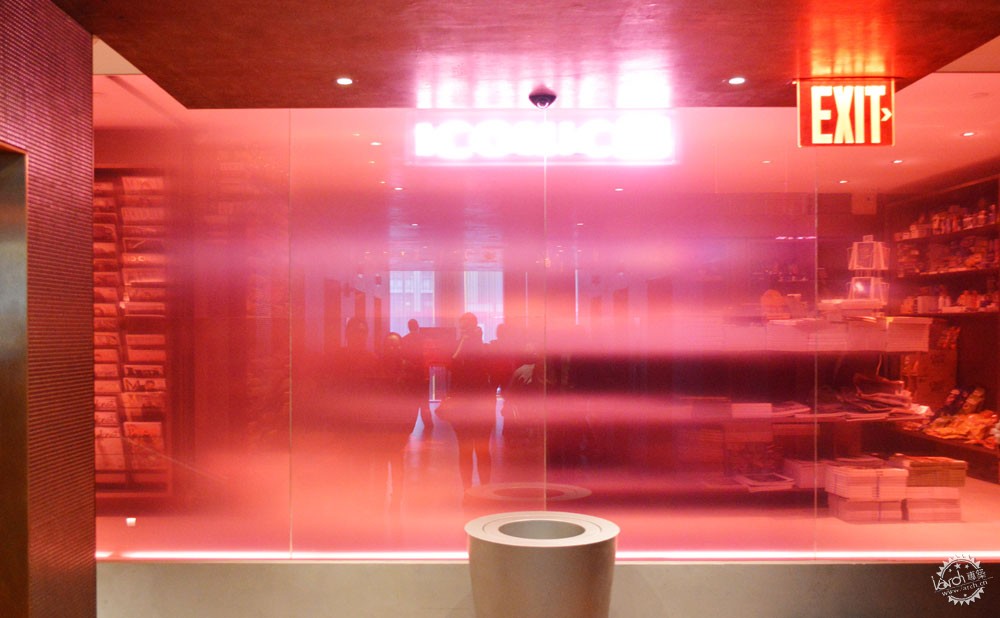
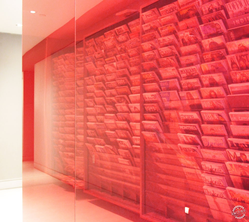
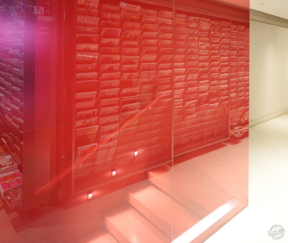
Row Hotel Lobby. Image Courtesy of Bendheim
纽约Row酒店由Gabellini Sheppard Associates事务所设计,建筑师利用了饱和的粉色玻璃,并且形成变化的色调效果,这让路人能够逐步看到其内部空间,整个形态由清晰到模糊地呈现出来。
Varying its tone in its extension, the saturated pink colored glass used in this store located in the Row Hotel, NYC, designed by Gabellini Sheppard Associates, allows its visitors to discover little by little what is behind, passing gradually from clear to fully obscuring as they walk past.

Knickerbocker Hotel. Image Courtesy of Bendheim
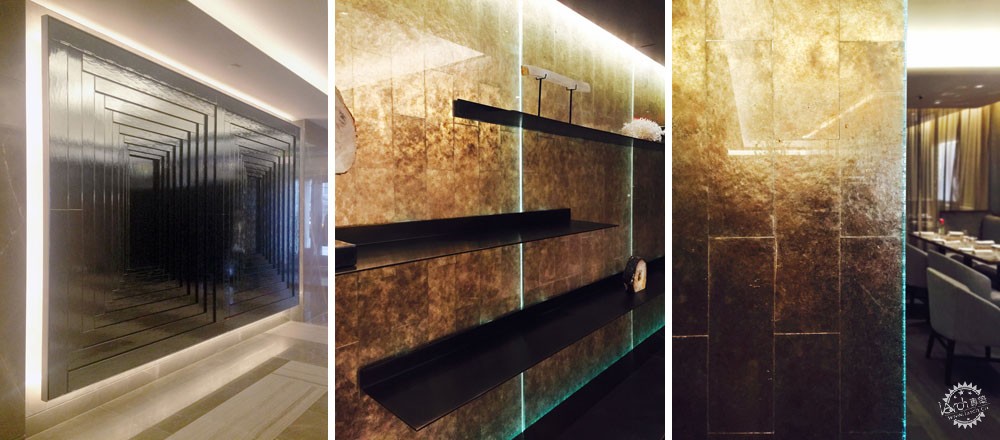
而在Knickerbocker Hotel,建筑师通过私密的墙体来表达色彩,墙体由云母矿物材料组合而成,通过独立砖石切割,其色彩呈现为金色到咖啡色,这让艺术品展示区更加纯粹。
In the Knickerbocker Hotel, mentioned above, the color is expressed through a privacy wall composed of a mineral material of mica, cut in individual bricks, which gives a rustic appearance to an exhibition area of art objects, ranging from gold to brown tones.
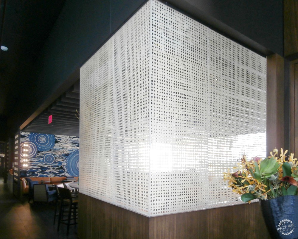
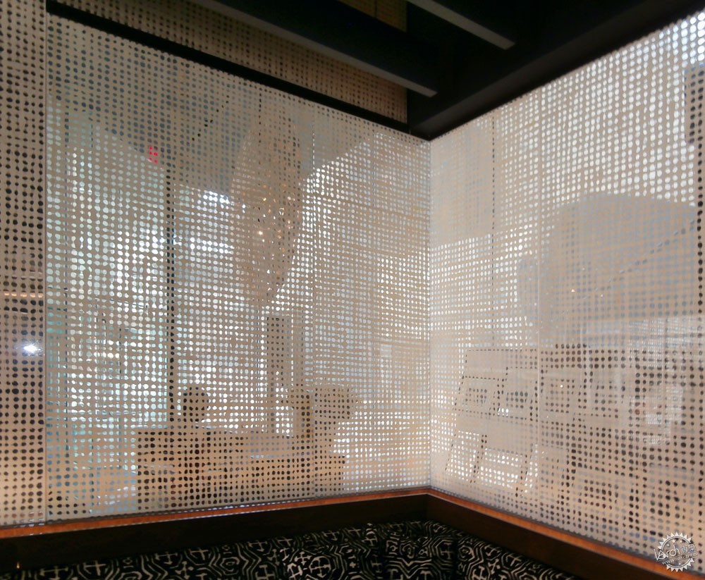
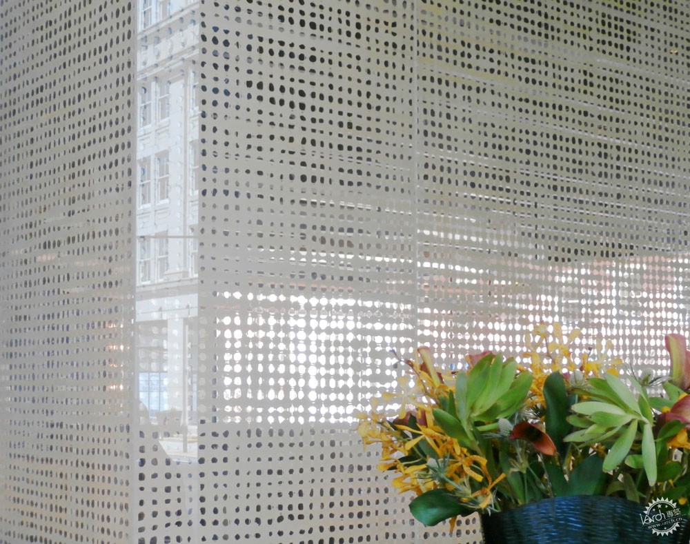
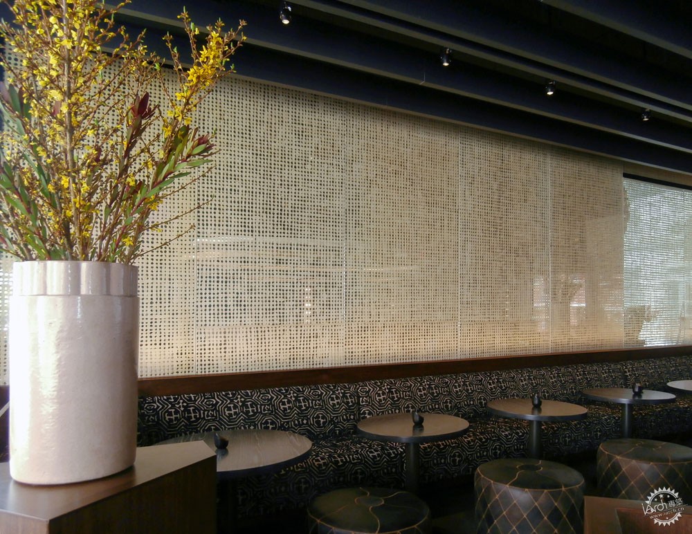
Volver Restaurant. Image Courtesy of Bendheim


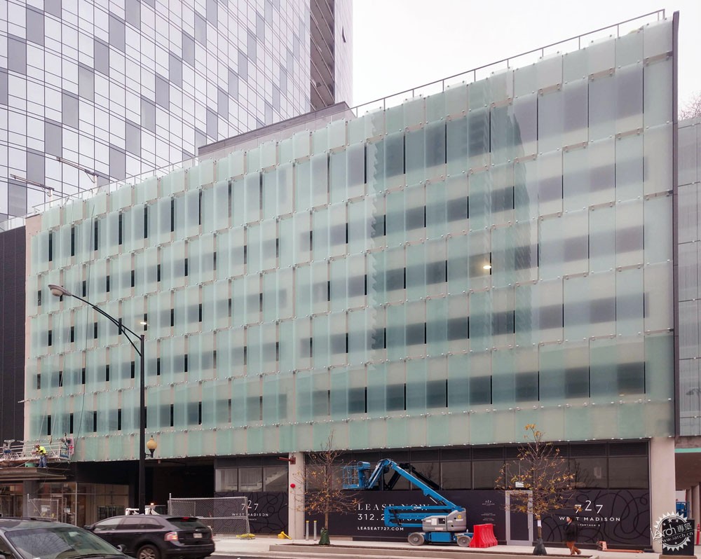
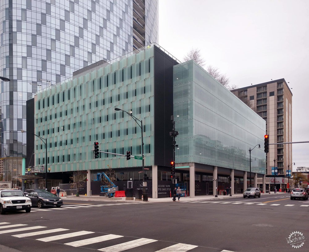

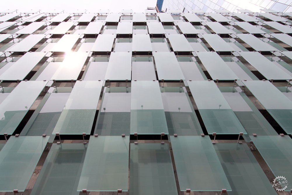
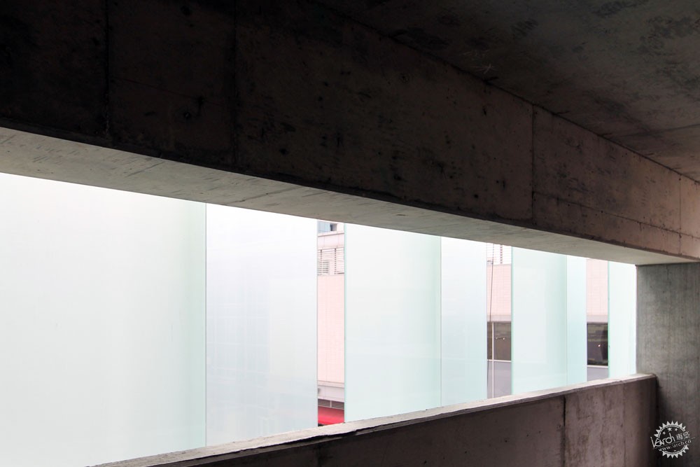
1 South Halsted Parking Structure. Image Courtesy of Bendheim
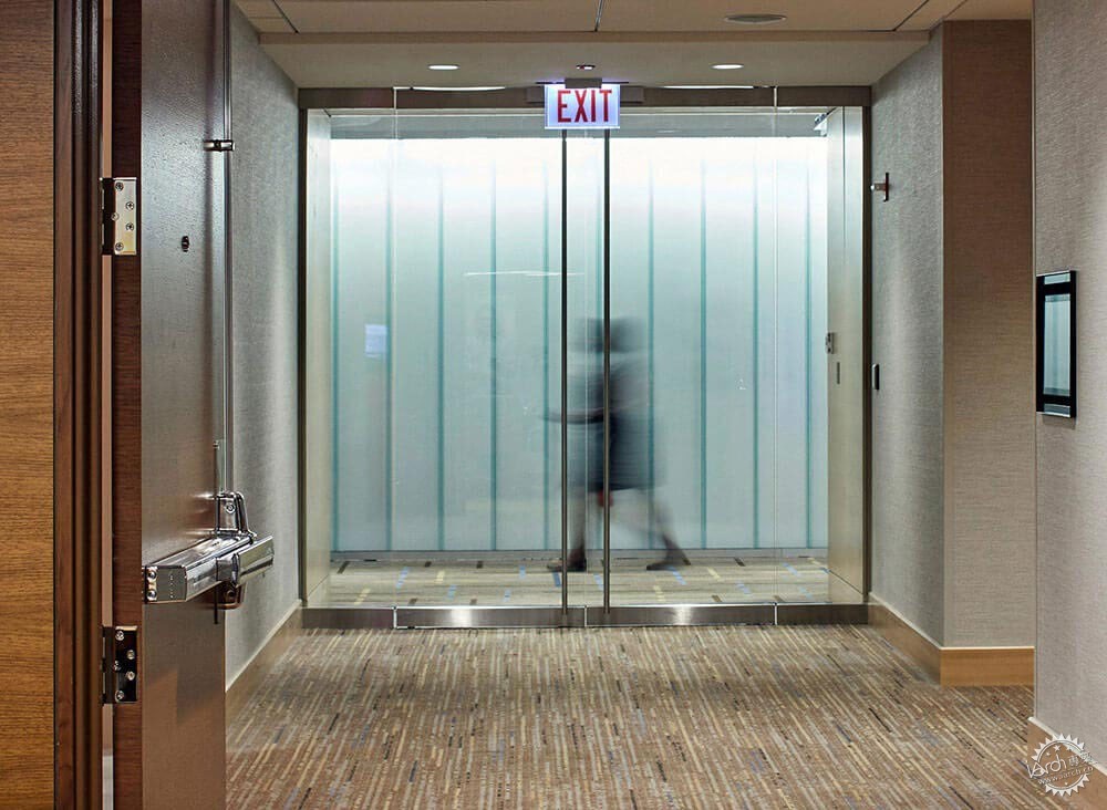
Hyatt Regency Chicago. Image Courtesy of Bendheim
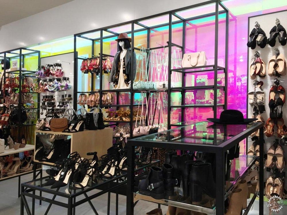
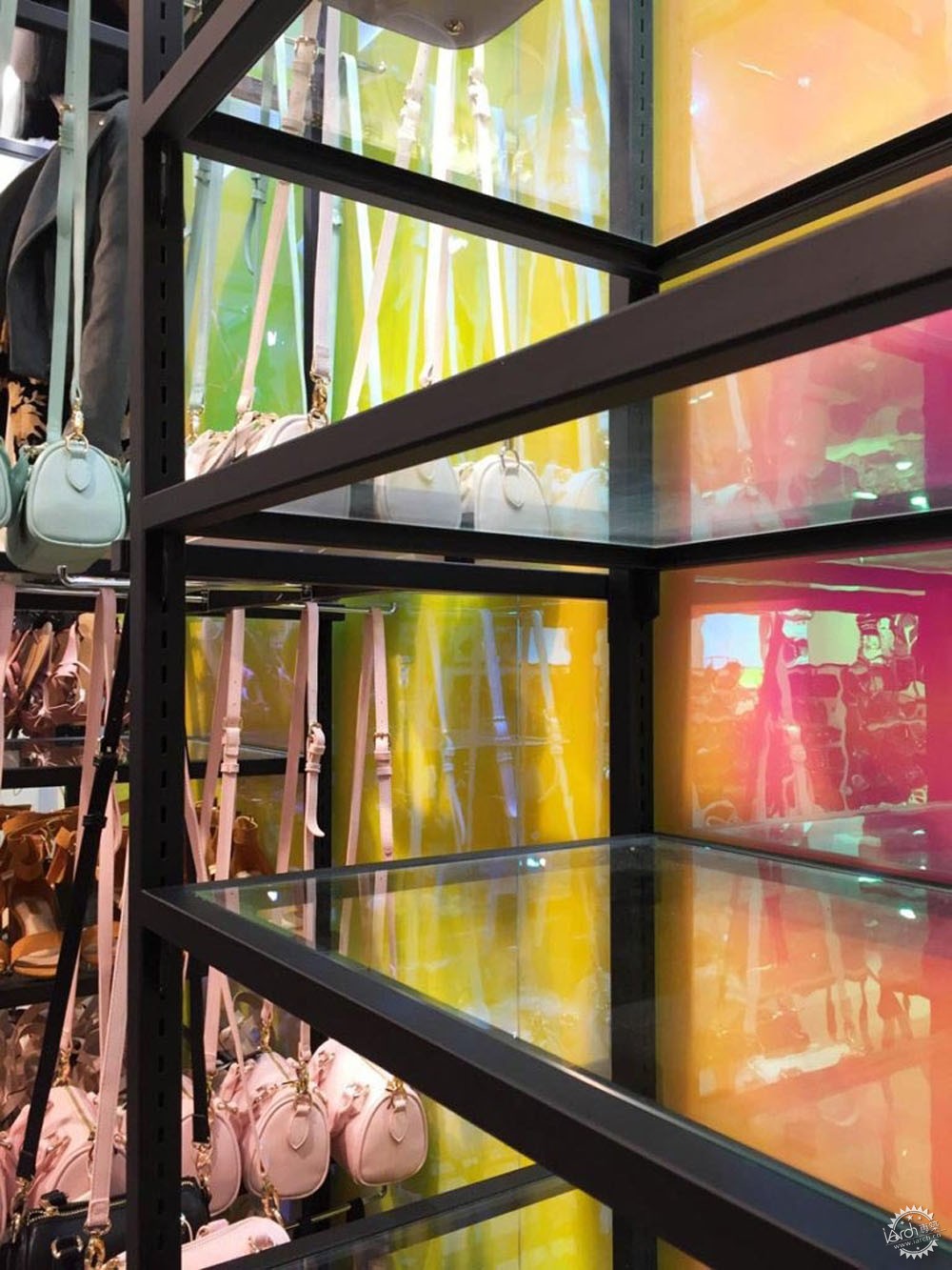
Fashion Retail World Trade Center. Image Courtesy of Bendheim
|
|
