项目说明:
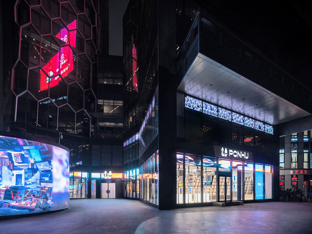
▲ PONHU奢侈品生活馆外立面
PONHU奢侈品生活馆,坐落于北京最繁华的潮流地——三里屯。作为新零售领域中致力于奢侈品“鉴定、回收、养护、销售”体系构建的专业平台,它的首家线下旗舰店在通盈中心顺利开幕,成为时尚新地标。该旗舰店由UNFOLDESIGN聿几空间担纲设计并落成,在近4个月的时间里,团队通过功能布局、动线规化、陈列载体、互动装置等内容的创意输出与呈现,用极具冲击力的视觉语言,有秩序的诠释了品牌理念和脉络。
Project Description
PONHU Luxury Lifestyle Store situated at the iconic fashion center of Beijing, Sanlitun, is devoted to transitioning PONHU’s online professional platform of identifying, collecting, maintaining and selling second-hand luxury goods into an offline brick and mortar retail center. UNFOLDESIGN was commissioned to design and build its first offline flagship store in Beijing. Within 4 months, the UNFOLDESIGN team designed and built a one of a kind retail store that interprets the brand idea through a fully functional layout via in-depth circulation programming, achieving product display exceeding +7,500 SKU requirement, utilization of modern retail technology, and implementation of interactive art installations with subversive visual themes that connect with PONHU’s clientele.
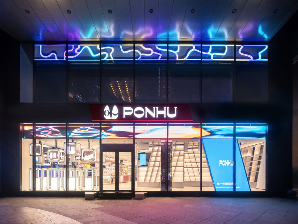
▲ 多媒体动态橱窗装置的应用
UNFOLDESIGN聿几空间将PONHU奢侈品生活馆定义为一个有态度的“中转站”。信息技术的不断更新,让奢侈品市场中的“二手流转”交易趋向标准化、数字化、透明化,随之而来的陈列场景、服务方式也必将打破传统,由“单一售卖”转向注重“价值”背后的收藏性、经典意义、分享性以及发烧友之间的共鸣。
UNFOLDESIGN re-defined the ‘second-hand retail shop’ into a ‘transit station’ with modern interpretations of shopper’s trending ‘attitudes’. In doing so, the traditional luxury retail design and service models had to be deconstructed and reconstructed based on the following focal points: ‘collectibility’ - retaining the value of goods through transparency in service and design; ‘cultural significance’ - the creation of themed zones that reduce the psychological of ‘barrier to purchase’; and enhancement of ‘single item value’ - product display methodology to downplay the cost of goods while encouraging sells. In order to supplement these design elements, the store is also packed with technological retail tracking systems that make the second-hand luxury goods exchange process standardized, digital and transparent.
“中转站”的概念被放大延伸,从箱包、腕表、饰品等物体的物体流通,过渡至情绪、城市、文化、艺术的交融转换。于是,店铺的入口、动线、分区与打卡装置,均采取穿插设计,制造出大量停留区和互动点位,以主题化的形式调动人们的感官。
The concept of a luxury good ‘transit station’ implies a facility that is primarily used for the purpose of loading, unloading, or accommodating the movement of passengers (at the store, the passengers are the second-had goods, such as bags, watches, jewelry and art) from one mode of transportation to another (transportation being the customers). The design team supported the setting in which the second-hand goods are sold through the juxtaposition of spatial features that exudes the transformation of emotions within city lifestyle, culture and art. As a result, UNFOLDESIGN created rendezvous points through time and space that enhance the patron’s senses in the form of shopping, resting, observing and interacting.
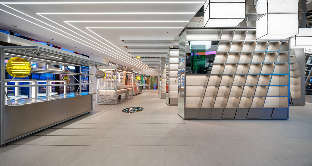
设计之初,UNFOLDESIGN聿几空间对周遭人流量、街道方位、商业体关系做了充分的调研与评估。1、2、3号街面入口,通过不同的尺度关系、形式感吸引客流,将临街商铺的优势发挥到最大;4号室内入口与购物中心相通,提升便利性、补充动线连接。值得一提的是,街面三个入口经由“橱窗+多媒体艺术屏”的串联,在动态光影的作用下,直观且有效的传递了品牌的摩登质感、行业前瞻性与科技渗透性。
From the onset of design, UNFOLDESIGN conducted a well-rounded study of customer circulation, particularly the positioning of street-side entrances and their relationship with public traffic flow. Entrances 1, 2 and 3 exert the advantages of street-front entrances, and are taken advantage of through the utilization of modern technology via ‘mechanical window display + multi-media art screens’. Entrance 4 is situated indoors and connected to the mall’s shopping corridor, a passage for convenience, interconnecting the street to the rest of the shopping center.
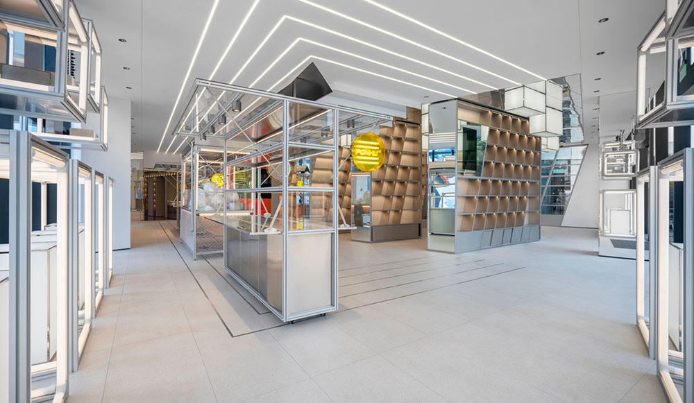
▲ “市井文化”主题区域
1200平米的室内空间,分别以“市井文化”、“精密制造”、“娱乐体验”、“精神堡垒”、“科技洞察”为创意出发点,阐述“中转站”内所囊括的各类元素。而每一个区域均对应了不同的雕塑、装置设计,拓展社交属性的同时,制造出更紧密、回旋的场景动线。
The 1200㎡ indoor space includes 5 themed spaces: ‘Civil Culture’, ‘Precision Manufacturing’, ‘Entertainment’, ‘Spiritual Fortress’ and ‘Glimpse of the Future’. Each area corresponds to different design devices and sculptural features, with social attributes for intrapersonal connectivity, which creates a dramatic but lineal storyline that enhances the shoppers’ experience.
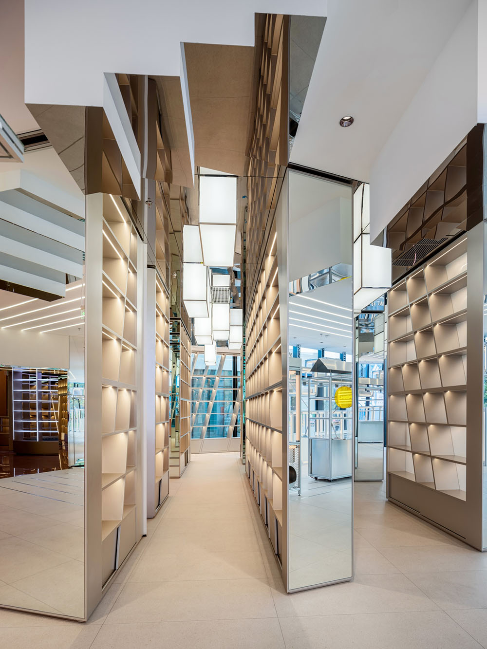

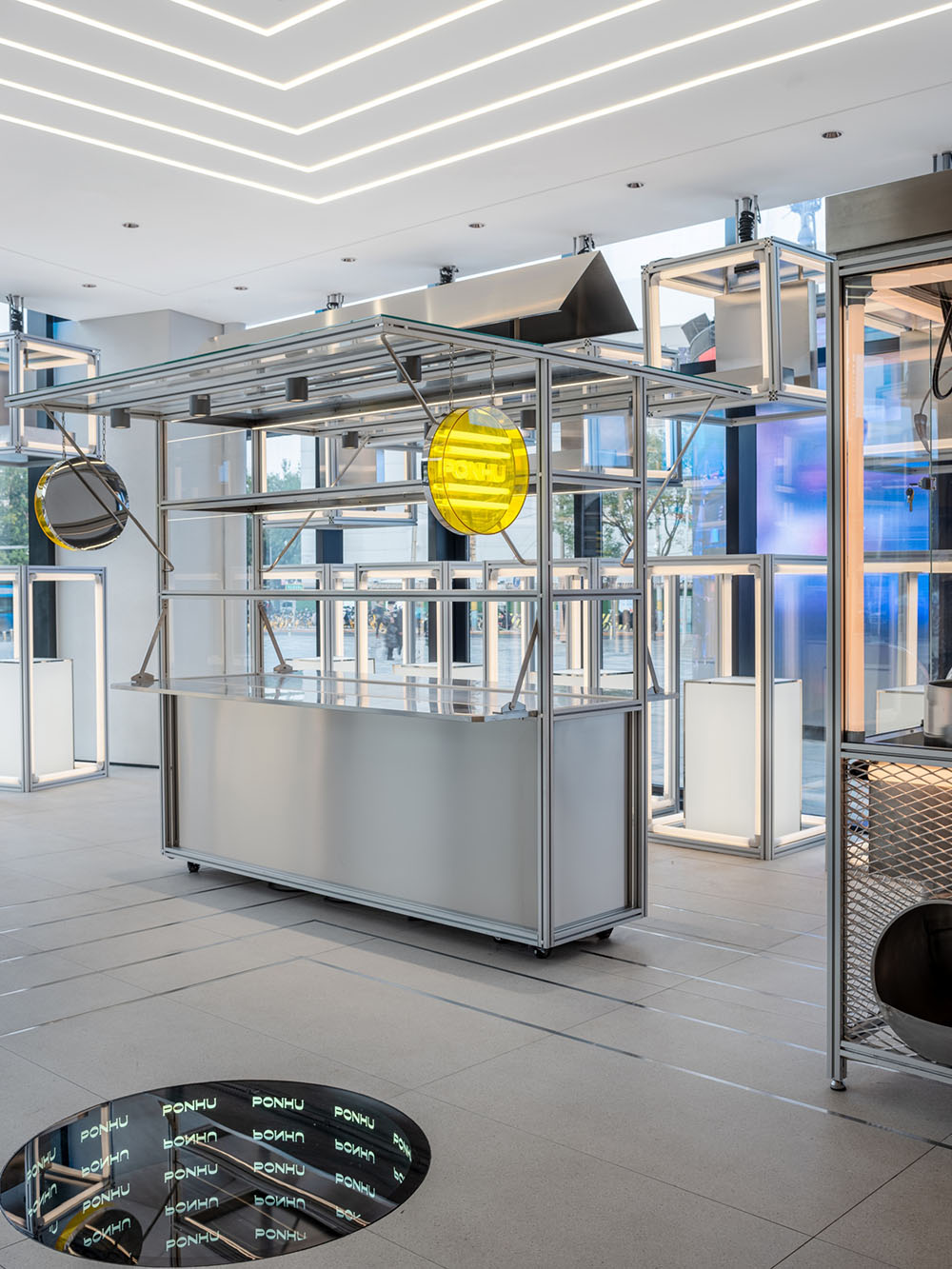
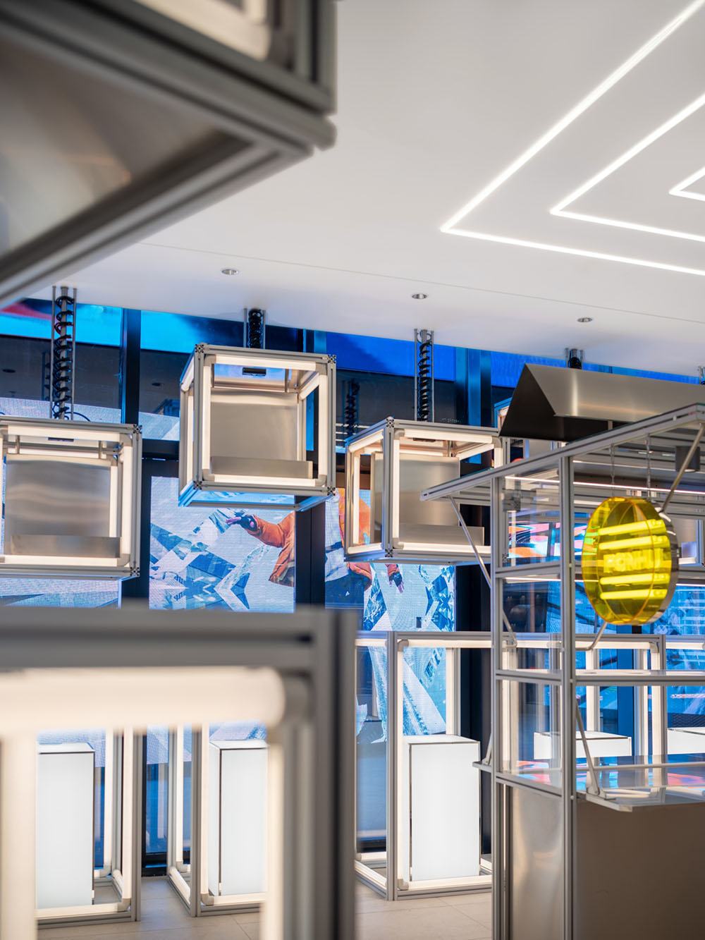
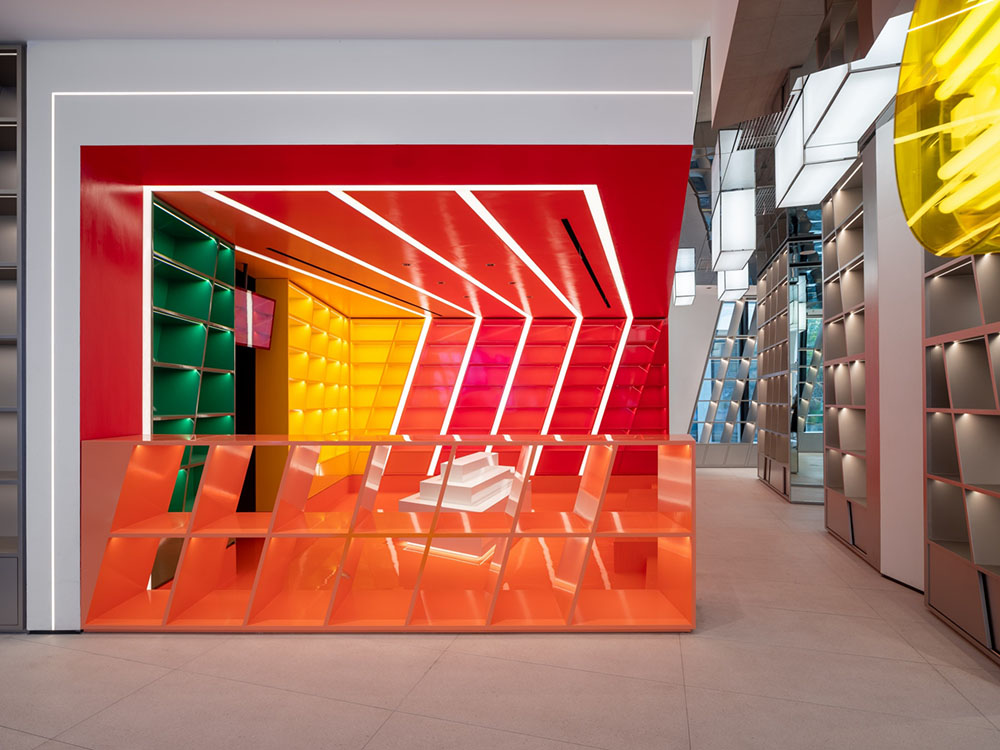
▲ “市井文化”主题区域
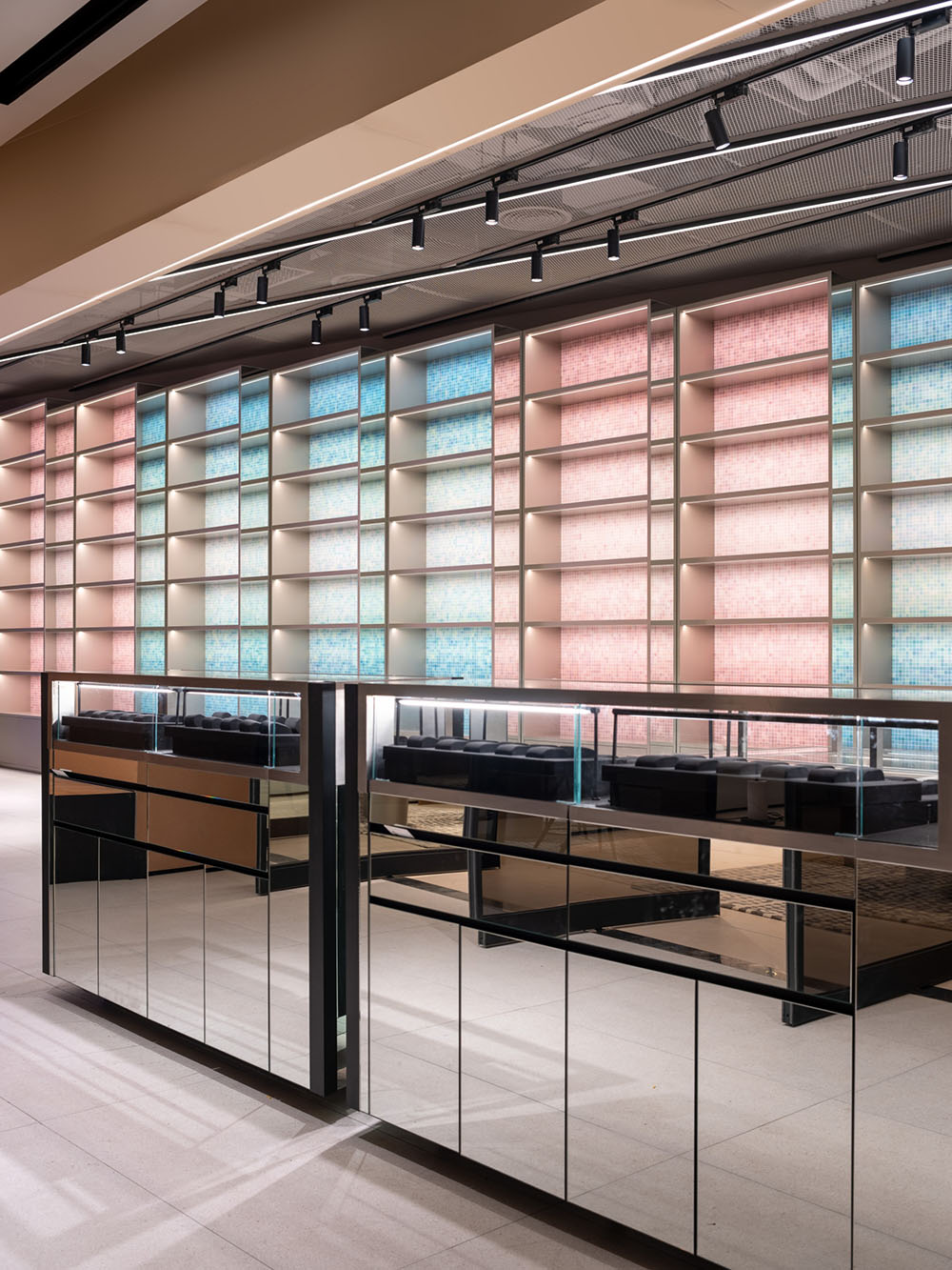
主入口处,市井文化的亲切与嘈杂被抽象演化。密布的货架仿佛阡陌纵横的街道;林立其中的抓娃娃机,如同小巷的贩卖档口,烟火气十足;镜面不锈钢、几何灯箱与彩虹陈列墙,渲染出热闹的夜市景象。高性价比的单品在这个区域以堆积、平铺的方式摆放,不经意间拉近了顾客与它们的距离,巧妙的去“奢侈化”,让人们回归集市与价格博弈的乐趣。
At the main entrance, the intimacy and bustling street market culture are abstractly evolved from the ‘Civil Culture’ themed space. Dense shelving is purposely designed to reflect the crisscrossing streets with monumental ‘buildings’ of product display. There is a customized doll catching claw machine and mobile display fixtures that reflect hawker stalls in city alleys; assembled through the use of extruded aluminum, stainless steel, and geometric lightboxes. In addition, the space is accented with a rainbow display wall to simulate the vitality of a night market. The methodology used by UNFOLDESIGN to display products in this area is intentionally implemented to break down the barrier between customers and luxury products, giving the customers opportunities to unconsciously draw closer to the products. The label of ‘luxury’is downplayed in the area, but it encourages patrons’ desire to play and bargain hunt in the most traditional sense of a marketplace.
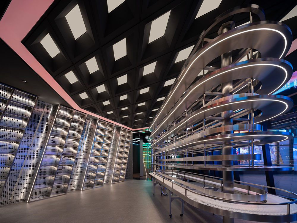
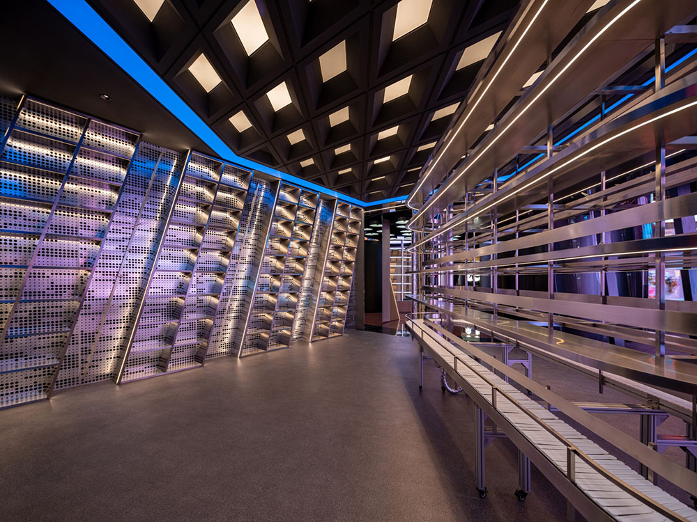
▲ “精密制造”主题区域
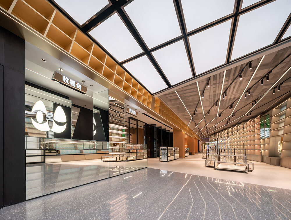
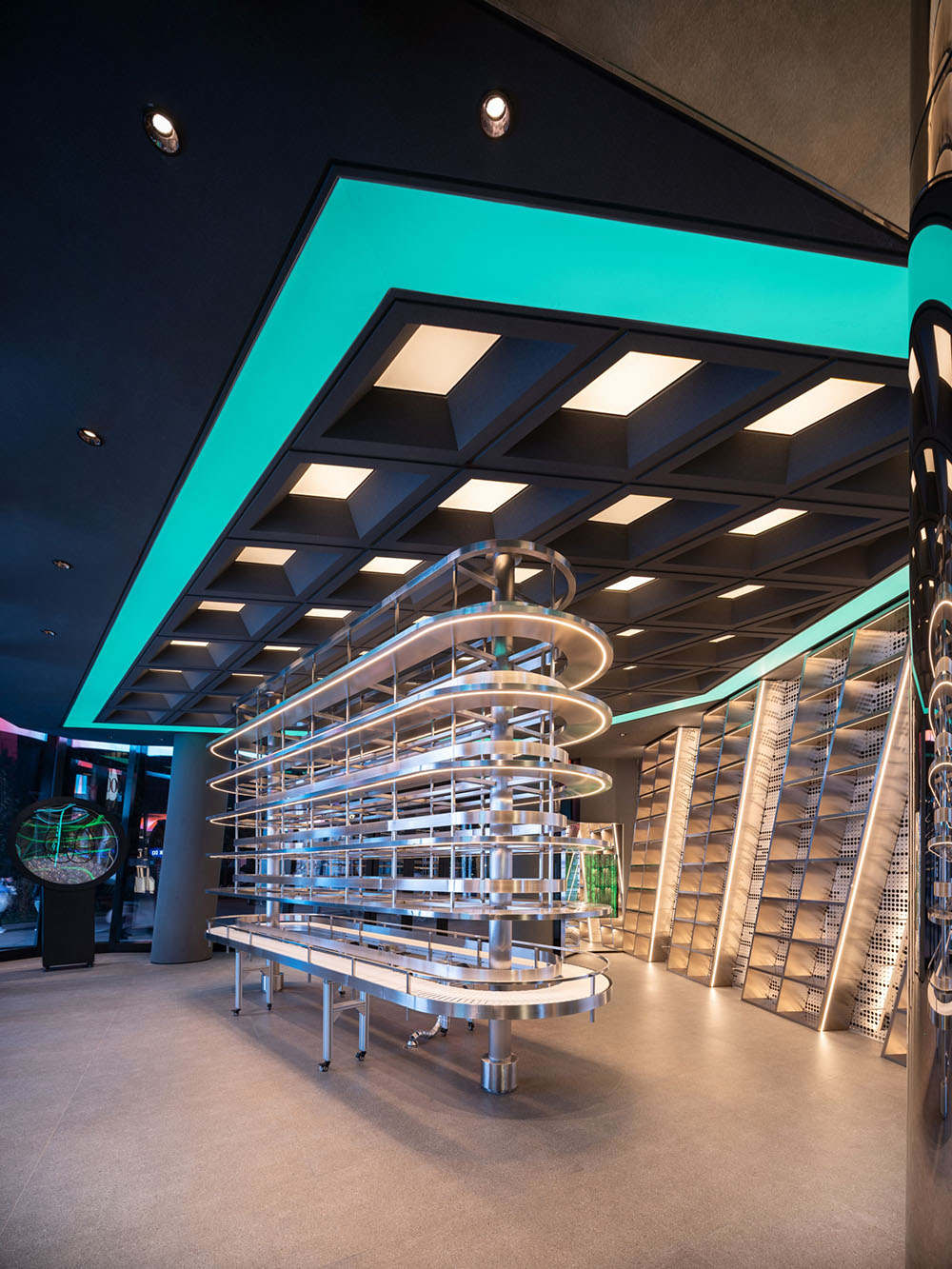
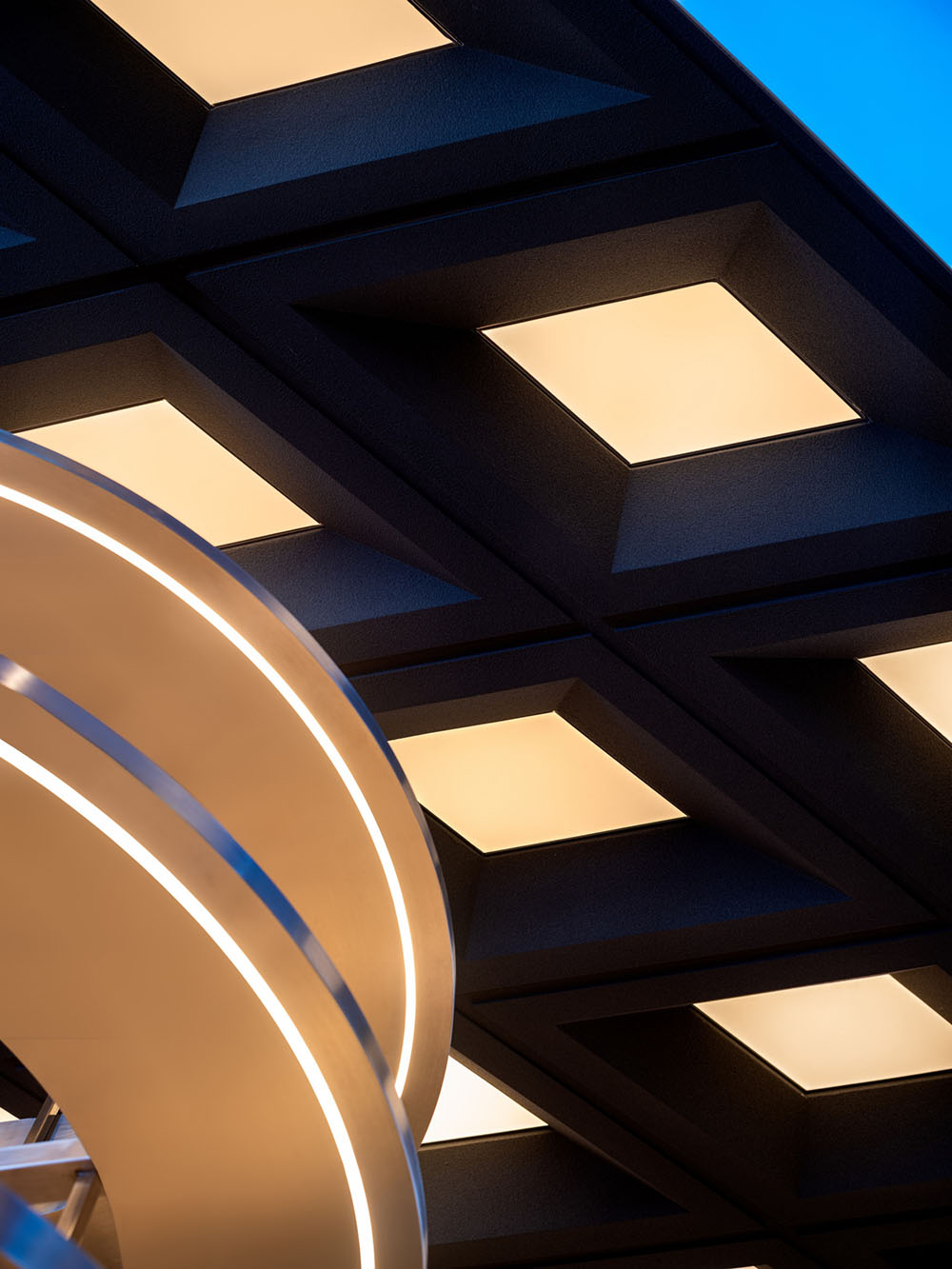
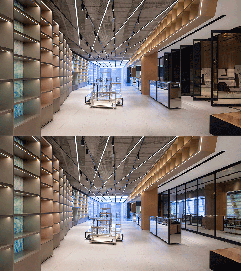
每一件奢侈品,都是技艺与精工的结合。“精密制造”主题区利用金属货架、回形传送装置、矩阵光带,演绎了对极致的追求。设计团队为选取了大量的冲孔金属板、灰色地砖、深色几何天花,营造具有冲击力的单色调环境,并通过LED变光灯带的置入,模拟精尖机械的速率,表达循环往复的流转意义和极致经典的价值。
Traditionally, luxury goods are produced through a combination of skilled and precision workmanship. ‘Precision Manufacturing’ themed area conveys the pursuit of perfection by using brushed stainless steel shelving, revolving conveyor belt mechanical installation, and color adjustable lighting features. The design team selected a customized perforated aluminum panel as the backdrop to the feature wall with dark stucco walls and geometric ceiling, and rough terrazzo replica floor tiles to create a monochromatic environment with strong visual impact. Through the movement of mechanical features surrounded by monumental stainless steel elements, the technological vibe of precision manufacturing is expressed through touch, sound and sight.
▲ “娱乐体验”主题区域
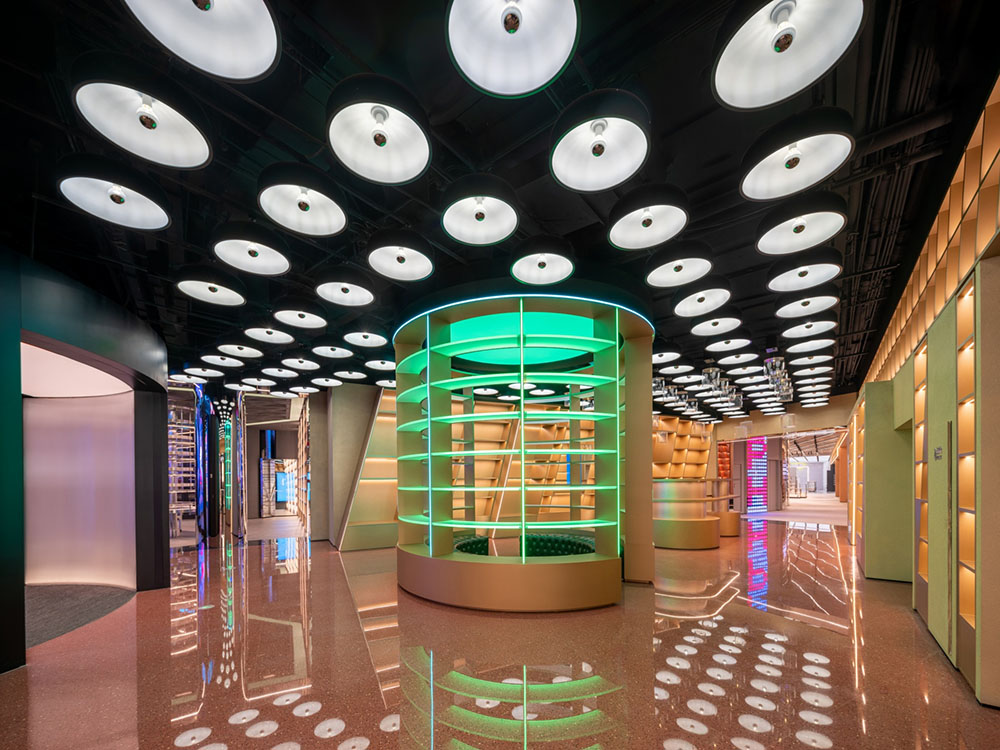
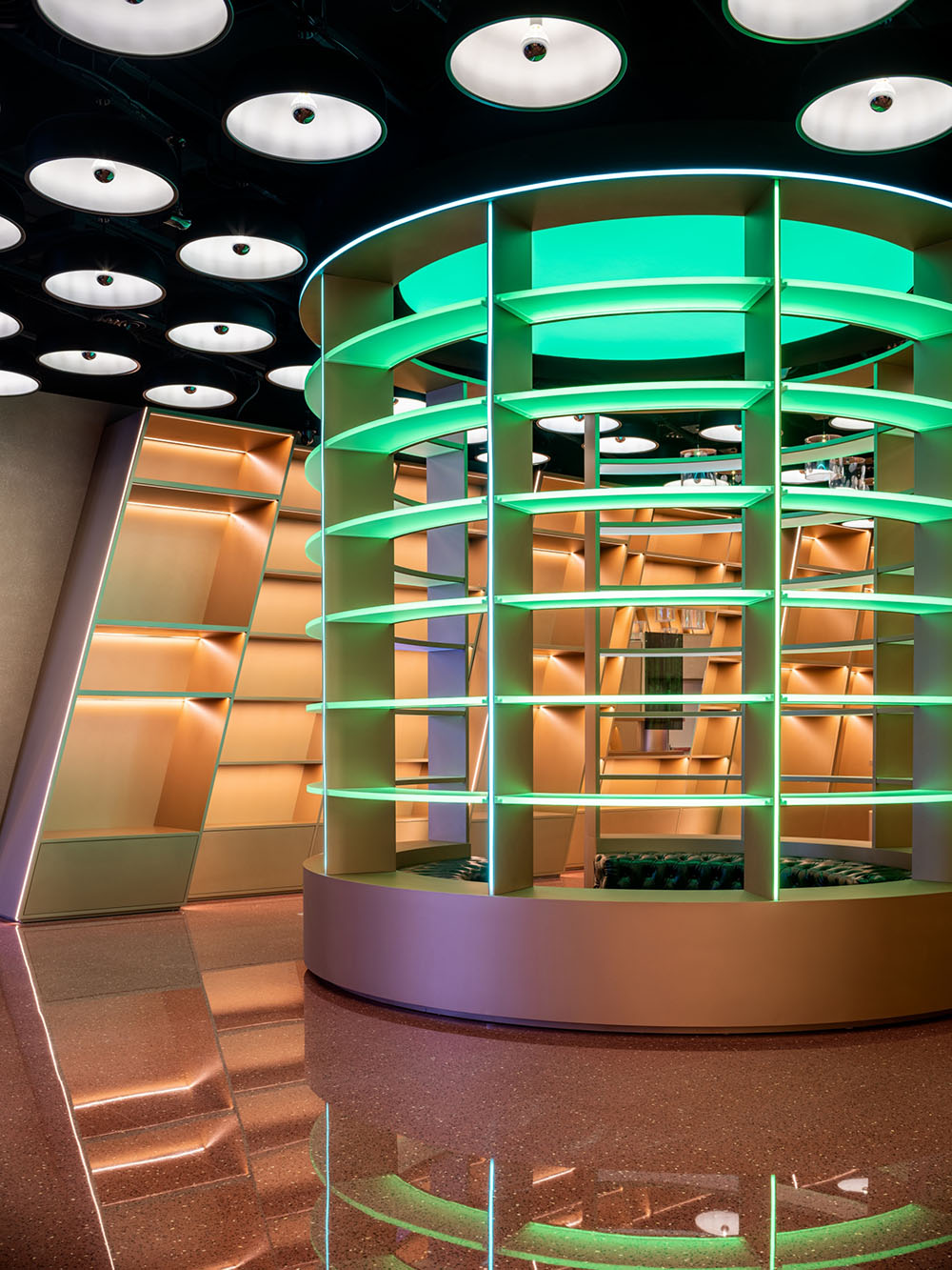
相邻区域里,涡轮卡座、动态天花装置的出现,形成一个枢纽中岛,成为室内动线的汇集处。时髦潮玩、悬浮包袋在霓虹光影的烘托下,描绘出大都市的“娱乐体验”。
In the adjacent area, the emergence of a turbine-shaped display booth and dynamic ceiling device form an island in the hub, which becomes the gathering place for indoor circulation. Collectible toys and dynamic floating bags depict the entertainment experience of a metropolis under the backdrop of color-changing light features and shadow.
▲ “精神堡垒”主题区域VIP室
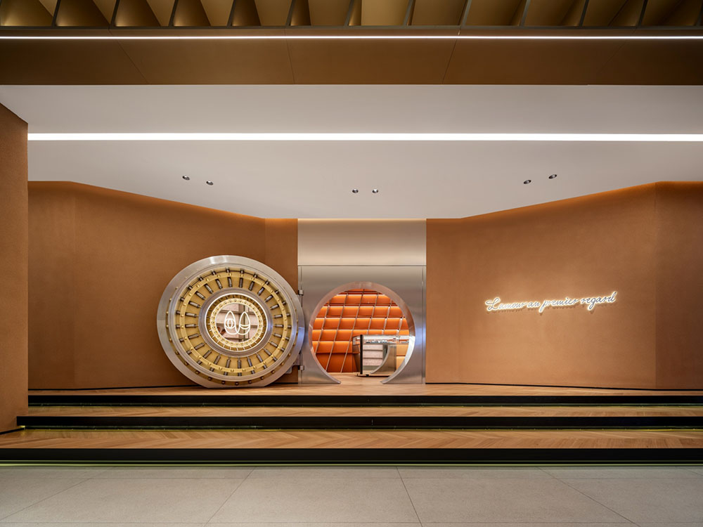
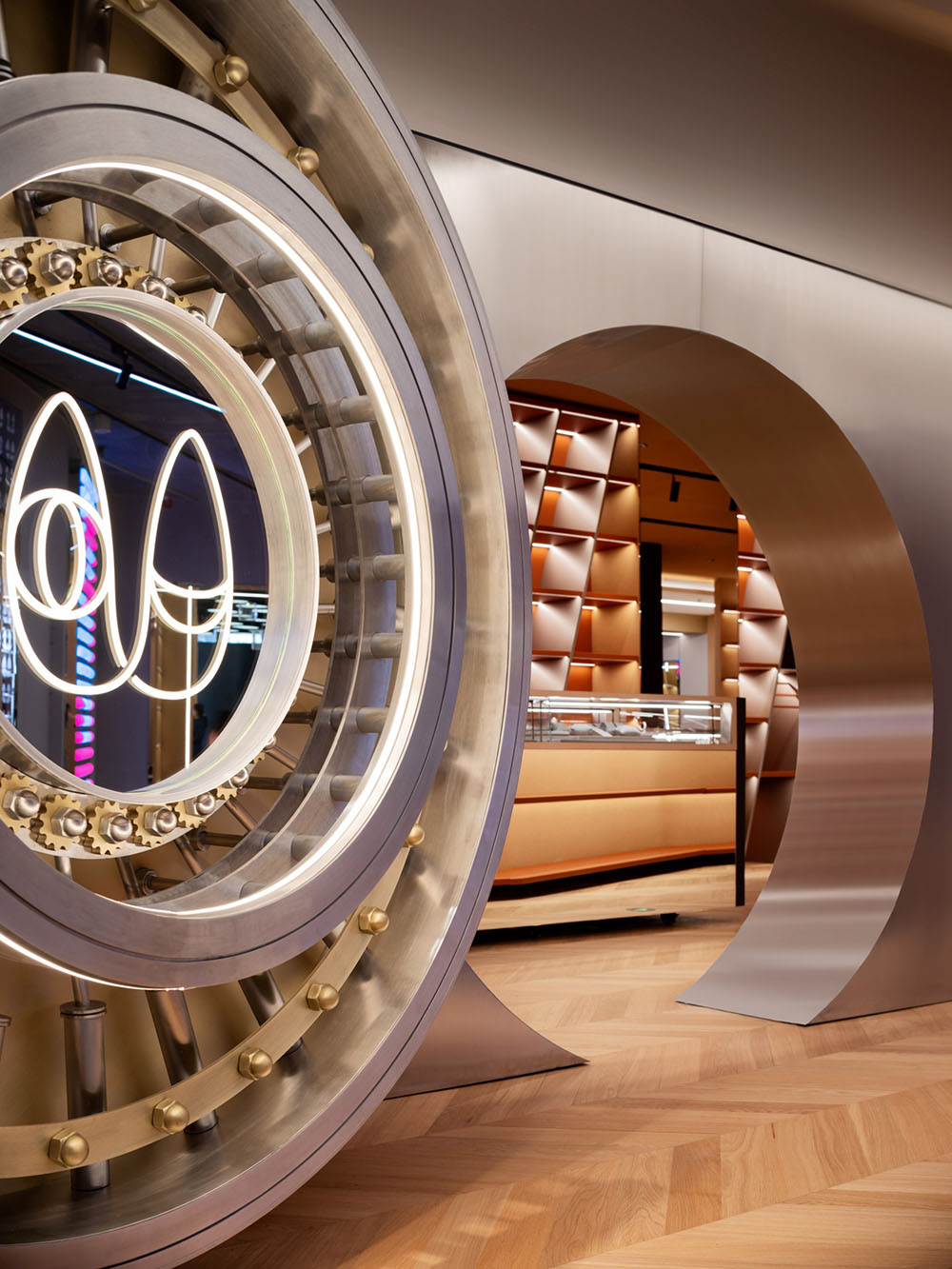
▲ “精神堡垒”主题区域金库门装置
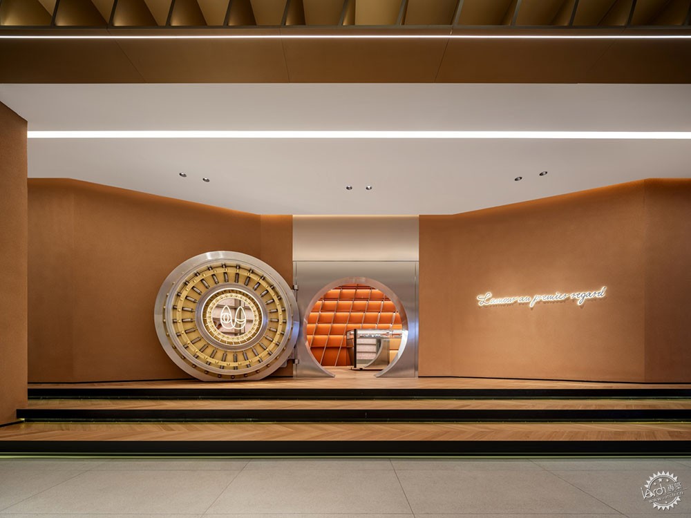
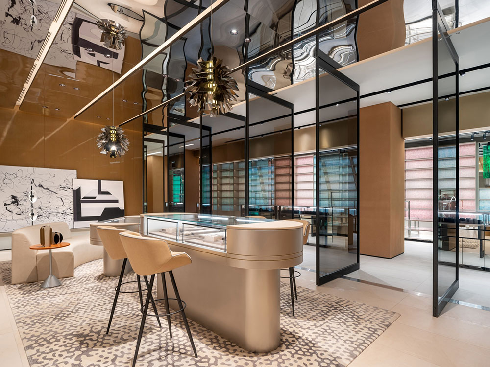
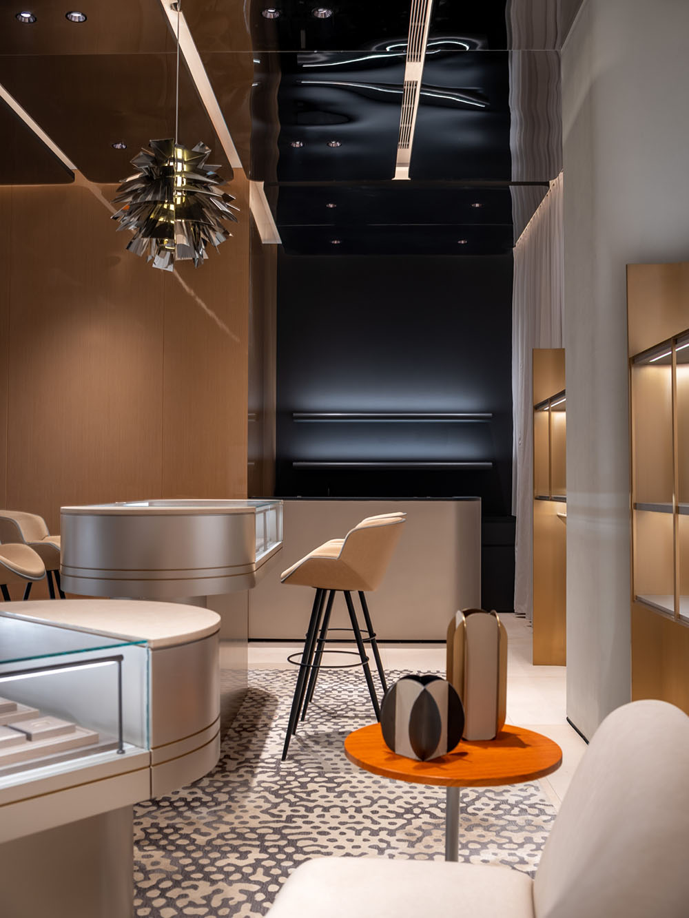
前端瑰丽的场景引人驻足,而后端更深层次的空间,则为美学爱好者、收藏家、资深潮人提供了更专业的探索地——拆解鉴定区、限量款及珠宝腕表鉴赏区、VIP沙龙区、保养修复区、回收区等。这些区域从“精神堡垒”、“科技洞察”的角度出发,注重仪式感与氛围塑造,通过纯净的沙丘色与银调质感,以及金库圆门、像素艺术装置、太空公仔形象等元素,营造一种不被打扰的、专注于精神层面的沉浸式体验。
The magnificent scenes described above are all along the street side which attracts people's attention, but as you funnel towards the back of the space, it becomes catered towards a virtuoso’s exploration. There are a series of spaces with limited edition products, jewelry and watches, along with VIP salon, certification and recycling booths. These areas are inspired by the themes of ‘Spiritual Fortres’ and 'Glimpse of the Future’ and designed to create an undisturbed and immersive experience through rammed earth colors, silver texture, vault door, pixellated art wall, fiberglass robot and other elements.
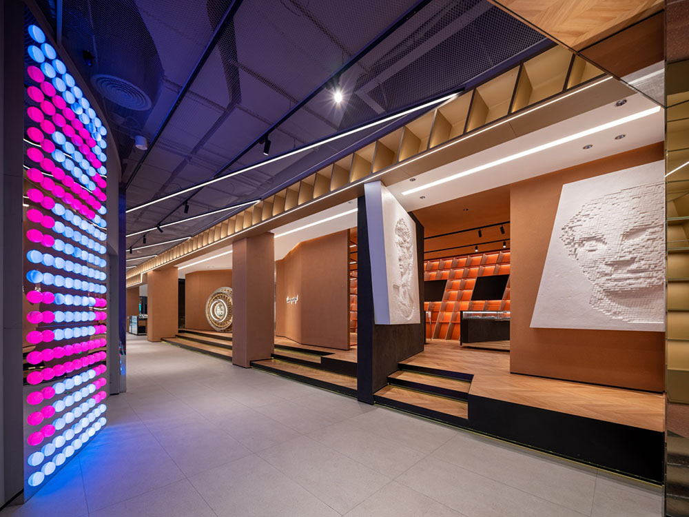
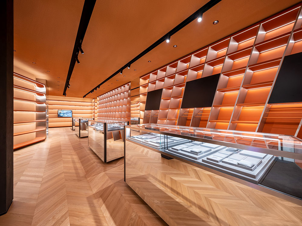
▲ “精神堡垒”主题的沙丘色调氛围
品牌理念与故事的贯穿,展现了PONHU奢侈品生活馆感性的一面,而其背后,是UNFOLDESIGN聿几空间一系列理性经验的支撑:从高效的成本与时间管控,到合理的展示坪效分配、客流动线、通道距离,甚至是仓储体系及安保系统、光与温度对产品展示的影响、背景音乐氛围等环节的设计,都建立在对品牌的精准剖析和理解之上。
All the themes in the space were developed to ensure the penetration of a new PONHU brand story allowing for better emotional connectivity with its customers. The design itself, along with the process, was supported by a series of rational planning by UNFOLDESIGN to ensure a precise portrayal of the new offline PONHU brand: cost and time control, area-effectiveness planning, customer circulation, distance and time consideration between entrances, storage and security system, proper dynamic lighting control and respective color temperature usage based on desired product display quality, and background music selection to support theme captivation.
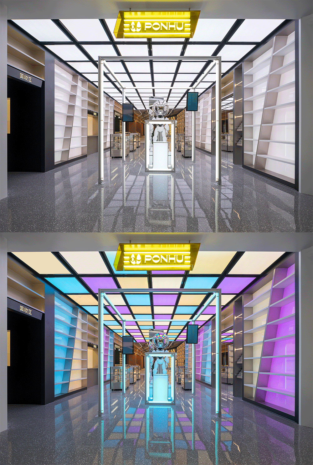
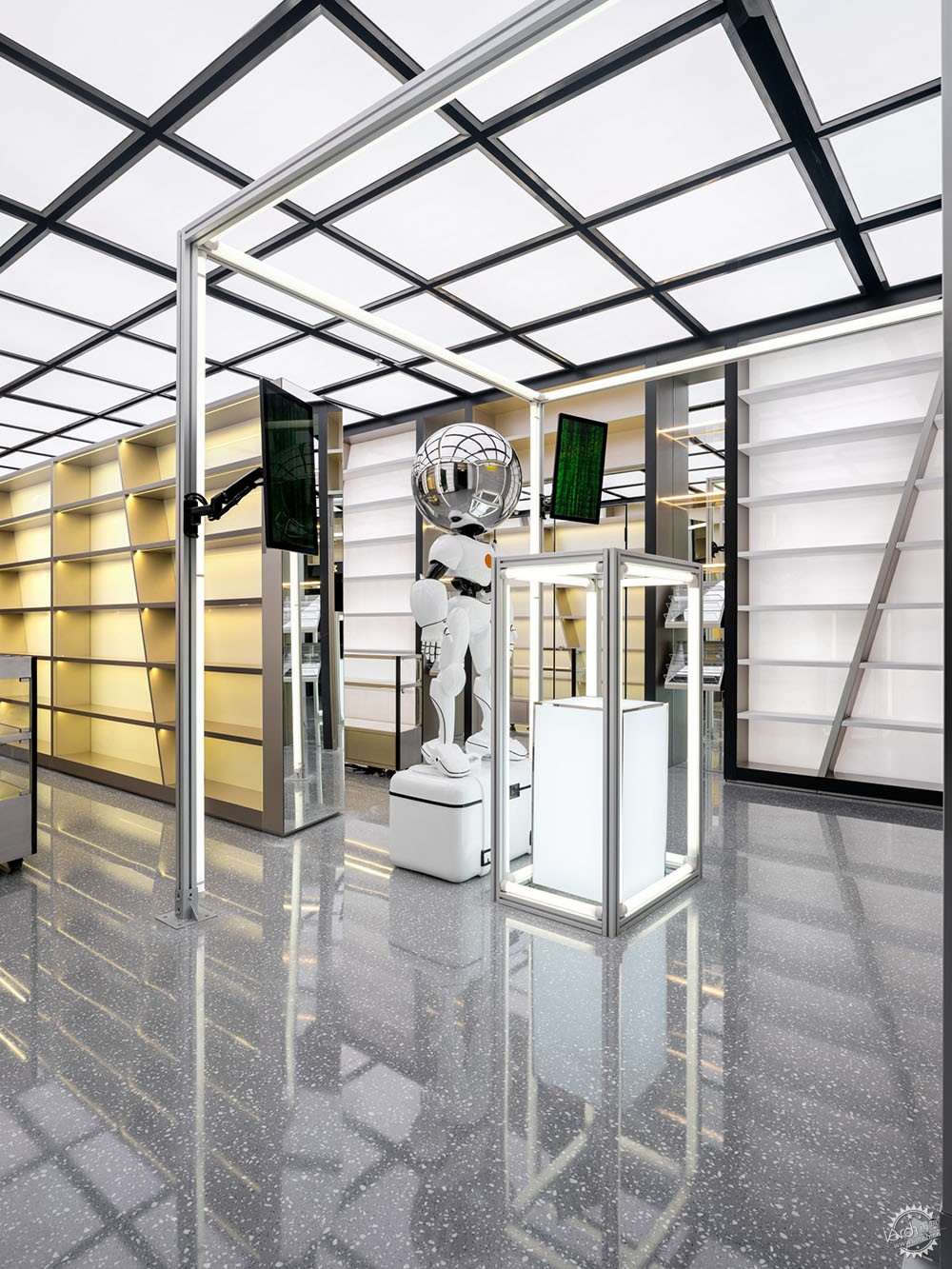
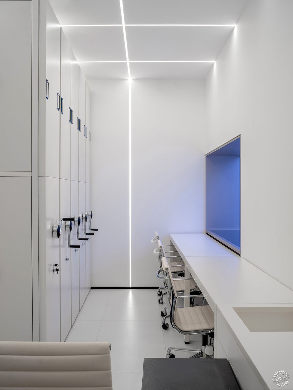
▲ “科技洞察”主题区域的银色调氛围
在“展示结构”与“科技植入”方面,设计团队利用层高、非常规货架系统,创造了海量SKU的陈设可能性,模块化的实现了产品分类、分档、分价的展示需求。倾斜且连贯的货架,具有瀑布般的流动性和引导性,结合丰富的动线,大大提升了人们的浏览兴趣,相较常规展厅增加了近3.5倍的停留时长。
For example, the design team takes advantage of the height of space and irregularly shaped shelving system to achieve the display of massive SKU quantity and distinguish product by category, status and price. The diagonal shelving units were designed to provide visual directional purposes which unconsciously guide the customer towards preplanned directions.
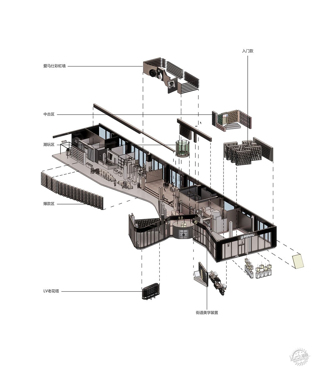
▲ 各主题区域代表装置与道具
与此同时,考虑到品牌方的“线上+线下”双运营机制,“热点感应技术”与“测算分析系统”被隐藏于空间的天花结构中。通过数据捕捉和分析,后台可以得到顾客在每个区域的停留时间、每件商品的取放频次,以此回馈于品牌的线上营销端口,为每日闭店后在场地内进行的直播内容,提供更具参考意义的信息。
In addition, to ensure the cohesiveness of an online-offline operation model, UNFOLDESIGN had to ensure the store itself is not only aesthetically pleasing but also data-driven. Modern retail technologies have been used throughout the store such as hot spot circulation sensors, online remote management, and customer counting has been taken to the next level as passerby customers (prior to the entrant to the store) can also be quantified. Post-occupancy goals have also been established to ensure periodic adjustments to future product staging are to be based on analytical data. Such feedbacks are also supported through online marketing channels because the store is used for live streaming sale after normal mall operation hours. This store currently increased its sales duration to 20 hours a day, and almost doubled its revenue per area via its connectivity between online and offline.
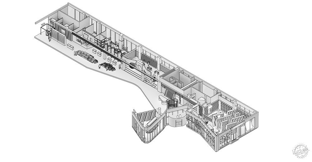
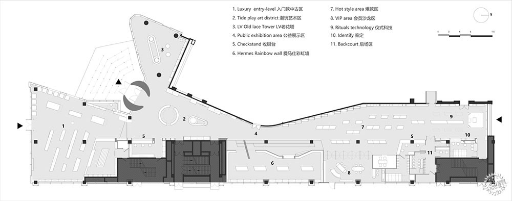
▲ 平面布局
设计的层面不仅仅停留于场景,UNFOLDESIGN聿几空间希望借助时代的触角,重新梳理人、物之间的价值关系,时空、情感、物品之间的交流模式,让商业体从单纯的售卖属性转向一个多元化的载体,帮助品牌洞悉和挖掘更多内在潜质,开拓自由度,从容应变未来市场与机遇。
The design intent of this project is not limited to just the physical space. UNFOLDESIGN hopes to take advantage of modern technology and the advantages of social media to redefine customer value by exploring the relationship between people and objects, and communication mediums between time, space, and emotions. These ideas may turn a traditional brick and mortar retail store into a ‘transit station’ that reaches far beyond the idea of purely selling goods but to help retailers explore new retail omnichannel potentials to respond to the challenges and opportunities of the future retail market place.
项目名称:PONHU奢侈品生活馆
项目位置:北京
项目业主:PONHU胖虎科技
项目类型:新零售空间
设计公司:UNFOLDESIGN聿几空间
设计团队:Joseph Chieng, Queena Qiao, Dereck Zhang, Yang Li, Chris Yao
项目面积:约1200 m2
设计周期:2021.07 – 2021.08
施工周期:2021.08 – 2021.11
项目管理:UNFOLDESIGN聿几空间
项目施工:UNFOLDESIGN聿几空间
空间主材:镜面不锈钢、拉丝不锈钢、冲孔金属板、水磨石、微水泥、环保艺术漆、木地板、定制图案壁纸、定制硅藻泥、定制灯饰、玻璃钢艺术装置、RGB W LED
项目摄影:湛影工作室
LOCATION: Beijing
CLIENT: PONHU
TYPE: Retail Store
DESIGN STUDIO: UNFOLDESIGN
DESIGN TEAM: Joseph Chieng, Queena Qiao, Dereck Zhang, Yang Li, Chris Yao
PROJECT AREA: 1200 m2
DESIGN PERIOD: 2021.07 – 2021.08
COMPLETION: 2021.11
MATERIAL & BRAND: Mirror stainless steel, Brushed stainless steel, Pre-perforated metal sheet, Terrazzo, Micro cement, Art paint, Wood floor, Custom-made wallpaper, Diatom mud, FRP installation, RGB W LED
PHOTOGRAPH: ZHANYING Studio
来源:本文由UNFOLDESIGN聿几空间提供稿件,所有著作权归属UNFOLDESIGN聿几空间所有。
|
|
