©存在建筑

标准商业体的一次非标准改造
Non-standard Renovation of Standard Commercial Complex
©存在建筑
在近 20 年的地产浪潮中,商业建筑已经形成一定程度的标准设计范式。这些追求资源集约管理与高效利用的范式在当时的经济环境中并无不妥。然而较长的建造周期使这些商业规划在多年后落地时却要面临早已变化的市场环境。此时的人们正为了适应新的变化,重新进入了一段非标准化产品不断涌现的探索时期。体验性,文化认同,创意表达都成为了潜在的新诉求。因此现存场所的进化便成为亟待解决的新课题。本案所探讨的正是基于新需求下的空间机能重组,不盲循固有范式,让场所回归其应有的属性。思考如何在现存的秩序中植入一行轻量的“代码”去盘活整个社区的商业生态。
In the recent two decades of real estate development, commercial buildings have adopted a certain level of standard design paradigm. These paradigms, aiming for resource-efficient management and effective utilization, were reasonable in the economic context of that time. However, these commercial plans are facing a market environment that has already evolved when they are implemented after a long construction period. People are currently exploring a period of non-standardized products, driven by new demands for experiential spaces, cultural identity, and creative expression. The evolution of existing spaces becomes a pressing new challenge. This project explores space functionality reorganization based on new demands, avoiding following standard paradigms but allowing places to reclaim their inherent attributes. The key consideration is how to insert a lightweight "code" into the existing order to revitalize the entire community's commercial ecosystem.

“从范式产品到特色街区”
From Paradigm Products to Characteristic Block
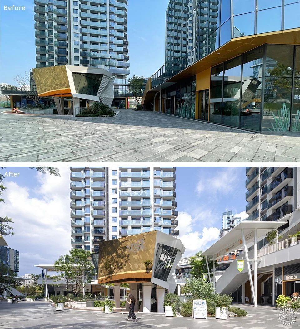
街区改造前后对比©未见筑、存在建筑
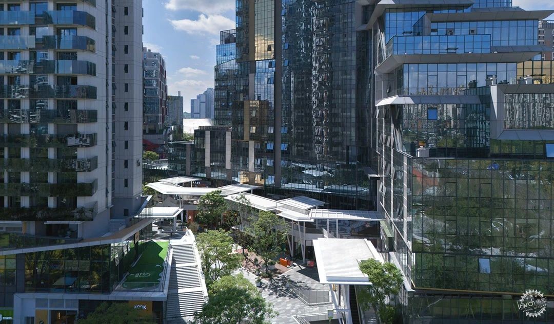
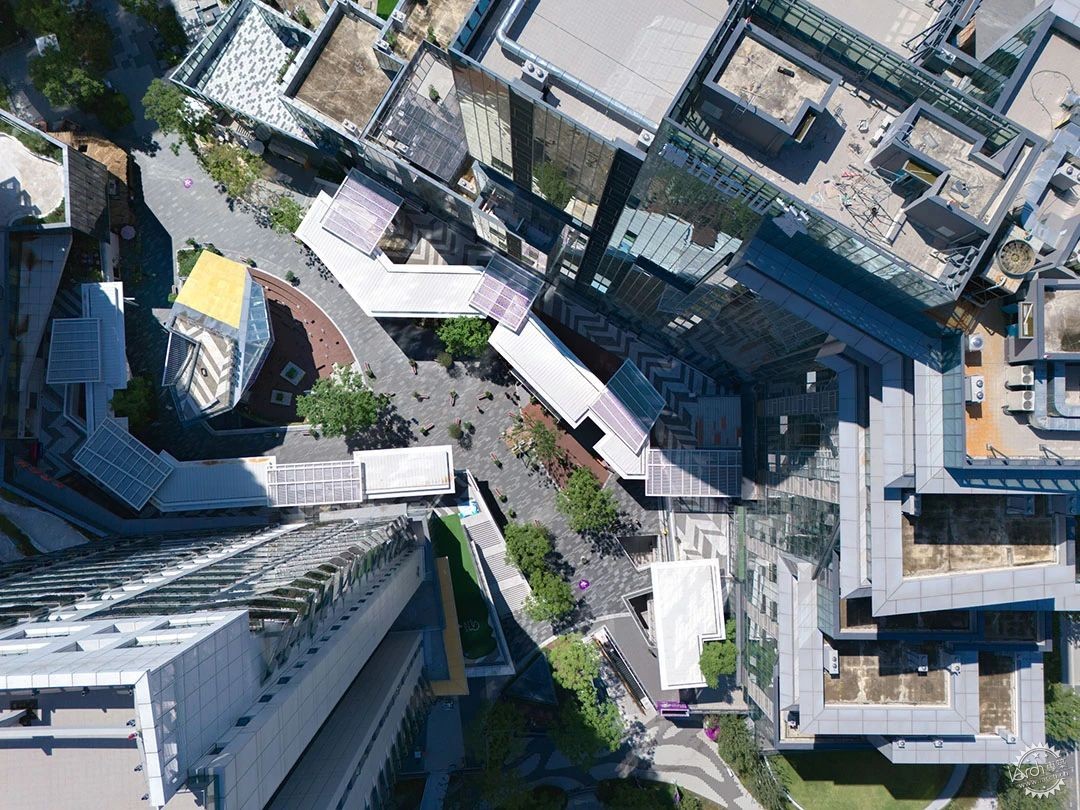
项目位于麓坊中心B馆,两栋塔楼的退台式底商在这里环绕成一处相对封闭的广场商业区。设计团队介入时,街区已接近完工。场域具有商业公建的诸多典型特征,开阔的楼间广场与二层露台,大面积不同颜色玻璃幕墙与多种颜色铝板运用,为了提亮大面积灰蓝色幕墙基底而进行的材料与色彩拼贴。
The project is located in the Block B of Luxe Zone, where two set back podiums of 2 towers form a relatively enclosed plaza commercial area. , The block was nearing completion when design team intervened. The site had typical features of commercial public buildings: open plaza areas between buildings and second-floor terraces, extensive use of colorful glass curtain walls and aluminum panels, and a collage of materials and colors to brighten the large areas of gray-blue curtain wall base.
©存在建筑
在商业改造项目中,既有建筑的情况各有不同,上一个成功案例的经验往往无法套用,设计团队在这一类项目中的工作并不仅仅是无脑听取业主方的建议直接开始着手设计,而是需要在为空间“治病”之前详细的进行“诊断”,找到空间问题的结症所在,进而采取有效的策略,才可以找到正确的设计手法。
In commercial renovation projects, due to the different conditions of existing buildings, the experience from a previous successful case often cannot be directly applied. The design team's work in such projects goes beyond blindly following the owner's suggestions and immediately starting the design process. Instead, it involves a detailed "diagnosis" before "treating" the space, identifying the main issue of the space, and then adopting effective strategies to find the right way.
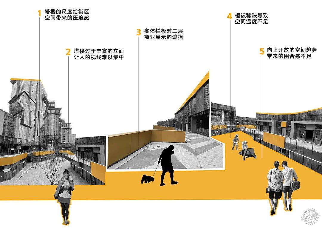
项目场地现状分析图©未见筑
在本项目开始的时候项目团队面临三个问题:
1. 要解决现状广场与露台空间的开放不聚气与消费行为所需要的聚合热闹在空间模式层面的差异问题。
2. 要修正现状街区上空商务冰冷的建筑立面与商业街区鲜活明快的需求在空间氛围层面所存在的偏差,
3. 回归到人的层面,标准化设计带来的可能性的缺失,使场地现状与“主理人街区”这一定位十分违和。
解决掉这三个问题,才有可能强化场所印象,使其有足够的能量成为麓湖诸多特色板块中的重要拼图。
The design team were facing three challenges at the beginning of this project:
1. On space mode dimension, the current square are open to the sky which doesn't fit the requirement to aggregate vibrancy for consumer activities.
2. On space atmosphere dimension, the current cold architectural facades doesn't fit the requirement of a lively and dynamic commercial area.
3. Back to people relations, standard design brings the lack of possibilies, which cause the current project stands far away from the idea of "Owner's Block"
Only by resolving these three issues could strengthen the place's impression, providing enough energy to become a crucial piece in the diverse puzzle of Luxe Lake.
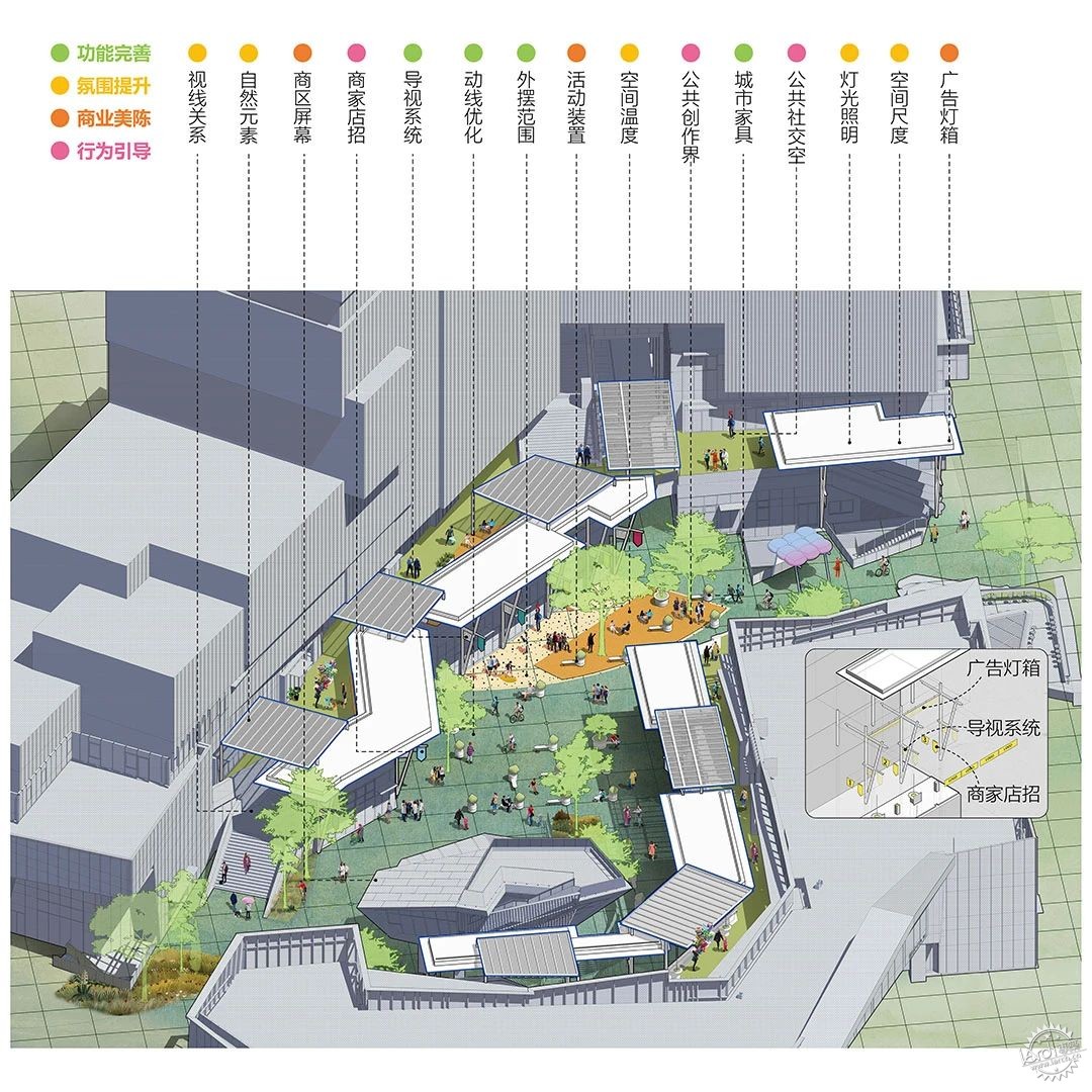
©未见筑

“主理人营地”
Owner's Camping Ground
在商业改造项目中,招商运营的前置是重要且必要的,建筑空间设计在这个时候应当作为商业意图的具象化体现。因此设计团队所有的行动都围绕 “主理人街区” 这一商业定位展开,并以此不断丰富空间设计的内容与边界。
In commercial renovation projects, the preposition of investment and operation is important and necessary, architectural design should be the physical realization of commercial intention at this time. Therefore, all the actions of the design team goes around the commercial positioning of the "Owner's Block", and in this way continuously enrich the content and boundaries of the spatial design.
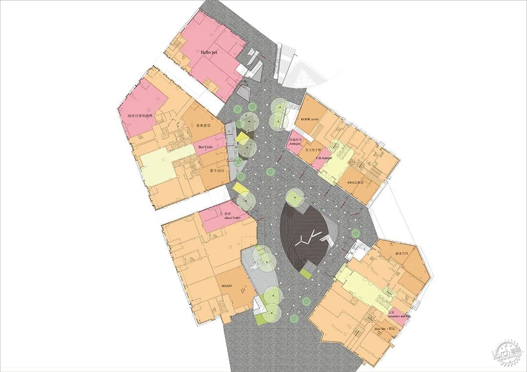
初期招商落位平面©未见筑
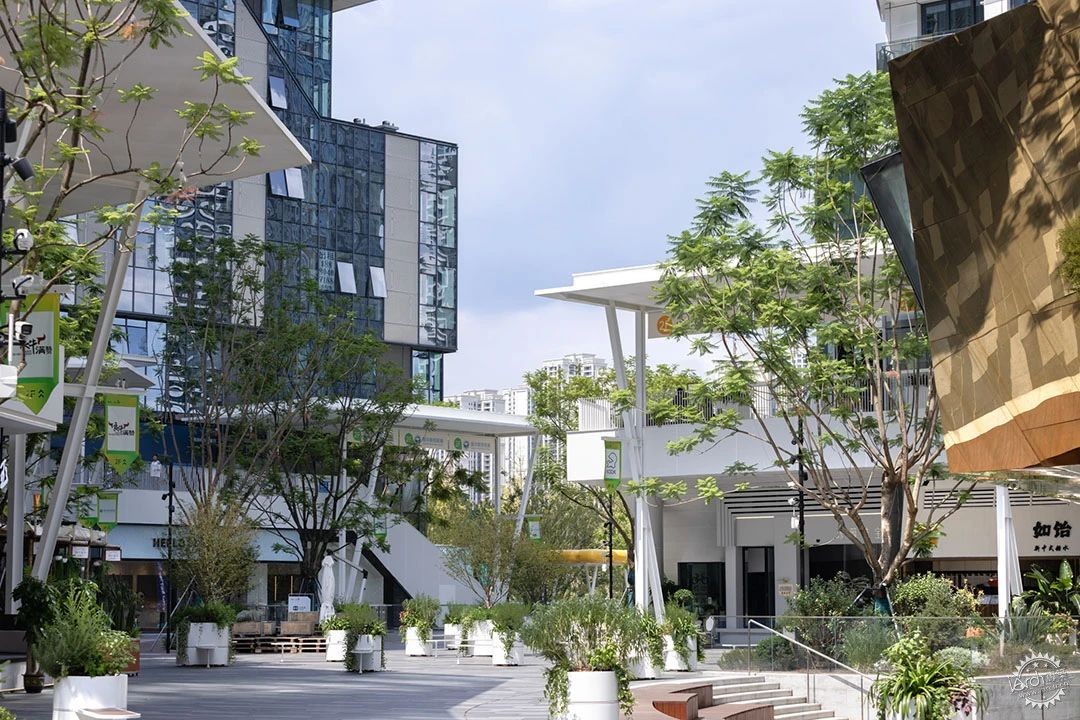
可以被称作主理人的经营者是一群有情怀,有想法,乐于分享全新的生活方式的人。设计团队希望通过空间的营造发掘他们积极的一面,鼓励他们从店里走出来,为其创造更多的可能性,最终实现属于社区的文化与精神认同。
Operators who can be called as "Owner-Principal" are individuals with passion, creativity, and a willingness to share a new lifestyle. The design team aims to bring out their positive aspects through space creation, encouraging them to step out of the store and explore more possibilities, ultimately fostering a cultural and spiritual identity that belongs to the community.
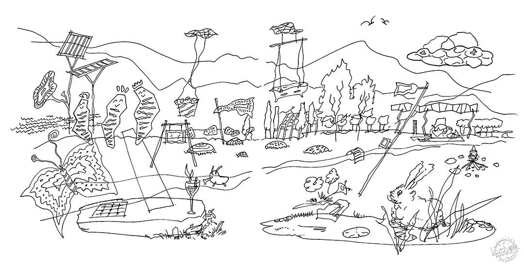
设计草图©未见筑
©存在建筑
设计团队相信这种价值共识的汇聚与传播长远来看会成为新世代商业体的巨大财富,这片街区在商业机能之外应当为主理人提供一片遮风避雨的营地。
The design team believes that the convergence and dissemination of this value consensus will become a huge asset for the new generation commercial complex in the long run. This block should provide a shelter for the Owners beyond its commercial functions.
©存在建筑

“白色的聚落”
The White Settlement
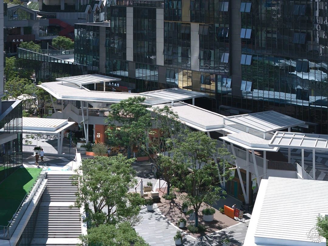
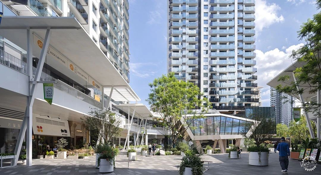
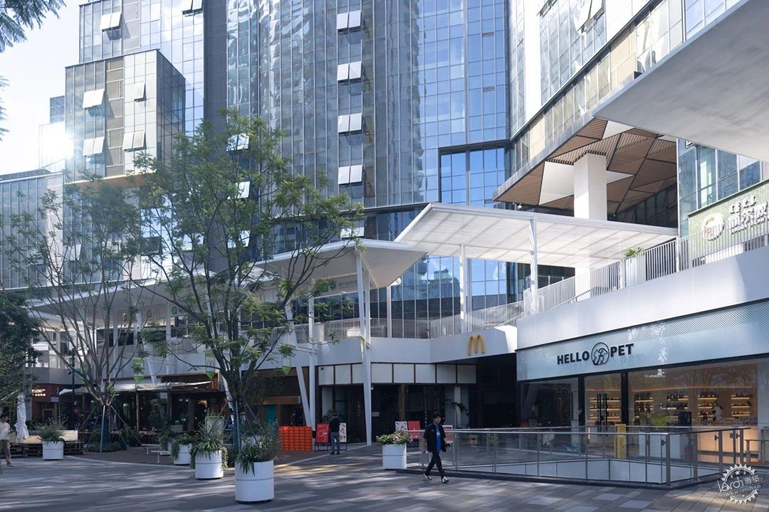
处理纷乱的现状是商业改造中常遇到的问题,在空间“诊断”的过程中,设计团队意识到按照传统思维通过建筑立面的改造无法解决问题,进而选择在空间模式上做转变。采取的策略是通过增加构筑物来做到擦除与留白,植入场地的所有新建设施均为白色,遮盖了原场所中的材料色彩拼贴。让街区成为主理人的背景与舞台,为后续各类商家的入驻提供了一处可供呼吸的纯白画布,让他们在这里得以充分展示各自的设计美学与品牌个性。
Dealing with the chaotic of current situation is a common challenge in commercial renovation. In the process of diagnosing the whole space, the design team recognized that the traditional way to rebuild the facade doesn't work, then prompting a shift to upgrade the space mode. The strategy is to add structures to achieve erasure and whitespace. All new facilities implanted into the site were white, covering the original materials and color collage. This turned the neighborhood into a background and stage for the operators, offering a breathable white canvas for various businesses to showcase their design aesthetics and brand personalities.

©未见筑
©存在建筑
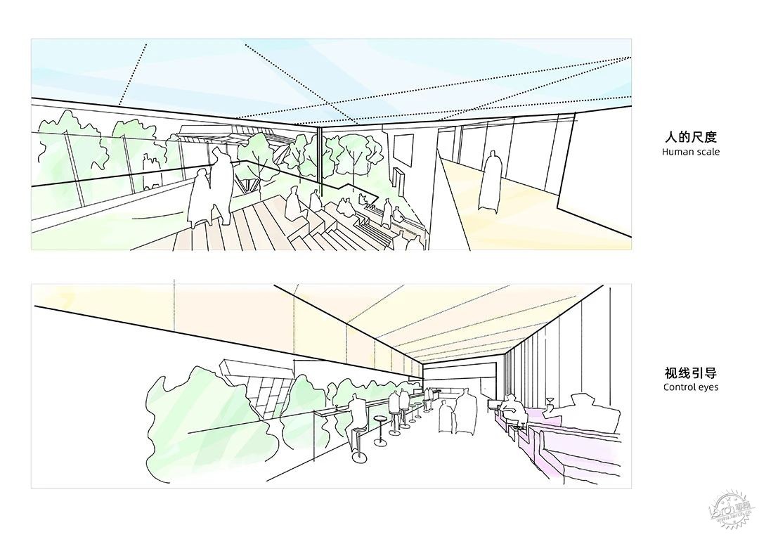
这片立体的聚落由面,线,点三组系统组成。
This three-dimensional settlement is composed of surface, line and point system.
设计草图 ©未见筑
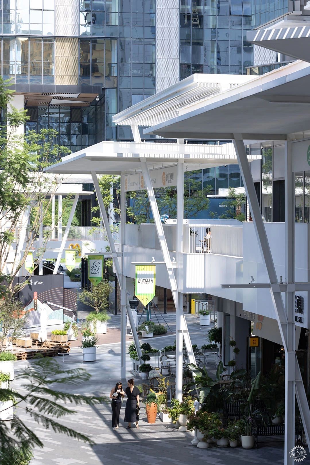
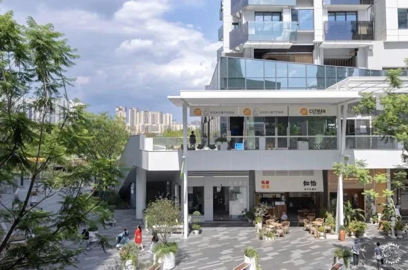
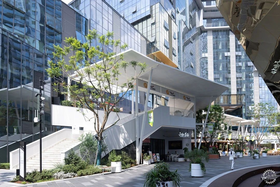
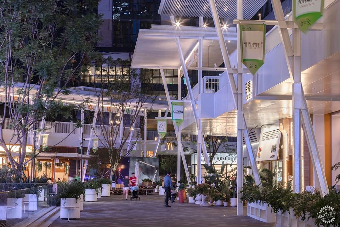
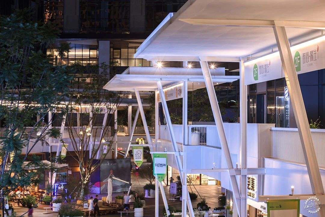
系统1:轻盈的白色伞廊以面的形式介入场域,对上阻断了巨大塔楼的视线干扰,对下压低了高度,形成一片庇护的灰空间,它们围绕广场形成了不同尺度的多样化户外空间组合,既满足不同主理人对室外布场的需求,也为行人的驻留提供更多可能。
System1: Lightweight white canopies intervene into the site as surface, blocking the view interference from the massive towers above and lowering the height, forming a sheltered gray space. They create diverse outdoor space combinations of different scales around the square, meeting the various needs of different owners for outdoor layouts, and providing more possibilities for pedestrians to stay.
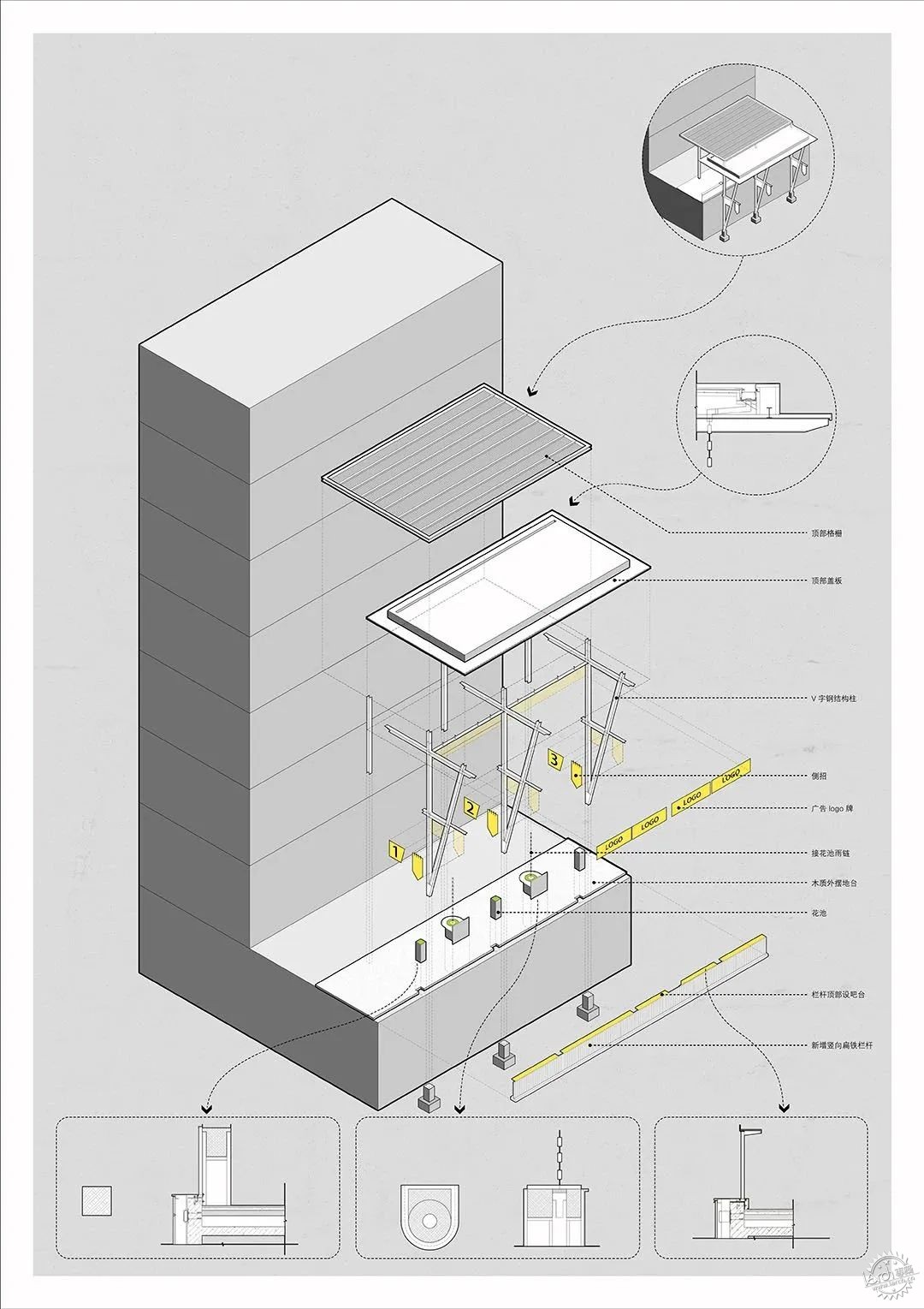
伞廊构造©未见筑
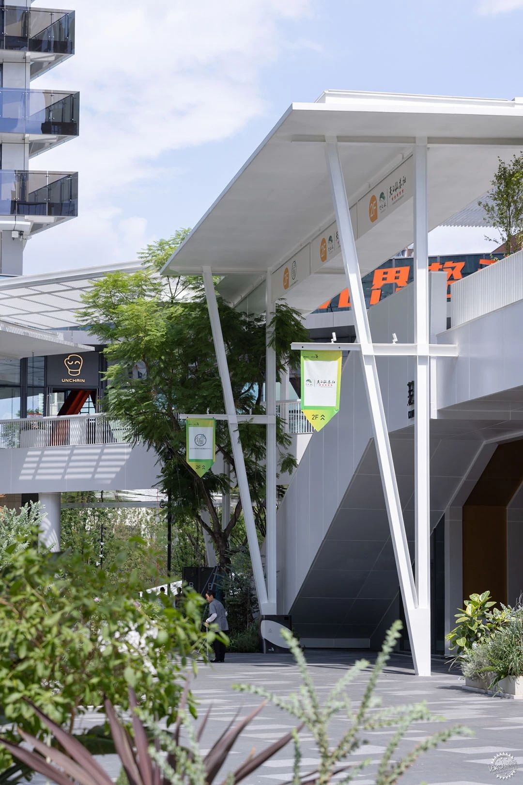
©存在建筑
在传统商业室内外界面上划出了一片舒适的过渡区域。视觉层面有别于原本大开大合的色彩拼贴,通过实体与栅格的不断切换,将光影有序的洒落在白色的空间中,形成更加丰富细腻的层次。
A comfortable transitional area is created between interior and exterior space. on visual dimension, different from the originally open and colorful collage, the continuous switching between solid and grid shielding cast light and shadow orderly scattered in the white space, forming a richer and more delicate hierarchy.
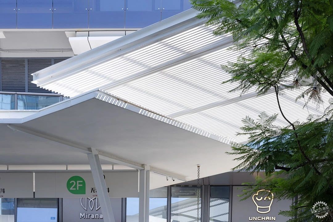
伞廊细节 ©存在建筑
系统2:通过线性的连续吧台与户外家具对原本空旷的二楼露台进行了内容的充实,结合上方的伞廊,为主理人及过往游客提供了多样的驻留场所。在这里,社区不会在人潮散去的时段变的冷清,场所鼓励主理人从店内走出来,或与人畅谈,或稍作小憩,街区不只是工作的场所,也是生活的归宿。
System2: The linear continuous bar counters and outdoor furniture enriched the originally empty second-floor terrace. Combined with the overhead canopies, they provided diverse places for the owners and passing visitors to stay. The community does not become deserted when the crowd disperses here, the place encourages owners to step out of their shops, engage in conversations, take a short break, making the block not just a workplace but also a living space.
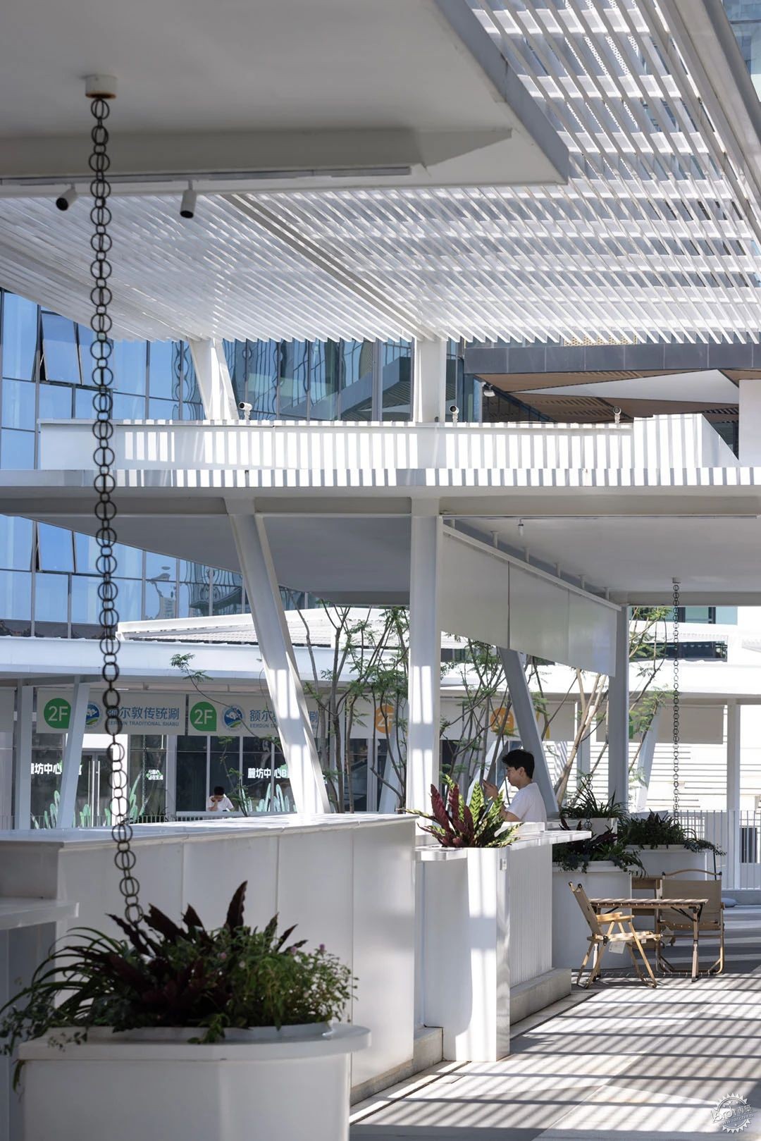
©存在建筑
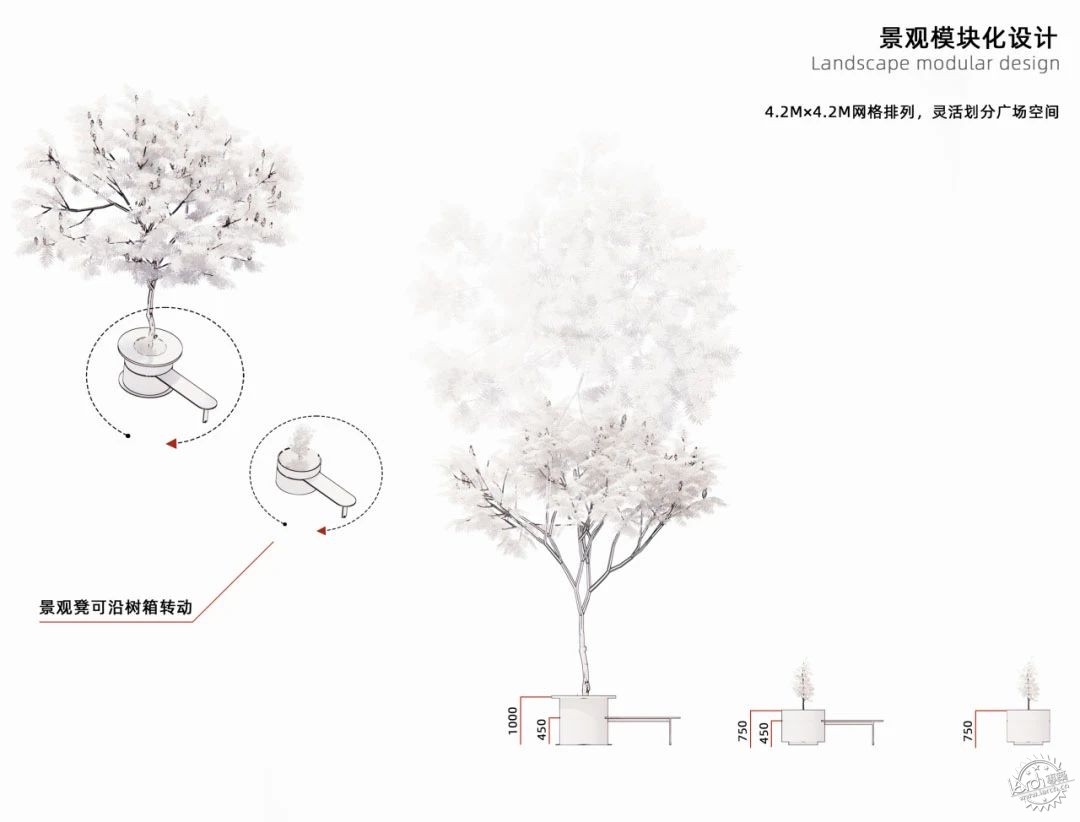
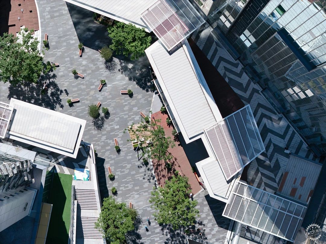
系统3:在点的层面,开阔的一楼广场空间被铺设了一层可变换的白色点阵。它们由可移动旋转的花箱树箱组成,可结合室外布场的需求重新划分组合原本单一的广场空间。
System3: On the point dimension, the open ground floor plaza is paved with a layer of changeable white matrix. Composed of movable flower boxes and tree boxes, they can be rearranged according to the outdoor layout requirements.
©未见筑
©存在建筑
这些矩阵也是送给全街区主理人的一组大型玩具,通过亲自操作进行场所的重组,使共创成为惯性,逐渐让社区成长为一个聚集创意的平台。
These matrices are also a set of large toys given to all the owners in the block, allowing them operate and reorganize the place, making co-creation a habit and gradually growing the community into a platform for creative gathering.
广场点阵 ©未见筑

“更细腻的功能体验”
Finer Functional Experience
范式设计往往立足于资源利用的效率,人在这里也仅只是诸多资源中的一部分。但新的商业模式会更加细腻的去发掘人的需求与体验,从动线的优化到导视的植入,从遮蔽风雨到提供驻留,从空间的温度到阳光空气雨水,都会成为设计的发起点。摆脱自上而下的标准框架,由细腻的需求引出充盈的功能体验,并将其确切的交付于每个使用者手中。
Paradigm design often focuses on the efficiency of resource utilization, and people are just one of many resources. However, new comercial models will explore people's requirements and experiences more delicately, from optimizing traffic flow to embedding guidance signs, from providing shelter from wind and rain to offering places to stay, from the temperature of space to sunlight, air, and rain — these become the starting points of design. Breaking free from the top-down standard framework, detailed requirements lead to fulfilling functional experiences and deliver them precisely to each user.
©存在建筑
“社群的诞生”
The Birth of the Community
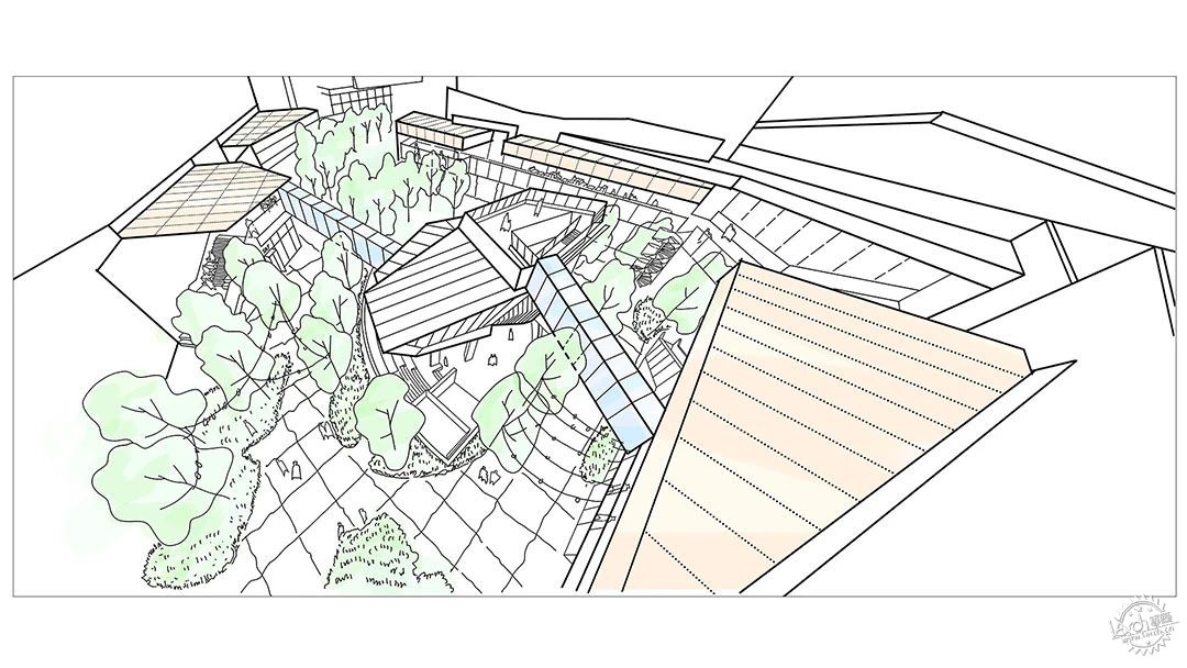
鸟瞰草图©未见筑
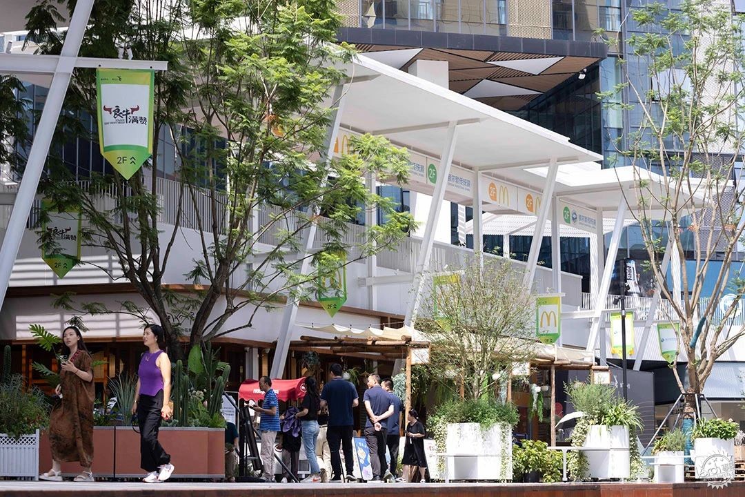
除了直接影响空间的“硬装”改造,设计团队还提供了诸多“软装”方案,进一步引导开业后的社群行为。如在场所中悬挂主理人自己的旗帜,布置可以由商家认领装饰的场地乔木,以及传递主理人情绪的幕墙贴纸方案 。
In addition to directly influencing the space's "hardware" renovation, the design team provided various "soft layout" solutions to further guide post-opening community behaviors. For example, hanging the owners' own flags in the place, arranging trees that can be claimed and decorated by businesses, and proposing wall stickers that convey the owners' emotions.
©存在建筑
设计团队所构想的是一个可以生长的平台,在这里开业只是商业进程中的一个节点,之后的一切会随着时间的积累、内容机制的成熟,产生的长远影响力、孵化出更多的可能性。
The envisioned platform is one that can grow. Opening is just a node in the commercial process. The subsequent impacts and possibilities will accumulate over time and with the maturity of content mechanisms.
©存在建筑
“行为的触发”
Behaviors Trigger
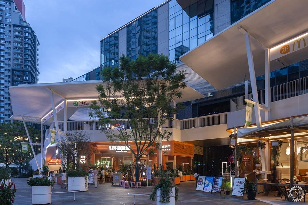
有别于传统的静态商业美陈,主理人街区的户外陈设更注重参与者行为的触发,可移动旋转的户外座椅鼓励主理人参与社群的空间营造,旗帜,贴纸鼓励更多的创意行为与自我表达。大面积的灰空间为室外活动与布场提供了物质平台与诸多可能性。在这里,人的行为体验才是设计的终点。
Different from traditional static commercial displays, the outdoor displays of Owner's Block focus more on triggering participant behaviors. Movable and rotating outdoor seats encourage owners to participate in creating the community space. Flags and stickers encourage more creative behaviors and self-expression. The extensive gray space provides a material platform and numerous possibilities for outdoor activities and layout. The experience of human behavior is the ultimate goal of design here.
©存在建筑

新增构筑物与既有建筑之间的结构关系到项目的安全性问题,所有的X字柱与Y字柱的落柱点位既要满足原始荷载,不对地库结构进行加固,又要躲开商家店面,不能遮挡门头店招。
The relationship between the new structures and existing building is crucial for project safety. The placement of all X and Y columns must meet the original load requirements without reinforcing the basement structure. Additionally, they need to avoid obstructing storefronts and signage.
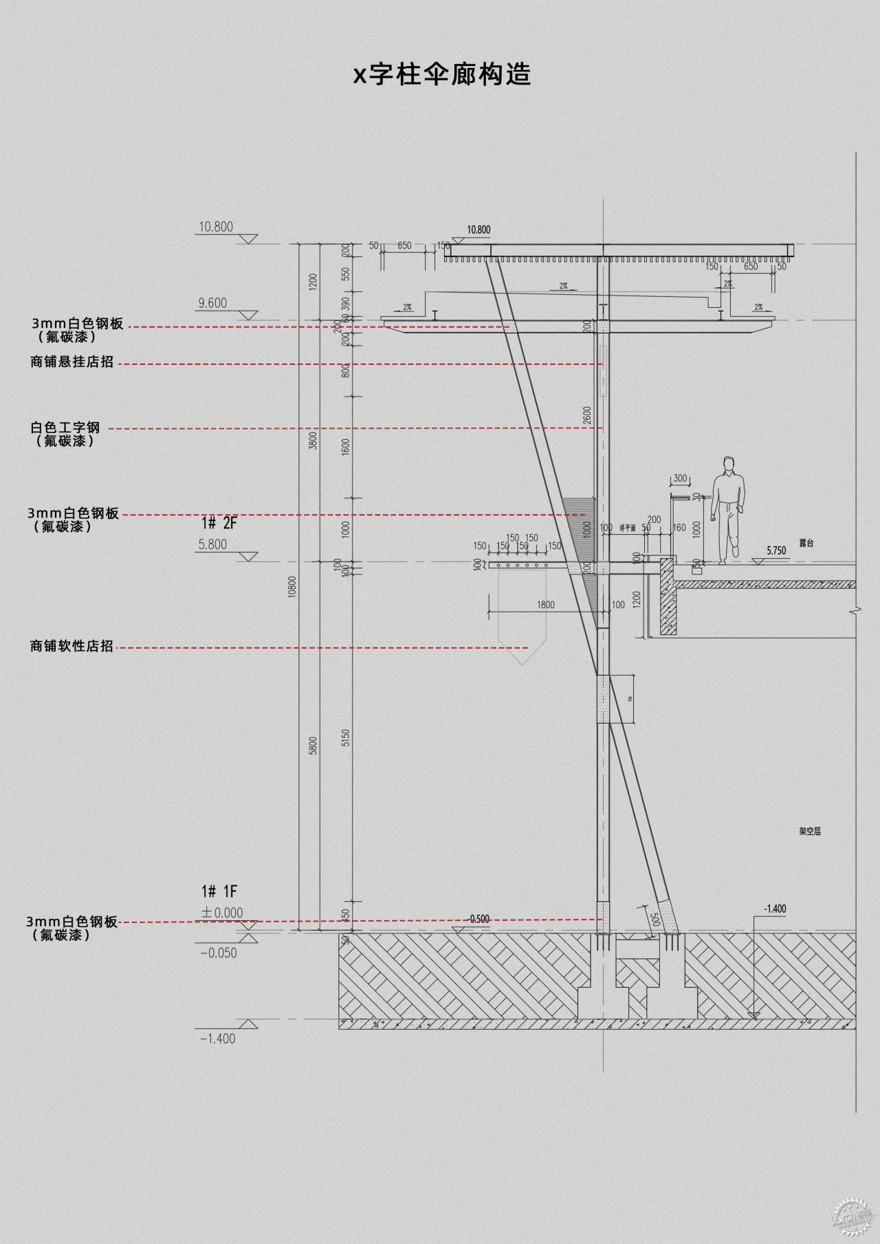
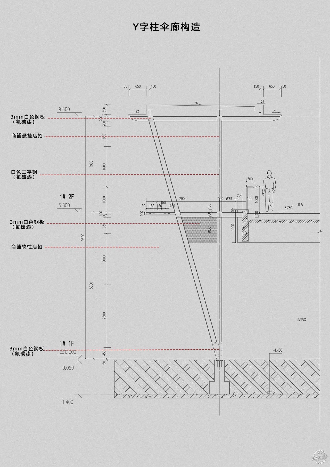
X字柱、Y字柱伞廊构造 ©未见筑
©存在建筑
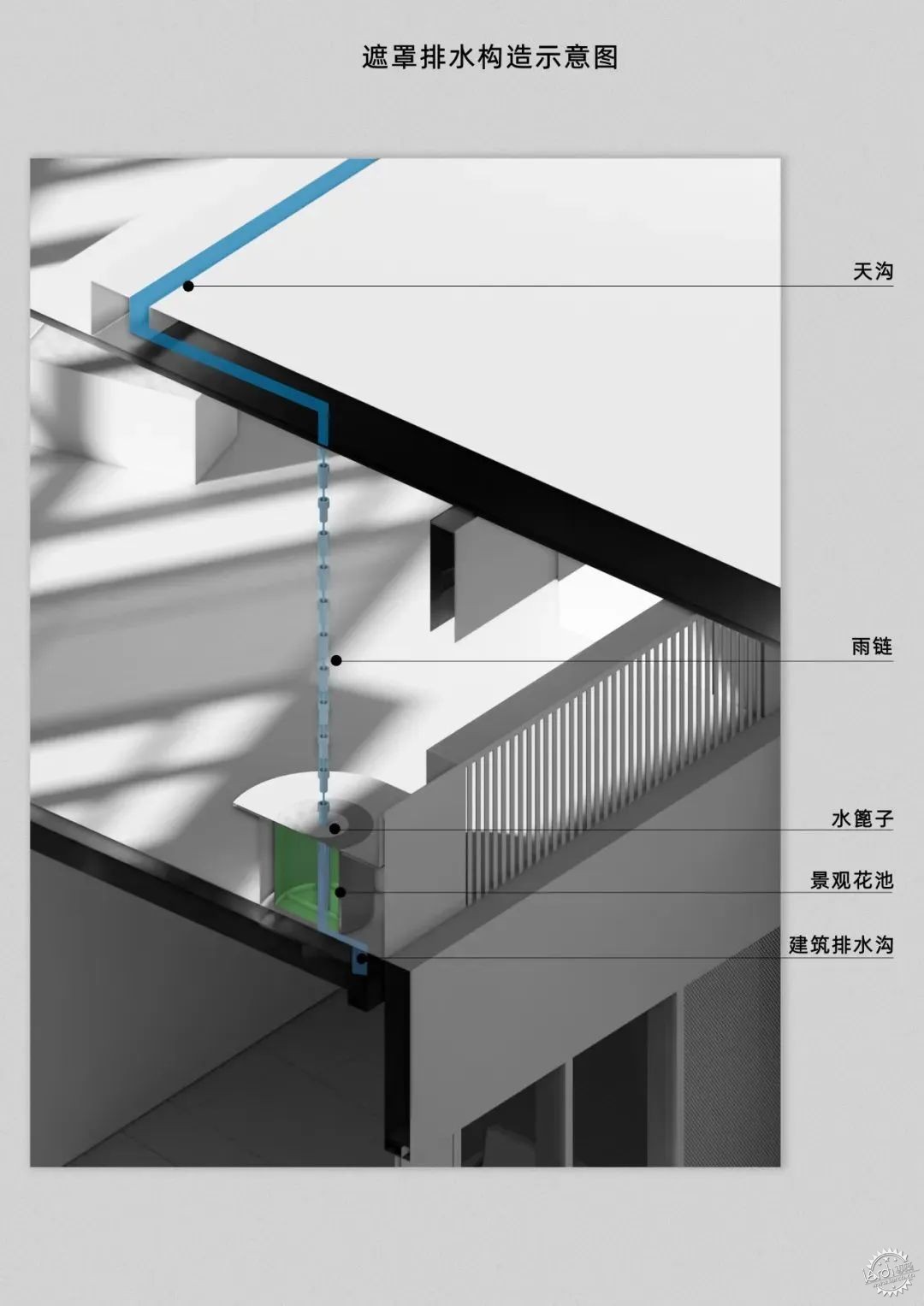
大面积的白色实体顶棚全部采用有组织排水,将雨水天沟隐藏在屋面之上,再通过雨水管或者雨链的方式导入既有的地面排水系统,将新增构筑物的排水体系与原始现状有机结合。
The extensive white solid ceilings incorporate organized drainage, concealing rainwater gutters above the roof. The drainage system of the new structures seamlessly integrates with the existing ground drainage system through rainwater pipes or chains.
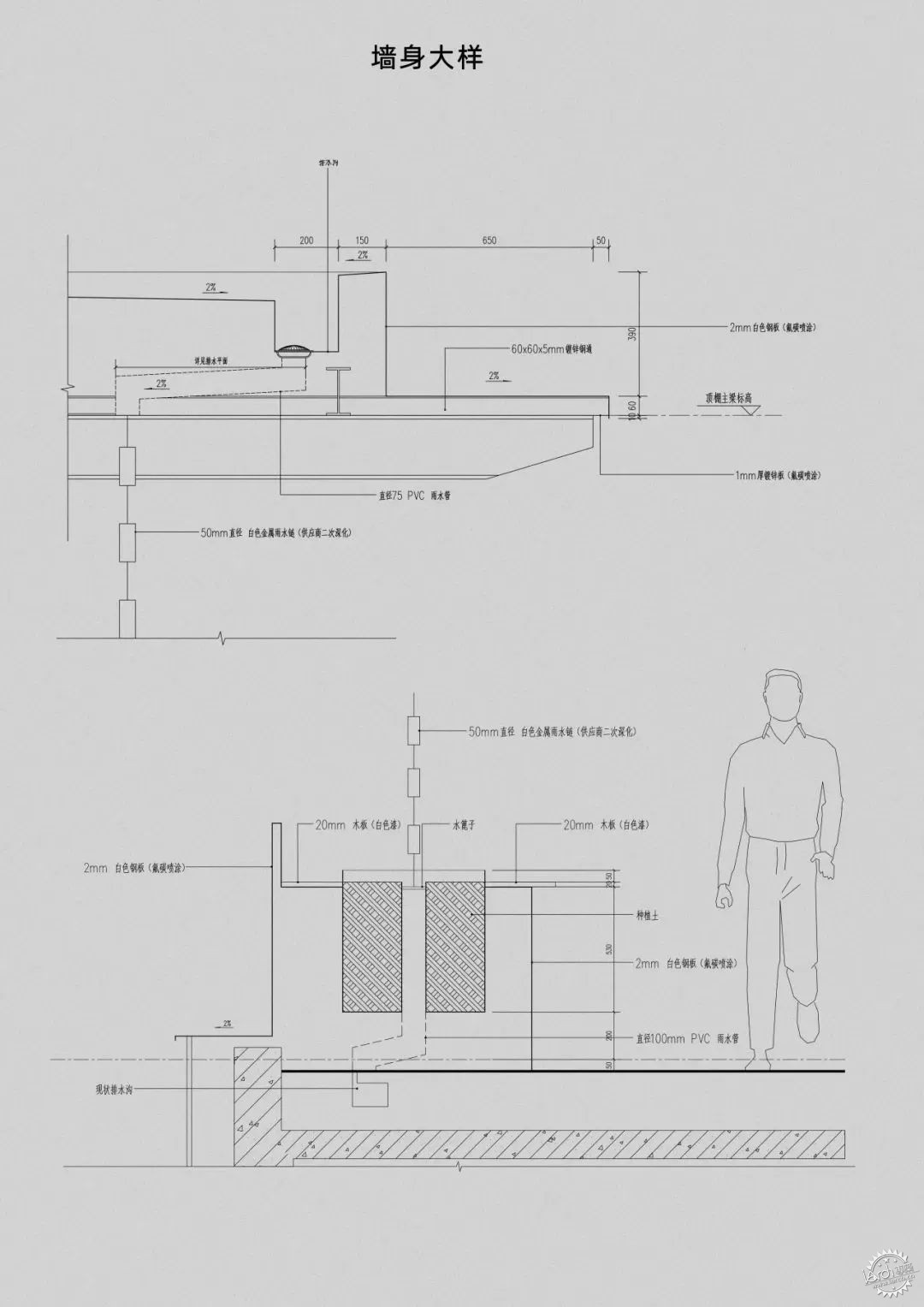
©未见筑
©存在建筑
项目整体设计施工周期把控严格,在6个月之内完成了工程建设,有效的配合招商运营的节点需求。
The overall project design and construction were tightly controlled, completing the construction within a six-month timeframe to effectively meet the operational milestones for leasing.
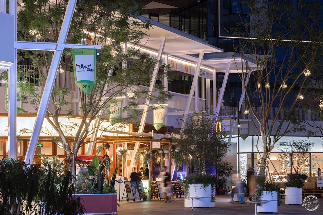
街区夜景©存在建筑

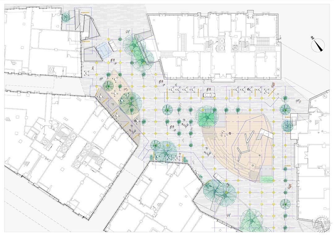
1F平面图 ©未见筑
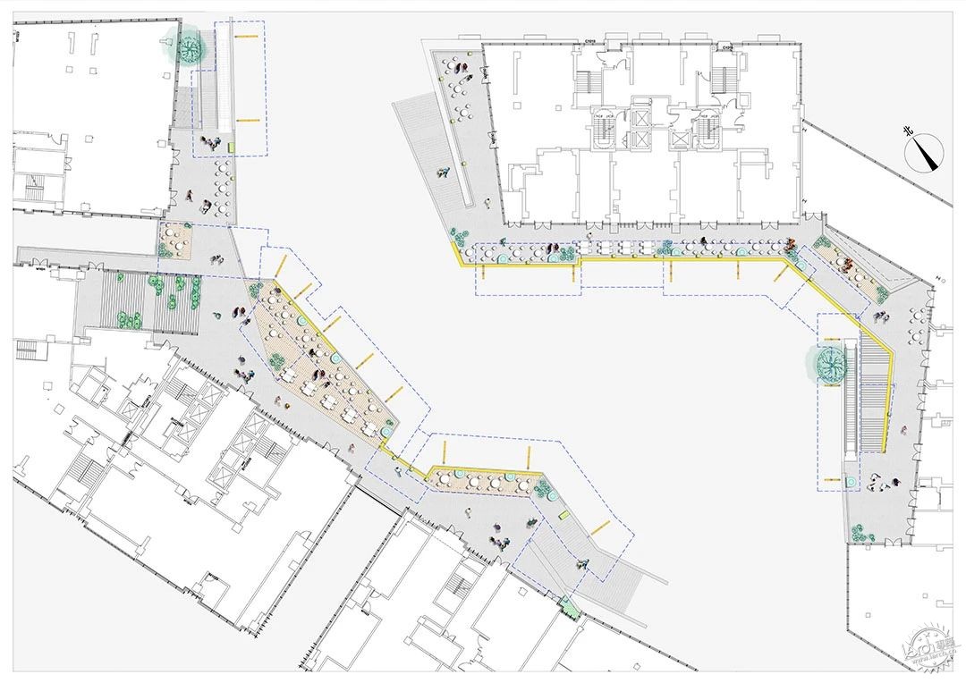
2F平面图 ©未见筑
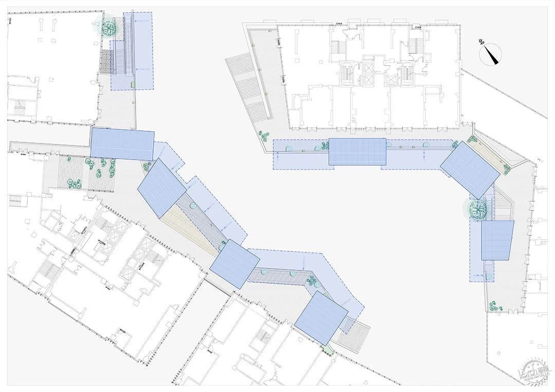
屋顶平面图 ©未见筑
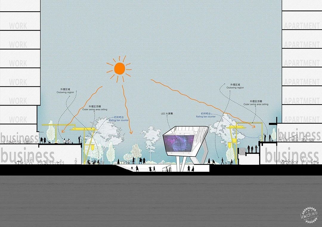
剖面图 ©未见筑

项目名称:麓坊中心 主理人街区
项目地址:四川省成都市
业主单位:成都万华新城发展股份有限公司商管公司
业主设计管理:成都万华新城发展股份有限公司(研发中心)
设计单位:未见筑设计事务所
设计内容:街区空间改造、景观改造
主创设计师:李博、李未韬
设计团队:杨梁玲、陈泓宇、吕品、方静雯、陈含瑶
结构顾问:曹庭
灯光顾问:BPI照明(成都公司)
施工团队:成都鼎鑫建筑工程有限公司
照片拍摄:存在建筑
Project Name: Luxe Zone Owner’s Block
Project Location: Sichuan, China
Client: Chengdu Wanhua Xincheng Development Co.,Ltd
Client Design Management: Chengdu Wanhua Xincheng Development Co.,Ltd (R&D Center)
Design Unit: We Live Architects
Design Content: Block Spatial Renovation, Landscape Renovation,
Facade Area: 1600sqm
Landscape Area: 2500sqm
Chief Designer: Bo Li,Weitao Li
Design Team: LiangLing Yang, Hongyu Chen, Pin Lv, Jingwen
Fang, Hanyao Chen
Structure Consultant: Ting Cao
Lighting Consultant: BPI(Chengdu)
Construction Team: Chengdu Dingxin Construction Co.,Ltd
Photography: Arch-Exist
来源:本文由未见筑设计事务所提供稿件,所有著作权归属未见筑设计事务所所有。
|
|
