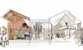
Life has been busy lately. However, I have managed to squeeze in a little time to create two new spreads. I have moved to a different project in the portfolio and I wanted to change up the style a little. Much of this portfolio so far has been very graphically intense meaning I rendered or post processed every image on the page. It’s very hard for me to accept any “white space”. This way of thinking comes from the fact that I am trying to fit as much information into as few pages as possible. The problem then becomes how to manage the hierarchy and avoid having the graphics all compete against one another.
One way to solve this is by taking the “less is more” route. Thinking minimally is outside my comfort zone but at the same time I find minimalist graphic design beautiful and refreshing. The difficulty comes from having to choose what to present and what not to present. If there is white space left on the page, I instantly start thinking what can I fit in there. For some reason, I have this fear that if there isn’t a lot on the page then it may appear like not much effort or time was put into the design. On the other hand, presenting minimal graphics successfully could show a certain comfort in the design and clearly drive home the concept.
With that said, I also wanted to explore putting some spreads together that didn’t require any rendering time and minimal Photoshop time. This site has many tutorials that look at abstract illustrations (such as this and this) yet there is very little on using these types of illustrations in portfolios or presentation boards. More than anything, I wanted to see if I could get these pages to be as informative and expressive as some of my other project pages.
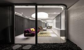
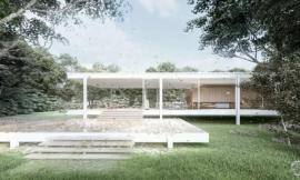
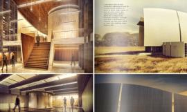
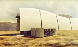
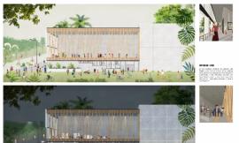
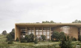
With the introductory page, I started out with a bold image. You may recognize this image since it was pulled from this post, with the colors desaturated. The only color comes from the highlighted text which also spills over into the next spread. The graphic itself has nice lines and draws the viewer in without giving away too much.
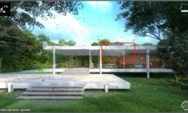
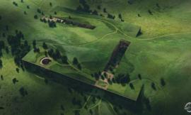
The most important part of this project was how the form was developed. This meant giving up a lot of space for simple line drawings and not over thinking how to graphically explain this idea. These first few pages have set the tone for the rest of the project pages and the goal is not to stray too far off course. It’s a good exercise to get myself to think differently about page layout and I’m interested to see what comes out of it.