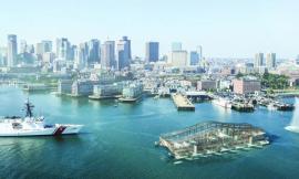
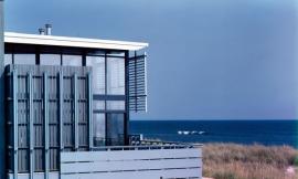
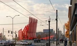
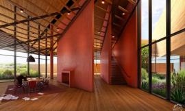
One of the final images that my upcoming Portfolio Vol. 4 was lacking was a view of the Boston harbor for my Long Wharf redevelopment project. This view was crucial because it showed how one of the most important parts of the design, the tiered seating, framed the view of the harbor and what that experience might feel like. Since the base rendering was limited in architectural and geometric detail, the success of the image relied on the entourage and lighting. Below is a quick breakdown of the image:
1. Sketchup Model
This image was composed in such a way to place emphasis on the view of the harbor with the architecture taking a secondary role. The Sketchup model therefore only consisted of the tiered seating, stone benches and light locations. The context in the distance will be added in Photoshop.
2. V-Ray Rendering
The V-Ray base rendering was basic as well showing a simple stone material covering most of the surfaces. I decided to add the grass in Photoshop because I wasn’t sure where exactly I wanted it to go. I figured I could iterate different design ideas faster in Photoshop by adjusting the mask vs baking it into the rendering.
3. Context
I used photos that I had taken a while ago for the background context. The time of day of these photos was the driving force of the overall tone and lighting of the scene. I actually had to patch several photos together to get the final background seen here.
4. Grass
To insert the grass, I first quickly masked in the general locations. The idea was that the grass strips would get less dense as the seating stepped closer the the water. Once I had the location dialed in, I selected a different paint brush shape and roughed up the edges of the mask to get rid of the sharp edges and give more dimension to the vegetation. This idea of roughing up the edges can be seen in one of my older video tutorials though I think it is time for an updated tutorial on this technique.
5. Lights
Although I modeled some lights, I ended up painting them in Photoshop so that I could have more control over their placement and density. Once the locations were finalized, I added a glow to the surrounding grass by painting in a simple color overlay. Finally, I added glow to the lights by using a soft paint brush with low opacity.
6. People
Entourage is important in defining the scale of the pier and overall atmosphere of the space. Due to the tiered seating, sizing the people properly was difficult. To solve this, I dropped in scale figures into the Sketchup model and exported an image to use as a guide in Photoshop.
7. Color
Color adjustments were minimal. I took the image to a slightly cooler range to match some of the other portfolio pages and added a slight haze in the distance. I didn’t want to deviate too far from the original photo colors used in the background photo.