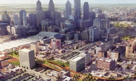
Philly Diagram Study
由专筑网王子铭,李韧编译
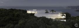
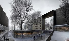
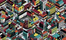
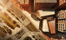
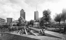
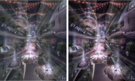
我经常会运用一些分析图来梳理思路,从而表达出清晰的设计逻辑。此分析图仅仅处理了一个简单的模型,几乎没有细节或结构性的表达,因为随着设计的修改深化,这种简易的工作流程更容易被修改。这个案例是为了体现方案中功能分区的概念,并且帮助我理清下一步的设计思路。同时,由于这些分析图将会运用于最终的图纸当中,所以我加入了一些纹理和雾气的效果,这样更好的体现出图面的质感。随着方案的深化,我也会在后期为图纸添加一些文字注释。
I always look to diagrams to help tease out ideas or to clarify my thoughts as early on in the design process as possible. The diagram being broken down below is working off of a simple model with almost no detail or structural articulation making it easier to update as the design evolves. This illustration is meant to study the big picture concept of the programmatic zones and will help me to think through some of the future design moves. At the same time, I know this will eventually be used in presentation materials, so I introduced some quick atmospheric and graphical effects to add a little emotion and give the image some texture. Items like annotation and information keys will be added later as I get closer to inserting the illustration into the portfolio.
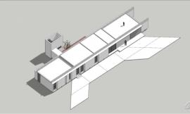
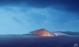
1. 基础模型渲染
该模型在Sketchup中建立,并利用V-Ray渲染,模型十分简洁,没有窗洞与细部结构,只需要简单的体块及光影关系。
1. Clay Model Base
The 3D model for this diagram is as simple as it gets. The model consists of basic massing with no window and structural articulation to give me light and shadow information. The model was built in Sketchup and rendered in V-Ray.
2. 整体压暗
通过“图像>调整>色相/饱和度、曲线”,去除渲染底图的饱和度并将色调压暗。
2. Darken
The base rendering was desaturated and darkened by going to “Image>Adjustments>Hue/Saturation” and by adjusting the levels.
3. 叠加地图
调整航拍图像的透视渲染底图,然后将图层混合模式设置为“叠加”,使图像具有微妙的纹理效果。
3. Map Overlay
An aerial image was distorted to match the perspective and then the layer blend mode was set to “Overlay” giving the image a subtle texture.
4. 叠加线稿
为了明确建筑的形体,我从Sketchup中导出模型线稿,反转颜色,并将图层混合模式设置为“滤色”,使线稿在黑色底图上显示为白色。同时为增强表达效果,线稿导出的模式为X光透视线。
4. Line Work
To help define the forms, I exported line work from Sketchup, inverted the colors so that the line work was white on a black background, and set the layer blend mode to “Screen”. For an added effect, I exported the line work from Sketchup with the face style set to “X-Ray”.
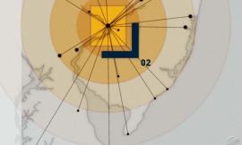
5. 添加环境灯光
作为丰富周边环境的最后一步,我将灯光素材叠加到几个立面上,通过简单地调整素材的透视,并将图层混合模式设置为“滤色”,即可体现丰富的细节。这只是一个简单的分析图,并不需要太准确的图面表达,所以在几分钟之内即可快速完成。
5. Turn on the lights
As a last move to add just a little more texture to the context, I found an image of building lights, and overlayed that texture onto several facades. Using the image above, set the layer blend mode to “Screen” and simply distort the perspective to match that of the contextual massing. Since this is a diagram, I wasn’t concerned about being accurate, therefore allowing me to move fast and only spend a few minutes on this step.
6. 添加颜色
在Photoshop中,添加颜色的方法有很多。我最推荐的方法是先填充一个橘黄色的纯色区域。
6. Adding Color
There are many ways that the color could be added through Photoshop. The way that I approached it was by first painting an area with solid color, in this case orange.
接下来,我建立与纯色选区相同范围的渲染底图的图层,建议将智能对象和蒙版搭配使用,这样会使工作流程更加简洁。
Next, I took the clay model rendering and cut that same section out. I would suggest using smart objects and masks, but for now, we will keep this super simple.
而后,我将抠出的渲染图层放在纯色图层之上,并调节图层混合模式为 “正片叠底”,来为功能色块叠加阴影。
I then took the clay model section and set the layer blend mode to “Multiply” on top of the color to give it some shade and shadow.
接下来重复这些步骤,让每种颜色都达到预期效果。
I repeated these steps for each color which will allow me to make quick edits or experiment with color later on as needed.
最后,我将白色线稿移动到所有图层的上方,为每个颜色区域增加了一个白色轮廓。
Finally, I moved the white line work layer above the new color groups to give each zone a white outline.
7. 镜头模糊
我还添加了一个简单的镜头模糊,来强调图像的中心。具体方法参照我以前的教程。
7. Lens Blur
I added a simple lens blur to draw attention to the center of the image. A tutorial on this step can be found here.
8. 添加雾气
雾化效果类似于镜头模糊,这些雾气再次将视线锁定在视图中心。这样在为图面增加的层次感同时也留出一些空间来添加文字注释。
8. Add Fog
Similar to the lens blur, I painted in some fog to again draw the eye to the center of the image. This also tones down the context and will give me some space to add annotations and descriptions for the diagram.
9. 颜色叠加
最终,整体图像看起来饱和度较低,所以我又添加了一些蓝色和橙色的颜色来叠加图层。如开篇所述,这张分析图将用于辅助设计,帮助更加清晰地表达方案的概念。一旦有进一步的深化修改,我还会在周边添加一些标注信息。
9. Color Overlay
Finally, the image was looking too desaturated, so some blue and orange color overlays were added. As mentioned earlier, this will be used to study my design and help clarify the concept. Once I get close to the portfolio, I will add some annotations and color keys.
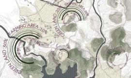
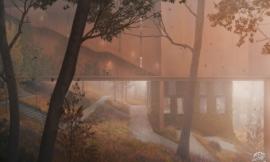
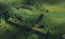
使用相同的渲染方法及Photoshop调整,可以改变画面的整体气氛,产生适合现有阶段的局部分析图,例如下图的绿色开放空间。
Using the same base renderings and Photoshop moves, I tweaked the colors and atmosphere to generate a base illustration for the existing conditions diagram. As well as a green spaces diagram.
出处:本文译自visualizingarchitecture.com/,转载请注明出处。
|
|
专于设计,筑就未来
无论您身在何方;无论您作品规模大小;无论您是否已在设计等相关领域小有名气;无论您是否已成功求学、步入职业设计师队伍;只要你有想法、有创意、有能力,专筑网都愿为您提供一个展示自己的舞台
投稿邮箱:submit@iarch.cn 如何向专筑投稿?