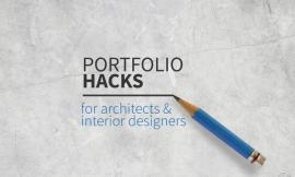
来自专筑编辑刘庆新的报道。整个周末我都在设计“项目作品集升级版”的封面,这对于我来说是一个非常大的挑战。设计封面会给人很大的压力,因为它很重要,人们第一眼就会看到,封面也是他们首先会去评价的地方。它为整个作品集奠定了一个基调。
All weekend has been spent working on the cover design for the Project Portfolio Upgrade and it is turning out to be extremely challenging. There is a lot of pressure that rides on the cover. It’s the first thing the audience sees. It’s the first thing they judge. It sets the mood of the entire portfolio.
我的脑海里一直在思考怎样将这个设计的压力降到最低。例如,我只用文字,不用图片可以吗?我十分的喜欢这个风格的作品集,因为设计者的控制能力和达到的精致给我留下很深的印象。用这种方法,封面引起了我极大的兴趣, 让我好奇地想打开作品集,看看它里面究竟是什么内容。然而,这很难实现。大量的工作都要集中在字体,大小,位置和排版。
另一方面,我想要用引人注目的图画。在一大堆的作品集里,一个独特的图画和鲜艳的颜色非常重要。观众会最容易记住有醒目的图画和鲜艳颜色的封面,而不是白色的底色上有些黑色字体的封面。问题是,如果这个醒目的封面做的不好的话,可能会适得其反,分散人们的注意力,有时还会喧宾夺主。
我想要知道我能不能在极简和醒目之间找到契合点。换言之 ,我想要设计的封面保持一定程度的精致和控制力,但是仍然保持简洁的语言。如果你看过我的项目页面,就会发现它们都使用了非常醒目的颜色和纹理。因此,我想要提取出一些材质和图像风格到封面上,但是放弃醒目的颜色。这将会帮助降低封面醒目的颜色色调,但是希望仍然能吸引人们的眼球。
下面是一些我做的第一版的作品集。正如你所看到的,我从非常简单的开始,渐渐地涉及到纹理和信息。我使用了我网站的图标作为一个大的图片,叠加在页面上面,给这个页面一些创意,也让我把文字设计进来了。
I have been debating in my head how minimal to go. For instance, do I just go with text and no graphics? I have always liked the portfolios that go this route because it gives the impression that the designer has a certain amount of control and refinement. In a way, it peaks my interest more and encourages me want to open up the portfolio to see what is inside. However, minimal can be difficult to pull off. A lot of focus is put on the font, size, placement, alignments.
On the other hand, I could go with bold graphics. In a large pile of portfolios, unique geometry and strong color can get your stuff seen. The audience will most likely remember a cover with bold graphics and colors over one with a white cover and some black text. The problem I have with a bold cover is if not done right, it can come off as looking desperate for attention, and in some cases competes with the content inside.
I wanted to see if I can find that sweet spot right in the middle of minimal and bold. In other words, I want a design that shows a certain amount of refinement and control, but still keeps a similar language to what is going on inside. If you have seen any of my project pages, they use very bold colors and textures. Therefore, I want to carry some of that texture and graphic style to the cover, but maybe leave behind the color. This will help to tone down the loudness of the cover but hopefully still grab the viewers attention.
Below are some of the first iterations that I did. As you can see, I started out very simple and slowly built in more texture and info. I used the favicon of my website as a large graphic to overlay the spread which gives some movement to the page as well as provides me something to relate text to.
最后两张图是我最后的设计图。我喜欢用透明图层来建立深度,并且我认为它能自然地过渡到作品集的其他部分,例如目录的页面。所以,我一直围绕着这个图标来设计文字和纹理,最后完成了下图。
The last two images are what lead to my final design. I liked the idea of using layers of transparency to build depth and thought it could transition well into other parts of the portfolio such as the table of contents. So I kept playing around with the favicon graphic along with text and texture and ended up with the image below.
下图和上面的图也很接近,但是我没有使用一直想要的透明效果。而是加入了一些大的文字并以这种方式放进来,插入了白色的图片后边,形成了一种遮挡效果。我调整了文字尺寸,所以“03”完全被白色的区域挡住了,这样人们就会看到“folio”,并且理解了“portfolio”这个词包含了这本书。
The above image was close, but I still wasn’t getting the transparency effect that I was looking for. I then brought in some large text and placed it in such a way that it appeared to slip behind the white graphic. I sized the text so that the “03” rested completely in the white zone and so that the viewer would read “folio” and understand that it was the word “portfolio” wrapping around the book.
一旦封面设计完成了。我将许多封面的设计语言移到目录页面。我喜欢这种从亮色页面到暗色页面对比的感觉,所以我反色了背景,将目录页面设计成为以黑色为主。我也设置了一个格栅来帮助文字放置在合适的位置,并且创造对齐和联系。
Once the cover was complete, I carried over much of this language into the table of contents. I like the contrast of going from light colored pages to dark color pages so I inverted the background to get a predominately black spread for the table of contents. I also set up a grid to help place the text and create alignments and relationships.
在作品集里我还有一些页面需要设计,完成后,我会开始测试从不同的网上印刷公司打印。这会呈现出很多不同的结果,我很好奇每个公司的质量、价格是怎样的。我计划将这一部分的每一个步骤都发表出来,敬请期待吧。
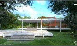
I still have a few more pages to work on inside the portfolio but once those are done, I will start doing some test prints from various online printing companies (The image at the top of this post is just photoshopped. I haven’t actually started printing yet). There are a lot out there and I am curious how the quality/price differs from company to company. I plan to post on every step of this process so be sure to check back often.
出处:本文译自visualizingarchitecture.com/,转载请注明出处。
|
|
专于设计,筑就未来
无论您身在何方;无论您作品规模大小;无论您是否已在设计等相关领域小有名气;无论您是否已成功求学、步入职业设计师队伍;只要你有想法、有创意、有能力,专筑网都愿为您提供一个展示自己的舞台
投稿邮箱:submit@iarch.cn 如何向专筑投稿?