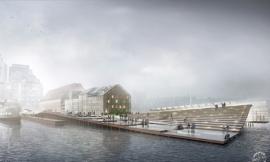
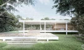
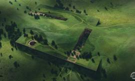
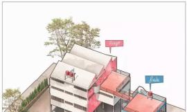
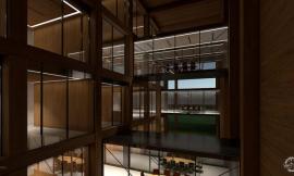
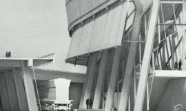
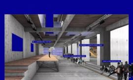
A thought that is often running through my head when working on architectural illustrations is how I can bring more of a human touch to the image. The answer is almost always through texturing in Photoshop. I have spent the last week illustrating an aerial perspective for my latest personal project. For this particular work, I wanted to hit almost every surface of the image with a strong texture to see what would happen. There were many areas that I would normally skip over in other illustrations but didn’t in this one. The result is an image with imperfections that shows age.
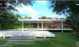
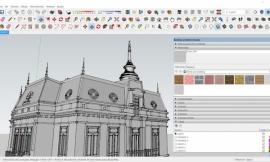
Texturing in the 3D environment is important but it can be difficult to avoid “tiling” of textures. Often, my base renderings come out looking flat and “perfect” meaning the texture has no flaws. This is because there is only so much I can do with bump maps and texture attributes. At a certain point, time spent texturing in the 3D environment could be done much faster in Photoshop. After producing so many illustrations over the years, I am starting to get a sense of what that threshold is and when I need to get out of 3D and into 2D post processing. In many cases, I need both a good texture in the 3D model combined with a good texture in Photoshop to get the right look.
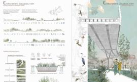
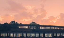
For this illustration, there were four areas that I focused on: the roofs of the surrounding context, the textures of my design, the streets, and the sidewalks/landscape. All four of these areas feed off of one another and if one is left untouched, then the computer’s plastic feel is revealed and the effect is lost.
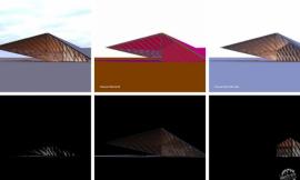
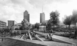
I used several images of asphalt roads to apply textures to my illustration in Photoshop. These have the right amount of grunge and imperfection and can be used in areas other than the streets. In this case, I used the asphalt textures for the roofs of the buildings and lowered the opacity and applied them to the concrete and brick sidewalks.
A side by side comparison reveals how powerful a little bit of texturing in Photoshop can be. Its elements like roads and roof tops that I often see people ignoring in their illustrations that I have come to realize make a big difference in giving an image that human touch. Building in these little imperfections start to trick the eye into thinking this is not a computer generated image.
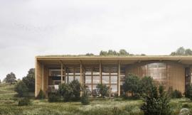
In this final image, I moved the colors to the warm side by using orange color overlays. As with a lot of my illustrations, I bumped up the detail and sharpness using plugins like Topaz Labs Adjust. For aerials, I typically turn off the perspective but in this case I left it on and increased the field of view in Sketchup to make the buildings feel taller. The perspective works here because it draws the eye to the center of the image and puts more focus on the design.