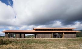
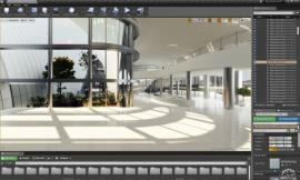
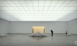
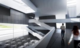
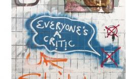
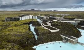
Image © Charcoalblue. Rendering by Kilograph.
How To Add People To Your Renders Like a Pro
由专筑网李韧,吴静雅编译
建筑设计必须以人为本。人与人之间有着快速的情感沟通方式。通过正确的视觉表达,你能够激发内心的情感,从而运用一个简单的形象来表达深刻的感受。在建筑可视化表达中,建筑师都会努力塑造这种感受,削弱自己的主观意识。人类处于自然环境之中,但根据日积月累的经验,许多的背景与条件都十分相似。这也是建筑师在可视化表达中必须充分考虑人类因素的原因。
周边的环境能够帮助人们看到图像,感受到你想要传达的思想感情。有时候这也是一种表达方式,来说明人们在空间之中的流动性。而在其他时候,这样的概念则有些抽象。但是不管哪个方向,周边环境实际上就是对构图与逻辑的表达。当你越了解某个复杂的场景,那么你的表达能力相应也越强。
在这篇文章中,我将向大家展示如何塑造图像中的周边环境。虽然每个人的背景各不相同,无论是建筑师、品牌专员,还是VR技术人员,都能够通过不断钻研,让图像既打动人心,又能从各个审美要素中脱颖而出。
It’s no mystery why we put people in our designs. People are the quickest way to an emotional connection. With the right visual cues, you can evoke deep feelings, turning a simple image into a source of awe or aspiration. In architectural visualization, we try to shape those feelings, working off the perceptions most of us share. While we are all creatures of circumstance, using our experiential knowledge to guide us day-to-day, a lot of our conditioning is the same. Which is why it is so important to consider how you use people when you create visualizations of your designs.
Entourage are your visual guides, alerting the viewer to the story or feelings you want to convey. Sometimes that story is one of usage, an explanation of how someone interacts or moves about a space. Other times, it’s a bit more abstract. Whatever the direction, the art of entourage is really a study of composition, conditioning, and narrative. The more you know about each topic, the better your visualization will turn out—especially when you have a complicated brief.
In this piece, I’d like to show you how we approach entourage at Kilograph. Since our backgrounds are diverse—artists, architects, brand experts, and VR technicians—we are constantly having discussions about how to make people stand out, from a psychological and aesthetic perspective. Here’s what we’ve found.

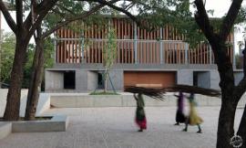
Image © NoMad Walk. Rendering by Kilograph
选择一种风格
在以上叙述中,我指的是两种类型的可视化方式,即概念效果和实际效果。后者很好理解,客户通常会希望建筑师能够拿出的最直接的表达成果。因为这能够让建筑师隐藏一部分不那么完美的要素,并且通过环境来表达整体构思。这在商业项目中十分有益,当客户看到一家人坐在建筑前方的草坪上享受阳光的画面,让人感到十分温馨。
Pick a Style
Above, I alluded to the two types of visualization: editorial and usage. Usage is fairly self-explanatory, and is often what clients ask for when they want an image or animation from you. Usage allows you to remove the unknowns from a visualization, relying on clear presentations of an environment’s attributes to do the heavy lifting. This can be especially helpful on entitlement projects where the fate of a neighborhood lies in the balance. Showing those bike lanes or a family hanging out on the grass can really be soothing, especially when it’s presented in a positive light.

Rendering by Kilograph
但是另一方面,那便是概念效果,这类图像往往很能吸引眼球,但相应地,也要牺牲一些细部空间。许多设计公司会希望通过这样高大上的图像来打造自己的品牌,并且通过图中的构件与风格来提升画面整体感。那些潜在的因素与公司品牌的概念相互契合。因此,如果你想要表达一个概念,亦或是一个大概的设计意图与方向,甚至是表达你的创造思维,那么你可以选择这种方式。
For editorial, on the other hand, you are trying to be eye-catching, in a way that doesn’t always prioritize the space at first. Most companies look to fashion spreads, centering the image on costumes or props to raise a mood. Those underlying feelings, which connect to a bigger idea of a building’s brand, are what you are going after in an editorial push. So if you have a good idea, an open brief, and a target audience that would respond to some creativity, this route can be a lot of fun.

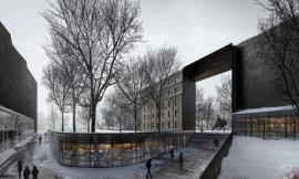
Image © East West Partners. Rendering by Kilograph
建立场景
人们仍然在讨论影视作品《The Odyssey》,其中原因那便是好故事将与我们同在。通过周边环境,例如往来的人,你能够直接地表达场景的故事。
我们近期在美国丹佛完成了一个住宅项目,我们的目标是让这座建筑看上去更具活力。例如,通过图像,人们能够看到一个孩子的四岁生日派对,长辈们在聊天,孩子们在愉快地奔跑玩耍,这一切都发生在这样的场景之中。大人们看起来衣冠楚楚,孩子们天真且有礼貌,他们看上去都拥有着扎实的经济背景,这是一派和谐的画面。那么,这一切都与建筑息息相关,因此,如果你的项目想要吸引到这类群体,那么你也可以这么做。人物的形态与其所处的社会背景密不可分,而这些通过图像就能直接表达。
Build a Narrative
There’s a reason why we are still talking about The Odyssey: good stories stay with you. With entourage, you can tell visual narratives without words, using the right presentation of people to keep someone scanning around the image, or leaving with an intended takeaway.
We recently did a project for The Coloradan, a residential project in Denver. Our goal was to make the amenities of this condo development feel a little more alive. For example, in one illustration the viewer is launched into a four-year-old’s birthday party, filled with parents chatting and kids tearing around the place. Think about all the elements at play here: families, gatherings, togetherness, all contained within an events room. The adults look successful, the children look maybe middle to upper middle class, and everyone looks comfortable. Everything ties back into the brand of the building and the types of people they wanted to attract—the right entourage, inserted in an appealing way, can do that. And because humans come with years of social conditioning, an image like this can get there in nanoseconds.

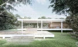
Image © Charcoalblue. Rendering by Kilograph
另一个需要考虑到不同的元素是图像的组成部分,例如所添加的小场景。很多时候,我们会把这些小场景放在图像前侧,因为大多数人在看图时最先看到的就是这个部分,那么你就应该在这里来表达你想要表达的场景。图像的每个部分都应该或多或少地表达某种场景,例如,我给你看一张博物馆的效果图,你也许会去观察,其中的人们在看向何处,但是与此同时,你更应该考虑的是,你希望你的客户在此时看向何处?你希望他们和展览品之间会产生什么样的互动?也许在图像的另一侧,你会放置一个正在喝水的人物。总的来说,你可以运用不同的任务来创建不同的场景故事,但其中的关键是这些人物不能够过于抢眼,因为每个人在当下只能接收这么多信息,你应该让人们保留精力,看到你真正想要表达的内容。
运用常规的环境表达
当客户来找我们时,总是会表达一些特定的需求,最常见的方式就是拿着他们曾经见过的图像,这也是我们创建自己的周边环境的原因,我们通常在项目中运用绿色屏幕和模型。那么,这要追溯到我之前所说的“品牌”,有的人会通过视觉感受来做出某种判断。像我们这样的专业机构,常常运用的手法就是包揽图像的所有过程,将主动权完全掌控在自己手中。
Another thing to consider is how the different parts of an image, including all the mini-stories, play off each other. A lot of times we put the narrative in the foreground. Since that’s where most people’s eyes go first, that’s where you should put your A story. Each part of the image should either expand or supplement that A story in some way though. For instance, if I were to show you an image of a museum, you might expect to see people staring at a painting. But it’s often smart to think about what else I (or the client) wants you to see. What if they have specific exhibits that are interactive? You could insert a group engaging with them in the background. And maybe to the side, you put someone getting a drink of water, a much-needed break. Together, these characters create a multi-layered narrative; the key is figuring out how to make sure your background stories don’t compete or take away too much from the main one. Humans can only process so much information, so it’s always best to serve your main concept over everything else.
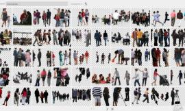
Use Custom Entourage
When clients come to us, they want something unique. The quickest way to look commonplace is to start filling their visualizations with a bunch of stock models that they’ve already seen before. That’s why we create our own entourage libraries, using a green screen and models we hire for the job. It goes back to what I was saying about brand; certain people are going to evoke certain types of feeling in the viewer. Casting allows an agency like us, who often handles branding and visualizations top to bottom, the highest level of control.

Courtesy of Kilograph
在作图过程中,我们最喜欢研究的便是苹果公司的ARKit,通过这个软件我们能够将3D环境线性排列。你只要拿起iPad,检查一下设置的角度,就能够节约大量的时间。
构图与场所
那么现在,当你有想要表达的场景之后,接下来该怎么办?很明显,应该整合周边环境,这并不是一件容易的事情,因此环境的设置很容易影响到建筑的表达。周边环境与人物的放置会影响到空间的尺度,同时也能够突出设计的关键要素,另外还能隐藏一些不足。
为了表达这一点,我以一个办公项目为例说明。
One of our new favorite toys for this process is Apple’s ARKit, as it allows us to line up models with our 3D environments. You just hold up an iPad and check angles on set, which saves a lot of time in post.
Compose and Place
So now you have your characters, you have your story. What’s next? It’s time to consider the placement and integration of your entourage—which admittedly is no easy task, since these decisions can directly impact the perception of the architecture. Entourage placement can make a space look big or small, spacious or narrow, or even highlight key elements of the design (or hide an unresolved aspect of the design).
To illustrate this, let’s break down an illustration I did for an imaginary office in Malibu.

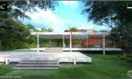
Courtesy of Kilograph
这其中有两个场景,即一个发生争论的办公场所,还有一些即将去海滩玩耍的人群。整体来说这个场景十分有趣,但是应该注意到每个组成要素的作用,例如,你需要表达海洋的宽阔,同时运用对称构图,这样看上去让整个画面更加适宜。
之前:空间中没有人,整体空间设计温暖开放,人们的视线畅通无阻。
There are two stories operating in tandem here: an office in crisis and some surfers on their way to the beach. The juxtaposition is supposed to be amusing, but notice how other key compositional considerations are at play, like a clear view of the ocean, a feeling of spaciousness, and the use of symmetry, which is pleasing to the eye.
Before: Without the people, you are left with an open, warm design that allows the viewer’s eye to scan unimpeded.

Courtesy of Kilograph
之后:添加了人物与场景。你放置了特定的家具,但是这样会遮挡部分视线,因此这里的布局至关重要。你需要表达的是场景,这比一个空荡荡的房间更加耐人寻味。
After: Introduce the people, different story. You lose your line of sight on specific furniture or architectural elements, so placement matters. But what you gain is narrative, and that’s better than an open room.

Courtesy of Kilograph
主动区域VS被动区域:在放置家具时,你要考虑到整个空间的协同作用。例如,人物的运动轨迹应该如何设定?你不可以让人们在办公桌之间乱跑,因为这会在安静的氛围中形成紧张感。在这个图像之中,椅子的摆放十分关键,它们能够表达会议场景,继而表达办公环境。
Active vs Passive areas: When considering placement, you have to think about how a space is supposed to function. For instance, where is motion permitted? You wouldn’t have someone running between the desks, as it would create tightness and feelings of chaos in an area that is supposed to be for collaborative work and quietness. In this image, the chairs act as an active meeting point for people, which makes sense in an office environment.

Courtesy of Kilograph
人物:接下来,你需要明确人物的数量、角色、层次,因为这是一条完整的逻辑思路。在这样的情况下,主要的场景(即图中的蓝色部分)位于图面的中间,点出了其重要作用,在其中,人物的大小、身体的位置也十分重要。我们可以将主要人物放置在画面的中心,然后你也可以留下一个小空间来表达次要的场景(即下图中的绿色人物)。如果主要人物太过于靠前,那么会影响整体的视觉效果。
Actors: Next, you’ll want to define the number of characters, their role, and a hierarchy, as it will set a path for their position and scale. In this case, the main story (the office drama in blue) is set in the middle-ground, giving it the same level of importance as the architecture. The scale, body positioning and location of the people play a key role. By having the main actors positioned close together in the center of the frame, you leave room to tell a secondary story (the surfers in Green) and space for the architecture. If the main actors were too close to the camera, it would become all about them.

Courtesy of Kilograph
构图:当你分析这个场景时,你会发现整体构图相对均衡对称,并且拥有景观朝向的一点透视。通过这样的构图形式,更能够表达整体的场景。如果你想要表达对称构图,但是你并没有把主要人物放在中心位置,那么这就会导致整个画面的失衡。
Composition: If you analyze this scene, you’ll see it’s balanced, symmetric and in a landscape orientation with one main point perspective. When you work through composition decisions like this, you create a structure that helps with placement. For instance, if you know you want symmetry, you don’t put your main actors in an off-center position. It would cause the whole image to feel unbalanced.

Courtesy of Kilograph
最后,当我们回顾所有的分析图时,我们会发现其中的每个表达信息,其中有人物的移动过程、主要场景的对称构图、主次场景的表达方式,每个层次环环相扣,让整个画面充满动态、美观的可视化效果。
在作图时应当思考的几个问题:
视觉路径:每个图像都有引导看图者的视觉路径,但路径的优劣也各不相同。在布局的时候,需要考虑人们真正关心的内容。如果你想要让人们着重关注某个区域,那么你就对其进行着重刻画。如果你希望人们有序地跟随引导而欣赏场景,那么你可以将人物分散排布,并将主要笔墨放在重点区域。
透视水平线:你的周边环境与人物是位于图面的上部还是下部?透视水平线对人物的比例和画面的情感表达有很大的影响。你可以将其作为某个标识,然后让人物与周边环境与之对齐。
相机镜头:镜头畸变在设计中是个非常关键的要素,它甚至可以让我们的作品带有艺术气息,镜头的畸变能够改变视角,但如果运用不得当,会使得人物看上去整体失衡。
构图规律:你是否结合了经典构图原则,例如三分法、黄金分割等等。
Finally, when we overlay all the analysis diagrams at once, we can see everything we need to know about the composition from where the main action and movement are happening, to how symmetry is broken by main story, to how the secondary story counterbalances this movement. Each piece serves the other, creating a dynamic, pleasing visual for the space.
A few other points worth considering during composition:
The path: Every image has a visual path that guides the viewer’s eye. But some are better than others. When considering placement, take into account what you want the viewer to see. If you want to call attention to one area, grouping helps. If you want them to discover space and narrative in an orderly manner, then disperse your actors, putting more of the focus on the areas you want to highlight.
The horizon line: Is your entourage above or below it? This line will tremendously affect someone’s perception of the scale and proportion of your people. You can also use it as a guidepost for making sure a person is aligned and blended properly with the surrounding elements.
The camera: Lens distortion is an important factor to be aware of in the photography world. It can make or break our images as artists. Distortion can shift perspective, making objects or people seem out of proportion if not balanced right.
The guidelines: Are you incorporating the classic rules of composition: the rule of thirds, golden ratio, etc?

Rendering by Kilograph
激发情感
虽然所有的人物都通过直接的线条进行连接,但并不是所有事物都拥有情感,它们有时无法表达诸如“我感觉很危险”、“这很不错”等情感信息。那么文化在其中也至关重要。在周边环境与人物的设定中,你需要同时考虑的是看图者对于物体美学、形态、色彩、服饰等元素的感知。每个事物都能对人产生启发,因此你要综合考虑各个元素,让看图者能够被其所吸引。但在展示之前,这里仍然有一些注意事项:
人物的面部表情与肢体语言:人物的面部表情是否和画面整体情感相契合?他们的肢体语言和表情是否和谐?我们常常会在某个方面的表达中有些过于慎重,但其实看图者很容易便能发现图面中人物的表情与体态是否存在不自然的现象,因此作图时需要确认画面的整体情绪是否统一。背景环境也同样重要,我们以盖里的作品为例进行了研究,那是一个具有创造力的工作场所,我们设计了一系列的人物体态,而这些体态非常符合当下的环境,比如一个人在办公桌前瘫坐在椅子上,双手方在臀部两侧,而另外一个人正在浏览杂志。你所选择的人物体态应该符合当下的整体环境,因为每个人对场景的理解并不相同,这一点你可以按照你自己的构思进行设计。
年龄:在部分文化中,年龄问题很受重视,但是在美国则一般。有时,年龄与成熟相互关联,那么这也意味着项目品牌的发展历史。你想象一下,如果将20多岁的青年与70多岁的老人放在同一个画面中,那整个图面会呈现怎么样的效果?如果图中的人物都是小孩,那又会怎样?人物的年龄范围能够对图面效果产生一定的影响,但这都与场景有关。不同的人物谁是重点对象?谁表达积极态度?谁表达消极态度?这都在作图的考量范围之内。
图面色彩:人们常常认为,蓝色让人舒适,而红色更引人注目。关于这个问题由很多研究结论,你都可以进行相关阅读。但是为了图面效果,你可以考虑色彩对于情绪的影响,以及色彩对于人们关注度的影响。因此,你在为人物添加色彩时,你可以将譬如红色等稍重一些的颜色添加给想要重点表达的那个人物。
结合未来
世界那么大,一座建筑至少能够存在50年,尤其是城市中所包含的交通项目和基础设施,那么,在图面可视化表达中,我们该如何处理时间问题呢?
当我们通过图面来表达未来,我们需要了解未来发展的趋势。例如在未来50年间,有的元素会产生改变,它也许不应该出现在当下的场景之中。有时你认为会出现的东西却又不一定出现,或者你还可以结合当下流行的VR技术。当夜晚降临,你所添加的人物在整体环境中应该如何当下的自然状况。钻研空间非常有趣,但稍有不对,整个感觉便会丢失。说白了,可视化图像就是创造一种感觉而已。如果图面看上去并不真实,那么设计也缺乏了相应的可信度,你投入的力气与情感也会浪费。或者换个方式说,也许你最终表达出来的东西并不是一开始的设计意图。
Fredy Castellanos是洛杉矶Kilograph工作室的艺术总监和高级合伙人。
Evoke Emotions
While all humans are hardwired to scan, not everything can be whittled down to biology ("I see danger," "they look nice," etc). Cultural conditioning plays a huge role as well. What’s important to consider with entourage is how your target audience feels about different aesthetics, looks, colors, clothes, etc. Everything can trigger somebody, so you want to be conscious about what you are putting together, so the viewer is left feeling good or intrigued by what you are showing them. Here are a few things to pay attention to:
Facial expressions/body language: Do the faces match the mood? Do the gestures match the faces? A lot of times we are guarding against overacting in our shoots. Viewers can quickly spot a fake smile or an over-the-top gesture and they don’t like either, so ensuring that the look is synonymous with the feeling is extremely important. Context also matters. When we created designs for Frank Gehry’s Ascend, a creative workspace, we included a mix of gestures that made sense in the situation, from the way someone comfortably leans back with their hands on their hips during an impromptu office chat, to the way another browses a magazine on a break. The gestures you pick should fall in line with a viewer’s expectations. And we all have thoughts about how different situations or environments should function.
Age: In some cultures, it’s respected. In the US, not so much. Age can be associated with everything from maturity to being over the hill, which means it is one of the quickest identifiers for brand intent. If twentysomethings are mixing with seventysomethings, what does that say about a space? If the visualization is child-heavy, what does that say? Age ranges can completely change the feeling of an image, so it all comes down to the narrative. Who belongs there and who gets priority? What are the biases and what are the expectations? Consider the norms and work from there.
Colors: There’s a reason why blue is thought of as comforting. Or why red cars get more tickets (eye-catching). There are whole studies on this subject, and you should read them, but for our purposes consider this: colors carry moods, draw attention and tell your eyes where to go. Remember that as you assign them to your entourage. If your A-character needs to stand out, don’t give the red to another group. It robs the hero.
Consider the Future
Cities think big. So big that plans can often live 50 years in the future, especially when they involve central services like transportation or infrastructure. So how do we, as visualization artists, work with a gap like that? 50 years is a long time.
When we plot out the future, we look to trends, trajectories and what’s not currently being used in the world, especially on the street. What’s on the runway isn’t always out and about, but it might be in 50 years. Or consider Google Glass. It didn’t work, but the idea of some form of technological eyewear is likely in time. At the end of the day, the people you choose should seem natural within the environment. It’s fun to be space-y, but if it doesn’t pass the scan test, it won’t feel right. And feeling right is the goal. If the presentation isn’t believable, the design is moot and the emotional connection is squandered. Or, thought of another way, you’ll get an emotion... just not the one you want.
Fredy Castellanos is an art director and senior associate at Kilograph in Los Angeles.
|
|