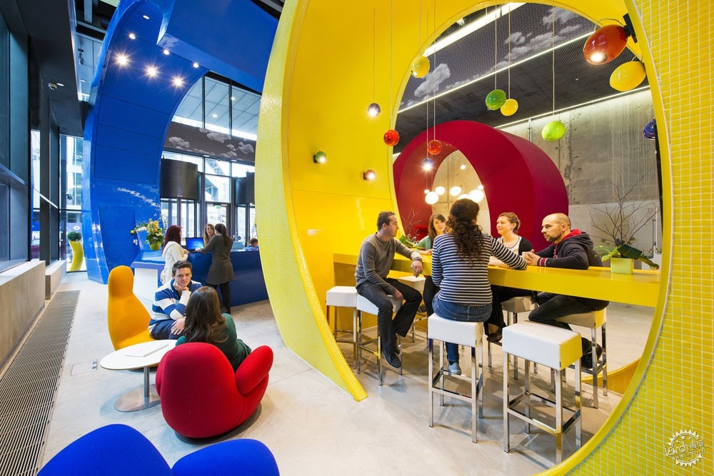
Google Dublin. Image © Peter Wurmli
建筑是一种我们都在购买的产品
Architecture is a Corporate Product - and We're All Buying
由专筑网李韧,王帅编译
建筑与其他时尚或音乐文化截然不同,它只能通过亲身体验来理解。对于优秀品牌公司而言,设计一座建筑是展示其品位与价值的好机会,同时这也会成为建筑业内的经典案例。虽然这些建筑主要使用者是员工,但是它们同样充满了创新意识,那么这是一种什么样的感受呢?
Architecture, unlike other aspects of culture (such as fashion or music), can only really be experienced and understood in person. For highly branded companies, designing a new building can be a prime opportunity to signal taste and values - but also creates an interesting architectural conundrum. While the buildings will be inhabited (nearly 24/7) by company employees, they’re also very much populated by the imaginations of people across the globe. What is it like to be in these places?
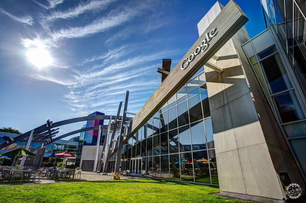
Image via Flickr user rjshade
这个问题具有一定说服力,因为在2013年的一部电影《实习大叔》中就是类似的剧情,Vince Vaughn与Owen Wilson主演的两位“失败者”希望能够恢复年轻时的心态,后来他们在谷歌公司实习,这里是一个他们并不熟悉的世界,但是他们不仅为公司奉献了许多,同时也造就了许多有趣的故事。工作其实大同小异,不同的是公司。谷歌公司设置有游泳池和理发店,还有各种免费的美食。你甚至可以在球场上进行电话会议,这样的环境谁不心动?
那么在电影中出现这种画面是一方面而已,但是许多公司都愈发地通过建筑来表达品牌意识,只是,你可能意识不到这一点。
开车环绕硅谷会让你大开眼界,在这里集结了许多创意与创新,但是你真正身处其中的时候也许感受不到这些。景观一般位于郊区,其中更多的是商场和办公园区,而非传统的城市广场亦或是一些你固有观念中的景象。
This question is so compelling that it was essentially the plot device of the 2013 film, The Internship. Vince Vaughn and Owen Wilson starred as two ‘loser’ guys so desperate to reclaim the coolness of their youth that they take internships at Google. While their hapless attempts to fit into a world they know nothing about makes the movie fun, it also does a lot of heavy lifting on the company’s behalf. Working isn’t cool... unless you do it at Google. The Google offices have swimming pools and barber shops, and all the food is gourmet and free. You could even take your conference call from a ball pit. Who wouldn’t want to work there?
It’s one thing to see this popular image presented in movies, but companies increasingly seem to be using architecture as a way to brand and signal their particular flavor of cool. And yet, you wouldn’t necessarily know this from the street.
Driving around Silicon Valley can be a disorienting experience. For all the creativity and innovation centered in the region, it’s nearly impossible to deduce this when you’re actually there. The landscape is suburban, punctuated more by strip malls and office parks than by the ‘town squares’ or ‘spaceships’ or you might expect to see.
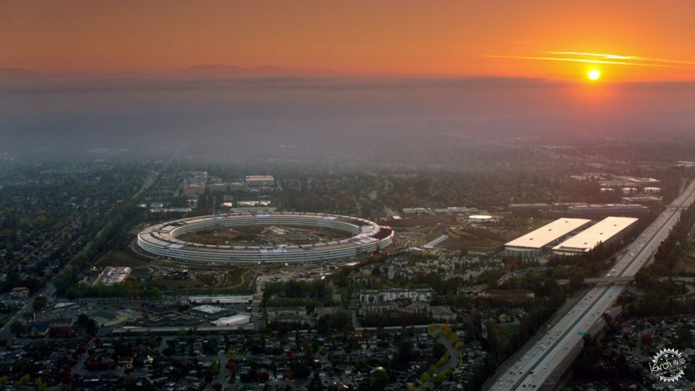
Screenshot from video via Apple
在过去几年里,建筑大师们都设计了许多产业项目,例如苹果公司和福斯特建筑事务所的合作便众所周知,而Facebook、BIG、 Frank Gehry同样也塑造了具有叛逆精神的作品,只是有时这都并不是事实。
一些大师们都热衷于承接公司项目,因为对媒体而言,这样的项目比较具有创新精神,那么问题来了,这些品牌作品能否真的满足使用者的需求呢?
Big-name (and occasionally BIG name) architects have, in the past few years, attached to tech campus projects in calculated alliances. Apple and Foster + Partners are both behemoths known for their sleek and uncompromising works; Facebook, BIG, and Frank Gehry all cultivate an image as rebellious underdogs, even though this is far from the truth.
That corporate offices are now the focus of this kind of branding is fairly obvious. After all, the companies say to the press, innovation can only happen when the space makes it happen. But can these highly-branded spaces actually provide for the needs of the users?
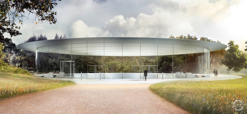
Rendering of the Apple Campus in Palo Alto
苹果公司的评论好坏各半,全新园区的效果图十分诱人,这里有着闪闪发光的玻璃幕墙,每个面看起来都十分精致,但是员工们同样在抱怨不合理的流线布局和功能空间。而对于当地人来说,苹果园区则有些吝啬,这只是因为品牌而出名,并没有出人意料的成果。在2014年“Vanity Fair”科技园区设计的回顾中,Paul Goldberger说:
“这波新建筑浪潮是否能够在建筑环境中给技术行业带来相同的影响还有待观察,亦或是这些新项目是否能够使硅谷脱离自身的传统领域,人们也许希望,建筑和社区在未来能够形成类似的创新意识。”
Goldberger大概能理解,虽然他没有明确表达,这些品牌空间都不能称呼为真正的建筑,它们只是产品而已。
Bloomberg HQ近期获得了斯特林奖,这更加明晰了这一点,在颁奖宣言上出现了诸如“成就”、“可持续”等关键词汇。评审团主席Sir David Adjaye 说:“Bloomberg有着惊人质量的建筑作品。”RIBA主席Ben Derbyshire 称赞这个项目十分“了不得”,他说:“福斯特建筑事务所的创意和Bloomberg的资助大大提高了办公空间与城市规划设计的门槛,让后人仰望到脖子痉挛。”
At Apple, results are mixed at best. The new campus is seductive in images: glitzy sheets of glass seem to appear to hover (just like an Apple laptop), every surface is polished to perfection. But employees have complained of indecipherable circulation, unpleasant working spaces, and long distances. For locals, the campus is even less generous (despite being a major presence): you’re welcome only up to a threshold. None of this comes as a surprise. In a review of tech campus designs published in Vanity Fair back in 2014, Paul Goldberger mused:
“…it remains to be seen whether this wave of ambitious new construction will give the tech industry the same kind of impact on the built environment that it has had on almost every other aspect of modern life - or even whether these new projects will take Silicon Valley itself out of the realm of the conventional suburban landscape. One might hope that buildings and neighborhoods where the future is being shaped might reflect a similar sense of innovation.”
What Goldberger seemed to get at, even if he didn't quite say it, is that these branded spaces don’t seem to be actual buildings. They’re products.
The press surrounding Bloomberg HQ’s recent Stirling Prize win make this even more clear, with keywords such as 'achievement' and 'most sustainable' cropping up throughout the award citations. "Bloomberg is an astounding commitment to quality architecture.” said jury chair Sir David Adjaye in his jury statement. RIBA president Ben Derbyshire similarly hailed the project as 'monumental achievement', saying: "The creativity and tenacity of Foster + Partners and the patronage of Bloomberg have not just raised the bar for office design and city planning, but smashed the ceiling."
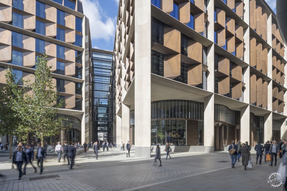
© Nigel Young. ImageThe Bloomberg Headquarters in London
这座建筑代表了巨大的成就,但是对于人们而言同样存在着巨大影响。例如受到许多称赞的公共道路使用起来并不方便,而广场过于繁杂,而这种体验同样出现在了室内,Olly Wainwright在《卫报》中评论这座建筑时说:“办公空间过于内向,来自外界的视线似乎次要于Bloomberg‘团队合作’的意识。你会感觉距离窗户很遥远,巨大的青铜面板遮挡了视线。”
Bloomberg公司总部只是此类建筑的一个案例,但是这座建筑同样受到了许多称赞,因为其外观形态比人们日常所见要独特得多。建筑远距离视觉感受和实际空间体验之间的区别让建筑师更加明确了真实的目的,即远距离视角。
这个问题值得关注。当建筑师更加关注远距离视角,而非城市肌理的参与特征时,那么建筑的本质是否还存在呢?如果品牌公司继续将建筑作为品牌策略,那么值得注意的便是整个受众群体。长此以往,建筑设计是否还能为公众最大程度地提供价值呢?
The building may be a colossal achievment, but it has an equally outsized presence to those actually on the street. The much-lauded public passage is gloomy, the public plazas overly-groomed. This experience is echoed inside: “…[it] is an extremely deep-plan, inward-looking office environment, where glimpses of the outside world are secondary to views back in to Bloomberg’s hubbub of ‘collaboration and teamwork,’” said Olly Wainwright in his review of the complex for The Guardian. “You often feel very far away from a window, a sense exacerbated by the great bronze baffles that further block the view.”
The Bloomberg HQ is just one among many of these types of buildings that have recently seemed to gain more praise for their appearance by the statistics and on our screens than on the street. And this gap between the architecture’s remote experience (how it is photographed and advertised) and their actual presence points us to whom the design is actually intended: the remote viewers.
This should be a concern. When structures become a commodity for remote viewers rather than an engaged participant in the urban fabric, the essence of architecture is lost. And if companies continue to use architecture as an outsized branding strategy, its worth paying attention to who they’re selling to. Can design retain its worth for the general public when presented as a value proposition? Probably not.
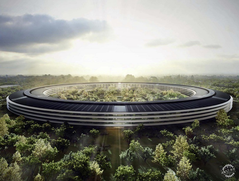
© Foster + Partners, ARUP, Kier + Wright, Apple . ImageRendering of the Apple Campus in Palo Alto
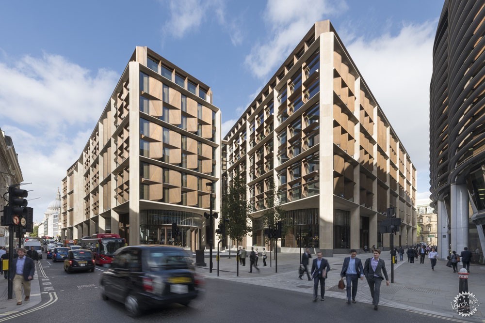
© Nigel Young. ImageThe Bloomberg Headquarters in London
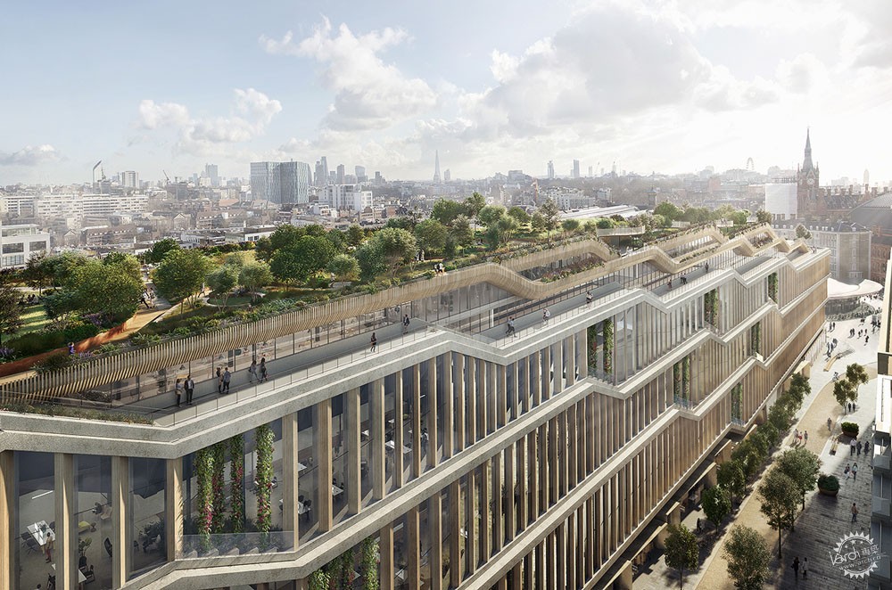
Google's new King's Cross campus, designed by BIG and Heatherwick Studios. Image Courtesy of Google
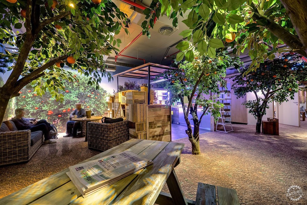
Google Tel Aviv. Image © Itay Sikolski

Google Tel Aviv. Image © Itay Sikolski
|
|
