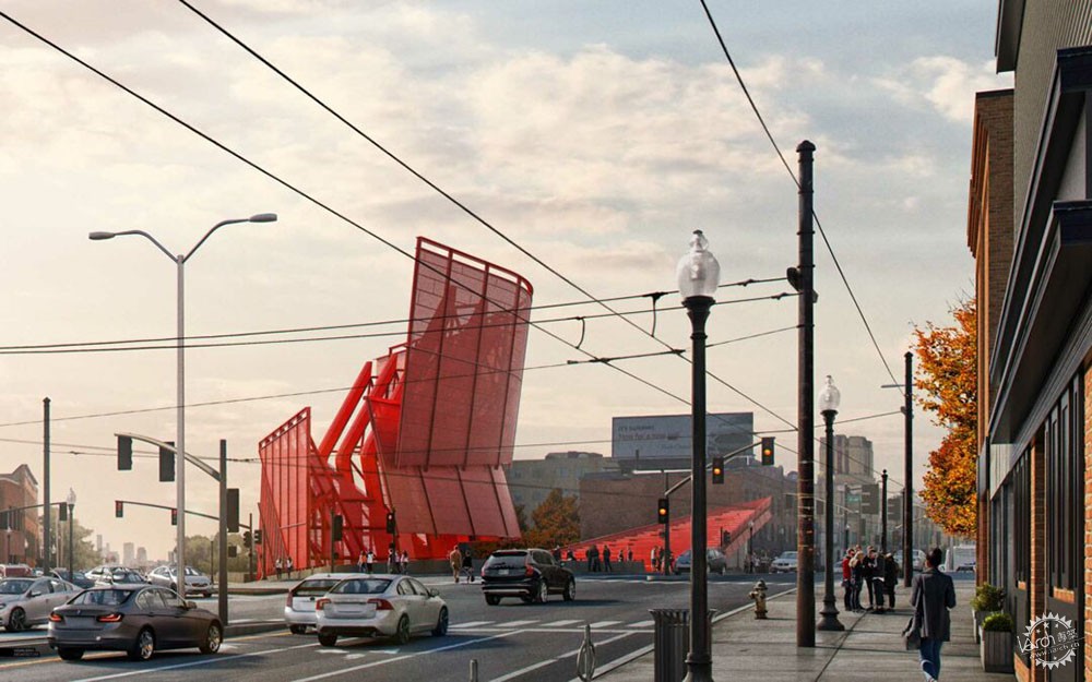
Porter Sq. Distant View by Alex Hogrefe
由专筑网小R编译
上个星期我搭乘公交去上班,经过Porter广场的时候,阳关十分明媚,那么这也给我的车站设计带来了许多灵感,我喜欢这种类型的图像,因为会包含许多肌理和细节。我认为,这类图像的重点在于整个背景,以及新设计和地区的呼应。
不到一天的时间我就能把图像制作出来,其中大部分的时间是花费在细节上,因为图像中会有很多元素,我需要控制相机和光线的位置和构图,那么就需要比较复杂的3D模型,但是幸运的时我可以直接应用其他图像的内容,只要3D模型完成后,那么后期在PS中只需要制作肌理和细节即可。
I was riding the bus into work last week and as it approached Porter Square, the sun was casting some amazing light accross the area. This experience got me motivated to illustrate the new station design as seen from further down Massachussetts Avenue. I love working on these types of images because of the amount of textures and details involved. I also think these types of images are important because of the emphasis that is placed on the context and how the new design fits within the fabric of the area.
I was able to put this image together in a day, but so much of my time went into the details. Because there are so many elements to this image, I needed full control over the composition and positioning of the camera and light. This meant a lot had to be modeled in 3D. Luckily I could recycle elements from my other illustrations including the axon from the last post. Once the 3D was in place, most of my time went into Photoshop inserting textures and building up details.
1、基本模型与渲染
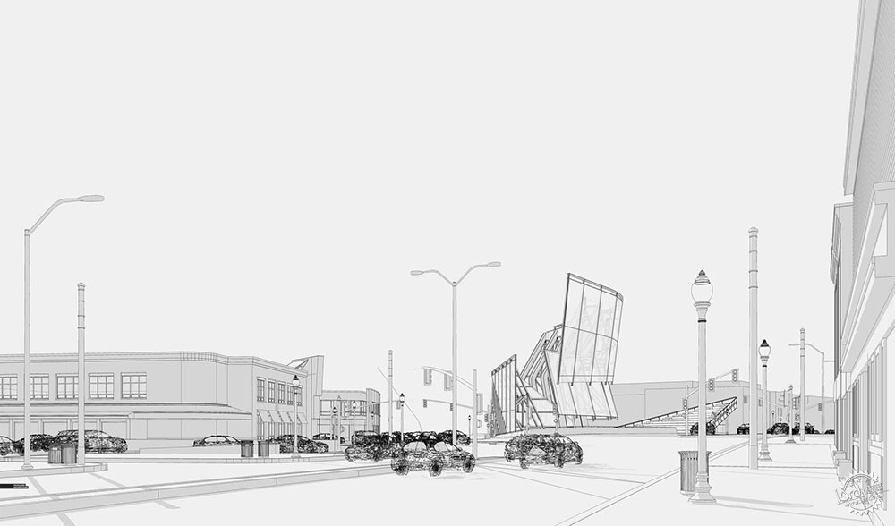
SU线稿
Sketchup Line Work
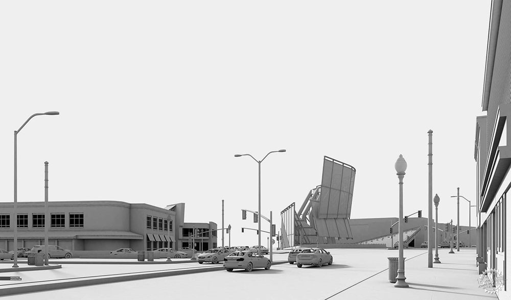
V-Ray白模渲染
V-Ray Clay Model Rendering
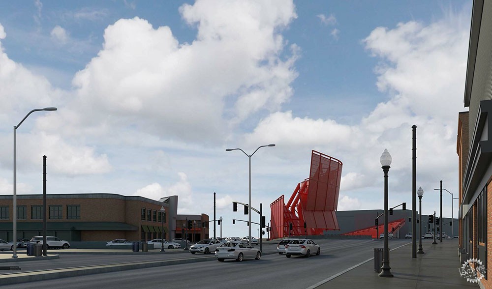
V-Ray基本渲染
V-Ray Base Rendering
针对这个图像,大部分的核心元素都在模型中体现,例如街道和建筑,从这个角度来说我没有很多场地照片,也没有合适的拍摄时间。但是这也很好,因为模型越细致,那么诸如汽车、街道设施等元素的可控性就越高。
1. Base Model and Rendering
For this image, most of the core elements were modeled including street infrastructure and context buildings. I didn’t have any site photos from this exact view angle nor did I take any at the correct time of day (busy week at work). This was fine though because the more I had in 3D, the more control I had over the placement of things like cars and street infrastructure.
2、构图
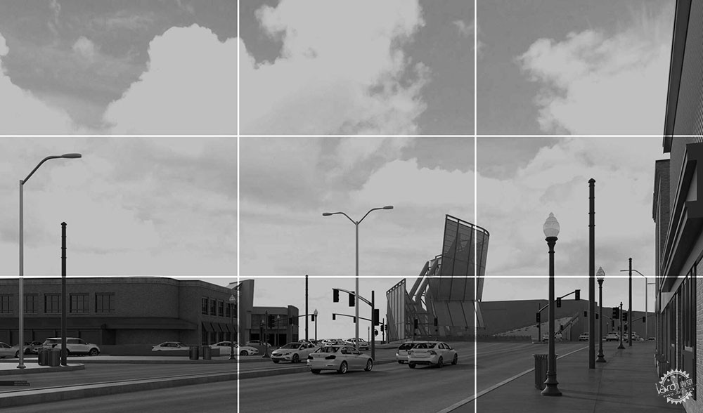
在这样的画面中,我喜欢多留出一点天空。如果将图像进行分割,那么上部三分之二都是天空部分,地平面大概位于下方六分之一处,那么这也说明天空的构图很重要,诸如路灯、汽车电缆等元素可以适当地起到打破横向构图的作用。
2. Composition
In images that are pulled back like this, I love giving the sky a ton of real estate. If you cut the image into thirds, the skyline sits at the lower 1/3rd of the image. The horizon sits at the lower 1/6th of the page. All this means that the sky will become an important part of the image. Elements like street lights and bus cables can be dramatized by allowing them to break the skyline and cut across the page as you will see later on.
3、天空与肌理
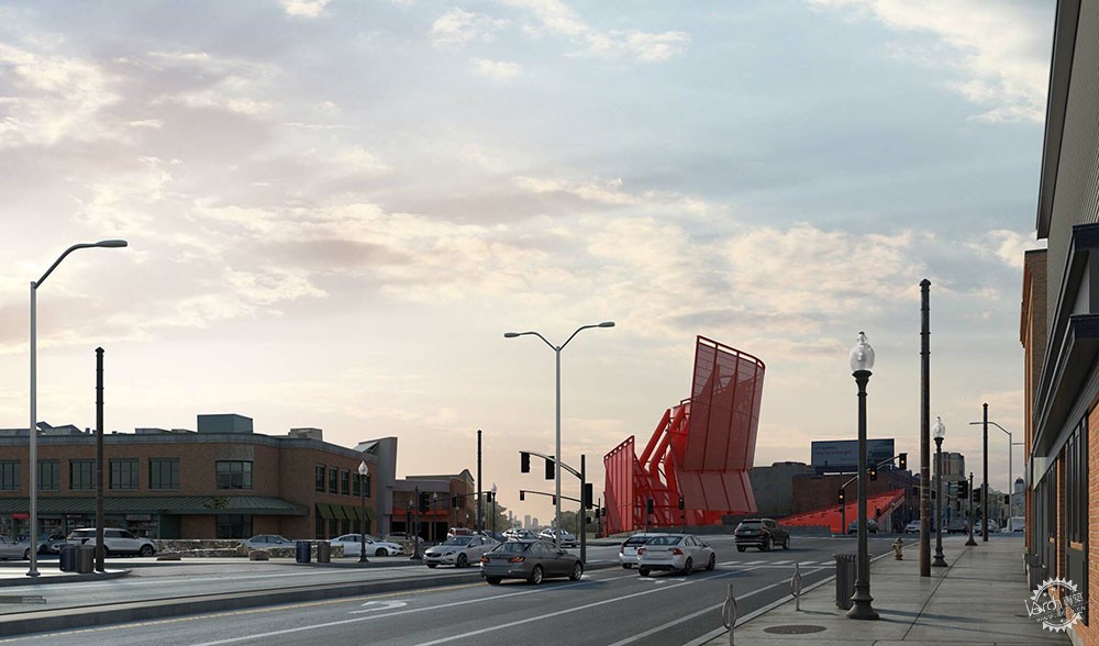
我花了很长的时间来找寻适合的天空贴图,幸运的是还真被我找到了。云朵并不会过于戏剧化,从暖色到冷色刚好形成过渡,我应用谷歌地球来收集街道和人行道贴图,这样看起来真实一些。
3. Sky and Texture
I spent a long time looking for the right sky and I am really happy with the one I found. The clouds are not overly dramatic, and there is a nice overall gradient from warm to cool. I also used Google Earth to collect street and sidewalk textures to help give things a little wear and tear.
4、树和人
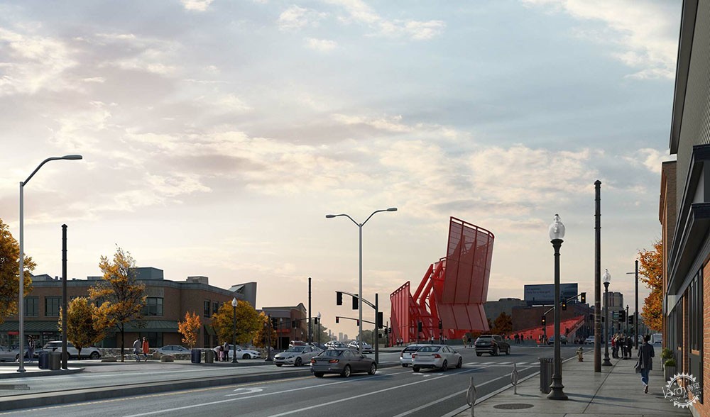
我加上了一些黄色的落叶,因为我觉得纯粹的绿色会减少温馨感,另外,橘色和黄色与车展的红色完美地搭配在一起,最后,我背光放置了几个人物。
4. Trees and Entourage
I went with fall foliage because I was worried to much green would steal some of the warmth of the early morning scene. Plus, the orange and yellows play well with the bright red of the new station design. For entourage, I placed just a few, but making sure they were all back-lit.
5、电线
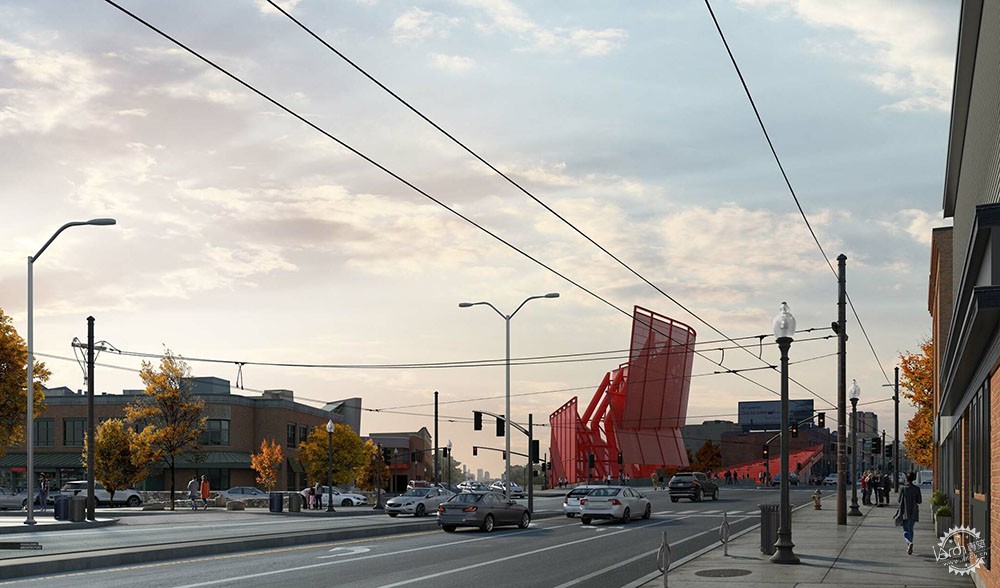
有电动公共汽车就会有电线,电线有时候虽然会破坏画面,但是有时候也可以带来动态感和生活气息,这些都需要不断地试错,直到最终真正掌握完美的构图方式,在PS中应用电线和一些街道装置会比较麻烦,但是如果用得好也很完美。
5. Cables
There are electric buses that run up and down Mass. Ave. which means cables everywhere. Power lines can sometime ruin the atmosphere of the image, but in this case, they add some really nice movement and texture. It took some trial and error, but I was finally able to Photoshop them in such a way that they work compositionally. It can be tricky to insert cables in Photoshop along with all of the attachments and fixtures, but they ended being my favorite part of the illustration.
6、最终成图
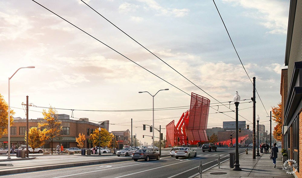
我并没有进行大面积的调色,只是在左边添加了一些光线,也加了一点眩光和饱和度,有的图片我会花比较多的时间来调色,但是这次并没有。
6. Final Image
I didn’t do anything crazy with the toning. I just added a hint of light to the left, played up the glare, and increased the saturation. Some images, I will spend hours playing with tones. For this one, it happened relatively quickly.
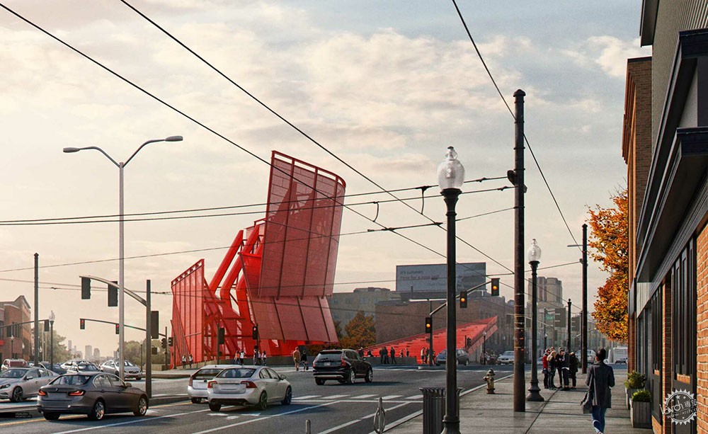
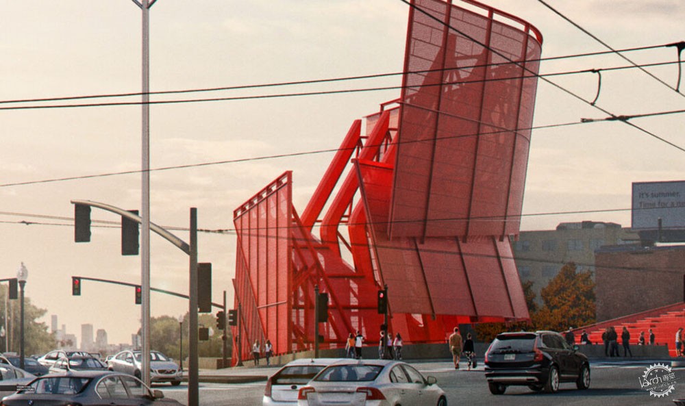
|
|
专于设计,筑就未来
无论您身在何方;无论您作品规模大小;无论您是否已在设计等相关领域小有名气;无论您是否已成功求学、步入职业设计师队伍;只要你有想法、有创意、有能力,专筑网都愿为您提供一个展示自己的舞台
投稿邮箱:submit@iarch.cn 如何向专筑投稿?
