微缩的艺术之城
它是什么模样
你说它很大
不过也就千方有余
你说它很小
但它又可以无限延伸
Miniature city of Art
What does it look like
It's large,but just more than a thousand square meter
It's small,but can be extended infinitely

买手美学
买手是位于时尚潮流前沿的一种职业,买手店的主理人以自身独特的时尚观念和趣味为基准,挑选不同的商品进行售卖。买手店崇尚自由与潮流,产品的款式有时凌驾于品牌之上,所以它并不属于常见的品牌形象店,也没有统一的宣发形象,往往以买手作为其核心,通过自身的创造力与灵感来塑造自由与充满想象力的展卖空间形象。
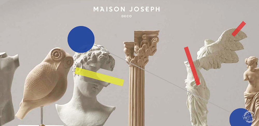
Maison Joseph将设计独特的家居饰物,琳琅满目的摆件呈现在商铺空间,表达着主理人对于生活美学的理解,试图引领着各类人群进入潮流的领地,在充斥着美学的空间领略产品的艺术,体会买手美学的精神。
Buyer Aesthetics
Buyer is a profession at the forefront of fashion trends. The manager of the buyer's shop selects different goods for sale based on his unique fashion concept and taste. The buyer's shop advocates freedom and fashion, and sometimes the style of products is superior to the brand. Therefore, it does not belong to the common brand shop, nor does it have a unified publicity image but take the buyer as its core to create a free and imaginative exhibition space image through its own creativity and inspiration.
Maison Joseph presents all the unique home furnishing design in the shop space to express the manager's understanding of life aesthetics,trying to lead all kinds of people into the territory of fashion life to enjoy the art of products and experience the spirit of buyer's aesthetics in this space.
空间美学的保鲜期限
空间是建筑师利用天然或者人造的材料,所创造的某种情感联系、某种统一的意图与秩序。
相较于潮流风向的转换以及商品的迭代更替,空间艺术所建立的时间更为久远与稳定,其持续的对产品提供能量支撑并对区域内部构成更为稳定的体系。面对着各类层出不穷的新型材料与艺术装置,塑造一个更有沉淀性的美学空间,方能营造和表现出更为真实而恒定的场域。
相较于时尚潮流化的快速节奏,空间美学的期限应在于恒定的经典性。一个富有买手美学的空间应具备自身的特性,它可以不受制于潮流,也不必完全作为产品的陪衬板,它会是一个极具包容性的空间,网罗万千。空间美学的期限无法用一个准确的数值或者单位来衡量,而这个空间则会慢慢地成为记录艺术活动的场所。
Preservation Period of Space Aesthetics
Space is a kind of emotional connection, unified intention and order created by architects using natural or artificial materials.Compared with the transformation of the trend and the iterative replacement of commodities, the time of space art is more stable. It provides energy support for products and forms a more stable system for the region. Although facing all kinds of new materials and artistic devices, it is necessary to establish and show a more real and constant field by creating a more sedimentary aesthetic space.
Compared with the fast rhythm of fashion trend, the space aesthetics should be constant or classical . A space rich in buyer's aesthetics should have its own characteristics. It can not be subject to the trend, and it does not have to be completely used as the foil of the product. It presents a very inclusive space to attract every possibility.The time limit of aesthetics cannot be measured by an accurate value or unit, but this space will gradually become a place to record artistic activities.
现场完成效果
2020 ZIETA艺术展
402

场地位于杭州江南岸创意园区的大厦内,来到4层的电梯厅,便可见到房间的入口,相比拥有标志型形象的沿街店铺,写字楼式的流线格局如何转化成独具体验性的到访途径以及店铺内化的自我空间语境变得特别重要。
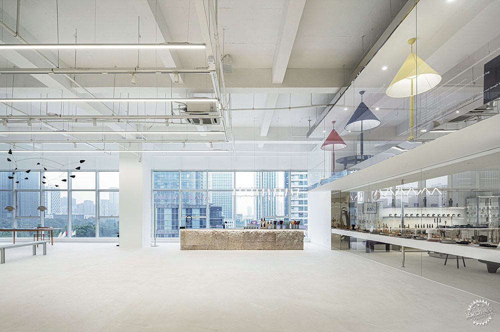
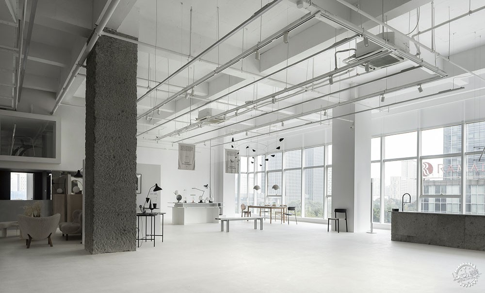
电梯厅相对空旷,402主入口嵌在背景墙上,正对着前厅。其1000平方的内部空间呈现”T”字型,进入完整的主体空间,需要经过将近20米进深的过道。主体空间有将近五米的净高,数跨混凝土立柱居中,相当具有力度,三面落地玻璃,采光绝佳。
The venue is located in a office building of Hangzhou, the entrance is facing the elevator hall of the fourth floor. Compared with the shops along the street, how to transform the streamline pattern of the office building into a unique and experiential way to visit and the internalized spatial expression of the shop become particularly important.
The elevator hall is relatively open, with 402 main entrance embedded in the background wall, facing the front hall. The 1000㎡ internal space presents a "T" shape. Entering the complete main space, it needs to go through about 20 meter deep aisle. The main space is about 5 meter high, several spans of concrete columns in the middle, quite powerful. Excellent lighting because of the ground glass around thee sides.


“洞穴”化的过道空间
空间的秩序

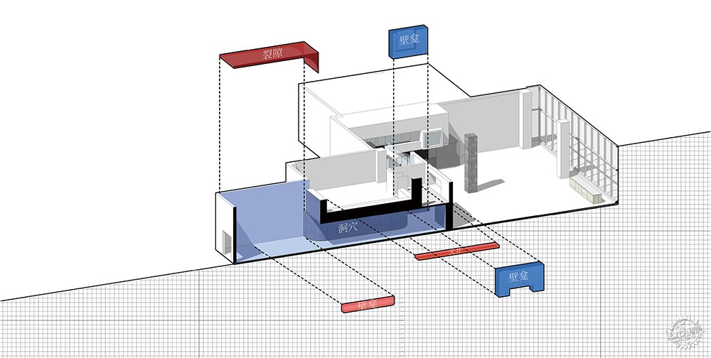
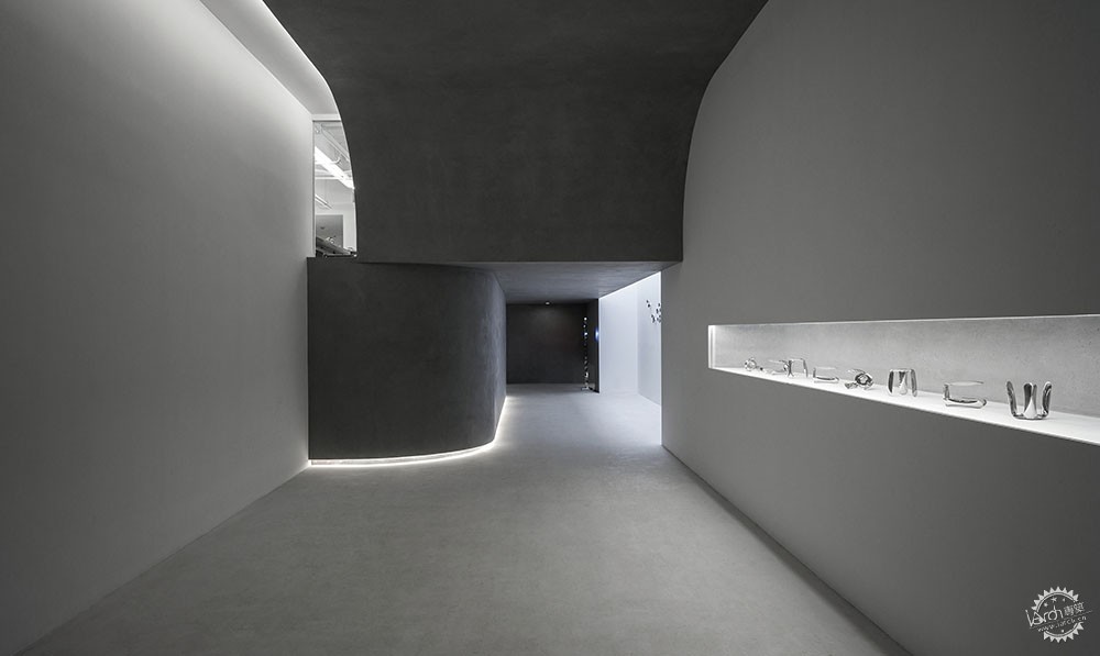
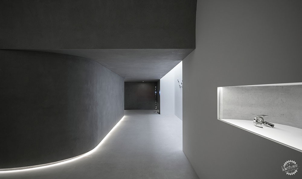
在审视原始场地的过程中,从电梯厅开始,感官上已经产生了强烈的明-暗-明的空间序列感,由入口进入展厅的体验如同穿梭20米深的洞穴,继而豁然开朗,展现出面前对于新世界的期待。
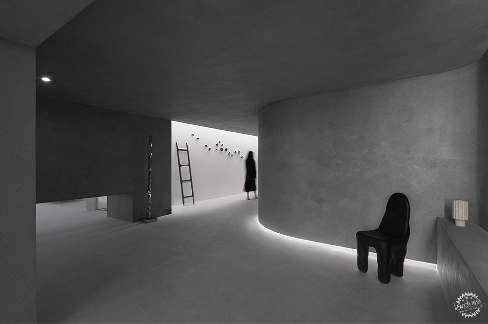
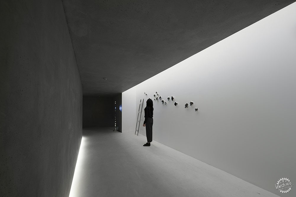
电梯厅到入口过道再至主体空间,循序渐进的形成一种先抑后扬的弹性,空间尺度与明暗的秩序变换使得原本有些闭塞的入口流线变得富有节奏感。压缩后主入口通道的空间,加强了人们对于下一段空间的期许。在进入的这一段相对漫长的过程中,出现了些许壁龛与裂缝,通过它们营造了类似于自然光的柔性光源,以激发进入空间探索与深究的欲望。
The Order of Space
In the process of surveying at the original site, starting from the elevator hall, there has been a strong sense of spatial sequence of light , dark and light.The experience of entering the exhibition hall from the entrance is like shuttling through a 20 meter deep cave, and then it suddenly opens up, show the expectation of the new world in front of people. From the elevator hall to the entrance corridor and then to the main space, it gradually forms a feeling of restraining first and then raising. The change of scale and light makes the entrance streamline which was originally clocked become full of rhythm. After compression, the main entrance passage strengthens people's expectation for the next section of space. In the relatively long process of entering, there are some niches and cracks, through which a flexible light source similar to natural light is created to stimulate the desire to explore the space.


电梯厅被“缝隙”的光照亮

渐入幽暗的“洞穴”

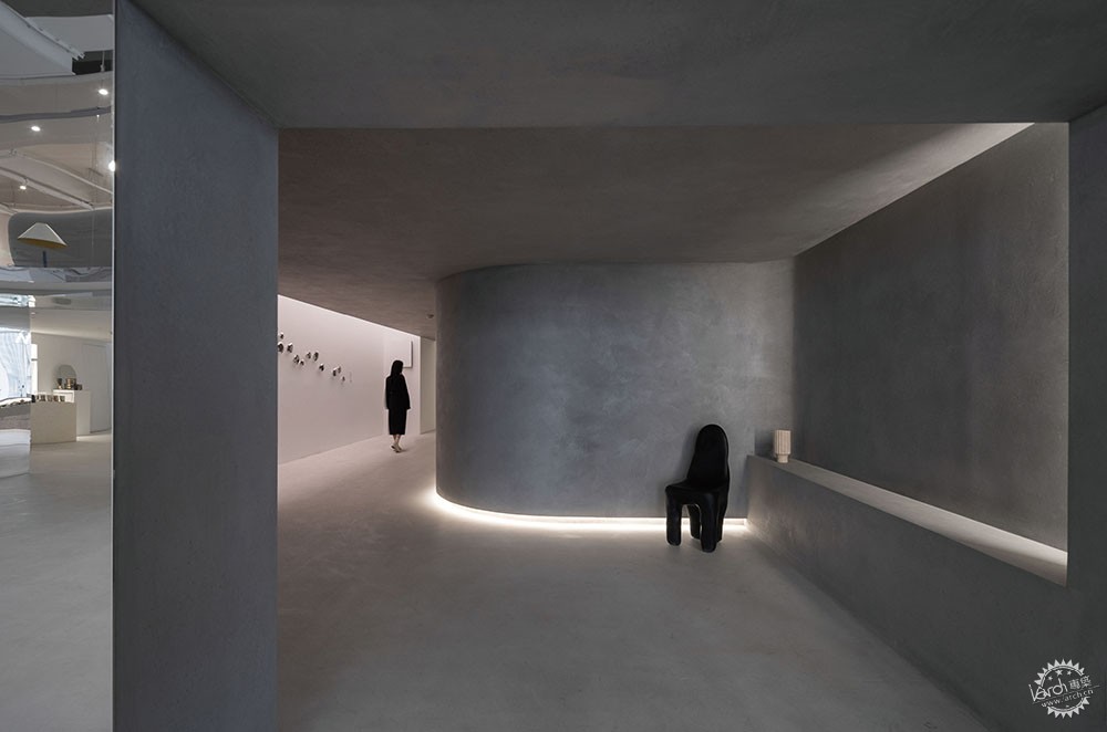
“洞穴”内裂缝的光
内化的艺术世界

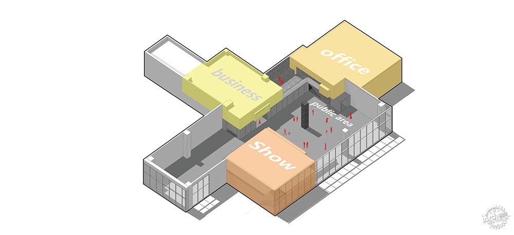
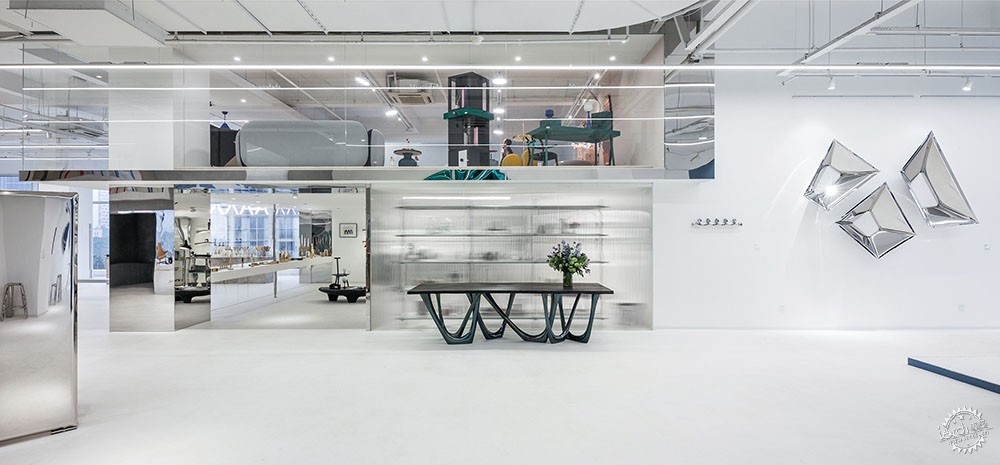
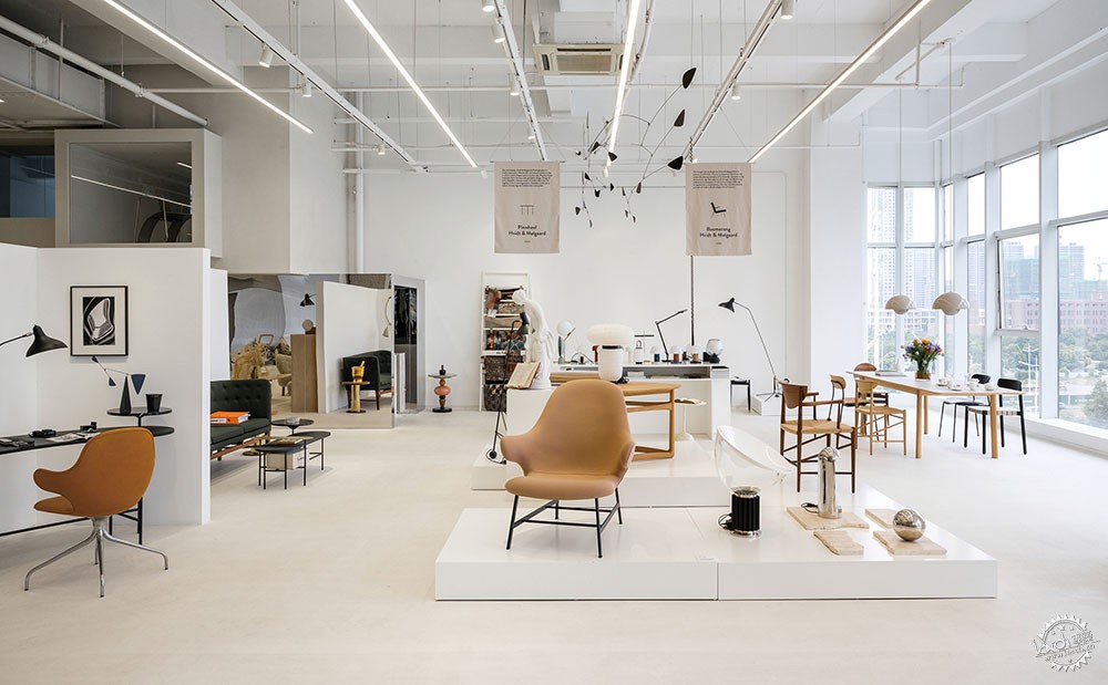
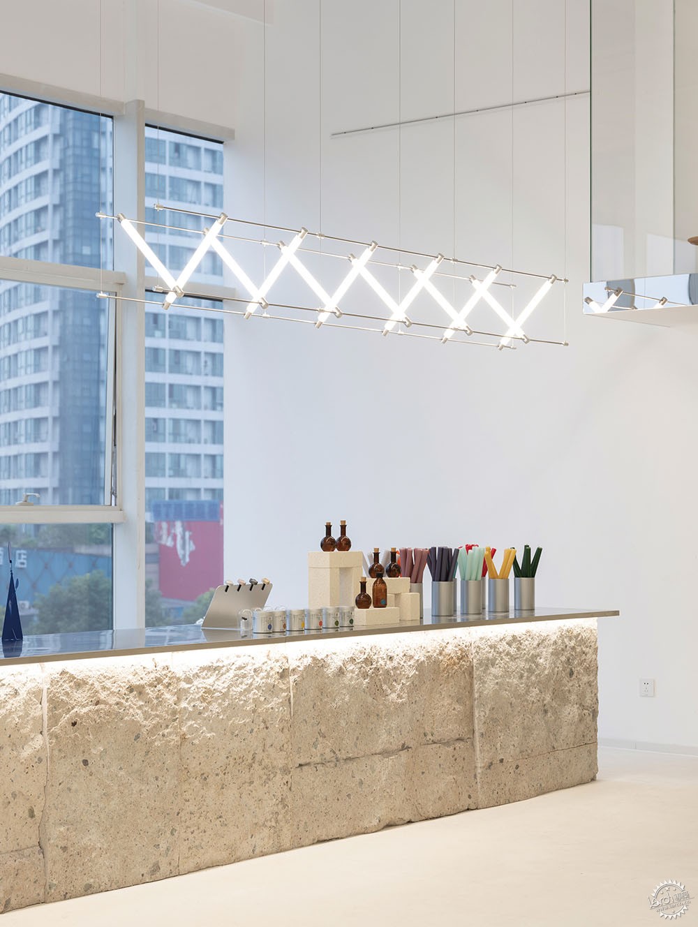
穿越“洞穴”进入主空间后,像进入了一个城市艺术街道,围绕着中心广场是三栋各具特质的建筑体,有商业、有展示、有办公;彼此之间形成“户外”楼梯与“露台”的连接,生成了各个交流、集聚与休闲的公共场所,各种各样的活动都可以在此生发,犹如一角微缩的城市公共艺术空间。
Internalized Art World
After crossing the virtual boundary, the public square space is like a city art street. Around the central square, there are three buildings with different characteristics, including commerce, exhibition and office. They form the connection between "outdoor" "stairs" and "terrace", and generate various public places for communication, gathering and leisure. All kinds of activities can be born here, just like a miniature urban public art space.
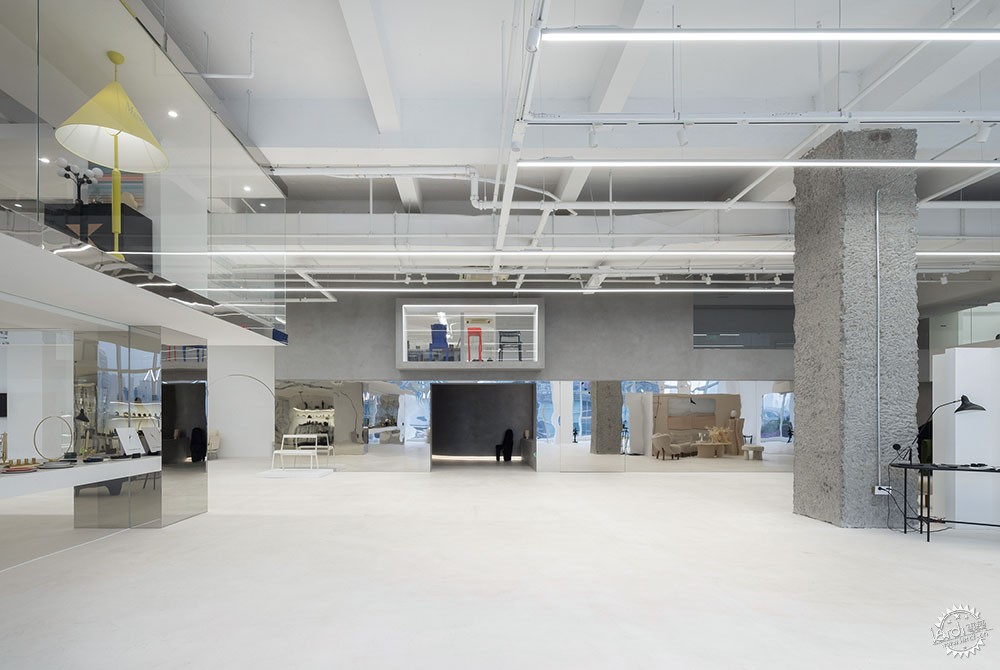
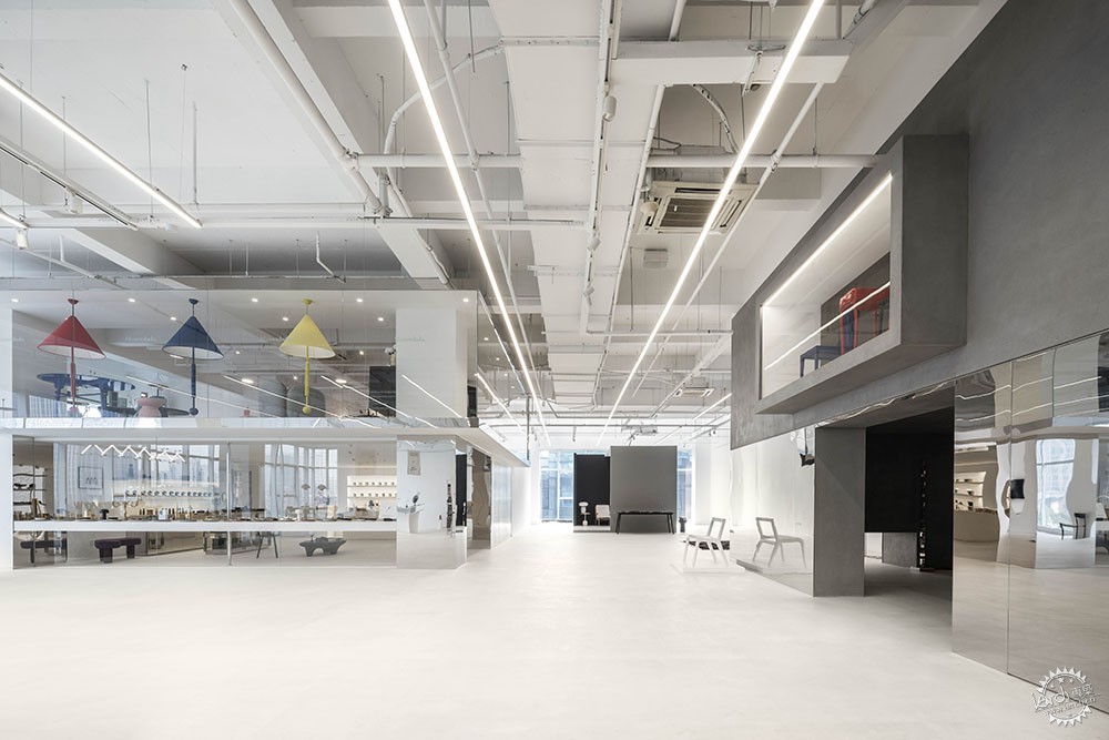
“艺术世界”的建筑体
艺术“广场”的集散
“展台”与“商铺”
独柱
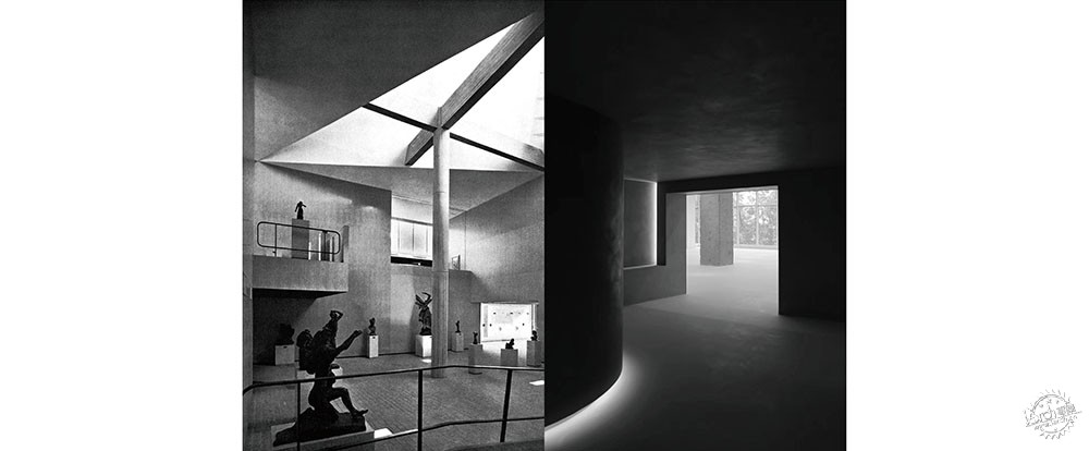
“空间涵盖了各种活动发生的场所,而柱子是空间聚焦的核心。”
Single column
"Space covers the place where all kinds of activities take place, and columns are the core of space focus."
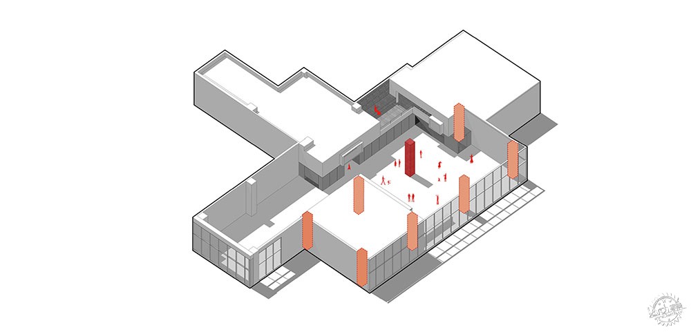
柱子既是建筑空间里的主要结构构件,又是界定空间领域的主要元素。原主体空间内有12根框架柱,设计在消隐柱体营造自由的“公共广场”同时保留了中央的一根混凝土柱子。柱体成为了艺术世界“公共广场”的空间领域中心,艺术品展示与人群集散的社交活动围绕独柱进行。柱子与周边几个建筑盒子形成了互为组合的对应关系。大面积的落地窗采光,以及以白色为主色的空间基底,强化了凿毛处理后的混凝土柱的粗糙质感。在极简的展示空间和虚实相间的艺术维度中,独柱成为了场所空间的聚焦,以一种独立庄重的力量感支撑并稳定着整个空间,并与所处的艺术世界展现出一场开放式的对话关系。
The column is not only the main structural component in the architectural space, but also the main element to define the space field. There are 12 frame columns in the original main space. A column in center has been retained when designer try hiding other columns to create a opening "public square". The column become the square center in the art world. The art exhibition and social activities are carried out around the single column. The column and the box spaces around it form a combination and corresponding relationship. The large area of ground glass window lighting and the white based space emphasis the the rough texture of the chiseled concrete column. In the minimalist exhibition space and the artistic dimension of virtual and real, the single column becomes the focus of the place , supporting and stabilizing the whole space with an independent and solemn sense of strength, and showing an open relationship with the art world as a dialogue.
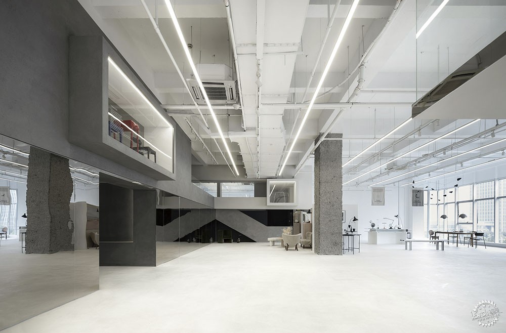

独柱的力量感与稳定感

一层平面图

二层平面图

剖面图
项目名称:微缩的艺术之城——Maison Joseph Deco买手店
设计公司:森上建筑设计
主要设计团队:章钧添 孙鸿斐 董瑾 周文凯 王鑫
客户:Maison Joseph
项目位置:浙江杭州
完成年份:2020.04
建筑面积:1000㎡
主要材料:艺术涂料、石材、镜面不锈钢
摄影:邱日培、汪敏杰、PHAETON 影像
Project name: Miniature city of Art——Maison Joseph Deco
Design Company :Hangzhou SSDesign
Main Design Team:Zhang Juntian,Sun Hongfei,Dong Jin,Zhou Wenkai,Wang Xin
Customer: Maison Joseph
Location:Hangzhou,Zhejiang
Completion Year:2020.04
Gross Built Area: 1000㎡
Main material:Faux finish、Stone、Mirror finished stainless steel
Photography:Qiu Ripei、Wang Mingjie、PHAETON image
来源:本文由森上建筑设计提供稿件,所有著作权归属森上建筑设计所有。
|
|
