
Tour a Serenely Decorated New York Apartment Where Natural Light Rules the Day
由专筑网澄镜之水,小R编译
询问任何经验丰富的装饰师,他们会告诉你:每个客户都有自己独特的东西。可能是对厨房台面的痴迷,或者只是对设计师椅子的偏爱。对于室内设计师Hadley Wiggins和建筑师Anderson Kenny最近在纽约上东区的一个项目而言,人们关心的是颜色,或者更确切地说,如何最好地呈现颜色的缺失。 客户 Elanna Allen 是一位著名的插画家和动画导演,以绘制精美的儿童书籍和卡通片而闻名。 她与丈夫和两个年幼的孩子同住一起,“她是一位令人难以置信的艺术家,具有令人难以置信的色彩感,所以她不会说:‘哦,我希望它是奶油色的,带有一些骨色调。’ 而是说‘这300种颜色我们要选择哪一种呢?为什么?’”Wiggins回忆道。
Wiggins准备迎接挑战。 “我喜欢这种特殊性。”她承认。Wiggins 是一位自学成才的设计师,在开始从事设计事业之前从事广告工作,她以色彩丰富、质地丰富的室内设计而闻名,由于精心挑选的复古家具,始终具有独特的生活古铜色和艺术感。 事实上,她在长岛的北福克开了一家古董店好几年了,现在这里是她各种设计项目的‘武器库’。 她认为中性色调的公寓描述为精确和克制的练习。 “对我来说,这是最简约的。”她打趣道。
为了开发战前三居室公寓的色彩面板,Wiggins向色彩专家Eve Ashcraft寻求建议,Eve Ashcraft曾为Martha Stewart和SOM事务所等客户提供咨询服务。 他们一起研究了房屋暴露在自然光下的情况:朝南的明亮主卧室光线强烈而直接,而朝西北的客厅和餐厅光线较弱,“我们花了很多时间思考光线和阴影在一天中会如何变化。”Kenny说,他拆除了几个较小的室内房间的墙壁,将厨房和相邻的图书馆面向西侧开放,“这能够提升使用者的感受。”
他们在厨房、客厅、餐厅和主卧室应用两种主要色调,即白色和灰色,再结合通透的浅绿色,“所有的色调都有一种美丽的在地性。”Wiggins谈到色调时说,这些色调具有复古的柔和的品质。“所有的饰面都非常干净、光滑和平坦。”
从那里开始,他们开始建立次要色调。“我们很早就认为这种浅绿色天鹅绒是我们想要的效果。”Wiggins说,因此应用这种织物装饰客厅沙发。她解释说,客户选择它是因为它与他们以前家中心爱的家具相似。 “我们称之为家庭织物。”她补充道。 她在客厅的各种花卉图案中加入了相同的色调,隐藏的吧台中的威廉莫里斯壁纸、壁炉旁贴着克拉伦斯宫印花软垫的老式锻铁长凳,还有沙发上的枕头。
考虑到公寓的特点,Wiggins认为家具需要有着同样的特征,“我不喜欢房间里有英雄作品。”她解释道。“相反,我在考虑,我想让你的眼睛停在哪里?我想看透这个空间吗?还是四处随意看呢?”
她将不拘一格的古董与当代作品混合在一起,创造出一系列平衡的画面。 例如,在客厅里,她选择了一系列柔软而圆润的中世纪斯堪的纳维亚扶手椅,搭配锋利的现代石灰华咖啡桌、由Kenny设计的黄铜和橡木书架、粉红色大理石顶的安妮女王风格边桌,以及一组Charlotte Perriand贴花灯,还有类似于从后面照亮的纸鞘。餐厅的焦点在于客户收藏的酒红色皮革 BDDW 椅子。 Wiggins定制了一张长木餐桌以匹配他们简单的轮廓,然后她用微妙的有机色调和形状围绕着餐桌,比如一个球形的吊坠、一个书柜,和一个丝带状的大理石雕塑,它在午后熠熠生辉。
尽管家里有点修道院的感觉,但Wiggins引入了她标志性的色彩,在浴室里,她用鲜艳的色彩衬托墙体,主浴室里有深红色的蕨类植物图案,客房化妆间里有靛蓝色的鸟和树枝图案。 “我们想拥有一些饱和的颜色。”她解释,“就像平静海洋中的小宝石。”
Ask any seasoned decorator and they’ll tell you: Every client has their own particular thing. It could be an obsession with the kitchen countertops, perhaps, or simply just a penchant for designer chairs. For a recent project on New York’s Upper East Side by interior designer Hadley Wiggins and architect Anderson Kenny, that concern was color—or rather, how best to render the lack of it. The client, Elanna Allen, is a celebrated illustrator and animation director known for lushly drawn children’s books and cartoons. She shares the home with her husband and two young children. “She is an incredible artist with an incredible color sense, so this was not a case of her saying: ‘Oh, I want it to be creamy with some bone tones. This was ‘which out of the 300 shades of bone do we want and why?’” Wiggins recounts.
Wiggins was up for the challenge. “I love this kind of specificity,” she admits. A self-taught designer who got her start in advertising before embarking on a career in design, Wiggins is known for interiors that are drenched in color and rich in texture, always with a distinct lived-in patina thanks to a careful selection of vintage furniture and art. In fact, she ran an antique shop for several years in North Fork, Long Island, which now serves as an arsenal for her various design projects. She describes the neutral-toned apartment as an exercise in precision and restraint. “For me, this is minimal,” she quips.
To develop the palette for the three-bedroom prewar apartment, Wiggins sought advice from color expert Eve Ashcraft, who has counseled clients ranging from Martha Stewart to blue-chip architecture firm Skidmore, Owings & Merrill. Together, they studied the home’s exposure to natural light: strong and direct in the bright south-facing primary bedroom, and dimmer and more diffuse in the living and dining room looking northwest. “We spent a lot of time thinking about how the light and shadows would change over the course of the day,” says Kenny, who tore down the walls of several smaller interior rooms to open up the kitchen and adjacent library to west-facing windows. “And how that would contribute to the sensation of being in the apartment.”
They landed on a two-tone palette in subtle variations of white, gray, and barely there pale green for the kitchen, living room, dining room, and primary bedroom. “There’s a beautiful dustiness to all the tones,” Wiggins says of the hues, which have the muted quality of a vintage photograph. “All of the finishes are really dry and thirsty and flat.”
From there, they began to build up the secondary tones. “We identified this sour green velvet early on as our accent,” says Wiggins, who used the fabric to upholster the living room sofa. She explains that the homeowners chose it for its similarity to a beloved ottoman in their previous home. “We called it the family fabric,” she adds. She incorporated the same shade in various floral-patterned accents in the living room: a William Morris wallpaper in the hidden wet bar; a vintage wrought-iron bench upholstered in a Clarence House print next to the fireplace; and Pierre Frey throw pillows resting on the sofa.
Considering the apartment’s desaturated aesthetic, Wiggins knew the choice of furniture had to be equally subdued. “I don’t like for there to be a hero piece in the room,” she explains. “Instead, I’m considering, where do I want your eye to stop? Do I want to see through this space? Or have the eye travel around?”
She came up with a series of carefully balanced tableaux by mixing eclectic antiques with contemporary pieces. In the living room, for instance, she chose a collection of soft and round midcentury Scandinavian armchairs, which she joined with a sharp-edged contemporary travertine coffee table, a brass and oak bookshelf designed by Kenny, a pink marble-topped Queen Anne–style side table, and a set of Charlotte Perriand appliqué lights that resemble sheaths of paper lit from behind. In the dining room, the starting point was a set of burgundy leather BDDW chairs that were already in the homeowners’ collection. Wiggins custom-designed a long wood dining table to match their simple profile, which she then surrounded with subtle organic tones and shapes, like a globe-shaped Noguchi Akari pendant, a floating burl credenza by Ruemmler, and a ribbon-like marble sculpture, which glows in the afternoon light from its perch on the window sill.
Despite the home’s somewhat monastic feel, Wiggins was able to introduce a touch of her signature color behind closed doors—so to speak. In the bathrooms, she lined the walls with vibrant paper: A dark red fern motif in the primary bath and an indigo pattern of birds and branches in the guest powder room. “We wanted to make sure there were a few moments of saturation,” she explains of the decision. “Like little jewels in a sea of calm.”
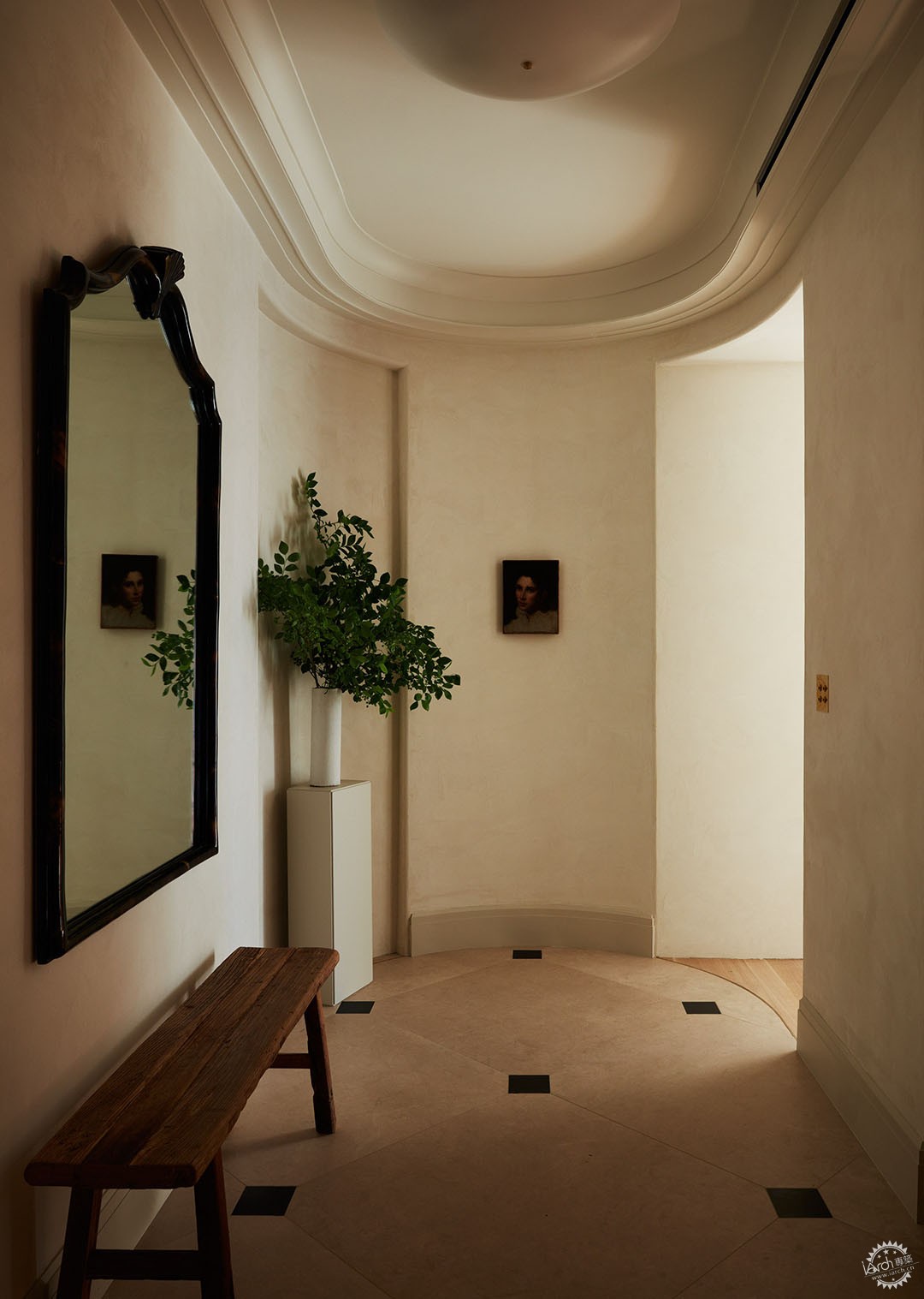
在制定整体平面图时,Kenny从曾经的大门厅削减了几平方英尺,以便在房子的其他部分开辟额外的空间。新入口采用流线型的皇冠造型和一个反映相邻走廊比例的小型装饰壁龛。 “这是一个将城市与家庭隔开的空间。”Kenny说。
When developing the overall floor plan, Kenny shaved several square feet off the once grand foyer in order to open up extra space in other parts of the house. The new entrance features streamlined crown molding and a small decorative niche that mirrors the proportions of the adjacent hallway. “It’s a liminal room that separates the city from the home,” Kenny says.
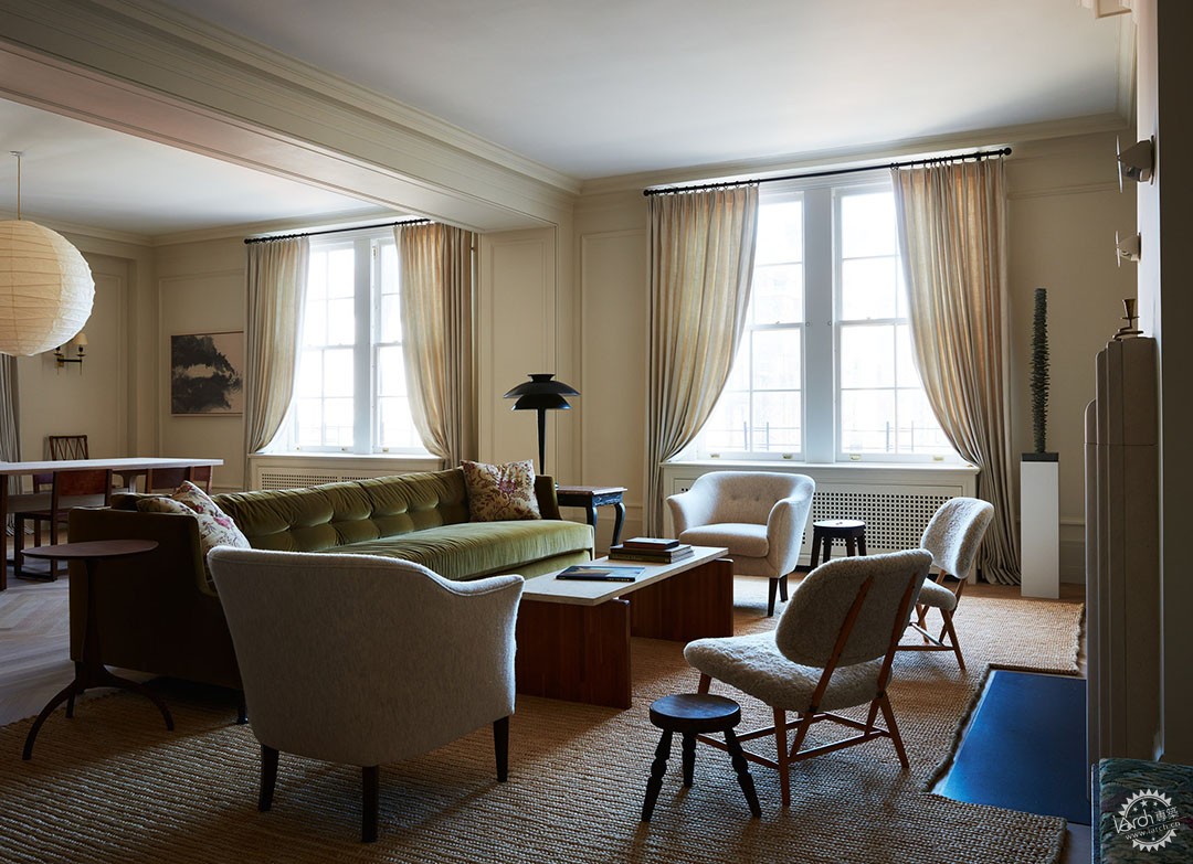
Wiggins特意选择了便于儿童使用的家具。 “我想确保它能够承受两个小男孩的使用,并且无需装饰。,”她说。 Wiggins加入了一套老式的丹麦俱乐部椅子,两把Alf Svensson的 TeVe 椅子,一张橡木和石灰华咖啡桌,以及一盏Benjamin Wilson的现代主义灯,它位于一张带有粉红色大理石台面的复古安妮女王风格的边桌上。
Wiggins deliberately chose furniture that would be easy to upkeep with children. “I wanted to make sure it could withstand two young boys flinging themselves into it without requiring any primping afterward,” she says. Wiggins joined a set of vintage Danish club chairs with two TeVe chairs by Alf Svensson, an oak and travertine coffee table, and a modernist lamp by Benjamin Wilson, which sits on a vintage Queen Anne–style side table with a pink marble top.
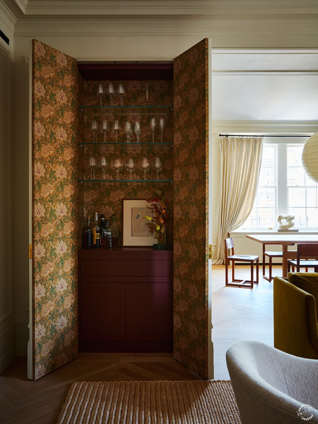
为了在起居室原本柔和的美感中呈现出令人惊讶的流行图案,Wiggins在隐藏的吧台内部衬有William Morris的绿色和粉红色花卉壁纸。
For a surprising pop of pattern within the living room’s otherwise subdued aesthetic, Wiggins lined the inside of the hidden wet bar with a green and pink floral wallpaper by William Morris.
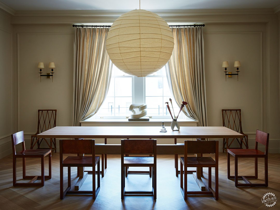
Wiggins定制了这张桌子,用于搭配由BDDW设计的酒红色皮革餐椅系列。上面是一个吊坠,后墙上挂着两个来自法国的中世纪黄铜烛台,窗台上是Paul Bloch的带状石灰石雕塑。
Wiggins custom-built the table to match the proportions of the couple’s collection of BDDW-designed burgundy leather dining chairs. Above sits a Noguchi Akari pendant, on the back wall hangs two midcentury brass sconces from France, and on the window ledge sits a ribbon-shaped limestone sculpture by Paul Bloch.
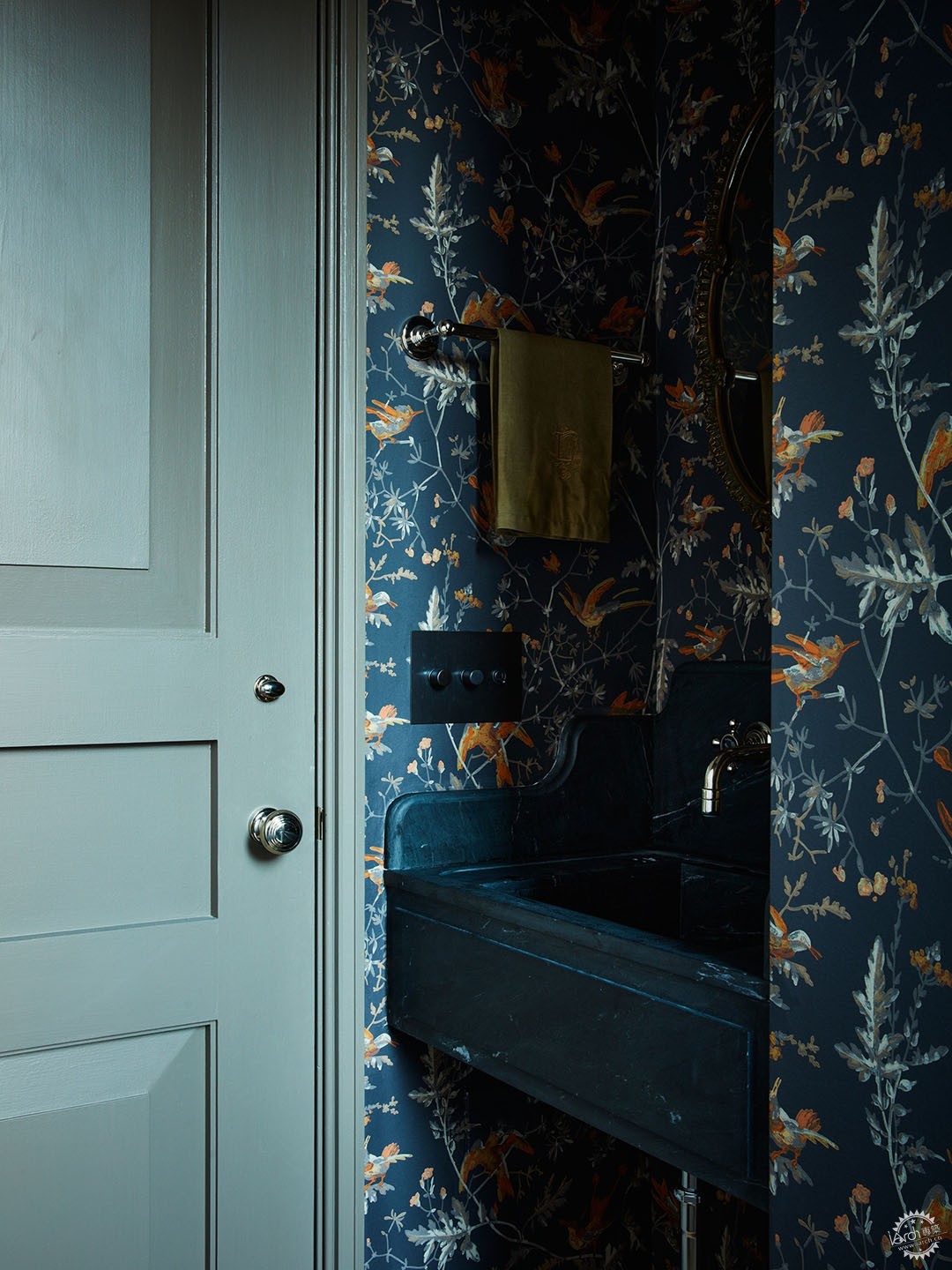
Pierre Frey的靛蓝色植物印花壁纸装饰化妆间,与 HWI 定制的大理石水槽完美搭配。
An indigo blue foliage print wallpaper by Pierre Frey decorates the powder room, perfectly matching the custom marble sink by HWI.
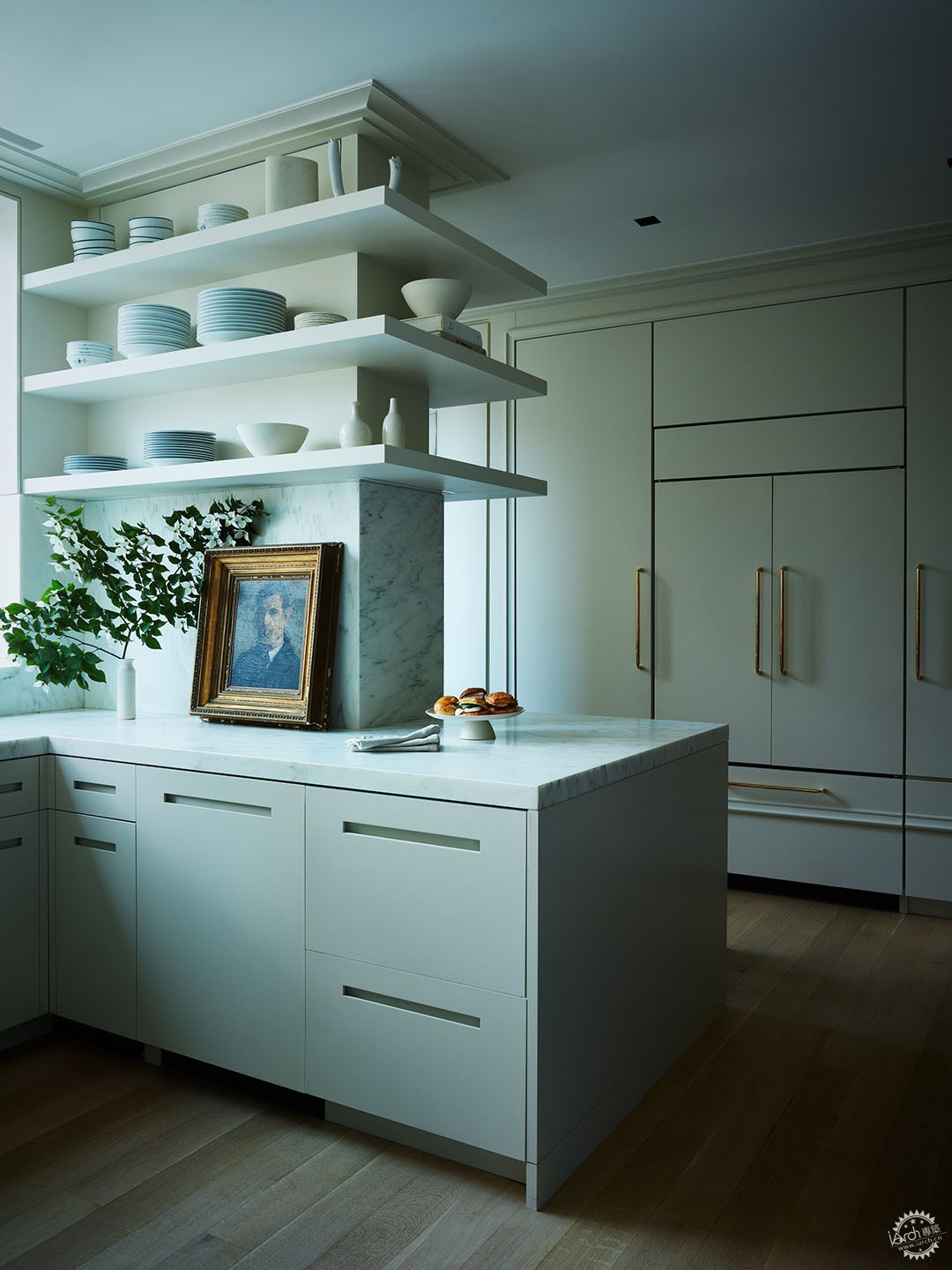
Kenny解释道:“在厨房中,我们希望拥有更明亮、更现代的饰面,包括大型面板、悬臂[搁板]、漆[饰面]和朴素的细节。厨房需要低调一些,但也要呼应传统的空间。”
“We took a departure with the kitchen,” Kenny explains. “We wanted to have a brighter, more modern finish with big slabs, cantilever [shelves], lacquer [finishes], and austere details. The kitchen needed to make a statement without being loud, but also work within the context of the [home’s] more traditional details.”
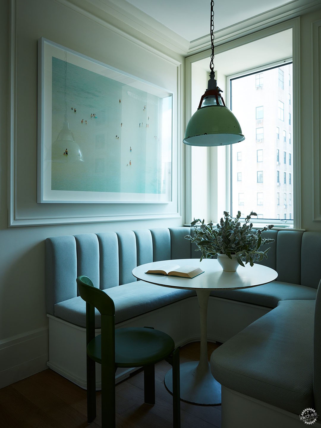
一个曾经是管家储藏室的小壁龛变成了早餐角落。 Wiggins定制设计了 U 形长椅,呼应了壁龛的舒适比例,并应用了Norbar Fabrics 的 Bombar Pewter 装饰座椅。 餐椅是Dietiker,工业吊灯是复古的,影像来自奥地利摄影师Josef Hoflehner。
A small alcove that used to be the butler’s pantry was transformed into a breakfast nook. Wiggins custom-designed the U-shaped banquette to fit the alcove’s snug proportions and upholstered the seat in Bombar Pewter by Norbar Fabrics. The dining chair is Dietiker, the industrial pendant lamp is vintage, and the photograph is by Austrian photographer Josef Hoflehner.
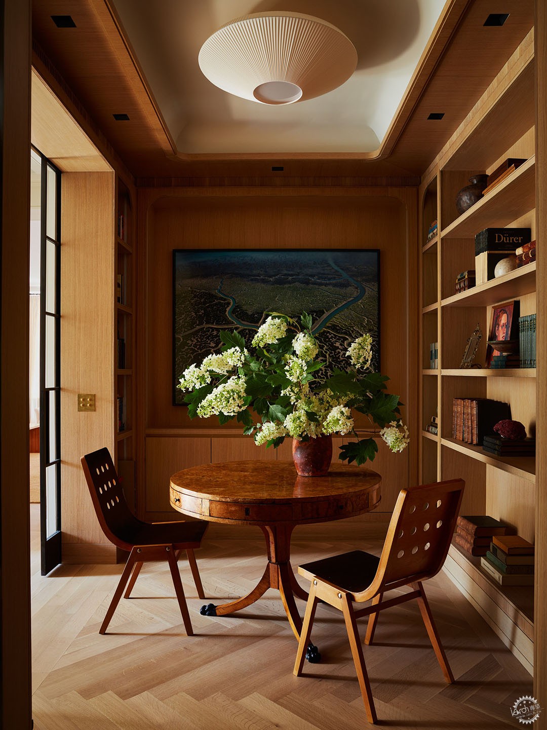
根据Kenny的说法,图书馆中定制的橡木木制品的灵感来自于 Jean-Michel Frank和Jean Royère等中世纪设计师。为了从相邻的房间引入自然光,他安装了玻璃和黑色钢制口袋门,这也与温暖的木质色调形成了微妙的对比。
According to Kenny, the custom-cerused oak millwork in the library was inspired by midcentury designers like Jean-Michel Frank and Jean Royère. To bring natural light in from adjacent rooms, he installed glass and blackened steel pocket doors, which also provide a subtle contrast to the warm wood tones.
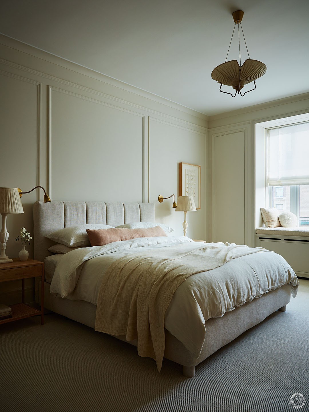
Wiggins在卧室的休息区采用了类似的柔和色调面板。墙壁是Benjamin Moore的灰雾和白鸽颜色的微妙色调对比。 Flou 的 Argan 床采用 Holland & Sherry 面料装饰,床头灯来自 Studio La Josa,古董黄铜烛台是 Soane 的,定制床头柜是 Faithful Roots 的,上世纪40年代的吊灯有着复古韵味,这归功于瑞典设计师Einar Bäckström。
Wiggins followed a similar muted palette to the seating area in the bedroom. The walls are a subtle tone-on-tone contrast of Benjamin Moore’s Gray Mist and White Dove colors. The Argan bed by Flou is upholstered in Holland & Sherry fabric, the bedside lamps are Studio La Josa, the antique brass sconces are by Soane, the custom bedside tables are by Faithful Roots, and the 1940s pendant lamp is vintage, attributed to Swedish designer Einar Bäckström.
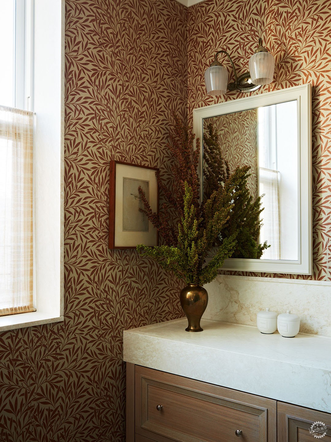
在主浴室里,Wiggins选择了William Morris的深红色植物印花壁纸,搭配白色大理石柜台和来自Waldorf Astoria酒店的老式黄铜灯。
摄影:Tim Lenz
In the primary bathroom, Wiggins opted for a deep red botanical print wallpaper by William Morris, which she paired with white marble counters and a vintage brass lamp salvaged from the Waldorf Astoria hotel.
Photography by Tim Lenz
|
|
