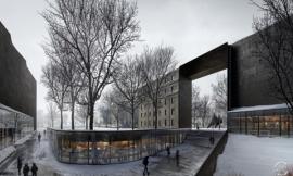
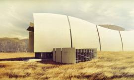
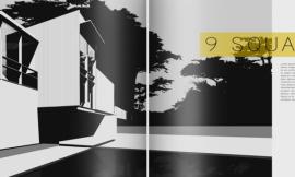
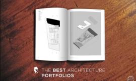
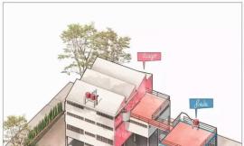
Last week I briefly posted some images that I had developed for the “rendering” spread of this particular project. I didn’t post the spread itself which is shown above. I thought I would spend this week breaking down how I got to this point. In other words, the process of deciding views, composition, etc.
As simple as the spread may seem, a lot of trial and error went into the design as with all of the spreads seen so far. It’s all about developing many iterations before finalizing the design. I rarely have everything come together on my first try. More importantly, I often don’t accept the first outcome without also experimenting with several other ideas. I do this iterative analysis because it encourages creativity. I tend to jump to past solutions first when designing, but forcing myself to look at multiple other solutions requires me to think more outside of the box.
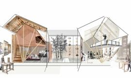
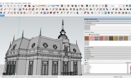
Architecture illustrations are time consuming so I wanted to be careful not to render something that I ultimately wouldn’t use in the final composition. I therefore started by putting together a selection of potential views that I thought told the story well.
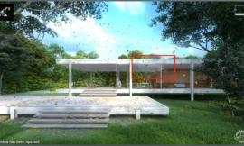
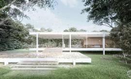
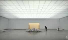
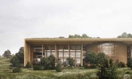
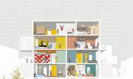
Above, a selection of interior views exported from my Sketchup model/从Sketchup模型中找来的室内场景
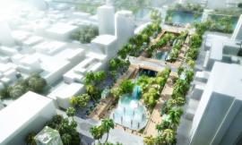
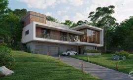
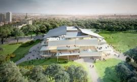
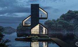
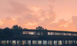
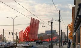
Above, a selection of exterior views exported from Sketchup/从Sketchup中找来的外部场景
With the views selected, I began testing out different layouts. There were a couple of key factors that influenced the layout design:
1. Hierarchy: What images are the most important and how do I get the viewer to look at those first?
2. Page Coverage: How much white space, if any, do I want to have?
3. Contrast: Do the images compete too much with one another or do they enhance one another?
4. Readability: Is it easy to understand the images?
5. Relationship to other pages: How well will this spread relate to the other spreads of this project?
6. Text: Is there room for text and if so, how will it work with the composition?
7. Number of spreads: Do I need more than one spread to get my point across properly?
I went back and forth multiple times trying to decide whether or not to use more than two pages for the illustrations. Ultimately, I went with a single two page spread which has a denser feel but I think works best with the rest of the pages. I am not a big fan of portfolios with too many pages so I often defaut to designs with the minimum amount that best tells the story. I also went with all full bleed images with minimal separation between them which saturates the pages with color.
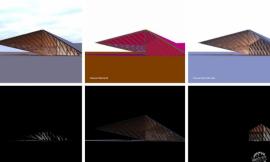
Since I had a clear plan for the layout, I knew exactly what images I needed to spend time rendering. Knowing what images were going to be next to one another also meant that I could post process more effectively ensuring that images used similar color tones and lighting.
The final result is a spread that has a lot of information, but does it in a controlled manner through the use of a simple grid layout. I’m curious what the consensus is out there as to which layout you think would have worked the best. More white space? Four pages instead of two? I even considered doing a daytime spread and a corresponding night time spread.
下面这些图是所有页面的组织这一步的过程:
Below is the progress of all of the spreads up to this point: