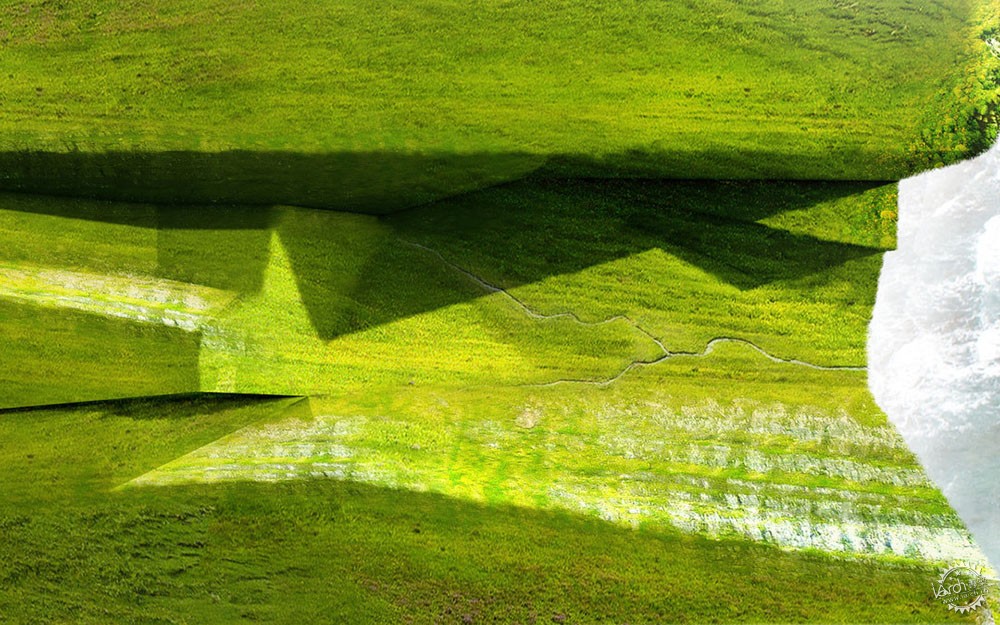
Cliff Landscape Study
由专筑网吴燕萍,刘庆新编译
这个设计的很大一部分是怎样使景观(地形)从结构的下部和周围产生下滑效果。因为我了解景观与建筑关系,所以我把几张图结合在一起。可以看出,这张图片的成功很大程度上依赖于纹理。这张图中,建筑是辅助角色,植被才是焦点,这就是为什么草会被渲染的如此饱和,建筑却如此透明的原因。下面,我将快速分布讲解这些图像是如何创建的。
A big part of this design is how the landscape slips under and around the structure. As a way for me to understand the relationship between the landscape and architecture, I put together a few diagrams. The success of this image relies heavily on the textures. The vegetation is the focus with the architecture playing a subsidiary role, hence why the grasses are so saturated and the architecture transparent. Below, I put together a quick breakdown of how the images were created.
1、 白模/1. Clay Model
开始,我用V-Ray简单的渲染我的sketchup模型,作为我添加纹理和照明的基础。这个渲染生成只花费了几分钟的时间,但却产生了很好的光影效果。
I am starting out with a simple V-Ray clay rendering of my Sketchup model to act as a base to which I will add texture and lighting. This rendering took minutes to generate, but gives me good light and shadows to work with.
2、 涂抹边缘/2. Smudge the Edges
因为这个图像将会被植被覆盖,我在Photoshop中使用涂抹工具把它的边缘模糊化,使其看上去就像是被风化一般。
Since this image will be covered with vegetation, I used the smudge tool in Photoshop to rough up the edges and give the geometry a more weathered look.
3、 添加纹理/3. Add Texture
我编制了大量的纹理,用于我将会在这个图像中所能遇到的不同的情况。这包括野草在直角和侧角、悬崖壁及边缘、岩石和杂草等情况。一旦我找到所有我需要的纹理,我慢慢地将它们贴到我的模型上。通过设置纹理图层的混合模式的“叠加”,就能将颜色和纹理与白模合并在一起。
I compiled a large amount of textures of all of the different conditions that I would run into in this image. This includes several wild grasses at both a straight-on angle and side angle, the cliff wall, cliff edge, rock and grass mixture, etc. Once I had all of my textures, I slowly pieced them into the clay model. By setting the texture layers to “Multiply” in the layer blend mode dropdown, I was able to merge the colors and textures with the shading of the clay model base.
4、建筑白模/4. Architecture Clay Model
该渲染图的一个重要部分是建筑与景观的关系。因此,我需要将建筑覆盖在图中。为此,我在3D模型中生成了带有建筑图层的第二个白模。然后在Photoshop中盖住背景并融合建筑与景观的影像。
An important part of the diagrams is the relationship of the architecture to the landscape. I therefore needed to overlay the architecture into the illustration. To do this, I generated a second clay model rendering with the architecture layer turned on in the 3D model. In Photoshop, I then masked out the background and merged the shadows of the architecture with the landscape.
5、淡化和轮廓/5. Dilute and Outline
建筑白模似乎过于大胆而突兀,所以我降低了透明度,然后给它一个相对明显的轮廓,这样可以看上去更图像化,可以显露一些景观纹理。
The architecture clay model seemed too bold and distracting, so I lowered the opacity and then gave it a thick outline so that it read more diagrammatic and allow some of the landscape texturing to show through.
6、最终渲染图/6.Final Image
设计仍在不断变化,但由于我已经设置了Photoshop文件,我可以根据这些图的发展形式简单的更新。这代表我只需花费我的大部分时间在网上寻找纹理。最难的是找到一个足够高的分辨率图像。一旦我有了纹理,图移动速度会比较快。好处是我现在有一个好的图库可以让我用其余的图完成这个项目。
The design is still in flux, but since I have the Photoshop files already setup, I can simply update these diagrams as the form develops. It seemed that most of my time was spent searching for the textures online. The toughest part is finding images at a high enough resolution. Once I had the textures, the illustration moved relatively fast. The good thing is that I now have a good library of images going that I can use for the rest of my illustrations for this project.
出处:本文译自visualizingarchitecture.com/,转载请注明出处。
|
|
专于设计,筑就未来
无论您身在何方;无论您作品规模大小;无论您是否已在设计等相关领域小有名气;无论您是否已成功求学、步入职业设计师队伍;只要你有想法、有创意、有能力,专筑网都愿为您提供一个展示自己的舞台
投稿邮箱:submit@iarch.cn 如何向专筑投稿?
