本文转载自零壹城市建筑事务所
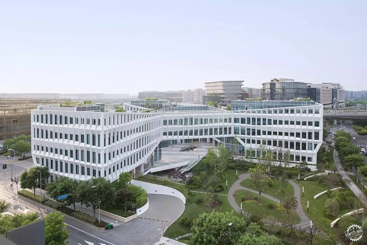
高铁从南面进入虹桥火车站前看到的最后一座建筑©苏圣亮
零壹城市建筑事务所设计的上海宝业中心建设完成,是上海虹桥新中心商务区二期开发的一部分,位于上海市西面高速发展区。场地位于公路、铁路和航运交通枢纽的交汇点,也是人们在高铁从南面进入虹桥火车站前能看到的最后一座建筑,赋予了项目重要的城市空间地位。场地的挑战之处在于:场地形状由城市规划的两块绿地挤压成了L形;场地的东面,南面和西面要求60%的建筑红线贴线率;场地北面紧邻一条24米高的横跨而过的高架公路;同时建筑容积率不得超过1.60,建筑高度不超过24米。
Shanghai BaoyeCenter is part of the phase-2 urban development scheme for the newCentral Business District in Hongqiao, a rapidly developing piece of western Shanghai. The location of theproject puts it at the center of car, train, and jet transportation, and is in fact the last building one sees beforeentering the busy Hongqiao High-Speed Rail Terminal from the south by bullet train, granting the project asignificant urban presence.The site has several challenging conditions: sandwiched by two city-designated temporary green spaces intoan L shape, with a 60% frontage ratio requirement to the east, west and south, and a 24m tall highway overpassrunning adjacent to its north face, the building must respond to a maximum FAR of 1.60 and a heightof 24m.
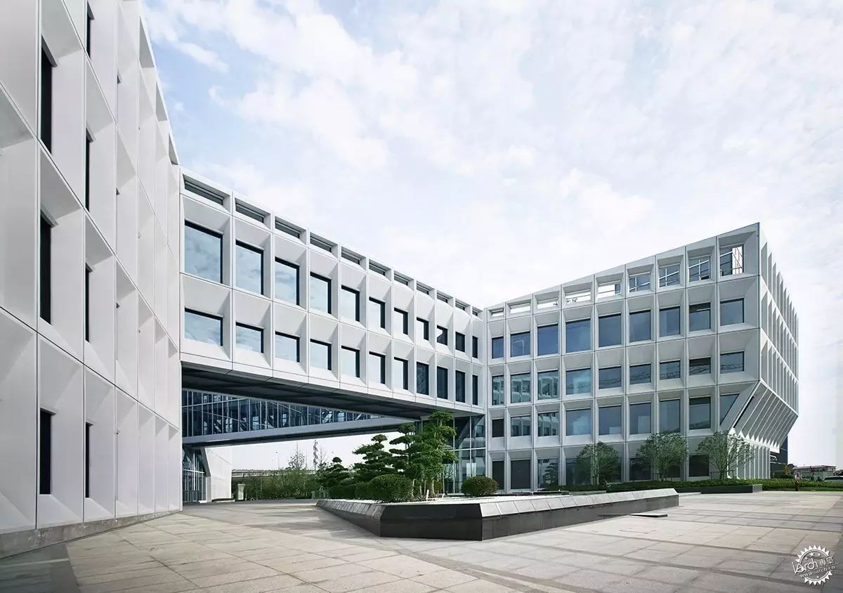
主入口丨Main entrance view ©胡娴娟
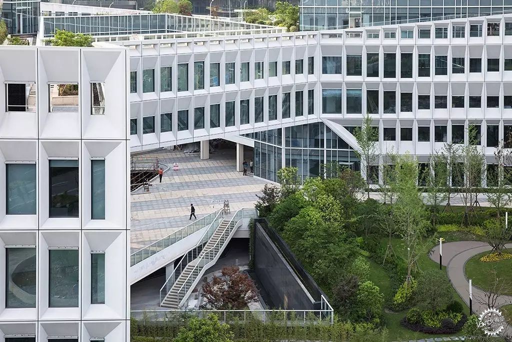
中心庭院丨Central Courtyard ©苏圣亮
应对这些条件,设计在过程中有非常多的尝试,试图在这些限制中寻找突破点,这些突破主要包括三个方面:1. 对场地限制条件下的突破;2.对办公楼“面积效率至上”法则的突破; 3.对办公楼单一化立面设计的突破。
In dealing with these conditions, There are many attempts within the design process, it’s more like finding breakthroughs within the limitations.The breakthroughs mainly are: 1. The breakthrough in site limitations; 2. The breakthrough in the rule of “maximum office space availability”;3. The breakthrough in the standardized elevation design.
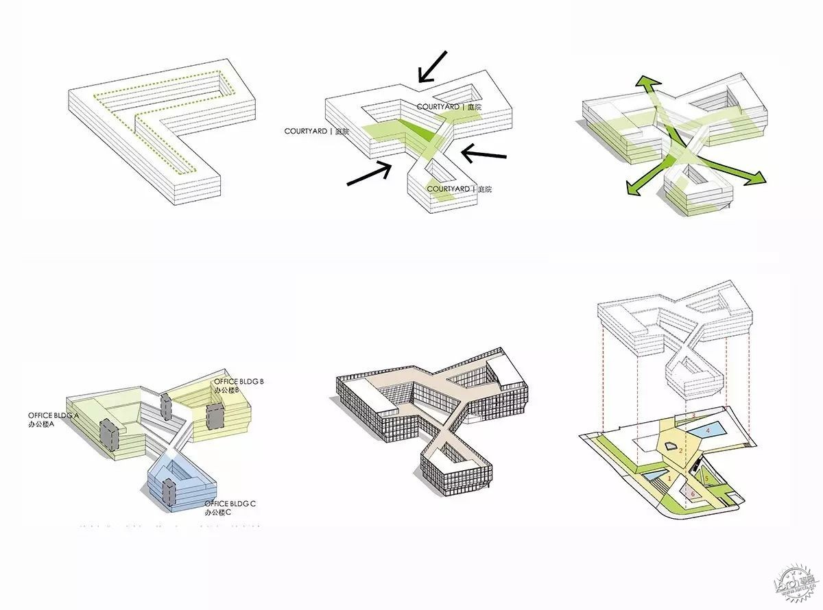
分析图丨diagram
在最大化L形基地周界的情况下,拉伸起4层体积满足面积要求;根据西面入口、东南面公园和北面绿地对体量边界进行挤压,挤压一方面增长了功能使用面积,在负形形成三个各自独立又相互顶角的庭院。这三个庭院被塑造出不同的性格:中心庭院作为人流汇聚点最为开放,也是公众活动集中的场所;南面的庭院联系中心庭院和东侧的公园,是半开放的景观庭院;北侧的庭院是由建筑围合的水院,为办公提供静谧的场所。对体量的边界挤压的同时,形成了三个向外敞开的“开口”。几个被挤压的边界碰撞在一起,发生了质的改变:内部流线与室外空间在中心庭院发生重叠,这也是在场地众多限制条件下功能与形态之间谈判的平衡。
The L-shaped site was first filled in to its maximum extents as a perimeterblock, then lofted up 4 stories to the building height limit while satisfying the desired program area of 13,000sqm. The perimeter is then pushed and manipulated to create three exterior-facing spaces and three distinctinterior courtyards, defining the spatial structure of the project.The three main office volumes, designated A, B, and C, can function independently or in combination. The three pieces are linked by suspended bridgeson the 2nd, 3rd and 4th floors. which generate hinged internal courtyards, to satisfy the internal circulation.
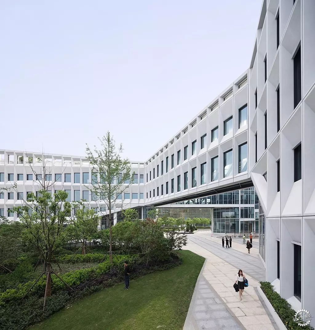
东面入口丨East Entrance ©苏圣亮
形态在打开三个开口后,自然而然地形成环抱的姿态引入人流,在中央庭院汇聚后又分别进入三栋建筑。同时,三条抬高的空中连廊一方面满足流线组织的需要,人们可以通过连廊在不同庭院和建筑体量、在不同层高和室内外之间游走。另一方面,空中连廊也起到压低空间的作用:当人流从室外通过三个敞开的开口经过连廊到达中心庭院,经历了一个由开敞-压低-再开敞的一个空间序列。通过这样的一种序列给了人们一直进入场地的心理暗示,同时先抑后仰的空间序列也在有限的空间中创造更丰富的体验。在此,形态,流线与空间序列是高度统一的,以形态几何激发流线、空间与功能使用之间动态的关系。
The enclosing corridors also attract people into the central courtyard and then lead people entering three office buildings. The lift operation creates a depressive space, which creates a spatial sequence as open-depress-open again when people walking from outside via three lifted corridor into the center courtyard. This sequence will indicate people of a sense of entering and creating richer spatial experience in the limited site. In this way, form, circulation and the spatial sequence are highly unified.
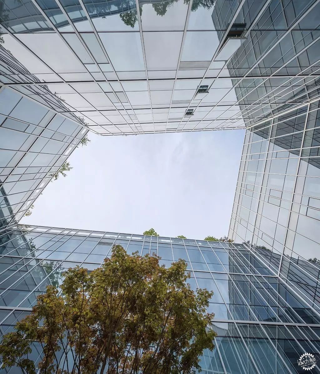
中庭丨Courtyard ©苏圣亮
由这些操作带来的体量围合与空间序列、功能性使用和游走性体验的平衡,是对当代办公楼“面积效率至上”的法则的突破。自从Bloomberg纽约总部办公楼首次应用开敞办公,极大提高单间办公模式的效率后,办公楼的高面积效率以及高“出房率”一直是办公楼设计的重要法则。设计以“空间品质效率”,来对办公楼的面积效率提出质疑:在适当牺牲面积效率的同时,通过组织室外景观绿化与室内和谐共存,引入室内更多的采光、景观与通风,给予使用者更多层次的建筑体验与空间感,来创造一个充满启发性的办公环境。这种具有高“空间品质效率”的办公楼,将比仅有高“面积效率”的更有办公效率。
The result of these operations, which bring the balance between massing and spatial sequence, between program and promenade experience, is an innovation to the rule of “maximum office space availability”. Since the open floor plan office first introduced in Bloomberg headquarters office building in New York, which significantly increases the efficiency of office working model, how to maximize the area of office space is the major principle of office design. Here we are challenging this by proposing a new idea of” maximizing the quality of office space”, which is organizing outdoor landscape and green space integrated with indoor space, bringing more natural light and ventilation., and enhancing the user’s spatial experience, to create a creative working environment. We believe compare with maximum office areas, this will bring more efficiency to the users in the office.
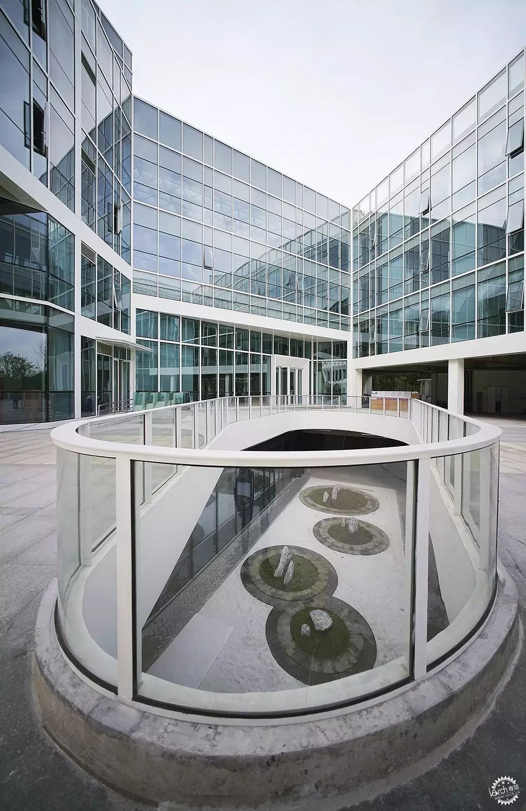
中庭丨Courtyard ©胡娴娟
项目的立面设计也是对当代办公楼单一化立面设计的一个突破。当代办公楼往往在“面积效率”的法则统领下,以标准层平面和立面在垂直方向堆叠形成。而项目除了游走性平面外,立面设计以模块化的遮阳屏板组成,屏板的水平向的渐变赋予了立面流动性,和空中连廊一起形成桥与水的意向。这些不同斜度的屏板也改变了窗户的高度,控制室内空间的采光。每个屏板由GRC(玻璃纤维混凝土)这种材料制成,整个幕墙的屏板多达千个,运用数字化算法对单元格进行逻辑分析形成幕墙优化方案,使得最终用26种单元屏板就能组成整体立面上的变化,并贯穿幕墙施工深化和施工过程。每个屏板也是集合外围护、采光、遮阳、通风、夜景照明为一体的立面构件,先在工厂里预制组装,然后将组装好的屏板运输到现场、吊装装配起来。通过4个1:1大小的mock up屏板两年时间的风吹日晒实验,清洁度和精密度还保持很高的水准,之后才对整个幕墙进行装配式建造。对项目的介入程度设计师也是逐步加深,从一开始建筑设计到景观、幕墙等整体设计和把控;之后开始建筑与室内、平面设计一体化设计;现在对一些空间的运营和经营提供策划案,一直从头到尾延续和把控项目整体的设计和效果。
Besides, the elevation design is a breakthrough to the standardized uniformed elevation of contemporary office building. Under the “maximum office space availability”, office buildings nowadays are always stacked by standardized plan and elevation. In this project, besides the “promenade plan” that mention before, the elevation consists of modularized shading panels. There’re around 26 kinds of different panels gradually flows on each level. These panels have different slopes, which changes the height of windows and controls the interior daylight condition.
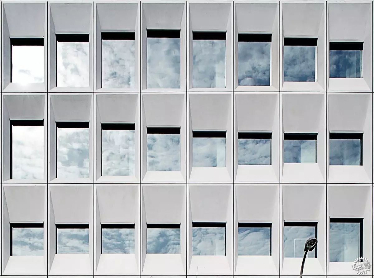
局部立面丨Elevation Detail ©胡娴娟
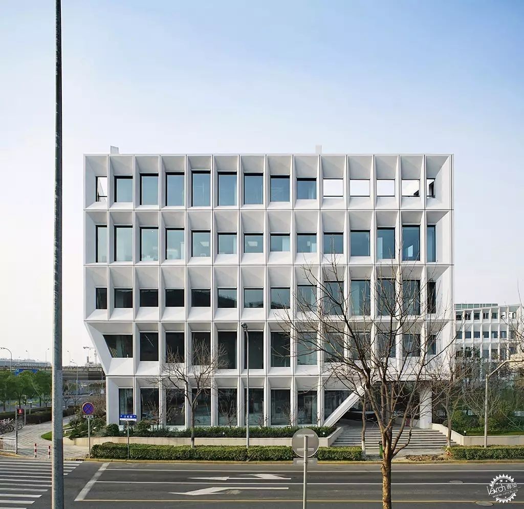
南面人视丨South view ©胡娴娟
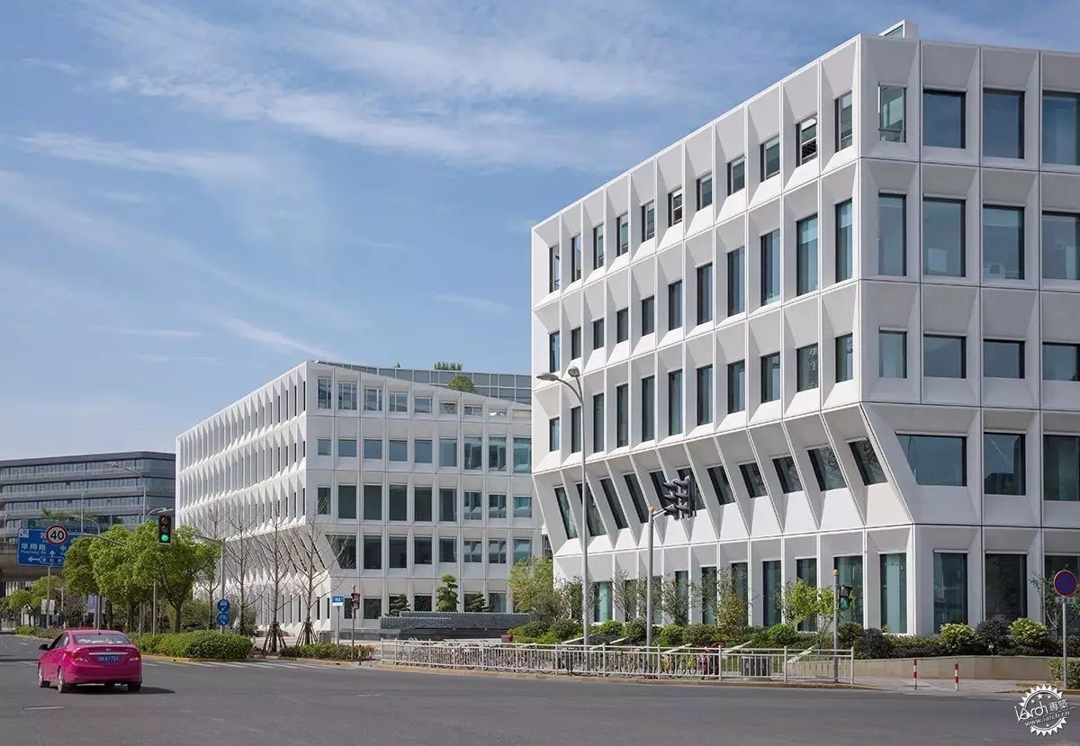
西南人视丨Southwest view ©苏圣亮
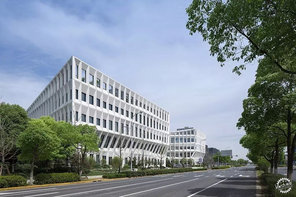
西北人视丨Northwest view ©苏圣亮
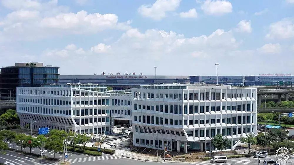
施工现场照片丨Construction Photo
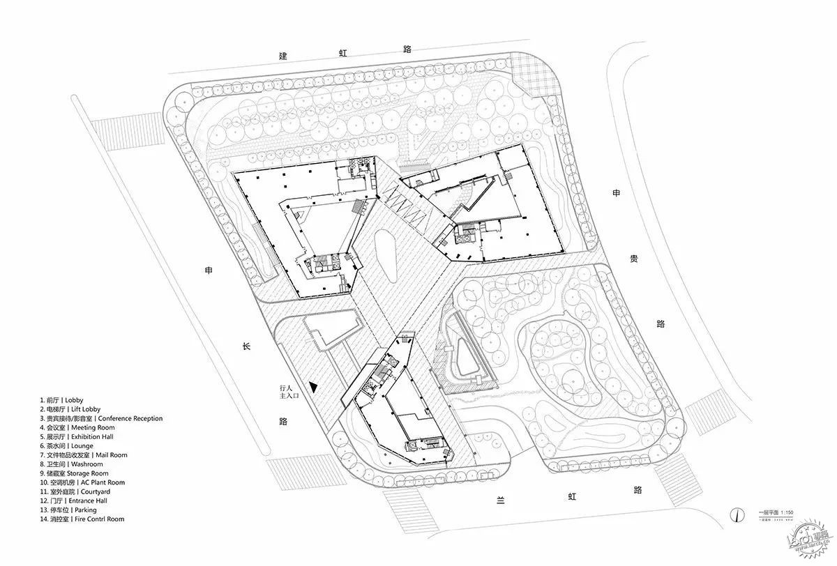
一层平面丨1F Plan
项目名称:上海宝业中心
建筑设计:零壹城市建筑事务所
项目地点:中国 上海虹桥CBD
设计团队:阮昊、詹远、Gary He、李琰、童超超、金善亮、Devin Jernigan
项目时间:(建筑)2012-2014设计,2014-2017完工;(室内)2014-2016设计,2016-2017施工
项目面积:27394平方米
图片版权:零壹城市建筑事务所
合作单位:浙江宝业建筑设计研究院有限公司(建筑、景观)/上海斯诺博金属构件发展有限公司(幕墙)
Project name: Shanghai Baoye Center
Architecture design: LYCS Architecture
Location: Shanghai Hongqiao CBD, China
Project Team: RUAN Hao, ZHAN Yuan, Gary He, LI Yan, TONG Chaochao, JIN Shanliang, Devin Jernigan
Project Period: (Architecture+landscape)Design 2012-2014, Construction 2014-2017;
(Interior)Design 2014 - 2016, Construction 2016- 2017
Size: 27,394 sqm
Images: Courtesy of LYCS Architecture
Architect of Record: Zhejiang Baoye Architecture Design and Research Institute/SINOBAU
|
|
