为使用表情符号做装饰的建筑进行辩护,并且有时候这样的建筑会显得格外有趣
In Defense of the Emoji Building and Architecture Being Fun, Sometimes
由专筑网芮万里,韩平编译
当建筑打破专业上的界限并且让更多其他专业的人参与讨论和评价的时候,建筑将充满魅力并且会总是让人感到着迷。
幸运的是,感谢互联网的出现,使这样情景越来越多:虽然说在网上搜寻一系列建筑相关的文章变得越发容易,但是也会有有些人因为自己看过几个现代主义建筑就突然声称大多数现代主义建筑看起来像“魔鬼”,这种病毒传播般的趋势确保建筑专业以外的人能够对于我们建筑专业以及建筑作品提出他们的意见。
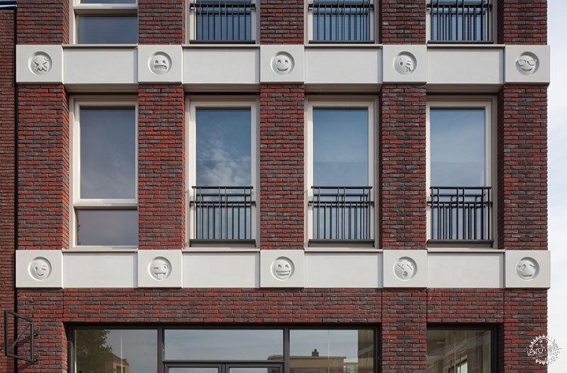
2017夏天最具风情的建筑是Attika Architekten设计的表情符号构成的立面。这栋完全合理并且优雅的建筑因为添加了表情符号的装饰而吸引了公众们的眼球。
虽然大多数人在互联网表达了对建筑的喜爱,但也有人们指出这些表情符号是这栋建筑的缺陷,他们认为随着社会的发展和我们对生活认知的提升,我们最终会发现这栋建筑已经被这些表情装饰毁掉了,再也不能复原。
这样的观点是来自Sam Lubell在《连线》杂志上的一篇文章,他的文章中指出发现有两位专家愿意拿着巨大的老式微笑的表情出现在Attika Architekten的这栋建筑中以示抗议。
考虑到这些专家将会对公众们的对话起到引导作用,因此,他们的观点应该经得起分析和推敲。
“这充分说明我们的文化缺乏深度。
— Miriam Dady (@mimdady) June 24, 2017”
“我简直要为社会的发展而哭泣
— sam smeltzer (@elyon113) April 24, 2017”
@UsAndRufus 这一定是末日来临的象征
— Chris Bennigsen (@chris_bennigsen) April 24, 2017”
第一个观点来自Sean Khorsandi,他是一名建筑历史教授,他说道:“建筑是一件很严肃的事情。我们正在使用丰富多样的材料修建建筑,并且我们也在占用着宝贵的土地资源。我们应该对要修建在土地上的建筑负责。如果所发生的一切都只是为了一个玩笑;那么我们应该减少这种一次性的设计,‘或许我会在第一次见到这栋建筑的那一刻喜欢上它,但是那只是一时的狂热,这种设计的态度是非常危险的。”
Lubell在Khorsandi的观点上进行了补充说道:“我发现我们对于这栋建筑最多的讨论是它的表情装饰,而不是它相当单调的设计。”
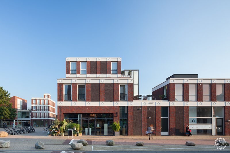
那么接下来,我们是不是应该探讨一下这栋建筑的设计呢?这栋建筑坐落于荷兰的阿默斯福特,是两栋建筑非常简单的组合,它使用了非常朴素的材质并且其大众化的造型很显然是受到之前荷兰现代主义大师们的影响,例如Willem Marinus Dudok以及Hendrik Petrus Berlage,或许还受到其他第一代北欧杰出的现代主义者的影响,例如阿斯普朗德。
It’s always fascinating when architecture breaks the bounds of the profession and becomes a topic of debate in the wider profession.
Fortunately, thanks to the internet, there is no shortage of such occasions: whether it’s the click-seeking cluster of articles that found a client for an improbable cliff-hanging designor the forums that suddenly decided that most modern architecture looks “evil,” the viral trend treadmill ensures that there are plenty of opportunities for the layperson to offer their two cents on the output of our profession.
The flavor of the summer of 2017 is Attika Architekten’s Emoticon Facade. This thoroughly sensible and polite building has caught the public’s attention thanks to its inclusion of emoji-shaped decorative additions.
While most of the internet has responded with heart-eyes, there’s no shortage of people for whom these carved emojis are a clear indication that architecture, and by extension society, and by extension all of life as we know it, is doomed, never to recover.
Such an opinion is legitimized by articles like this one in Wired by Sam Lubell, who in reporting on the building found two experts willing to take a big old smiley poop on Attika Architekten’s work.
Given the role that these experts play in directing the conversation among the public, their arguments bear analysis.
“This speaks volumes about the (lack of) depth of our culture.
— Miriam Dady (@mimdady) June 24, 2017”
“literally weeping for how far society had devolved
— sam smeltzer (@elyon113) April 24, 2017”
“@UsAndRufus surely a sign of the end times
— Chris Bennigsen (@chris_bennigsen) April 24, 2017”
First up is Sean Khorsandi, a professor of architectural history, who argues that “architecture is serious.We’re using copious materials, and we’re taking up land. There is a responsibility that goes along with that.
If everything is a joke; reduced to this disposable ‘I like it in the moment’ fad, that’s a dangerous attitude to have.”
Lubell adds that Khorsandi “finds it telling that most discussion of the building has focused on the emojis, not its fairly pedestrian design.”
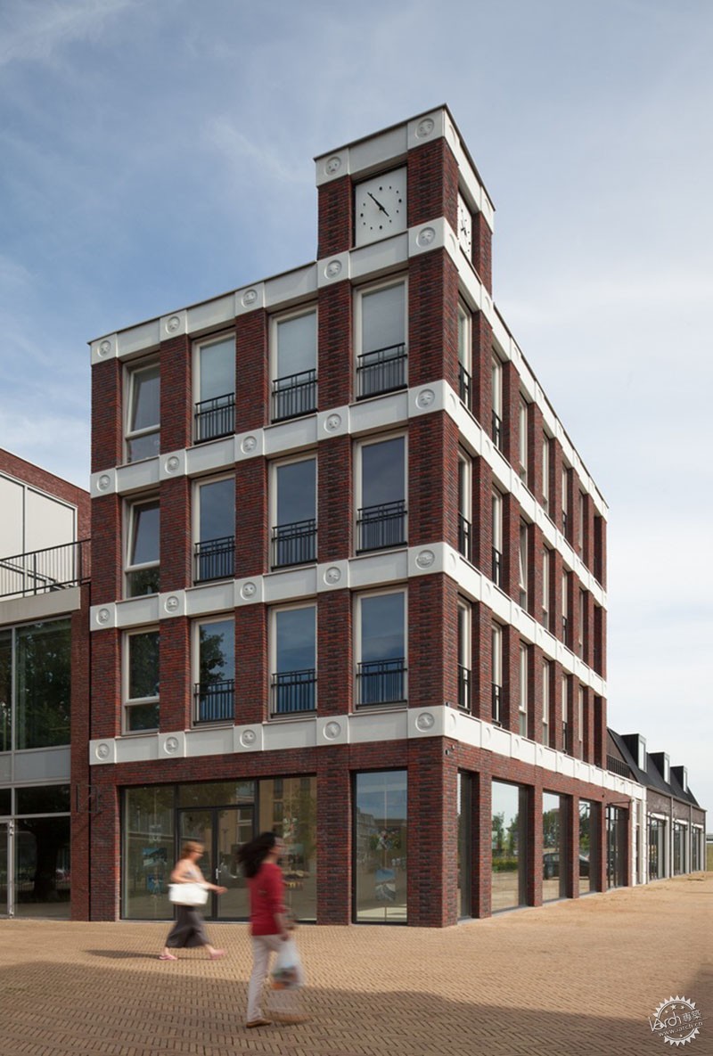
Ok then, let’s talk about that design, shall we? Located in Amersfoort in the Netherlands, the two-building complex has a simple, austere materiality and subtly civic massing that clearly owes a debt to greats from the Netherlands’ past such as Willem Marinus Dudok and Hendrik Petrus Berlage, or to other prominent North European proto-modernists such as Gunnar Asplund.
© Bart van Hoek
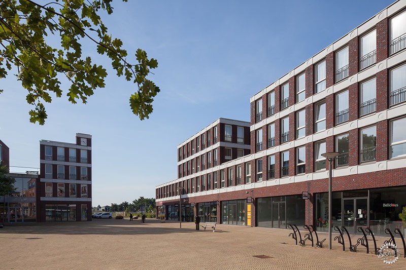
这栋建筑在立面的处理和设计上借鉴了芝加哥学派在水平和竖向的金属框架结构从而能够开很大的窗户;然而,芝加哥学派的摩天大楼强调了垂直方向上的要素,而这栋低矮复杂的建筑则通过白色的装饰条来强调了其水平方向上的要素。
在建筑一层的落地玻璃窗的商店前面,设计师创造了一种可以被接受的,并且能够同公共空间联系起来的场所,虽然它看上去显得很平庸。
In its facade treatment, the design borrows from the Chicago School in the way that the large windows enabled by the steel structure are framed by horizontal and vertical elements; however, where the Chicago School skyscrapers emphasized the vertical elements, in this low-slung complex it is the horizontal white bands which are dominant.
The ground floor glass shop fronts create an acceptable, if not exemplary, connection with what appears to be an underwhelming public space.
© Bart van Hoek
使用表情符号作为装饰还是不使用,你不能奢求每一个人都将这栋建筑当作杰出的作品来看待,但是将整个项目当作是设计者开的一个不好的玩笑是不合理的。
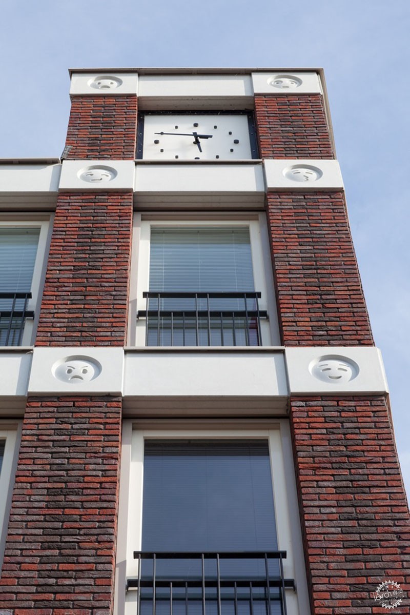
即使设计者添加了表情符号作为装饰,它也是出于建筑的目的:这栋看起来很大众化的建筑中所有的表情符号的装饰都局限于立面的关键部位(其中一个位于钟楼表面的顶端)。
设计师对于外部立面的关注是通过建立了一个主次等级的设计来使其整体具有连贯性和一致性。
因此,我们得出结论,建筑师并没有在开玩笑并且这也是一栋非常严肃的建筑。
此外,设计师冒着增加业主不想要方案的风险去添加这些表情,据我估计,正是因为建筑立面过于平凡,因此这些表情符号的添加才会起到作用。
这些表情符号会出现在你期望看见有一些轻微装饰的地方,但是却绝对不会有这栋建筑是在搞笑的感觉。正是这种对于人们所渴望看见的东西的巧妙转换为人们带来了快乐。
建筑使用状况良好。 pic.twitter.com/f9CGGS5wmD
— Scott Kerr (@scott_kerr) July 17, 2017
《连线》中一篇文章提到的另外的一个观点是使用表情符号作为装饰也许会让这栋建筑在其完成的那年,也就是2016年开始变得过于臭名昭著,尽管Attika Architekten最近几年的建筑设计发展很快。
艺术历史学家Susan Kart对Lubell说道:“现在看来这样的设计也许是可爱的,有一种卡哇伊的感觉,但是想象一下在二十世纪八十年代使用人物头像作为装饰的风格就像这栋建筑使用表情符号做装饰一样,当潮流过去之后,这些将都不再显得可爱并且也不会被延续下去。”
你知道还有其它别的事物能够真正记录建筑吗?建造日期。
几百年来,建筑很自豪地展示它们建造的日期是一件司空见惯的事情,大概是因为当时的建筑师不会因为自己的建筑而感到羞耻。
人们唯一能够想象到的是四世纪君士坦丁的设计师现在会松一口气;他们在装饰中使用了罗马文化作为参考,这一点也许真的会让人感到尴尬,但是幸运的是我们现在每一天穿着古罗马的长袍并且君士坦丁的建筑仍然看起来是十分可爱的。
让我们更加严肃地看待Kart的观点,所有的建筑都是时间的产物,也是特定时期下的产物,设计者对于任何流行文化的参考是不需要的。
如果是这样的话,那么我们将很难想象在任何时期都有可能出现后现代主义建筑而不是在20世纪八十年代,或者哥特建筑也将会在任何时候发展而来而不是在宗教社会的中世纪。
更重要的是,建筑向人们讲述了它当时被建造时所处的社会的历史和故事。
我们能够通过建筑作为媒介而被告知那些令人着迷的历史故事,然而看起来那位艺术历史学家对于我们自己创造历史的能力不屑一顾。
Kart的观点也许有一个更好的版本:“这栋建筑现在看起来也许是可爱的,但在它变得无趣之前它能够这样保持可爱感多久?”
Emoji decorations or not, you won’t find anyone who considers this design to be a masterpiece, but it’s unreasonable to conclude that the entire project is some sort of bad joke.
Even the jokey addition of the emojis serves an architectural purpose: instead of being used throughout the design, the emojis are confined to the key facade on the more civic-looking building in the complex (the one which is topped by the clock face).
The extra attention given to this facade establishes a hierarchy within the design, giving it coherence.
In conclusion, architecture is serious, and this is serious architecture.
Furthermore, at the risk of adding another unwanted opinion to the pile, by my estimation it is the design’s very ordinariness which makes the emojis work.
They appear in a place you’d expect to see a slight embellishment of some sort, but on a building which you’d never expect to have a sense of humor. It’s this bait-and-switch that brings delight.
Architecture had a nice run. pic.twitter.com/f9CGGS5wmD
— Scott Kerr (@scott_kerr) July 17, 2017
Another concern raised in the Wired article is that the use of emojis—which in recent years have seen their designs evolve rapidly—might make the building stink a little too much of 2016, the year it was completed.
“It might be cute now, in the kawaii sense of the word,” said art historian Susan Kart to Lubell, “but imagine a building that used portrait heads with 1980s-style mullet hairstyles the way this building uses emojis. Not very cute or trendy after the hairstyle passes.”
You know what else really dates architecture? Dates.
And yet for hundreds of years, it was fairly common practice for buildings to proudly display the date they were constructed, presumably because designers back then had no sense of shame.
One can only imagine how relieved the 4th-century designers of the Arch of Constantine must be right now; their use of Roman cultural references in their decoration could have been really embarrassing, but luckily we still all wear togas on a daily basis and the Arch of Constantine is still totally kawaii.
Taking Kart’s quote a little more seriously, all buildings are products of the time in which they are produced, irrespective of any overt pop-cultural references made by the designer.
It’s hard to imagine Postmodern kitsch emerging in any time period other than the 1980s, or Gothic developing in anything other than the religious society of the middle ages.
More importantly, buildings tell stories about the societies that built them.
Fascinating histories can be told through the medium of architecture, and it’s concerning that an art historian is so dismissive of our ability to create our own stories.
A better version of Kart’s comment might be: “it might be cute now, but how long will it be before it becomes interesting instead?”
© Bart van Hoek
最后一个观点是来自Khorsandi 文章里的评论。
他是这样回应其他评论者的:“我所看到的表情符号并不是作为装饰,而是作为一种文字——表意文字。这不像其他字面意义上对于建筑装饰的解读......这些符号并不是代表着高雅文化,也没有试图探寻更深层次的含义。它们仅仅只是对于表意文字的混合和收集。”
从Khorsandi 的观点中我们似乎明白了什么。表情符号本身就是用来表达事物的,并且这种“语言”其实非常简单,我们在建筑设计的时候很大程度上都忽略了它们。
但是完美是美好的敌人,对于大多数公众来说,这样的担心在他们观赏这栋建筑的时候是不会发生的。
尤其是未来的设计将完全能够以一种更加成熟复杂的方法使用表情符号,而Attika Architekten在这片未知的水域中做了一个测试来观察人们对于这种想法的反应。你猜怎么着?大部分公众都非常喜欢这一想法。
A final concern is raised by Khorsandi in the comments of the article.
Responding to another commenter, he writes: “I see emojis not as decoration though, but as text—ideograms. Unlike other means of literally reading architecture... these icons are not heralding high culture, nor do they seek to represent a deeper meaning. They are merely a motley collection of ideograms.”
Here we may be getting somewhere. Emojis are supposed to signify things, and this “language,” simple as it is, was largely ignored in the design of the building.
But the perfect is the enemy of the good, and for most members of the public, such concerns would not even occur to them when seeing this building.
Perhaps future designs will be able to use emojis in a more sophisticated manner, but Attika Architekten did a service in testing the waters to see how people would react to the idea. And guess what? For the most part, the public really liked it.
© Bart van Hoek
借用《连线》杂志中一位评论员的话,评论员这一职业有时候会让建筑师们更加地坚定。
当一位建筑师打破常规并且数百万的公众也都为此感到愉悦,为什么总有一些人投入如此多的精力试图去说服别人这是一个糟糕的,病态的想法?
为什么我们总是飞快地对建筑思想和专业知识进行掩饰,因而使建筑师看起来不知道自己正在做什么?对于这些,也许只需要用一个悲伤的哭泣的表情就够了。
To borrow an expression from one Wired commenter, this profession can sometimes seem to have its architect's scale firmly up its a**.
When an architect breaks this status quo—to the delight of literally millions of members of the public—why do some invest so much energy in trying to convince others that it was a bad, ill-considered idea?
Why are we so quick to gloss over the thought and expertise that has been brought to a design in order to make architects seem like they don’t have a clue what they’re doing? It’s enough to make one sadface cryingface.
出处:本文译自www.archdaily.com/,转载请注明出处。
|
|
