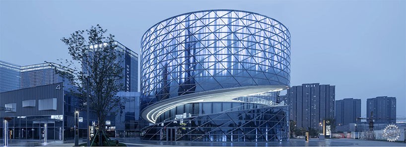
ATAH设计的螺旋形中国纺织中心
ATAH's spiral China textile center references woven fabric
由专筑网王帅,蒋晖编译
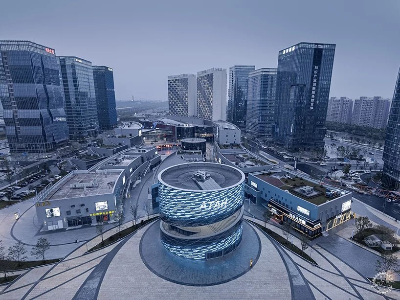
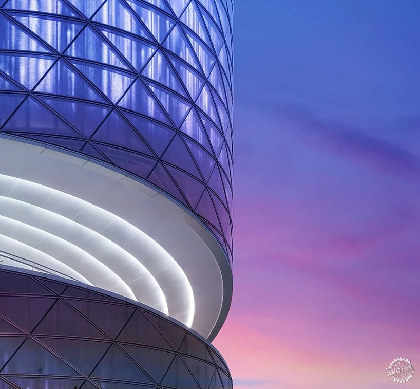
ATAH建筑事务所在洛杉矶和上海都设有工作室,近期他们展示了为CTC(中国纺织中心)设计的概念图,该方案的大楼螺旋形模糊了楼层之间的边界,它将外部空间与内部空间连接起来,创造一个连续性的展览空间,同时螺旋表面所融合的几何网进一步强化了这一视觉效果。
Los angeles- and Shanghai-based studio ATAH’s design concept for the CTC (China Textile Center) involves a spiral form, blurring the boundary between floors, therefore connecting the exterior space with the interior, creating a continuous exhibition space. In order to achieve this visual effect, a geometric web fuses onto a helical surface.
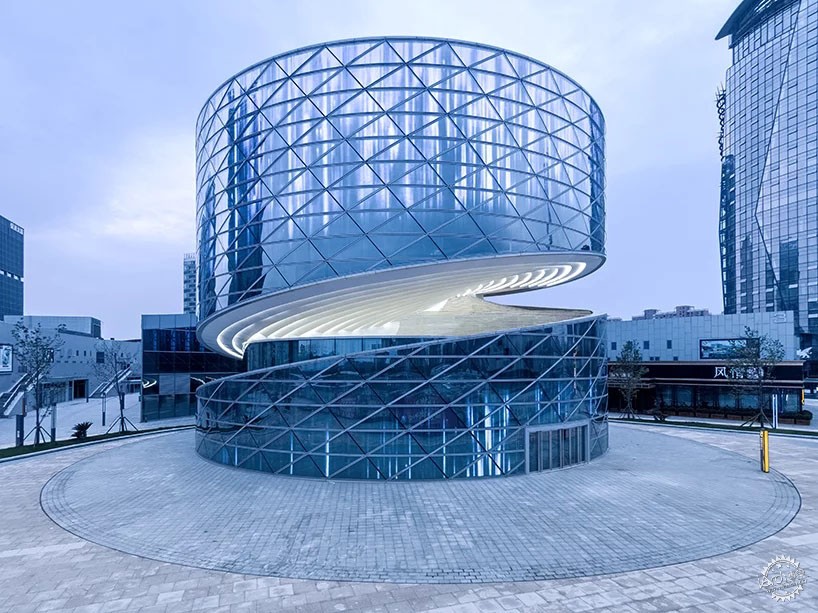
All images © shiromio
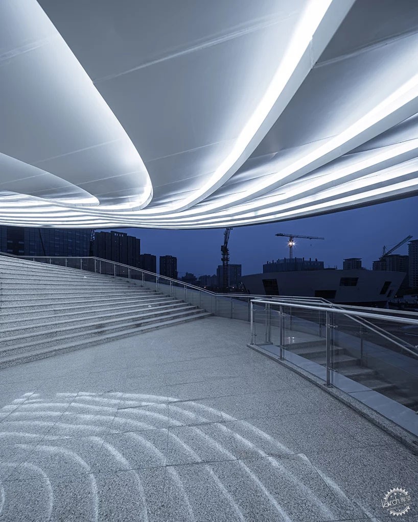
在该项目中,人们可以通过通道与楼梯在室内外自由的穿梭,由于设计师对于地板的处理手法采用了模糊效应,因此人们不会意识到空间环境转变的发生。正如在艺术表演中的表演者需要通过一个缓慢旋转的楼梯走向舞台的中心。
In the center, one will shuttle through both indoor and outdoor landscaping via the access staircase without being aware of the transition due to the blurring effect of the floors. During an artistic presentation, performers seem to be walking towards the center of the stage via a slow spinning staircase.
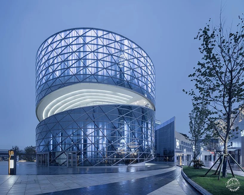
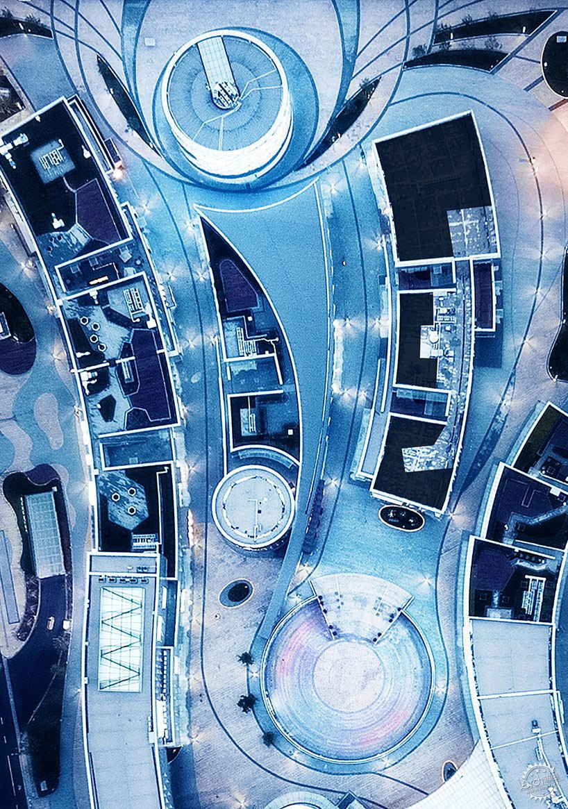
ATAH建筑事务所的项目涉及多种商业类型,其目标是成为绍兴Keqiao科学城的核心。CTC(中国纺织中心)的螺旋楼梯位于商业综合体的中心,并相应地位于该项目的主入口,它是该项目的标志中心。由于项目特有的纺织背景,加上其独特的结构,它用自己独特的设计语言将各种商业景点与艺术融合在一起。
ATAH’s project involves a mix of commercial typologies and aims to become the core of the Keqiao science city in Shaoxing. The heli-stage of the CTC is the epicenter of the commercial complex and is correspondingly located at the main project entrance, Which is the symbolic center of the entire project. Due to the background of the project, a unique structure with its own design language proposes to fuse the various commercial attractions with an artistic blast.

在结构上,该设计采用了一种“中心-管”关系:主要结构为中心的钢结构,内设中央空气井和电梯;从一楼延伸至三楼的几何形状楼梯与中心钢结构直接相切。水平钢构件悬垂支撑着外立面的吊架;空间框架与其自身表面周围的悬索结构相结合,在水平方向上创建出无柱空间;建筑内的剩余空间用于容纳建筑服务设备。
Structurally, the design adopts a core-tube relationship: the main structure is the steel core in the center, which houses a central air well, and an elevator; The changing geometry of the staircase from the first to the third floor is directly tangential to the structural steel core, while horizontal steel members overhang to support the spandrel; The space frame, in combination with a suspended cable at the periphery of its own surface creates a column-free space on the horizontal; The leftover spaces within are used to contain building services and equipment.
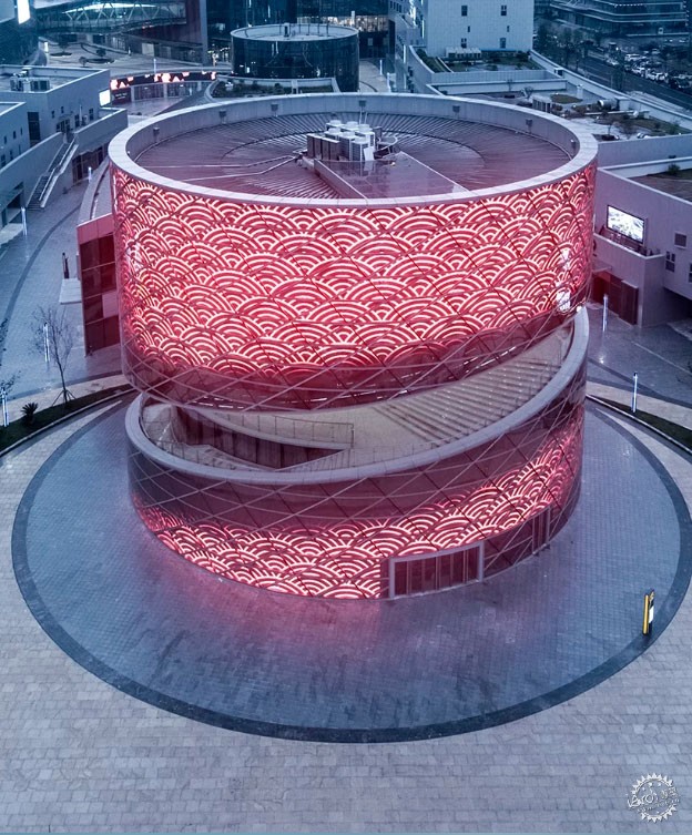
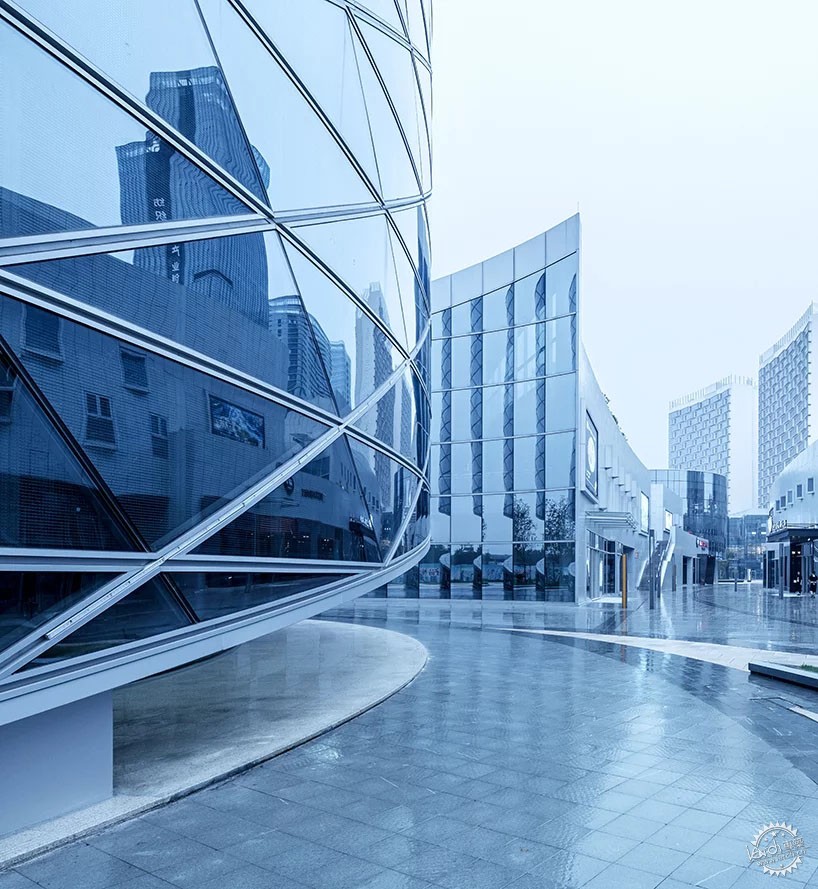
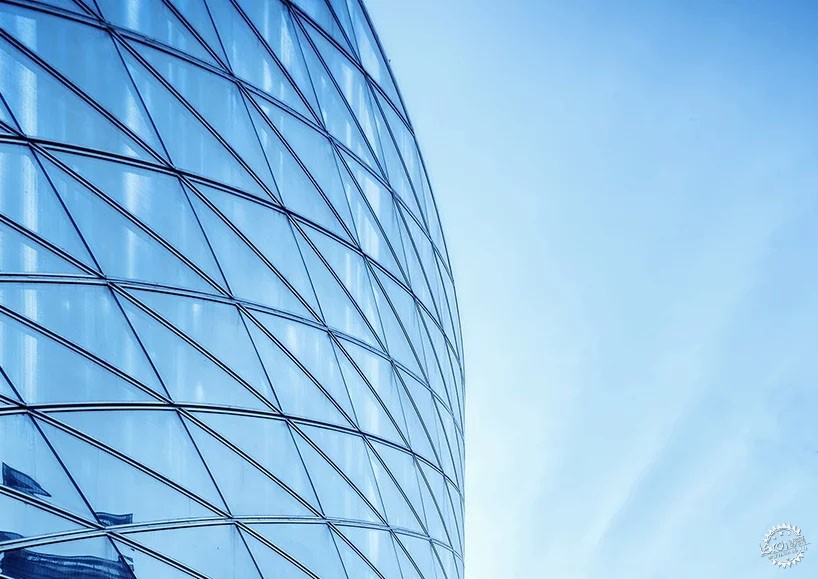
总之,结构设计采用了莫比乌斯环(一种几何图形)的颠覆性结构。为了进一步强化形态的概念,设计师使用了曲三角形low-e双层釉面玻璃幕墙(3 m×2.3 m×1.6 m)包裹着圆柱形的外墙。而中央空隙内的立面则由单一的模块单元组成。
In summary, the structural design adopts the subversive nature of a mobius strip. In order to further strengthen the concept of morphology, curved triangular low-e double glazed units make up the outer curtain wall (3 m by 2.3 m by 1.6 m in size), wrapping its cylindrical façade. The façade within the central void consists of a single modular unit.
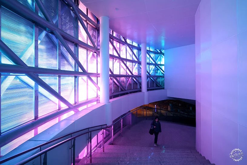
室内设计也使用了纺织的概念,例如运用了纺车等抽象的元素。当游客进入其中,瞬间就会沉浸在旋转、扩散和相互交织的建筑空间中。它的室内设计手法突出了纺织生产的过程,并结合了当地的纺织文化。
The interior design adopts the concept of weaving, using abstract elements such as the spinning wheel. Upon entry, visitors immerse in the architectural extravaganza of rotating, diffusing, and interweaving movement, which celebrates the space. This is accentuated by its interior design, taking a cue from the textile production process, as well as the local textile culture in mind.

项目信息:
建筑设计:ATAH建筑事务所
建筑位置:中国,浙江,绍兴
主创建筑师:Guang xu; Lilas dandan wang design
设计团队:Ji Zhongxia; He fan; Zhang dejun; Yang Zhenqin; Geng Lingxiang
建筑面积:2400 平方米
项目年份:2018
客户:office of CTC development
室内设计:ATAH(概念设计); 上海 Kuanchuang (设计建造)
标识系统设计:ATAH (全相位)
合作设计:Mada s.p.a.m.
承建单位:同创工程设计有限公司;上海建筑设计研究院有限公司
幕墙顾问:宝业集团
摄影:Shiromio
珠宝:Iriffle
Project Info:
Architect: ATAH
Location: Shaoxing, Zhejiang, China
Chief Architects: Guang xu; Lilas dandan wang design
Team:Ji Zhongxia;He fan; Zhang dejun; Yang Zhenqin; Geng Lingxiang
Area: 2400 sqm
Project Year: 2018
Client: Office of CTC Development
Interior Design: ATAH (concept); Shanghai Kuanchuang (design and construction)
Sign System Design: ATAH (all phase)
Collaboration: Mada s.p.a.m.
ldi: Tongchuang Engneering Design co.; Institute of Shanghai Architectural Design and Research co., ltd
Curtain Wall Consultant: Baoye group
Photography: Shiromio
Jewelry: Iriffle
|
|
专于设计,筑就未来
无论您身在何方;无论您作品规模大小;无论您是否已在设计等相关领域小有名气;无论您是否已成功求学、步入职业设计师队伍;只要你有想法、有创意、有能力,专筑网都愿为您提供一个展示自己的舞台
投稿邮箱:submit@iarch.cn 如何向专筑投稿?
