“我们经常想象自己如果还是一个孩子,想要快乐的玩耍,探索的样子。我会希望在能感受到安全和温柔的地方,给自己一个角落,躲在里面看书,想象。我们一直在努力实现它,然后从孩子们的笑容中得到我们想要的答案。”
--主持设计师程枫祺及团队
Your Child’s Second Home - Pony Running Daycare Showroom / VMDPE Design
“We always imagine ourselves as kid who wants to have fun and explore. I would like to have a space with safe and gentle feeling, a corner for myself, to hide, read and imagine. We've been trying to make this happen, and then we got the answer we wanted from the smile of the kids.”
— Principal Designer Vinci Chan & Team —
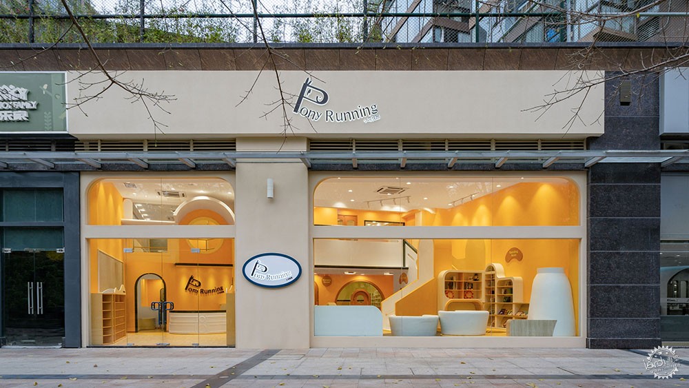
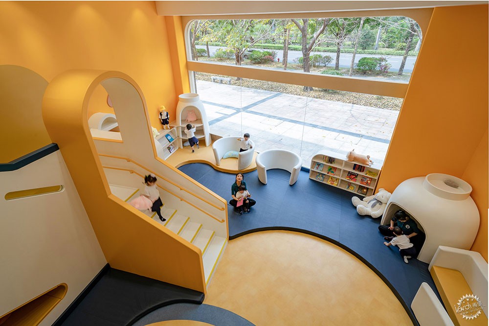
一道透明玻璃,将欢乐的明黄色世界与外面的灰色都市隔开,在钢筋混凝土森林包围之中,却有一方温暖的天地包容了孩子心灵成长的空间和时间。小马快跑,正如品牌寓意,穿越传统思维界限,插上隐形的翅膀,尽情奔跑,孩子们在这个充满张力的迷你宇宙中探索和成长。
Transparent glass separates a shiny and bright yellow world of joy from the sober grayness of the city outside. Despite being surrounded by a forest of reinforced concrete, its warm atmosphere flows through time and space, favoring the spiritual growth of children. Pony Running, as the name of the brand implies, goes beyond the boundaries of traditional thinking, granting children invisible wings of freedom to move at will, explore and grow in an inspiring mini universe full of possibilities.
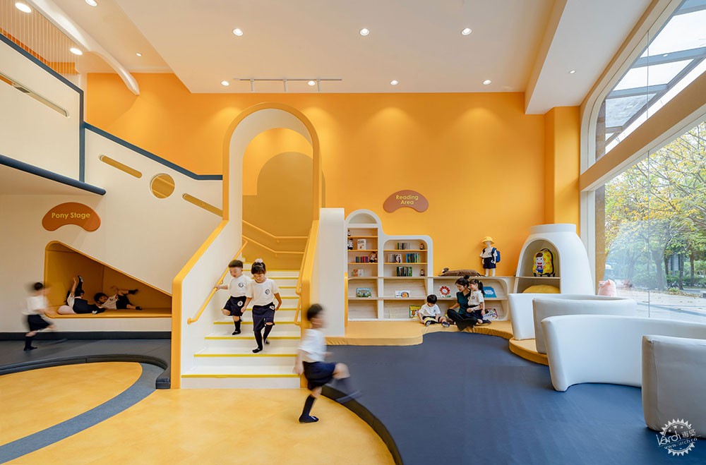
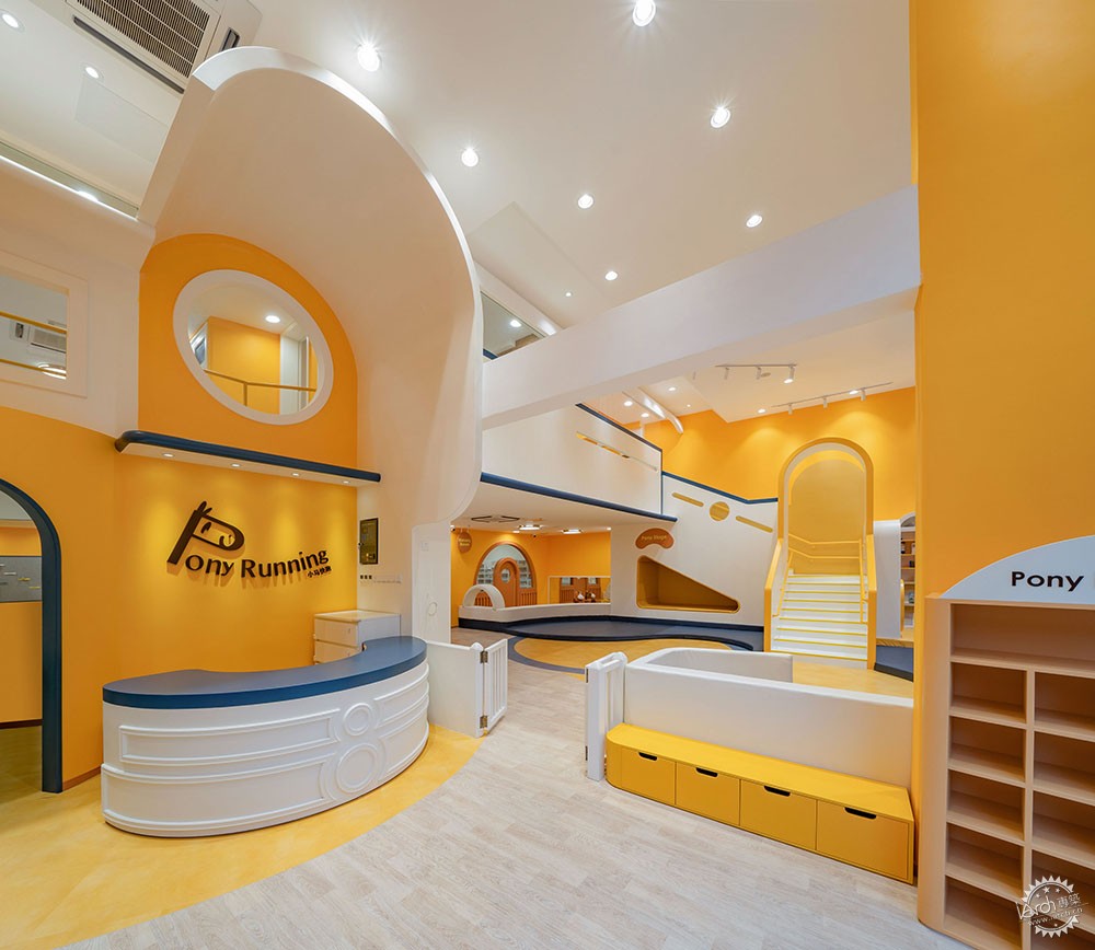
“Earth Building”东方实践
作为早教机构,小马快跑因其丰富的教学体系而广受喜爱,它以小班制为教育理念,致力于关注到每一个孩子的性格需求及潜力。此次品牌形象升级,圆道设计从西方“自然生活派”建筑师的新兴概念“Earth building”中汲取灵感,立足儿童的本质,摒弃使用成人化的“装饰”手法,旨在突出建筑本身美感与趣味,让孩子们自由地释放天性。
An Oriental Approach to the “Earth Building”
As an early childhood education institution, Pony Running is widely cherished for its rich teaching system. A small class structure stands at the core of its educational concept, focusing on the personality needs and potential of every child. To perform the brand upgrade, VMDPE Design was inspired by the emerging approach of an “Earth Building” found in the Western Architectural “School of Natural Life”. Based on the natural disposition of children, the use of adult “decoration” techniques was completely abandoned, highlighting the beauty and fun of the building itself, letting children be children in a free environment.

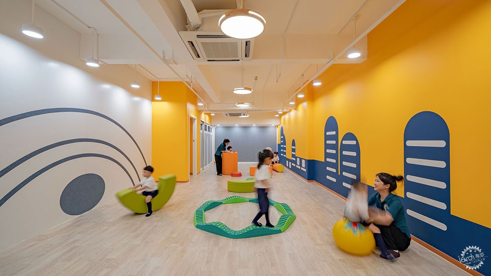
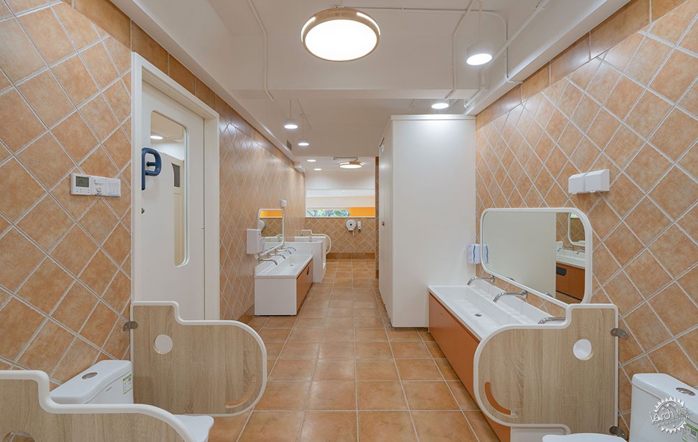
材质选择上,大量环保材料被转化为设计语言,展示出设计者和教育者的可持续性理念,为城市里的孩子创造水泥丛林中的“绿洲”。色彩表现上,否决五彩斑斓的方案,仅用一种主题色彩强化环境感染力,让空间中的人感受到此刻、此处是舒适的,快乐且经典的,纯粹而非强调物质化的,这种积极的心理和情绪暗示透过门面的落地玻璃又传递给外部世界,引发强烈的共鸣。
对于装饰性与实用性的关系处理,圆道设计始终认为功能才是现代教育空间的核心。去掉冗余的装饰物,造型被控制在最小范围,不做无意义的装饰,只保持最基本的生活需求,只关注与教学功能有关、与儿童活动有关的内容,在此基础上进行空间整合以及色彩搭配,用最“简单”的手法,突出自然且本质的气质,最终把所有的空间还给孩子。
In terms of material selection, a large number of environmentally friendly materials were integrated into the design language, demonstrating the sustainability philosophy of the designers and educators, and creating an “oasis” for children among the concrete jungle. In terms of color selection, colorful schemes were rejected in favor of a unique main tone that enhances the appeal of the environment, letting people feel the moment, in a comfortable, happy, classic and pure manner, rather than focusing on materialistic attributes. Such positive psychological and emotional suggestions are transmitted to the outside world through the floor-to-ceiling glass façade, arousing strong resonance among the local people.
Regarding the relationship between decoration and practicality, VMDPE Design firmly believes that function is the core of the modern educational space. Thus, the designer parts away with redundant ornaments, shapes are reduced to their minimum expression, there are no meaningless decorations and only essentials for a healthy life are nourished, focusing architectural content on didactic functions and activities for children. On this basis, both spatial integration and color matching use the “simplest” techniques to highlight a natural and essential temperament, eventually devoting all the space to the children.
自由的社交
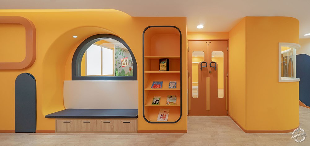
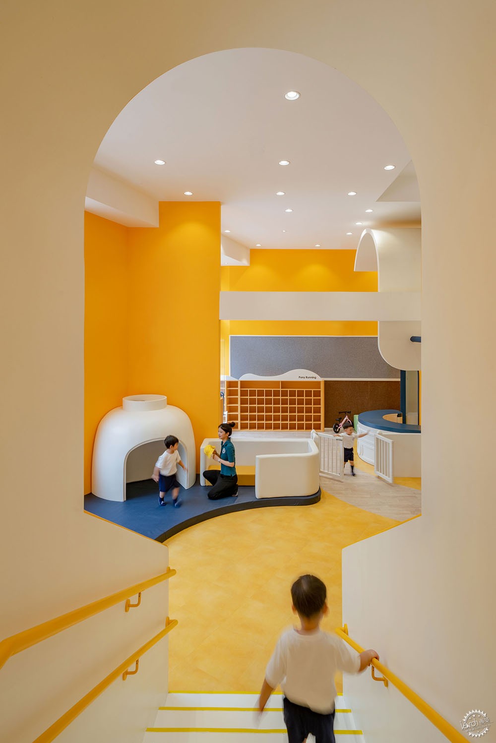
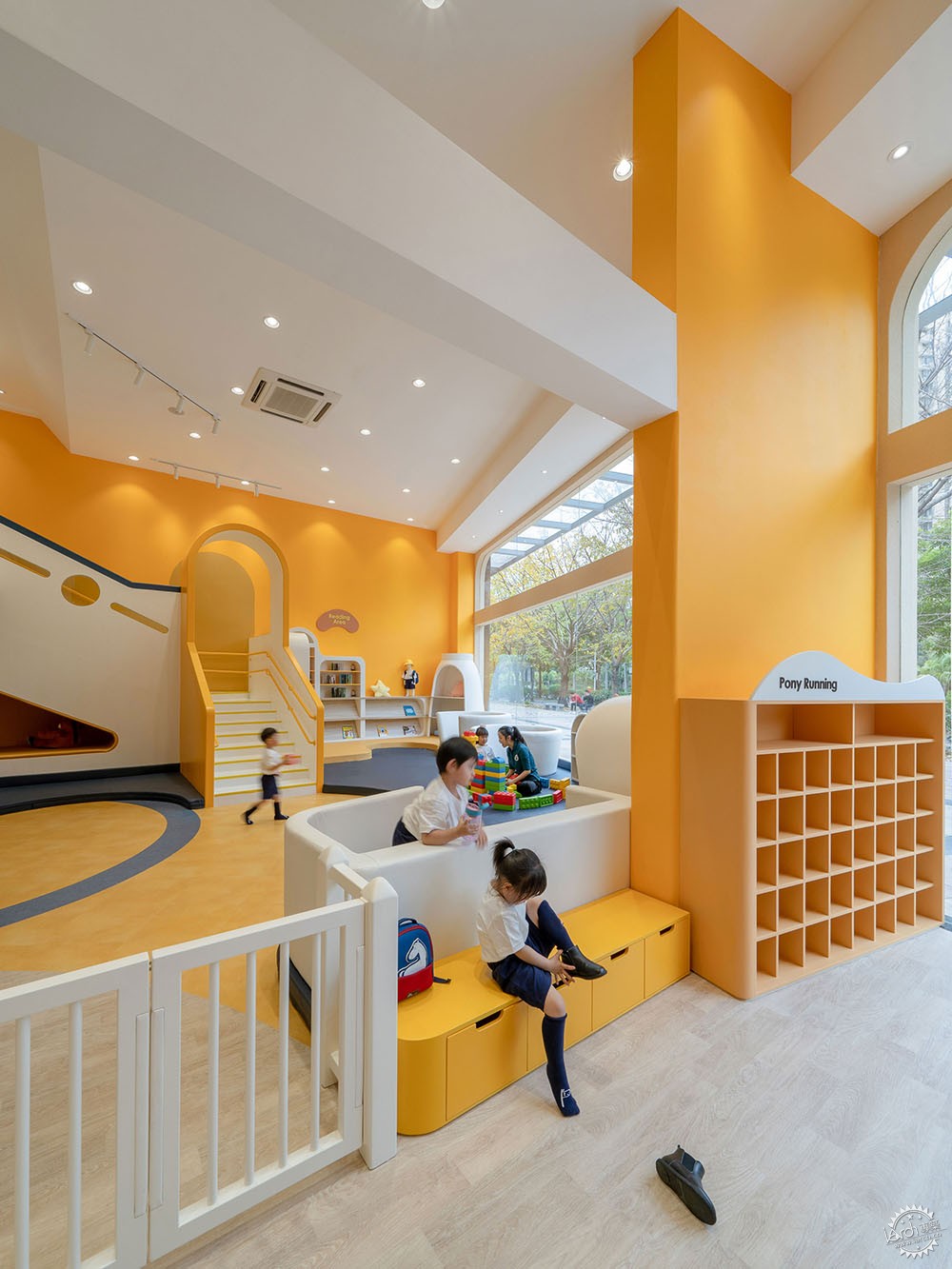
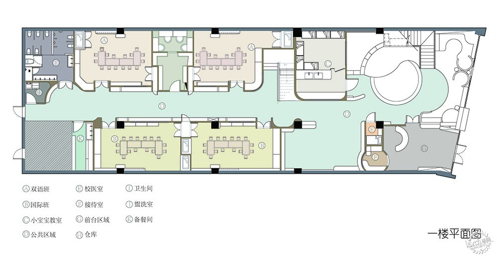
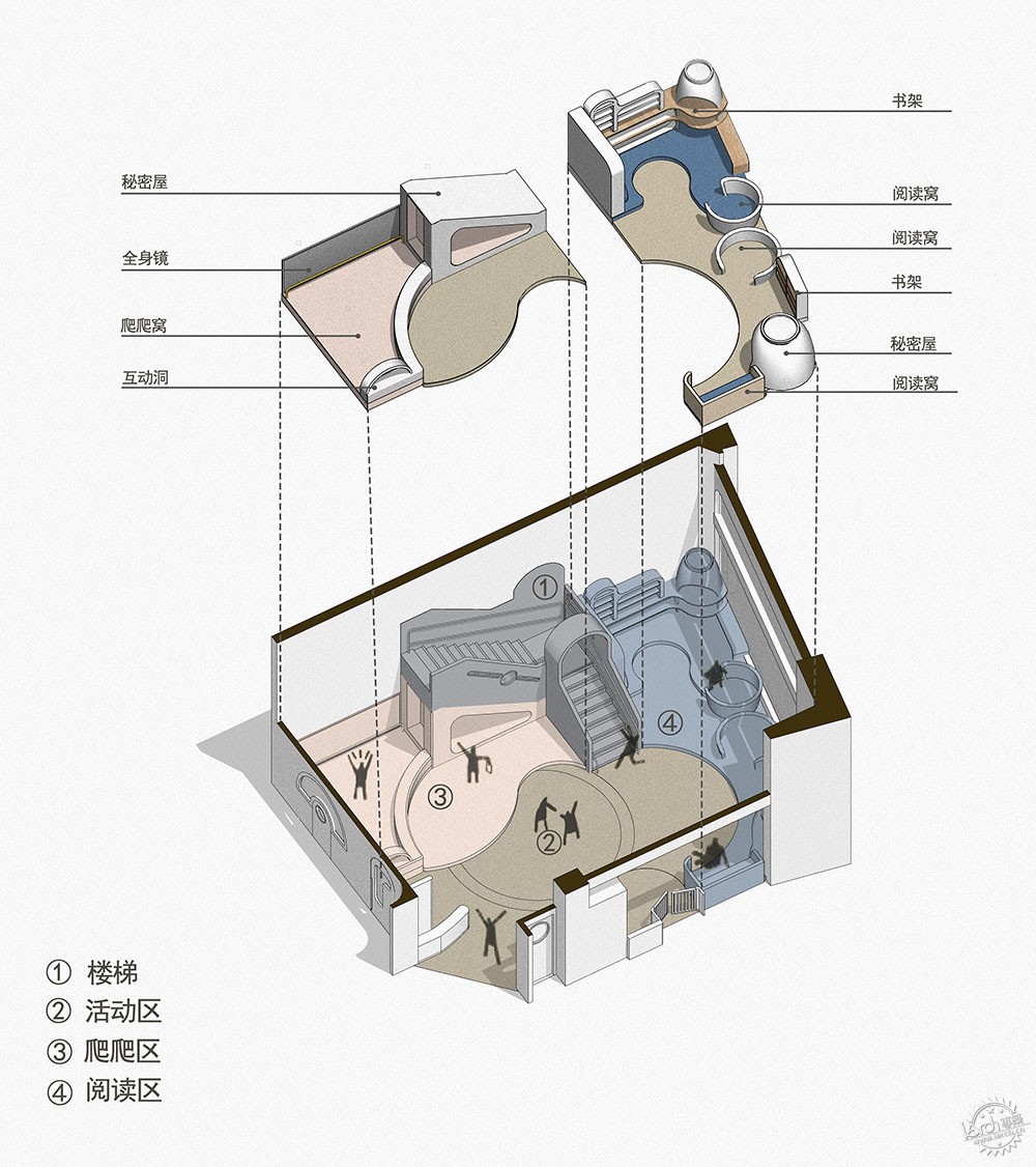
“用空间本身创造空间内的使用目的和美感”,即还原空间用途,回归使用者本身。圆道设计认为,托育这个年龄段(0~3岁)的孩子们同样需要适当的自由社交行为,他们也渴望与同龄的孩子们进行接触和交流。因而,空间设计反国内大部分托育机构之道而行之,划出占场地3分之1的面积作为自由社交区域,阅读区、科学区和角色扮演区等穿插其中,共同构成孩子们初步尝试建立社群关系的舞台。在这个偌大的空间内,孩子们才是主角,成人及后勤的功能,都被巧妙隐藏在孩子们接触不到的背后。
Unrestricted Social Life
“Use the space itself to create purpose and beauty, revitalize spatial use and put it at the service of the user.” VMDPE firmly believes that children in the age group of 0 to 3 years old need socializing opportunities without restrictions, as they are eager to contact and communicate with children of the same age. Therefore, the spatial design of the project goes against that of most nurseries in China, reserving one third of the site as a dynamic integration of the social area, the reading area, the science area and the role-playing area. Together, they form the stage where children first try to establish community relations. In such a huge space, children are the main characters, while functions destined to adults or logistics remain cleverly hidden beyond children’s reach.
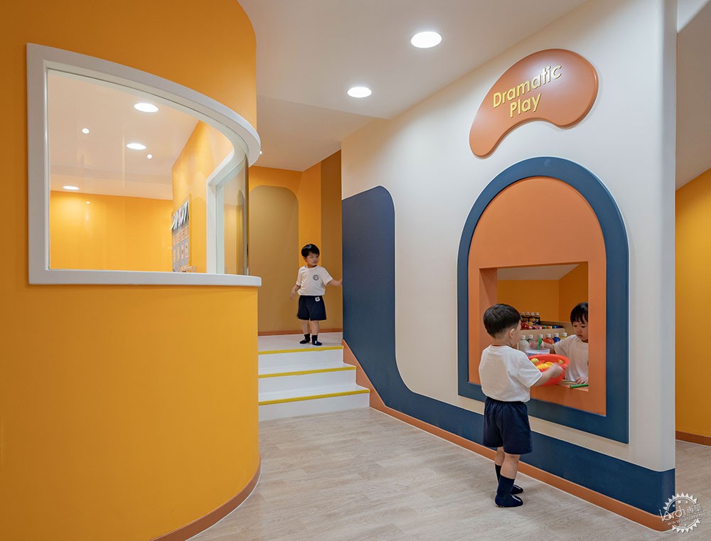
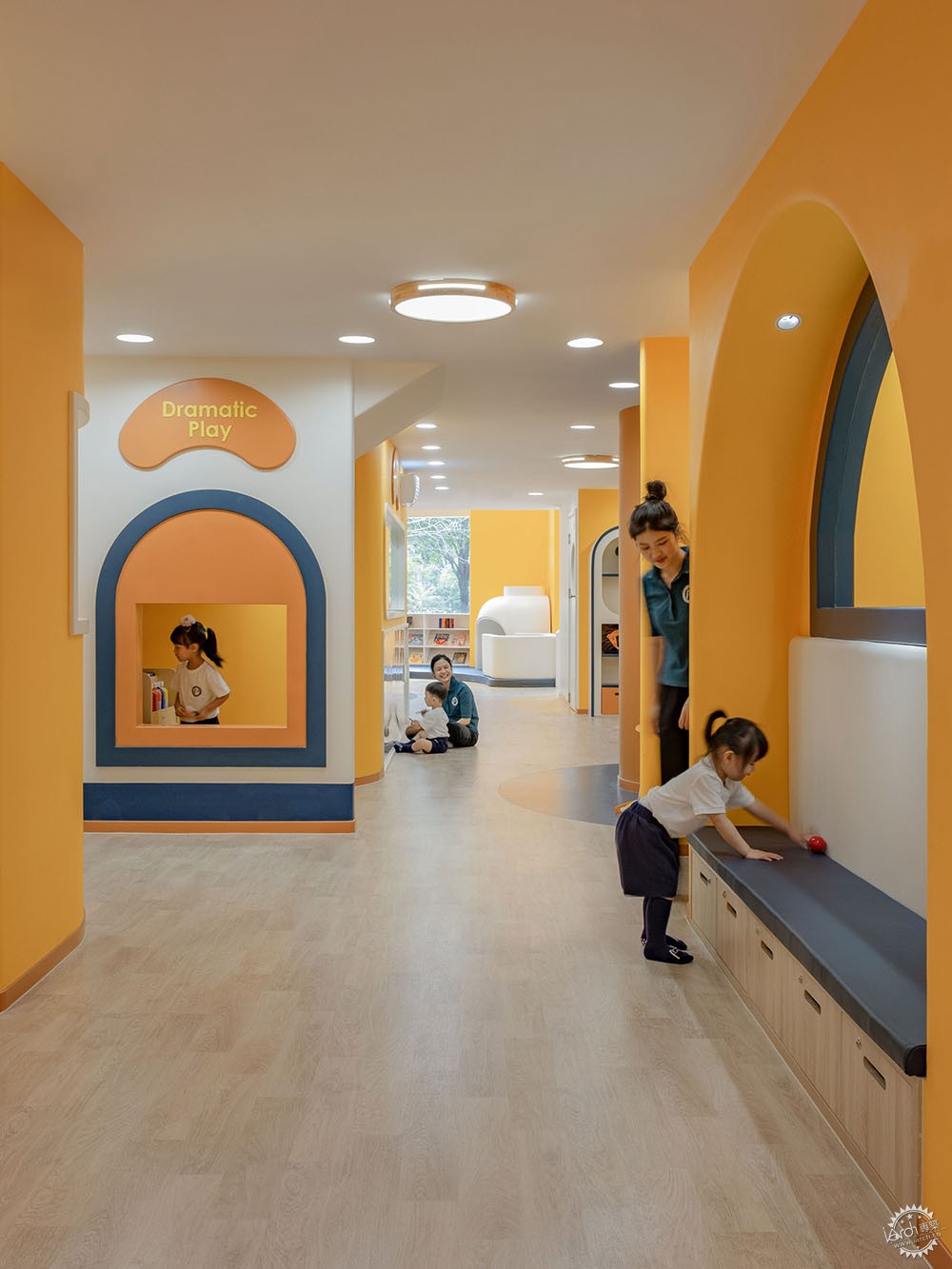
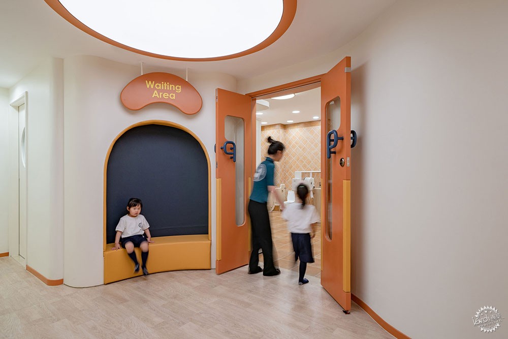
整个自由社交区域采用开放式设计,并布置了大量称为“窝”的角落,孩子们可以随时找到自己喜欢的位置,另一方面尺度上也作出了平衡的取舍,所有角落都被设计成老师们均可观察到,而孩子们却有私密感的高度。与此同时,从材料到造型,整个区域均引入高安全级别的设计,老师可以放手孩子们自由活动,同时在一旁适当的参与和引导,让孩子在玩耍中学会思考,在游戏中发展人格。在这里,孩子们可追逐嬉闹,可静待一角,可与师为伴,可自由探索,将选择权交还孩子,激发其埋藏在潜意识里的个性。
重塑学与教
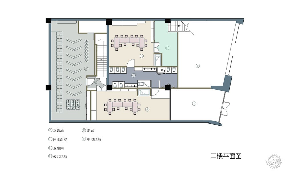
基于品牌教育理念,小班式课室的设计逻辑更为简洁清晰,减掉繁琐的软装,去除复杂的色彩搭配,旨在打造一个促进培养孩子专注度的学习环境,使其不易受到外界干扰,同时结合儿童心理赋予空间合适的尺寸,给予孩子更多安全感,让他们更快地融入集体活动。
在挖掘小马快跑的教学特色的过程中,圆道设计还从该品牌的“教学仓库”中受到启发,将丰富的教具课件与环境设计相结合,专门为每间教室设计了一个“教具导入口”,方便老师为每一堂课提前准备好丰富的教具内容,重塑了教师们日常使用教学仓库的方式,并深化品牌注重通过多样化的教具激发孩子潜能的理念。
The entire social area adopts an open design that arranges several corners called “nests”, where children are free to choose their favorite location at any given time. The scale of the space has been carefully balanced, designing all corners in a way that allows teachers to observe, while transmitting children a comfortable feeling of privacy. Furthermore, everything from materials to the design style has been carefully thought to provide a high degree of safety in the area. This allows children to move freely, while teachers participate and guide activities on the side, stimulating children to learn to think during play and develop their own personalities. This is the place where children chase and play, they can play leisurely in a corner, they can be accompanied by teachers, or they can explore freely, in other words; empower children to choose for themselves, stimulating their personalities to grow in a natural way.
Reshaping Learning and Teaching
To design classrooms with small class structures proves to be a clear and concise approach based on the education concept of the brand. As such, the designer parts away with any cumbersome furnishings and complex color matching techniques, creating a positive learning environment for children to study, a place less susceptible to outside interference. Even more, children psychology is considered to design every corner on the right scale, allowing children to feel safe and relaxed, encouraging them to take part in group activities at ease.
Delving into the didactic features of Pony Running, VMDPE Design was inspired by the brand’s “Didactic Warehouse” to design a system that combines abundant teaching aids and courseware with environmental design into a unique “teaching tool input system” for every classroom. Thus, the warehouse strengthens the brand’s core concept by providing fresh and abundant content on a daily basis, making it easier for teachers to prepare and present effective educational materials that greatly stimulate the children’s potential.
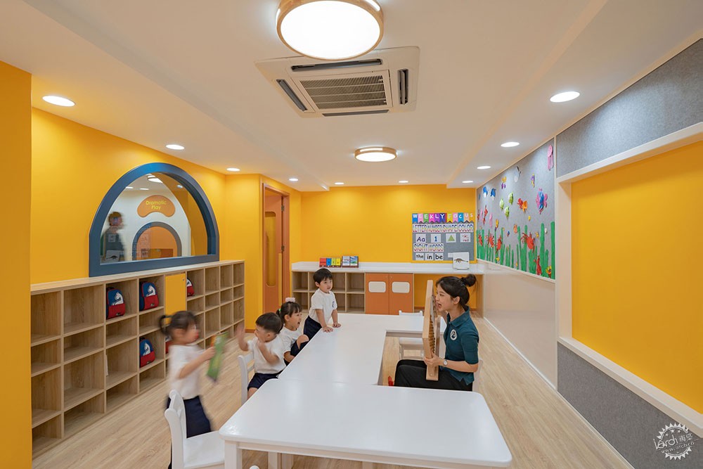
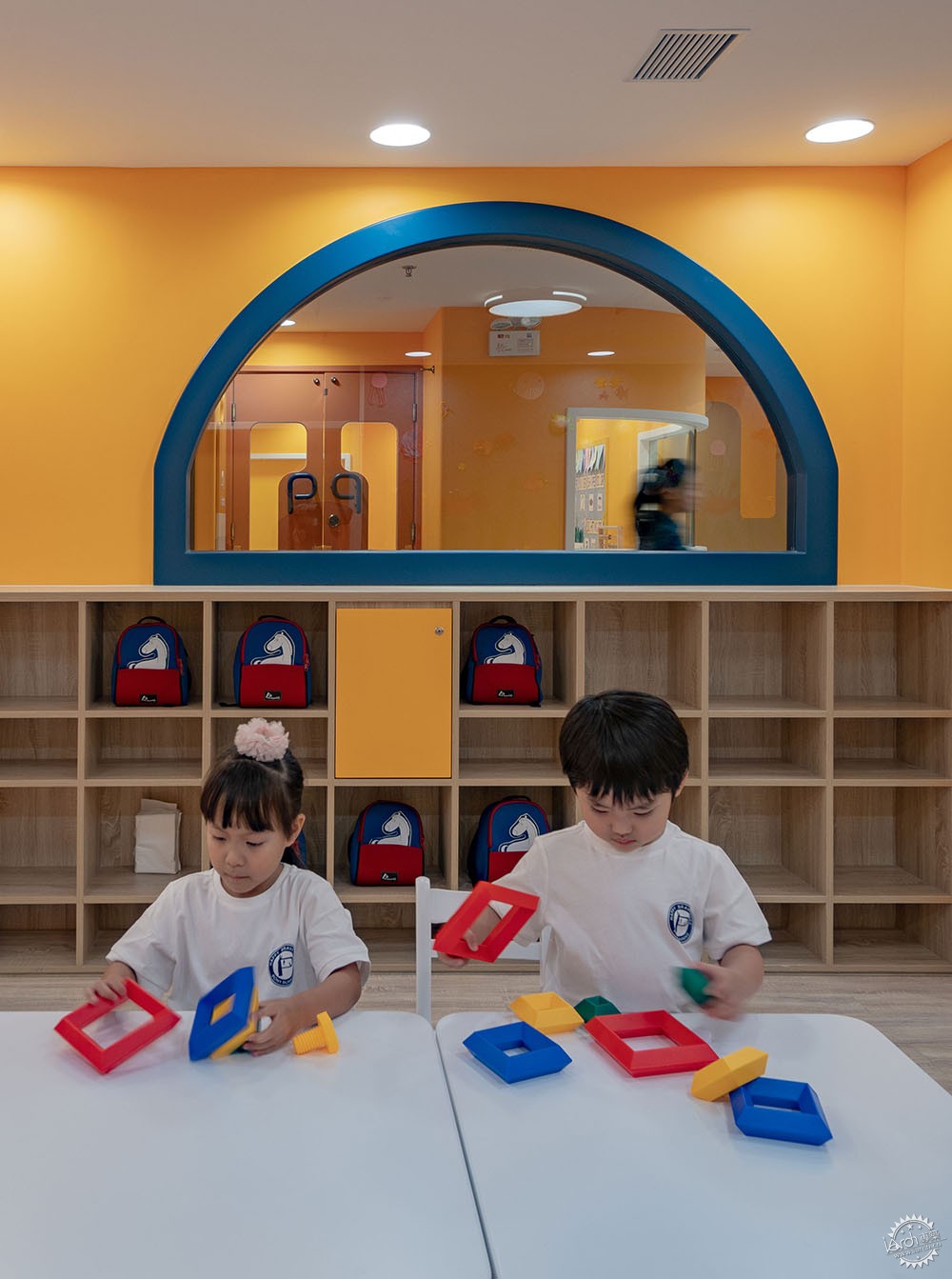
当人们重新思考幼儿教育空间在城市发展中的地位,在发展迅速的早教行业中寻找真正属于儿童的成长空间,小马快跑项目主张的并非空间本身的“设计”,而是孩子们与空间融为一体后的美好画面,就像站在街上一看,它如同橱窗般展示了一个令人动容的童真世界。
When pondering about the status of early childhood education institutions in urban development, people realize that the rapid expansion of the industry demands growth spaces that truly belong to the children. In this regard, Pony Running does not advocate the “design” of the space, but the beautiful picture of the children and the space in natural harmony. Just like standing outside a shop window, the interior showcases a breathtaking world of pure innocence.

项目名称:小马快跑托育全国示范店
项目地点:中国深圳南山区君汇新天地
设计公司:VMDPE圆道设计
设计时间:2019.7 - 2019.9
施工时间:2019.9 - 2019.12
场地面积:626m2
项目状态:已建成
设计师总监:程枫祺
设计团队:韦柱任,张健
深化团队:张健,陆欢
项目类型:外立面改造与室内设计、灯光设计、道具设计
摄影:张超
文字:张森文字工作组
建材及厂家品牌信息
灯光:Philips
地胶:TAJIMA
墙面漆:buoncolor
Project name: Pony Running Daycare Showroom
Project location: Junhui Xintiandi, Nanshan District, Shenzhen, China
Design company: VMDPE Design
Design period: July 2019 – September 2019
Construction time: September 2019 – December 2019
Site area: 626m2
Project status: completed
Lead designer: Vinci Chan
Design team: Sean Ve, Dio Chang
Design development: Dio Chang, Nancy Lu
Project type: Façade renovation and interior design, lighting design, prop design
Photography: Zhang Chao
Article: Zhang Sen from the Text Working Group
Materials and manufacturers information
Lighting: Philips
Rubber mats: TAJIMA
Wall paint: buoncolor
来源:本文由VMDPE圆道设计提供稿件,所有著作权归属VMDPE圆道设计所有。
|
|
