The Color of Architecture:72 Projects Spanning the Spectrum
由专筑网丁康杰,王雪纯编译
对于一座每日都有人看见、经过、使用的建筑来说,建筑的色彩无疑会对我们的感受产生巨大的影响。很多当代的建筑师似乎把色彩看作是一种设计的干扰选项,他们在构思项目时更倾向于关注建筑的形式、架构和层次。对他们来说,外观色调的选择是一个非常简单而普通的问题——也就是说,这个问题并没有什么讨论的价值和意义。
然而,对于其他某些建筑师来说,色彩却被认为是一种具有不可思议的意义的设计元素,而且科学研究表明,这些建筑师的想法是非常合理的。对色彩心理影响的深入研究表明,人们对周围环境的颜色、对色彩的饱和度非常敏感。例如,一抹蓝色可能会给人们带来一种平静和安宁的感觉,而滥用红色可能会导致人们产生焦虑甚至恐慌的感觉。
对于建筑师来说,这也增加了他们的设计风险:他们对颜色的选择可能会决定一个项目的成败。在这里,我们展示了九种不同颜色的建筑,一共七十二个项目,每座建筑的色彩都对居住者产生了深远的影响。
Choice of color in architecture has an overwhelming effect on the way a building is perceived by those that view it, walk by it and occupy it each day. Numerous contemporary architects appear to view color as a distraction, preferring to focus on form, structure and program when conceptualizing their project. For them, the choice of exterior hue is a simple one — it is, quite literally, a black and white issue.
For others though, color is held up as a design element of incredible significance, and science indicates these architects are justified in their thinking. In-depth studies on the psychological impact of color show that people are highly sensitive to the hue and saturation of their surroundings. For example, a swathe of blue might give rise to feelings of calmness and serenity, while a misuse of red might lead to feelings of anxiety or even panic.
For architects, this raises the stakes: Their choice of color could make or break a project. Here, we present 72 buildings across nine color-coded collections, each of which possesses a hue or shade that impacts its occupants in a profound way. Take inspiration from this grand prismatic guide to architecture, and let us know which is your favorite over on Facebook.
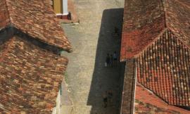
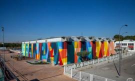
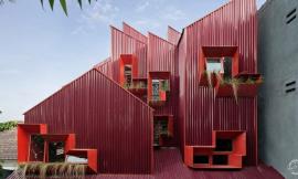
红色/Red

九个红色建筑项目,让我们认识红色的魅力
红色是一种充满戏剧张力的颜色。当看到红色时,我们总是会产生一种强烈的本能反应,一种难以言状的恐慌感油然而生,这种恐慌是因为红色和我们存在一种亘古不变的联系——红色是血液的颜色,生命的颜色。当红色出现在我们的视野中时,我们不免将其与血液流失所带来的恐慌联系起来。因此,随着时间的推移,红色被用作警告标志、信号灯和紧急响应标志的颜色,哪怕在建筑中使用时,它通常也是为实现这些目标服务的。
建筑师们注意到了这种联系的重要性,因此在使用红色时也进行了一定的斟酌。正如下面这些项目所证明的:这种潜意识所赋予的属性使得红色在非紧急情况下也能成为被广泛应用的流行颜色。无论是帮助一个项目从周围环境中脱颖而出,还是使其成为环境的一部分,我们都不可能将这种颜色从其深刻的反射性含义中分离出来。以下这些项目涉及了各种建筑规模、各种设计程序和以及用色意图,但引人注目的效果总是殊途同归:如果你把一些事物涂上红色,人们就会被它们吸引。
红色系列项目精选:
Blood Center by F A A B Architektura Adam Białobrzeski | Adam Figurski, Raciborz, Poland (pictured above)
The Couch by MVRDV, IJburg, Netherlands
Serpentine Gallery by Ateliers Jean Nouvel, London, United Kingdom
The Red House by Jarmund/Vigsnæs Architects_ JVA, Oslo, Norway
People’s Canopy by People’s Architecture Office, Lancashire, England, United Kingdom
Jean-Claude Carrière Theatre by A+Architecture, Montpellier, France
Red Wall by 3GATTI, Shanghai, China
Amphithéatre Trois-Rivières by ATELIER PAUL LAURENDEAU, Trois-Rivières, Canada
Qinhuangdao Red Ribbon Park by Turenscape Landscape Architects, Qinhuangdao, China
9 Scarlet Projects Making Us See Red
Red is a dramatic color. Always eliciting a strong visceral response, we’ve evolved to become alarmed when we see it, since its oldest association is with the natural hue of blood when it’s outside the body. As such, red has been employed over time as the color of warning signs, stoplights and emergency response, and when used in architecture, it is often in the service of one of these goals.
The importance of this association is not lost on architects who use it discriminately. As evidenced in these nine projects, it is exactly these subconscious attributes that make red a popular color to apply liberally in non-emergency settings. Whether helping a project stand out from its surroundings, or as a complement to them, it’s impossible to divorce this color from its deeply reflexive meaning. These projects exhibit a wide range of scale, program and intent, but the attention-grabbing effect is always the same: If you make something red, people will notice.
Projects in the RED collection:
Blood Center by F A A B Architektura Adam Białobrzeski | Adam Figurski, Raciborz, Poland (pictured above)
The Couch by MVRDV, IJburg, Netherlands
Serpentine Gallery by Ateliers Jean Nouvel, London, United Kingdom
The Red House by Jarmund/Vigsnæs Architects_ JVA, Oslo, Norway
People’s Canopy by People’s Architecture Office, Lancashire, England, United Kingdom
Jean-Claude Carrière Theatre by A+Architecture, Montpellier, France
Red Wall by 3GATTI, Shanghai, China
Amphithéatre Trois-Rivières by ATELIER PAUL LAURENDEAU, Trois-Rivières, Canada
Qinhuangdao Red Ribbon Park by Turenscape Landscape Architects, Qinhuangdao, China
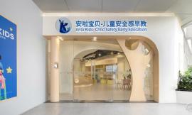
黄色/Yellow

黄色在建筑中令人兴奋的应用
将建筑涂上黄色必然会引发震撼的效果。黄色可以说是光谱上最强烈、最具视觉冲击力的颜色,几乎任何一种黄色都能引起人们的注意并捕捉住大家的目光。那么,在建筑中使用这种颜色意味着什么呢?从色彩心理上来说,黄色通常被描述成一种让人快乐、充满活力的颜色,而且——不管设计师是否有意为之——当在建筑中使用黄色时,它都可以向使用者传达这样的理念。
以下七个项目在建筑的表达上都运用了醒目的黄色。建筑的类型上存在很大的差异,但是在颜色的选择上对使用者的影响却显示出了惊人的相似性和对比度。总的来说,这些项目强调了这样一种理念,即黄色在任何地方都具有强大的影响力,我们应该仔细考虑它的内在含义。
黄色系列项目精选:
Tellus Nursery School by Tham & Videgård Arkitekter, Stockholm, Sweden
Apprentice Formation Center by AIR architectures, Saint-Maur, France
Sunray Woodcraft Construction Headquarters by DP Architects, Singapore
Inter-Generation Centre by Dominique Coulon & Associés, Venarey-les-Laumes, France
Housing for the Fishermen of Tyre by Hashim Sarkis Studios, Abbasiyeh, Lebanon
Morangis Retirement Home by Vous êtes Ici, Morangis, France
Centre Clignancourt by GPAA Gaëlle Péneau Architecte & Associés, Paris, France (pictured above)
7 Uplifting Uses of Yellow in Architecture
You can’t make something yellow without causing a stir. Arguably the most intense color on the spectrum, almost any expanse of it commands attention and draws the eye. So what does it mean when this color is employed in architecture? Psychologically, yellow is often characterized as making people happy or invigorated and — whether the designer intended it to or not — it can underscore such notions for inhabitants when used in a building.
These seven projects all feature noteworthy applications of yellow in their articulation. Typologies vary widely, but the effect this color choice has on a wide range of occupants illustrates striking similarities and contrasts. In all, these examples reinforce the notion that yellow exerts a powerful presence wherever it is used, and its implications should be considered carefully.
Projects in the YELLOW collection:
Tellus Nursery School by Tham & Videgård Arkitekter, Stockholm, Sweden
Apprentice Formation Center by AIR architectures, Saint-Maur, France
Sunray Woodcraft Construction Headquarters by DP Architects, Singapore
Inter-Generation Centre by Dominique Coulon & Associés, Venarey-les-Laumes, France
Housing for the Fishermen of Tyre by Hashim Sarkis Studios, Abbasiyeh, Lebanon
Morangis Retirement Home by Vous êtes Ici, Morangis, France
Centre Clignancourt by GPAA Gaëlle Péneau Architecte & Associés, Paris, France (pictured above)
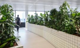
绿色/Green

9座真正的绿色建筑
人们总是潜意识地倾向于将绿色和平衡、和谐、自然以及生长这些属性联系起来。因为这些属性普遍具有积极的意义,使得绿色在主流文化中成为一种很受欢迎的选择——况且仅仅是“绿色”这个词汇本身就体现着环保意识和责任意识的内涵,这种内涵对我们见到这种颜色的感受产生了很大的影响。
在设计构图中,所谓的“绿色”属性功能强大,可以用来强化或者甚至是营造出一种作品本身缺乏的平衡感与和谐感。正如下面这9个项目所展示的,这种颜色通常是在自然元素稀缺的时候使用,或者是将不同的模块或形式联系整合在一起。这些建筑提醒着人们,简单的颜色选择对建筑的观感会产生根本性的影响,应该与结构和形式等元素一样给予同等的重视。
绿色系列项目精选:
123 social green housing by SOMOS.arquitectos, Madrid, Spain
Bilbao Arena and Sports Center by ACXT, Bilbao, Spain
Habitat 825 by Lorcan O’Herlihy Architects (LOHA), West Hollywood, Calif., United States
Expansion of Government Offices by CrystalZoo, Alicante, Spain
hERZberg by feld72 architekten zt gmbh, Vienna, Austria
School Center Antas by AVA ARCHITECTS Antas, Spain (pictured above)
The Kindergarten of the German School of Athens by Potiropoulos+Partners, Athens, Greece
Dream Dairy Farm Store by MORIYUKI OCHIAI ARCHITECTS, Chiba, Japan
Sports Centre Neumatt by Evolution Design, Strengelbach, Switzerland
The Natural Inclinations of 9 Truly Green Buildings
There’s an unconscious inclination to associate the color green with balance and harmony, as well as with nature itself and, by extension, growth. As generally positive attributes, these qualities make green a popular choice in mainstream culture – a mere utterance of the word itself carries with it connotations of environmental stewardship and responsibility, a notion that greatly influences the way we react upon seeing it.
These qualities can be especially helpful in a composition, used to emphasize or even manufacture a sense of balance and harmony in a work that may otherwise be lacking it. As these nine projects demonstrate, this color is often employed to invoke nature when it isn’t there, or to tie together a disparate program or set of forms. These buildings serve as reminders that a design move as simple as color choice has fundamental implications for how a building is perceived, and should be held in equal regard to elements such as structure and form.
Projects in the GREEN collection:
123 social green housing by SOMOS.arquitectos, Madrid, Spain
Bilbao Arena and Sports Center by ACXT, Bilbao, Spain
Habitat 825 by Lorcan O’Herlihy Architects (LOHA), West Hollywood, Calif., United States
Expansion of Government Offices by CrystalZoo, Alicante, Spain
hERZberg by feld72 architekten zt gmbh, Vienna, Austria
School Center Antas by AVA ARCHITECTS Antas, Spain (pictured above)
The Kindergarten of the German School of Athens by Potiropoulos+Partners, Athens, Greece
Dream Dairy Farm Store by MORIYUKI OCHIAI ARCHITECTS, Chiba, Japan
Sports Centre Neumatt by Evolution Design, Strengelbach, Switzerland
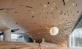
棕色/Brown

大地的颜色:8座棕色建筑
棕色也许是建筑中最本真的颜色。它的使用非常广泛,从木材的默认颜色,到作为大规模建设的郊区住宅中常见的外部涂料颜色,棕色的使用无处不在。我们到处都能看到棕色,但我们很少将其与某种特性联系起来。以下的这个系列中的项目突出地使用了棕色来达到强调的目的,并且与此同时让我们产生了一种对于棕色的联想。与绿色对自然的隐喻相似,棕色让人联想到地球本身:大地的颜色。
当一种有色植物从土地里萌芽,我们很容易就分辨出大地和小植株的颜色区别,因为我们已经见证过太多次花叶的成长与凋零。但是,一座小山丘、一座大山甚至一棵树树干连成的棕色却让我们发现这颜色和大地的颜色非常接近,显然这些颜色可以看做是地面的延伸,长久不变色的树干与山丘提醒着我们棕色与大地的联系。从这个意义上说,棕色是所有色调中最真实的大地色调,它温柔地提醒我们,我们与赖以生存的地球表面有着密不可分的联系。在颜色选择上,以下这8座建筑也深刻的告诉着我们这个道理。
棕色系列项目精选:
Science Park by 24H-architecture, Amsterdam, The Netherlands
A House for Oiso by Dorell.Ghotmeh.Tane / Architects (DGT), Oiso, Japan
Selcuk Ecza HQ by Tabanlioglu Architects, Istanbul, Turkey
MA&MI House by 3ndy Studio, Fossò, Italy
Plot 6 & Tea House in Jiangsu Software Park by Atelier Deshaus, Nanjing, China (pictured above)
Bob Champion Research and Education Building by HawkinsBrown, Norwich, United Kingdom
The Riparian House by Architecture BRIO, Karjat, India
Biomass Power Plant by Matteo Thun & Partners, Tübingen, Germany
8 Earth-Oriented Brown Buildings
Brown is perhaps the color most taken for granted in architecture. Its use is pervasive, from the default appearance of wood to its role as an abundantly common exterior paint color in mass-produced suburban housing. We see brown everywhere, but rarely is it a feature. The projects in this collection make a prominent use of brown for an emphatic purpose, and in doing so bring the color’s associations along with them. Similar to green in its allusions to nature, brown evokes the material of the earth itself: dirt.
While a colored plant may grow from the ground, it’s easy to distinguish the difference between the two because we’re used to seeing leaves change color and die. But the brown of a hill, mountain or even a tree is clearly an extension of the ground, due to its apparent permanence. In this sense, brown is the truest earth tone of them all, gently reminding us of our inescapable relationship with the surface we live on. As a matter of color choice, these eight buildings do the same.
Projects in the BROWN collection:
Science Park by 24H-architecture, Amsterdam, The Netherlands
A House for Oiso by Dorell.Ghotmeh.Tane / Architects (DGT), Oiso, Japan
Selcuk Ecza HQ by Tabanlioglu Architects, Istanbul, Turkey
MA&MI House by 3ndy Studio, Fossò, Italy
Plot 6 & Tea House in Jiangsu Software Park by Atelier Deshaus, Nanjing, China (pictured above)
Bob Champion Research and Education Building by HawkinsBrown, Norwich, United Kingdom
The Riparian House by Architecture BRIO, Karjat, India
Biomass Power Plant by Matteo Thun & Partners, Tübingen, Germany
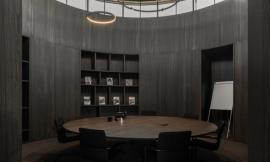
黑色/Black

8座漆黑的建筑传递着一种强大的肃穆感
在建筑中,黑色是一种非常特殊的存在。除了体现建筑师一种刻板的设计方式(有人甚至写了一本书,试图找出原因),在实际建筑设计中,这种颜色的使用可能会产生强大的视觉效果。这种影响对建筑的使用者来说是不可低估的。
作为建筑设计的一部分,黑色很少大面积使用,它与权力、威望和权威有关。伴随着一种正式感与肃穆感,当一个项目选择了黑色,这其中的微妙暗示是不可避免的。以下这8个项目恰恰证明了这一点,每一个项目都以黑色为特色,令人难以抗拒。
黑色系列项目精选:
Water Bottling Plant by Panorama Arquitectos, Coihaique, Chile
Prestige Mall by DILEKCI Architects (DDA), Istanbul, Turkey (pictured above)
No99 Straw Theater by SALTO, Tallinn, Estonia
Luxembourg Apartment by Metaform atelier d’architecture, Luxembourg City, Luxembourg
ABC Building by WISE Architecture, Seoul, South Korea
Private Clinic by Mario Mazzer Architects, Conegliano, Italy
Centre de Collaboration MiQro Innovation by Menkès Shooner Dagenais Letourneux Architectes, Bromont, Canada
MPO9 Headquarters by GSarchitects, Graz, Austria
8 Jet Black Buildings Conveying Powerful Prestige
Black is a color with a very special presence in architecture. Besides defining the stereotypical manner of dress for architects (to the extent that someone has gone so far as to write a book in an attempt to figure out why), it can have a powerful effect when used in actual architecture. The strength this effect has on building occupants cannot be understated.
Relatively rare in large expanses as part of a building’s design, black is notable for its associations with power, prestige and authority. With attendant notions of formality and respect, the subtle insinuations of black are impossible to miss when it defines a project. These eight examples typify exactly this, each of them featuring black to an overpowering degree.
Projects in the BLACK collection:
Water Bottling Plant by Panorama Arquitectos, Coihaique, Chile
Prestige Mall by DILEKCI Architects (DDA), Istanbul, Turkey (pictured above)
No99 Straw Theater by SALTO, Tallinn, Estonia
Luxembourg Apartment by Metaform atelier d’architecture, Luxembourg City, Luxembourg
ABC Building by WISE Architecture, Seoul, South Korea
Private Clinic by Mario Mazzer Architects, Conegliano, Italy
Centre de Collaboration MiQro Innovation by Menkès Shooner Dagenais Letourneux Architectes, Bromont, Canada
MPO9 Headquarters by GSarchitects, Graz, Austria
紫色/Purple

7座带有贵族气质的紫色建筑
紫色可能是建筑设计中使用的最少的颜色之一,紫色的魅力在于它与贵族气质的联系。在一定程度上,它传达了财富、成熟和特权的理念,即使是局部的使用,它也可以产生一种强大的影响力。紫色具有在任何事物上都能体现出威望的能力,当人们有意识地使用它时,往往会意味着事物本身的价值,或者也或多或少的体现着使用者的特权意识,当然在不同的环境中使用这种颜色体现的价值也存在差异。
这七个项目都以某种方式,或巧妙暗示或直截了当地展示了紫色的这一特性。值得注意的是,不管紫色在下面这些项目中是怎么使用的,不同用途之间的用色意图都是非常相似的:紫色是用来表达富裕或体现排他性,在许多情况下都是为了体现这一特性。
紫色系列项目精选:
Comédie de Béthune – National Drama Center by MANUELLE GAUT São Paulo,RAND ARCHITECTURE, Béthune, France (pictured above)
Garware Club House by Shashi Prabhu & Associates, Mumbai, India
Boutique Almira Sadar by SADAR + VUGA, Ljubljana, Slovenia
Woo Nam Jai by IROJE KHM Architects, Seoul, South Korea
Dui Restaurant by SuperLimão Studio, São Paulo, Brazil
Sacred Heart College Performing Artsby Tridente Architects, Somerton Park, Australia
Purple Whale by IROJE KHM Architects, Seoul, South Korea
7 Opulent Instances of Purple Architecture
Perhaps one of the least-used colors in building design, purple’s power to influence lies in its well-known association with royalty. To the extent that it conveys notions of wealth, sophistication and privilege, it can be a powerful color choice even in small doses. With the ability to suggest a prestige in almost anything, purple, when used consciously, tends to suggest the traits it’s associated with are for sale, or at least conditionally available to those who want them, depending on what sort of circumstances they’re willing to accept.
These seven projects all showcase the color in some form or another, either subtly or front-and-center. Equally noteworthy regardless of application, the desired intent between uses is quite similar: purple is employed to communicate opulence or exclusivity, and in many cases to stir a desire for such things.
Projects in the PURPLE collection:
Comédie de Béthune – National Drama Center by MANUELLE GAUT São Paulo,RAND ARCHITECTURE, Béthune, France (pictured above)
Garware Club House by Shashi Prabhu & Associates, Mumbai, India
Boutique Almira Sadar by SADAR + VUGA, Ljubljana, Slovenia
Woo Nam Jai by IROJE KHM Architects, Seoul, South Korea
Dui Restaurant by SuperLimão Studio, São Paulo, Brazil
Sacred Heart College Performing Artsby Tridente Architects, Somerton Park, Australia
Purple Whale by IROJE KHM Architects, Seoul, South Korea
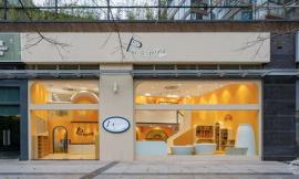
橙色/Orange

8座充满活力的橙色建筑
橙色可能是最被低估的颜色。我们会觉得橙色过于“微妙”,而很难把它和紧急情况联系在一起,也会觉得它过于沉闷压抑,而无法让我们感到快乐。因此,它最初的让我们熟知是因为和它同名的水果——橘子——在其他地方,它常常被人们忽视。然而,与红色或黄色相比,橙色的使用给建筑注入了生命和活力,因此,它在建筑中大规模的使用能够产生相当大的影响力。
这个系列中的所有项目都向居住者传达了一种生命和活力的感觉。不管设计师的意图是什么,无论在哪里使用这种颜色,都能让人联想到生命力。它可能会激发建筑的使用者们的力量或勇气——或者至少让他们思考这一点。在任何情况下,无论人们是否意识到了颜色的影响力,颜色与其含义的潜在联系是建筑使用者们不可避免会注意到的事,正如下面这些项目所证明的,橙色也不例外。
橙色系列项目精选:
The Orange Cube by Jakob+MacFarlane, Lyon, France
Why Factory Tribune by MVRDV, Delft, Netherlands
Cykelslangen/The Bicycle Snake by DISSING+WEITLING architecture, Copenhagen, Denmark
Afterglow by AmorphisCorvallis, Ore., United States
ArcelorMittal R&D Headquarters [insideOUT] by [baragaño], Aviles, Spain
Moderna Museet Malmö by Tham & Videgård Arkitekter, Malmö, Sweden
Premaydena Residence by Misho + Associates, Premaydena, Australia
Houston Dynamo by Populous, Houston, Tex., United States
8 Vigorous Applications of Orange in Architecture
Orange is perhaps the most underrated color. Too subtle to be associated with emergencies, too dull to make us happy, this lone remaining “warm” color’s primary renown is the eponymous fruit — elsewhere it often fails to be taken seriously. No less attention-grabbing than red or yellow, however, orange’s subconscious claims imbue it with a sense of life and vitality, and as such it can have a considerable effect in architecturally scaled applications.
The projects in this collection all telegraph a sense of life and vitality to their occupants. Regardless of the intentions of the designer, this color’s associations with life-lusting vigor are present wherever it is used. It may inspire strength or courage in the people who use these buildings — or at least get them thinking about it. In any case, the subconscious associations of color is something that building occupants pick up on, whether they realize it or not, and as evidenced here, orange is no exception.
Projects in the BLUE collection:
The Orange Cube by Jakob+MacFarlane, Lyon, France
Why Factory Tribune by MVRDV, Delft, Netherlands
Cykelslangen/The Bicycle Snake by DISSING+WEITLING architecture, Copenhagen, Denmark
Afterglow by AmorphisCorvallis, Ore., United States
ArcelorMittal R&D Headquarters [insideOUT] by [baragaño], Aviles, Spain
Moderna Museet Malmö by Tham & Videgård Arkitekter, Malmö, Sweden
Premaydena Residence by Misho + Associates, Premaydena, Australia
Houston Dynamo by Populous, Houston, Tex., United States
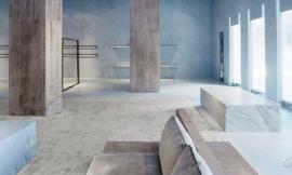
蓝色/Blue

8个酷炫的蓝色项目奠定一种宁静的基调
当有人把蓝色描述为一种很“酷”的颜色时,这个词汇背后可以暗含很多种意思。然而真正去了解这种颜色背后的含义,我们并没有常常将其与酷炫联系起来,因为蓝色相比于其他颜色更多的透露出着一种宁静的气质。这种联想很可能源于人们对蓝色海洋的感受,这样是下面这些项目给我们宁静感的基础:蓝色的潜意识中暗含着平静与安宁。
从文化交融的角度去感受,蓝色作为一种柔和的,被动的颜色,当被使用在建筑中时,必定会产生强大的影响力。以下这八个项目都以蓝色为主色调,无论效果好坏,这种颜色选择都为每个项目奠定了主导的基调。这些例子有力地说明了颜色如何影响建筑使用者——无论被如何使用,建筑的颜色几乎总是会在潜移默化中强化我们对于建筑本身的理解。
蓝色系列项目精选:
Blue Box by Hofrichter-Ritter Architekten, Graz, Austria
La Luciole by Moussafir Architectes, Alençon, France
Stade Océane by SCAU architects, Le Havre, France
BIG by BUREAU A, Geneva, Switzerland
Swimming Pool in Bagneux by Dominique Coulon & Associés, Bagneux, France
Burgos Art School by Primitivo Gonzalez Arquitecto, Burgos, Spain
HDE 17 by POGGI Architecture + MORE Architecture, La Rochelle, France
Perth Arena by ARM Architecture and Cameron Chisholm Nicol, Perth, Australia (pictured above)
8 Cool Blue Projects With Tranquil Undertones
When someone describes blue as a “cool” color, the term can have a wide range of meanings. With regards to literal color temperature, the inverse is actually true, as blue ranks highest on this scale relative to other colors. Most probably the association is rooted in a likeness to the color of the ocean, which may serve as a basis for how the color blue is understood in this collection: for its subconscious undertones of calmness and tranquility.
Cross-cultural understandings of blue as a subdued, passive color ensures it will have a strong effect when used in architecture. These eight projects all feature blue extensively and, for better or worse, this choice sets the predominant mood for each. These examples are powerful illustrations of how color choice can affect a broad user base in a consistent manner — a move that, no matter how it is wielded, will almost always strengthen a particular understanding of that project in the collective unconscious.
Projects in the BLUE collection:
Blue Box by Hofrichter-Ritter Architekten, Graz, Austria
La Luciole by Moussafir Architectes, Alençon, France
Stade Océane by SCAU architects, Le Havre, France
BIG by BUREAU A, Geneva, Switzerland
Swimming Pool in Bagneux by Dominique Coulon & Associés, Bagneux, France
Burgos Art School by Primitivo Gonzalez Arquitecto, Burgos, Spain
HDE 17 by POGGI Architecture + MORE Architecture, La Rochelle, France
Perth Arena by ARM Architecture and Cameron Chisholm Nicol, Perth, Australia (pictured above)
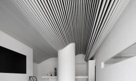
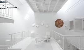
白色/White

干净整洁:8个白色建筑项目
很难想出哪种颜色会比白色更能让人联想到最前沿的建筑。只需扫一眼从早期现代主义建筑到现在的主流设计刊物,我们就会发现白色总是能不约而同的体现一种概念——纯粹,以至于一些正统的现代主义者甚至以这种颜色来命名自己的作品。几十年来,建筑师们常常以白色为自己项目的主题色,希望能通过这种颜色为自己的作品带来了一种绝对的纯粹性——这种纯粹包括形式的纯粹性、功能的纯粹性、甚至是意识形态的纯粹性。从这八个项目可以看出,这种趋势不会很快消失。因此,或许我们有必要花点时间考虑:为什么选择白色?
除了白色与纯洁的广泛联系外,白色更实际的效用是为了体现清晰、干净和简单。白色可以掩饰任何形式的小瑕疵,将原本不完美的结构拯救回来;如果被用作背景色,它可以展现出一种隐藏的美。本系列中的项目展示了这种隐藏功能的广泛应用,最终表明,白色的百搭性可能是它长期受到世界各地建筑师喜爱的原因。
白色系列项目精选:
Xixi Artist Clubhouse by AZL Architects, Hangzhou, China
GOLIRAN Flower Shop by Alidoost & Partners, Rasht, Iran
Apartment House “Am Heiligenstock” by CHRIST.CHRIST. associated architects, Wiesbaden, Germany
Torus by N Maeda Atelier, Saitama, Japan
Kaffee Partner Headquarters by 3deluxe, Osnabrück, Germany (pictured above)
Vilnius University Library, by R. Paleko Arch Studija, Vilnius, Lithuania
Extension of Hamborn Abbey by ASTOC Architects and Planners, Duisburg, Germany
Living Foz by dEMM arquitectura, Porto, Portugal
8 Clean and Clear Applications of White
It’s hard to think of a color (or shade) more strongly associated with cutting-edge architecture than white. A quick glance at leading design publications from the early days of Modernism up to this very moment quickly reveals the color as one of few consistent themes, so much so that a group of orthodox Modernists even named themselves after it. Architects have bathed their projects in white for decades in hopes of claiming the absolute purity it suggests for their own work — whether it be purity of form, function or ideology. As evidenced by these eight projects, this trend isn’t going away any time soon. So perhaps it’s worth taking a moment to ask: Why white?
Besides the color’s widespread associations with the concept of purity, a more practical employment of white is in service of clarity, cleanliness and simplicity. White can disguise any number of formal gesticulations, pulling an otherwise unwieldy structure back down to earth; if used as a background color, it can be both beautiful and virtually invisible. The projects in this collection demonstrate a wide range of applications under this guise, ultimately suggesting that white’s versatility may be the reason it remains a perennial favorite for architects around the world.
Projects in the WHITE collection:
Xixi Artist Clubhouse by AZL Architects, Hangzhou, China
GOLIRAN Flower Shop by Alidoost & Partners, Rasht, Iran
Apartment House “Am Heiligenstock” by CHRIST.CHRIST. associated architects, Wiesbaden, Germany
Torus by N Maeda Atelier, Saitama, Japan
Kaffee Partner Headquarters by 3deluxe, Osnabrück, Germany (pictured above)
Vilnius University Library, by R. Paleko Arch Studija, Vilnius, Lithuania
Extension of Hamborn Abbey by ASTOC Architects and Planners, Duisburg, Germany
Living Foz by dEMM arquitectura, Porto, Portugal
|
|