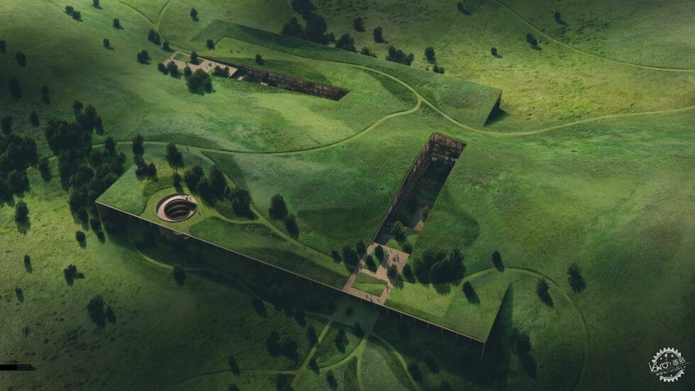
Texas Prairie Aerial by Alex Hogrefe
由专筑网小R编译
这是我所渴望的工作,也是我并没有尝试过的图像类型,有一些东西我不太熟悉,因此让我有些不太确定,这个图像需要经过很多的PS步骤,画面的角度看起来比较平淡,并且也有很多细节需要摸索。但是,我认为如果可以正确地应用肌理,那么这也是个有趣的画面,这个项目的重点在于想法,这是复杂且树木丛生的景观环境,这个项目我需要表达一些角度和特征,整个视角和场地平面和鸟瞰图息息相关,其中需要我表达一些想法,但是也要调整背景,从而让人们把重点放在项目里。
这个角度的问题在于没有办法展示地平线,因此我无法通过天空来让画面看起来更加有趣,我只能通过草地等植物,而这个角度也让场地的表达有些困难,因此镜头呈现俯瞰的状态,那么这就说明我需要通过植物的肌理来表达地形的空间感,让人们能够感受到山地的形态。
因此,那么这样的图像的挑战就存在于通过植物的尺度来表达不同的尺度,我努力寻找能够放大的肌理图像,因此我将许多场地肌理叠加使用,这样在表达近景的时候,草地就能够呈现不同尺度的多样特征,同时保持画面的干净。
接下来是场景的建立过程,我渲染了10000像素的画面,这样就能够让图像看起来清晰一些,我的PS文件最终由1300个图层,就作图而言,这个过程永远未完成,因为总是有可以再添加的细节,但是我需要让它有个收尾,这样才能更好地表达角度的重点内容。
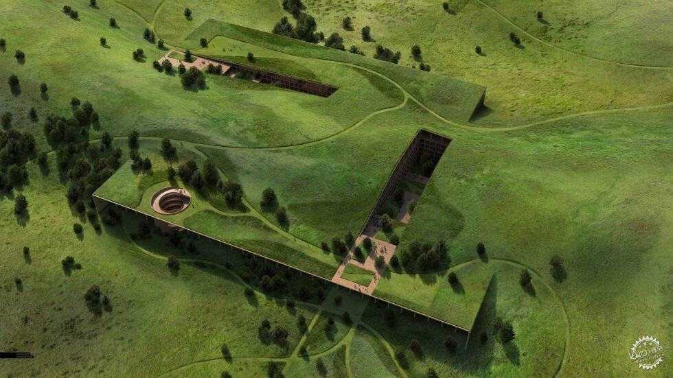
This was one of my more ambitious undertakings and an image I almost didn’t do. I had a lot of things going against me that made me second guess taking on this type of image. It was going to require a ton of Photoshop, the view is at an angle that tends to feel flat and boring, and there was going to be a lot of pain staking detail. However, I felt that if I could dial in the textures just right, it could tell an interesting story. The main focus of the project design was this idea of a complex and lush landscape that flowed over the project and I needed a view like this, closeup, to drive that idea home. This view angle lands somewhere in between a site plan and full on aerial perspective. It needed to have some perspective to it, but cut out much of the context so that focus remained on the project itself.
The problem with a view angle like this is that it doesn’t show the horizon, so I cannot lean on a dramatic sky or atmospheric depth to make the image more interesting. Instead it is all about the prairie grass and vegetation textures. This view also makes reading the topography somewhat problematic because the camera is looking extremely downward onto the site. This meant that I had to create a sense of topography by carefully rotating and positioning the grass textures so that they felt like they were going up and down hills.
However, the most challenging aspect of an image like this is getting the prairie grass to read properly at different scales. I was struggling to find textures that looked good from both a distance and up close when zoomed in. To overcome this, I layered many different field textures together so that there was a diversity to the grass at the different scales while remaining crisp when close up.
Below is a quick break down with a focus on the prairie grass build up. I rendered the image out at 10,000 pixels wide so that I could get the sharpness in grass textures that I was looking for. My Photoshop file ended up with over 1,300 layers. An image like this is never done, and there are many other things I would like to refine or add detail too, but I need to call it quits and move on to some other perspectives that I have in mind.
1、基础渲染
1 Base Rendering
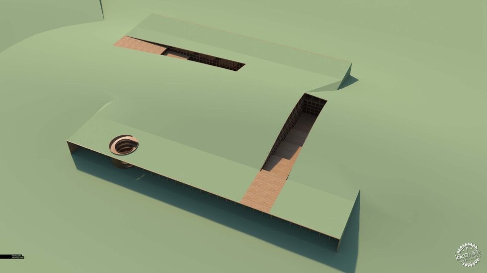
V-Ray基础渲染
V-Ray Base Rendering
我的大多数基础渲染作品在一开始看起来都很丑,这张看起来也是一样,在我一开始看到它的时候,我甚至想立刻关闭它。
Most of my base renderings look bad starting out, but this one looks exceptionally horrible. Getting started on this image, I saw this base rendering and this was one of the moments that I just about backed out of this image haha.
2、草原上的植物
2 Prairie Grass
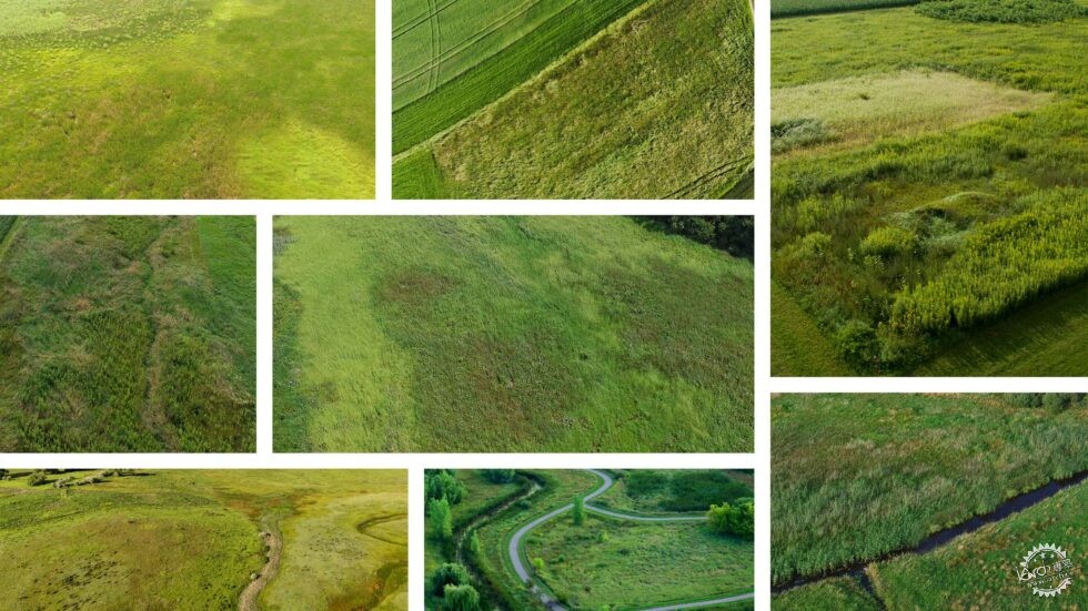
肌理
Textures
我花了很多时间来寻找合适的肌理图像,这只是其中的一部分。
A lot of time was spend finding good high quality textures through Google image searches. These are just some of the ones that I used.
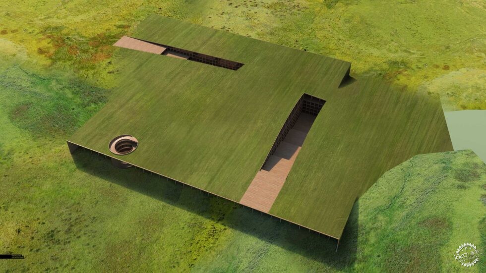

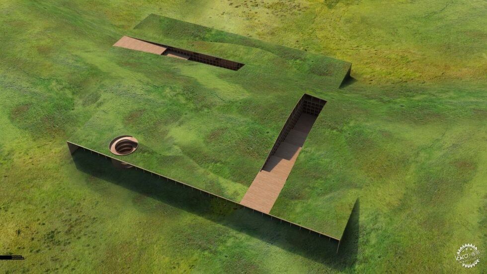
我应用了多种不同的肌理,在场地上构成不同的色调和密度,并且保持一定的清晰度,在这个方面我花了很多时间,从而构成了山坡的空间感,你会发现其实有很多重复的肌理,但是在我添加道路和植物之后,这些重复的感觉就会被弱化。
As I mentioned above, I combined many different textures to build in a diversity of color tones and densities throughout the site while maintaining sharpness and detail up close. There was quite a bit of time spent rotating and skewing the textures so that they had the feeling of going up and down hills. You may notice that towards the end, you start to see a lot of repeat textures, however, this gets broken up and lost in some of the following steps as I add in paths and trees.
3、道路
3 Paths
道路
Paths
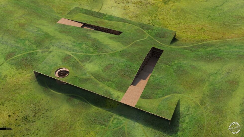
在画面中,景观的流动构成了道路体系,我通过颜色来区分道路的材质,在它们的位置确定之后,我就通过几何体来进行划分,并且应用蒙版,快速地将它们放置在草地当中。
One of the reasons for this image was to think through the flow of the landscape and test out some paths systems. I started out simply roughing in the paths with solid paint. Once I had their locations determined, I cleaned up the geometry and turned them into a mask so that I could quickly place in a manicured grass texture.
道路阴影
Path Shadows
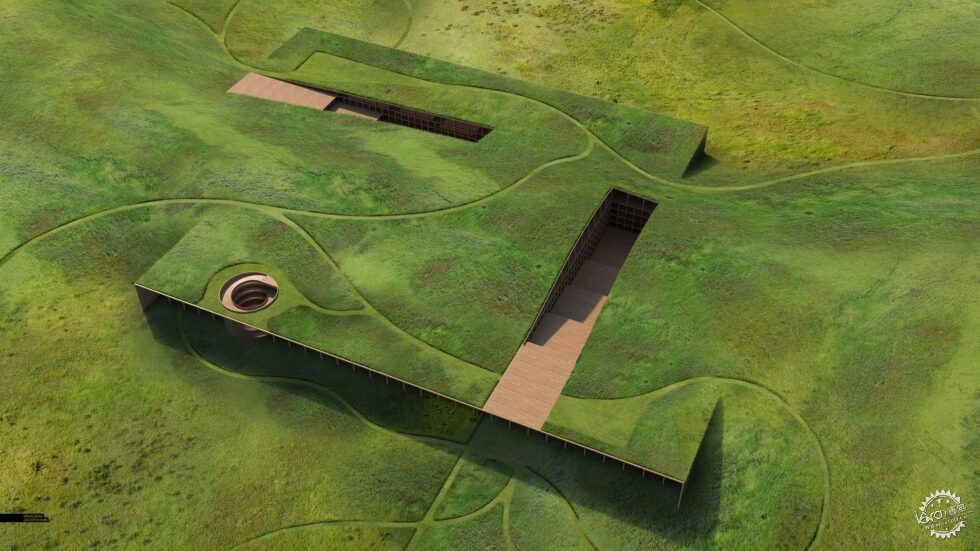
道路完成之后,我添加了一些阴影,让它们构成一定的深度,并且和草地形成区分。
With the paths in place, I then added slight shadows to give them depth and help define them from the wild grasses.
4、草原流线
4 Prairie Flow
独立的花园
Garden Patches Isolated
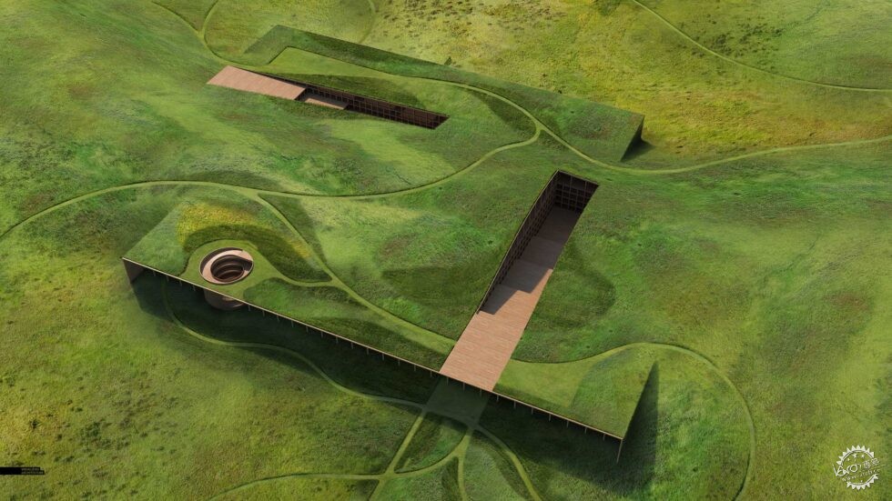
在画面中添加花园
Garden Patches Inserted into Image
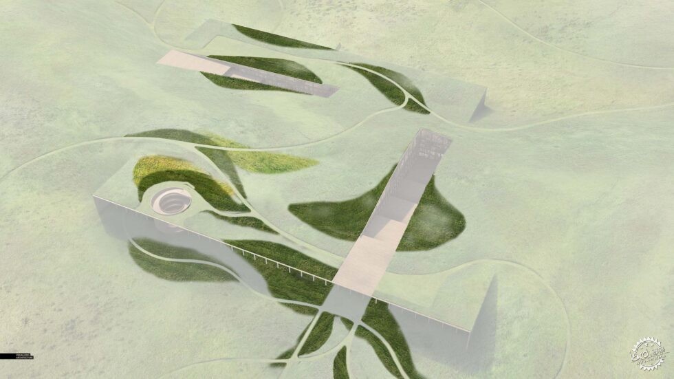
目前看来,草地有些空旷,因此我想让画面看起来有一些设计感,并且通过植物来构成明暗的区别。场地的道路已经形成,因此我将它们用作框架,花园贯穿其中。
Up until this point, the prairie grass was still feeling too wild and even. I wanted to set up some moments where the site was a little more designed and where groupings of the same plant created light and dark patches. Since the paths were in place, I used them as a framework from which the dark and light garden patches flowed around.
5、微妙的光影
5 Subtle Shadow and Light
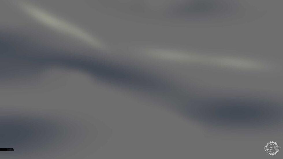
独立的光影
Light and Shadow Isolated
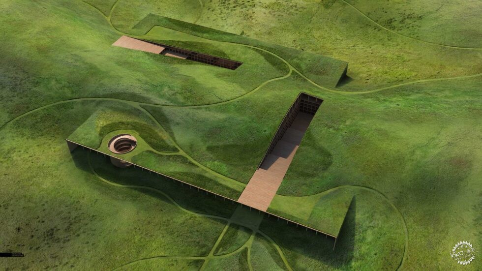
在画面中加入光影
Light and Shadow Inserted into Image
画面看起来还是缺乏层次感,因此我通过光影来强调山脉和场地。
The image was still too flat at this point, so I faked in some subtle light and shadow to help clarify the hills and topography.
6、细部处理
6 Details
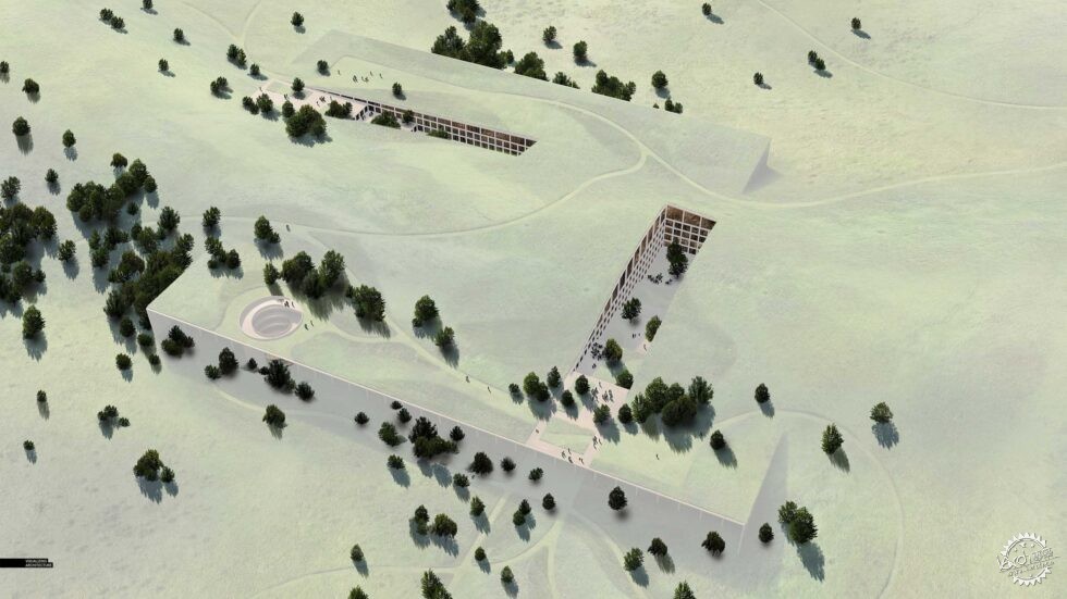
独立的细节
Details Isolated
在画面中加入细节
Details Inserted into Image
添加草地之后,我开始在其中添加一些细节,树木能够很好地强调整个项目的景观设计理念,另外,一些小路已经形成了,因此我按照流线来摆放树木,除此之外我还增加了一些人物,让画面更有肌理感。
With the grasses in place, I could start to add in the details. The trees were important to emphasizing the idea of the landscape flowing around and over the project. Again, since the paths were in place, I used them as a framework to help place the trees. I also added lots of people which at this point, was just another way to build in a little more texture.
7、最终效果
7 Final Effects
云朵阴影
Cloud Shadows
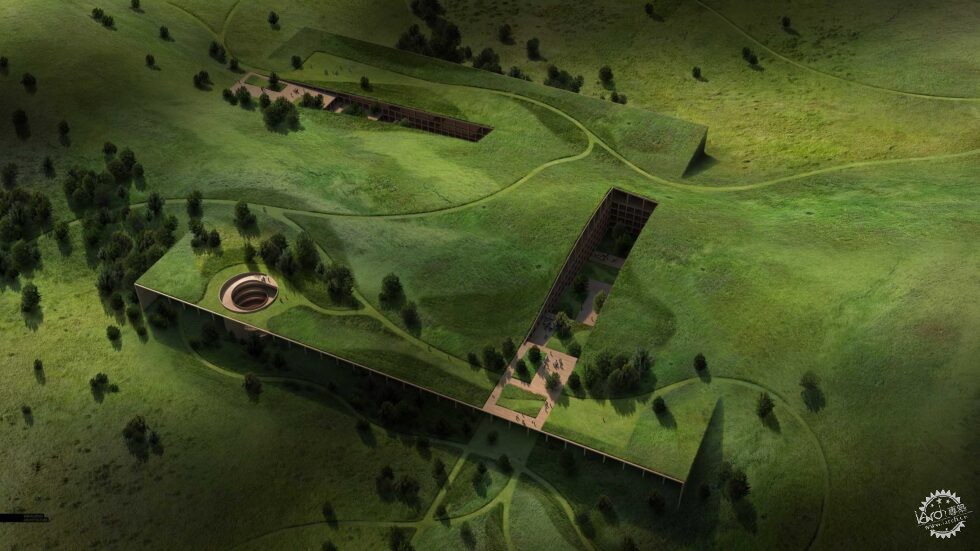
我增加了一些漫射的云朵阴影,这样强调画面的亮色部分,让视线能够有所聚焦。对于这个图像我有些恍惚,因此想要增加一些戏剧效果。
I dropped in some diffuse cloud shadows so that there were moments of strong highlight that pulled the eye from one spot to another around the image. I was also a little bored of the image up to this point and wanted to amp up the drama.

最终成图
Final Image
最后,我软化了阴影边缘,添加一些暖色,并且保留一些图面上暗色的信息。
Finally, I softened the shadows, pulled back some of the warmth, and tried to grab back some of the detail lost in the dark parts of the image.
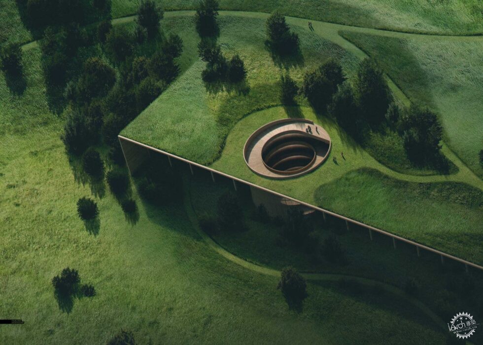
最终成图01
Final Image Crop 01
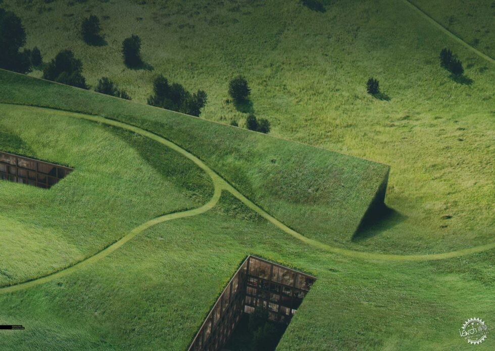
最终成图02
Final Image Crop 02
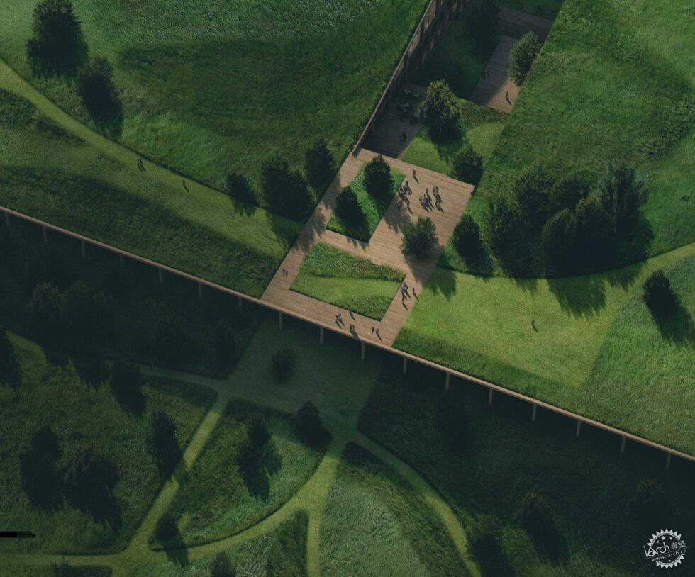
最终成图03
Final Image Crop 03
|
|
