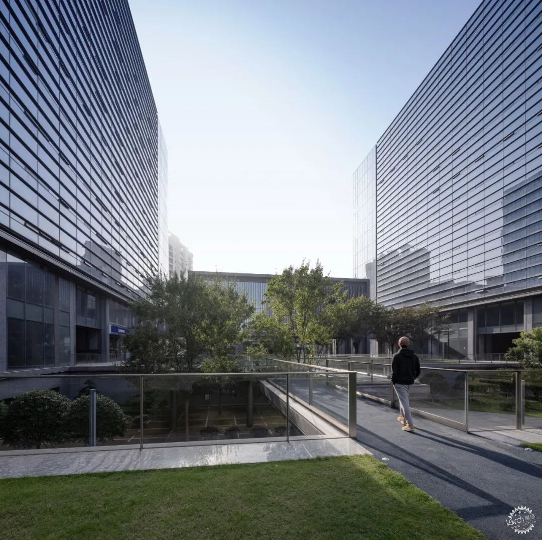
有别于租售类办公建筑,
总部办公属于一种定制型设计,
建筑师需要直接倾听使用者需求,
了解企业的品牌审美定位,
并将其物化为建筑空间语言。
这类项目既真实可感、又逻辑清晰,
在推理与解决问题之外有发挥趣致的空间。
Different from office buildings for rent and sale,
Headquarters building falls into customized designs.
Architects should listen to users’ needs,
understand the Company’s aesthetic positioning of brands,
and then materialize them into spatial language.
Such projects are usually realistic and logical,
With room for imagination beyond reasoning and problem solving.
共振的磁场
不仅仅是办公楼
对企业而言,总部建筑能创造出一种企业文化与场所之间的共振磁场,成为工作者的“第二家园”,帮助塑造出独属于本企业的“归属感”与“凝聚力”。对城市而言,基于当下时代巨头企业涌现并纷纷建造超大体量企业总部的现实,总部建筑如能在保证自身运作的同时反哺外部城市生活,则有成为新一类“城市综合体”的潜力。
Resonant Magnetic Field
It is not merely an office building
For enterprises, the headquarters building should be able to create a resonant magnetic field between the corporate culture and the place, and become the “second home” of workers to help enterprises shape a unique “sense of belonging” and “cohesion”. For cities, given the fact of emerging tycoons in the current era and the construction of extra huge headquarters building in succession, the headquarters building has the potential to become a new type of "urban complex" if it can ensure its own operation while giving back to urban life.
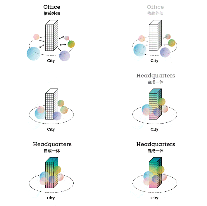
△ 总部办公与租赁办公的区分
(goa × CTBUH 总部研讨活动)
△ Distinction between Headquarters Office and Leased Office
(goa × CTBUH Seminars)
goa大象设计团队于2012年始,在长达7年的时间内为亚厦集团“定制”落成了一座总部办公楼。亚厦集团是一家国内建筑装饰行业的知名企业,其业务涉及建筑外墙、室内装饰的设计与施工。如果要将这家企业进行画像,稳固而明确的审美倾向与专业而执着的工程技术追求是首要的特征。
It took GOA 7 years to customize such a headquarters building for Yasha Group since 2012. Yasha Group is a well-known enterprise in domestic decoration industry with business covering the design and construction of exterior wall and interior decoration. If you want to know something more specific of this company, the primary characteristic is its constant and clear aesthetic tendency and persistent pursuit of professional engineering technology.
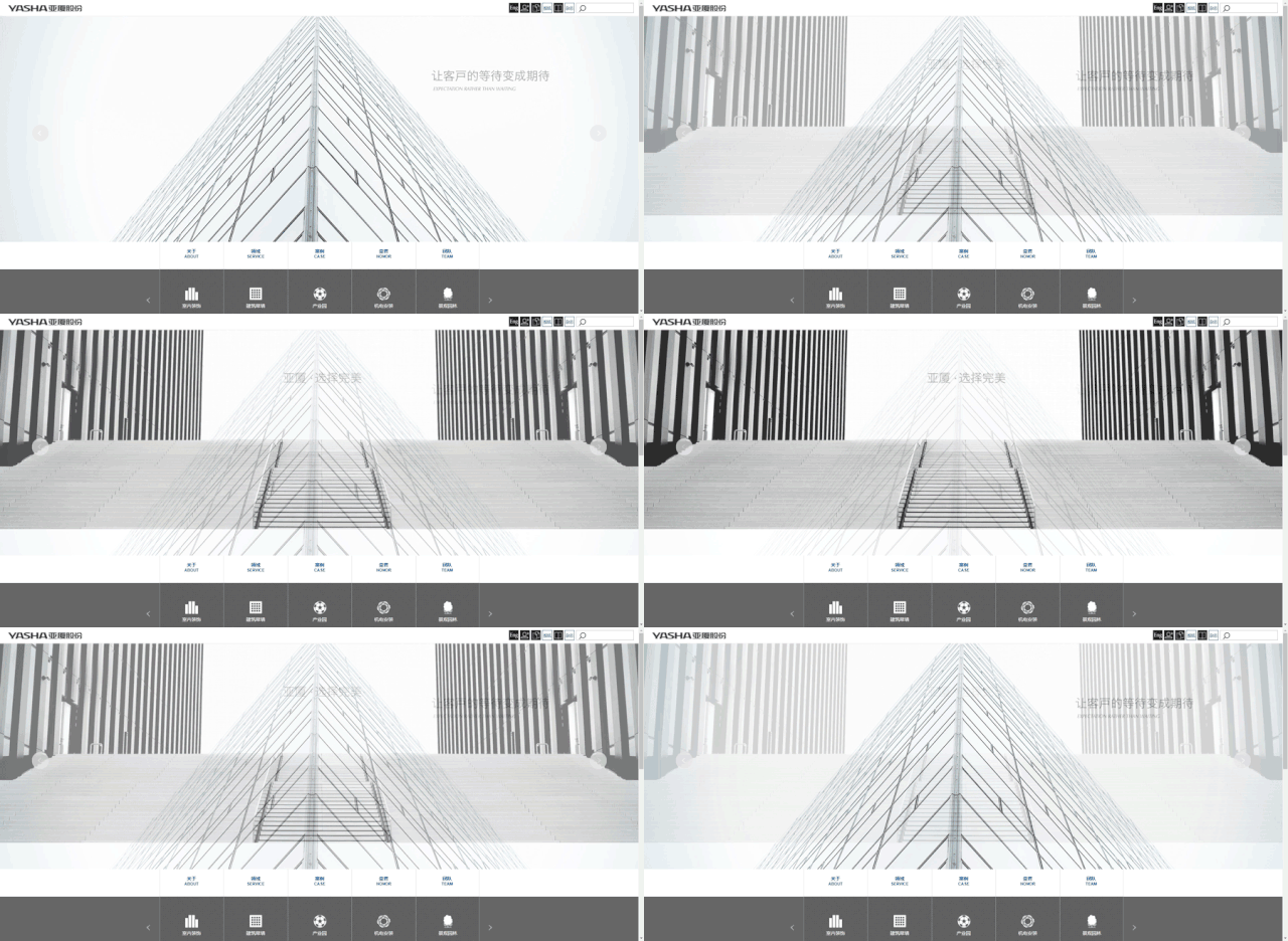
△ 亚厦集团总部官方网站
△ Official Website of Yasha Group's Headquarters
在创作过程中,亚厦的企业文化作为一个核心的因子,深切影响了项目从概念到细部的完整历程;在这个强大的前提之下,建筑师对办公场所和城市生活的关照以适宜的方式植入其中。最终的作品可以说是这两方因素共振的结果。
In the process of construction, Yasha’s corporate culture as a core factor deeply influenced the complete process of the project from conception to details, and the architects took office space and urban life into account. The final work can be said to be the result of the resonance of these two factors.
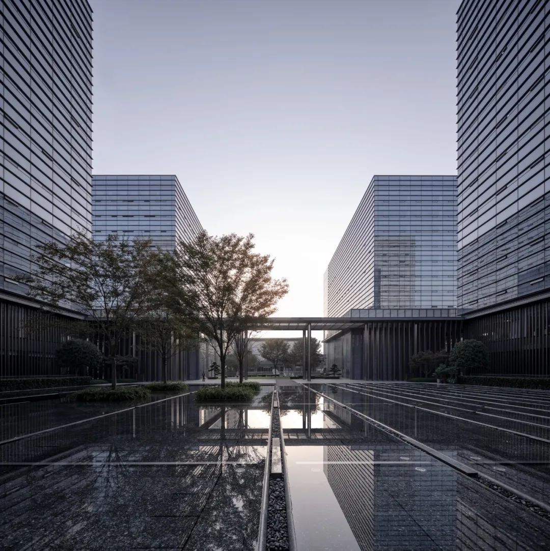
叠盒子的游戏
简单秩序下的丰富性
基地距离杭州旧城中心约10公里,位于一片极具潜力的待开发区域。形态为长宽比近似1:2的矩形平坦用地,总计约35400㎡。将来,这里是一个全新的会展区域,但在项目设计之初的2012年,地块周边均无建设,是一片典型的新城用地。
A Game of Stacking Boxes
Richness under Simple Order
The site, 10 kilometers away from the downtown of the old city of Hangzhou, is in an area with great potential for development. It is a rectangular flat land with an aspect ratio of approximately 1:2 and total area of about 35,400 square meters. In the future, it will be a brand-new exhibition area, but at the beginning of the project design in 2012, there was no construction around the plot, which was a typical land for new town.

△ 项目区位图(杭州主城区、西湖、五云山、12.2公里、钱塘江)
△ Project Location(, Main Districts of Hangzhou, West Lake, Wuyun Mountain, 12.2 km, Qiantang River)
经过一段时间的设计方向探索,在明白企业主的根本诉求在于“不追求办公建筑本身形式的出位,更倾向于以平实语言塑造优质、具有稳定感的空间氛围”后,建筑师所面临的题目逐渐清晰。平实、对称、稳定,似乎指向一种乏味的结果,如何在简单、稳定的平面之下创造空间趣味性?
After a period of exploration in the direction of design, understanding that the fundamental demand of the owner is not to pursue the unique appearance of the office building per se, but to create a premium and stable space atmosphere with plain design", the challenge facing architects gradually looms large. Since simpleness, symmetry and stability turn out to be boring, then, how to make space more interesting under a simple and stable plane?
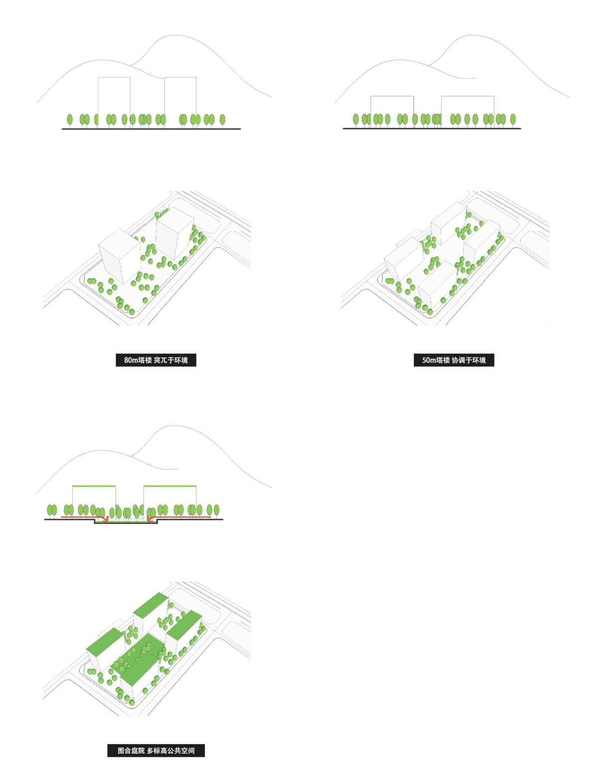
△ 体量研究(80m塔楼 突兀于环境、50m 塔楼 协调于环境)
△ Volume Research(80m Tower, incompatible with environment, 50m Tower, compatible with environment)
建筑师首先对照基地上的山脉视线关系,将体量被确定为4幢12层50M高的塔楼。这一体量框架,无论对内、对外的空间关系都十分平和。每一办公塔楼的平面近乎于完整的矩形,体量在基地的短边方向对称,长边方向则按照每栋塔楼的使用容量需求切成不等的两段。
First of all, the architects compared the line of sight to the mountains on the site, and determined the volume to be four 12-story 50m towers. With this volume framework, both internal and external spatial relations are smooth. The plane of each office tower was almost a complete rectangle, and the volume was symmetrical on the short side of the site, while the long side was cut into two unequal sections according to the requirements of capacity of each tower.

△ 总平面图
△ General Layout
简洁的结构蕴藏了极大的可能性——当元素设定成极为简单的方盒子,空间整体的丰富性便可依赖盒子之间的逻辑关系及空间结构的层级进行多样化的表达。盒子的六个界面的定义带来不同的空间属性;盒子间界面的定义又使它们之间的关系多种多样。如此,貌似一目了然的设计被演化为一个叠盒子的游戏。这些盒子最终演化为塔楼、地面庭院及下沉庭院、入口雨棚、过街天桥等,构成明快而丰富的空间序列。设计初始的命题随之迎刃而解。
The simple structure contains great possibilities - when the elements are set as extremely simple square boxes, the overall richness of the space can be expressed diversely depending on the logical relationship between the boxes and the hierarchy of the spatial structure. The definition of the six interfaces of the boxes brought different spatial attributes, while the definition of the interfaces between the boxes made the relationship between them diversified. In this way, the seemingly open-and-shut design has evolved into a game of stacking boxes that eventually evolved into towers, ground courtyards and sunken courtyards, entrance canopies, and overpasses and so on, forming a bright and rich spatial sequence. Therefore, the initial challenge of the design will be solved accordingly.
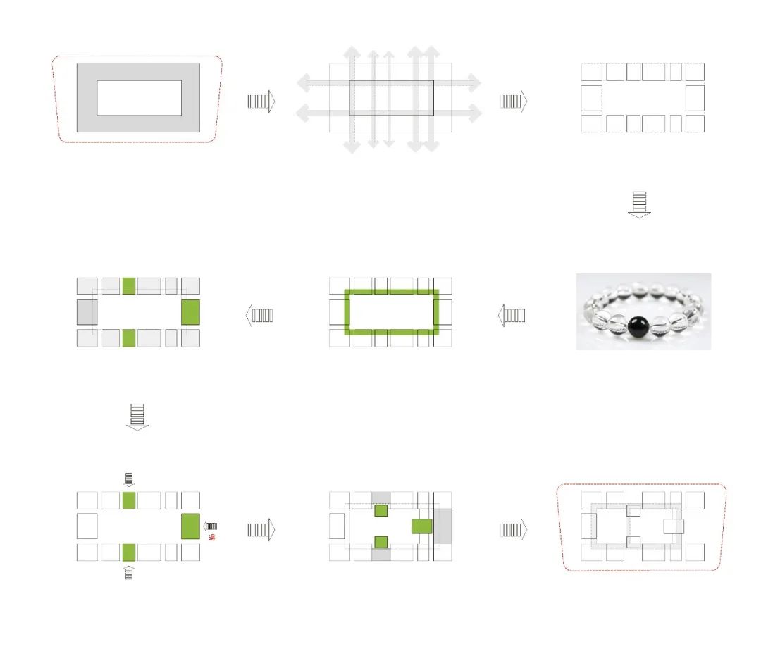
△ 概念发展
△ Development of Design Concept
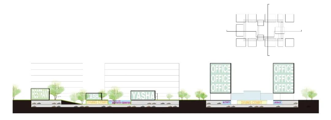
△ 概念剖面
△ Profile of Concept
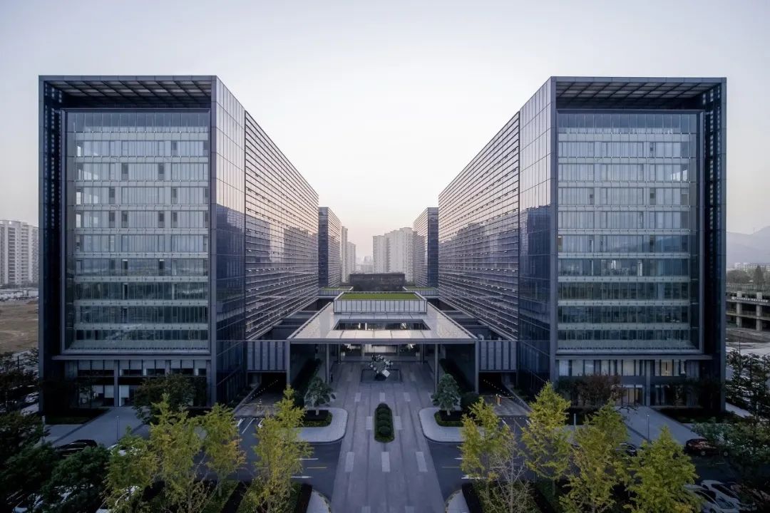
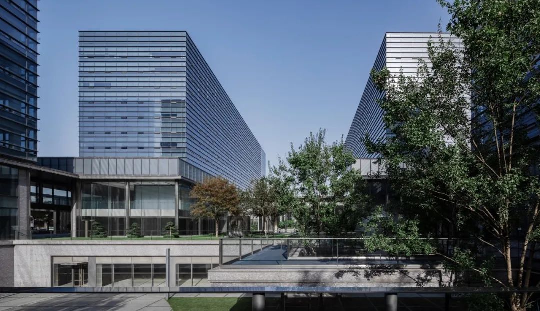
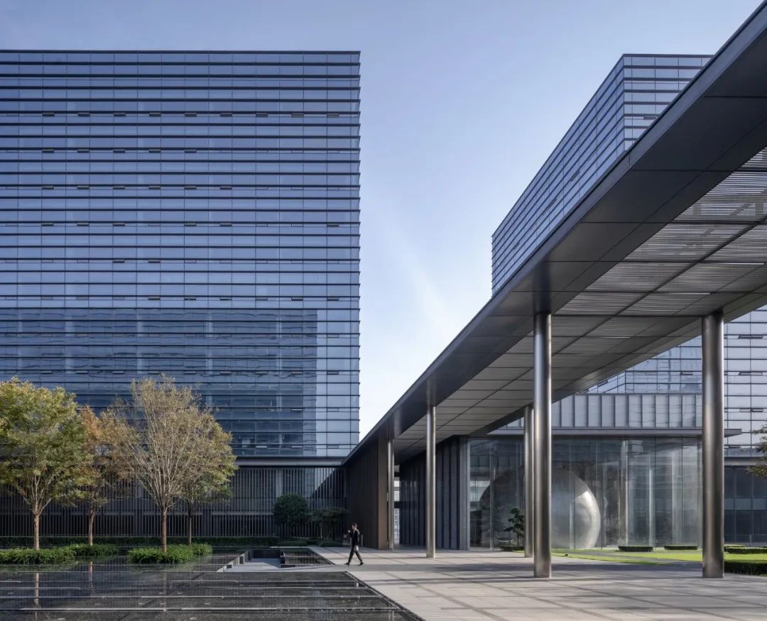
△ 叠盒子:线、面、体
△ Staking Boxes: Line, Plane, Volume
半开放的花园
平衡城市性与私密性
在设计之初,建筑师基于与企业主的对谈规划出丰富的功能计划书,设想园区成为一个“具有自身强领域感,却向城市打开的空间”。建筑师希望总部在为自己的员工提供活动场所的同时也可容纳部分外来人群,以此令位于园区边界的底层商业保持活力,帮助建筑与外部城市相融的同时促进该区域新城的发展。
Semi-open Garden
Balancing urbanity and privacy
At its inception, the architects planned a diverse function plan based on the dialogue with the business owner, envisioning the park to become "a space with its own strong sense of territory, but being open to the city." The architects hoped that the headquarters can accommodate some visitors while providing activities for its own employees, so as to maintain the vitality of the underlying business located at the boundary of the park, and to promote the development of the new town in the region while helping the building blend with the outer city.
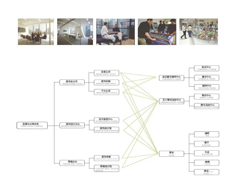
△ 最初的功能规划
△ Initial Functional Planning
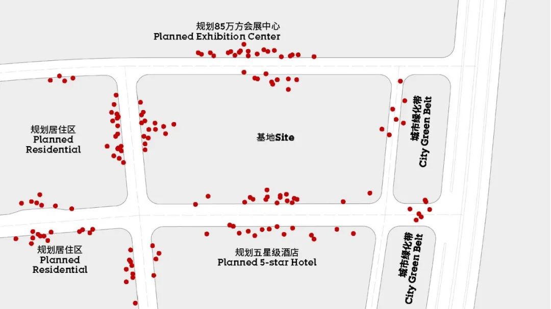
△ 建筑师设想总部建筑具有一定的开放性
△ The architects envisioned that the headquarters building should be open
然而,随着设计的深入,这一设想与业主对于管理可控性的强烈诉求产生了一定矛盾。经过平衡,“可视而不可达”成为一个折衷做法,建筑师试图通过加强人在视线上的感知来达成一种 “联结感”。
As the design progressed, however, this idea was contradicted with the owner's strong demand for managerial controllability. After balancing, "visibility and unreachability" became a compromise choice. The architects managed to achieve a sense of "connection" by enhancing the perception of people's sight.
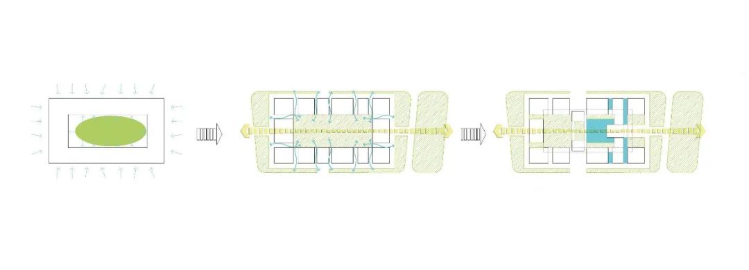
△ “可视而不可达”
△ "Visible and Unreachable"
原本开放、可穿行的底层庭院落地为一个“半开放”的花园。切分裙房体量的若干通道设置景观水系或下沉空间虽然限定了行为上的可达性,却保持了视线上的通畅。在边界上设置有一些具有顶棚的灰空间,城市中行走的人可以透过玻璃一窥总部内部的风貌。
The originally open and travelable ground-floor courtyard became a "semi-open" garden. Several passages that divide the volume of podiums were set up with a landscape water system or a sinking space, although the accessibility was limited, the sight was unobstructed. There are gray spaces with a ceiling on the border, and passerby can see the interior of headquarters through the glass.

△ 办公门厅采用超白玻,形成视线通廊
△ The hall of this building uses clear glass, forming a sight corridor

△ 园区边界的灰空间,可由外部向内窥视
△ The gray space at the boundary of the park can be viewed from the outside
平坦的表皮
基本属性叠加出细腻质感
立面做法延续了“简单而丰富”的概念,完全“平坦”却具有高工艺的立面契合了企业形象的诉求。建筑表皮的基本属性通常被简单理解为透明-半透明-不透明三种设定;然而,这三种基本属性叠加材料、颜色、质感等因素,却能变化出无穷的表现形式。
主楼部分幕墙基于3.9m的层高,被划分成1.3m高的单元,以横向突出的线条表达,竖向则尽可能的隐去,仅仅用玻璃表面25mm宽的细金属条分割。裙房部分的表皮根据空间需求采用了全透明超白玻、乳白或灰色印刷玻璃、灰色或香槟色金属格栅、灰色花岗石幕墙和各种不锈钢表面等做法。所有材料都以极其微小的线状构造相互拼接,以期保持形体简洁的同时传达表皮的细腻质感。
Flat Building Skin
Basic attributes were superimposed to create a delicate texture
The building facade continued the concept of "simpleness and richness", and the completely "flat" but exquisite facade fit the corporate image. The basic attributes of facade are usually simply understood as three settings of transparency-translucency-opacity; however, these three basic attributes can be combined with factors such as materials, colors, and textures to bring infinite forms.
The curtain walls of main building with the height of 3.9m were divided into units with a height 1.3m. They expressed themselves by horizontally protruding lines and hidden vertical lines only divided by thin metal strips 25mm in width on the glass surface. According to the space requirements, the facade of the podium adopted fully transparent and ultra-clear glass, opal or gray glass, gray or champagne metal grille, gray granite curtain wall and various stainless steel surfaces. All materials were spliced with each other in extremely small linear structures, in order to keep the shape simple and convey the delicate texture of the building skin.
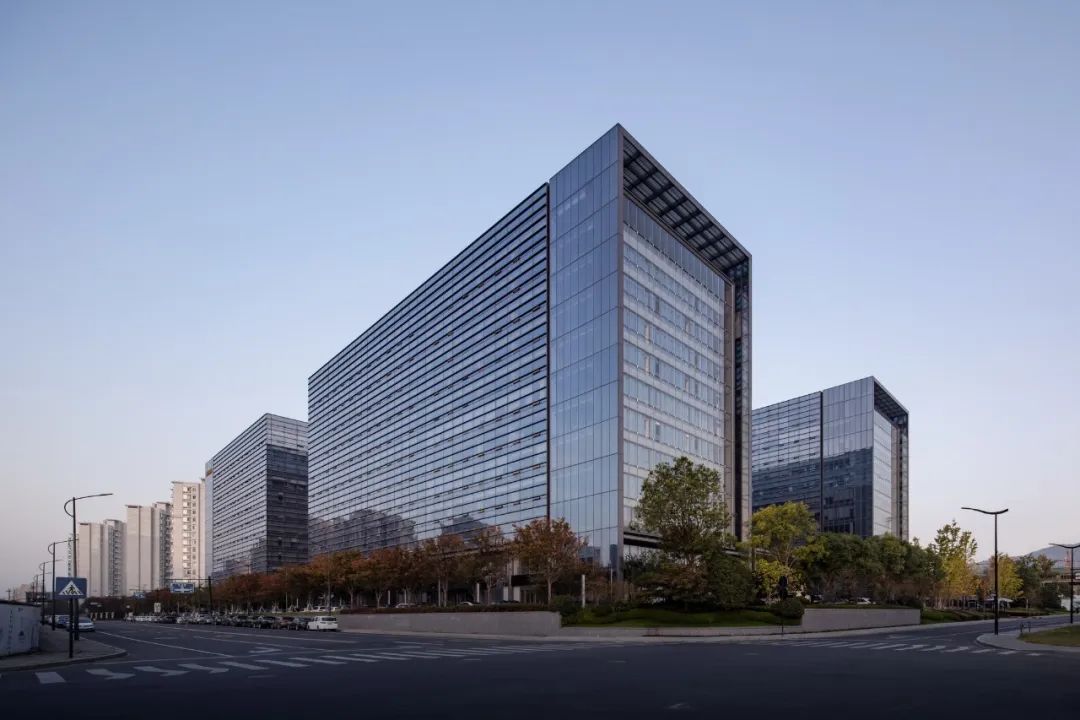
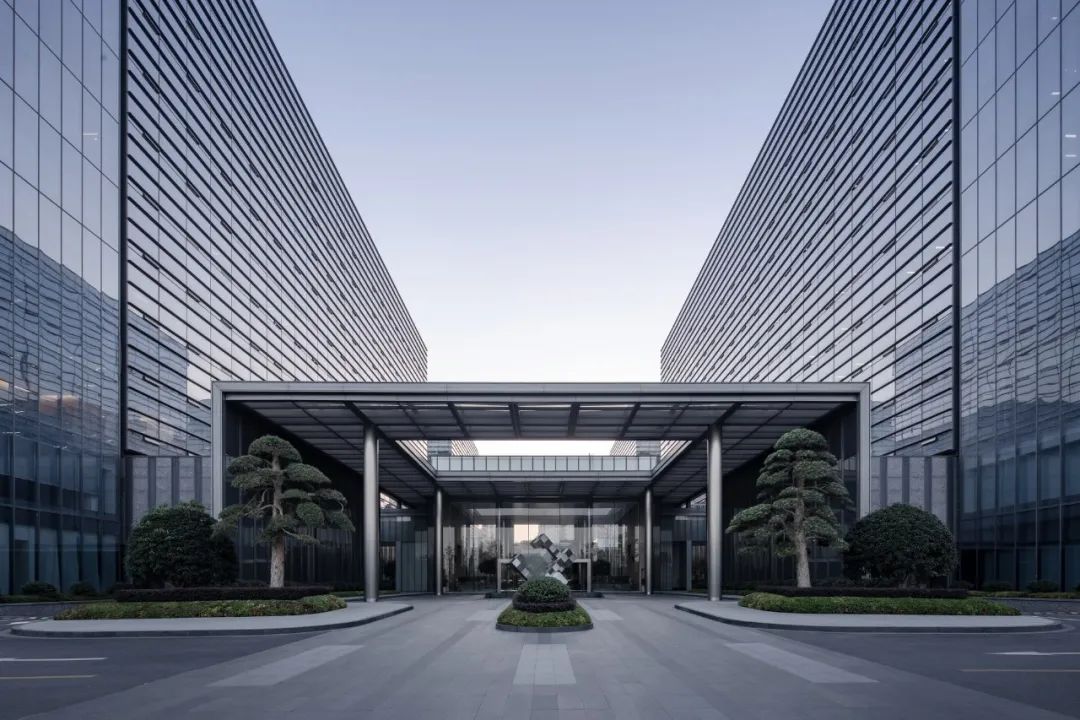
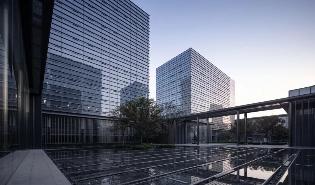
△ 平坦的表皮
△ Flat Building Skin
玻璃幕墙的开窗通风问题一直是困扰建筑师的难题之一。一方面,自然通风有着节能与环保的意义,符合中国传统人居观念所对应的心理需求;另一方面,布置不善的开启窗扇会给幕墙外立面造成一定影响,对于立意极简的建筑而言尤其是不小的挑战。出于人体工程学视角,建筑师将开启扇布置于距室内地坪约60cm处,使人能在坐着办公时感受“扑面而来”的自然风。同时,建筑师研究了多种隐藏开启扇的方式,考虑以穿孔铝板遮挡开启扇,并于实体上做了1:1的样板。但在最终落实阶段,业主仍然选择了较为传统的开启方式。
The ventilation of glass curtain wall had always been one of the problems that puzzled architects. On the one hand, natural ventilation can be energy-saving and environmentally friendly, which is in line with the psychological needs corresponding to the traditional Chinese concept of human settlement; on the other hand, poorly arranged window sashes will impact the facade of the curtain wall, so it was a big challenge for architects to achieve minimalist building. From the perspective of ergonomics, the architects arranged the window sashes at a distance of about 60cm from the indoor floor, so that people can feel the natural wind when working in the office. At the same time, the architects studied a variety of ways to hide the window sashes, considering the use of perforated aluminum plates to cover them, and made a 1:1 model. However, in the final implementation, the owner still chose more traditional window sashes.
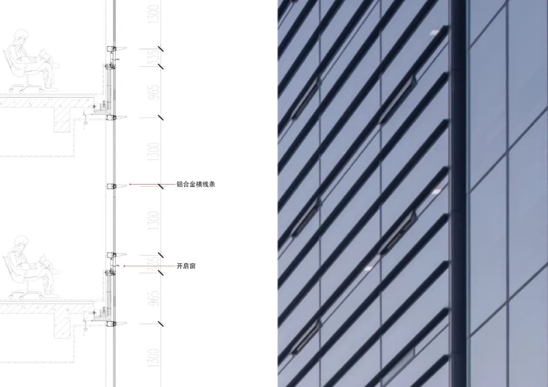
△ 幕墙立面开启扇及细部做法(铝合金横线条、开启窗)
△ Window Sashes and Details of Curtain Wall Facade(Aluminum Bar, Window Sash )
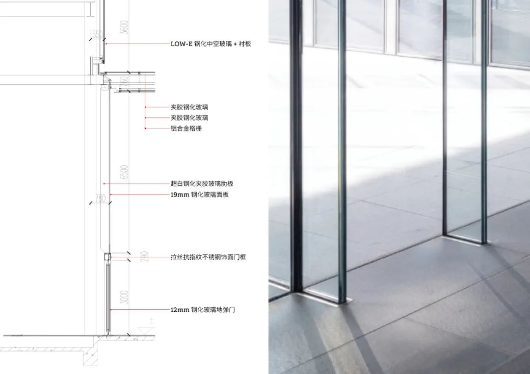
△ 门厅玻璃肋使用极小勾边(LOW-E钢化中空玻璃+衬板、夹胶钢化玻璃、铝合金格栅、超白钢化夹胶玻璃肋板、19mm钢化玻璃面板、拉丝抗指纹不锈钢饰面门框、12mm钢化玻璃地弹门)
△ The glass ribs in the hall use extremely small hooks(LOW-E tempered insulating glass plus liner plate, Laminated tempered glass, Aluminum grille, Ribbed plate of ultra-clear tempered laminated glass, 19mm tempered glass panel, Brushed fingerprint resistant stainless steel decorative door frame, 12mm tempered glass spring door)
得益于亚厦集团在外墙装饰领域的专业性与高水准,诸多高技的工艺操作在该项目中落地,例如高11m宽度仅为0.4m的印刷玻璃面、高38m的拉索幕墙等。另一方面,一些需要弱化的构造尺寸,包括小单元式幕墙的勾边、玻璃肋幕墙的拼缝、泛光照明的灯具等,均控制在极有限的尺寸内。
Thanks to Yasha Group's profession and high standards in exterior wall decoration, many exquisite operations have been implemented in this project, such as a printed glass surface with a height of 11m and width of only 0.4m, and a cable curtain wall with the height of 38m. On the other hand, some structural dimensions that need to be weakened, including the hooks of small-unit curtain walls, the joints of glass-ribbed curtain walls, and floodlighting lamps, were all controlled within a limited size.
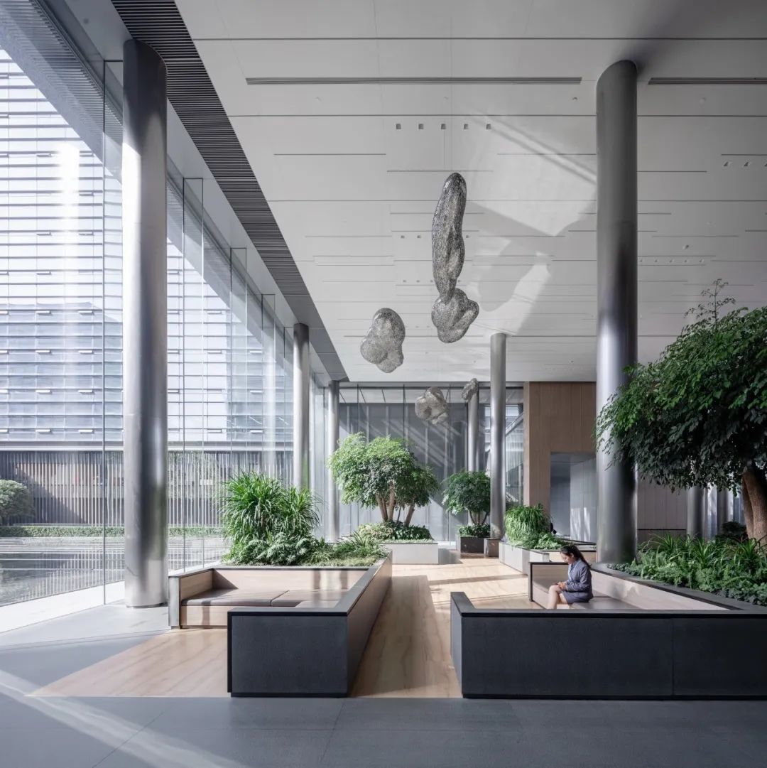
△ 办公门厅内部
△ Inside of the
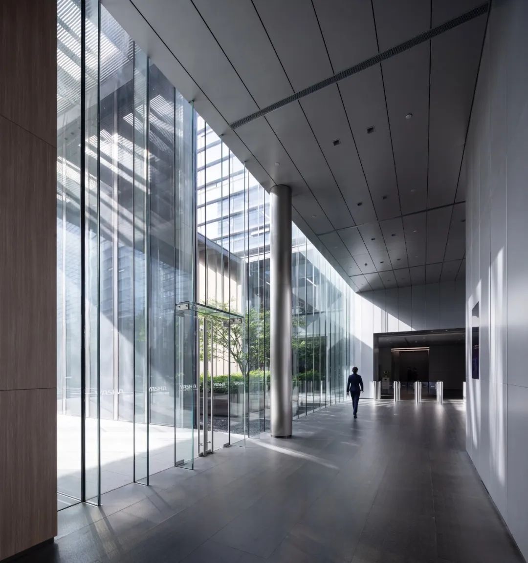
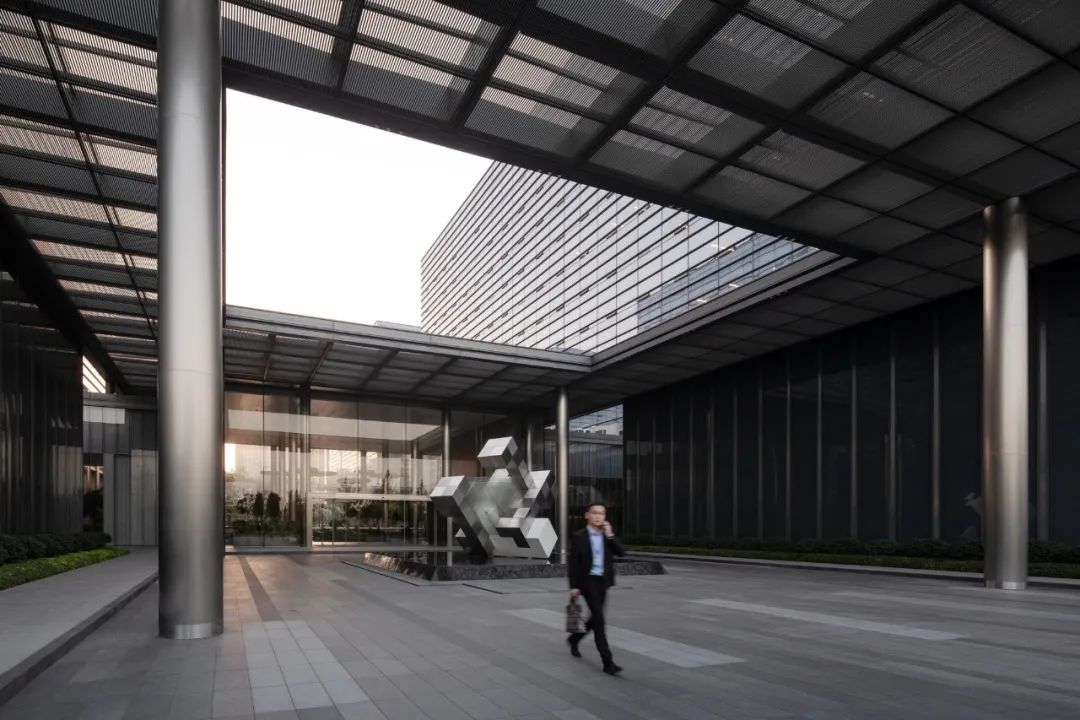
△ 室内外细部的对线情况
△ Alignment of Indoor and Outdoor Details
“一体化”设计的思维贯穿项目始终。建筑师的创作充分考虑建筑、景观、室内等不同专业设计成果之间的统一对位关系。表皮划分的对线问题是这一目标之下最基本而又最难控制的部分。所有的划分都以虚拟轴线为基准,以相同的模数单位进行设计。以幕墙表皮的位置控制为例:如有因构造原因引起的表皮位置改变,则在最后一块上做局部改动而不调整大面的划分模数。原则与基准的统一让建筑师在多专业合作的复杂过程中得以实现绝大部分的立面对线。
"Integrated" design thinking ran through the project. The architects fully considered the unified counterpoint relationship between the design results of architecture, landscape, interior in their creations. The alignment of the building skin division was the most basic and difficult part under this goal. All divisions were based on the virtual axis and designed with the same modulus unit. Take the position control of the surface of the curtail wall as an example: if there was a change in the position of the surface due to structures, they would make partial changes on the last piece without adjusting the division modulus of the large surface. The unification of principles and benchmarks allowed architects to achieve most of the vertical lines in the complex process of multi-disciplinary cooperation.
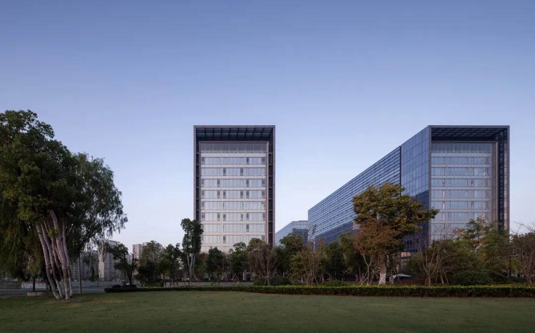
回顾整个项目的设计过程,建筑师的角色类同于一个“定制裁缝”,在既定条件下,不断寻找设计理想与使用者需求之间的共鸣,最终以一个相对包容的姿态呈现于城市的大背景之中。
建筑师于项目限制条件下试图探索的话题——“企业总部面向城市的开放性”——虽然并未完全落地,但其中的历程不失为一种真实、可传递的经验。
Reviewing the design process of this project, the role of the architects is like that of “tailors”. Under the established conditions, they constantly sought the resonance between the deal design and the users’ needs, and finally presented itself in a relatively tolerant attitude in the backdrop of city.
The topic that the architects tried to explore under the constraints of the project - openness of the headquarters to the city - though was not fully implemented, but the course of it was a real and transferable experience.
项目信息
设计单位:goa大象设计
企业网站:www.goa.com.cn
所在地:浙江杭州
设计/竣工:2011-2017
建筑面积:180,000 ㎡
主创建筑师:何峻,张迅
设计团队完整名单:方婷,汪进,李令捷,马佳
建筑摄影:是然建筑摄影
Profile
Designed by: GOA
Website: www.goa.com.cn
Location: Hangzhou, Zhejiang
Commencement /Completion: 2011-2017
Building Area: 180,000 square meters
Chief Architect: He Jun, Zhang Xun
Full List of Design Team: Fang Ting, Wang Jin, Li Lingjie, Ma Jia
Photography: SCHRAN Image
来源:本文由goa大象设计提供稿件,所有著作权归属goa大象设计所有。
|
|
