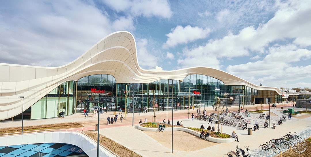
MVSA建筑事务所设计的荷兰Westfield购物中心
Westfield Mall of the Netherlands
由专筑网江鹏,小R编译
MVSA建筑事务所对荷兰这座过时的Westfield购物中心进行改造设计,实现了惊人的转变。MVSA建筑事务所受邀改造Leidschendam现有的建筑,使其成为一个当代城市全方位的休闲目的地,在这个改造过程中将其体量从7万平方米扩展到20万平方米,成为荷兰最大的购物中心。
然而,Westfield不仅仅是一个购物中心。翻修后的购物中心超越了它原有的功能,因为它有了新的用途和服务需求,这里有博物馆、电影院、洗车间和宠物医院,以及其他令人兴奋的餐饮和购物场所。新的购物中心提供了一个具有独特体验感、时尚休闲景观和另一层级的购物场所。
Our design for the Westfield Mall of the Netherlands works a magical transformation on what was a dated, run-of-the-mill shopping centre. We were asked to remodel the existing building in Leidschendam to make it an all-round contemporary urban leisure destination, expanding it from 70,000m2 to 200,000m2 in the process to become the Netherlands’ largest mall.
Westfield is much more than a mall, however. The renovated shopping centre transcends its main function thanks to new uses and services – from a museum and cinema, to a car wash and ‘dog hotel’ – as well as exciting places to eat, drink and, of course, shop. The new mall offers a unique experience as a stylish leisure attraction and next-level shopping venue.
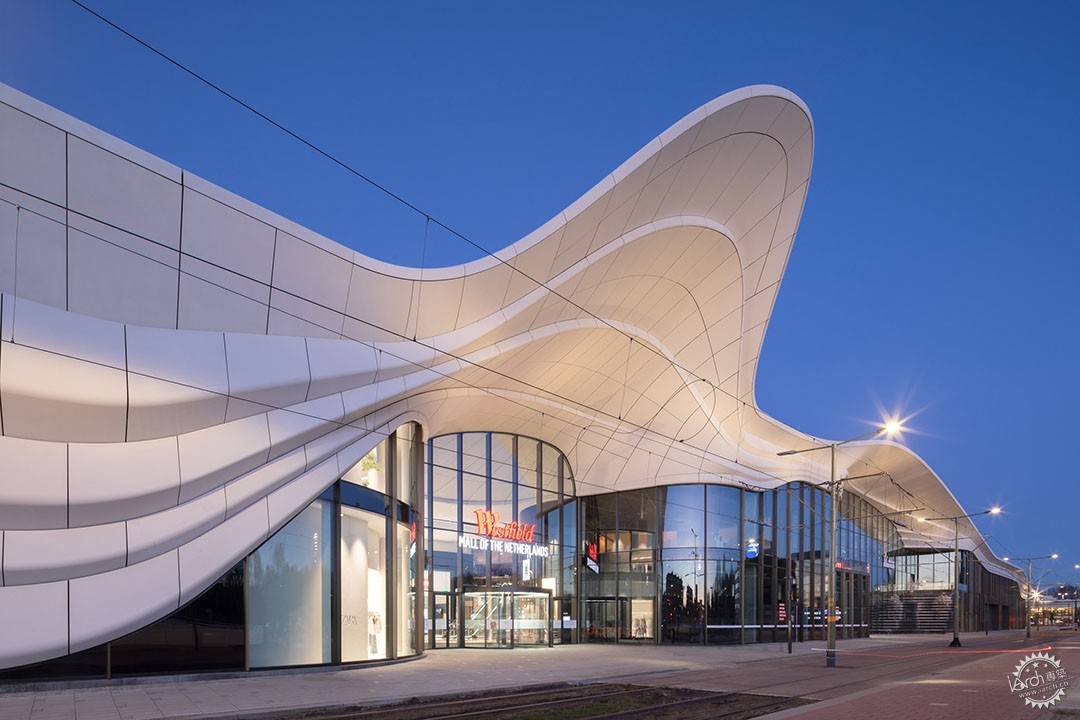
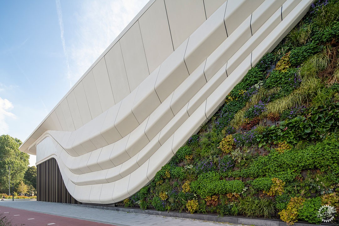
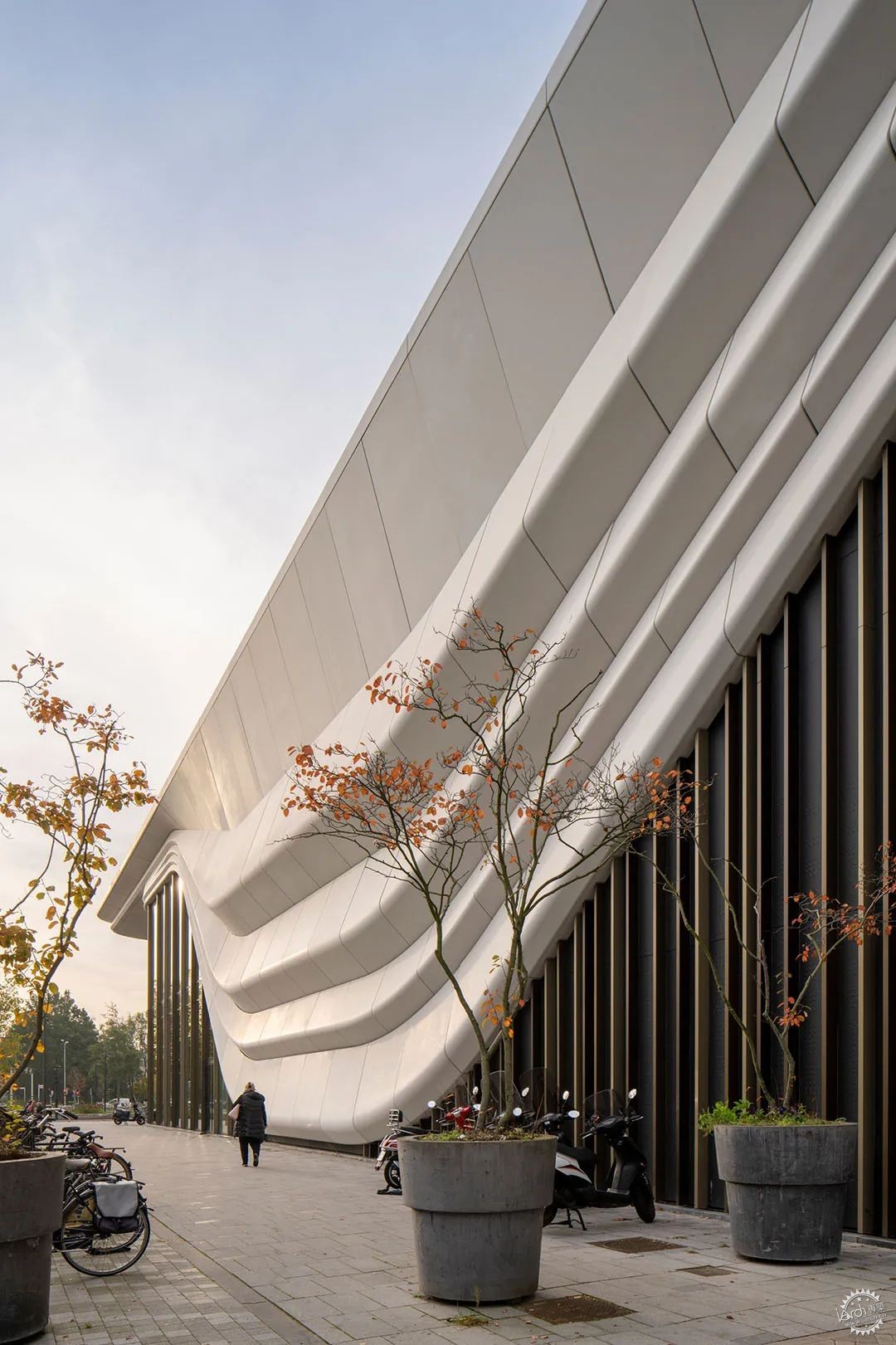
最重要的是,建筑拥有“wow”的设计元素,具有一个强大和壮观的设计特征,将成为标志性建筑,并与周边环境相适应。从外面看,立面上流动的白色线条重新定义了这个购物中心。这种建筑形态,基于丝巾覆盖在建筑周边的设计理念,在统一表皮设计和赋予购物中心单一的特征方面发挥了关键作用。
Above all, it has the ‘wow’ factor – a strong and spectacular design identity that is architecturally ambitious and appropriate to the context.White wrappingFrom the outside, the flowing white lines of the façade define the mall. This gesture, based on the idea of a silk scarf draped around the building, plays a key role in unifying the design and giving the mall a single strong identity.
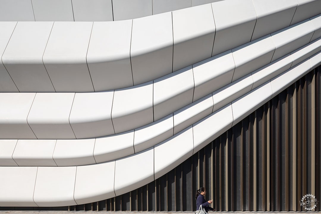
流畅而有活力的白色“丝巾”将建筑连接在一起,建筑局部空间的开放,强化游客流线。
立面表皮的设计特点是对一种日常材料的不同寻常的表达和雕塑般的使用,即混凝土。由玻璃纤维强化的微型混凝土应用于超薄的模压板,创造出轻柔的摆动形式——这是对常用材料的一种新式的和意想不到的使用。
Fluid and dynamic, the white scarf pulls the building together, here and there opening with a flourish to allow visitors to enter and exit the shopping centre.
The façade design features an unusually expressive and sculptural use of an everyday material: concrete. Glass fibre-reinforced micro concrete is used in super-thin moulded panels to create the softly waving forms – a fresh and unexpected use for the familiar material.
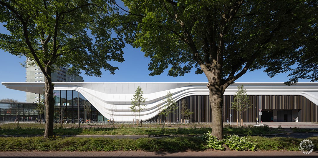
表面经过抛光,显得光滑有触感。它能精确地捕捉光线,构成温暖、友好的外观。白色的“丝巾”线条与下方广阔的玻璃窗形成了明显对比,除此之外,还有覆盖在窗户之间的封闭区域内青铜色调的垂直铝百叶窗,为建筑立面增添了活力。“丝巾”的流畅性也成为室内设计的关键元素。
The surface is polished, smooth and tactile. It catches the light beautifully and has a warm, friendly appearance. The white scarf contrasts beautifully with the expanses of glass window below, and with the rippling vertical aluminium louvres in bronze tones that cover the closed areas between windows, adding dynamism to the façade.Journey of discoveryThe fluidity of the scarf was key to the concept of the interior, too.
在这里,一个流动的八字形环道穿过建筑,带着游客进行一场激动人心的探索之旅。这1.8公里的商铺环道以荷兰的标准来说是史诗级的,其间有着多种多样的景点、商店、服务设施,同时具有各色的感官要素,包括颜色、风景、气味、声音和其他有待发现的东西。荷兰的商铺新特色是店面的高度可高达7.5米。
Here a flowing figure of eight loops through the building, carrying visitors along on an exciting journey of discovery. This 1.8 km shopfront odyssey is epic by Dutch standards, with a huge range of attractions, stores, services, sensory input – colour, sights, scents, sounds, and things to discover. New for the Netherlands is the imposing height of the shopfronts: a lofty 7.5m.
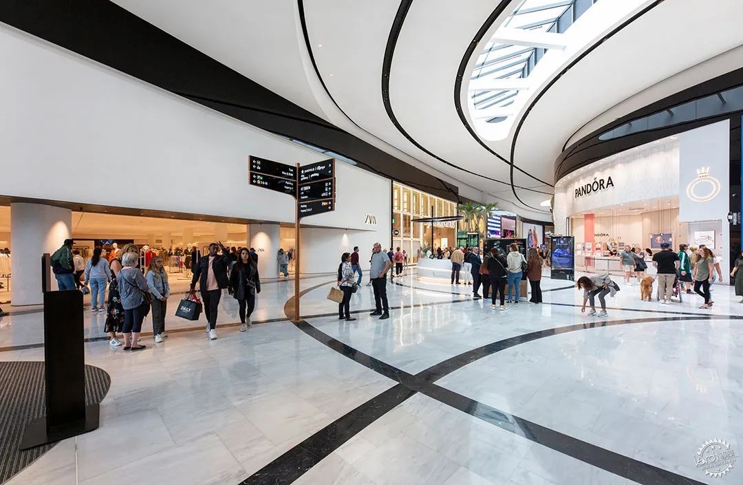
商场本身的内部净高也将达到10到12米。MVSA建筑事务所通过设计,使得建筑内每个细节都有新的创新。曲线突出了运动的感觉。设计中使用了简单的白色大理石和流畅的黑色线条作为购物中心门廊的色调,并在关键区域使用了更壮观的材料,以增强完整的空间质量,并为所有零售购物体验提供了中性的背景色。该购物中心位于城市中心,毗邻城市公园。
The interior height of the mall itself is similarly unprecedented: 10 to 12 metres.Our design ensures that there is always something new around every corner. Curved lines accentuate the sense of movement. We use a simple palette of white marble with fluid black lines for the shopping galleries – accented by more spectacular materials for key areas – to enhances the unbroken spatial quality and provide a neutral backdrop for all the colourful retail experiences.Heart of the cityThe site is located in the heart of the city, bordering a park.
新的购物中心需要融入到周边环境中去,但同时又是一个突出的、具有吸引力的标志建筑。
“丝巾”的概念是一种设计解决的方案,它使得建筑能够通过单一的形态达到整体的统一,同时赋予其独特性和标志性。
The new mall needed to be beautifully embedded in its location, yet at the same time make an architectural statement as a stand-out attraction.
The concept of the scarf was a design solution that allowed the building to be unified by a single architectural gesture while giving it a unique and iconic identity.
“丝巾”在局部开敞,建筑通过众多对应城市的出入口将综合体与周围环境连接起来。例如,与邻近的公园(Zijdepark)有很强的新联系,在Burgermeester Banninglaan一侧有三个微妙的形体划分,与商场对面的三个相邻住宅街区相呼应。
The ‘scarf’ opens up here and there, connecting the complex to its surroundings through a number of entrances that flow into the city. For example, there are strong new connections with the neighbouring park (the Zijdepark), and three subtle divisions on the side of the Burgermeester Banninglaan respond to the three neighbouring residential blocks opposite the mall.
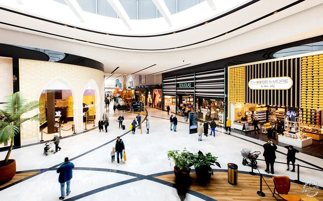
场地与城市公园的紧密联系增强了购物中心作为休闲目的地的吸引力。建筑内设计的一系列空间节点及建筑亮点空间让顾客享受到激动人心的购物体验。建筑外部对应城市的多个出入口,根据周边环境要素的不同,入口区的风格形式也从活跃到温和作出相应调整。
The strong connection with the park in particular boosts the attractiveness of the shopping centre as a leisure destination.Exciting experiencesOur building choreographs a series of exciting moments thanks to a sequence of architectural highpoints. Key areas in the building’s exterior are the multiple entrances, which range from exuberant to more modest in approach depending on context.
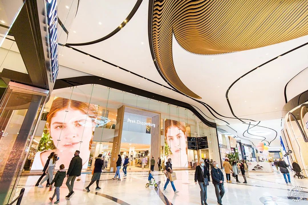
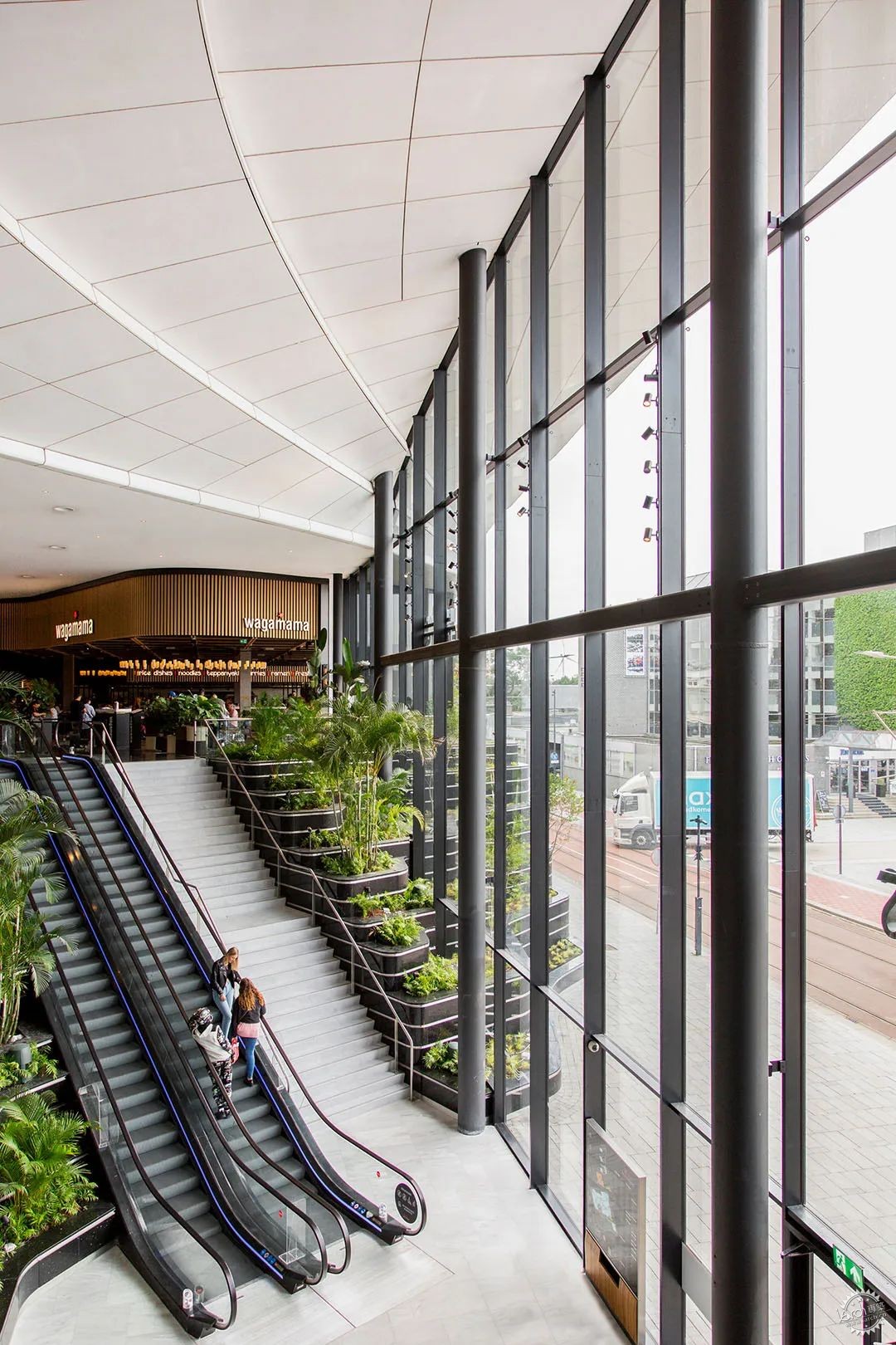
购物中心餐饮区的入口特别壮观:入口两边是黑色大理石的“sawas”(露台),绿意盎然,形成了强烈的视觉效果,并允许游客进入。
在内部,弯曲的八字形环道将顾客引导到主要空间,其中有更壮观的装饰空间,包括中央广场、带电影院入口的餐饮广场和生鲜市场。
The entrance to the Dining Plaza is particularly spectacular: flanked by black marble ‘sawas’ (terraces) with lush greenery, it makes a strong visual statement and invites visitors inside.
In the interior, the curving figure-of-eight route leads visitors to the key spaces, with their more spectacular décor, including the Central Plaza, the Dining Plaza with cinema entrance, and the market (Fresh).
沿着这条室内环道,每隔几米会有一些小型空间节点,顾客的旅程会被一个游乐区、一个带手机充电口的长凳或一个外展的商店打断,就像这样由一个个的空间节点将购物体验逐渐引导至主题空间上的高潮。荷兰的Westfield购物中心设计定位为一个体验目的地,而不是一个普通的购物中心。
Along the way, there are a number of smaller key spaces – every few metres, the customer journey is punctuated by a play area, a bench with phone charging points, or an ‘island’ store, for example – building up to the ‘crescendos’ of the headline spaces.Colour-coded parkingWestfield Mall of the Netherlands was designed as an experience destination, not as a standard shopping centre.
顾客购物体验从可容纳4000辆汽车的停车场开始。当你进入这个区域,迎接你的是菱形的元素,它们将引导你进入购物中心。每个停车位都有不同的颜色,以达到最佳指向性。停车大厅被设计成购物中心的倒影,并通过其开放的结构逐渐吸引你进入,引导你走向购物中心。中央广场是顾客在购物中心购物时的主要焦点空间。
The experience starts with the parking area which has space for 4000 cars.When you enter this area, you are greeted by rhombus-shaped elements which guide you in. Each parking bay has a different colour for optimal orientation. The parking lobbies are designed as reflections of the mall and gradually invite you in via their open structure, leading you towards the shopping centre.The Central PlazaThe Central Plaza is the key focal point for visitors as they move around the mall.

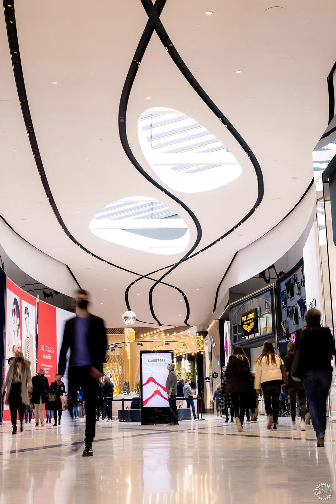
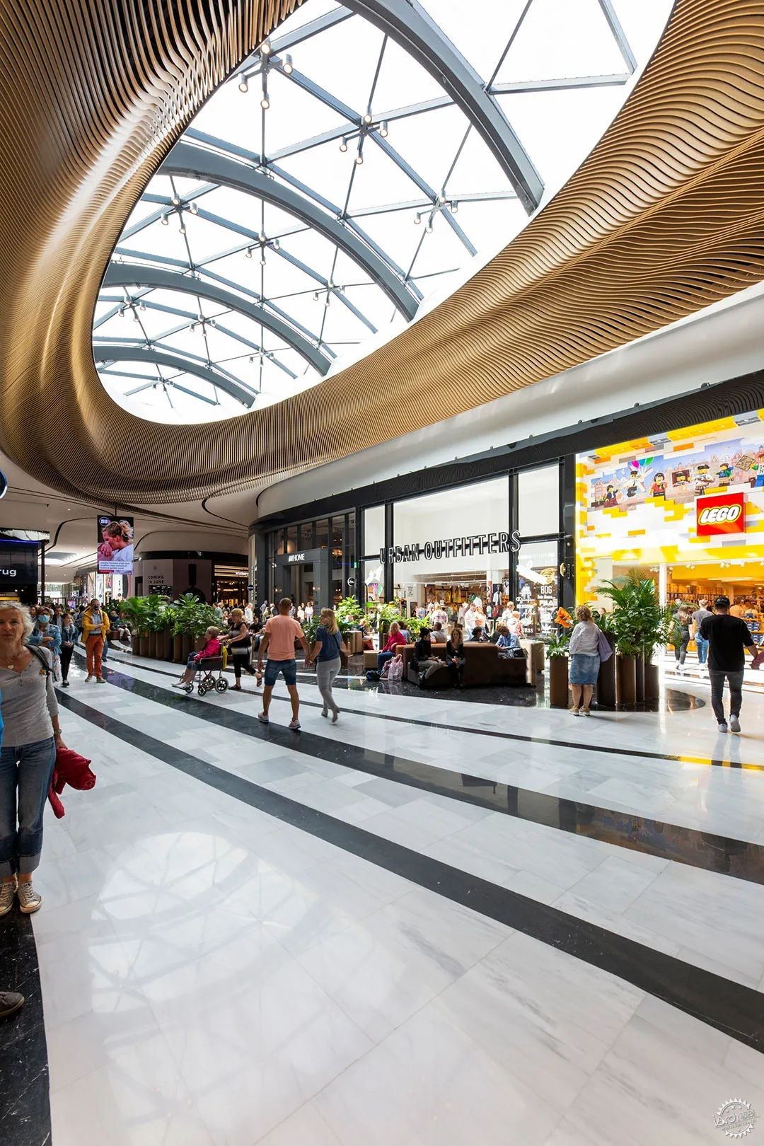
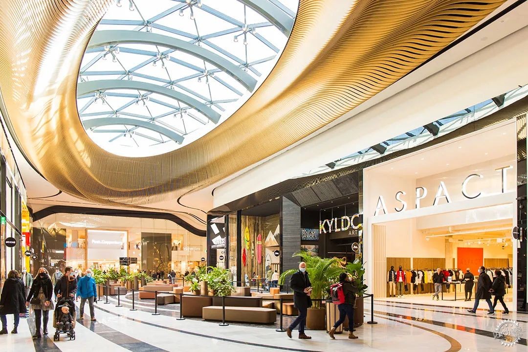
中央广场就像一个城市广场,占据了购物中心内八字形环道的交叉点。这个中心空间形成了改造设计的核心。在这里,所有穿过门廊的线条汇聚在一起,形成了一个壮观的椭圆形天花板。螺旋状的图案由700根独立的木结构组成,这些木结构围绕着中央的天窗,将中心空间变成了购物中心内一个独特的节点空间。
Acting rather like a town square, it occupies the crossing-point of the figure-of-eight loop that runs through the shopping centre. This central space forms the heart of the redesign. Here all the lines that run through the galleries converge, forming a spectacular elliptical ceiling. The spiralling pattern is formed from 700 individual wooden ribs that weave around the central skylight – turning the space into a unique destination within the mall.
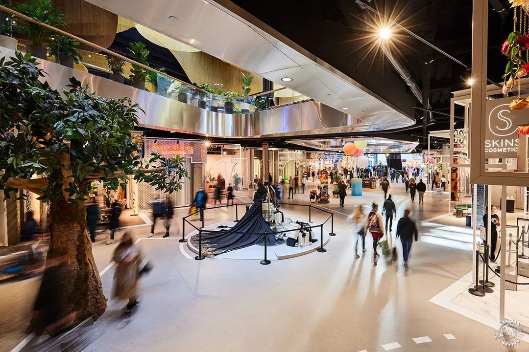
这一流动优雅的设计是在3D建模软件的帮助下创建和制作的。该区域是荷兰Westfield购物中心的主要节点空间之一,是一个设备齐全的活动空间,赋予了空间多功能的可能。餐饮广场在购物中心的上层,在设计师门廊的上面,是餐饮区的广场。
The elegant design was precisely created and crafted with the help of 3D modelling software.This central area is one of the Westfield Mall of the Netherlands’ prime destinations and it functions as a fully equipped event space, adding to its multifunctional possibilities.The Dining PlazaOn the upper floor of the shopping centre, above the Designers Gallery, is the Dining Plaza.
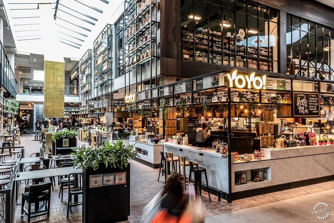
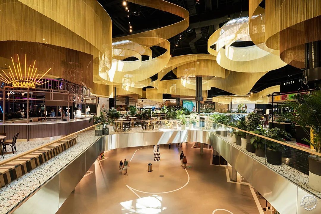
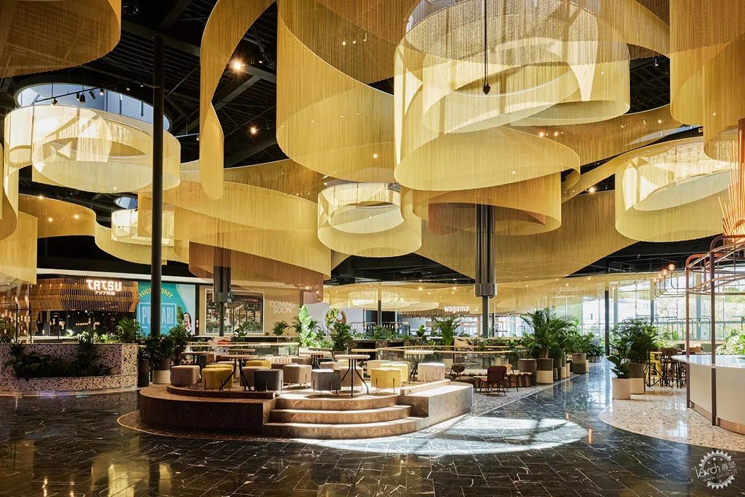
该区域直接连接到主要的户外停车场,并设有独立的出入口,餐饮广场本身是一个突出的景点。当从街上进入时,白色的表皮会折叠起来,黑色大理石的“sawas”(露台)和茂盛的绿色植物吸引着人们。连接室内的空间,金色流动的线条提供感官上的冲击。从天花板上垂下的弯曲链式窗帘,模拟了空气流动中不同方向的运动,创造出一种精致的空间感。
Directly connected to the main outdoor parking area and with its own dramatic entrance, the Dining Plaza is a stand-out attraction in itself. When entering from the street, the white façade folds in on itself and black natural stone terraced ‘sawas’ (terraces) with their lush greenery draw you in. Approached from inside, the fluid movement of the golden chains triggers the senses.The curving chain curtains suspended from the ceiling mimic the movement of air flowing in different directions and create a sophisticated sense of space.
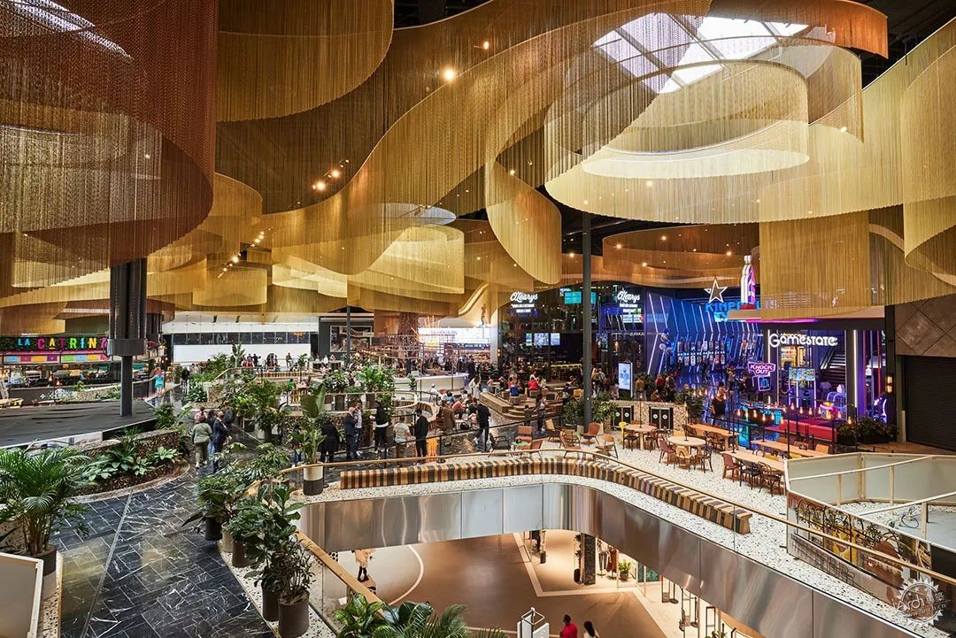
精致而富有戏剧性的设计吸引着顾客,并在上层巨大的空间中强化了人的尺度。照明设计中的灯光颜色可以改变,因此可以适应一年中的每一天的时间,创造一系列可能的氛围。
帘子垂到不同的餐饮区,标记位置的同时,又重新定义了空间。
The delicate yet dramatic design warmly embraces the visitor and reinforces the human scale in the huge space of the upper level. The colour of the lighting scheme can be changed, so the mood can be adapted to the time of day of year, creating a range of possible atmospheres.
The curtains descend to the different food kiosks, marking their spot and giving them definition.
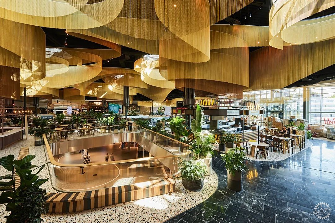
除了奢华的金色线条的天花板,餐饮广场还使用了更为柔和的材料,与荷兰Westfield购物中心的内敛设计保持一致,并为零售商提供了一个中性的背景色。有遮盖的生鲜食品市场,将工业、在地风格与室内其他部分柔和和开放的风格相结合。
Except for the lavish gold-chain ceiling, the Dining Plaza uses subdued materials in keeping with the restrained design of Westfield Mall of the Netherlands and the philosophy of providing a neutral backdrop for retailers.The Fresh Food MarketFresh, the (covered) food market, combines an industrial, local feeling with the subdued and open style of the rest of the interior.
除了市场,餐饮区还充当了烹饪示范和其他食品相关活动的舞台。设计师门廊是对荷兰传统购物街的最新诠释,是荷兰年轻设计师的展示场所。门廊位于餐饮广场下方,中性和优雅的设计风格为各种各样的人才提供了完美的展示环境。美丽的浴室是宁静的、多功能性的(配有化妆镜、更衣台等)、免费的,而且这在荷兰是不寻常的,豪华的浴室表明了购物中心在各个层面都能提供最佳体验。设计过程中,重新利用现有购物中心的结构,而不是拆除它,这一措施是使荷兰新Westfield购物中心成为可持续项目的关键因素。
As well as a market, Fresh functions as a stage for cookery demonstrations and other food-related events.The Designers GalleryA new interpretation of the traditional Dutch shopping street, the Designers Gallery is a showcase for young designers in the Netherlands. Located beneath the dining plaza, the gallery’s neutral and elegant design provides the perfect setting for a wide range of talents.Beautiful bathroomsBeautiful, restful, multifunctional (with make-up mirrors, changing stations and so on) and – unusually in the Netherlands – free of charge, the luxurious bathrooms indicate the shopping centre’s ambition to provide an optimal experience on every level.A study in reuseThe decision to reuse the existing shopping centre structure, rather than demolishing it, was a crucial factor in making the new Westfield Mall of the Netherlands a sustainable project.
此外,由于含水层热能储存系统(ATES)和LED照明系统,该商业综合体节省了能源。来自商店的多余热量会被重复利用,锯齿形屋顶减少了阳光直射,减少热量。室内减负意味着冬季热量损失更少。玻璃纤维增强混凝土的使用使得建筑的表皮异常薄,因此节省了材料。荷兰Westfield购物中心获得BREEAM-NL评级的新建筑非常好认证,改造设计优秀奖。
In addition, the complex saves energy thanks to an aquifer thermal energy storage system (ATES) and LED lighting. Excess heat from the shops is reused, while the sawtooth roofs minimise direct sunlight and reduce heat. Indoor unloading of stock means less heat loss in winter. The use of glass-fibre reinforced concrete allowed the building’s façade to be unusually thin, and therefore saves materials.Westfield Mall of the Netherlands achieves the BREEAM-NL ratings Very Good certification for new construction and Excellent for renovation.
建筑设计:MVSA Architects
类型:商业›购物中心
状态:已建造
年份:2021
尺寸:1000000+
预算:1亿美元+
FIRM: MVSA Architects
TYPE: Commercial › Shopping Mall
STATUS: Built
YEAR: 2021
SIZE: 1,000,000 +
BUDGET: $100M +
|
|
