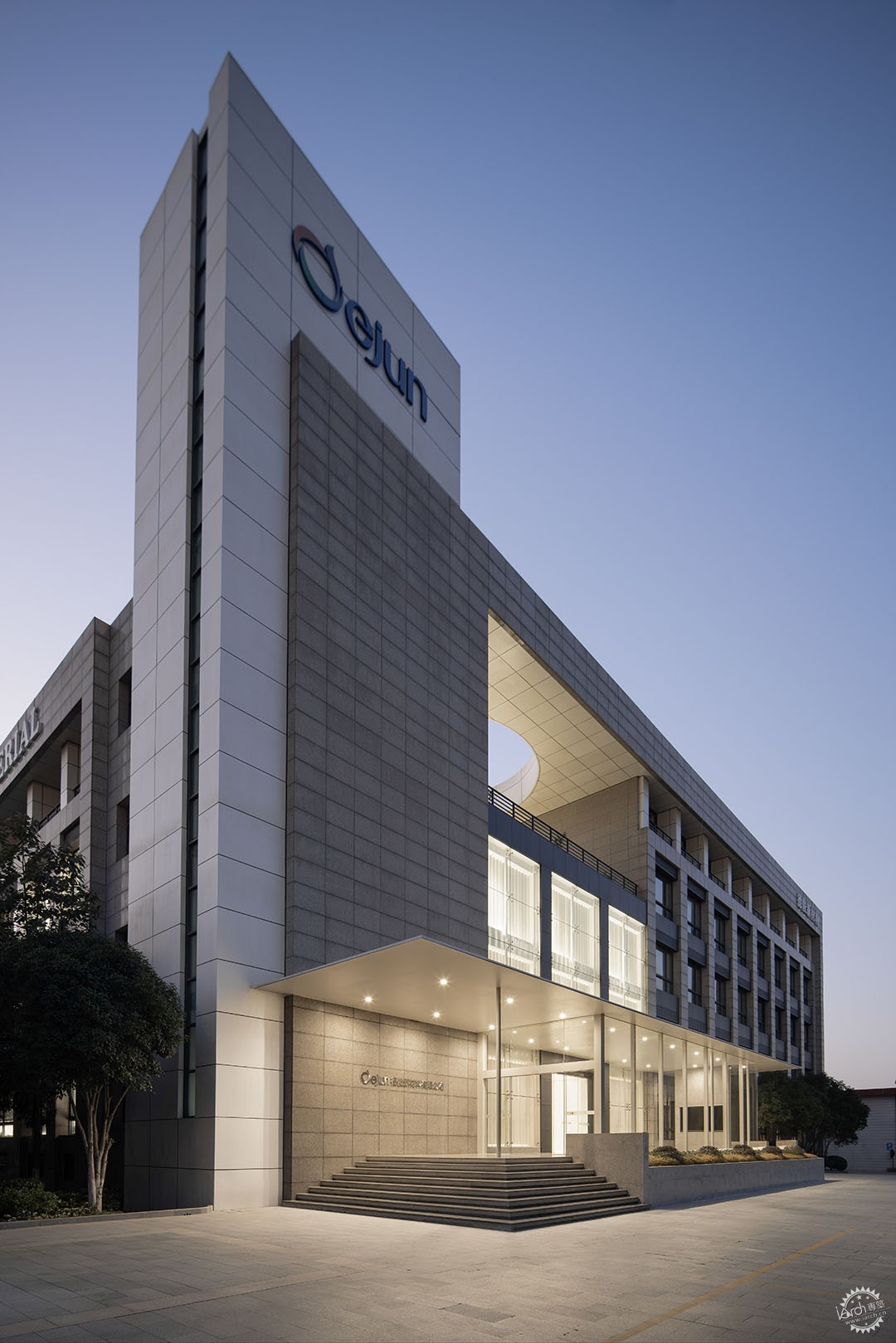
▲ 德俊总部办公外立面/ Dejun HQ Office facade @UK Studio
德俊新材料有限公司位于浙江海宁市,拥有近30年历史,是一家创新的布料研究与生产企业。随着时间的推移,公司总部的办公楼也面临着亟待改造更新的局面。在如今这个互联网和新技术快速发展的时代,我们接触到德俊这样一家一直坚守实业的企业,也感到颇为欣慰。第一代创始人虽已退休,仍常驻厂区,全情奉献。得益于这种实业工厂的创业历程,我们提炼了“隽永”这个概念,让改造后的总部办公空间能够传承和引领更多的奉献与坚持。同时,我们也将德俊生产的高科技面料的“轻盈”也植入其中,面料的轻盈中也蕴含着研发坚持与创新。
Dejun New Materials Co., Ltd. is located in Haining, Zhejiang, with nearly 30 years of history, serving as an innovative research and production enterprise in fabric industry. As time goes by, the company's headquarters office building is in urgent need of renovation. In today's era of rapid development of the Internet and new technologies, we feel quite gratified to come into contact with a company like Dejun that has always adhered to industry. Although the first-generation founders have retired, they still stay in the factory and devote themselves wholeheartedly. Thanks to the entrepreneurial history of this industrial factory, we have refined the concept of "meaningful" so that the new headquarters office space can inherit and lead more dedication and persistence. At the same time, we have also embedded the "lightness" of the high-tech fabrics produced by Dejun. The lightness of the fabrics also contains persistence and innovation.
漂浮屋面/Floating roof
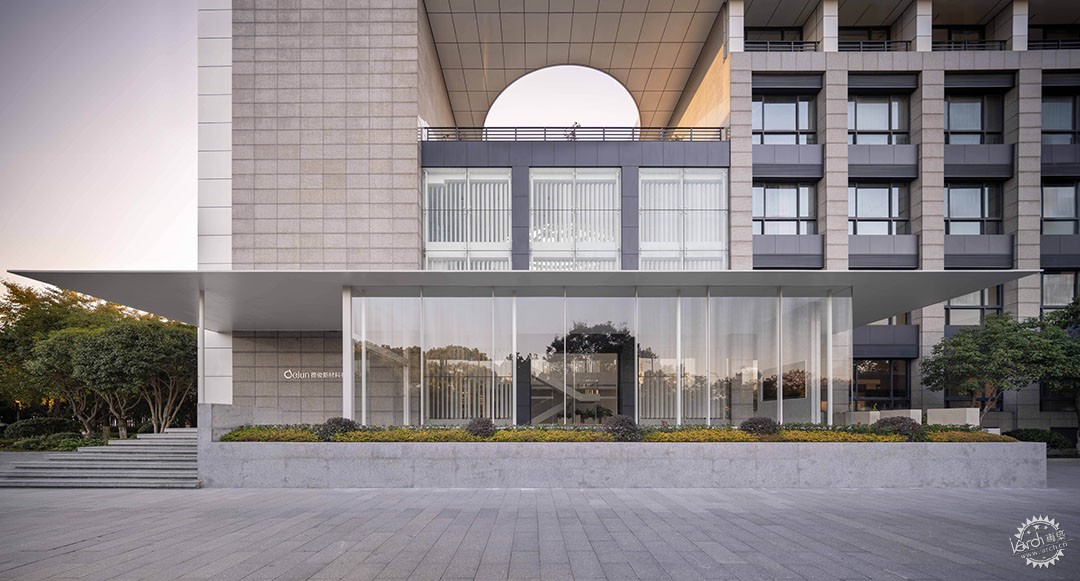
▲超薄屋面/ Super-thin roof @UK Studio
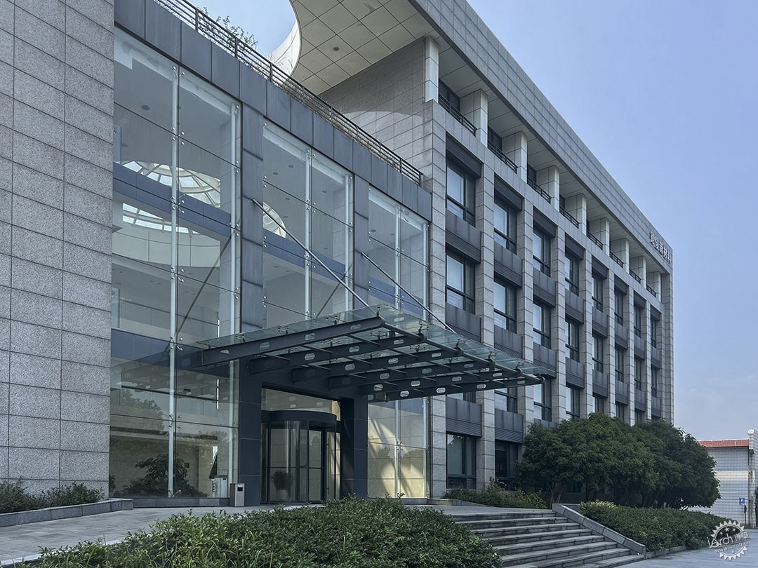
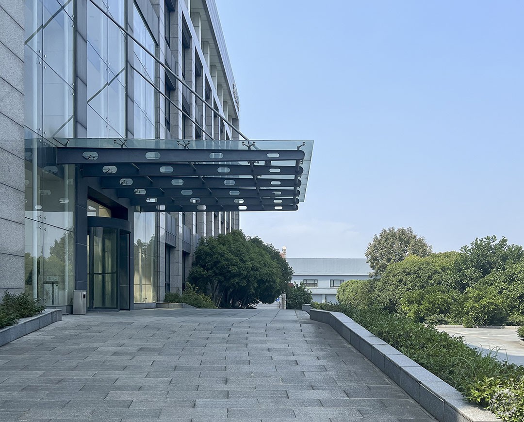
▲改造前雨棚/ Canopy before renovation ©域式建筑UStudies
建筑的入口原本是非常传统的玻璃雨棚,为了让这一栋本就沉稳的建筑显得轻盈灵动,我们在设计中植入了一个漂浮的屋面。屋面在入口处嵌入建筑体内,以轻盈的白色柱子作为支撑,营造出通透而又具有诗意的室内外衔接空间。仅100毫米厚的钢制板桁架屋面和直径仅80毫米的大跨度钢柱,形成了令人震惊的结构美感。这一异乎寻常的组合,以最轻盈的方式造成了视觉上和建造经验上的冲击,这也成了本项目一项高难度的结构挑战。
这种超薄雨棚屋面采用了板桁架技术,在工厂预制中,将天沟、灯孔、玻璃槽等一系列功能高度集成在板桁架体系中。现场可以直接安装,不仅施工极快,还能制造出纯净、纤薄的结构美感。
The originally entrance of the building was a very traditional glass canopy. In order to make this building appear lightweight and dynamic, we implanted a floating roof into the design. The roof is embedded into the building at the entrance, supported by delicate white columns, creating a transparent and poetic indoor-outdoor connection space. The steel plate truss roof with a thickness of only 100 mm and the long-span steel columns with a diameter of only 80 mm form a shocking structural beauty. This unusual combination creates a visual and construction experience impact in the lightest way, which also became a difficult structural challenge for this project.
This super-thin canopy roof employs a plate truss technology where various functions such as rain gutters, lighting apertures, and glass slots are seamlessly integrated within the plate truss system during factory prefabrication. Its on-site installation is remarkably swift, generating a clean and slender structural aesthetic, embodying pure and slim structural beauty.

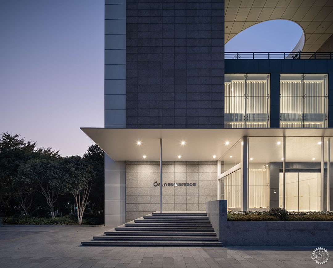
▲漂浮屋面与玻璃盒子入口/ Floating roof and glass box entrance @UK Studio
傍晚的夜色下,建筑体消隐,让屋面的漂浮感加剧,对于整个建筑体量而言,入口屋面就像一块漂浮着的布料,让人在这里可以感受到一种时间的静止感以及强烈的结构张力。
Under the evening's darkness, the building structure fades away, intensifying the sensation of the roof floating above. In the context of the entire architectural volume, the entrance roof appears akin to a floating piece of fabric, evoking a sense of temporal stillness and a powerful structural tension.
隽永的美术馆大堂/Meaningful Art Gallery Lobby
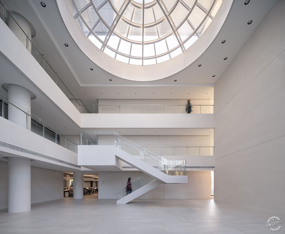
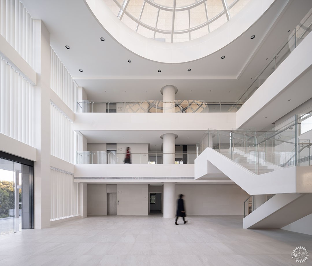
▲极简的艺术馆般的大堂/ Minimalist art museum-like lobby @UK Studio
路易斯康在金贝儿美术馆的设计中,将光作为结构的一种献礼,让美术馆的结构与光影的变化成为一种永恒变化的代表。
通常的办公大堂都充满各种属性,例如展示、接待、会客、等待、交流、甚至是发布等。在德俊总部办公的改造中,我们从开始就一反常态,将路易斯康在美术馆设计中的这种“隽永”引入空间,摒除的大堂的所有功能,这里没有家具、没有展示、没有公司logo、甚至没有一个前台。让人在这里反而有一种参观的游离感。设计中把对外需求最多的销售部设置在了一层,整个办公区采用透明的隔断,能让部门的员工快速的与外界产生互动并且也成为一个办公场景的对外展示。
In the design of the Kimbell Art Museum, Louis Kahn used light as a tribute to the structure, making the structure of the museum and the changes in light and shadow a representation of eternal change.
Conventionally, office lobbies serve various functions such as display, reception, meetings, waiting, communication, and even product launches. However, in the renovation of Dejun headquarters office, we defied the norm from the outset. We incorporated the " meaningful" essence derived from Louis Khan's museum design, removing all functionality typically found in a lobby—there are no furnishings, displays, company logos, not even a reception desk. This intentional absence creates a sense of exploration and wandering. The sales department, which requires the most external interaction, is positioned on the ground floor, while the entire office area features transparent partitions allowing swift external interaction and serving as a display of the office environment.

▲大堂均质的结构形成艺术化的韵律感/ The homogeneous structure of the lobby creates an artistic rhythm @UK Studio
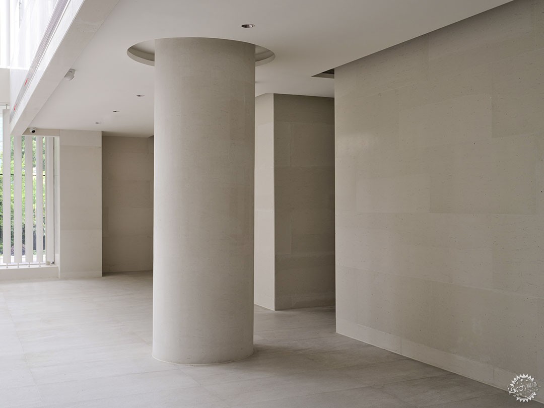
▲大堂结构细节/ Lobby structural details ©Erik Ho
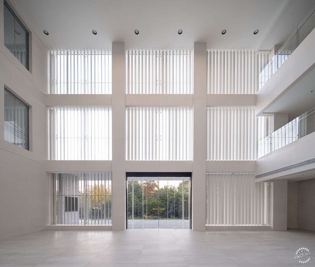
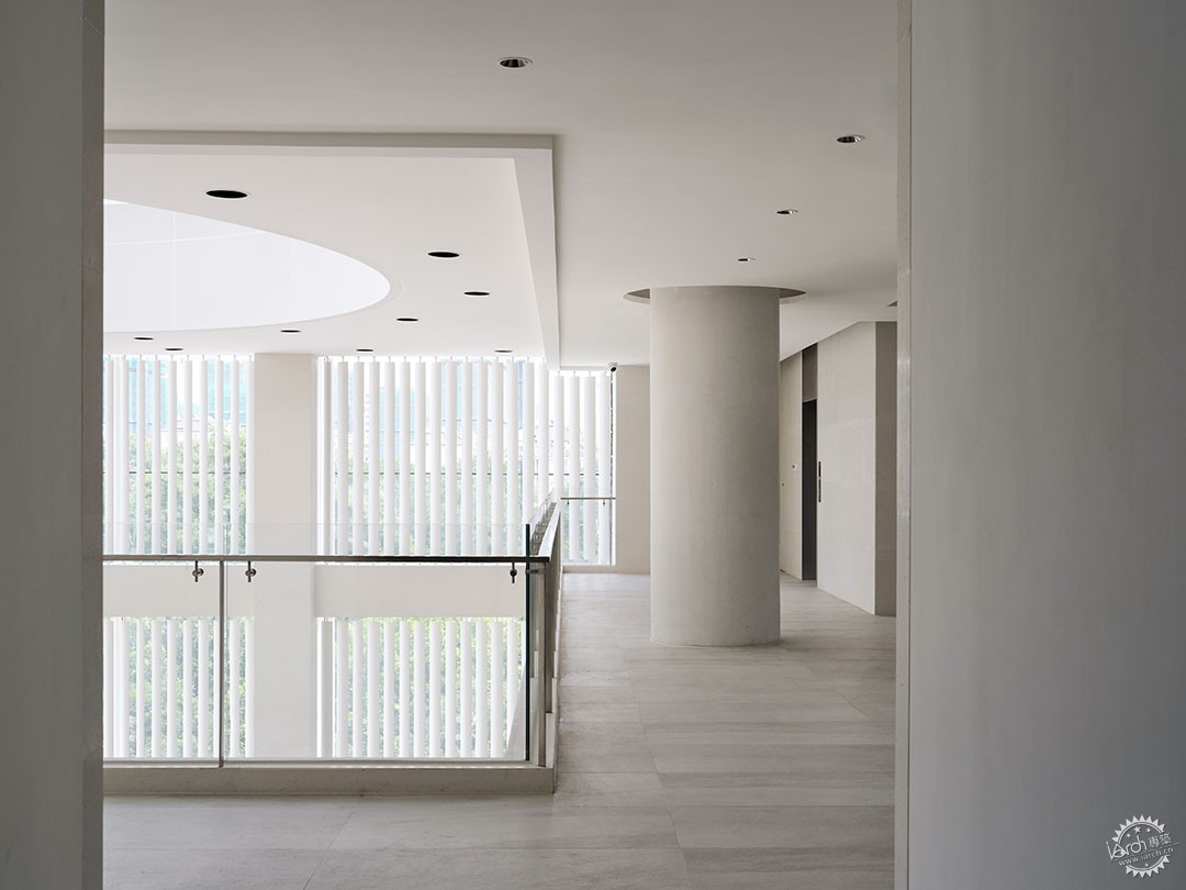
▲大堂的玻璃立面与遮阳格栅/ The glass facade and sun shading grilles in the lobby @UK Studio/ Erik Ho
大堂的南立面的改造,我们增加了通高的铝格栅百叶,格栅的角度根据太阳的入射角进行设计,每一片的角度都略有不同。不仅可以用来柔化阳光,改善室内办公的光环境,而且结合室内的整体纯净色调,营造一种极致的简约感。
The transformation of the lobby's southern facade involved the addition of full-height aluminum grilles. The angles of the grilles were designed according to the angle of the sun's rays, varying slightly for each panel. This not only softens the sunlight, enhancing the indoor working environment, but also combines with the overall clean color scheme indoors, creating an extreme sense of simplicity.
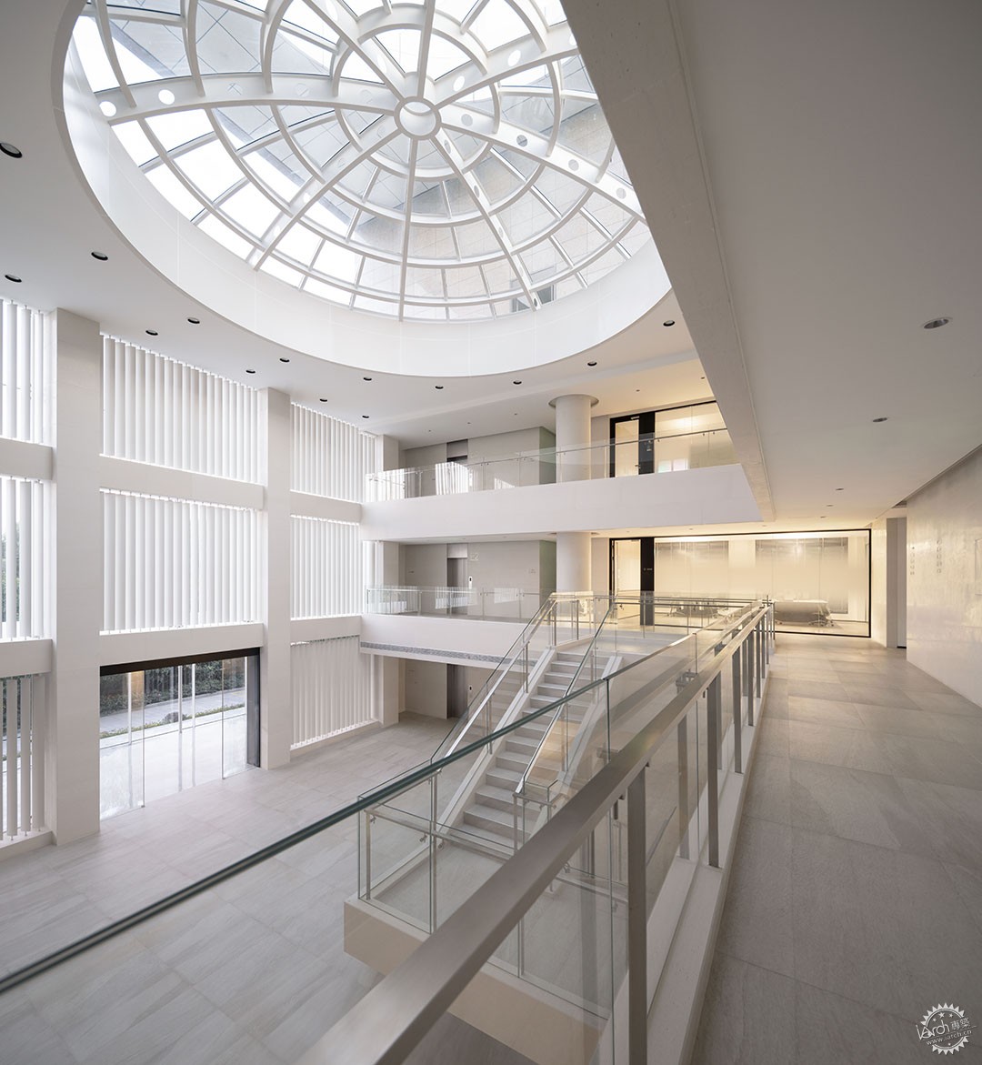
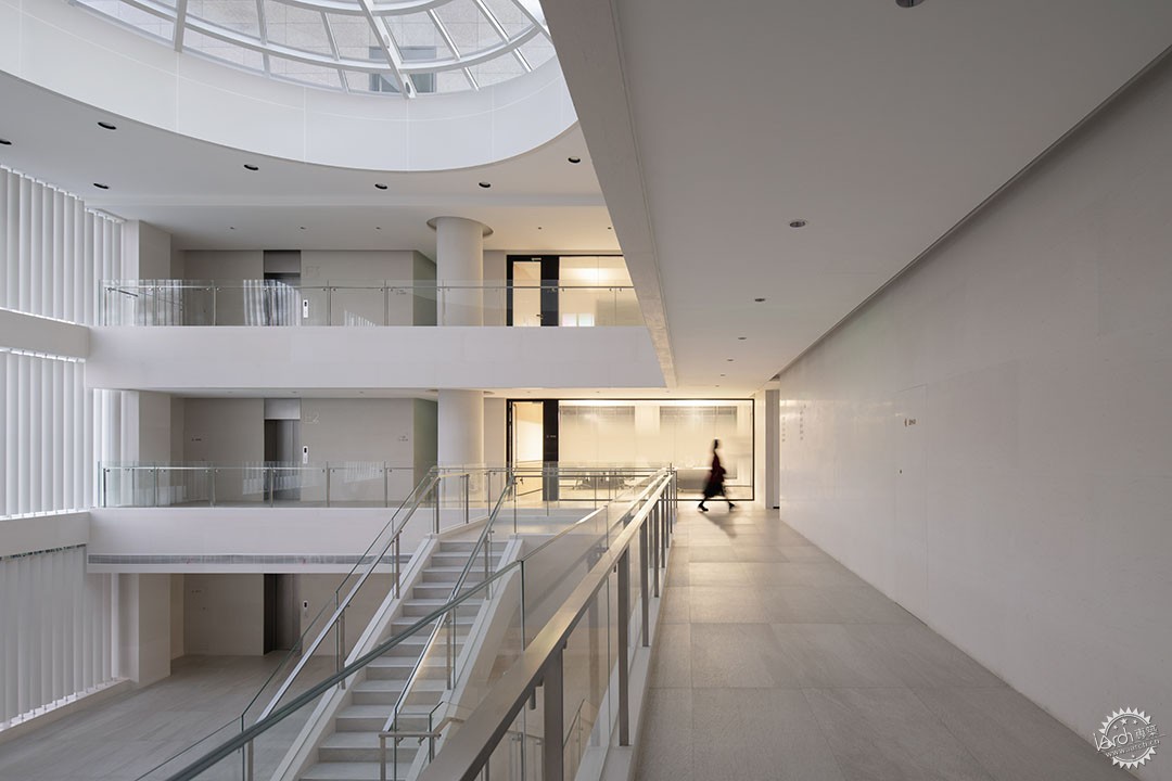
▲大堂的整体结构/ Overall structure of the lobby @UK Studio
大堂的墙面和地面采用颜色接近的大地色系倍砼石及意大利进口地砖材料,营造极致的整体感,这里除了建筑结构本身以外,参与其中的就是不断变化的天光。这里是一个能让人在精神上感受纯粹的地方,员工都不禁感叹,这是把艺术馆搬进了办公室。在这里,一些空间可以是“无限的”,但也有一些空间就应该完全地“有限”。虽然大堂没有设置让人停留的空间,但是这种近乎于美术馆的精致、简约,就足以让人主动驻足。立体的楼梯与层叠的走廊,也让员工在竖向层面多了更多的偶遇与交互。
The lobby's walls and floors utilize earth-toned materials such as concrete and Italian-imported tiles, creating an ultimate sense of unity. Besides the building structure itself, what contributes here is the ever-changing natural light. It's a place that spiritually feels pure; employees can't help but marvel at how it brings an art gallery into the office. Some spaces here can be "infinite," while others should be entirely "finite." Despite the absence of designated pause zones in the lobby, its near-art-gallery refinement and simplicity are enough to compel people to linger. The three -dimensional staircase and layered corridor also give employees more encounter and interaction at the vertical level.
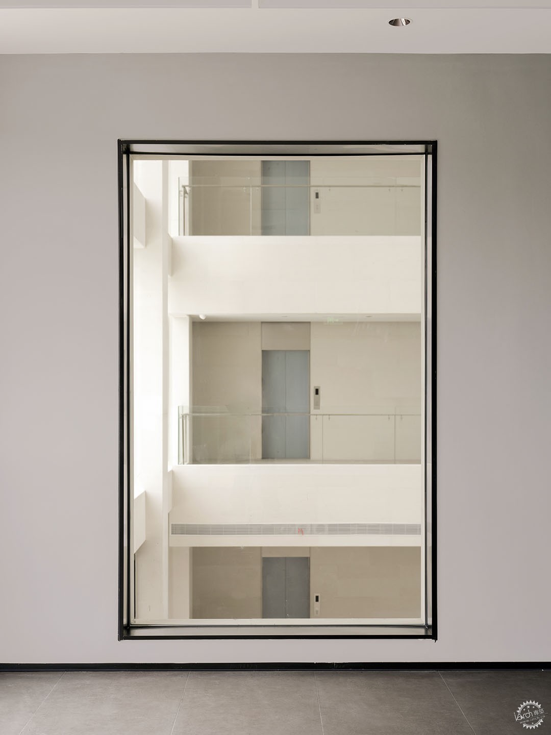
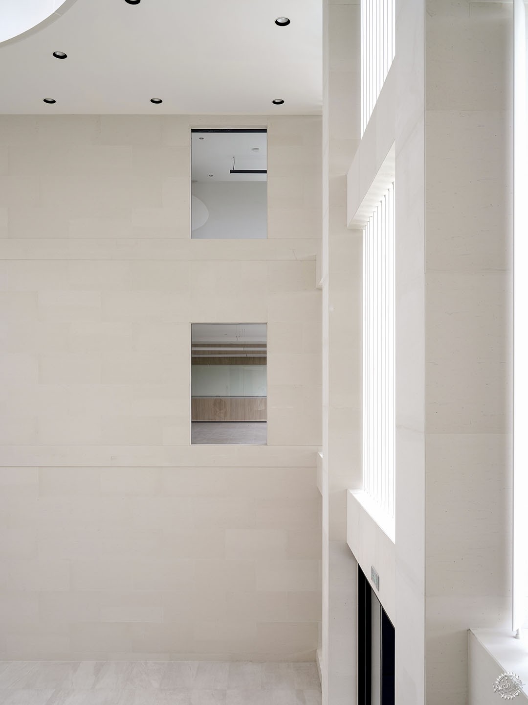
▲内外的看与被看/ Watch and be seen inside and outside ©Erik Ho
探寻材料的多重可能性/ Exploring the multiple possibilities of materials
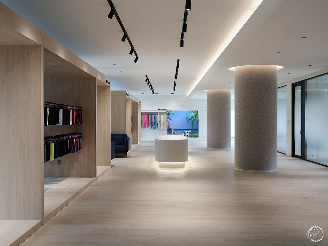
▲一层面料展厅/ Material exhibition hall ©Erik Ho
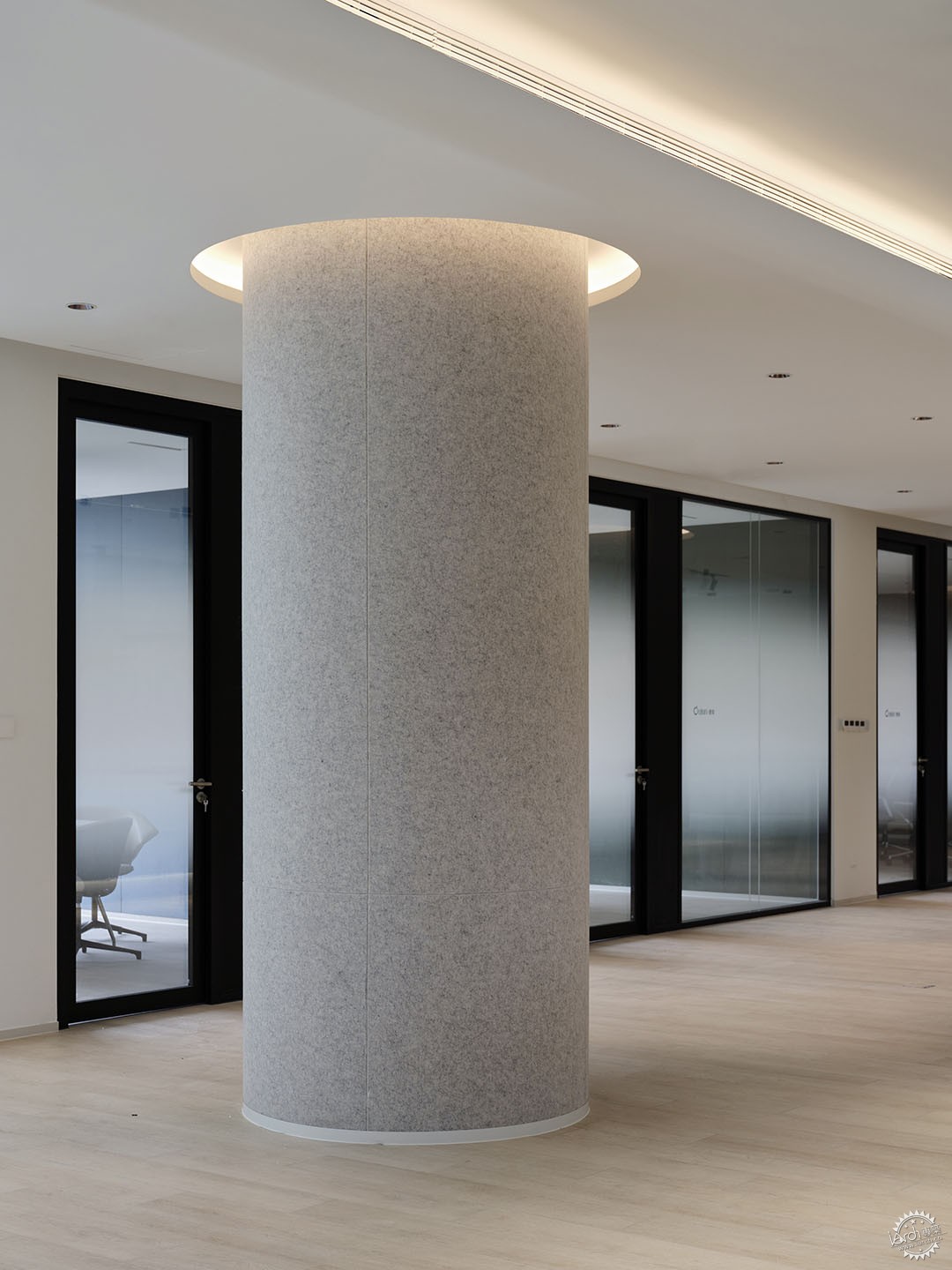
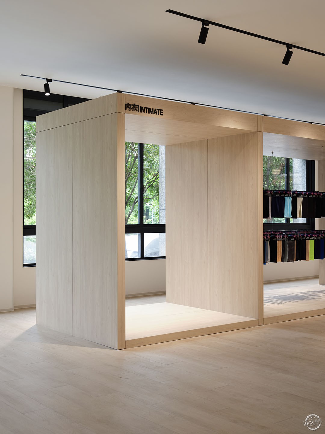
▲面料展厅细节/ Details of the fabric exhibition hall ©Erik Ho
在首层,我们设计了一个面料展厅。空间同样延续这种极简的色调,将几个木制的展示框置入空间,成为一种通透的展陈构架。德俊生产的面料主要用于运动服饰以及高端汽车内饰,不同的面料也都具有不同的个性,其实建筑材料也亦然。整个室内的改造中,材料大部分选择石材、在办公区域点缀木材。这两种材料的性格一刚一柔,由此我们也想到了面料的个性。面料的可塑性极强,并且也能代表德俊的产品。
On the ground floor, we designed a fabric exhibition hall. The space continues the minimalist color scheme, integrating several wooden display frames, forming a transparent display structure. Dejun's manufactured fabrics are primarily used in sportswear and high-end automotive interiors, each fabric possessing unique characteristics, just as architectural materials do. Throughout the interior renovation, the predominant materials are stone with accents of wood in the office areas. The character of these two materials, one rigid and the other soft, resonates with the idea of fabric personality. Fabrics exhibit tremendous pliability, resembling Dejun's products.
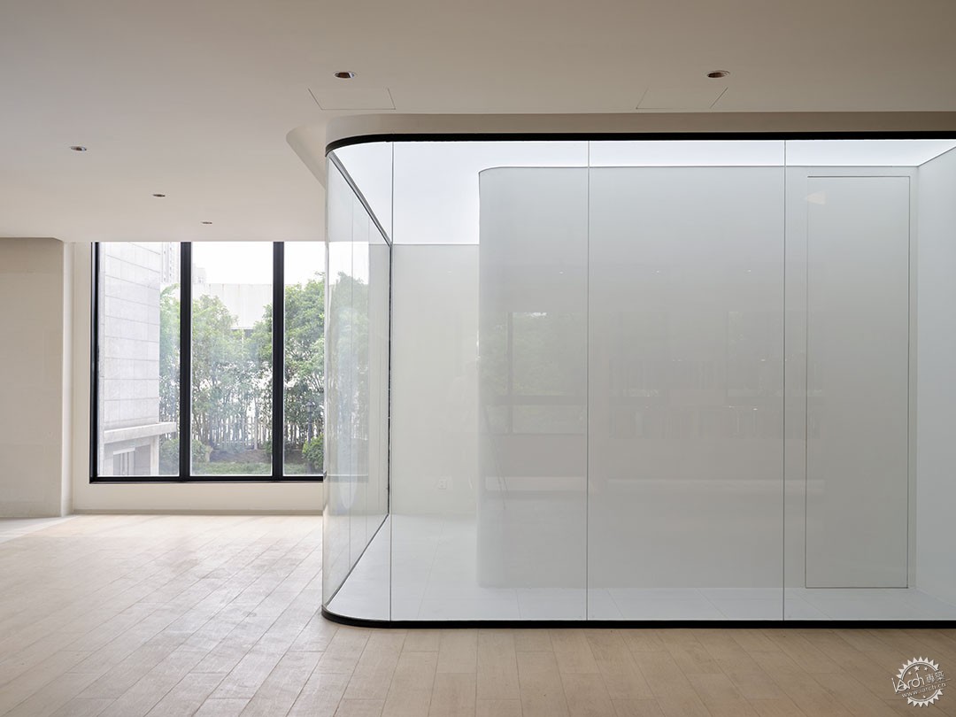
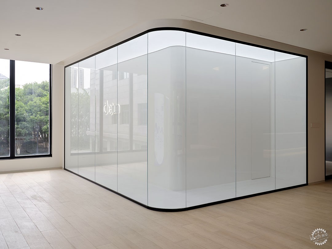
▲展厅入口橱窗展示/ Exhibition hall entrance window display ©Erik Ho
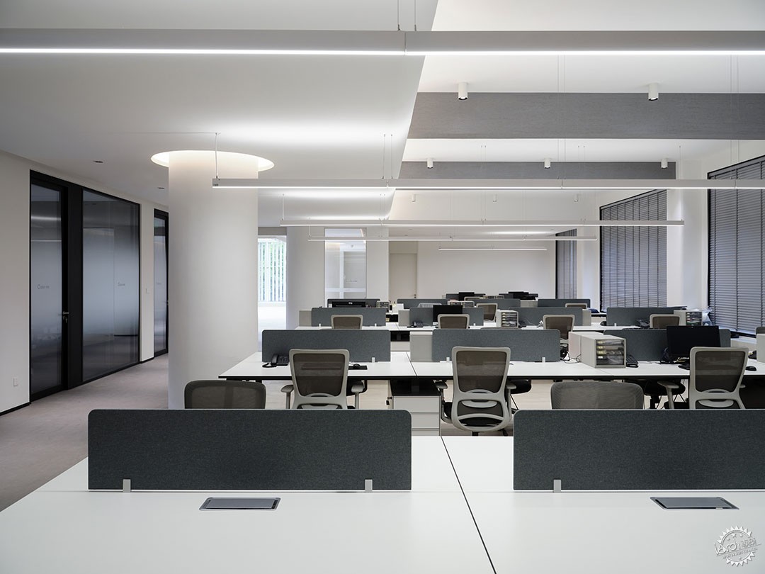
▲开放办公区/ Open office area ©Erik Ho
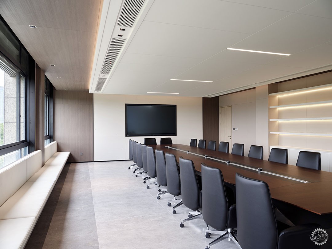
▲大会议室/ Conference room ©Erik Ho
我们尝试将布料运用在室内设计中,让这种轻薄与柔性的材质包裹坚硬的混凝土,柔化室内空间,同时,在这个庞大的总部大楼中,也让不同区域的布料成为一件件“展品”,参观的客户能够更多元的感受面料的特性以及体会到企业创新的热情。
We attempted to incorporate fabrics into interior design, wrapping the hard concrete with this lightweight and flexible material to soften the indoor space. Within this vast headquarters building, various areas feature fabrics as individual "exhibits," allowing visiting clients to experience the diverse characteristics of the fabrics and feel the company's innovative spirit.
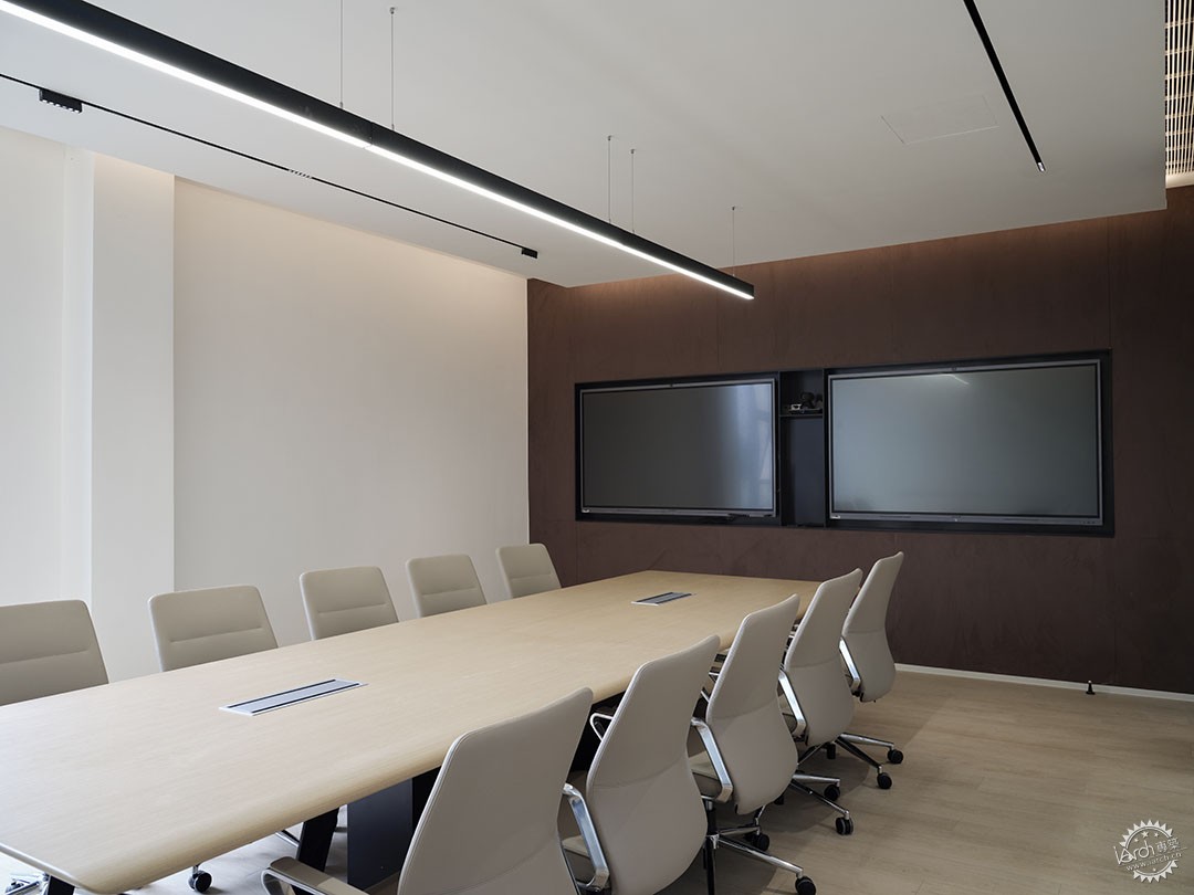
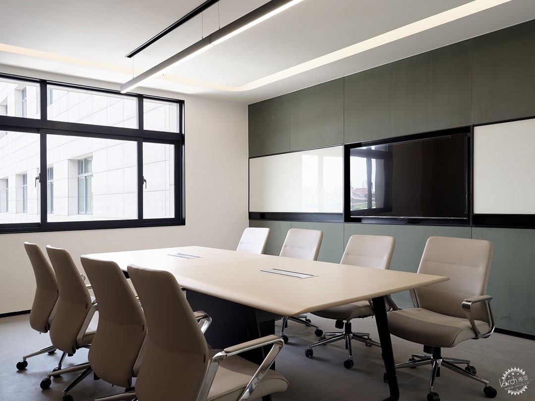
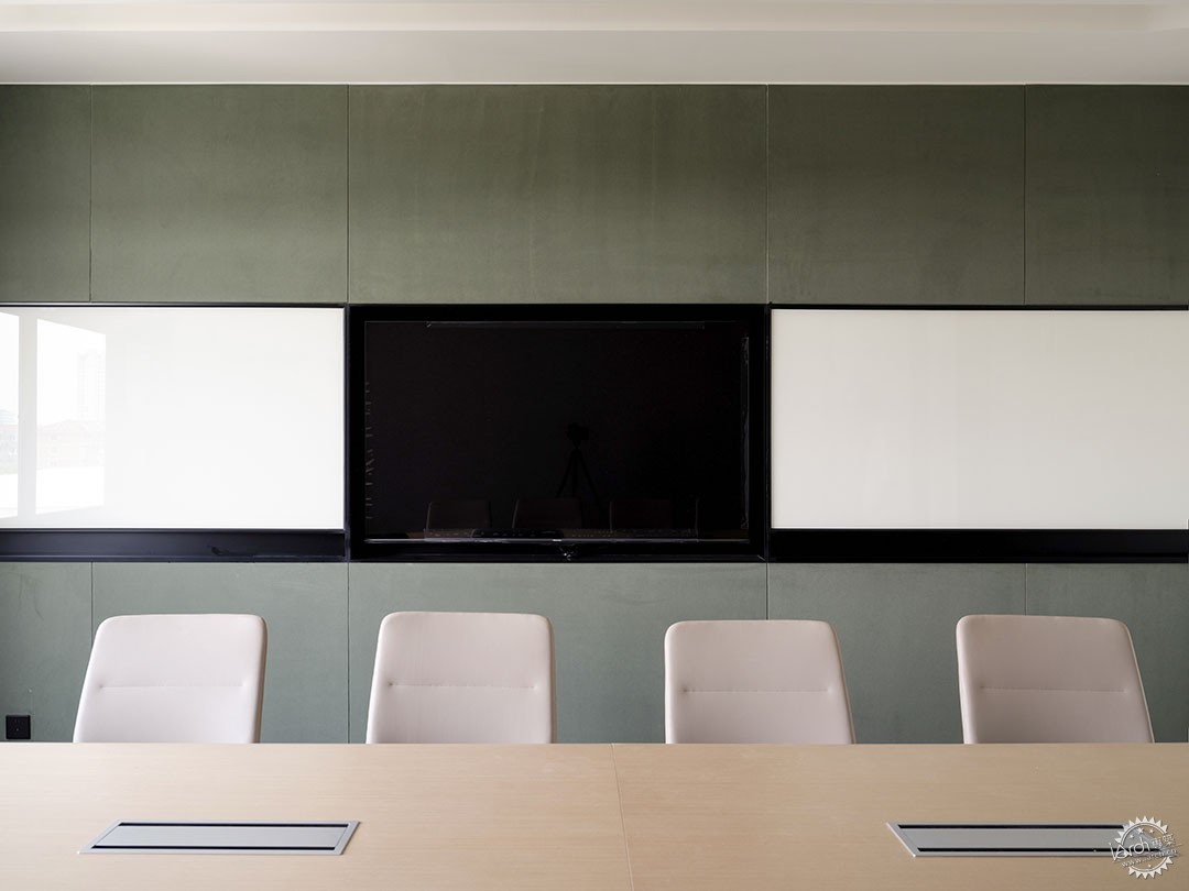
▲小会议室/ Small meeting room ©Erik Ho
小会议室的背景材料采用了德俊的新型人造麂皮面料,这种面料在室内领域也可以发挥自己的优势。材料虽然是非天然材料,但是有着有胜似天然材质耐污抗磨损性能,用在墙面,营造了一种柔化的氛围,并且易于打理与维护。
The background material in the small meeting room uses Dejun's innovative artificial suede fabric, which also demonstrates its advantages in the interior field. Although it's an artificial material, it boasts properties akin to natural materials, such as stain resistance and durability. Applied to the walls, it creates a softened ambiance and is easy to maintain and clean.
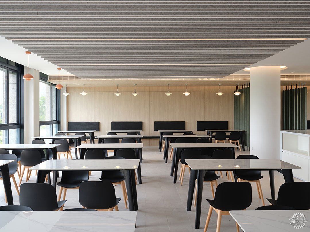
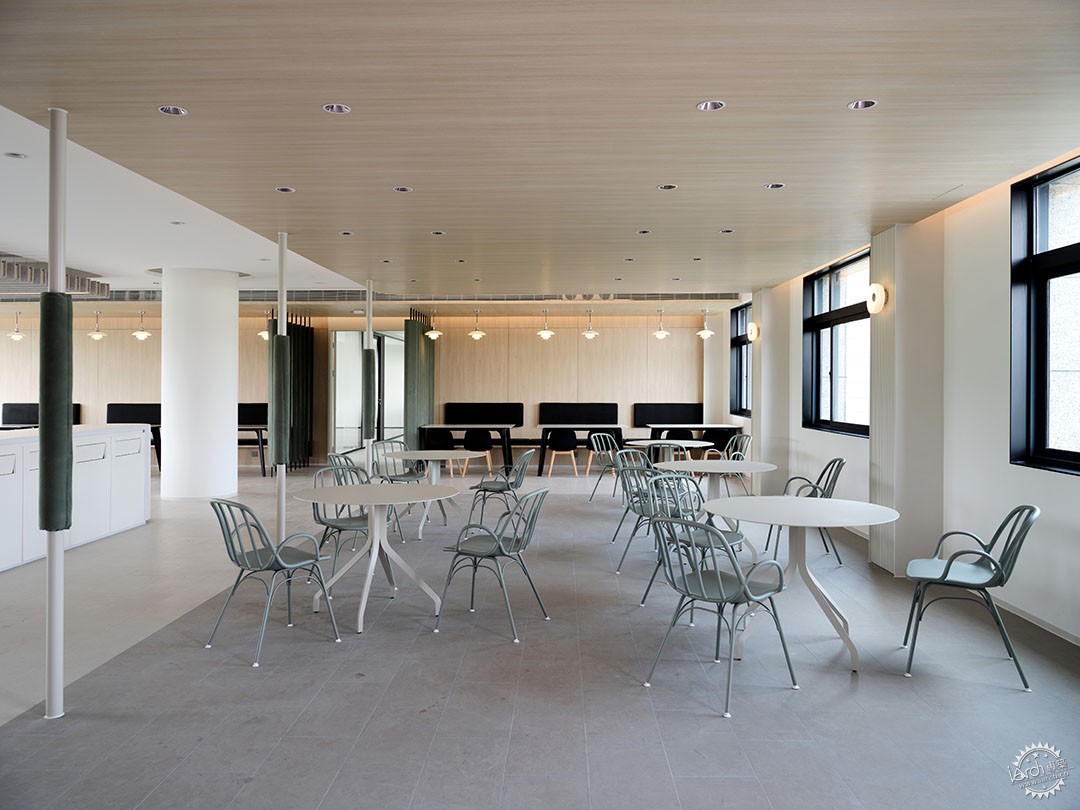

▲二层餐厅及细节处布料的运用/The use of fabric in the restaurant and in various detailed areas©Erik Ho
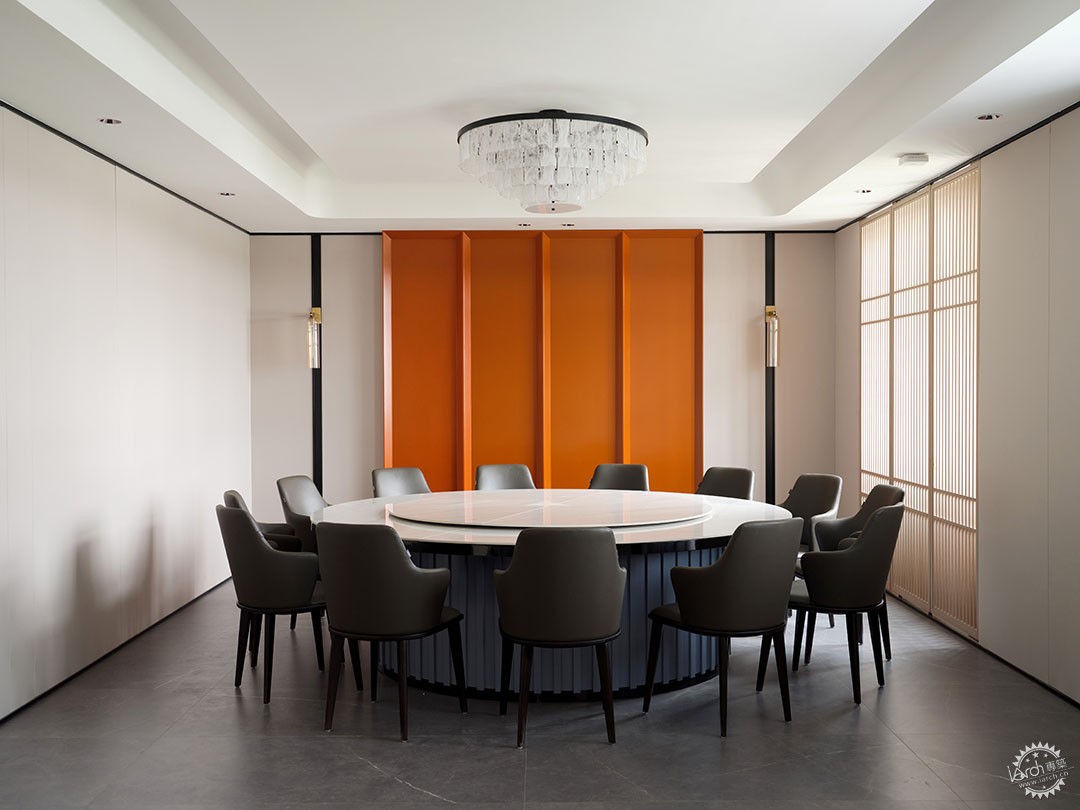
▲大会客厅/ Conference hall ©Erik Ho
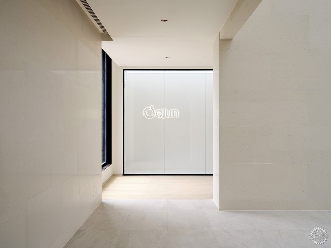
▲走廊与公共空间/ Corridor and Public Space ©Erik Ho
德俊新材料办公是一次反常态的办公设计,入口漂浮的屋顶像公园的景观、室内大堂又像一座美术馆,办公区域又充满了点缀着内敛的细节与惊喜。这种内敛的隽永,也是一代代坚守实业的企业家的品质,我们以这座建筑的设计作为致敬。
Dejun HQ Office boasts an unconventional design. Its entrance features a floating roof reminiscent of a park's landscape, the interior lobby resembles an art gallery, while the office areas are filled with restrained details and surprises. This subtle elegance represents the enduring qualities of generations dedicated to industry. We pay homage to these entrepreneurs through the design of this building.
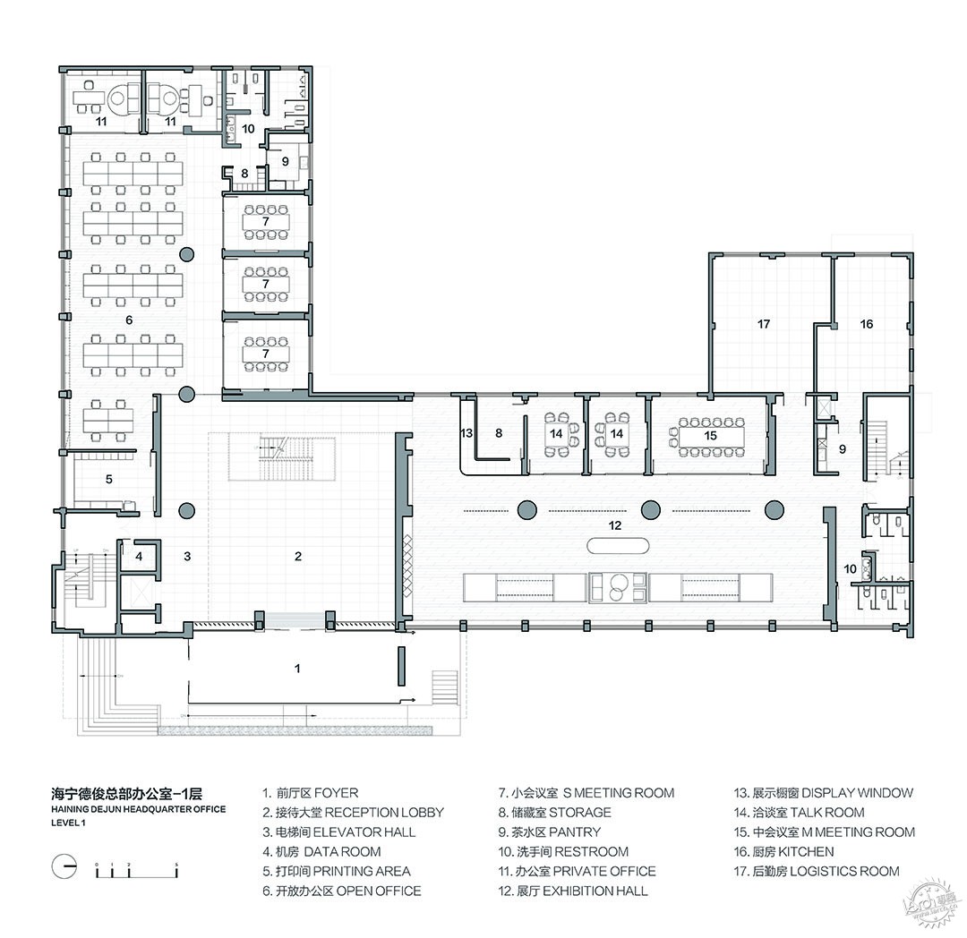
▲ 一层平面图/ FIRST FLOOR PLAN ©域式建筑
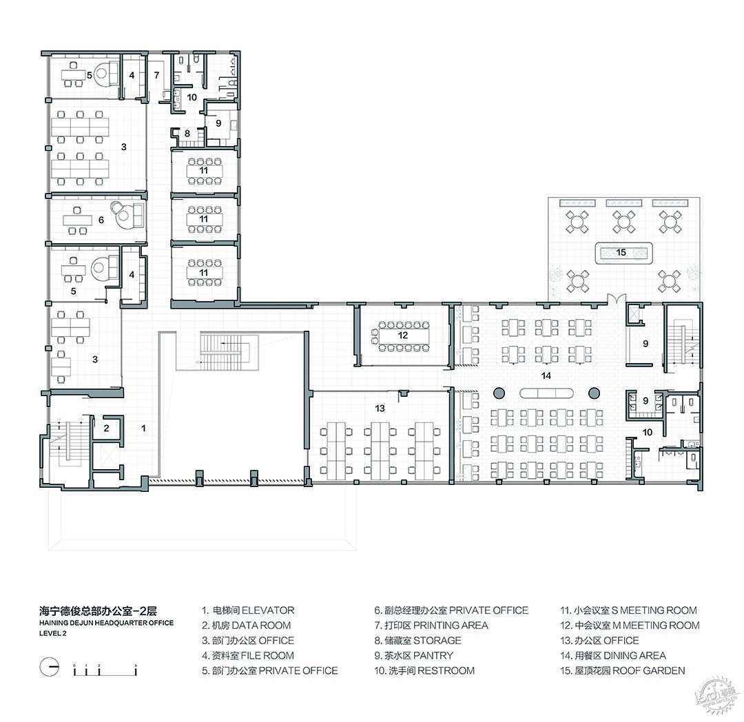
▲ 二层平面图/ SECOND FLOOR PLAN ©域式建筑
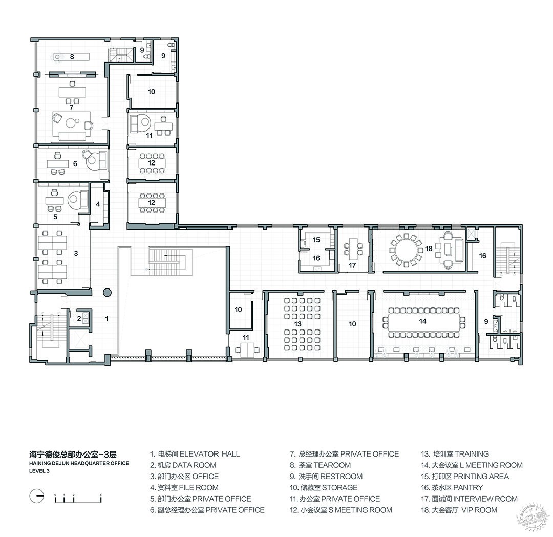
▲ 三层平面图/ THIRD FLOOR PLAN ©域式建筑
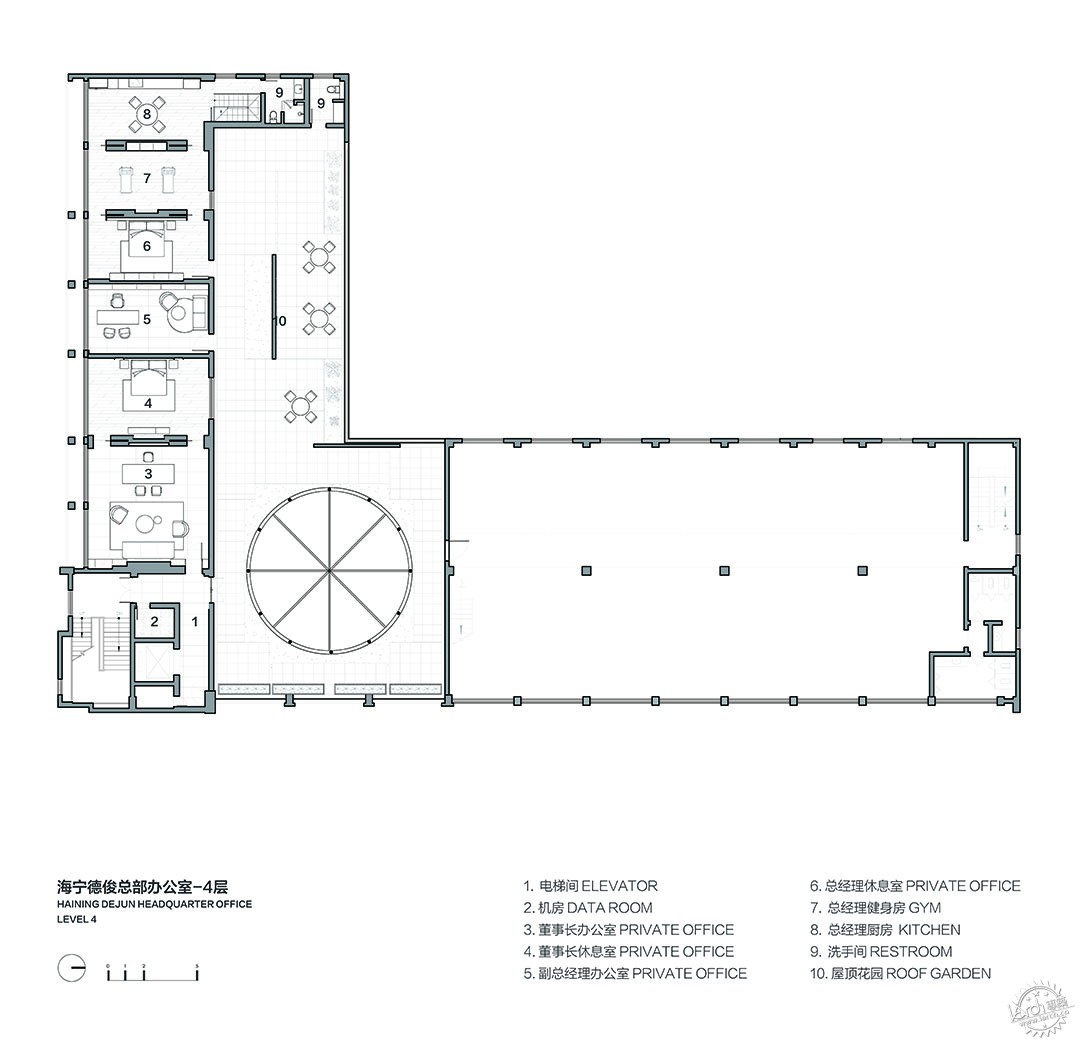
▲ 四层平面图/ FORTH FLOOR PLAN ©域式建筑
项目信息
项目名称:海宁德俊新材料总部办公空间
设计公司:域式建筑
项目设计 & 完成年份:2022.09 – 2023.05
主创及设计团队:付强,刘思妤,孙小明
结构设计:上海泰大建筑科技有限公司
项目地址:浙江省海宁市
建筑面积:3727㎡
摄影版权:UK Studio / Erik Ho
项目文章:UK Studio
项目客户:德俊新材料
Project Information
Project name: Haining Dejun HQ Office
Designer: UStudies Architects
Project design & completion year: 2022.09 – 2023.05
Design team: Qiang Fu, Nora Liu,, Xiaoming Sun
Construction company: T&D
Project address: Haining, Zhejiang
Building area: 3727㎡
Photography copyright: UK Studio / Erik Ho
Project article:UK Studio
Client: Dejun
来源:本文由域式建筑提供稿件,所有著作权归属域式建筑所有。
|
|
