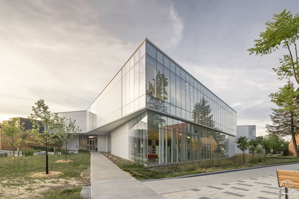
Pierrefonds Public Library / Chevalier Morales Architectes + DMA
由专筑网邢子,小R编译
这座创新的图书馆在设计概念上被定义为公园和购物中心的结合体,这两者都被认为是参与度很高的“第三场所”,这体现了一种生态系统的观点,项目和它们之间的关系都得到了同样的关注。这是一个真正的社会信息的交流网络,一个复杂的流通结构,每次的到访都会有新的体验。
Pierrefonds公共图书馆的设计也在其与景观的关系上有所创新,严谨的技术运用到场景设计和藏品的展示中,在展示部分利用合理设计,提高功能的可及性。
“这个创新和高度技术化的图书馆的整体规划策略受到了购物中心、火车站和机场的务实效率的启发,同时也避免了它们的缺陷。”
Text description provided by the architects. Defined as the combination of a park and a shopping mall, both considered as highly attended "third place", this innovative library embodies an ecosystemic vision where the programs and the relations between them are developed with the same level of attention. It is a true social and information exchange network that takes shape into a complex circulation structure that renews the library experience with each visit.
The design of the Pierrefonds Public Library also innovates in its relation to the landscape, its discreet technological approach actively participating in the scenography, and the collections’ display. The latter are structured around thematic poles to enhance accessibility.
“The overall planning strategy of this innovative and highly technological library was inspired by the pragmatic efficiency of shopping centers, train stations, and airports, all while avoiding their flaws.”
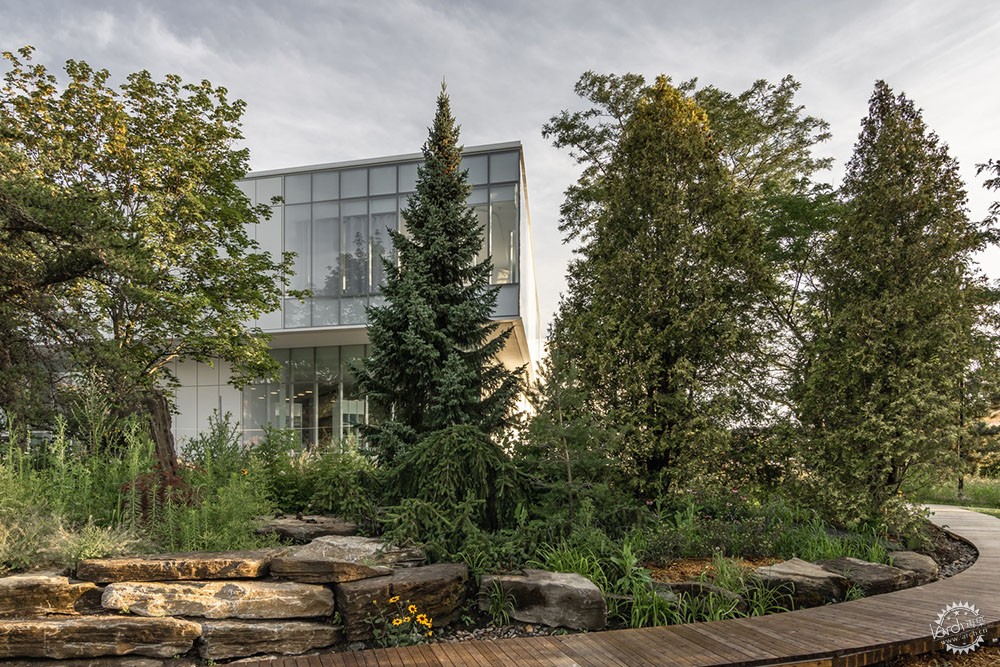
一个理想的公园和一个购物中心的结合。在翻阅Pierrefonds-Roxboro的旧总体规划时,建筑师们发现了一张描绘该区绿地主要规划标准的图形图像。该图表达了在一个普通场地上的理想化的公园,这座公园根据年龄组和活动类型被划分为不同的区域,其中包含绿地、休息空间、游戏区、交流网络等,这类似于图书馆的规划。
对这份文件的深入研究,加上对各个区域,特别是绿地的重组部分的关注,成为项目的基础。作为这些探索的结果,建筑师设计了一个内部花园,通过分隔,花园可以得到自然光,并通达现有建筑的中心,花园也同样是图书馆用户和员工的使用空间。
The combination of an ideal park and a shopping mall. While looking through old masterplans of Pierrefonds-Roxboro, the architects came across a graphic image depicting the main planning criteria for green spaces in the district. The drawing showed an idealized park on a generic site. The park was divided into various areas, based on age groups and types of activities: green spaces, rest spaces, play zones, exchange networks, etc.; similar to library planning.
An in-depth study of this document, paired with a reorganization of the various areas, especially the green spaces, became one of the foundations for the project. An interior garden emerged as a result of these explorations. Created by an extraction process, the garden allows natural light as well as part of the natural surroundings to reach the heart of the existing building. The garden also functions as reference point for users and employees of the library.
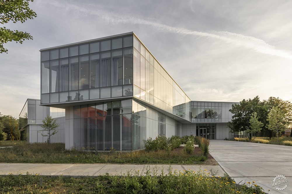
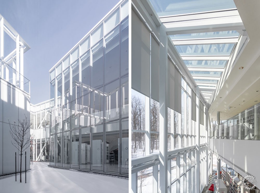
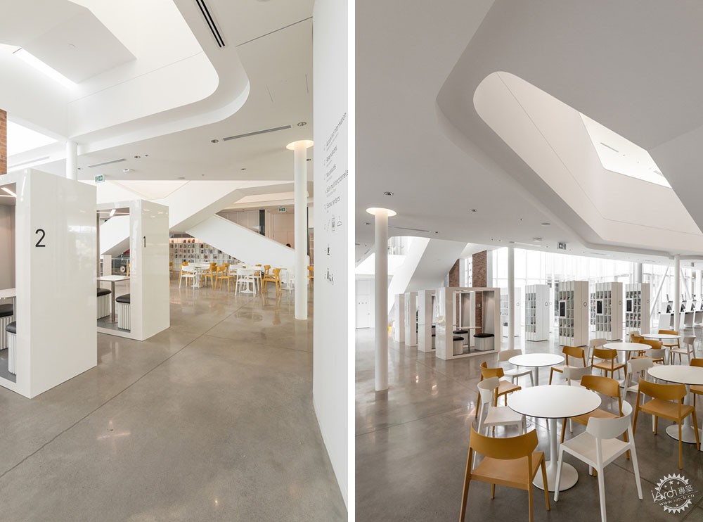
作为郊区环境的典型,购物中心也经常受到批评与审查。购物中心服从于功能和经济要求,它通常有一个或多个枢纽。这些活动和交流中心的顶部几乎都有一个大天窗,突出了整个构图。
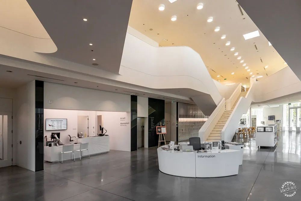
购物中心的另一个重要特征是它的流通网络由多个入口处提供,迫使顾客进入特定的路径。因此,通常位于中央中庭的楼梯经常被刻意颠倒,作为延长游客逗留时间的一种方式。这种类型对图书馆的规划来说很有意思。其空间品质是所谓的"第三空间"的重要组成部分。使用者的自由流动、空间组织的灵活性、体验只是这些优势中的一部分。
Typical of suburban environments and often criticized, the shopping mall typology was also investigated. Generic buildings, obedient to functional and economic requirements, shopping malls have one or many focal points. These centers of activities and exchange are almost always topped with a large skylight accentuating the composition.
Another important characteristic of the shopping mall is its circulation network fed by multiple entryways that compels the customer into specific paths. Thus, stairways typically located in central atriums are often voluntarily reversed, as a way of extending the visitor’s stay. This typology is particularly interesting to the planning of a library. Its numerous spatial qualities are essential components of what is called a “third place”. Users circulating freely, flexibility in spatial organization, multiple movements and experiences are just a few of these advantages.
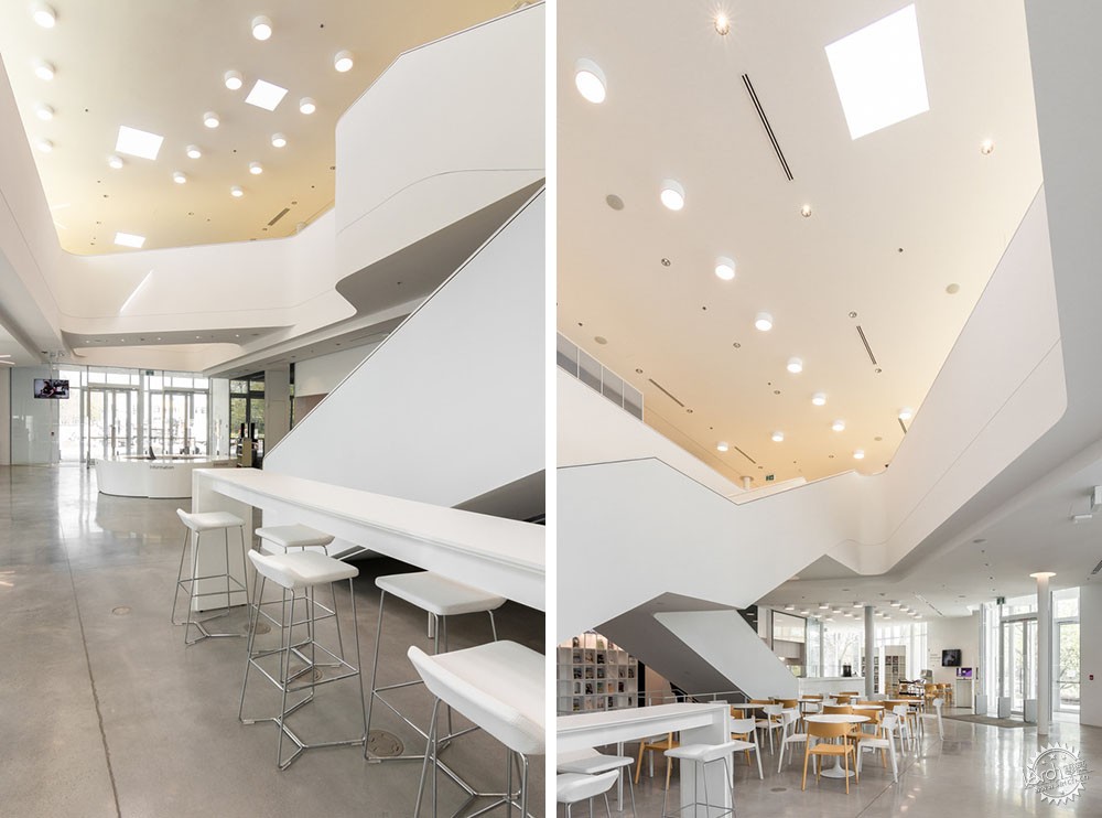
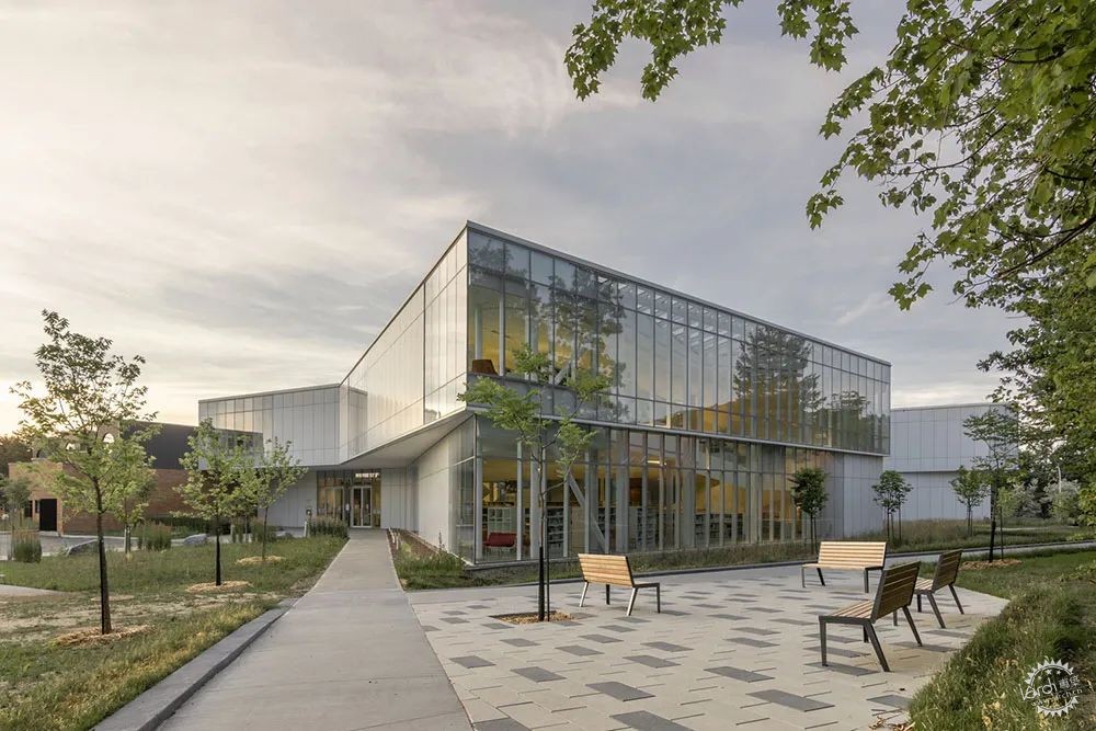
该项目的主要元素受到购物中心的启发,两翼合并成一个中央会议空间,另外有楼梯枢纽,通高平台,允许视觉连接的开口,多个天窗,以及公共空间等。建筑物周围的停车场和墙壁,在这里被绿色空间和玻璃幕墙所取代。
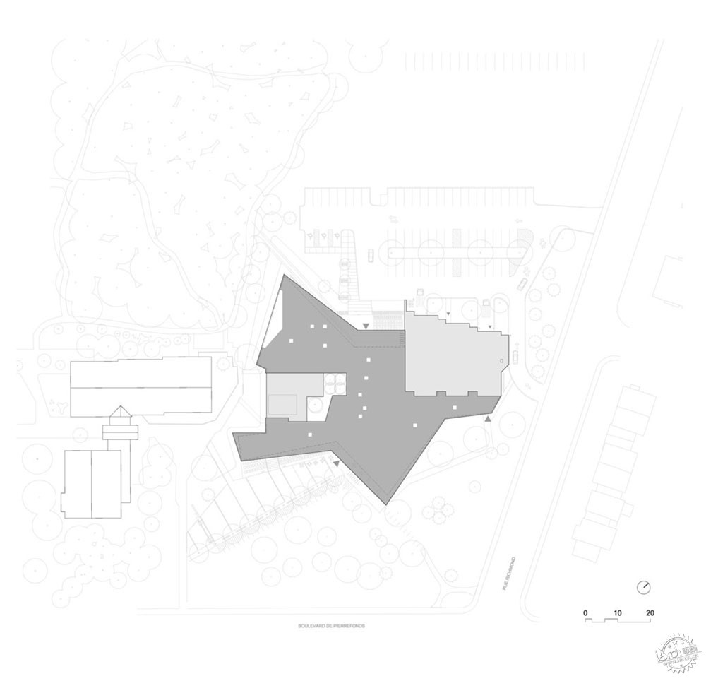
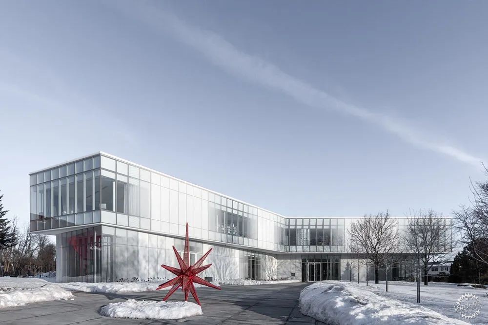
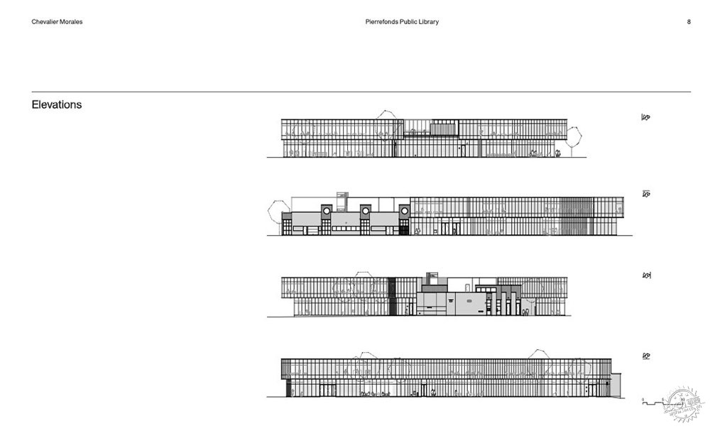
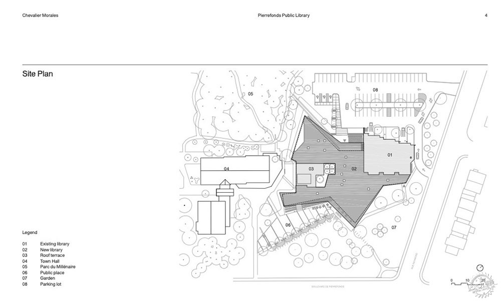
在形式上,该项目根据场地的主要元素进行自我调整。建筑物的形状不是纯粹的功能性和经济性,而是既要体现其在Pierrefonds大道上的存在感,又要融于树木茂盛的公园,还要配合场地上现有的绿化。
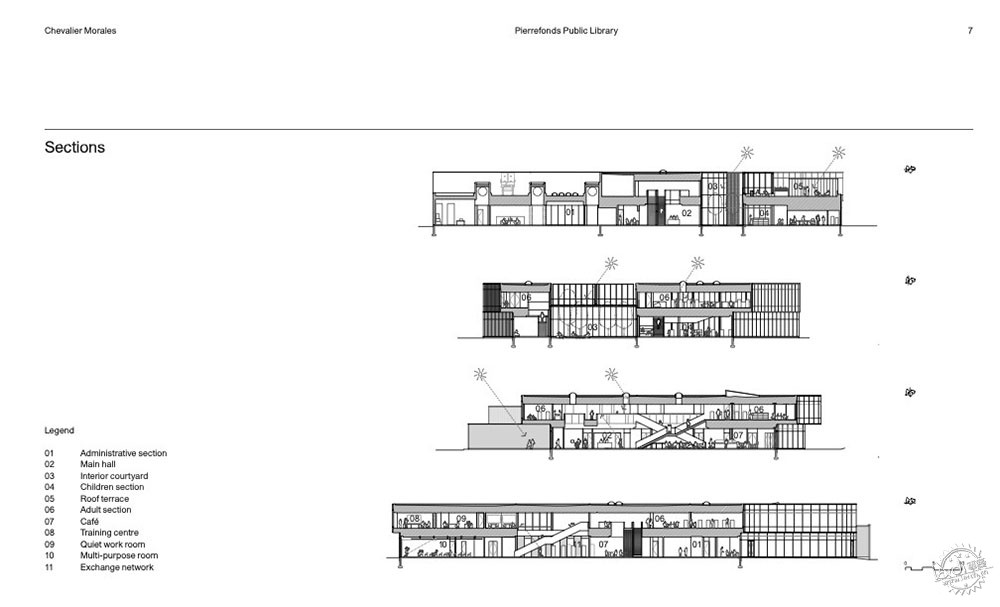
The project’s main elements are directly inspired by the shopping mall typology: wings merging into a central meeting space, a network of stairways, a bleacher, floor openings allowing visual connections, multiple skylights, as well as a civic space. The building’s surroundings, usually filled with parking lots, and opaque walls are here replaced by green spaces and glass curtain walls.
Formally, the project adjusts itself according to the site’s main elements. Instead of being purely functional and economic, the building’s shape is drawn to both manifest its urban presence on Pierrefonds Boulevard, and get closer to the wooded park, and to retract to reveal existing greenery islands on the site.
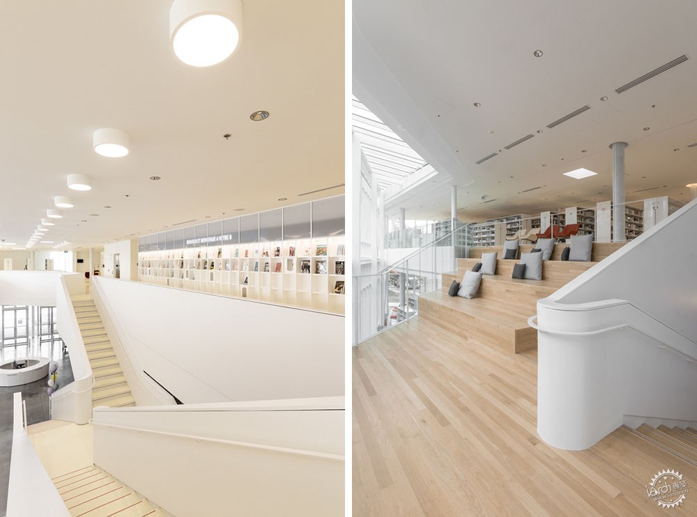
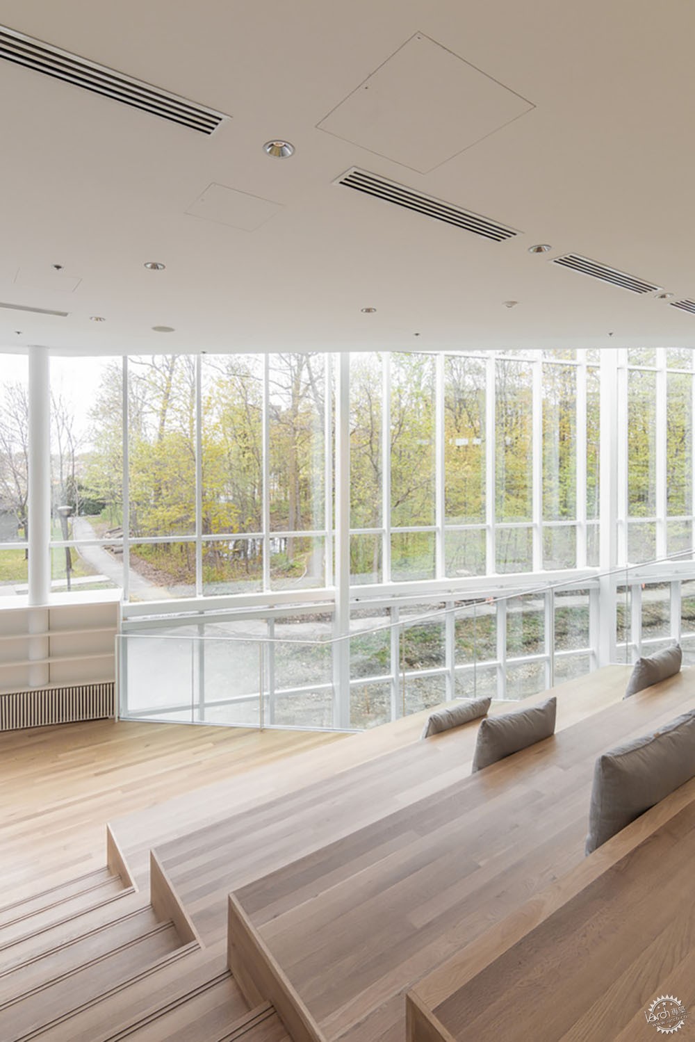
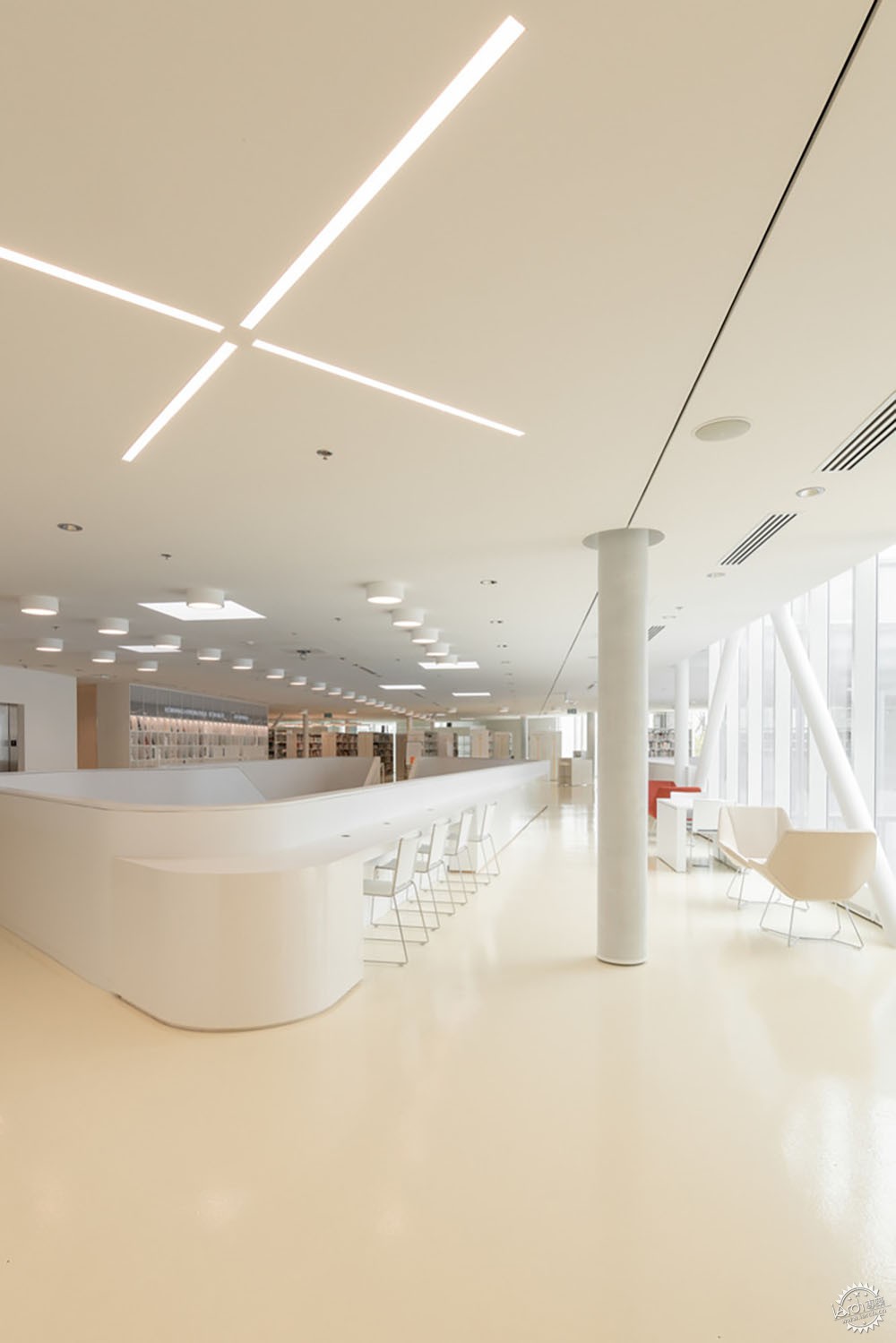
白色的通透和结构的轻盈。这个项目的形式和材料都很简单,突出其景观、使用者和书籍的存在。白色在内部和外部都占主导地位,提供了一个色调中性的画布,从中可以看到景观的变化、漫游的用户和书籍的突出。白色的墙壁、天花板和书架,反射并增加了通过巨大的玻璃幕墙、室内花园、玻璃屋顶射入的自然光,使图书馆在阴天时也能保持明亮。在上层,浅黄色的环氧树脂釉面混凝土地板、橡木平台和色彩丰富的舒适家具为白色的空间带来了温暖的色调。
White transparency and structural lightness. The project’s forms and materials are simple and intend to disappear to highlight the presence of its landscape, users, and books. White is dominant both inside and out and offers a neutral canvas from which the landscape’s changing colors, the roaming visitors, and the many documents contrast and stand out. The white surfaces – walls, ceilings, and shelving – also reflect and multiply the natural light coming in through the vast glass curtain walls, the interior garden, the glass roof, and the multiple skylights, allowing the library to stay bright even during cloudy weather. On the upper level, the light-yellow epoxy-glazed concrete floor, oak bleachers, and colorful and comfortable furniture bring warmth to the predominantly white spaces.
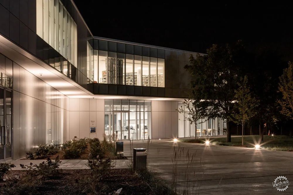
玻璃幕墙系统用白色的铝型材点缀,包裹着建筑的周边。一些玻璃板是丝网印刷的,在透明和不透明之间创造了平滑的过渡。围护结构内部也是有纹理的,穿孔铝板在地板和天花板两侧,同时作为通风系统。
上层楼板的大部分是沿着建筑的周边悬挑的。结构上的挑战是如何保持轻盈的形象,工程师通过使楼板看起来尽可能的薄来实现轻盈。钢结构是与结构工程师合作制作的,特别是面向树林上方的玻璃屋顶。
A glazed curtain-wall system punctuated with white aluminum sections wraps the perimeter of the building. Some glass panels are screen-printed to create a smooth transition between transparency and opacity. The envelope is also textured inside; perforated aluminum panels flank the floor and ceiling, which also act as a ventilation distribution system.
Most of the upper floor slab is cantilevered along the perimeter of the building. The structural challenge to preserve the impression of lightness was achieved by making the floor slab appear as thin as possible. The steel structure was carefully crafted in collaboration with structural engineers, especially the glass roof over the bleachers facing the woods.
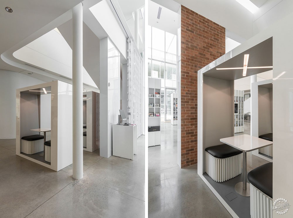
最后,新建筑围绕着最初的区图书馆展开。开发新建筑围护结构和现有外墙之间的连接点是另一个技术和美学挑战,一些残余的砖块被用来制造内部隔断,使人回想起以前的建筑轮廓。将旧图书馆的记忆融入到目前的项目中也是一个非常重要的考虑。
Finally, the new building spreads around the initial borough’s library. Developing the junctions between the new building envelope and the existing facade was another technical and esthetical challenge. Some salvaged bricks were used to create inside partitions recalling the outline of the previous building. Integrating the memory of the old library into the current project was fundamental.
藏品的组织和分布。在与客户所期望的主题的藏品组织对话中,建筑师们开发了一种优先考虑个人和互动的方法。提供了可视性、灵活性和阅读、工作和休闲的空间。建筑师选择了密集分布的藏品,并释放中心的最大空间,突出规划设计,保留有趣的节点。
随后,在腾出的空间中放置主题通道,以图书馆的方式展示藏品。就像人们在公园里占据一个适合自己的地方一样,这些中央空间是有机的,包含了许多独立的子空间,或多或少地满足了每个人的愿望。
Collections organization and distribution. In dialog with the collections’ organization in thematic poles desired by the clients, the architects developed an approach that prioritizes individuals and their interactions. It offers visibility, flexibility and a variety of spaces to read, work, and relax. The architects first opted for a dense distribution of the collections to free a maximum of space in the centers and accentuate the plan taking care to preserve interesting views.
Then, they proposed to place thematic isles in the freed-up spaces allowing the display of the collections in a library style. Just as one occupies a place that suits them in a park, these central spaces are organic and contain many sub-spaces more or less intimate following each one’s desire.


建筑设计:Chevalier Morales Architectes, DMA
类型:图书馆
面积:4550 m2
项目时间:2019年
主创设计师:Stephan Chevalier, Sergio Morales and François Lemoine. Architects: Alexandre Massé, Julie Rondeau, Gabriel Lanthier, Céline Leclerc, Christian Aubin, ève Beaumont-Cousineau, Catherine St-Marseille, Simon Barrette, Geneviève Riopel
景观设计:Version Paysage
顾问:Bouthillette Parizeau, SDK, équipe Laurence
城市:蒙特利尔
国家:加拿大
LIBRARY•MONTREAL, CANADA
Architects: Chevalier Morales Architectes, DMA
Area: 4550 m2
Year: 2019
Lead Architects: Stephan Chevalier, Sergio Morales and François Lemoine. Architects: Alexandre Massé, Julie Rondeau, Gabriel Lanthier, Céline Leclerc, Christian Aubin, ève Beaumont-Cousineau, Catherine St-Marseille, Simon Barrette, Geneviève Riopel
Landscaping: Version Paysage
Consultants: Bouthillette Parizeau, SDK, équipe Laurence
City: Montreal
Country: Canada
|
|
