查看相册 View Gallery
由专筑网韩平,刘庆新编译
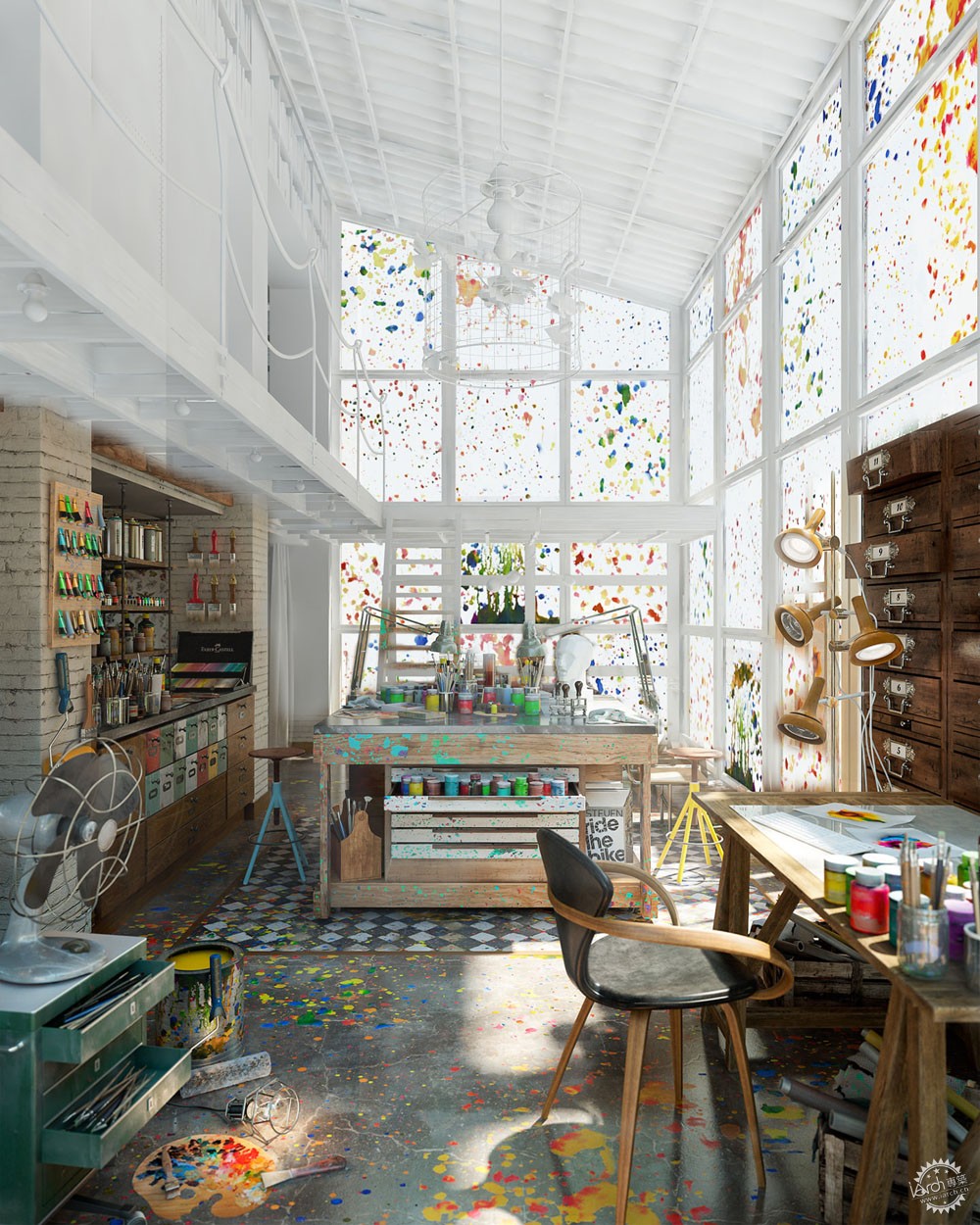
三月份Diego Querol在论坛上分享了他漂亮的工艺美术室的图片。那以后他有分享了两组个人比较出彩的作品——工作室上部空间和纹身沙龙,作品后来也获得了3d awards奖项。今天,他将带领我们感受他最新作品,他将从最初的概念构思到后期制作进行详细的讲解。
Diego Querol shared his beautiful Arts&Crafts images back in March on the forums. Since then he shared two more sets related to this great personal project, the upper area of the studio and a Tattoo Salon, as well as winning the 3d awards with the image behind. Today he takes us for a ride into his great looking mess of things, breaking it down to bits from initial concept to final post-production. Enjoy!
Introduction/简介
首先,我要感谢Ronen Bekerman给我这个机会,让我能在论坛里与大家分享我制作工艺美术室的新帖子。该项目最近也获得2015年3dawards图片奖(非委托类别)。
我花费近3个月的业余时间完成了该项目,我觉得有时将项目搁置一段时间,在开始时会有更多的新想法。
完成之前,这简直像一个噩梦,虽然噩梦真的发生了,但最终还是在颜色和材料的组织上取得了平衡。
First of all I would like to thank Ronen Bekerman for giving me the opportunity to share with you a new article about the making-of my Arts&Crafts project which was posted on the forums and recently won the 2015 3dawards in Image – non commissioned category.
It took me about three months to complete this project, working on my free time and I have experienced that sometimes is nice to have time to stop a project for a while and then start it over with new ideas.
For many days this was looking like a complete nightmare, and probably for some people that is still happening, but in the end there is a nice harmony between composition colours and materials.
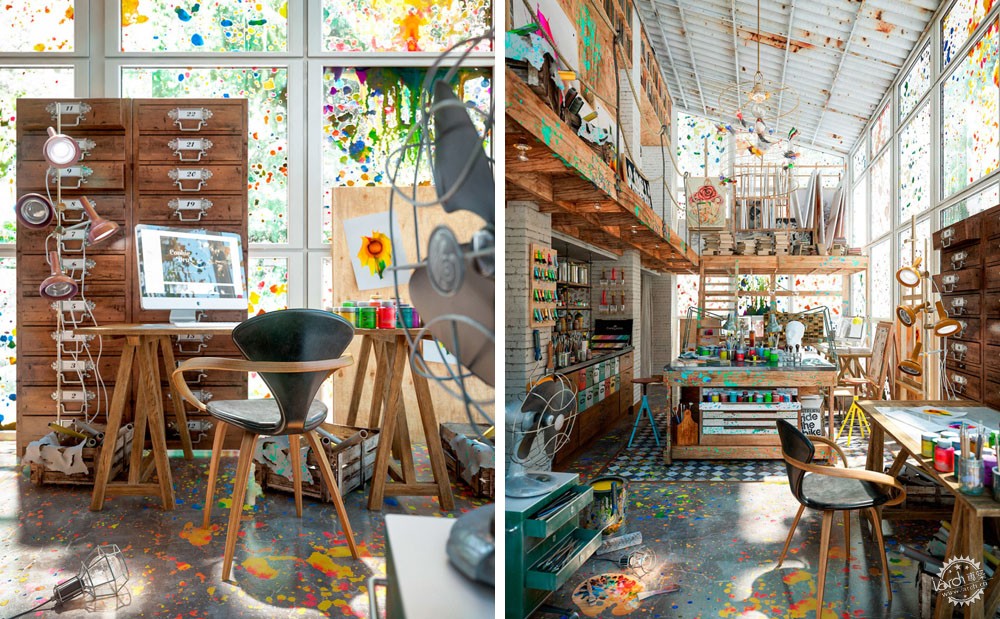

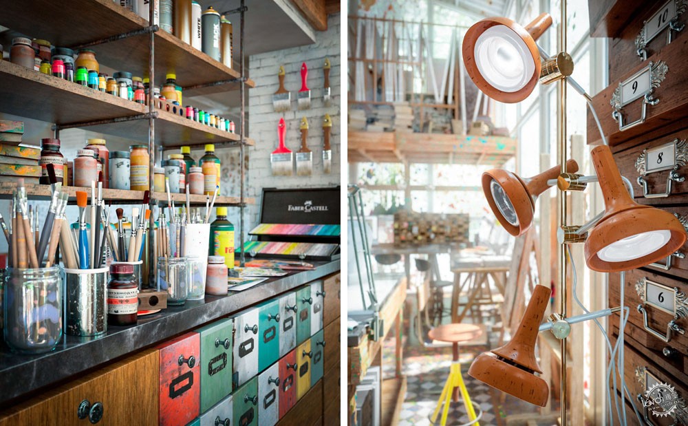
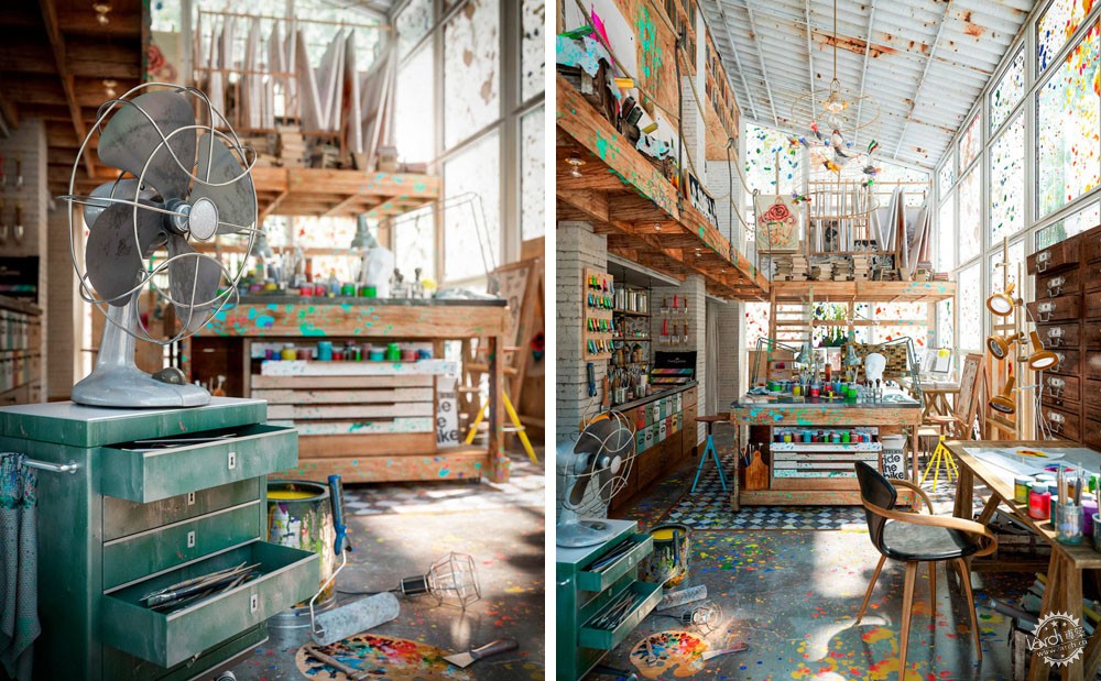
这是我设计的三个不同场景的第一部分,它是受一个美术工作室的启发。这些发生在楼上,另一层还有个纹身沙龙。
下面让我们开始以下的场景。
This is the first part of three different scenes I have designed and it is inspired by an art studio space.
There is something going on upstairs and a Tattoo salon on the other side.
Let’s start the behind the scenes.
The Initial Idea/最初的构思
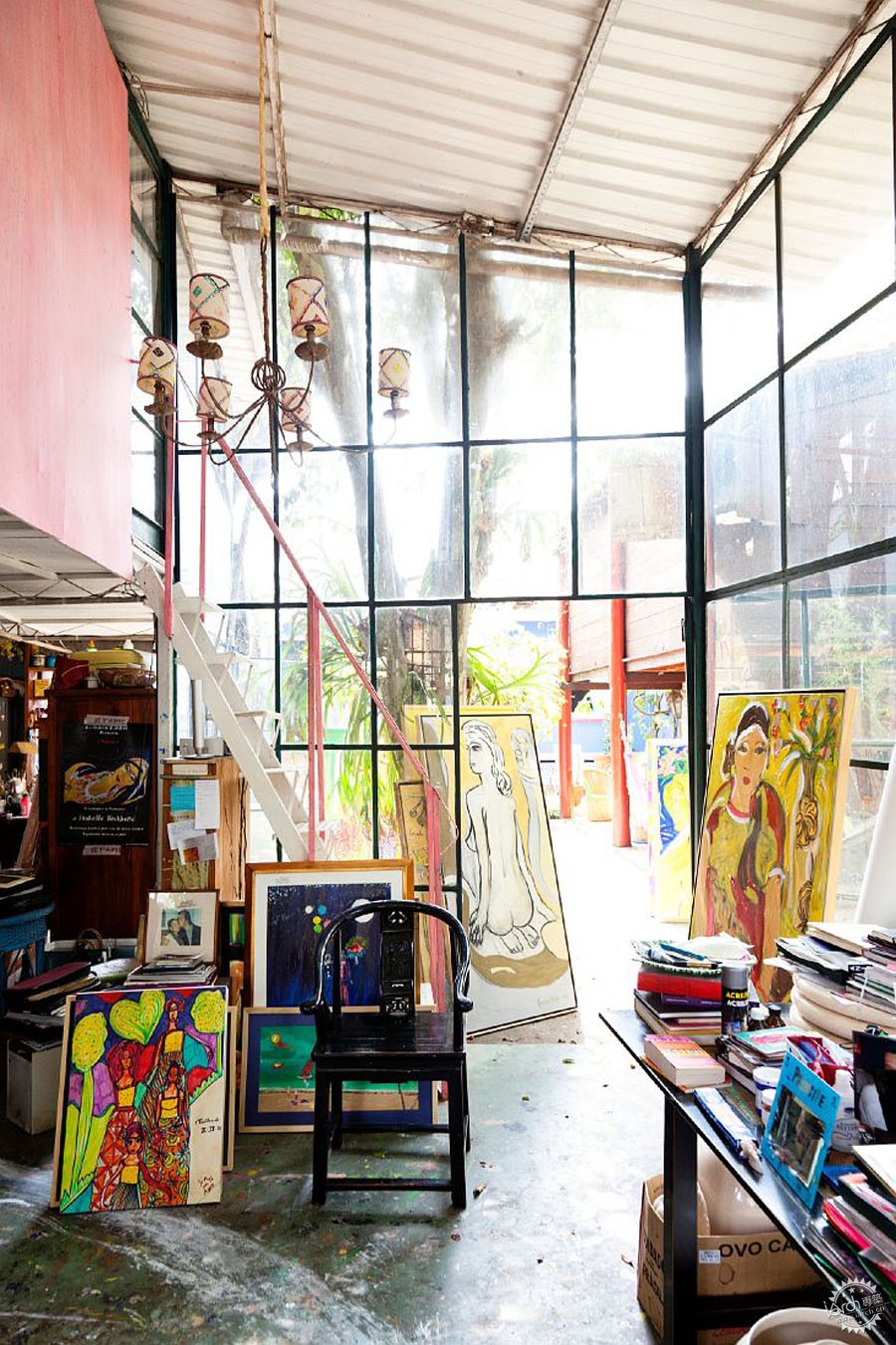
如果我们看下我之前在pinterest找到一些灵感图片,我们就可以看出所有巧妙的构图和元素之间的联系。
If we have a look at some of the inspiration imagery I found on pinterest, we can already see nice compositions and small stories between all the elements.
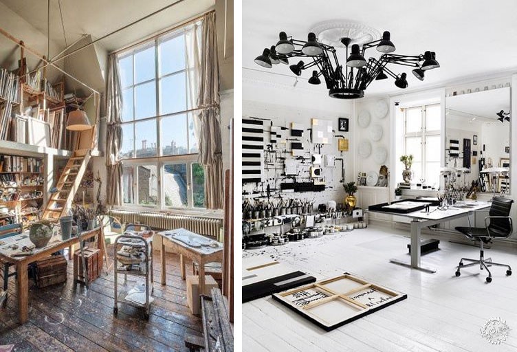
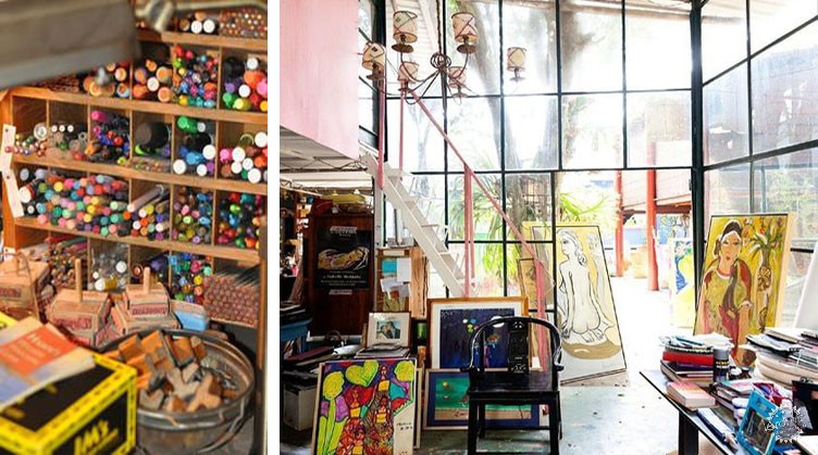
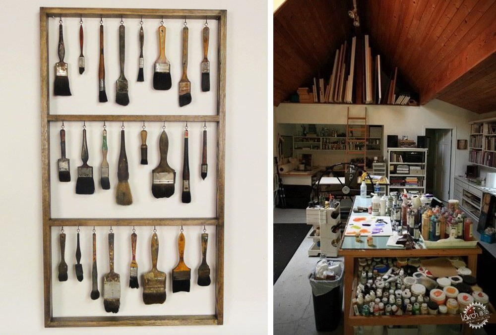
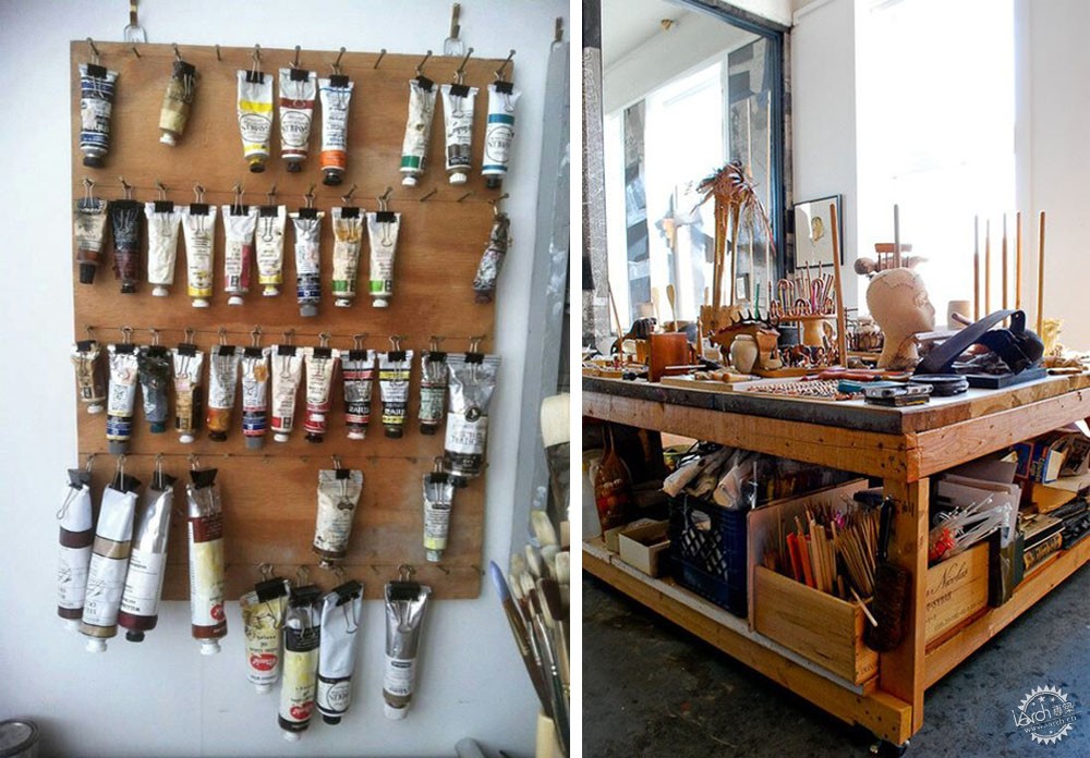
一切既是混乱的也是有序组织的。
这是该项目的巨大挑战。怎样在恰当的混乱与完全的噩梦之间把握平衡?
如果你看过我之前的作品,你可以看出我总是喜欢使用一些具有冲击力的色彩来强调空间,这一次我想沿用我的想法。
我参考了印度胡里色彩节的图片和一些画家利用喷洒主要原色创作的作品。
Everything looks messy but at the same time it is organized.
This was the big challenge of this project. How to get the right balance between a nice mess and a complete nightmare?
If you have a look to some of my old work, you can see I always like to use powerful colors to accent the spaces and I wanted to keep the same idea for this area.
I referred to imagery of the holi color festival and some artist that work splashing of nice primary colors.
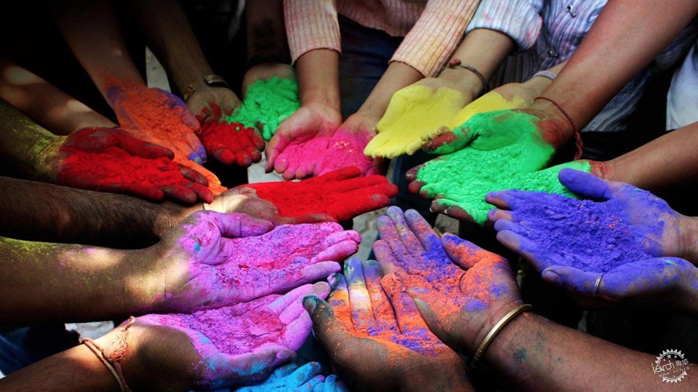
为何不呢?让我将这些颜色遍及我的空间吧。
后来我便将我的想法在3d软件中建成了。
Why not? Let’s have these colors all around the space.
With all this inspiration I started to develop the idea in 3d.
Modelling and Composition/建模和组合
我希望有大量的阳光从窗户射进,所以我设立了5米高的大框架来达到这一想法。
I wanted to have light coming through windows, and lots of it, so I started by setting up big frames – 5 meters high.
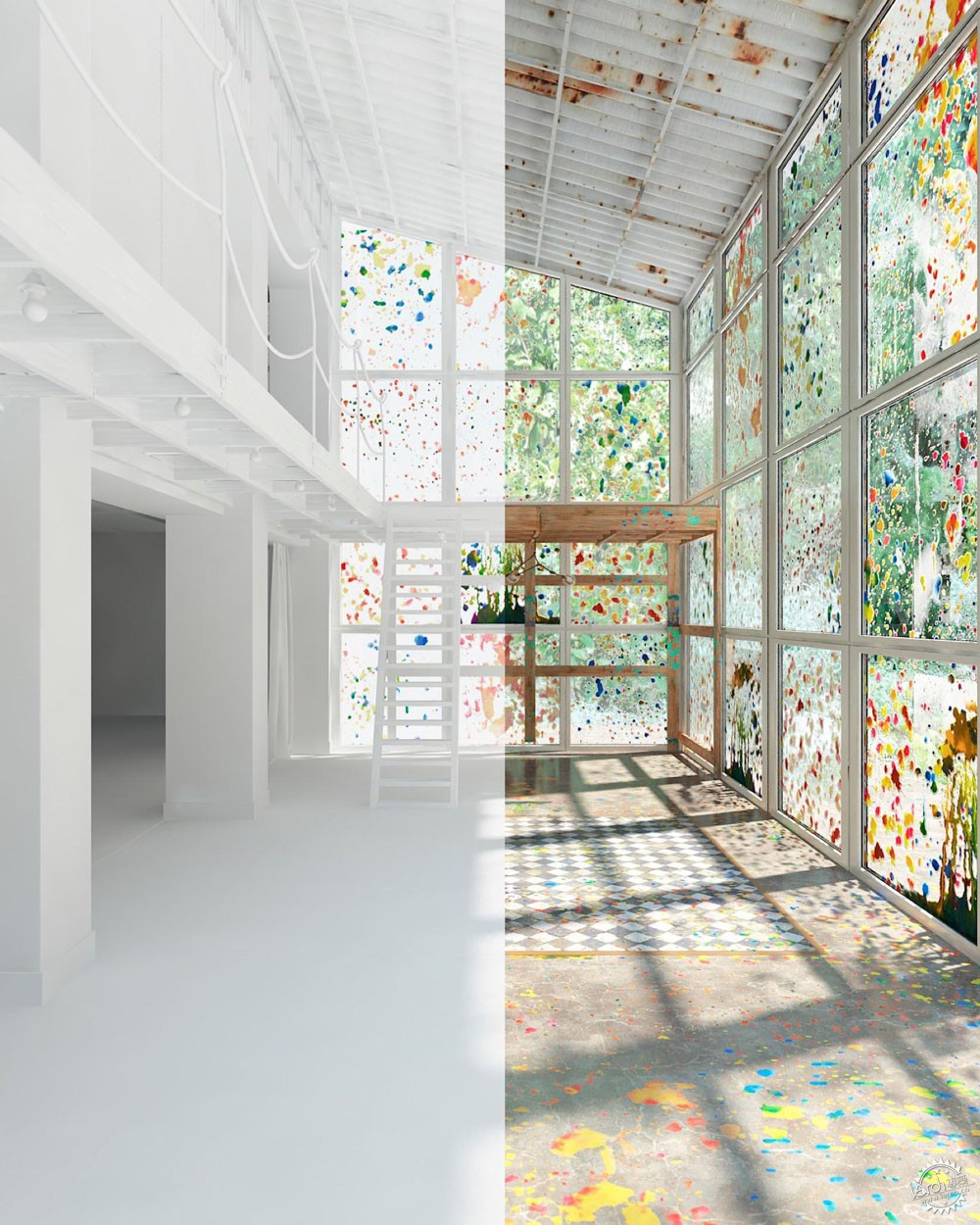
场景内还需容纳很多东西,我将它们分成几个层置入,这样更简单。每个图层都与组织方式和色彩形式有密切关联。所以将它们分开,独立完成十分必要。为了保证有序的工作流程,我们需要确保第一个图层完全完成了,在开始下一个图层。
A lot of things were going in the scene, so I broke it down to layers to make this easier. Each of these layers is telling a small story in terms of composition and colors and it is important to go through each of them separately and complete one by one before you go to the next layer of elements in order to keep an organized workflow
Layer 1 – Foreground/图层一——前景
我总是喜欢在前景的左边和右边放一些物品,接着我就可以设置背景了。你也许会有完全相反的做法。
I always like to have something in the foreground left and right and then I can start setting the background. This can be done on the opposite way depending on your inspiration.
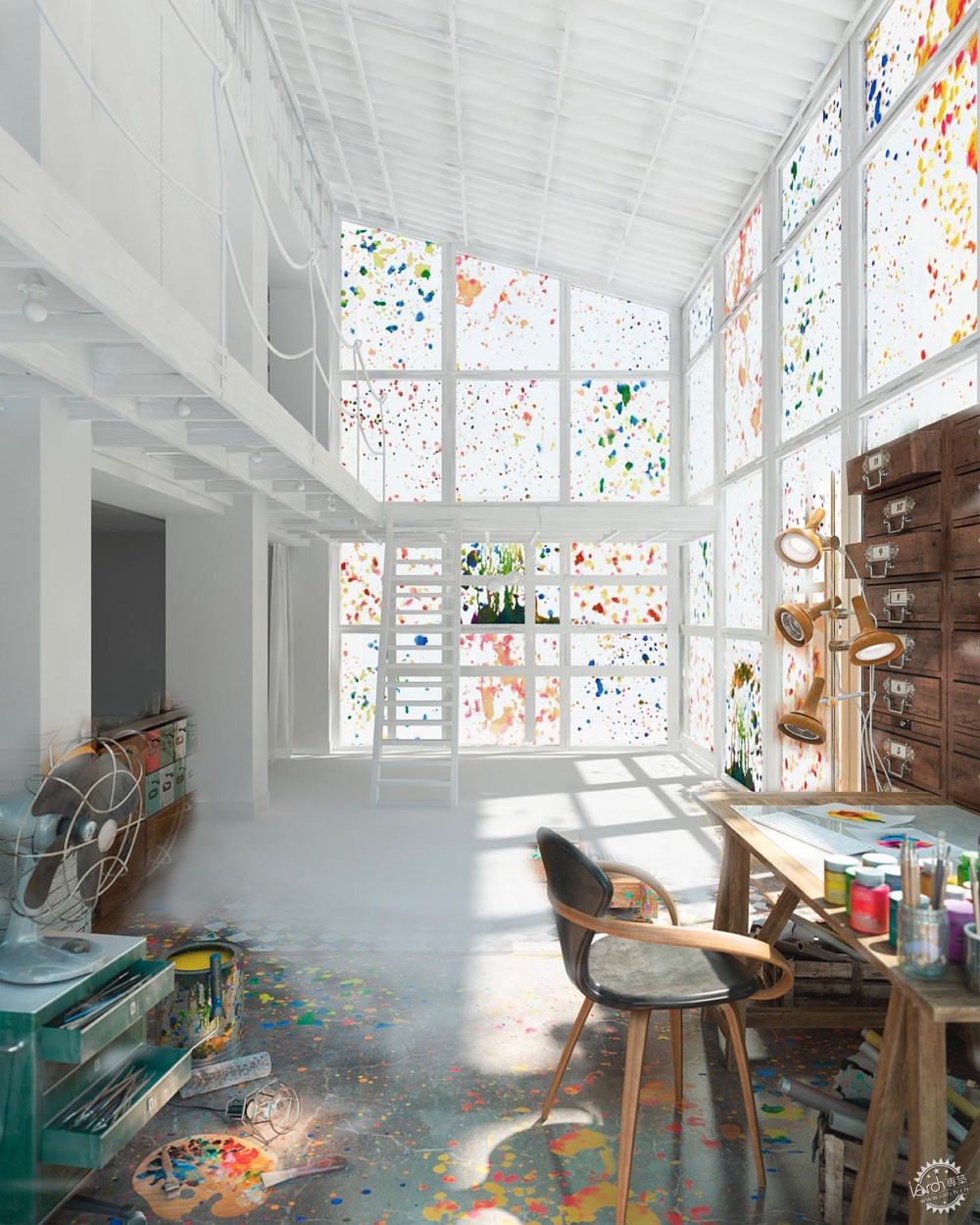
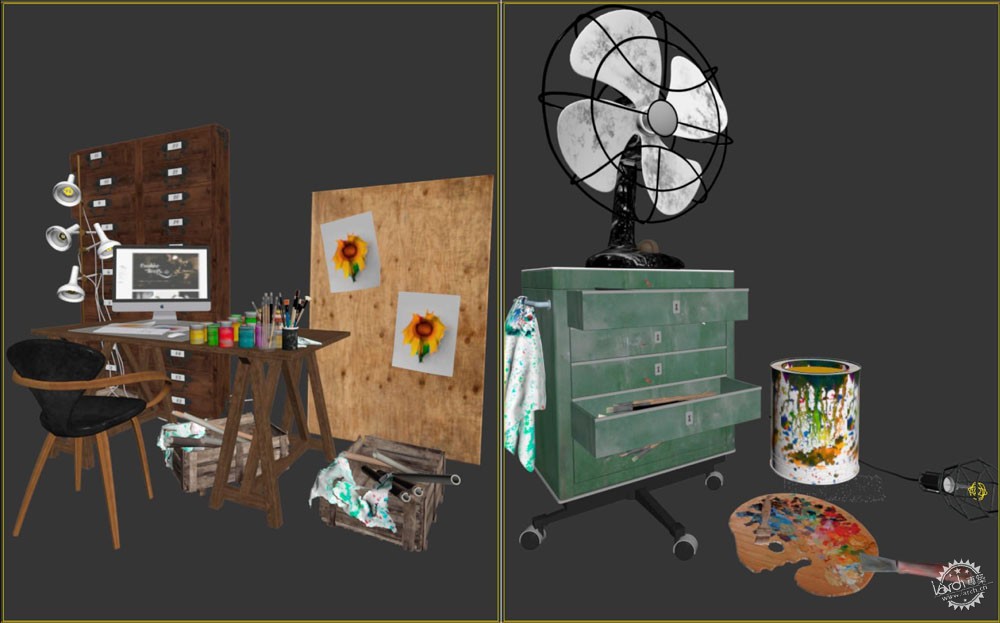
正如你看到的我将这两组物品放在了前景中。这些模型大多是从3dsky.org网站下载的,然后我进行了编辑。其余的比如落地灯是我自己做的模型。
As you see I did these two compositions for the foreground. Some of the models had been downloaded from 3dsky.org and then customized by me. Some others like the floor standing lamp were model by myself.
这是一个我从elrecibidor.com网站下载的古董灯。
This is a vintage lamp I took from elrecibidor.com
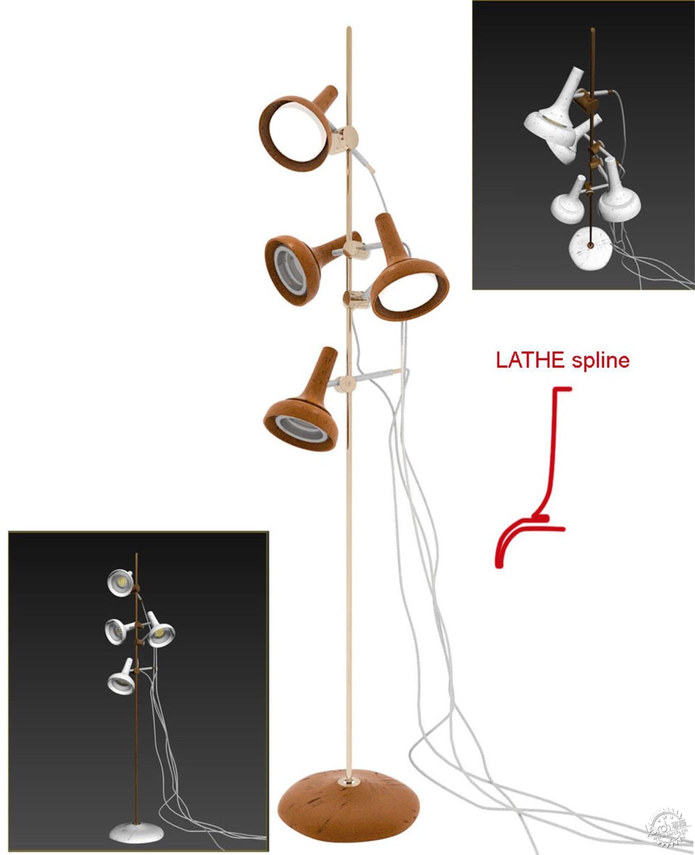
这个网站有许多英国古董单品,我建议大家可以看看作为参考。
这些模型非常简单。你可以使用旋转编辑器制作灯座,利用曲线工具模拟悬挂着的电线。接下来,创建一些列结构圆柱杆件,你必须确保你将所有的面都覆盖。在真实生活中任何事物都不可能完美无缺。这是我们在制作物品保持真实性的一条重要法则。
There are some interesting English vintage single pieces there I suggest you to have a look at the website for reference.
The modeling is pretty simple. You can use a Lathe Modifier for the base of the Lamp and splines for simulating the hanging cables. Then, a mixture of cylinders for the structure and be sure you chamfer all the edges. There is nothing in the real world with perfect edges. This is a very important point at the time of making objects look realistic.
Layer 2 – Working Table and Drawer/图层二——工作台和抽屉柜
第二个图层是工作台和附属抽屉柜。
The second layer is the working table and the accessory drawer.
工作台是参考之前的灵感图片创建的。抽屉是由一个金属把手和老的油漆木料组合而成的。
然后,我将这些架子上摆上不同的颜料和绘画工具。这些就是我在第二层组合图层中添加的一些色彩元素。
The working table was modeled based on the reference I have on the inspiration imagery. The drawer shelf was built from scratch combining a metal structure with old painted timber.
Then, I filled up the shelves with all kinds of paint and painting tools. These are the elements I used to give some color on this second composition layer.
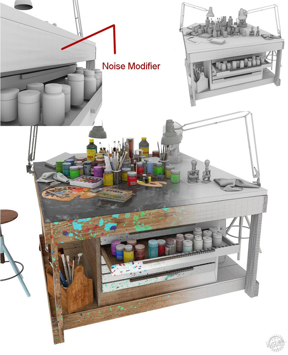
再创建木板有一条小建议:在表面附上纹理并在顶点加一些噪点,这样表面更随机看起来像真实的老木头。
正如我之前提到的,在3D中每件物品看起来都过分完美干净,这一直困扰着我。我花了很多时间研究如何使物品元素看起来使用过或是老旧了。当然,纹理首当其冲,有助于保证事物的真实性。
One simple tip for modeling the wood slates was to tessellate the faces and then add a small noise on the vertex so we can get a nice random surface that gives some realistic look of old wood.
As I mentioned, one of the things that bother me working in 3D is that everything looks too perfect and clean. I spend a lot of time working on making elements look used and old. Of course, the texturing process is very important at this point and helps a lot to get the realistic look and feel.
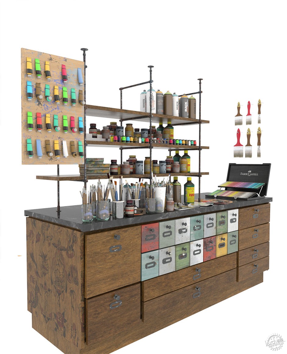
抽屉的组合几乎是一摸一样的。你需要耐心地设置所有的元素,接着只需保持颜色的和谐就可以了。
Drawer composition is pretty much the same. You need the patience to set up all the elements and then just try to keep the harmony between colors.
Layer 3 – Background Working Tables/图层三——背景工作台
接下来的图层是背景个人工作台,这里我使用了不同的组合方式。两台苹果电脑及工业凳子。此外,放置了辉柏嘉铅笔的木质抽屉的色彩与之前的参考图片一样。
Next layer is the background individual working table in which I have used a different composition. Industrial stools with two iMac 27’’ and in this case, the element adding color is the wood drawer with some Faber Castell pencils on it following up the inspiration reference images.
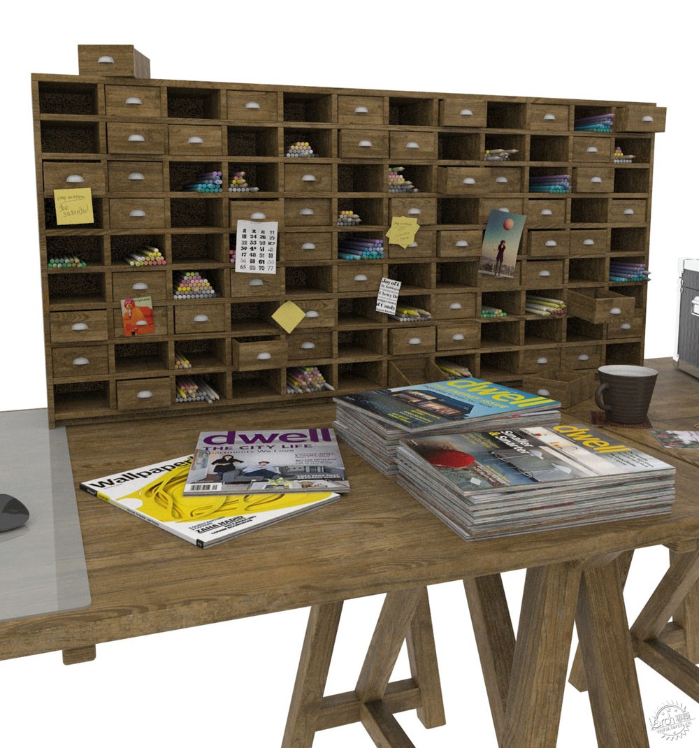
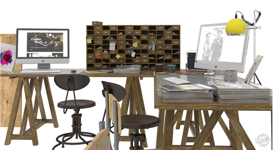
这是我开始覆盖纹理之前的最后一个组合。二楼摆满了画框,其中还有些是我弟弟David Querol画的插画。还有些我觉得很符合这个主题的老书架我也置入了。
一旦我开始建模和组合,我就非常喜欢解释添加纹理的工作,所以接下来我会展示我在该项目中用到的重要的材质和纹理。
This is the last composition before we go into the texturing process.
The second floor filled up with painting frames and some illustration done by my brother David Querol. Also some old books collections I thing worked very well for the concept.
Once we have modeling and composition. I would like to explain the texturing process so I will proceed show some of the most significant materials and textures I have used for this project.
纹理/Texturing
添加纹理是一项非常有趣的过程,而且对最后的效果图影响深远。所以花一些时间来创建你自己的纹理会使你最后的效果图品质大大提高。
这是一样极具艺术性和个性的部分,很有可能最后的效果与你最初的想法完全相反,但是你需要不断测试,调整颜色和纹理。我始终认为只有你努力去发现找寻,灵感自然会来到。
我制作的第一个纹理是空间散步的颜料。
This part of the process is very interesting and also very important for the final look. Spending some time creating your own customized textures makes the difference on the final quality.
It is most artistic and personal part where an initial idea can bring your mind to something completely different in the end but you need the time to test and play with colors and textures. I think inspiration only comes when you are working hard to find it.
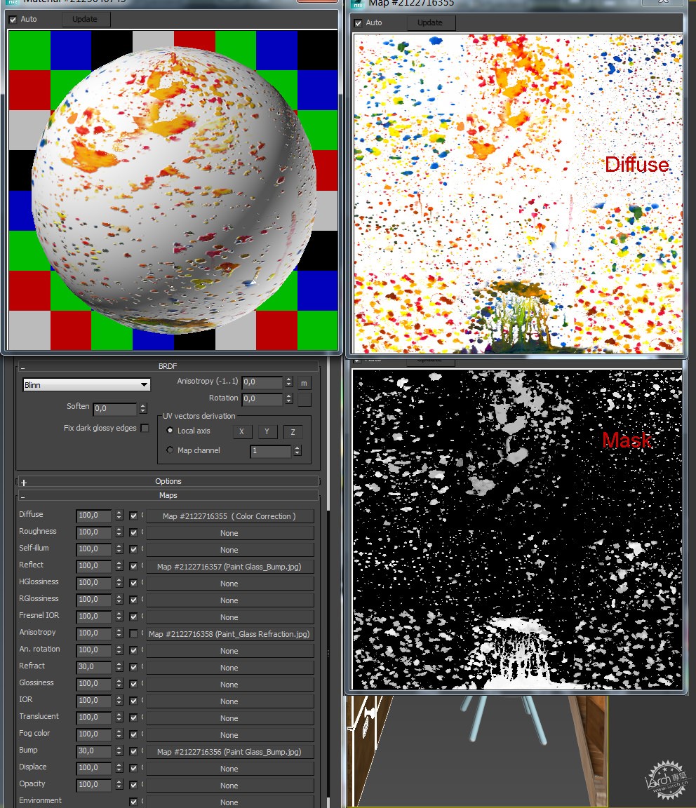
The first texture I have made was the Paint which is all over the place.
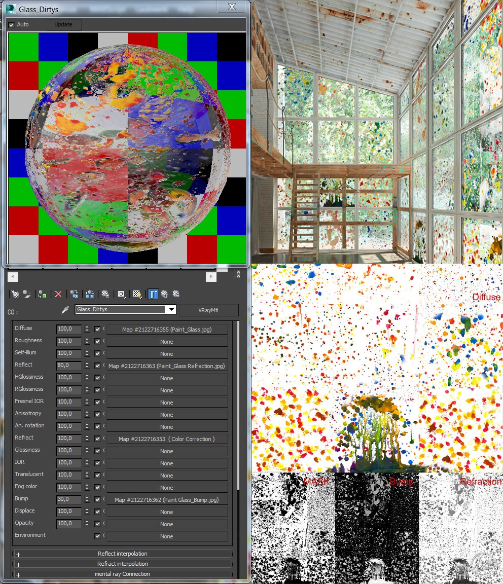
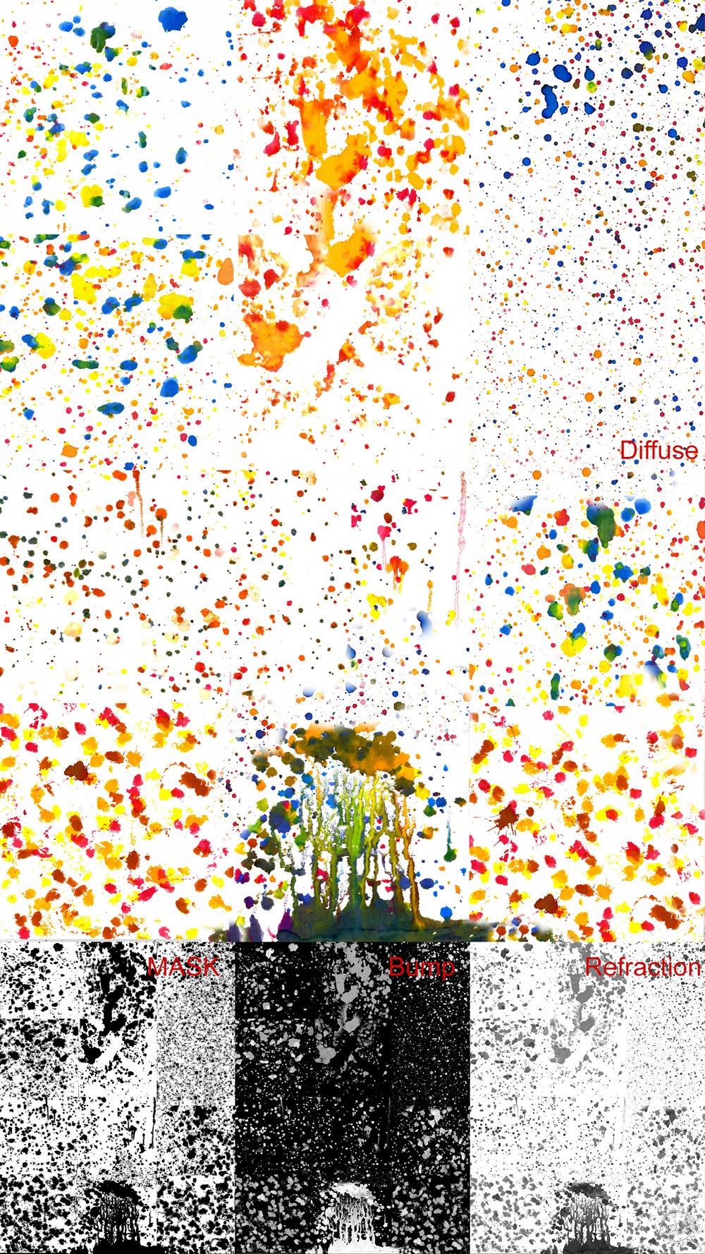
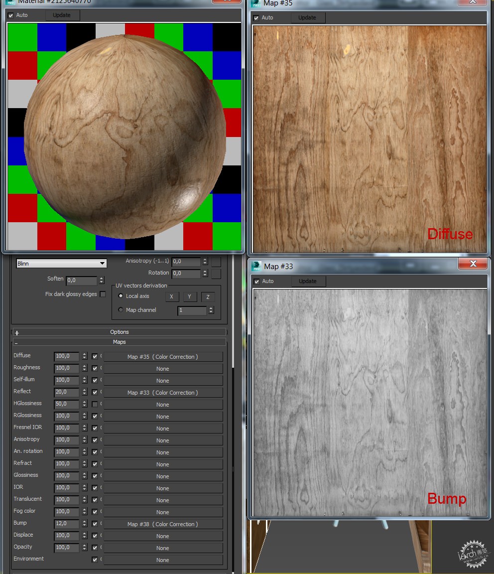
为了协调玻璃的透明度与折射光泽度,我使用了颜色更正折射贴图。创建完洒满颜料的玻璃材质后,我萌发了将所有的地板和木材都喷上颜料的想法。所以我从CGTextures.com网站找到一个胶合板高清样本,并创建为纹理贴图。
I have ColorCorrect’ed the Refraction Map in order to get the proper balance between transparency and refraction glossiness on the Glass.
According to this painted glass material I have developed the idea to splash the paint on the floor and also in the wood. So I have created a plywood texture modified from one of the HD samples on CGTextures.com.
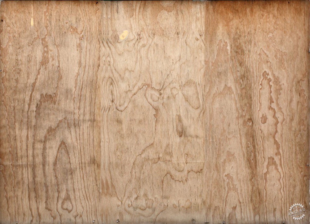
接着我将该纹理与在玻璃上创建的颜料材质进行叠加。此外,我还将木材上的颜料进行了模糊处理。
Then I have blended it with the paint splash material I have created on the glass. But in this case I use the mask to overlay the paint on the wood.
Wood Configuration/木材配置
Paint Configuration/颜料配置

混凝土地板我使用了之前的纹理,这是很久前我的另一个个人项目——创意咖啡屋中创建的。这是一个非常大且高品质的纹理。
For the concrete floor I have used a texture I did a long time ago for another personal project called Creative Coffee. This is a huge concrete texture with a very nice quality.
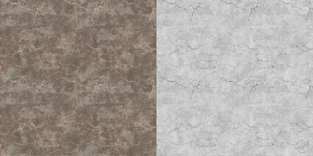
我在PS中混合了许多纹理,通过不断调节透明度和滤色/柔光模式才得到了外观看起来恰到好处的破旧和污渍的纹理。
正如你们看到的,这个纹理不能完全平铺,但我也不需要这样,因为原始图片有10K且UVW贴图足够大可以解决这个问题。我使用木材的相同方法,将颜料材质与混凝土叠加。
For this texture I have blended different textures in PS playing with opacities and screen/soft light modes to get a nice old and dirty aspect.
As you see, the texture is not perfectly tiled but I do not really need it to be because the original map was 10K and the UVW Mapping is big enough to avoid this problem. In order to blend it with the paint material I have used the same method as in the wood material.
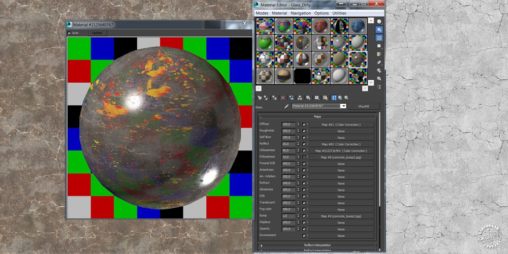
Lighting and Camera Settings/灯光和相机设置
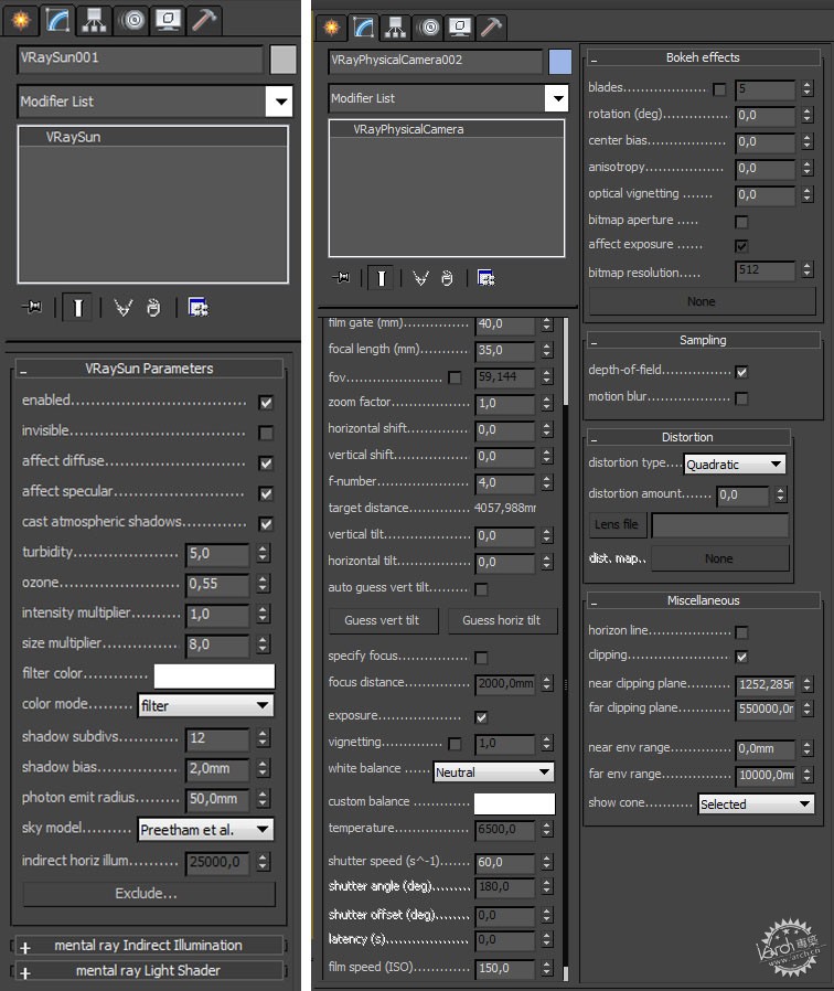
由于玻璃及木材上泼满颜料给我以奇妙的感受,我觉得灯光应该简单,最好就是简单的V-Ray太阳光配合V-Ray天空,建筑投射下阴影,混凝土地板上能够反射一些白光就如我之前在参考图片中看到的亮斑。
Lighting the scene was simple because effects on the floor glass and wood paint splashes provide me a dramatic feeling so I thought best thing would be a simple V-Ray Sun with V-Ray Sky casting some shadows and generating nice white reflections on the concrete trying to reproduce the kind of lighting I have seen on the reference images.

下面你可以看到V-Ray太阳光和相机参数设置。
You can see below the setting for the V-Ray Sun and Camera Parameters.
Post Production/后期制作
我觉的这部分与个人因素密切相关。每个人对于对比度和色温度都有不同的感受。这也是我每天在不断学习的方面。当你希望照片更加真实时,渲染的白色平衡和对比度起到重要作用。
当然,你原始模型渲染的花费的精力时间不同,你后期制作的时间也不尽相同。在这个项目中,原始渲染图看起来还不错,我调整了对比度,色阶并增加了深度和环境,进行再次渲染。
我开始初步渲染。
I think this is a very personal part and everyone has a different eye for contrast and color temperatures. That is something that I try to improve every day. White Balance on the renderings and also the contrast is something I find very important when you are looking photorealism.
Of course some images need some more post production than others depending on how much time you have to work on the raw rendering. In this case, the raw rendering came pretty good and I adjusted contrast, temperature and added some depth and environment to the rendering.
I start with the Raw Rendering
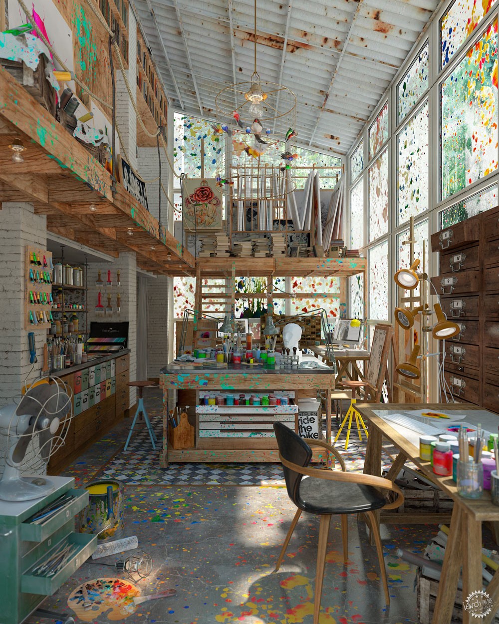
接着我调整对比度和色阶,曲线和色彩平衡度。
Then I adjust contrast and Temperature with levels, curves and color balance.
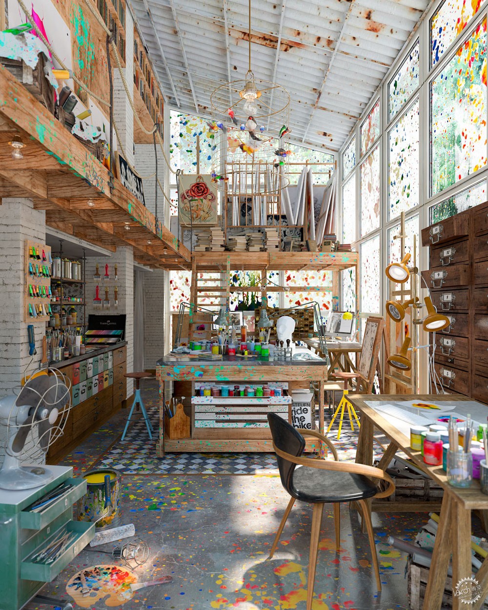
正如你们看到的我目前所有的基础颜色的感觉还不错,接着我要调整渲染通道来促进最后的效果图。在滤色/柔光模式里使用VRay反射通道,并增加高光/对比度。
As you see I have already a nice temperature with saturated primary colors then I start to play with rendering passes to improve the final look.
VRayReflection Pass, using it in Screen/Softlight mode to add Highlights/Contrast.
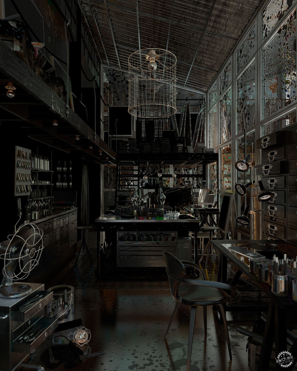
Vray镜面高光通道,在滤色模式中加入高光。
VraySpecular Pass, in screen mode to add Sun highlights.
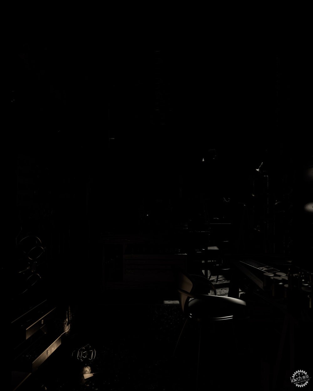
VrayExtraTexAO,为了进行多次折射,我在接触点加了一点阴影。
VrayExtraTexAO, by multiplying this we add small shadows in the contact points.

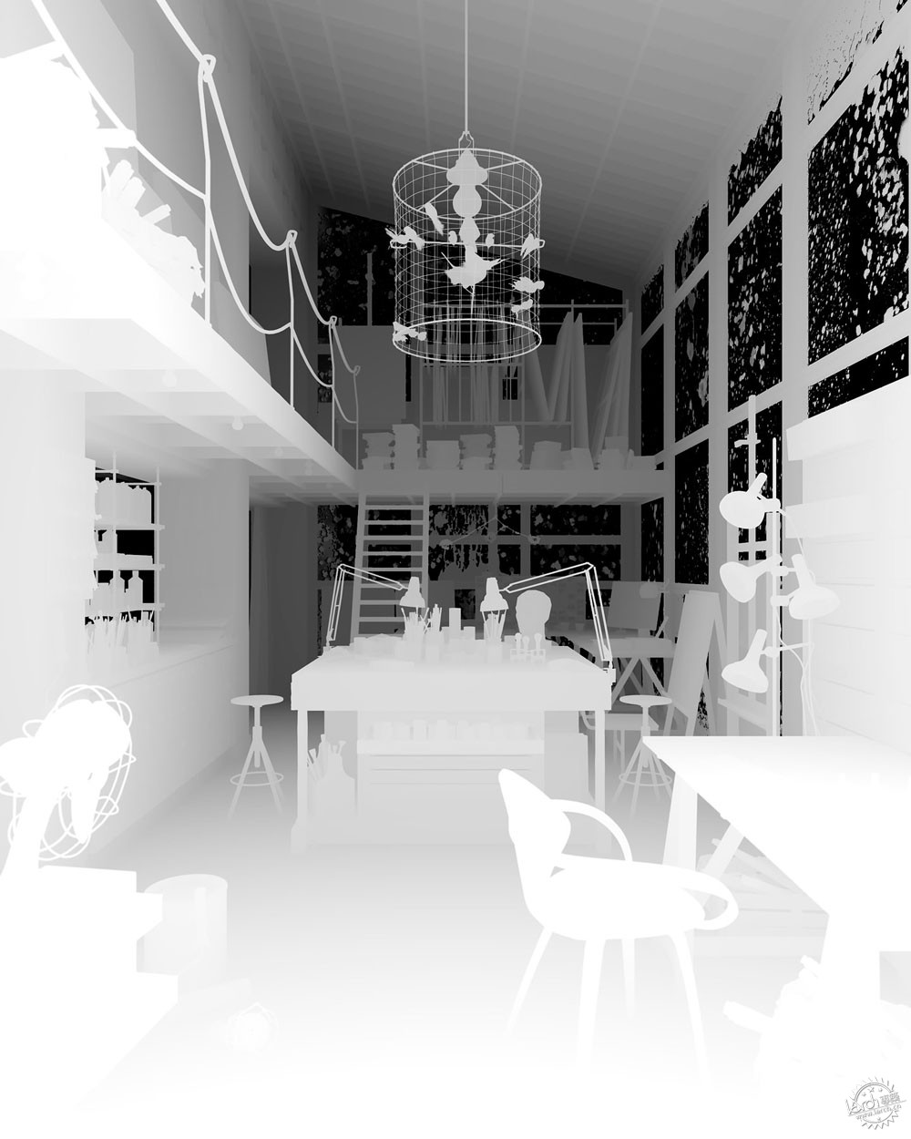
Vray景深通道,图底颠倒并在滤色模式中我们可以通过景深通道选中图片中需要加入环境的部分。该项目中的景深滤镜是由V-Ray相机渲染生成的,但是这个贴图非常有用,可以用来模糊其他通道混合的不真实感。
VrayZDepth Pass, Inverting this map and setting it in screen mode we can generate some environment fog to add Depth to the image. Depth of field in this case was rendered with the V-Ray Camera but this map is very useful also to use it as a mask to blend with other render passes.
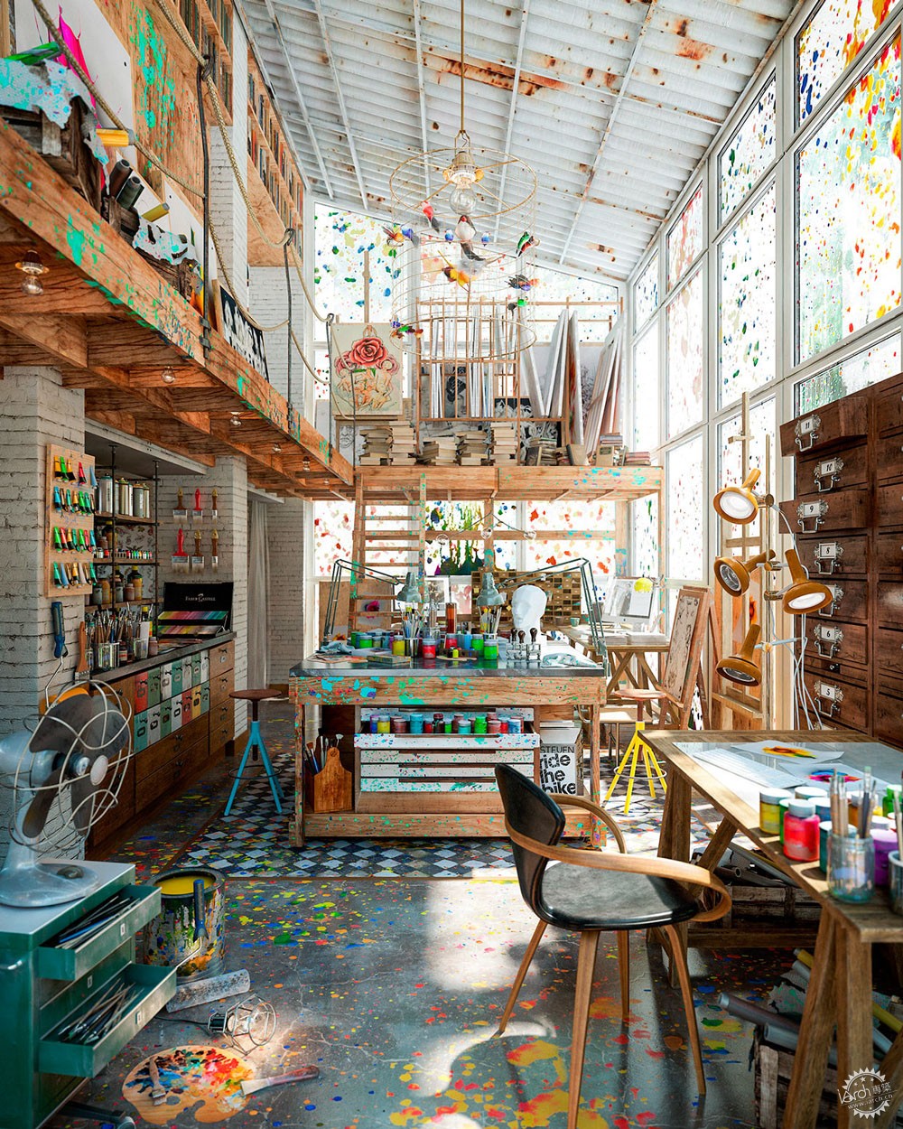
一旦我对组合满意后,我再次应用下最后的参数,色调/饱和度,色彩校正和一些有影响的装饰图案。最终,下面是我期望的结果。
Once I was happy with the composition and apply again final levels, tone/saturation, color correction and some vignette effect. And this is the final result I like.
当然,后期工作也有许多工作流程,我希望你们能体会其中的乐趣。正如你们看到的,我简化每个工作流程。我努力在原始渲染时就能有不错的呈现,这样就避免在PS中毁图。
最后,我想感谢Ronen Bekerman邀请我写这些幕后工作,也希望你们感到有趣。你们可以在Ronen Bekerman论坛看到我的最新作品,也可以登陆diego3dq.com网站。
期待在论坛见你们。
Of course there are many workflows for post production and I hope you find this one interesting. As you see I keep everything very simple and I work hard to have a nice raw rendering to avoid destroying the image in PS.
Well, I want to thank Ronen Bekerman for the invite to write this behind the scenes and I hope you guys found it interesting. Find some of my latest work in Ronen Bekerman Forum and also visit diego3dq.com
See you in the forum

Diego Querol是西班牙先锋工作diego3dq的一名3D艺术家,主要从事室内设计和建筑设计相关的3D建模工具和灯光模拟。
Diego Querol is a 3D artist based in Spain heading studio diego3dq, for Interior Design and Architecture through 3D modeling tools and lighting simulation.
出处:本文译自www.ronenbekerman.com/,转载请注明出处。
|
|
【专筑网版权与免责声明】:本网站注明“来源:专筑网”的所有内容版权属专筑网所有,如需转载,请注明出处
专于设计,筑就未来
无论您身在何方;无论您作品规模大小;无论您是否已在设计等相关领域小有名气;无论您是否已成功求学、步入职业设计师队伍;只要你有想法、有创意、有能力,专筑网都愿为您提供一个展示自己的舞台
投稿邮箱:submit@iarch.cn 如何向专筑投稿?
扫描二维码即可订阅『专筑』
微信号:iarch-cn

