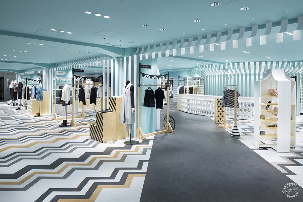
Nendo designed women’s fashion floor of Seibu Shibuya department store with zigzag patterns
由专筑网Yumi,杨帆编译
Nendo为东京西武涩谷商业大厦的女士时装层设计了锯齿形图案的地板,以此打破室内的休闲感。该女士时装层位于东京西武涩谷商业大厦主楼,名为“key to style”。该商店与Nendo在2013年设计的、位于副楼三层的“Compolux”以一个步道连接,当时“Compolux”为了吸引年轻顾客有着更强的休闲感。Nendo用色彩、家具、地板、涂漆塑造出材料的真实感,这有助于营造场所的新感觉。
Nendo has designed the women’s fashion floor of Tokyo Seibu Shibuya department store with zigzag patterns in order to break the casual feeling inside. Titled as 'key to style', the women’s fashion floor is located within the main building of the Seibu Shibuya department store in Tokyo. The department store is connected by a walk-way with the “Compolux” floor on the third floor of the annex building that Nendo designed in 2013, and has a more casual feel by targeting the young customer. Nendo creates a new combination of materiality in the interior reshaped by colours, furnitures, floorings, paintings and new way of presentations, which attributes to the new sense of place.
Nendo的最初草图/Nendo's initial sketch
Nendo协调了折线图案的色彩以创造一种反差。既表现了新的、可视化的、动态而生动的背景,也维持了与“Compolux”区域的联系。Nendo将“移动游乐园”作为这次设计的主题,其灵感来源于欧洲一个惬意的公园。
Nendo harmonizes colours with zigzag patterns to create a contrast, which presents a new visual, dynamic and vivid setting while maintaining the connection with the “Compolux” area. Inspired by a cozy European park, the design studio creates an “mobile amusement park” that is held at parks as the design theme.
“室内的色彩主要从单色的色表中选出。为了增加一些趣味性,天花板被漆成蓝色,部分室内使用了木材,从而增加了项目的材料感。”Nendo说,“销售区域的设计灵感来源于一个马戏团帐篷,而品牌的收集被安排给人以市场摊位的印象。附加层的设施灵感来源于货车。”
“The chosen colours are scaled on a monotone colour scheme, while to add some accent the ceiling was coloured blue and wood was used in some parts, which helps to enhance the colour and the sense of texture of the products.” says Nendo. “The design of the sales area is inspired by a circus tent, and the collection of the brands are arranged to give the impression of market stalls. The fixtures of the accessory floor were inspired by wagons.” Nendo adds.
“Compolux”的地板方案使用了以人字式铺陈的灰色塑料地板砖。通过这个方案,Nendo在主楼与副楼的连接通道里,用渐变效应营造了同一种颜色缓慢改变的效果。
The flooring scheme of the “Compolux” uses grey plastic floor tiles that are laid out in a herringbone style. Regarding this scheme, Nendo made the same colour change gently using the gradation effect along the passage that connects the annex building and the main building.
设计工作室加入了条纹图案砖,以增加“Key to Style”区域的塑料地面的色彩反差。销售区域围绕着环形的自动扶梯,环状排列的自动扶梯提高了人行的流动性。该区域增加了对角相连的十字形通道,也创造出了线性的视野。该项目不仅是简单的一个空间设计,也将西武涩谷商店作为一个整体来考虑,从而拓展了Compolux的概念。
For the “key to style” area, the design studio enhanced the contrast of the colours of the plastic floor tiles incorporating striped patterns. The sales area surrounds the escalator, around which a circular line is formed for people to walk through. Cross shaped passages that run diagonally were added to this area in order to improve the flow of people and create a line of sight. The project became one of, not simply designing a space, but to think of the Seibu Shibuya department store as a whole and to expand the concept of Compolux.
项目信息
设计师: Nendo
项目名称:Key to style
地点:日本,东京
现状:2016年1月份完成
合作者:mmk
摄影:Takumi Ota,Akihiro Yoshida
Project Facts
Designer: Nendo
Project Name: Key to style
Location: Tokyo, Japan
Status: Completed January 2016
Collaborator: mmk
all interior images © Takumi Ota
all fixtures images © Akihiro Yoshida
出处:本文译自worldarchitecture.org/,转载请注明出处。
|
|
专于设计,筑就未来
无论您身在何方;无论您作品规模大小;无论您是否已在设计等相关领域小有名气;无论您是否已成功求学、步入职业设计师队伍;只要你有想法、有创意、有能力,专筑网都愿为您提供一个展示自己的舞台
投稿邮箱:submit@iarch.cn 如何向专筑投稿?
