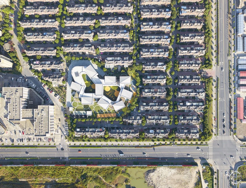
▲别墅区环绕的∞幼儿园/∞kindergarten surrounded by villa area ©Office Mass
上海金蔷薇幼儿园/曼景建筑
Shanghai Golden Rose Kindergarten/Office Mass
幼儿园建筑是住宅开发过程中必要的配套设施。在住宅货值最大化原则的驱动下,大部分幼儿园无法脱离被住宅挤压和被规范限制的双重困境,最终以妥协和消极的空间状态呈现。在上海一个典型别墅区环绕的不规则用地内,曼景建筑试图通过设计的策略突破周边环境和建筑规范的双重限制,为孩子们营造一个城市中的理想空间。幼儿园俯瞰形似“∞”,被称为∞幼儿园。
Kindergarten is a necessary supporting facility in the process of housing development. Driven by the principle of maximizing the value of housing, most of the kindergartens can’t be separated from the double predicament of being squeezed by housing and restricted by the building norms; they’re finally presented in the compromising and negative spatial state. In an irregular land encircled by a typical villa area in Shanghai, Office Mass tries to break through the dual restriction of surrounding environment and norms through design strategies to create an ideal space in the city for children. The kindergarten looks like “∞” from aerial view, so it’s called ∞ kindergarten.
盆景——异质介入
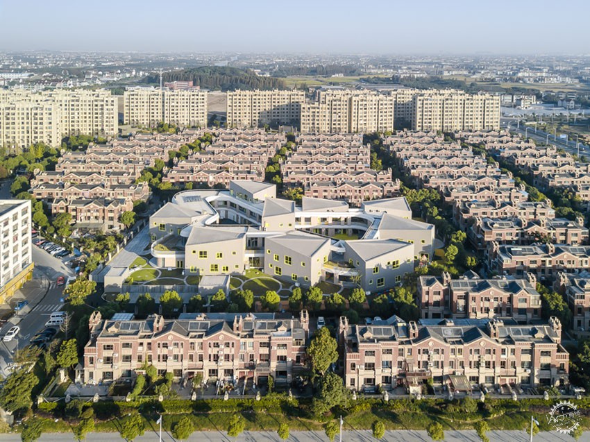
▲都市盆景/urban bonsai ©苏圣亮
在设计的最初阶段,建筑师面临的问题是如何用积极的态度去回应这块消极的场地——不规则地形带来的用地效率的降低、与别墅区过分接近带来的独立性的缺失。在无法对外部条件进行干预的前提下,最积极的态度也许就是再造一个理想之地,如同一个盆景,它分明是微观和局部的,但是它包含了我们对这个世界的期许和想象。放弃过多的与周边环境呼应、而以一种异质化的状态介入,以不规则的场地为“盆”,在不规则的场地上造“景”。
Bonsai—heterogeneous intervention
At the initial stage of design, the architect faced the problem of how to respond to this passive site with a positive attitude——the decrease in land use efficiency caused by irregular terrain and the lack of independence brought by being too close to villa area. In the absence of interference with external conditions, the most positive attitude may be to recreate an ideal place, like a bonsai, which is clearly microscopic and partial, but it contains our expectation and imagination for the world. To give up too much echoing with the surrounding environment and intervene in a heterogeneous state, take the irregular site as the “pot” to create “landscape” on the irregular site.
积木——聚散为整
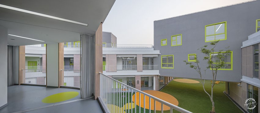
▲房子、廊子和院子/house,corridor and courtyard ©苏圣亮
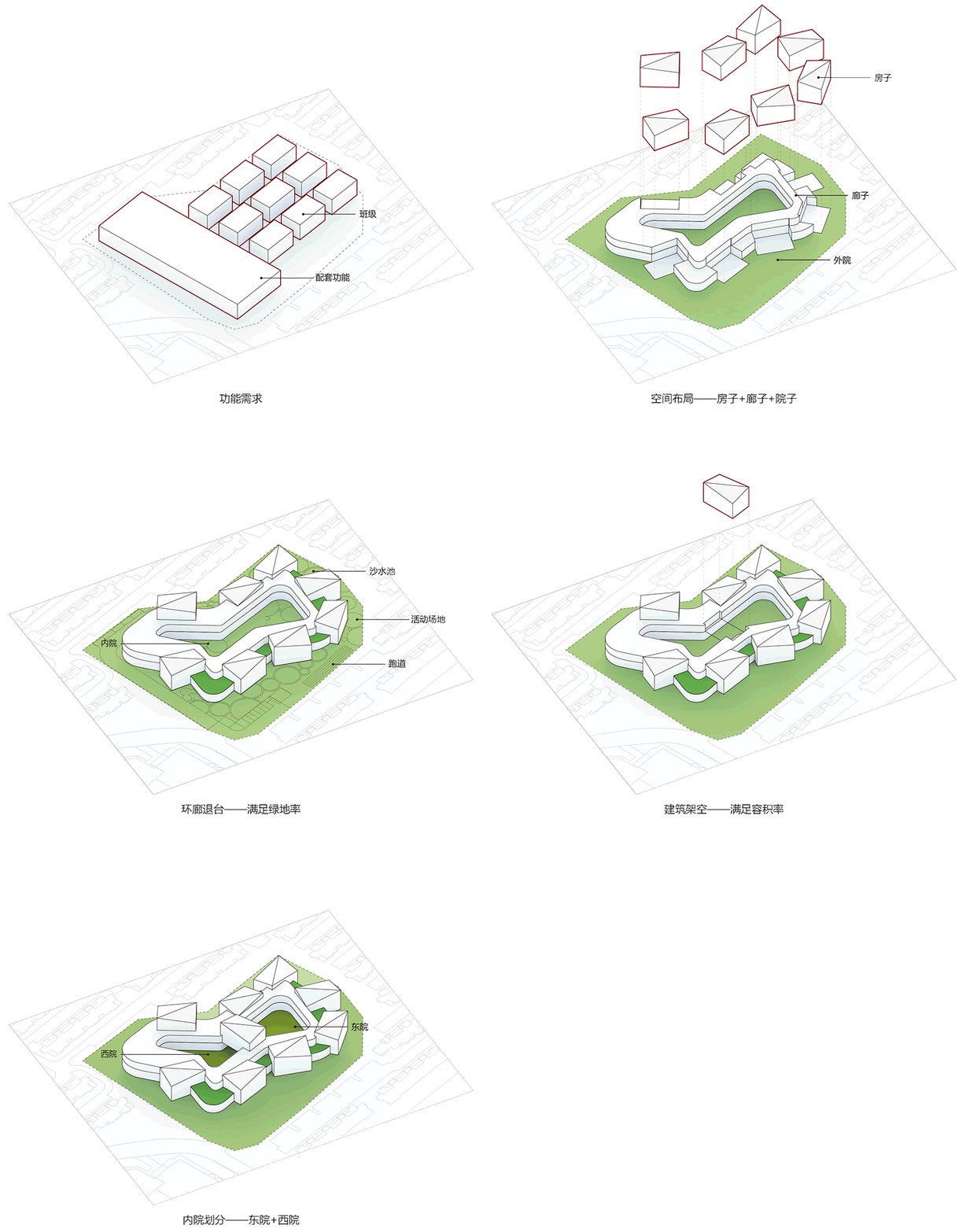
作为城市尺度的盆景,它是应该是一个理想化的空间存在,最重要的是要包含“日常”之外的“非常”。与普通集中式幼儿园不同,建筑师将这个接近6000平米的建筑分解成了房子、廊子和院子。这些空间组件犹如积木,以一种松散的秩序搭接起来一个“∞”。
Building blocks——gather the scattered into a whole
As a bonsai of urban scale, it should be an idealized space, and the most important thing is to include “unusual” beyond “daily”. Unlike ordinary centralized kindergartens, architect decomposed the building which is nearly 6000 square meters into houses, corridors and courtyards. These spatial components, just like building blocks, form one “∞” through stacking in a loose order.
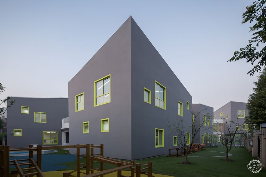
▲矩形房子单元/rectangular unit ©苏圣亮
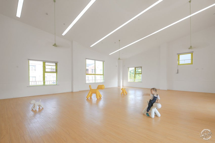
▲矩形班级单元内部/interior of rectangular classroom ©苏圣亮
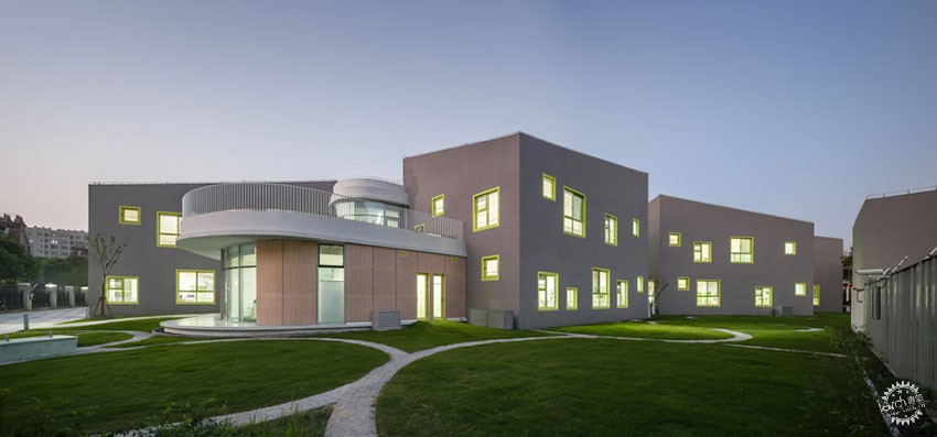
▲房子的聚落/cluster of houses ©苏圣亮
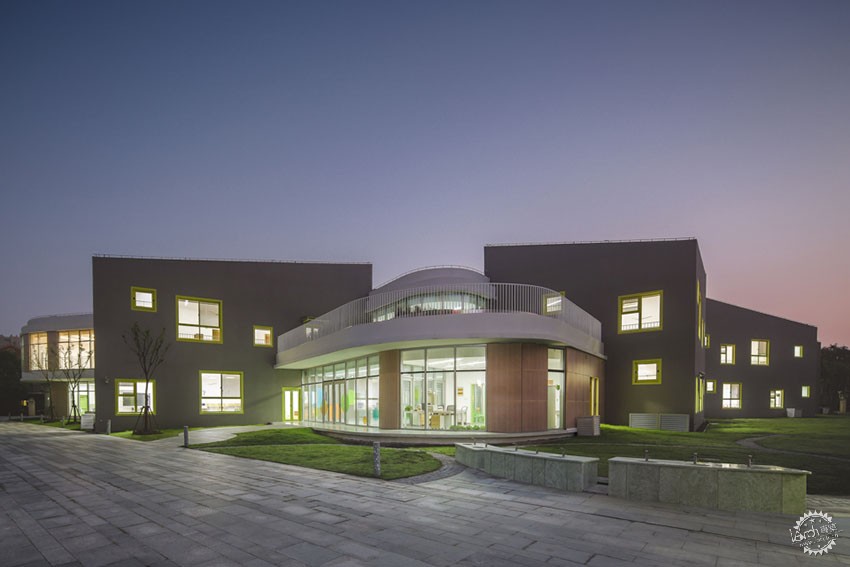
聚落式布局的矩形单元——房子,容纳了儿童的分班教室。房子的单元采用的对角坡屋顶的形式将一、二层的两个班级统一成一个体量,这种坡屋顶的形态也可以用一种更为轻松的方式与周边的别墅区的屋顶形式取得形式上的呼应。体量上错落的方形窗洞,共有三个尺寸,包含了与儿童的身体尺度匹配的两个尺寸的低窗,用于空气对流和卫生间通风采光的小高窗。窗框采用柠檬绿色的彩色铝合金,配合窗洞周边墙体上的同色涂料,在灰色的基底上画满了跳跃的景框。
Houses——rectangular units with cluster layout, are classrooms. The house unit with diagonal sloping roof unifies the two classes at the first and second floor into one mass, this kind of sloping roof can also echo with the surrounding villa roof in a more relaxed manner. The staggered square window openings, designed in three sizes, contain two low windows that match the children’s size, and small high window used for air convection and bathroom ventilation and lighting. The window frame is made of lemon green coloured aluminum alloy, matching with the same color coating on the wall around these window openings, jumping scene frame is painted on the gray background.
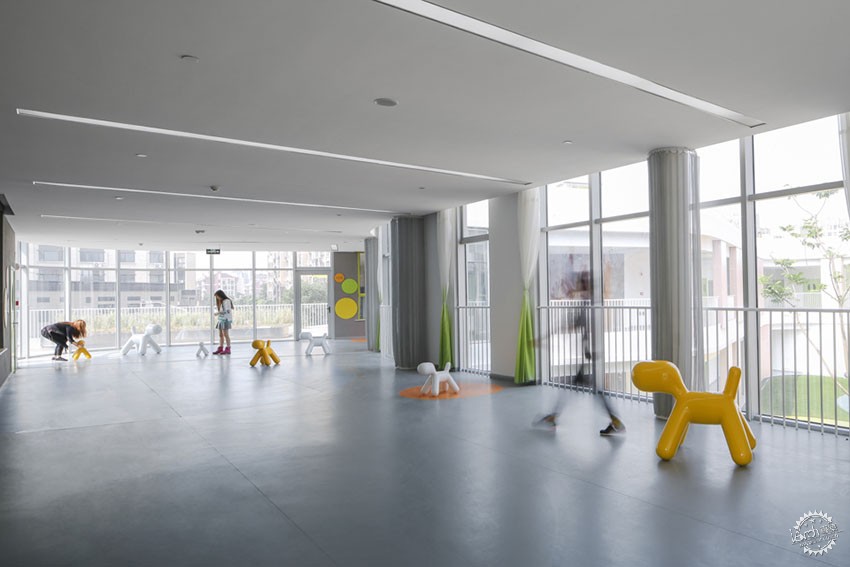
▲连廊/corridor ©苏圣亮
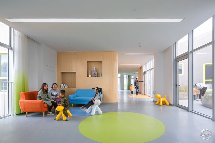
▲等候区/waiting area ©苏圣亮
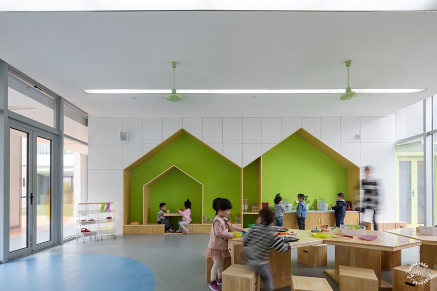
▲生活教室/living room ©苏圣亮
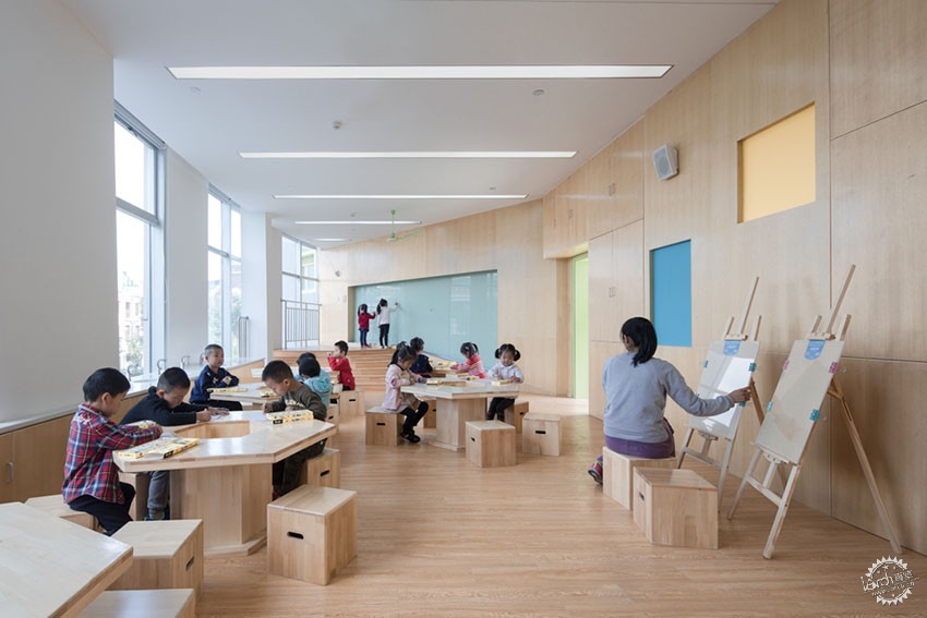
▲绘画教室/painting room ©苏圣亮
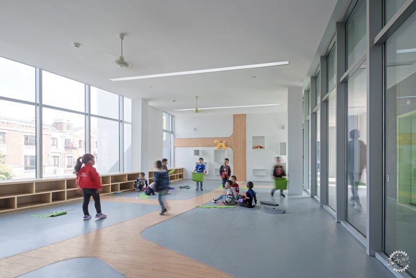
▲建构教室/lego room ©苏圣亮
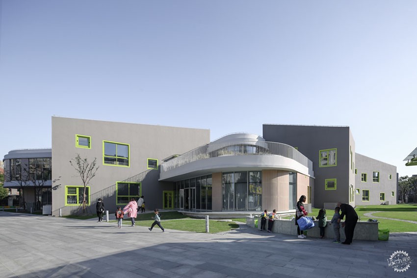
▲清晨入园时的幼儿园入口/entrance space when children going to school ©苏圣亮
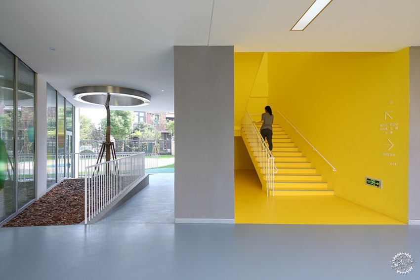
▲ 黄梯/yellow staircase ©苏圣亮
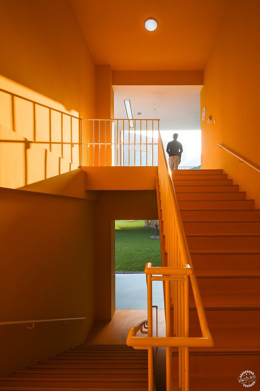
▲橙梯/orange staircase ©苏圣亮
廊子将分散的房子串联起来,容纳了幼儿园除班级之外的服务空间:供儿童使用的晨检室、保健室,音乐、美术、建构、生活和科学教室,以及供教师使用的办办公室、配套用房;环廊也容纳了联系各个分散班级的交通体系,建筑师刻意将环廊加宽,并与室外空间融为一体,让它成为除交通之外的让儿童可以停留、相遇、玩耍的空间。
The corridor connects the scattered houses in series and accommodates kindergarten’s service space except the classes: the morning check room, the health care room, music, arts, LEGO, life and science classrooms, as well as the offices and the serving rooms; the circular corridor also accommodates the transportation system linking to the scattered classes. The architect deliberately widened the circular corridor and integrated it with the outdoor space to make it a space for children to stay, meet and play.
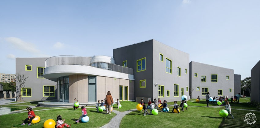
▲ 布满环形路径活动场地/playground full of circle paths©苏圣亮

▲西内院/West courtyard ©苏圣亮
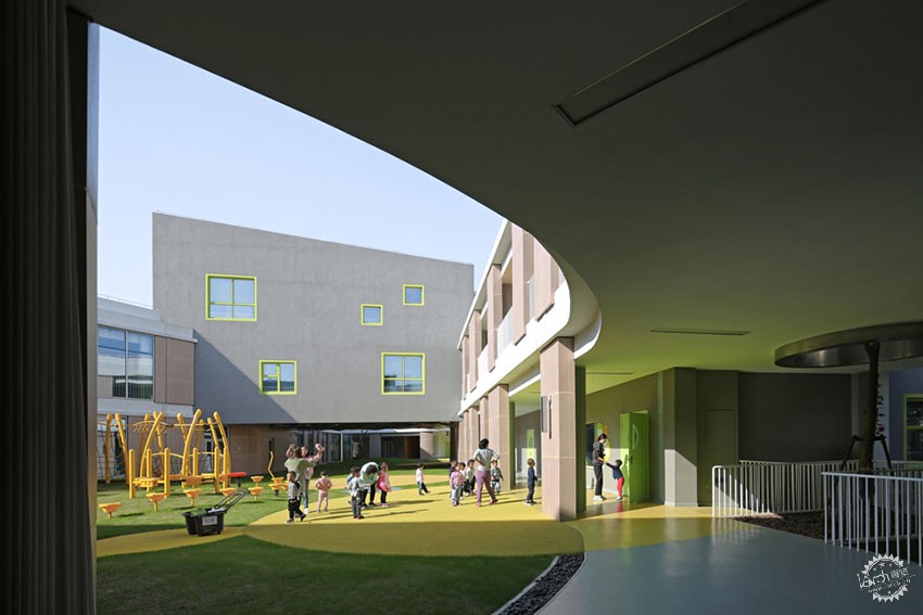
▲东内院/east courtyard ©苏圣亮
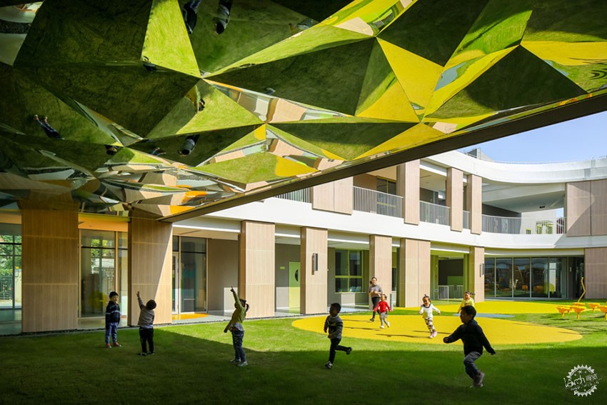
▲连接两个内院的通道/channel connecting two courtyards ©苏圣亮
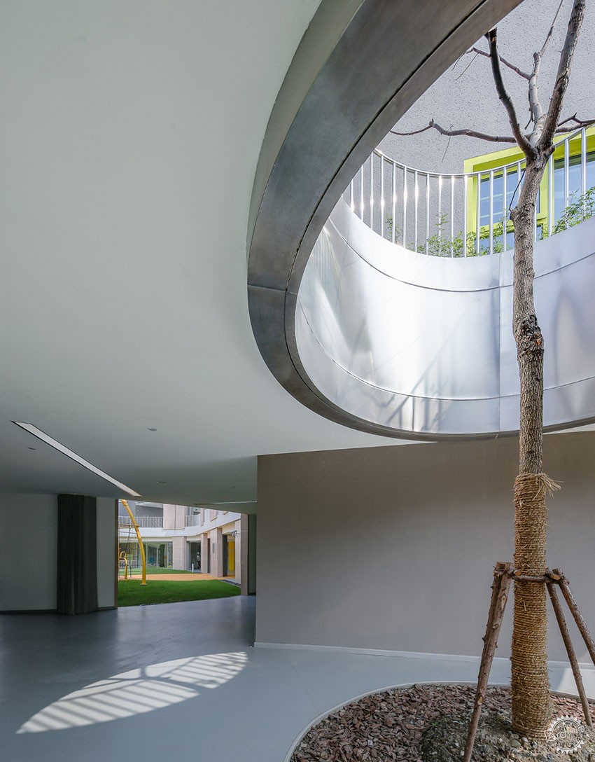
环廊和房子把场地分割成四种风格迥异的院子——开放的外院、曲折的东西内院、屋顶花园以及大树下的树院,可供孩子们运动、玩耍、种植、攀爬。
The circular corridor and houses split the site into four different styles of courtyards——open outer courtyard, tortuous east and west inner courtyards, roof garden and tree yard under big trees, where children are free to do exercises, play, plant and climb.
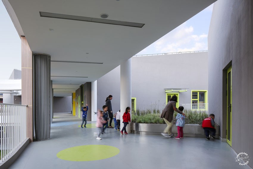
▲空中植物辨识园/plant identification garden on rooftop ©苏圣亮
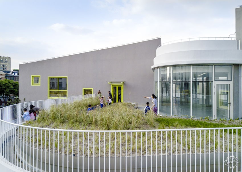
▲入口上方的植物辨识园 ©曼景建筑/plant identification garden above the entrance©Office Mass
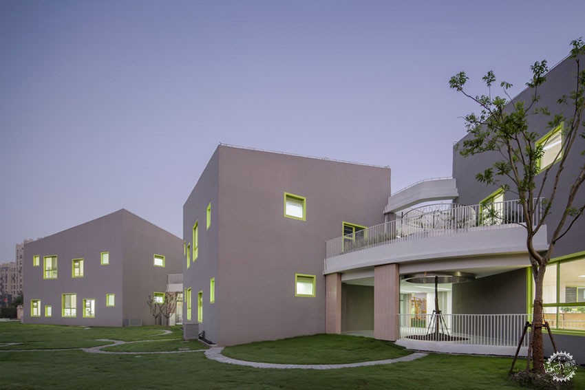
▲房子之间的树院/tree courtyard among the houses ©苏圣亮
▲树院/tree courtyard ©苏圣亮
▲儿童离园后的入口空间/entrance space after school ©苏圣亮
幼儿园是孩子在家庭之外接触最多的空间,孩子们需要的不只是一所房子和一块活动场地,而是从家到外面世界的过渡,是可以盛放他们童心、童趣的空间容器。九个房子、二层廊子、四种院子,在这个不规则场地中,通过散落、镶嵌、围合的方式创造了各种模糊的可能性,等待孩子们用自己的想法去定义。
Kindergarten is the most space for children to stay except their own home. What children need is not just a house and playground, but a transition from home to the outside world and a space container for their childishness and fun. Nine houses, two layers of corridors, and four types of courtyards; in this irregular site, a variety of vague possibilities are created in a scattered, embedded and enclosed way, waiting for children to define them with their own ideas.
方法——设险求稳
▲空间生成/space formation
▲超级玩具/super toy
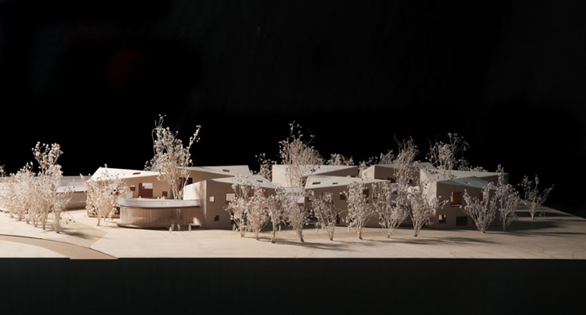

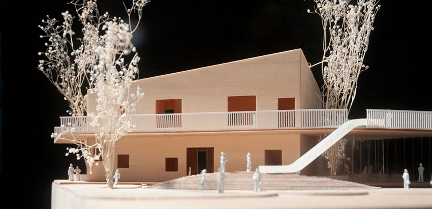
▲模型/model
幼儿园的不规则地形、建筑师意将其作为一个1:1的积木的初衷和将建筑从三层降低到主体二层局部三层以减少建筑对人的压迫感的想法,导致用常规的空间布局方式都将是个不可能完成的任务:建筑平面增大,绿地率和活动场地面积难以达到要求;建筑周边场地形状不规则,不利于分班活动场地的划分。建筑师给出的答案是用一个漂浮的班级单元留出底层架空的活动场地;二层环廊形成退台,作为空中花园,增加绿地面积;在余量很小的场地中用圆形母题,铺满场地,形成分班活动场地、器械活动场地、沙水池、跑道等。相切的园环的边界自然形成了入园的环形洗手池、圆环景观路径、和活动场地的边界。简单、统一的形式处理,带来了功能之间最少差异,和可以互相转换的可能性。形式的统一性弱化了形式在设计中的地位,从而保证它跟不规则的地形之间会有更兼容性的衔接。
Method——stability from risk
The irregular site of the kindergarten, the architect’s original intention of making it into a 1:1 building block and the idea of reducing the building from three floors to two floors for main structure and three floors for part of it so as to reduce the sense of pressure all cause that it will be a mission impossible through conventional spatial layout: the increase of building plan makes it hard to meet the requirements on greening area and activity space area; the irregular shape of the surrounding site is not conducive to the division of activity space by classes. The answer given by the architect is to use a floating classroom unit to make space for outdoor activity; the second-floor circular corridor forms stepped terrace as the hanging garden to increase the green area; a circular motif is used in the site with small margin to pave and form the activity space by classes, apparatus activity space, sand pool and runway, etc. The boundary of tangent ring naturally forms the circular washing basin into the garden, circular landscape path and the boundary of activity space. Simple and unified form operation brings about the least difference between functions and the possibility of mutual transformation. The unity of form weakens the position of form in design, so as to ensure that it has more compatible linkup with irregular terrain.
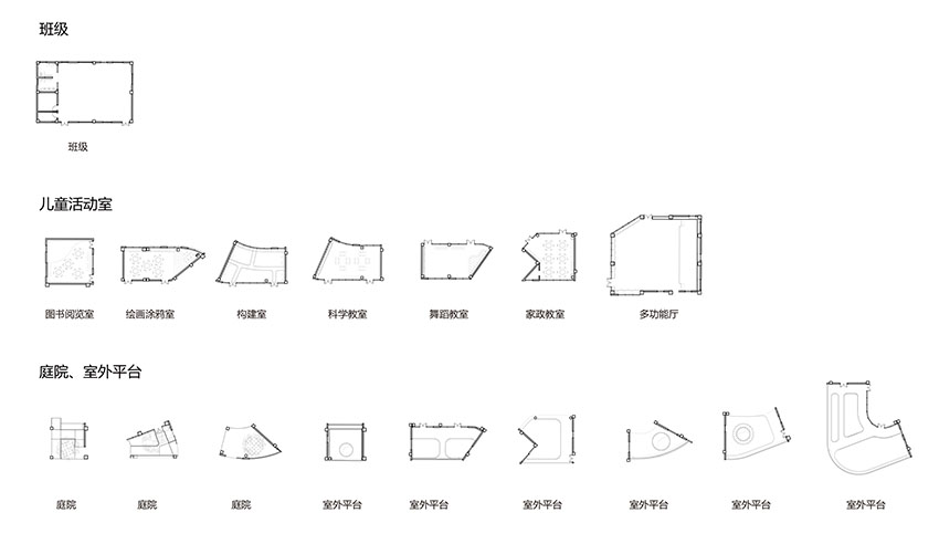
▲矩形班级单元+剩余不规则空间/rectangular classroom units and leftover irregular space
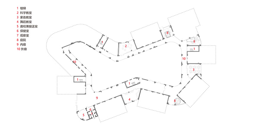
▲一层廊子公共空间/common area on first floor corridor
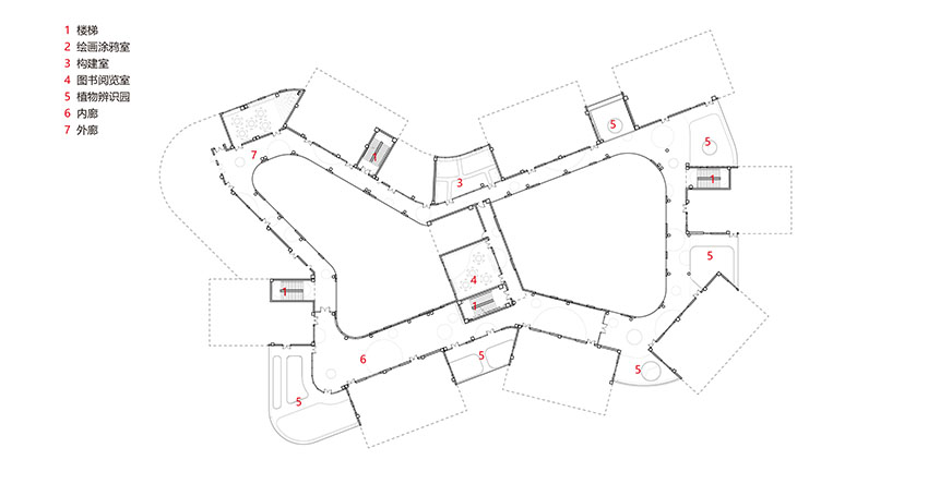
▲二层廊子公共空间/common area on second floor corridor
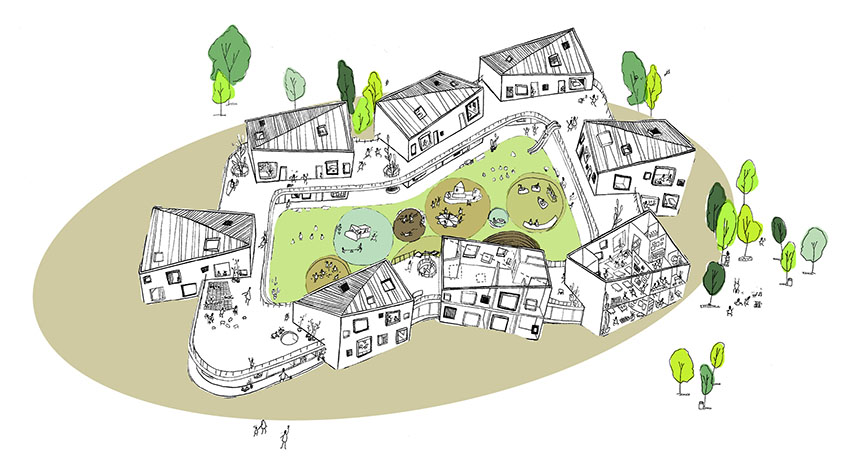
对于内部空间的处理、建筑师保持了班级的规则平面,但是根据地形在方向上做扭转,以满足日照和活动场地的要求。环形廊子减去矩形活动室留下的不规则剩余空间看似难以使用,实际这种空间的不规则性恰好让孩子们能够更加自由和多样的使用空间。建筑师利用了这一点,通过室内和景观的一体化设计,开发每个不规则空间的潜力,把整个建筑做成了一个超级玩具。
For the operation of interior space, the architect maintained the regular plan of class but twisted the direction according to the site so as to meet the requirements of sunshine and the playground. It seems difficult to use the irregular residual space left by the circular corridor minus rectangular classroom; in fact, this irregularity of this kind of space makes the children more free and diverse to use the space. The architect used this point to develop the potential of each irregular space through integrated design of interior and landscape, and make the whole building a super toy.
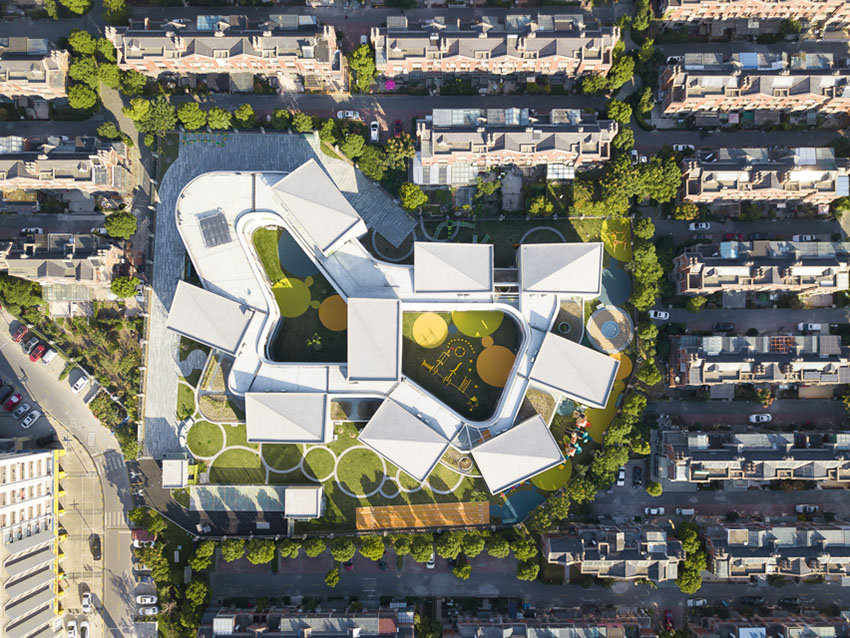
▲ 单元空间和剩余不规则空间/unit space and leftover irregular space ©Office Mass
∞幼儿园的设计从对现状的挑战出发,以空间概念作为引导,设计过程中通过针对规范进行反复的调整优化,形成最终的空间布局。设计过程本身,也如同一个游戏,在明确的目标下,通过特定的规则,持续地迭代操作。最终的空间不是即时的灵感迸发,实际上是一系列关联的空间操作过程中凝固的一个瞬时状态。
The design of ∞ kindergarten is based on the challenge to the present situation and guided by the concept of space. In the design process, the spatial layout is formed through the iteration and optimization according to the norms. The design process itself is also like a game, which continues iterated operation through specific rules under clear objectives. The final space is not an instantaneous inspiration, but a transient state solidified in a series of related spatial operations.
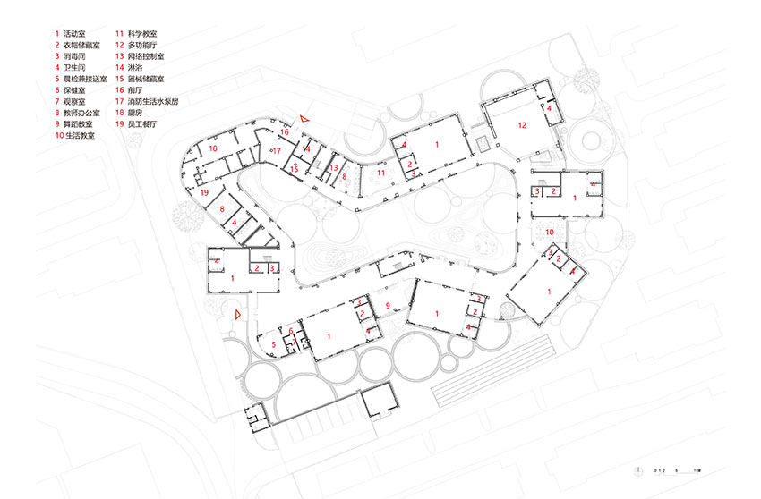
▲一层平面/level 1 floor plan
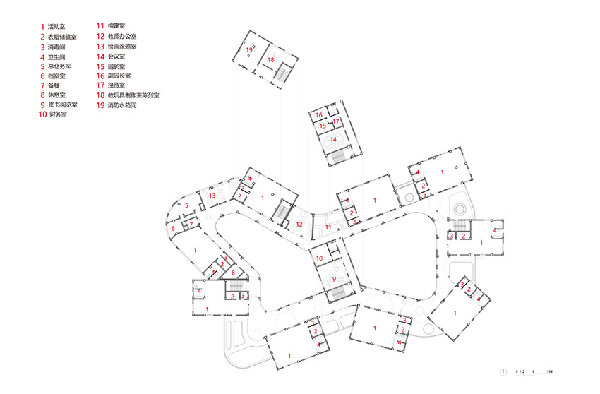
▲二层平面/level 2 floor plan

▲立面/elevation

▲剖面/section
项目信息
项目名称:上海金蔷薇幼儿园
项目地点:上海市金山区龙皓路学府路
业主:上海金山区教育局
用地面积:8375㎡
建筑面积:5899㎡
竣工日期:2017.10
主要材料:真石漆、LOW-E玻璃、木纹转印铝板、PVC地坪
主持建筑师:吴海龙
摄影:苏圣亮(标注除外)
建筑方案设计:曼景建筑
室内方案及施工图设计:曼景建筑
景观方案及施工图设计:曼景建筑
设计团队:吴海龙 赵林 李三见 陈柳均 唐程颖 苗梦娜 程孟雅 郭思博 卫韡 苗梦娜 李诗慧 毛广知
建筑施工图:联创设计
建筑:俞斌 徐之杰
结构:何利 宋泽维 郭伟宾
暖通:陈翠悟 孙刚 黄晓康
电气:陈志远 杨宗俊
给排水:孔令兰 胡龙顺
BIM:程孟雅 帅立钰
Project Name :
Location: Xuefu Road, Longhao Road, Jinshan District, Shanghai
Client:Bureau of Education,Jinshan District,Shanghai
Site Area: 8375㎡
Gross Floor Area: 5899㎡
Completion Date:Oct,2017
Main material:Stone-Like Coating,Low-E Glass,Wooden Transfer Aluminum Plate,PVC Floor
Partner in Charge: Wu Hailong
Photography: Su Shengliang (unless annotated)
Building scheme design: Office Mass
Interior design and construction drawing design: Office Mass
Landscape design and construction drawing design: Office Mass
Design team: Wu Hailong、 Zhao Lin、Li Sanjian、Chen Liujun、Tang Chengyin、Miao Mengna、Cheng Mengya、Guo Sibo、Wei Wei、Li Shihui、Mao Guangzhi
construction drawing: UDG
Architecture: Yu Bin、Xu Zhijie
Structure: He Li、Song Zewei、Guo Weibin
HVAC: Chen Cuiwu、 Sun Gang、Huang Xiaokan
Electric: Chen Zhiyuan、Yang Zongjun
Water supply and drainage: Kong Linglan、Hu Longshun
BIM: Cheng Mengya、Shua Liyu
来源:本文由曼景建筑提供稿件,所有著作权归属曼景建筑所有。
|
|
