上海鲲驰办公楼室内设计
项目位置及概况:
上海鲲驰贸易发展有限公司是一家专业的电子商务运营企业,其核心业务旨在帮助国际著名的化妆品品牌建立其在中国地区电子商务的业务系统。鲲驰办公楼位于上海浦东新区丹桂路,总建筑面积约6000平方米。
办公室设计旨在为员工提供一个灵活,协作,减压,激发创造性的工作环境,以满足不同工作情况的需要,让员工既能集中精神独立完成工作,又能促进员工之间的团队合作沟通,从而创造一个能给员工带来充分舒适感的工作环境,让员工能够展现出最佳的工作状态。
整个项目的设计范围包括1-4F室内方案设计及施工图设计,于2018年08月竣工。
项目设计理念——旋律
本项目共有4个楼层,每个楼层都有相对独立的部门及其部门的特色,各部门的默契配合组成了个性鲜明的鲲驰公司。就如同音乐的旋律,不同的篇章交替融合组成一支协奏曲,编织出属于鲲驰公司的独有旋律。设计师以旋律为灵感,用曲线为设计元素,并通过材质的变化与组合打造本项目。
Project location and project overview:
Shanghai KUNCHI Trade and Development Co., Ltd is an enterprise specialized in e-commerce operation with its core business in facilitating international cosmetics brands to establish their e-commerce business system in China. Located on Dangui Road, Pudong New District, Shanghai, the office building of KUNCHI covers a total construction area of 6,000 square meters.
Aiming at providing a workspace of flexibility, collaboration, stress reduction, and creative thinking stimulation, the office design tried to meet different working requirements, allowing employees to conduct independent work with concentration as well as collaborative work when necessary. The working environment provides employees with physical and mental comfort so that people could perform and function at their best. Scope of design includes interior design and construction drawings from 1st - 4th floor. Construction work of the office was completed in August 2018.
Project design concept-- Melody:
There are in total 4 floors for the project. Each floor is deployed with relatively independent departments and features. The tacit cooperation among different departments constitutes the unique company of Kunchi, as if different chapters of music compose variations. The alternation and combination of different chapters form a unique melody for Kunchi office. Inspired by melodies, designers adopt a variety of materials in this project with curves as a main element.

一层/1F
前奏
富有空间感的入口门厅设计——彰显企业文化
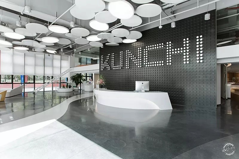
本案业主是一家电商企业,因此入口门厅设计以网络黑白像素为理念,采用灰白色系的中性色调,金属柱面的形象墙如同直播间的计时墙,同时亦将大厅接待区域和内部公办区域分隔开。地坪上灰白拼接的流畅线条引导人们进入办公区域。在部分空间采用开放式天花,以解决空间高度的问题。天花上圆形装饰造型设计灵感来自于电商摄影道具中的“反光板”同时还起到遮挡天花设备的作用。
穿过门厅进入产品展示区,此区域供客户陈列并展示其主营产品,在左右两侧展区之间打造了一个商务接待和休闲功能的咖啡BAR区域。顶部的定制环形射灯为展厅提供专业的照明,左侧通道保留原建筑窗,让自然光和天花照明得以融合,弧形灯带引导人们前往多功能厅区域。
First Floor
Prelude – Brand Association
The lobby design commences with the intention to convey corporate culture through sense of space.
As the project owner is an e-commerce enterprise, neutral color scheme from white to gray is applied to the entrance lobby with the concept of black and white cyber pixel. The feature wall of metal cylinders looks like the timekeeping wall in live studios, separating the entrance lobby from the back office area. The gray-white waves on the floor function as a guidance into the office area. The concept of open ceiling is adopted to ensure adequate space height. Disc-shaped decorative plates, which are inspired by reflectors, one of the e-commerce photography props, are suspended on the ceiling and serve as a separation between the ceiling equipment and the lobby space.
Walking through the entrance lobby, one can find a display area for client to exhibit the main products. Between the display area on both sides, a commercial reception as well as leisure cafe area is designed. Spot lights in circular shape are custom-made on the ceiling of the display area to provide professional illumination for exhibits. Windows are retained on the left corridor to embrace natural light with lighting system. Diffuse light slots in the curved shape go with the direction to the multi-function room.
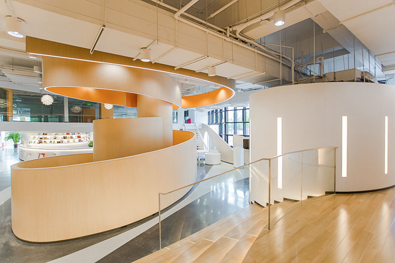
螺旋形常见于大自然中,从动物的外壳到银河系的行星,从流动的水滴到风抚起的尘埃。螺旋传达了成长与演化、四季与时间、生命循环不息的概念,代表了变革、繁衍。墙面上摆放着员工们的设计作品,像客人展示着企业文化。地坪上的曲线和螺旋形墙面互相呼应延伸到天花。
The shape of spire is common in nature, embodied in animal shells, planets in galaxy, flowing water drop and dust in the air. Spire conveys the concept of development and evolvement, seasons and time, and the reincarnation of lives, representing revolution and proliferation. Design works of employees are displayed on the wall, presenting to the guests its entrepreneurial culture. Curves on the floor are matched with the spiral wall, finally extended to the ceiling of the entire space.
二层/2F
间奏
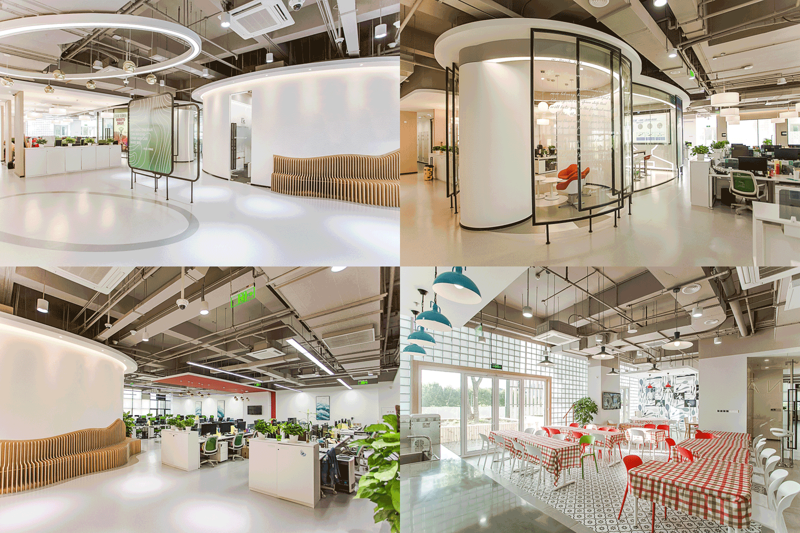
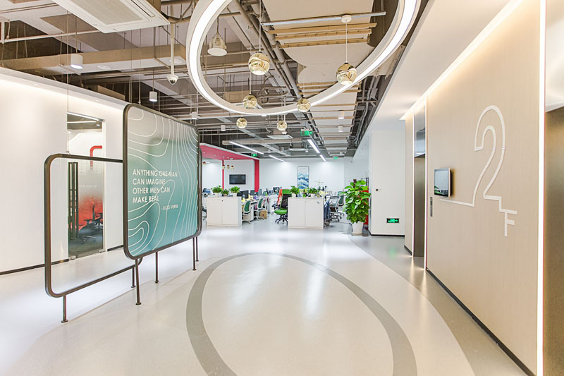
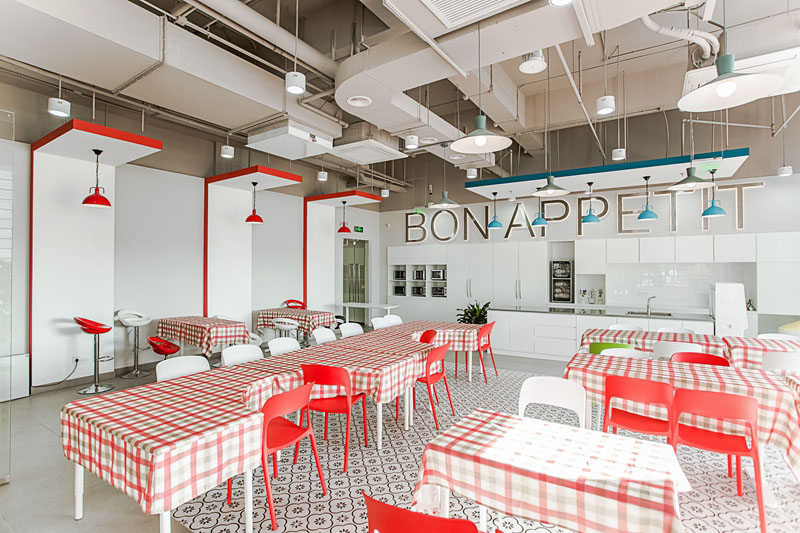
二层是鲲驰公司设计团队办公空间,采用木质材料和定制吊灯打造出明亮舒适的办公环境,以减缓设计师们的工作压力,位于核心区域的讨论区采用明亮的色彩来激发设计师们的灵感,让他们沉浸其中。
On the 2nd floor is the office area of the company's design department. Wood material and custom-made chandeliers are adopted to create a bright and comfortable working environment so as to relieve the stress for designers. Discussion zone in the core area is designed with bright colors to spark inspiration and let designers immerse themselves in.

不同主题的会议室采用弧形透明玻璃,像“岛屿”般散布在整个楼层。
Meeting rooms of different themes with transparent glass wall in oval shape are reminiscent of "islands" distributed on the 2nd floor.

三层/3F
变奏
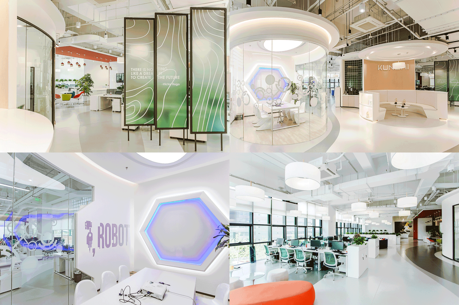
随着电梯门缓缓打开,别致的会议室宛如飞船舱室,透明材质的运用营造出空间的通透感。象征着思考的头脑风暴洽谈区明亮的色彩映入眼帘,激发员工的工作热情。三层办公区有多个单独会议室及开放工作区,以适应不同部门的需求。悬挂于电梯两侧的半通透隔断,在展示公司销售产品的同时,让整个空间产生移步换景的感觉。
Third Floor
Variation
As the lift doors open, a unique spaceship-like meeting room unfolds in sight. Transparent materials are adopted to produce a see-through effect for the space. As the symbol of thinking, vivid colors in the brainstorming area help stimulate the working passion of employees.
There are several private meeting rooms and open working area on the 3rd floor to meet the requirements of different departments. On both sides of the elevators there are translucent partition walls served as products display area and create different scene in the office space.

四层/4F
主旋律
如果说设计师是演奏家,那空间就是不断流动的旋律。不同的节奏贯穿其中,带给人们一段充满变化的旅程。进入四层,灯光由明亮变为柔和同时搭配温和的材质成为这首乐曲的精彩部分,给人留下深刻的感受。
Fourth Floor
Key Composition
If designers are compared to musicians, space is deemed as flowing melody. Different rhythms invite people to a varying journey. On the fourth floor, lighting turns from bright to soft with mild materials and compose the impressive climax of the composition.
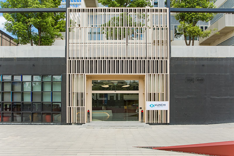
外立面/façade
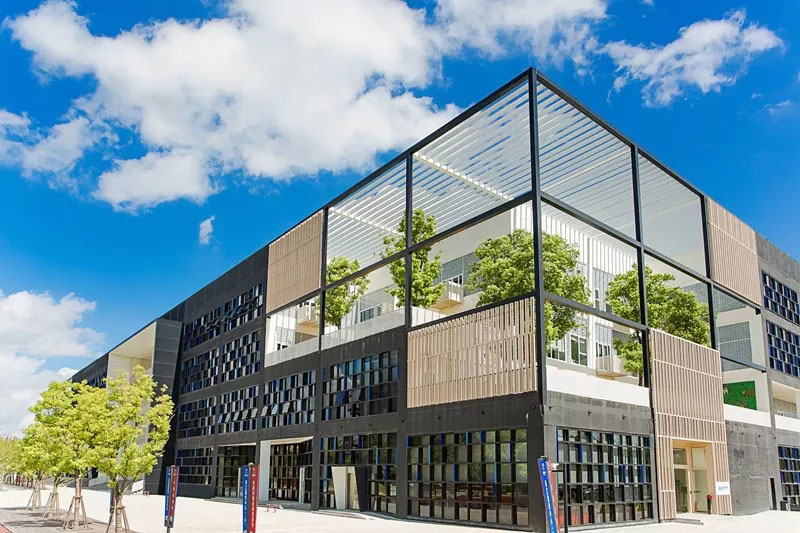
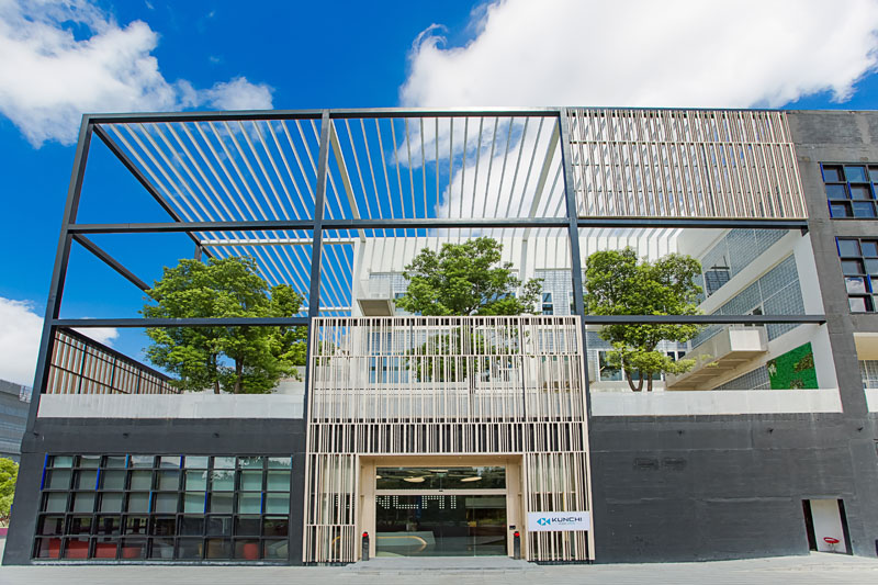
外立面设计灵感源于大自然森林里生长的树木,用木格栅构成一道道垂直线条,打造办公楼主入口的同时又和原建筑融为一体。
Inspired by woods in the natural forest, the new façade design adopts vertical wooden blades to create a new entrance for the office building, which also integrates with the existing architecture.
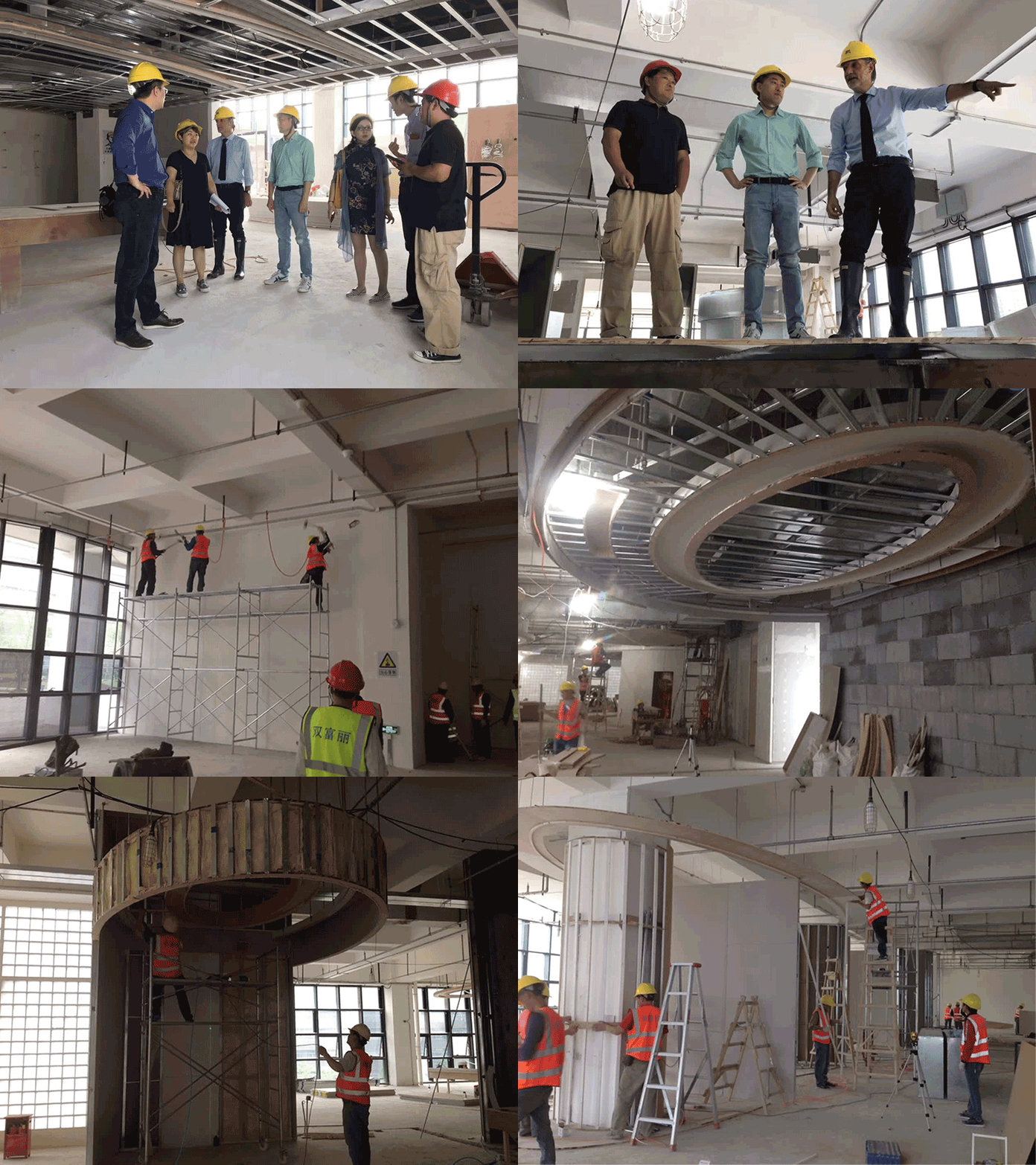
施工过程
项目信息
项目名称:鲲驰办公楼室内设计
项目地点:上海市丹桂路899号国创中心1号楼104-105
设计公司:上海飞睿建筑设计工程有限公司
主设计师:Ferruccio Ferri Bonato / 夏奕
设计团队:王蓓琪,夏雨,葛怡馨,刘申昌
摄影师姓名:李翔
设计开始时间:2018年01月
设计完成时间:2018年04月
施工开始时间:2018年05月
施工完成时间:2018年08月
建筑面积:6000平米
室内面积 (平米):5000余平米
容积率:N/A
绿化率:N/A
项目状态:已建成
总承包: 北京双富丽建筑工程有限公司
项目总负责人:杨国庆
项目协调:张志成
项目经理:丁家林、姜德和
施工员:徐子洋、王良兵、任成龙
预算控制: 杨国庆
机电暖通顾问:张志成、胡仁刚
材料及厂家:丽娜地毯、波世嘉胶地板、绰琪水磨石、韩华木纹膜
Project Info
Project name:Kunchi Office Interior Design
Project location: Room 104-105, Building 1 Guochuang Center, No.899 Dangui Road, Shanghai (Coordinates in Google maps)
Project type: Interior design
Design starting date: January, 2018
Design finish date: April, 2018
Construction starting date: May, 2018
Construction finish date: August, 2018
Gross floor area (m2): 6,000 sqm
Interior space area (m2): 5,000 sqm
FAR: N/A
Greening rate: N/A
Project status: Built
Designer
Name of Practice: Ferri Architectural Design Engineering Co.Ltd Shanghai
Chief Designer: Ferruccio Ferri Bonato / Sherry Xia
Design Team: Peiqi Wang / Yu Xia / Yixin Ge / Shenchang Liu
Photographer:Hero Li
Contractor
General contractor: Beijing Shuangfuli Construction Engineering Co., Ltd.
Project Director: Jack YANG
Project Coordinator: Zhi Cheng ZHANG
Project Manager: Jia Lin DING, De He JIANG
Construction Laborer: Zi Yang XU, Liang Bing WANG, Cheng Long REN
Construction Estimator: Jack YANG
MEP Consultant: Zhi Cheng ZHANG, Ren Gang HU
Materials and Brands
Carpet Tiles, Reina
PVC carpet, Bosega
Terrazzo, Chuoqi
Wood veneer film, Hanhua
来源:本文由海飞睿建筑设计工程有限公司提供稿件,所有著作权归属海飞睿建筑设计工程有限公司所有。
|
|
