接下来的两个星期毕加索在画牛。
那牛身上似乎有一种越画得多
也就越少的古怪现象。
“少,”艺术家问,“能变成多吗?”
“一点不错。”毕加索回答说。
批评家等着看画家的多。
但那牛每天看上去都更加稀少。
先是蹄子不见了,跟着牛角没了,
然后牛皮像视网膜一样脱落,
露出空白之间的一些接榫。
“少,要少到什么地步才会多起来?”
“那要看你给多起什么名字。”
......
——欧阳江河《毕加索画牛》
In the next two weeks, Picasso was painting a cow.
The cow seemed to have a weird phenomenon
That the more painted the less the cow shows.
"Less," the artist asked, "Can it be more?"
"Definitely." Picasso replied.
Critics waited to see more from the painter.
But the cow looks even less every day.
First, the hoof is gone, and the horn is gone.
Then the cowhide falls off like a retina.
Some of the connections between the blanks are exposed.
"Less, what is the point that less becomes more?"
"That depends on what name you give to more."
......
—Ouyang Jianghe - "Picasso Painting Cow"

这是一个体验空间的常规场所,却不是一个常规的空间体验场所。
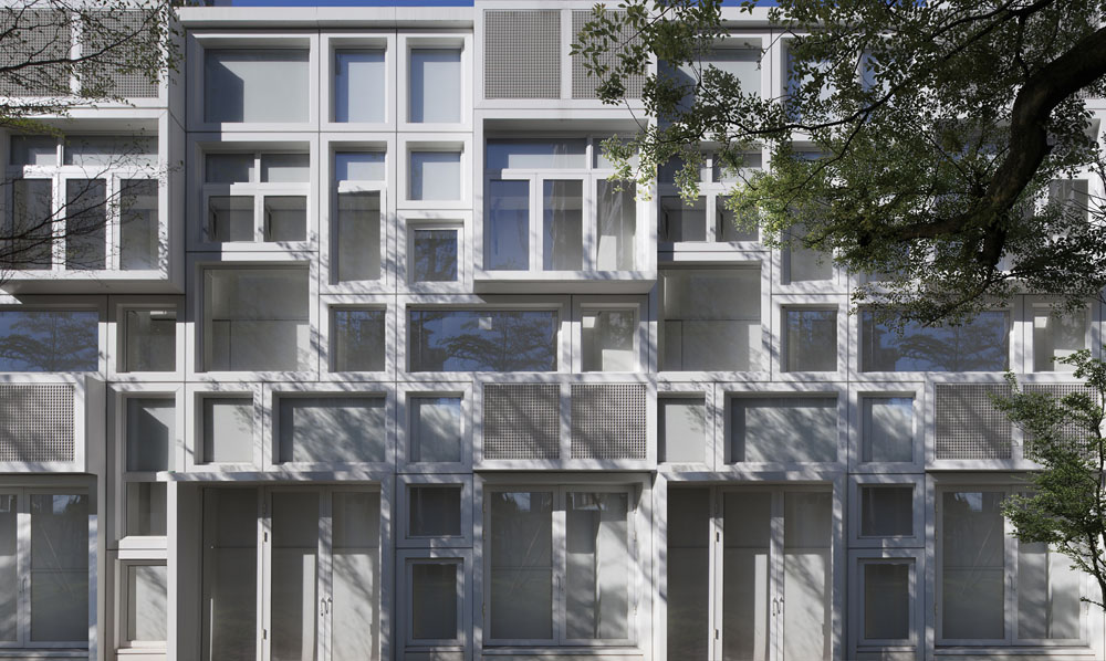
作为改造项目,原有建筑格局已不适合新的空间使用要求,我们要在原有建筑结构框架的限定中,重新规划功能空间、流线以及节奏,用来满足新的使用需求,同时更希望以一种合理且符合人心理特质的方式,将项目信息准确的传递给体验者。重新设计建筑立面,让室内外协调统一,并符合本项目内涵。
基于对原有建筑结构特点,及体验者交通动线的细致分析,我们将传统的功能体系展示方式进行了打散重构,用一种“艺术空间”的浸入式模式体验来建构整个空间体系,同时将传统展示功能巧妙的嵌入。
This is a regular place to experience the space, but it is not a regular space experience location.
As a renovation project, the original architectural layout is no longer suitable for new space use requirements. We need to re-plan the space function, streamline and rhythms in the definition of the original building structure framework to meet new requirements, and simultaneously we hope to pass the project information to the guests in a more reasonable way conforming to human psychological characteristics. We redesign the architectural facade to harmonize indoor and outdoor, and in line with the connotation of the project.
According to the features of the original structure, and through the detailed analysis of the visiting flow, we broke up and reconstructed the function system of the traditional display mode, and set up the entire space system with an immersive “art space” experience mode, while traditional display functions are cleverly embedded in the space.
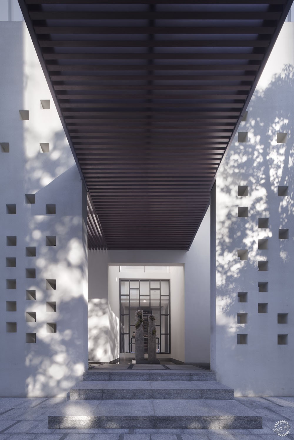
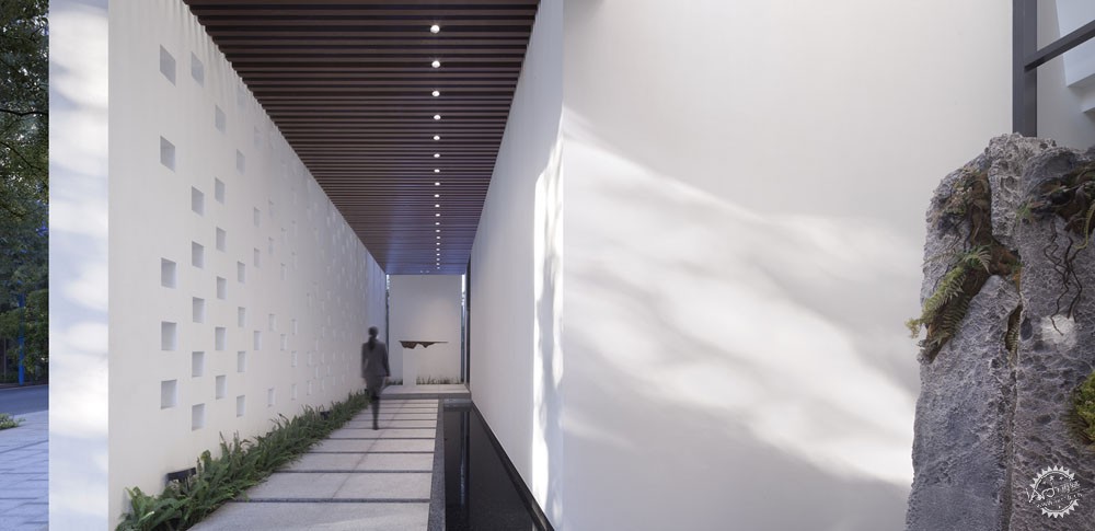
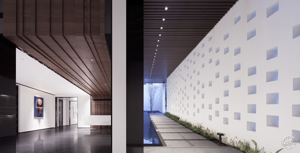
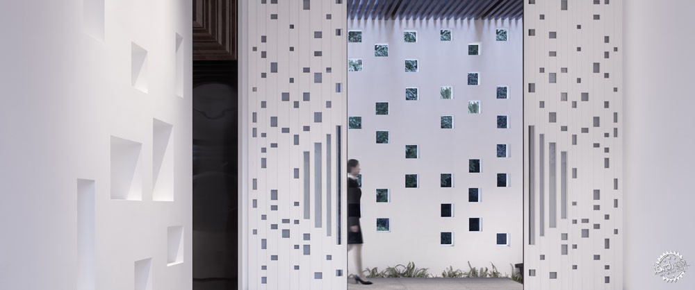
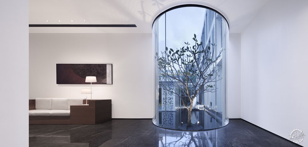
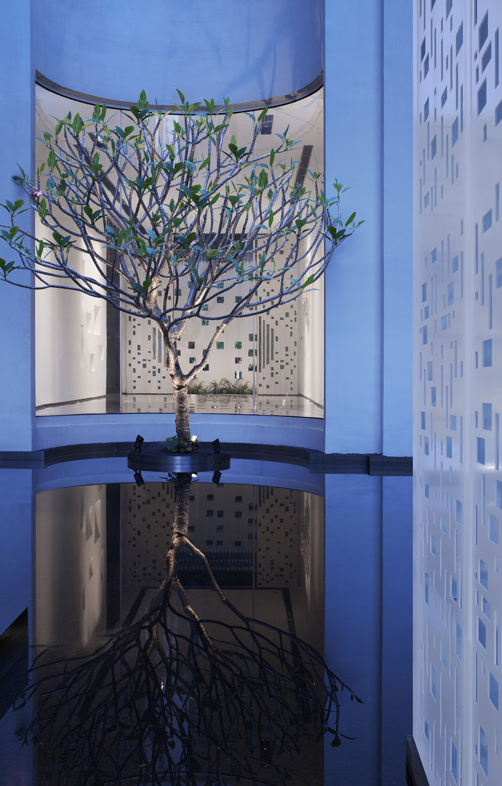
从入口开始,踏着斑驳光影的户外长廊,隔绝了城市喧嚣的幽静,铅华尽洗,已是别样的心境。到达过厅时,迎面正对的弧形玻璃内一颗生机盎然的树木静立水面,窥视下依稀可见内院景致,震撼中又给人带来某些期许。
From the entrance, walking in the outdoor hallway with mottled light and shadow that isolate the noise of the city, quiet and revealing the true inside as a different state of mind. When one arrives at the hall, there is a lively tree in the curved glass stood still in the water on the opposite side. One can take a peep at the inner courtyard that is faintly visible, and the shock brings some expectations.
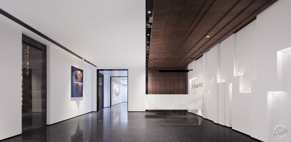
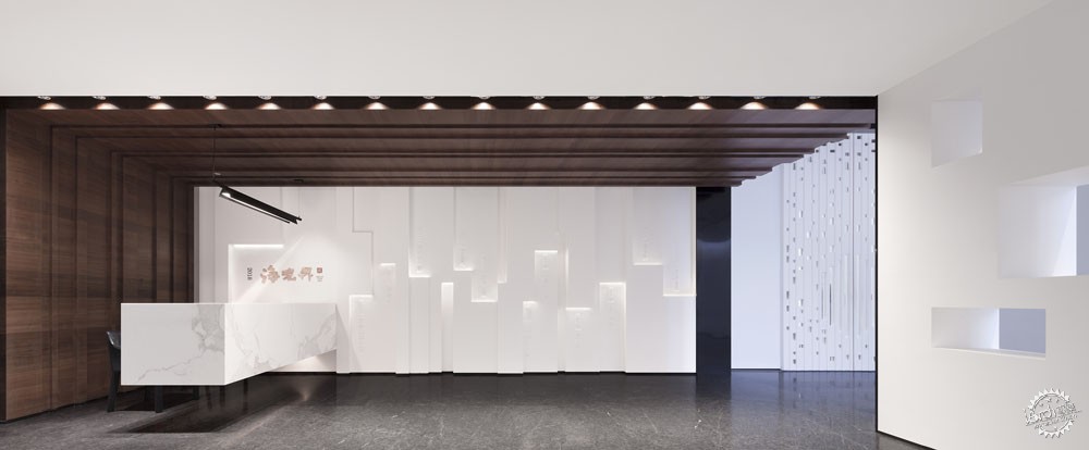
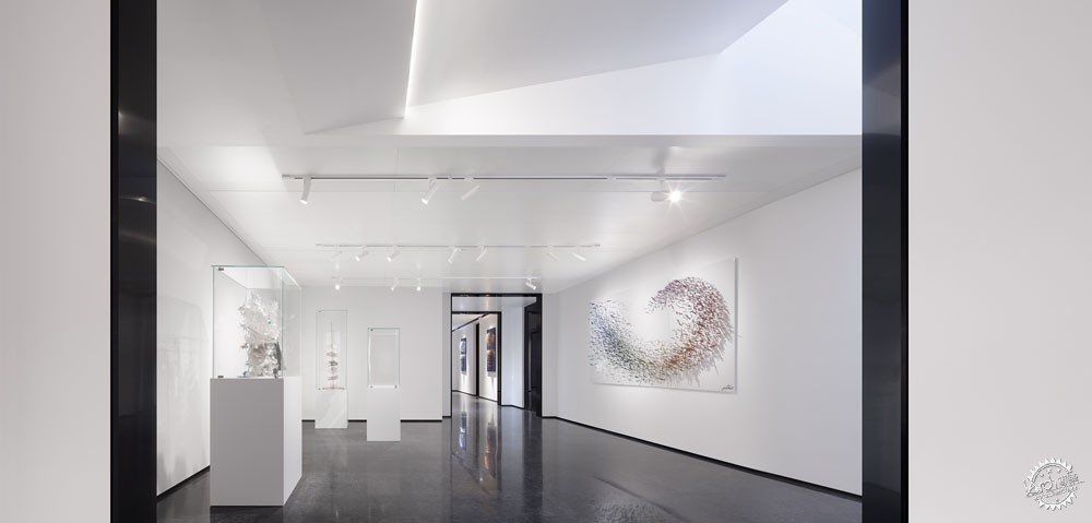
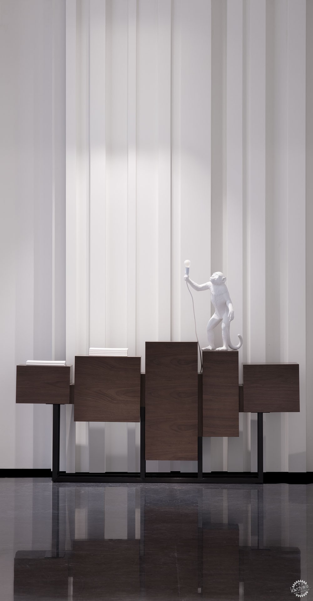
设计者特意让前厅与画廊通过小段的连廊自然衔接而又相互渗透,采光天窗及专业轨道灯为画廊提供了漫射光源及重点照明,让人不自知的进入了艺术氛围的浸染中。
The designer deliberately allows the front hall and the gallery to naturally penetrate each other through the small corridor. The skylight and professional track lights provide the gallery with a diffused light source and accent lighting, making people enter the artistic atmosphere unconsciously.
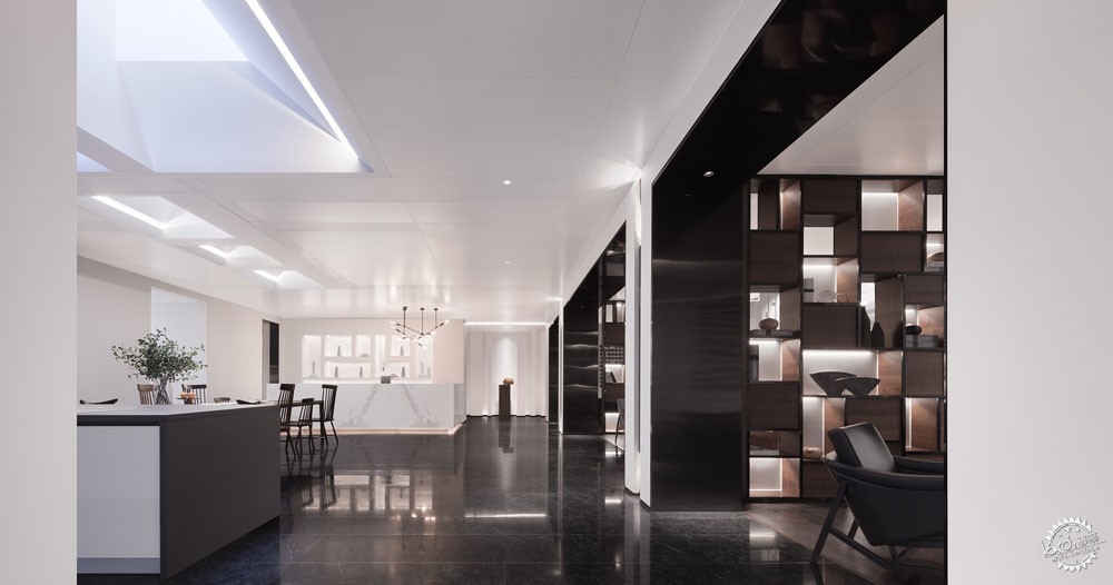
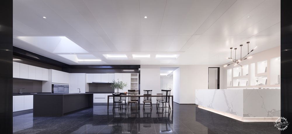
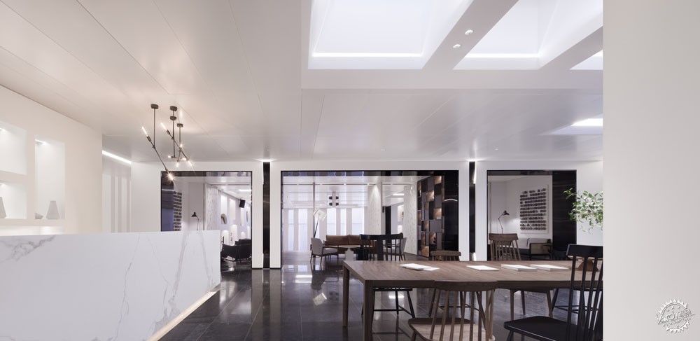

由画廊经过展示区就进入公共开放式厨房的体验区,体验区与阶梯多功能厅可根据需要和活动规模进行自由组合,而户外景观又成为整个空间的对景,空间因此豁然开朗,柳暗花明之际,大小不一的采光天窗让阳光自然洒满室内,与室内空间及家具相得益彰,形成了丰富而生动的动态影效。
Through the exhibition area from the gallery, one enters the experience area of the public open kitchen. The experience area and the terrace multi-function hall can be freely combined according to the needs and the scale of the activity, and the outdoor landscape becomes the opposite scenery of the whole space, so the space is suddenly clear and bright. In addition, the skylights of different sizes allow the sun to naturally fill the interior, complementing the interior space and furniture to create a rich and vivid dynamic effect.

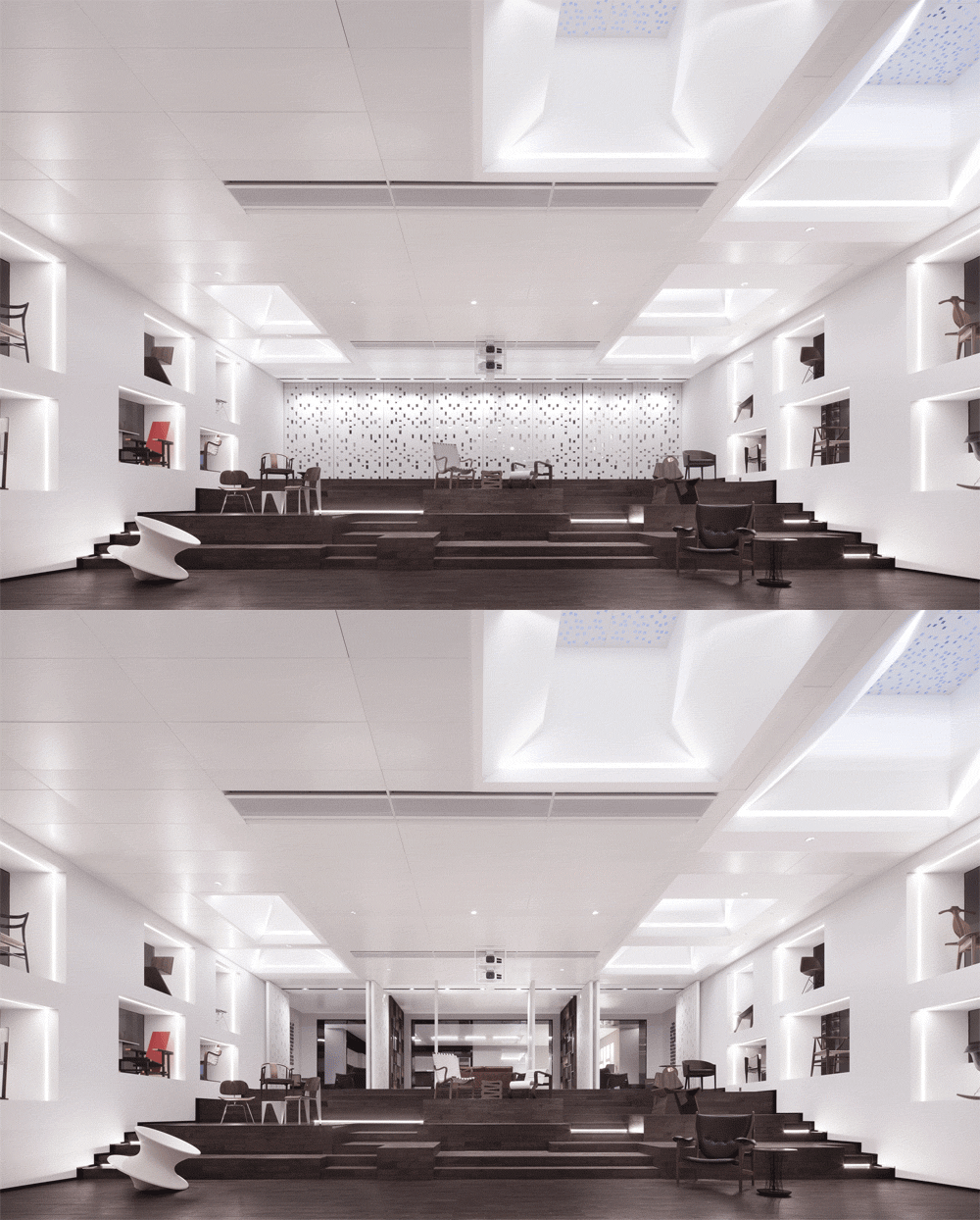
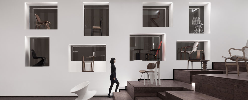
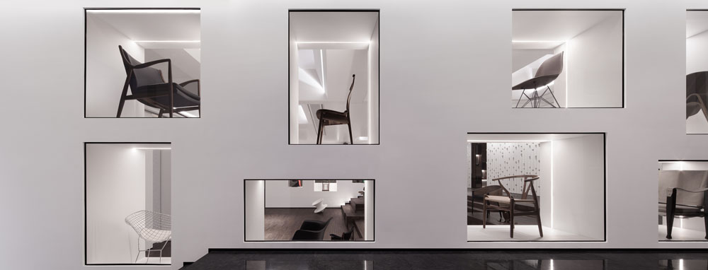
实体艺廊设于多功能厅两侧,同时也是几个重点空间的主要交通节点。在这里,设计师选取了和生活最为密切的器具——“椅子”进行展示,几十张经历岁月洗涤而沉淀下来的经典座椅既是空间展品,也是可以不断更换并体验的坐具,让体验者在体验的同时不自觉间成为了经典展示的一部分。
The physical gallery is located on both sides of the multi-function hall and is also the main traffic node of several key spaces where the designer selects the chair to display as the furniture closest to our daily life. Dozens of classic seats that have many years of vicissitudes are not only exhibits but also seats that can be replaced and experienced at any time, allowing the experiencers become part of the classic display unconsciously during the experiencing process.

书吧及咖啡吧作为室内场所的最终空间,四周两层高的书架作为空间主体带来强烈的视觉感,看似自由的家具摆放形式自然组成不同的交流氛围,为整个室内画上完美句号,心境也随之而升华。
The book bar and coffee bar serve as the final place for the indoor space. The two-story bookshelf brings a strong visual sense as a subject. The furniture laying out in a seemingly free form has made a different communication atmosphere naturally, which is a perfect ending for the whole interior space while the state of mind has also sublimated.
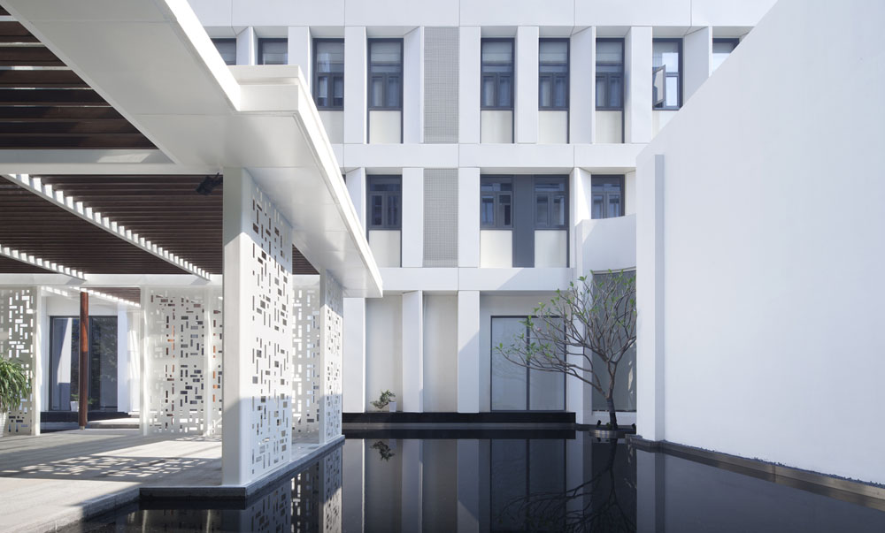
经由书吧,可到达户外园林,由开放连廊,又可从另一维度体验建筑与环境、环境与室内的关系,“不识庐山真面目,只缘身在此山中”。整个流程不再是简单机械的罗列展示,设计者对空间功能进行了规划性的延展与提升,让体验者在整个的体验过程中可以自然而然地感受空间及项目的品质,让心灵去旅行。
Through the book bar, one can reach the outdoor garden, and from the open corridor, once can experience the relationship between architecture and the environment, also the connection between the environment and the interior from another dimension. " You cannot know the shape of a mountain when you stand on it." The whole process is no longer a simple mechanical display, when the designer has extended the planning and promotion of the space function, allowing the experiencers to naturally feel the quality of the space and the project throughout the process and let the mind wander in it.
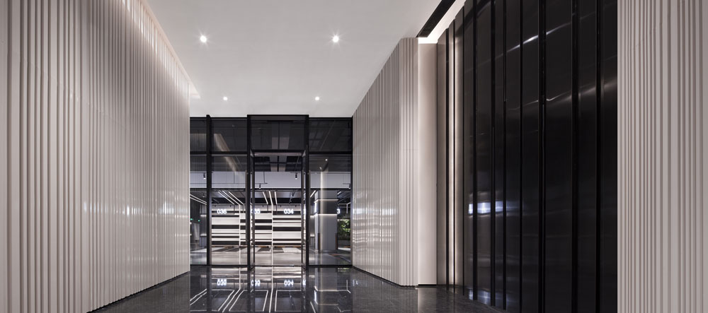
本项目结合WELL健康建筑标准要求进行设计,(WELL是一套注重建筑环境中人的健康和福祉的系统,被誉为建筑界的 OSCAR,是全球首个专门针对人员健康舒适的室内建筑标准。)关注建筑环境与人体系统之间的关系,控制建筑空间尺度、节奏及比例关系,通过不同角度、方向的视线分析及光线的运用,室内外环境关系的处理,来把控和营造整体空间氛围,使得室内空间立面处理得以最大限度的简化。而不是简单的依靠材料或者浮于表面的形式去体现。最终所谓形式、手法均被摈弃于外,纯粹的白色墙面成为空间主体。而白色除了表现空间的纯粹,也带来更多可能性,于“无形”中孕含着“万象”,形成一个将“人文、健康、艺术、科技”融合为一体的多功能艺术空间。
最终呈现结果达到了我们的预期,画廊、多功能厅、书吧成为最受欢迎的场所。定期举办的画展给客人带来丰富的艺术感受,公共开放式厨房体验区和多功能厅籍借空间的分合,成为小型论坛和聚会的理想场所。书吧则是三五好友小聚、或一个人独处的好去处。人们都乐于在其中流连忘返的体验和感受,而不是被动接受某些概念性的机械说教,直接的感受成为了空间关注的重心。
This project is designed in line with the requirements of WELL standard of Healthy Building. (WELL is a system that focuses on the health and well-being of people in the built environment. It is known as the OSCAR of the architecture industry and is the world's first indoor building standard for the health and comfort of people.) We pay attention to the relationship between the built environment and the human body system, control and create the overall space atmosphere by controlling the spatial scale, rhythm and proportional relationship of the building through the line of sight analysis of different angles and directions, the use of light, and the treatment of indoor and outdoor environmental relations. The façade treatment of the interior space is simplified to the maximum extent. In the end, the so-called forms and techniques are all abandoned. The white wall becomes the main body of space which not only reflects the purity of the site, but also brings more possibilities and contains "infinite" in the "invisible", and it becomes a multi-functional art space that integrates “humanities, health, art and technology”on the original basis.
The result has reached our expectations, where the gallery, multi-function hall and book bar became the most popular places. The regular exhibitions bring different artistic feelings to the guests. The public open kitchen experience area and the multi-function hall can be combined to turn into an ideal venue for small forums and gatherings. The book bar is a good place for meeting friends or enjoying some me-time. People are happy to stay, feel, and experience, rather than passively accept some rigid conceptual preaching. The direct feelings have become the focus of attention in the space.
建筑与城市虽不是自然的产物,但许多建筑与城市现象却表现出生命体的特征,同样经历着如同新陈代谢的演变过程。“万物生于有,归于无”,我们以无形之意,以“精于心,简于形”的方式,让空间不囿于固有的功能与形式,意图建立一种新的健康生活方式,带给人们一种全新的生活体验和精神依托。
Although buildings and cities are not living organisms in the natural world, many architectural and urban phenomena show the characteristics of living organisms and experience the evolution as metabolism. "Everything in the world comes from being and being comes from nothing." We make the best of "sense in the heart, simple in shape" as an invisible way to make the space not limited to the common functions and forms and intend to establish a new healthy lifestyle and bring people a fresh life experience and spirit.

平面图
项目信息
项目名称:深圳海境界二期健康人居体验中心
项目地点:广东深圳
设计范围:建筑及外立面改造,景观及室内设计
项目面积:1385㎡
空间设计:朗联设计
设计总监:秦岳明
设计团队:李明、徐双圆、李志强、陈宝骏、葛长川
陈设设计:朗联空间艺术
设计团队:何静、刘梦莹
主要材料:白色烤漆板、白色铝板、范思哲灰石材、岩板、胡桃木饰面
摄影师:井旭峰
Project Name: Shenzhen Mind the Sea Phase II Healthy Habitat Experience Center
Project Location: Shenzhen, Guangdong
Design Scope: Building and Exterior Facade Renovation, Landscape and Interior Design
Project area: 1385㎡
Space design: Rongor Design
Chief Designer: Ronger Kane
Design Team: Li Ming, Xu Shuangyuan, Li Zhiqiang, Chen Baojun, Ge Changchuan
Furnishing Design: Rongor Space Art
Design Team: He Jing, Liu Mengying
Main material: White painted board, white aluminum board, Versace gray stone, rock board, walnut finish
Photographer: Jing Xufeng
来源:本文由朗联设计提供稿件,所有著作权归属朗联设计所有。
|
|
