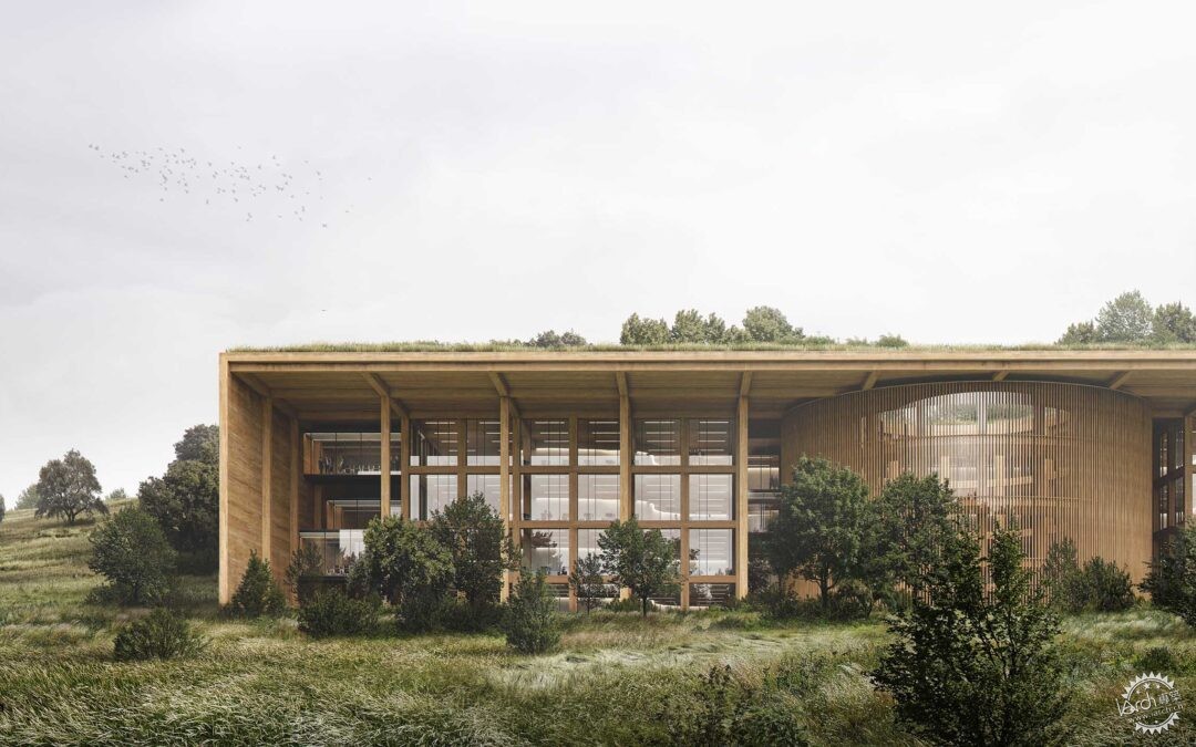
Texas Office Elevation by Alex Hogrefe
由专筑网小R编译
我通过制作这张图像整理出了一些我不太确定的细节,首先,我考虑的是草地和树木在建筑内部和周围的结合方式,因此我想让角度尽量简单一些,这样我就能够进行快速地测试了,我也不确定这里有多少的草地,有多少的树木,因此,各种各样的问题让我想尽可能地完善画面。
建筑的整体结构已经经过了优化和调整,我仍然在进行着一些改变,同时也会调整一些细节,相机的高度和角度让我进行一些迅速的调整,从而决定某个视角,否则这个调整的工作我也许永远都不会停止。
以下是图像制作的分解步骤:
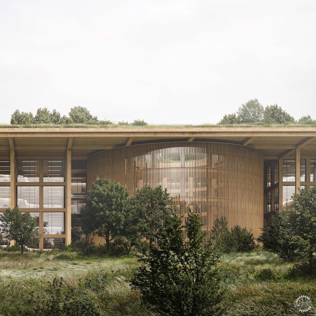
I created this illustration to tease out a few details with this project that I wasn’t too sure about. For one, I had this idea of the meadow and trees flowing in and around the architecture so I wanted to setup an “easy” view angle where I could quickly test out how this would work. I wasn’t sure if I wanted to go all meadow, or if there would be trees throughout, how dense the trees would be, etc. Therefore, this images allowed me to visualize things a little better and hopefully inform other illustrations that will follow.
You may also notice that the architecture has already changed from the last post. I am still making big formal changes while at the same time trying to work through some of the details. Illustrations like this elevation where the camera is close up forces me to make some quick decisions and just go in one direction or another, otherwise I would probably never stop tweaking and changing.
Below is a quick breakdown of the image focusing on the vegetation.
1、模型和基础渲染
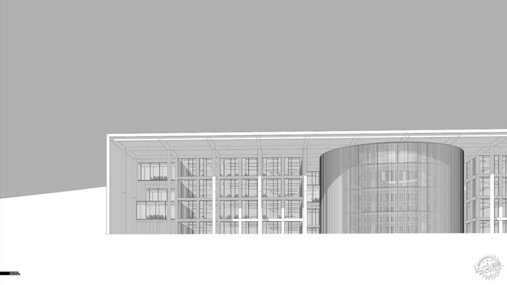
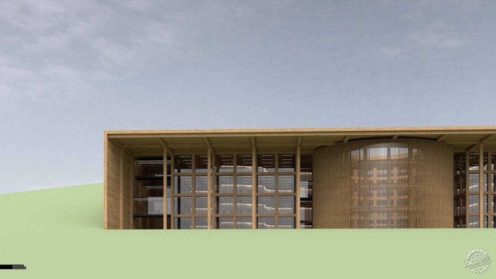
这没什么特别的,我在SU中尽量把模型完善,然后通过V-Ray来渲染,我应用了一种全新的木材,它的尺寸比较大,这样可能就看不到接缝了。这座建筑几乎完全由木材建造,因此我需要保留一些木材的质感,来适应不同的观看距离,除此之外,建筑的规模很大,因此我应用了很多组件,一些相同的组件可以在其中重复使用,这样能够便于后期的修正和更改。
1. Model and Base Rendering
Nothing unique here. I modeled everything in Sketchup, and rendered in V-Ray. I built a new timber material that was relatively large in size so that you would not see tiling. This project will almost be entirely wood, so I knew I needed some textures that read well from a distance as well as up close. Also, since the project is so large in size, I am using as many components as possible and designing in such a way that the same kit of parts can be used throughout the whole project allowing me to easily add detail and make quick changes.
2、草地
基本草地肌理
Base Grass Texture
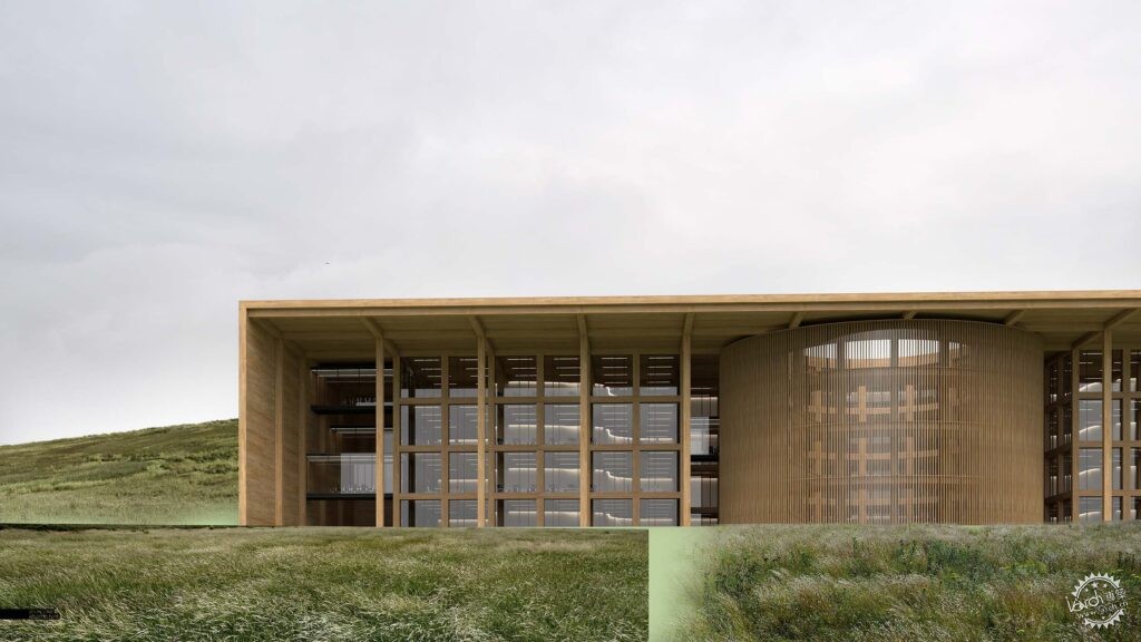
草地是图像中最为重要的部分,我有着想要的外观形态,这张图的分辨率相较于平时要高很多,所以我需要找到分辨率类似的肌理,但是这其实很难,因此我将几个肌理图像结合起来,从而形成我想要的质感和细节,首先我通过三到四张素材制作了基本的图像,并且让画面变暗一些,降低饱和度,这样能够应用在比较阴暗的场景里,让画面看上去更加连贯。
2. Meadow
The meadow was probably the most important part of the image, and I had a specific look I was going for. The problem was that this illustration was much higher resolution than I normally do, so I needed to find textures at an equal resolution which was just about impossible to do. Therefore, I combined several textures to get to the quality and detail I needed. I first started with a base that combined 3 or 4 large textures. I significantly darkened and desaturated the textures to get them to fit the overcast scene as well as read more cohesively
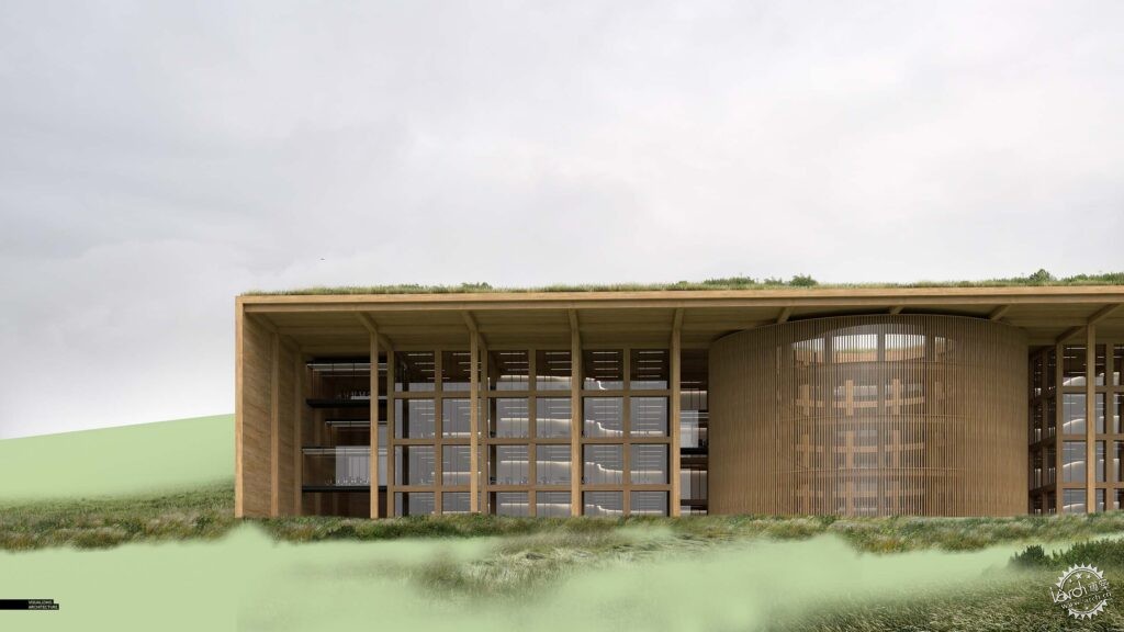
草地细节肌理
Detail Grass Textures
我增加了第二层植物,让画面细节丰富一些,打破大型草地的单调感,而这些细节也能够隐藏草地肌理之间的连接处,同时让画面即使放大很多,也能够很清晰。
A secondary level of vegetation was added to give moments of detail and breakup the monotony of the large grass textures. These details also help to hide the seams of the larger grass textures and also add resolution to certain areas when zoomed in really close.
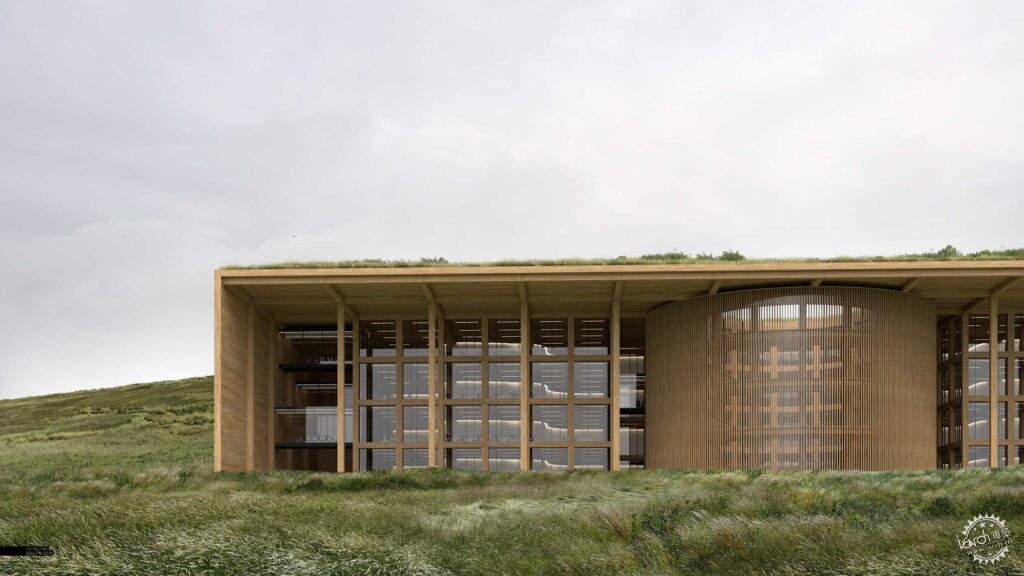
草地质感的结合
Grass Textures Combined
最为重要的部分就是调色了,所有的草地质感目前都是同样的感觉。要做到这一点有很多不同的方法,我发现在最后才进行一系列大调整其实效果并不好,反而每次调整一种肌理的效果会更好一些,因为这需要根据个人的审美和画面的基调来制作,这个过程比较耗时,但是这是让我十分沉迷的步骤,这样能够让画面看起来很自然,减少PS的痕迹。
The most important part was toning all of the different grass textures to feel as one. There are lots of different methods to do this and I have found it rarely works to do a series of big adjustments at the end. Instead, I will bring in one texture at a time, and tone and adjust on an individual basis. It is obviously a more time consuming method, but it allows me to really dial in things and keep it looking natural and not-so-Photoshopped.
3、树木
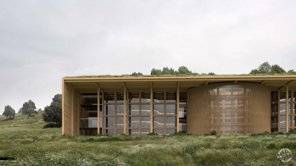
背景树
Background Trees
这些树木也有几个不同的层次,我从远景树开始,它们框出了建筑的位置,也暗示着景观的重点向画面的上方移动。
3. Trees
The trees were deployed in different layers as well. I first started with the trees in the distance. These were positioned to frame the architecture and hint at the landscape moving up and on top of the project.
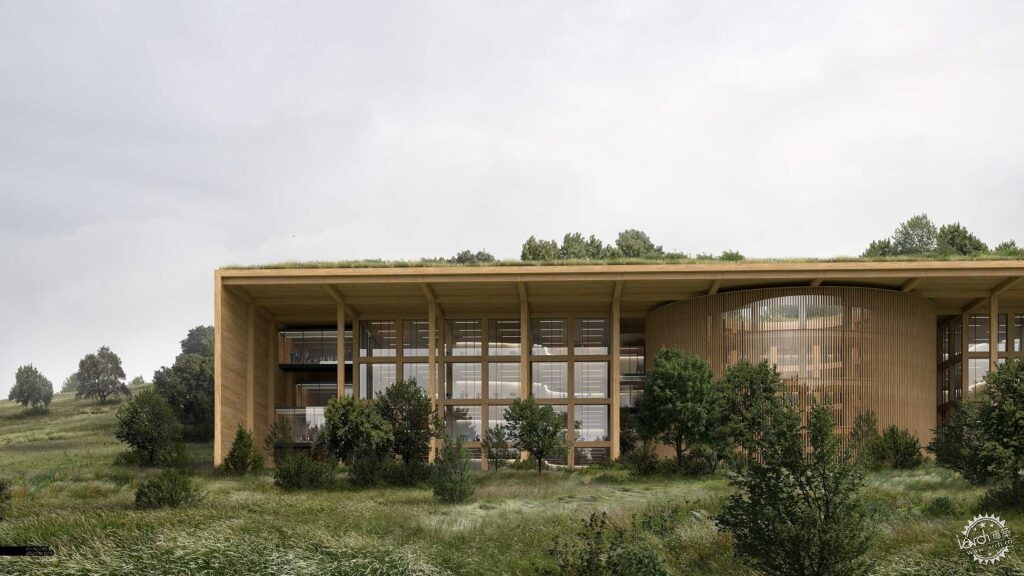
前景树和下层树
Foreground Trees and Understory
接下来是前景树木和下层的植物,我们合作的许多景观事务所常常在自然景观渲染的时候,会要求强调大量的下层植物,这样能够很好地把地面低矮的植物和高大的树木结合在一起,但是问题就在于,低矮的植物和植物很难融合,它们需要大量的覆盖和柔和的阴影才能看起来符合逻辑。
和草地一样,树木也有很多的色调,主要是要让画面变暗,同时降低饱和度,这些都是在独立的图像基础上完成的,并不是在后期进行很大的综合调整。
Next came the foreground trees and understory vegetation. One trend with many of the landscape architecture offices we work with is that when they want to play up the natural/wild landscapes, they spec lots of understory plantings which helps blend the low ground cover with the mature taller trees. The problem is that it is hard to blend the understory shrubs with the grasses without it looking too edited. It takes a lot of careful masking and soft shadows to get it to feel right.
As with the grass, there was a lot of toning with the trees and understory. Primarily, darkening and desaturating. Again, this was all done on an individual basis instead of large adjustments at the end to the entire group.
4、玻璃

玻璃调整
Glass Adjustments
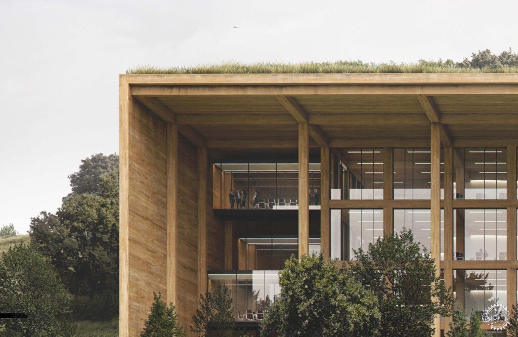
我没有对玻璃和室内进行太多的调整,因为这个图像主要表达的还是景观,但是天空非常明亮,因此我需要强调一下反射,并且加入树木的反射,除此之外,我还给左边的玻璃会议室添加了一些人物和暖色调。
4. Glass
I didn’t do too much to the glass/interiors because this image was really about the landscape. However, because the sky is so bright, I needed to amplify the reflections and add in the reflections of the trees. I also added some people and a hint of warmth to the glass conference rooms on the left.
5、年代感
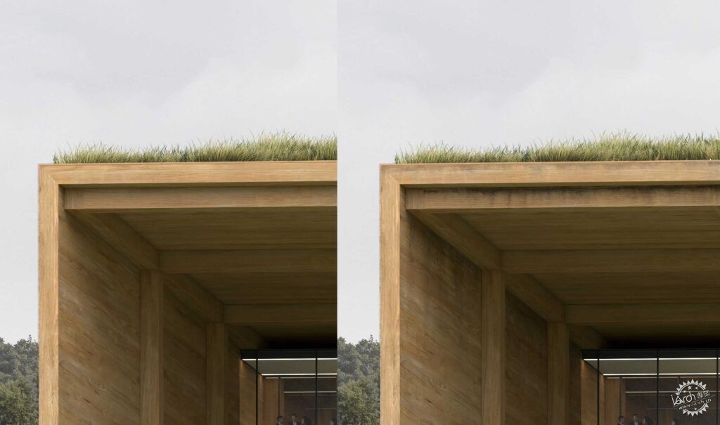
调整前后
Before and After Aging
我希望在项目中表达出略微的年代感和风化感,我们需要让画面看起来更贴近生活,但是同样也要让建筑保留和自然的联系。你可以在网上找一些肮脏贴图,我并没有过于沉迷在这个步骤中,我是想要把它们集中在木梁等区域里。
5. Age
I am trying to be more consistent with showing slight aging and weathering in my projects. It goes a long way in making an image feel more human but is also a way to connect the architecture back to nature. There are a ton of dirt or leaky textures you can find online. I didn’t go too crazy with them, but instead focused them in a few areas at the overhang and on the wood beams.
6、一些小错误
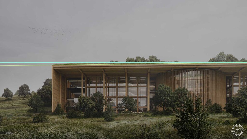
水平校正
Horizontal Correction
我发现图面有些不对劲,于是我检查了一下整个图片,结果发现,水平面有些不够准确,我一般会在3D模型中进行检查,但是这次好像忘了。我不喜欢在最后进行大规模的调整,我也不想重新渲染重新添加蒙版。当时是周日的晚上,在第二天一大早我还有其他的工作,所以我合并了图层,微微调整图像进行水平校正。
6. The Mistake
I was more or less done with the image when something just didn’t feel right. It turns out, the horizontals were not perfectly horizontal. I normally check and double check this in the 3D model but somehow, I let it slip this time. I don’t like to make these kinds of major adjustments at the end, but I also did not want to re-render and re-mask everything again. It was Sunday night and I had work the next morning haha. So, I copy-merged the layers at the top of the layer stack and skewed the image to correct the horizontals.
7、最终成果
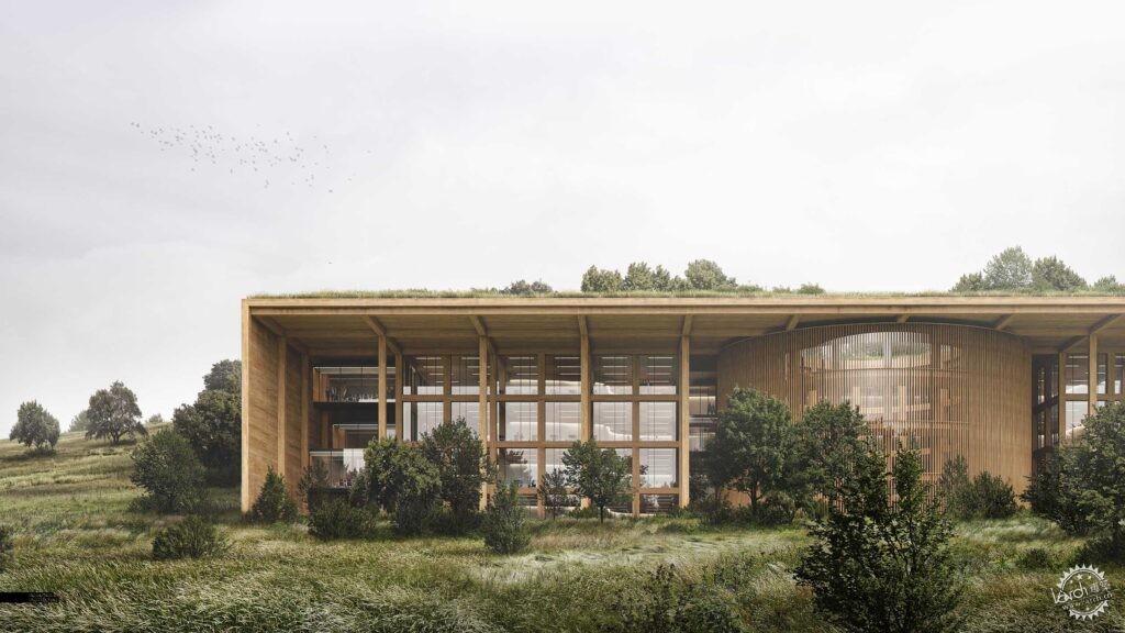
最终成图
Final Image
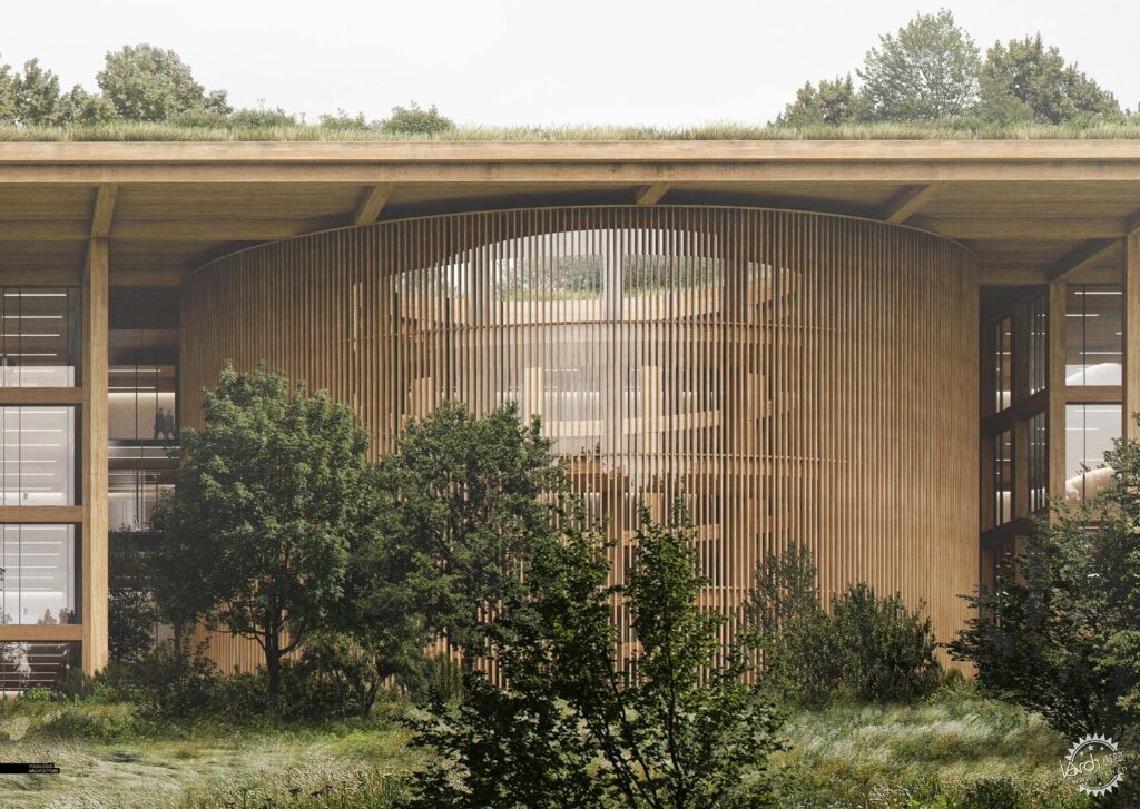
我给这张图片进行了轻微的色彩调整,我本来想要做一些极端的效果,但是后来还是决定让画面简单一些。最终的成图分辨率为10000像素,这比我平时做的要多一些,但是也让选择变得更容易,只要你不沉迷于高品质的肌理,那么图像看起来就会更加干净与细腻。
7. Finals
I did very minimal color grading to this image. I was going to do some more extreme effects but backed off and decided to keep things simple. The final image resolution was 10,000 pixels wide. It is much more than I normally do, but makes selections and masking much easier. Once you get past the need to find higher quality textures, the image ends up being much more cleaner and refined.
|
|
