
城市探索的未来公式
The Future Formula for Urban Exploring
高速的科技与经济发展,模糊了未来城市的边际。我们生存在一个边际逐渐泯没的时代,城市与荒野、人工与智能、虚幻与真实之间的界限不断被淡化。没有一样工业产品能比汽车更深入参与人类文明的进程,从百年前的工业革命到未来的赛博世界,汽车和人类社会的每一步都息息相关。由此,我们窥见时间之流,溯回,交叠,开启与未来的对话。
High-speed technology and economic development have blurred the boundaries of future cities. We live in an era where the margins are gradually disappearing, and the boundaries between city and wilderness, artificial and intelligent, illusory and real are constantly being diluted.No industrial product is more deeply involved in the process of human civilization than the automobile. From the industrial revolution a century ago to the virtual world of the future, the automobile is closely related to every step of human society. From the industrial revolution of a century ago to the virtual world of the future, every step of the automobile and human society is related. Thus,we glimpse the flow of time, go back, overlap, and open a dialogue with the future.
▼项目概览,Preview ©样本空间摄影 八尺口
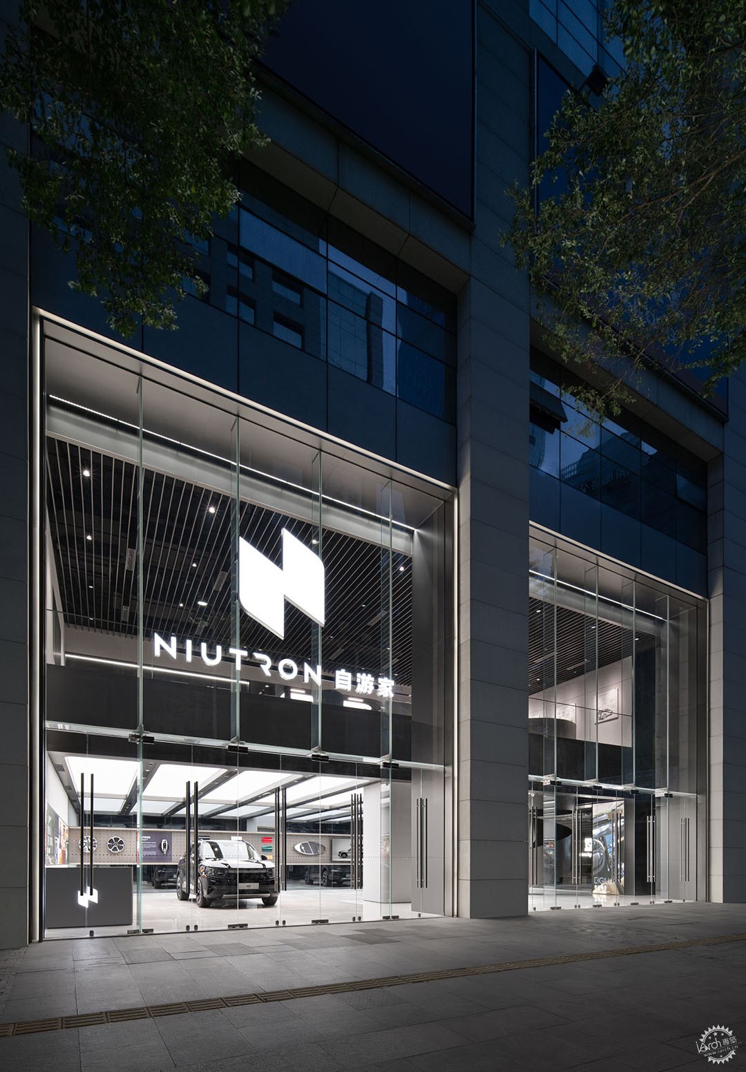
1881年,法国工程师Gustave Trouvé 第一次把电能汽车带入人们的视野,此后选择新能源汽车逐渐成为跨越欧美各阶层的出行方式。在现阶段的中国,新能源汽车受众面已逐步从小群体车友转变为需求首选。DAGA大观建筑受到NIUTRON自游家的委托,在广州高德置地广场设计一处面向街区的汽车展厅。在业主的推动下,该展厅不仅需要对品牌用户提供技术支持,同时也侧重于对新生品牌的推广宣传。
In 1881, French engineer Gustave Trouvé first brought electric cars to people's attention, and since then, the choice of NEV has gradually become a way of travel across all classes in Europe and America. At this stage in China, the audience of new energy vehicles has gradually changed from a small group of car enthusiasts to the first choice of demand. In this case, DAGA Architects was commissioned by NIUITRON to design a neighborhood-oriented car showroom in Guangzhou GT LAND PLAZA. Driven by the owner, the showroom not only needed to provide technical support to brand users, but also focused on promoting new brand.
▼项目入口处,Entrance ©样本空间摄影 八尺口
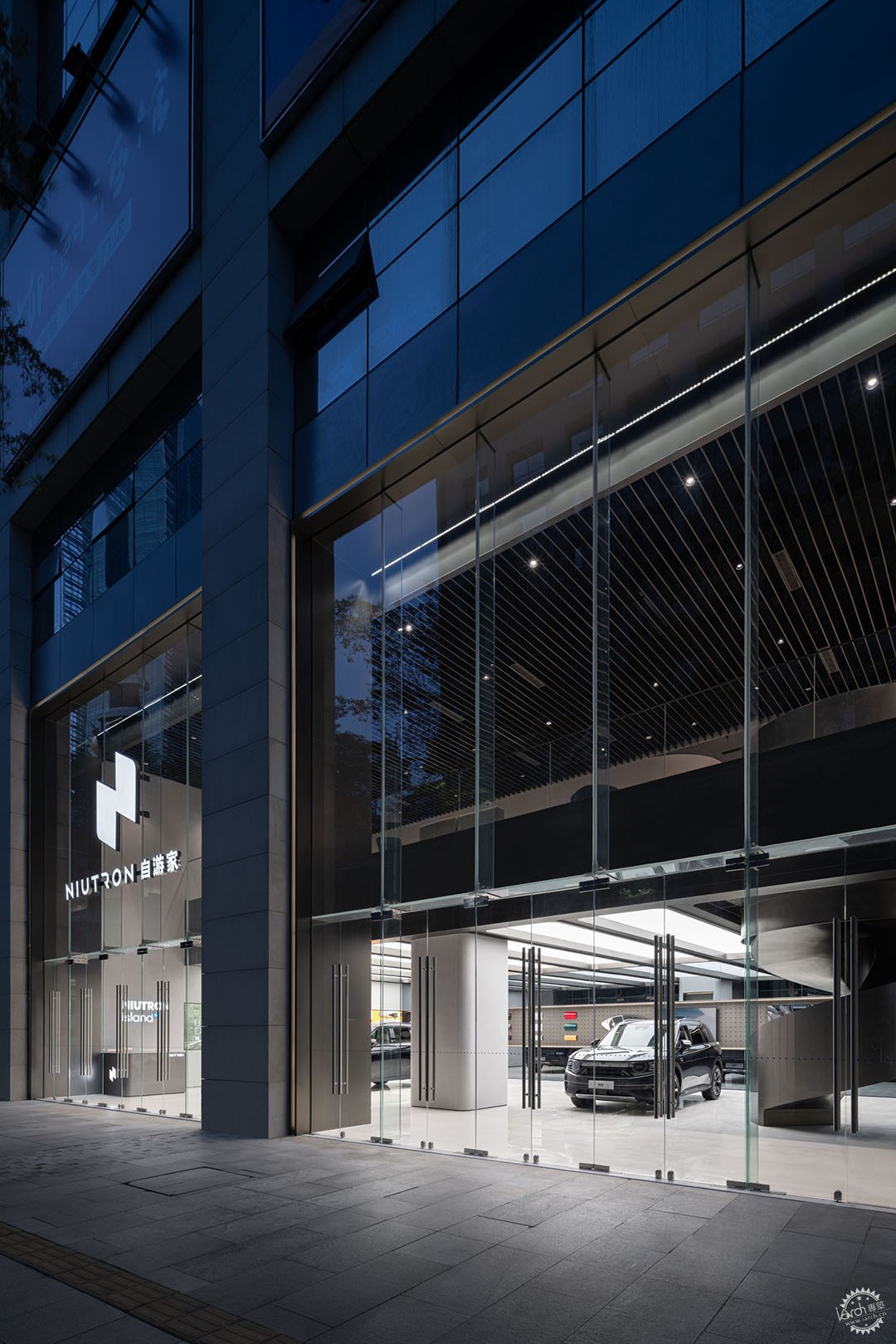
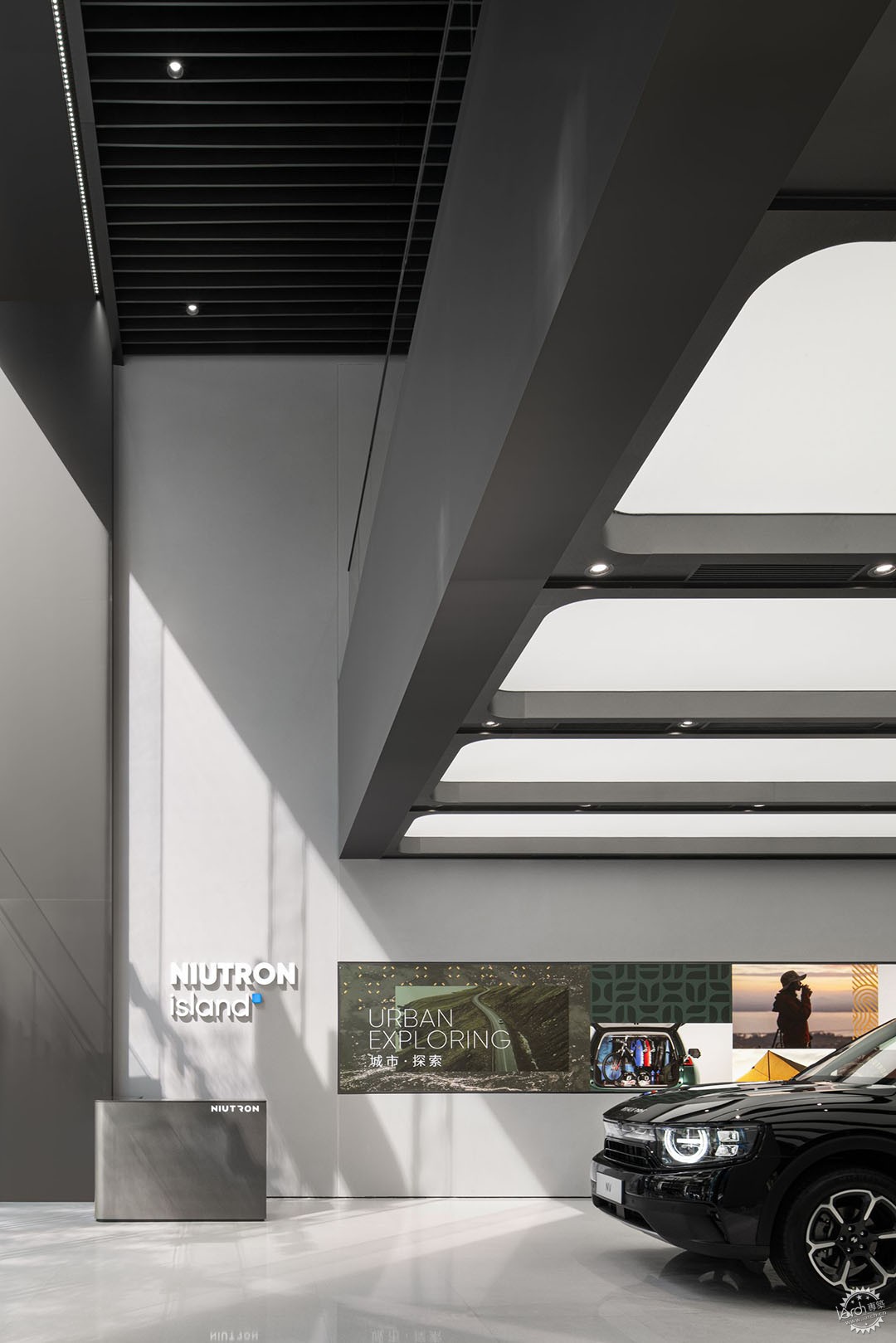
设计前期最大的挑战在于如何让空间“打开”,由于地理位置的优越性,为了实现商业与街区的视野交流,建筑立面的框架与结构被极大简化,材料语言强调了其通透感与统一性,从竖向做切割,使入口立面与室内结合。大厅前部的挑空处理,让层次更为丰富,通过空间内大面积镜面材质的铺展,人为性扩张首层的视觉体量,让步入空间的方式形成递进、延伸、转换层次变化。
The biggest challenge in the early concept of design is how to make the space "open". Due to the advantageous location, the frame and structure of the building facade are greatly simplified in order to realize the exchange of view between the commercial and the blocks, and the material language emphasizes its sense of permeability and unity, and the entrance facade is cut from the vertical direction to combine with the interior. The front part of the lobby is made richer in layers, and the visual volume of the first floor is artificially expanded through the spreading of large mirrored materials in the space, so that the way of stepping into the space forms a progression, extension and transformation of layers.
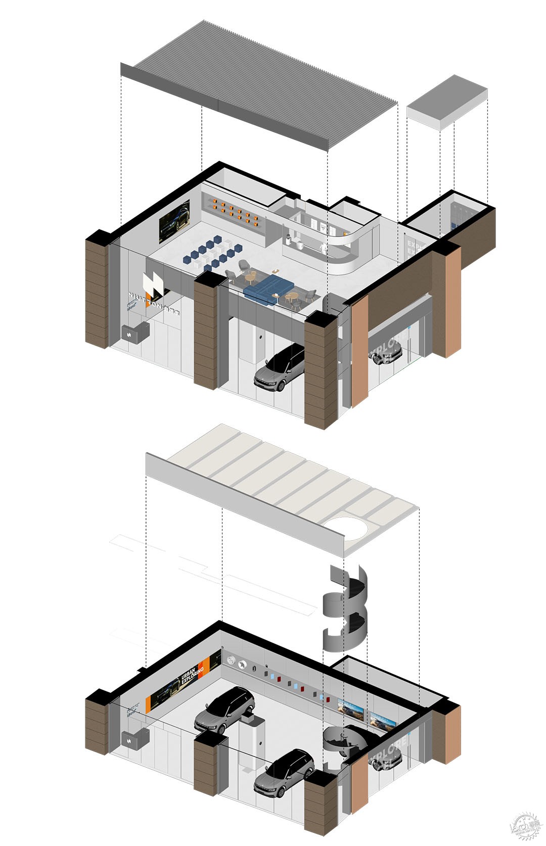
▼轴测分析图,Axon ©DAGA大观建筑
▼首层挑空处理,atrium space on the first floor ©样本空间摄影 八尺口
原生空间是两面朝向街区的双层空间,最大的问题是上下层之间缺乏关联,受原生建筑场地的改造限制,在表皮利用雾面不锈钢及通透玻璃幕墙对近九米长的临街外立面进行包覆。设计师通过大幅玻璃幕墙将自然光引入到室内空间,同时柔和地映射川流不息的高德置地广场街景。我们希望摆脱原有空间格局来思考建筑更多的可能性,实现虚与实之间的平衡与衔接。改造的核心策略不仅是让采光构成项目的视觉导向,更激发了受众的好奇心理,激活了场域营销系统。
The original space is a two-story space facing the block on two sides. The biggest problem is the lack of connection between the upper and lower levels, which is limited by the transformation of the primary building site. The designers used the large glass curtain wall to bring natural light into the interior spaces while softly mapping the flowing streetscape of The GT LAND PLAZA. We wanted to move away from the original spatial pattern to think about the possibilities of the building and to achieve a balance between the real and the imaginary. The core strategy of the transformation is not only to let the light form the visual orientation of the project, but also to stimulate the curiosity of the audience and activate the marketing system of the site.
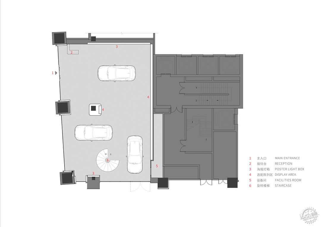
▼一层平面图,1F Plan ©DAGA大观建筑
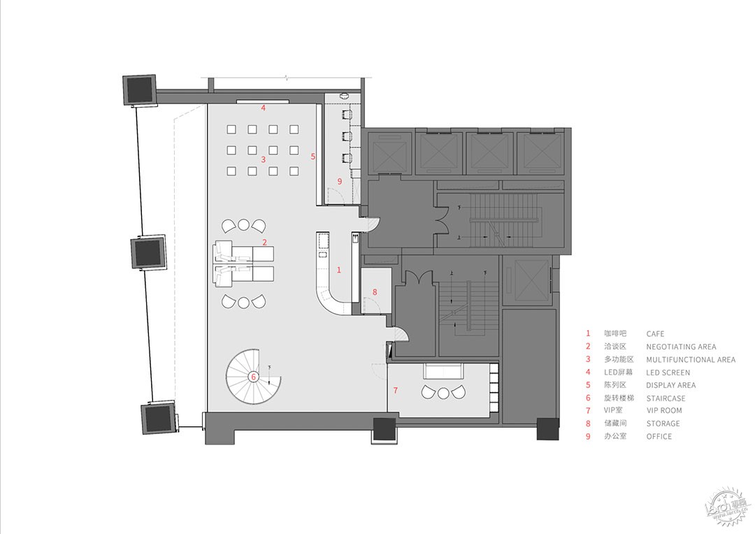
▼二层平面图,2F Plan ©DAGA大观建筑
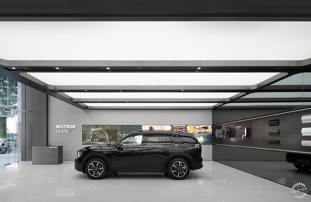
▼汽车展示区一侧,NEV display area ©样本空间摄影 八尺口
多样的使用需求使得建筑的内部空间既非简单的隔断单元,也非单一的大空间,更多的是希望谋求一种空间私密与公共之间的平衡,隔而不断。我们采用打破原生场地二层全包围结构,保留一部分透气的灰空间来回应二层空间的限制,希望谋求一种私密与公共之间的平衡,隔而不断。结构的设计也进一步强化空间序列上的延伸状态,通高超白玻璃从二楼延展,巨大的建筑立柱以不锈钢材质包裹,当光线穿过时,空间产生了内与外的对话。最终,建筑获得了一种介于内向序列空间与外向开敞展台之间的姿态。
The diverse demands of use make the internal space of the building neither a simple partitioned unit nor a single large space, but more of a balance between private and public space, with constant separation. We adopt the structure of breaking the full envelope of the second floor of the original site and retaining part of the airy gray space to respond to the limitation of the second floor space, hoping to seek a balance between the private and public, separated but not continuous. The design of the structure also further strengthens the extension of the spatial sequence, with ultra-white glass extending from the second floor and huge architectural columns wrapped in aluminum panels, creating a dialogue between inside and outside as light passes through the space. Ultimately, the building acquires a posture between inward sequential space and outwardly open showroom.
▼从外侧看向展厅内部,Look at the showroom from the outside to the inside ©样本空间摄影 八尺口
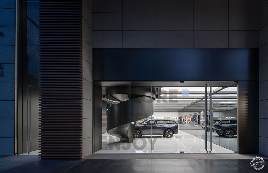
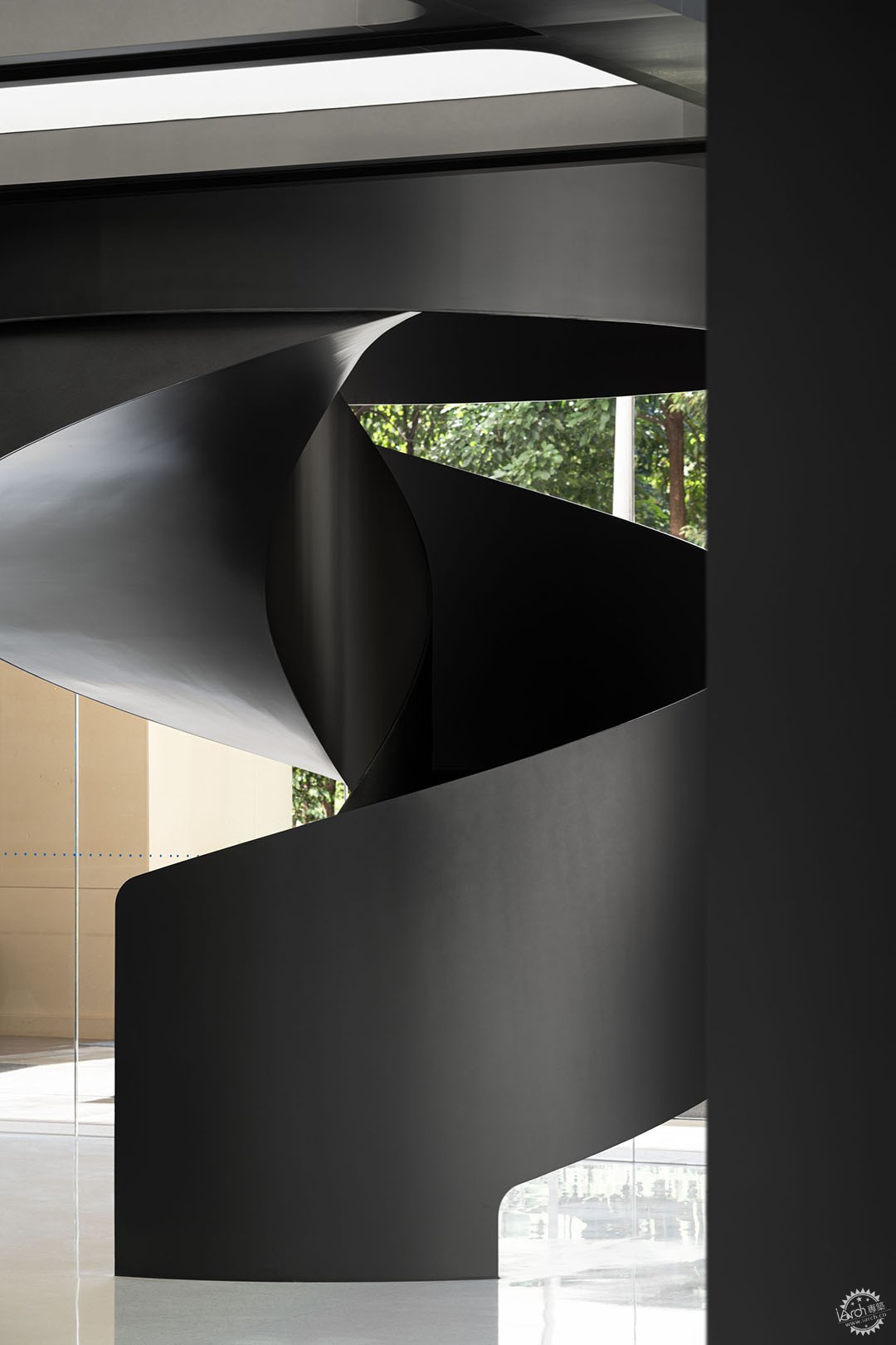
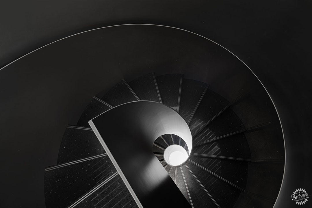
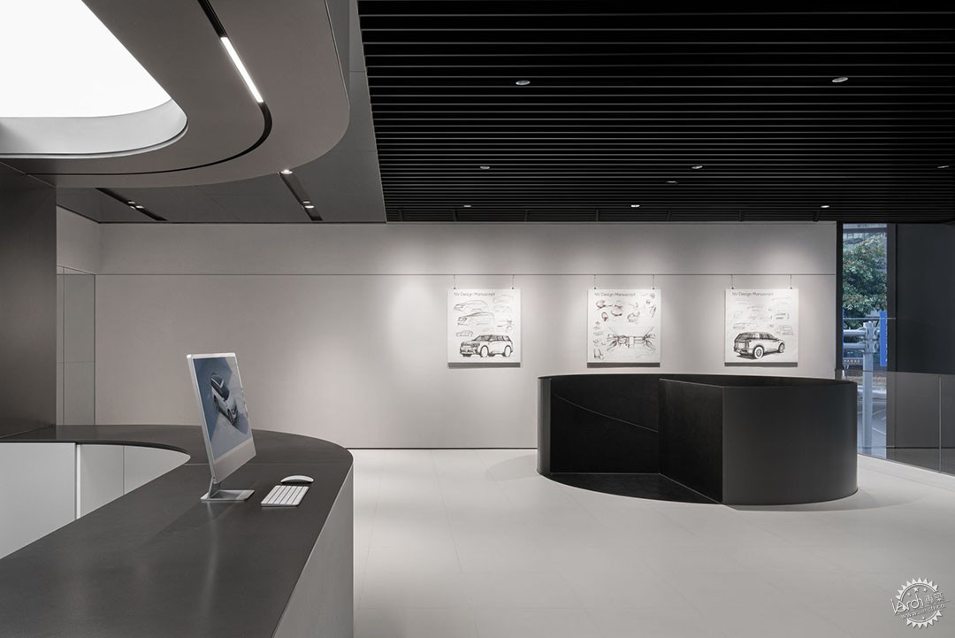
整个过程都贯穿着对于动线的把握。展陈建筑的空间体验是连续性的,动线是组织空间最重要的手段。当来访者进入空间伊始,映入眼帘的就是中央跨度长达五米的漩涡式旋转梯,其作用并不仅仅是提供垂直方向上的连接 —— 在视觉上保持了楼层之间的连贯性,带给室内空间更多的层次,也为社交互动创造了更多可能。
The whole process is carried out with the grasp of the traffic flow. The spatial experience of the exhibition space is continuous, and the traffic flow is the most important means of organizing the space. The swirling staircase with a central span of meters is not just a vertical connection - it visually maintains the continuity between floors, bringing more layers to the interior space and creating more possibilities for social interaction.
▼通过旋涡式旋转楼梯向上直达二层,The spiral staircase leads up to the second floor ©样本空间摄影 八尺口
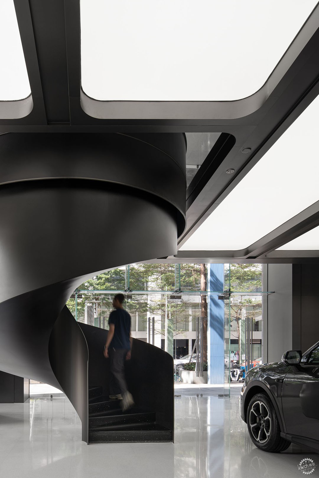
▼展厅一角,A view of showroom ©样本空间摄影 八尺口
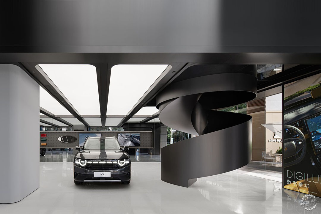
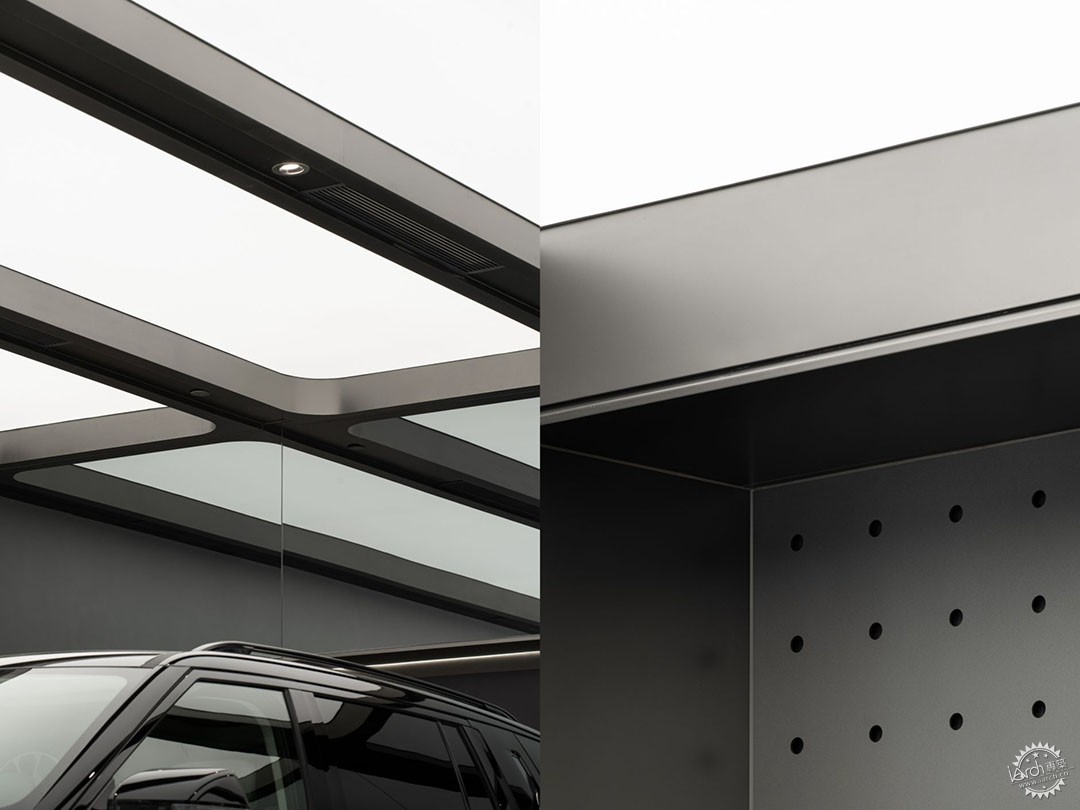
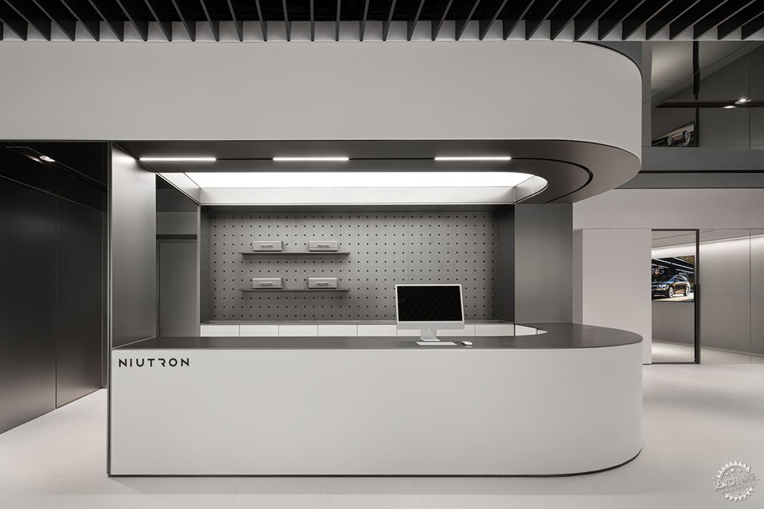
机械的精密美感充满科技的魅力,以象征品牌logo的意向为概念贯穿空间始终,肌理从自游家的概念车流线造型中获取灵感,强化了几何体块的可读性。将流动的城市形式引入商业空间中,形成多重表达融合下的室内装饰,并配合品牌视觉标准的材质和配色,生成展陈空间的整体逻辑。充满未来感的双层发光灯膜犹如外太空射灯,贯穿空间始终,进行着一场过去和未来的对话。
The mechanical precision aesthetics is full of technological charm, and the concept of intention symbolizing the brand logo is used throughout the space. The texture takes inspiration from the flowing shape of the concept car of NIUTRON, strengthening the readability of the geometric block. The flowing urban form is introduced into the commercial space, forming the interior decoration under the fusion of multiple expressions, and matching the brand's visual standard of materials and color scheme to generate the overall logic of the exhibition space. The futuristic double-layer light-emitting film is like a spotlight from outer space, running through the space and conducting a dialogue between the past and the future.
▼品牌LOGO展示区,Brand LOGO display area ©样本空间摄影 八尺口
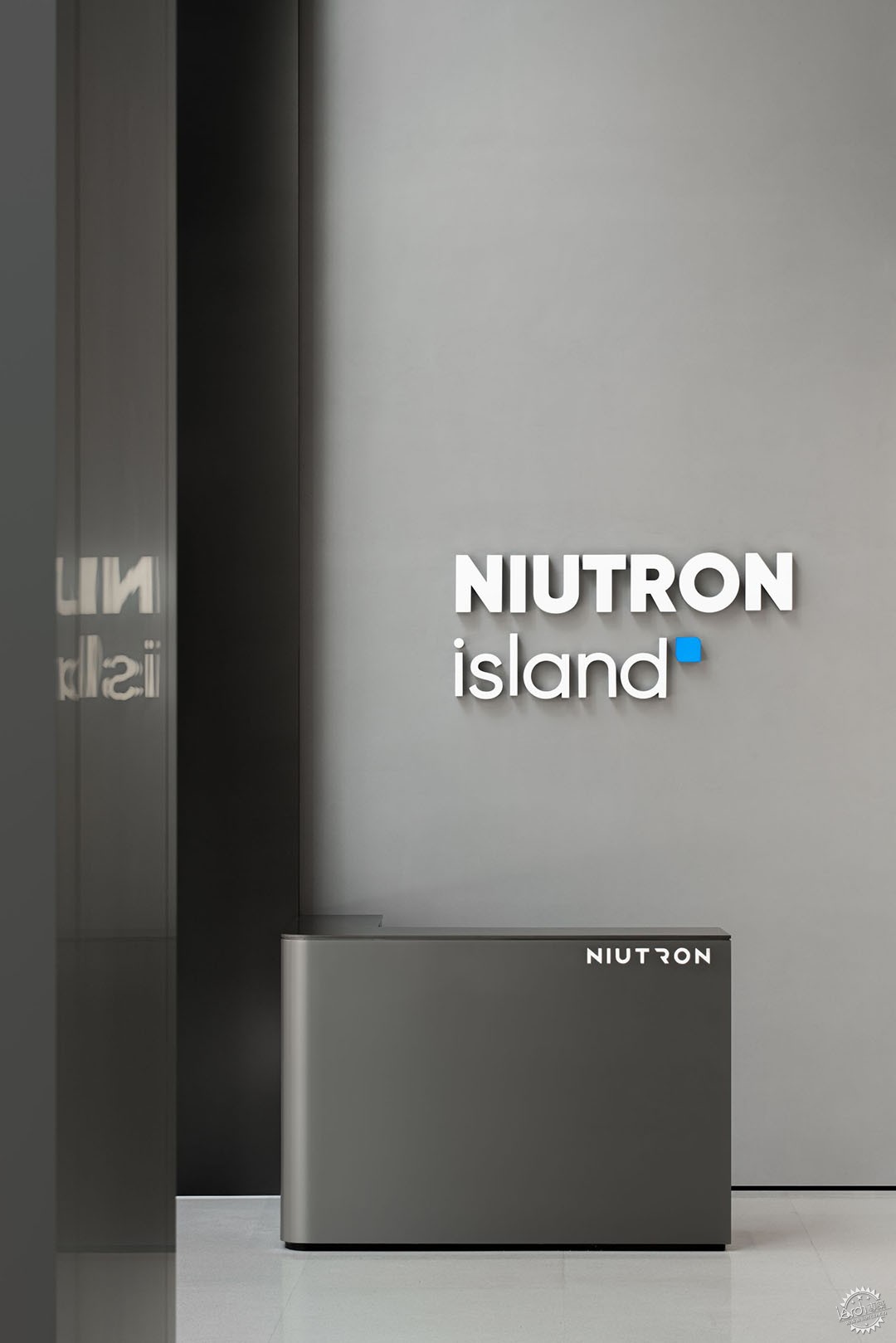
▼从展厅内部望向外立面展示区,Brand LOGO display area ©样本空间摄影 八尺口
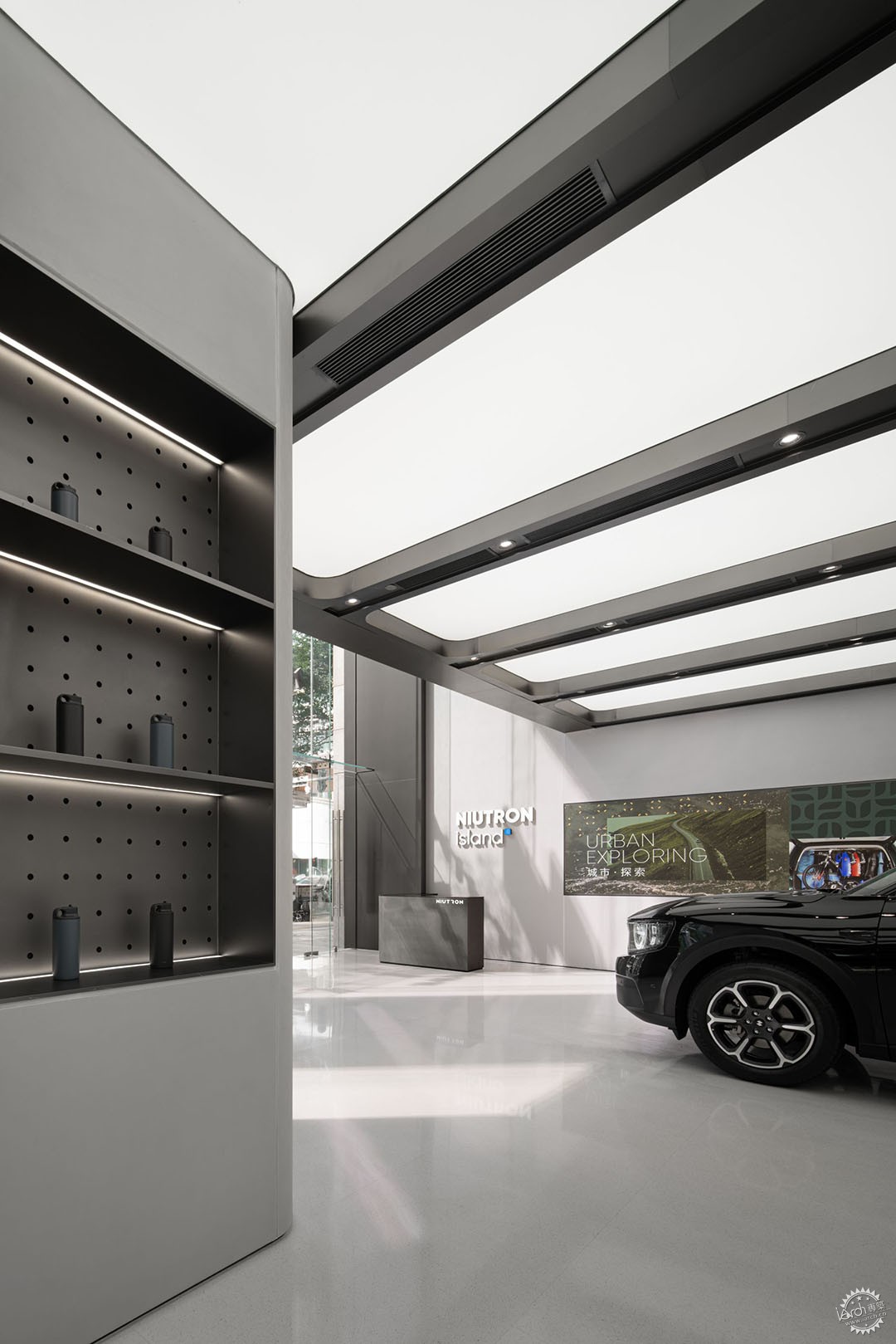
几何式光形的延展,不仅仅始于功能上的视觉聚焦,更营造出一种明暗对立的时间感。营造出明暗层次、虚实对比的视觉感,在丰富空间语境的同时,通过镜面的折射打开一层展厅的尺度。以灯带为媒介,结合空间框架及功能进行设计,简洁的体块自上而下延伸至整个空间。
The extension of geometric light forms not only begins with a functional visual focus, but also creates a sense of time with the opposition of light and dark. It creates a visual sense of contrast between light and dark layers and reality and opens up the scale of the first floor of the exhibition hall through the refraction of mirrors while enriching the spatial context. Using the light strip as a medium, the design is combined with the framework and function of the space, and the simple block extends to the whole space from top to bottom.
▼天花射灯细部,Details of Ceiling spotlight ©样本空间摄影 八尺口
▼涡旋式旋转楼梯细部,Details of the spiral staircase ©样本空间摄影 八尺口
▼从二层望向涡旋式旋转楼梯,Looking at the spiral staircase from the second floor ©样本空间摄影 八尺口
空间递进,二层包含洽谈间及水吧功能,我们强调材质选取对于内部空间延展的重要性,它使建筑物“非个体化”,金属材质释放沉静稳定的情绪,形成具有鲜明特性的场域。
The space is progressive, the second floor contains a negotiation area and a coffee bar. We emphasize the importance of material selection for the extension of the interior space, which makes the building "non-individualized", and the metal material releases a quiet and stable mood, forming a site with distinctive characteristics.
▼二层展示区细部,Details of the second floor display area ©样本空间摄影 八尺口
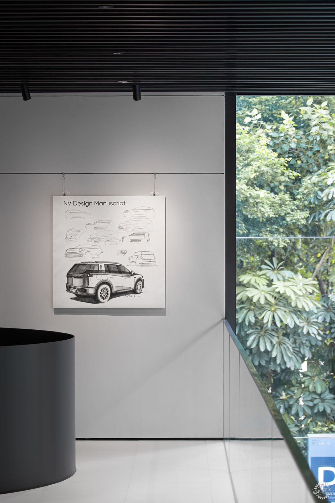
▼从二层吧台望向展示区,Looking at the spiral staircase from the second floor ©样本空间摄影 八尺口
在平滑墙面的另一侧,隐藏着一面收纳客椅多功能柜,根据使用场景灵活切换,前一刻收纳,下一刻则变成小型的展示洽谈会。几何形凳子是基于功能的体验,每一处都暗藏巧思,是这个空间不可或缺的移动元素。
On the other side of the smooth wall, there is a multi-functional cabinet for storing guest chairs, which can be flexibly switched according to the use scene. One moment, it can be stored and the next moment it can be transformed into a small exhibition meeting. Geometric stool is a function based experience, every place hidden ingenuity, is an indispensable moving element of the space.
▼收纳客椅的多功能柜,Multifunctional cabinet for guest chairs ©样本空间摄影 八尺口
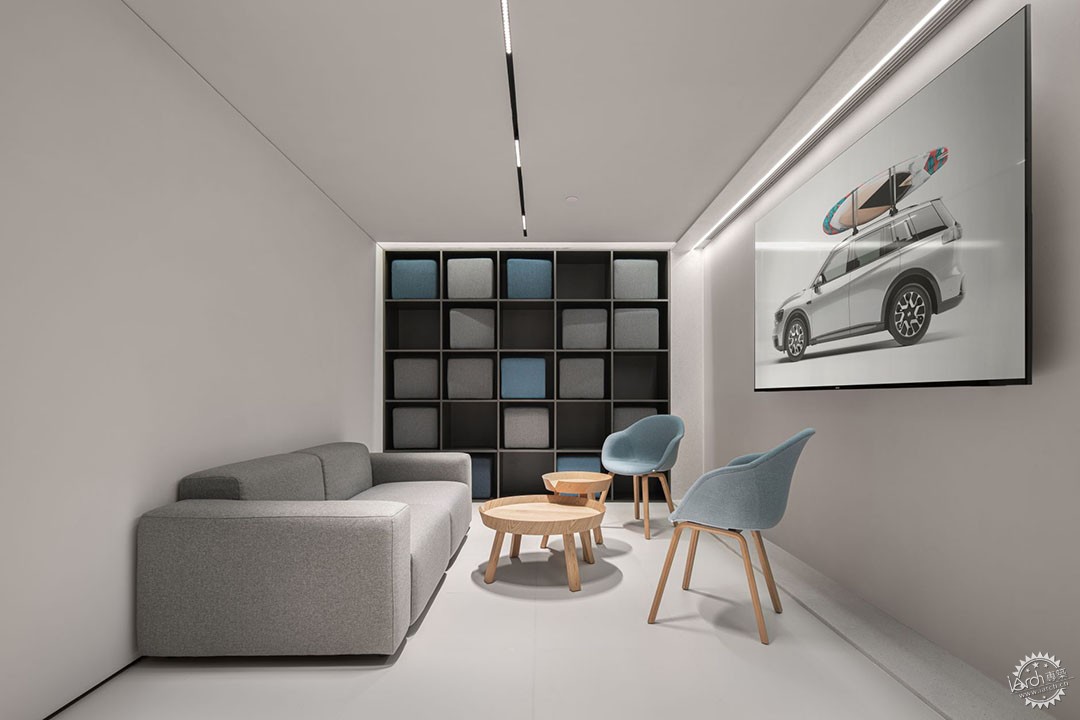
▼一个开放的小型会议厅,An opening small conference space ©样本空间摄影 八尺口

▼二楼吧台细部,Details of the bar on the second floor ©样本空间摄影 八尺口

空间最突出的特征就是带有科技赋能属性的金属铝板,这种轻巧的建筑元素包覆了空间并定义了品牌定位。我们旨在与自游家一道建构一个与科技共生的空间,通过拓宽功能的多样性,在传统零售模式中注入更多独立性体验,让新的交流和探索在复合场域中回归成为可能。
The most prominent feature of the space is the metal aluminum panels with technology property, a lightweight architectural element that envelops the space and defines the brand positioning. Together with NIUTRON, we aim to construct a space that lives in symbiosis with technology by broadening the diversity of functions, injecting more independent experiences into the traditional retail model, and making possible the return of new communication and exploration in a composite site.
▼二楼吧台细部,Details of the bar on the second floor ©样本空间摄影 八尺口
项目名称:NIUTRON自游家汽车展厅广州高德置地店
设计公司:DAGA大观建筑
设计团队:任晓伟,周宇,张贝贝
项目类型:室内设计
建筑面积:400平米
设计时间:2022年5月
建造时间:2022年5月-9月
项目摄影:样本空间摄影 八尺口©样本空间摄影 八尺口
Project Information
Project name : NUITRON ISLAND (GT LAND PLAZA)
Design company : DAGA Architects
Design Team : Ren Xiaowei, Zhou Yu,Zhang beibei
Project type : Interior Design
Project area : 400m2
Design time : May 2022
Construction time : May 2022 - Sep 2022
Photographer : Ba Chi Kou©样本空间摄影 八尺口
来源:本文由DAGA大观建筑提供稿件,所有著作权归属DAGA大观建筑所有。
|
|
