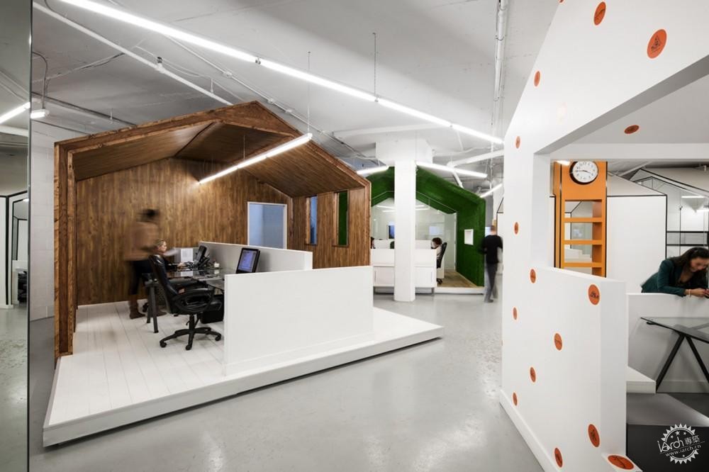
© Adrien Williams
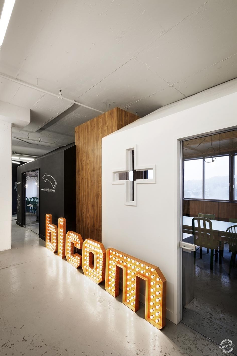
© Adrien Williams
一进入BICOM-Communications 办公区,你立即就会被其放射出来的正能量所吸引。然而,这种伟大能量的感觉就是主要涉及“传播者”方面的内饰设计主题, 以及在里面大型的公关活动炮制了主要的牌子如vitaminwater (可口可乐), Guerlain 和 Kerastase (欧莱雅)。
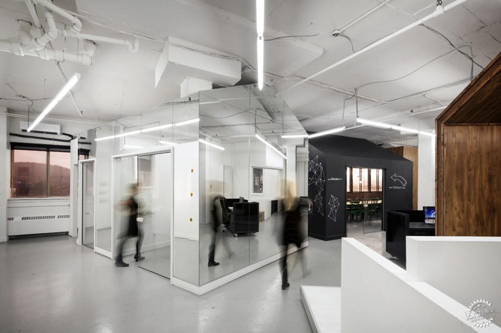
© Adrien Williams
“他们是新一代的年轻人、聪明的人。我的设计战略是反映出他们的架构和方式。24名员工的完全不同的个性也通过这个闪耀出来了。” BICOM的室内设计师解释说。
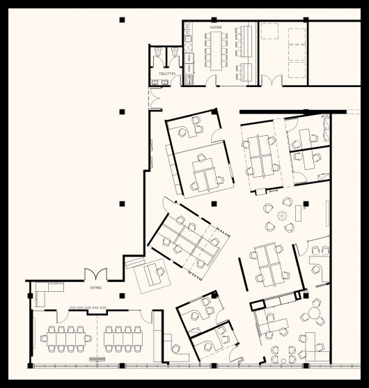
楼层平面图
用设计师的话来说就是设计采取了不受约束的布局形式,在这个超大的区域,利用了开放的空间,由以前接合的连续办公空间来满足该机构的不断扩大。这种布局让几个独立办公室的整合来满足35个人,使得同事之间拥有社会互动的开放空间成为现实。在一起同样可以激发灵感,基于此,为什么同事之间不用在一种有趣的、多功能的和复杂的环境中沟通呢?
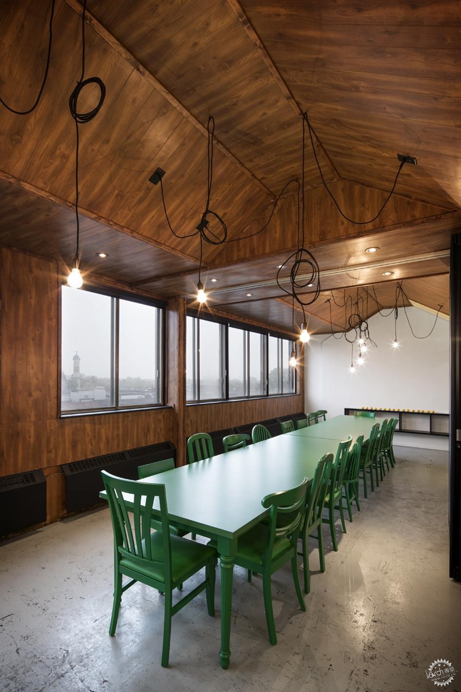
© Adrien Williams
个人和团体是分不开的
Jean de Lessard 在他以前BICOM的方案中举例说明了哲学家和人道主义者Michel Serres的发现——沟通的进步已经废除了空间界限和与他人的关系。因此,出现了当今很有必要从一种很新的方式考虑人类,它也同样重要地相信Jean de Lessard通过假想,一个人自己所处的环境作为一种新的恐惧,以此来重新设计,除了界限和时间的惯性,重新进行了格式化。
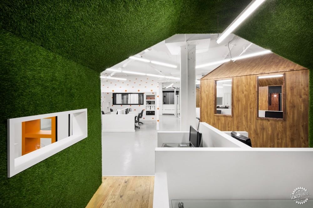
© Adrien Williams
这是一个有关BICOM项目的案例:作为一处具有风格的乡村,它的系统的结构和功能要考虑在它重建之前。
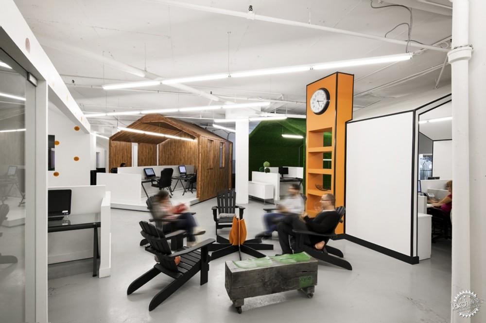
© Adrien Williams
Jean de Lessard选择了这间小房子的原型设计,因为对许多人来说,晚上在夏季湖边的小屋, 在篝火旁,它能带来激发快乐的回忆。 这些房间位于一些公共区域之间。不说建筑材料的坚硬,这些小屋有着很灵活的设计体系,允许这个机构的成长。
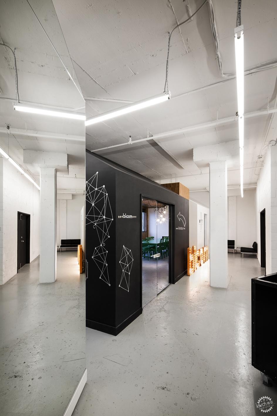
© Adrien Williams
里面的空间是精简的,线条很简洁,没有使用大量色彩,这就组成了一个温暖舒适的建筑信封,而不是旧工厂白墙和高屋顶组成的死板的空间。
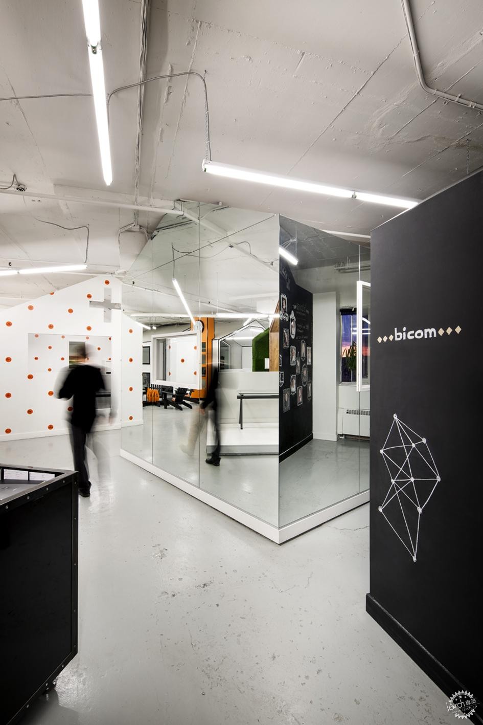
© Adrien Williams
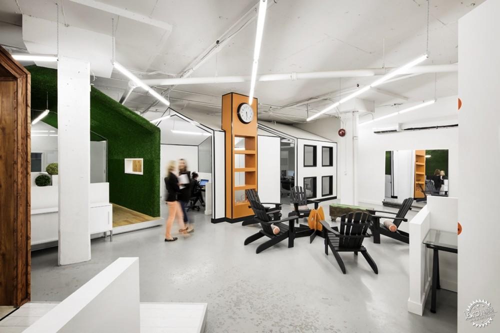
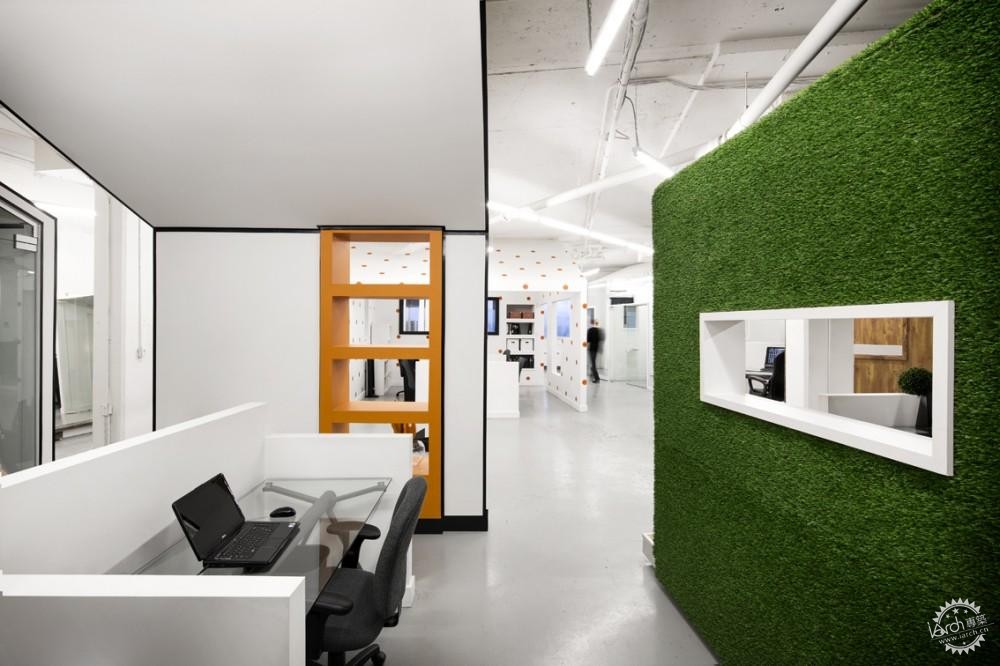
通过它自己的视觉识别,每一个房间都流露出了一种语言和功能:一个房间被绿草覆盖,另一个房间被木板镶嵌,甚至通体都是镜面。表面的各种“镀层”就是一个提醒:每一个个体都有他们自己的个性,所有房间相同的形状带给整体一致性。乡村一样的空间也包含了两个像小茅舍一样的会议空间用来给两个人沟通。和一片公共区域,有一个浴室和一间厨房,计划给有相同爱好的人和聚会的人使用。

© Adrien Williams
Jean de Lessard 用设计为以团队为核心的客户创造了一个微型“村落”,在那里欢腾的环境成为个体和团体取得成就和进化的因素。
© Adrien Williams
© Adrien Williams
设计师:Jean De Lessard
地点: Montreal, QC, Canada
面积:4500平方英尺
时间:2014
摄影: Adrien Williams
合作:Corflez, Chronoglass, Meubles Resto-Plus, Peinture Laurentienne, Gestion D.O.S. and Plomberie B.D.
总包商:Construction Inox
委托客户: BICOM Communications
Bicom Communications / Jean De Lessard
From the architect. Montréal, January 16, 2014 – When entering the new offices of BICOM Communications, a Canada-wide public relations agency specializing in lifestyle, one is immediately struck by the positive energy that radiates. This feeling of great energy is, however, the main interior design theme that concerns the “communicator” aspect of such a place in which large PR campaigns are concocted for major brands such as vitaminwater (Coca-Cola), Guerlain and Kerastase (L’Oréal).
“They are young people of the new generation, smart people. My design strategy is reflecting their agency and the method of operation. The diverse personalities of the 24 employees is also shining through, ” explains interior designer Jean de Lessard about BICOM.
The design, in the words of the designer, more of a controlled chaos, makes use of open space in this vast expanse which was created by the previous joining of contiguous office spaces to meet the agency’s continuous expansion. The integration of several private offices to accommodate eventually 35 people plus a few open areas dedicated to social interactions between colleagues has thus become a reality, thanks to chaos. This is so because the fact of being together should be equally inspiring than inspired, why not then communicate between colleagues in a fun, functional and sophisticated environment.
Individual and community are inseparable
Jean de Lessard illustrates in his formal approach for BICOM the finding of philosopher and humanist Michel Serres for whom “advances in communication have abolished spatial boundaries and relationships with others”. Since it appears necessary today to view human beings in a quite new way, it is equally essential believes Jean de Lessard to imagine one’s own surrounding as a new territory to be redesigned, to be reformatted beyond limits and spatial conventions.
This is the case with the BICOM project: a systematic deconstruction of a place and functions before its reconstruction as a stylized village, surely, but in a totally offbeat way.
Jean de Lessard chose the archetype of the small house, because it brings out emotions that trigger, for many, happy memories at the summer cottage by the lake and campfires at night. The houses are positioned around a few public areas. Despite the rigidity of the construction materials used to build them the cottages are a flexible design system that allows growth within the agency.
Volumes are simplified, lines are pure and masses of colour are used parsimoniously to form a warm and cozy architectural envelope against the stark universe of the bare white walls and high ceilings of the old factory. Further, the seemingly erratical positioning which also defines circulation axis is aiming at breaking monotony and to encourage interactions between people.
Each house has a language and a function that are revealed through its own visual identity: one has been covered with grass, the other with wood panelling, there are mirrors on the next and so on. While the variety of cladding is a reminder that every individual has his or her own personality, the identical shape for all the houses brings consistency to the whole. The village-like space also includes two hut-like conference rooms that communicate between one another, and a common area, including a bathroom and a kitchen, that was planned in the same spirit of closeness and gathering.
Jean de Lessard has created for his client for whom the well-being of the team is a core element, a micro village where the effervescent environment becomes a factor of accomplishment and of evolution for both the individual and the community.
Architects: Jean De Lessard
Location: Montreal, QC, Canada
Area: 4500.0 ft2
Year: 2014
Photographs: Adrien Williams
Partners: Corflez, Chronoglass, Meubles Resto-Plus, Peinture Laurentienne, Gestion D.O.S. and Plomberie B.D.
General Contractor: Construction Inox
Client: BICOM Communications
* 本文由专筑网译自www.archdaily.com,转载请注明出处。* |
|
