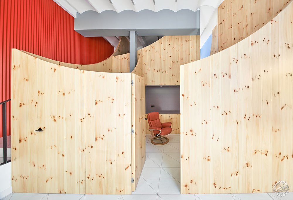
Impress牙科诊所
Impress Dental Clinic / Raúl Sánchez
由专筑网小R编译
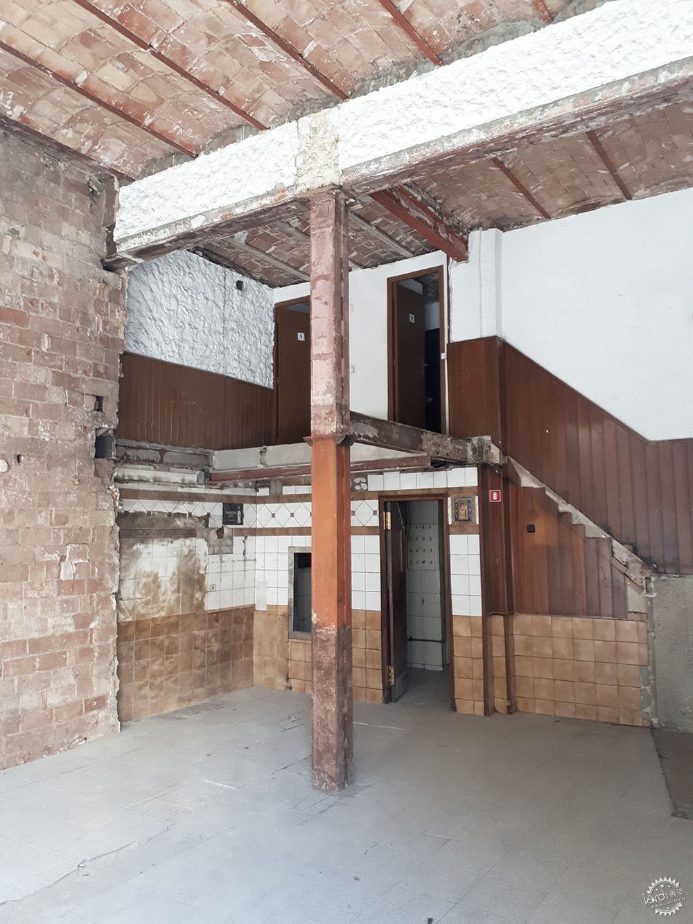
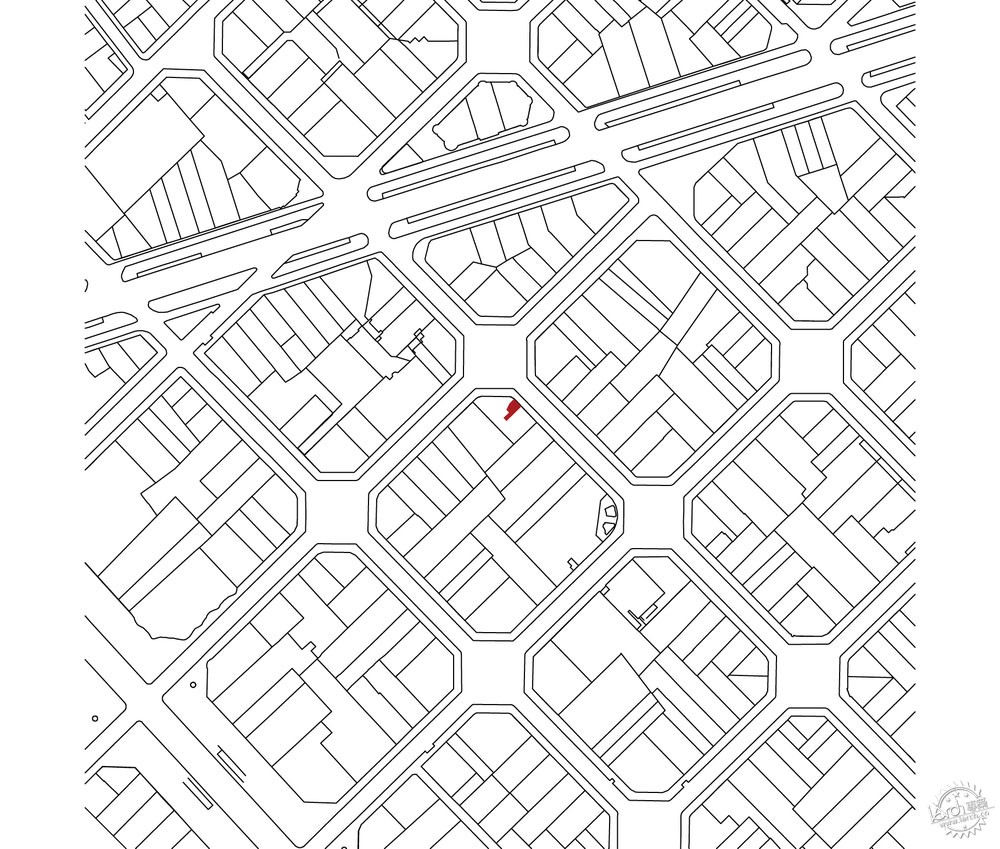
来自建筑事务所的描述:西班牙的第一家Impress牙科诊所位于巴塞罗那城市中央的一个小空间里,分为地面层、夹层、地下层。
Text description provided by the architects. Impress's first dental clinic in Spain is located in a small space in the center of Barcelona, comprehending access on the ground floor, mezzanine and basement.
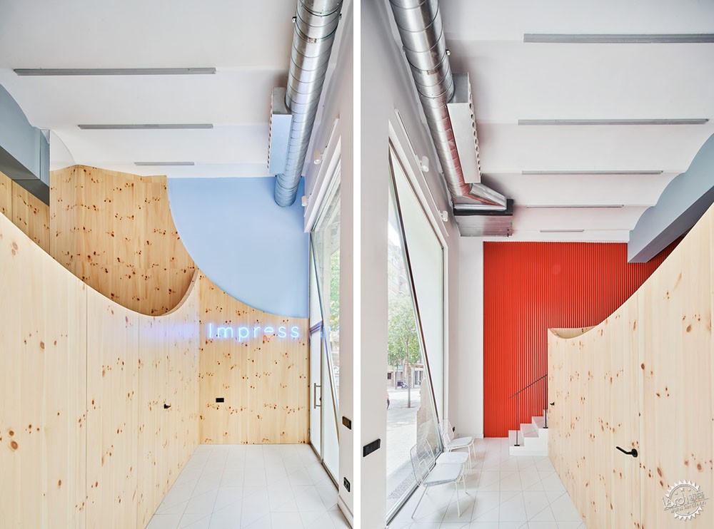
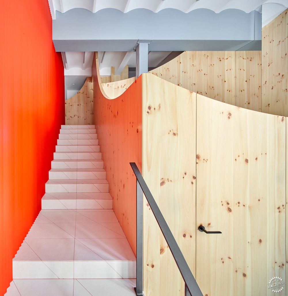
Impress牙科诊所的设计概念针对年轻群体,随着科技的发展,该诊所以线上问诊为基础,减少了面对面的交流。从最初开始,Impress牙科诊所就希望有着全新的设计策略,需要代表品牌及其价值理念,避免了传统的牙科白色的封闭环境。
The concept of Impress dental clinic is aimed at a young audience, which has grown with new technologies, since its offer is based on online treatments that reduce face-to-face visits. From the first moment Impress looked for a fresh design, which represented the brand and its values, which moved away from the topics of a dental clinic (white colors, aseptic environment).
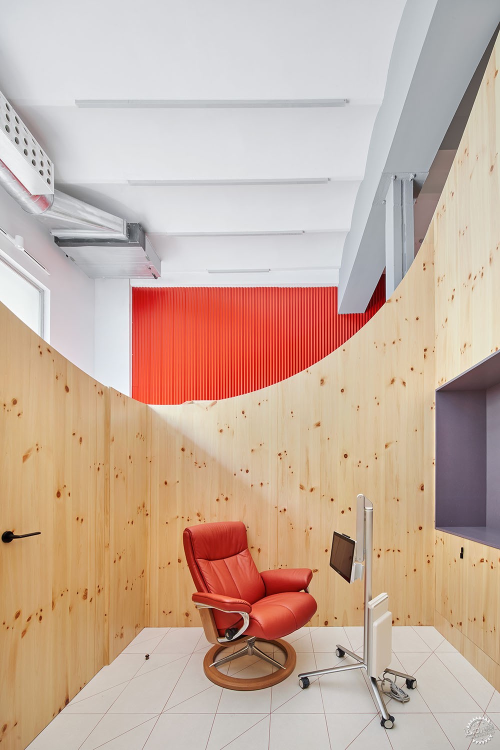
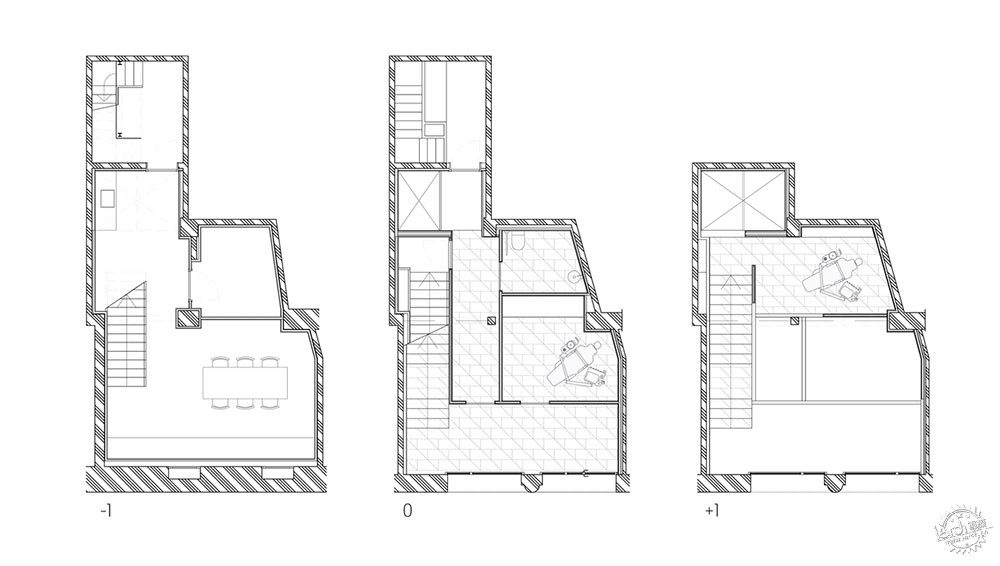

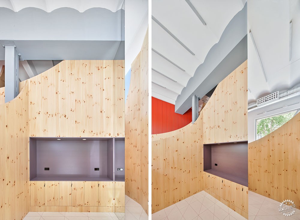
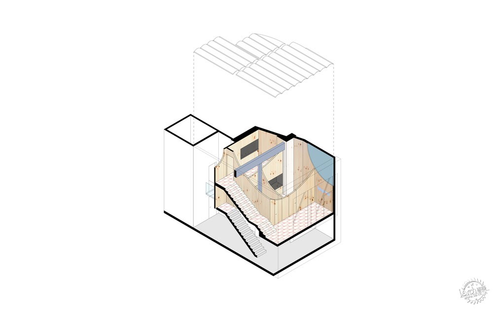
设计方案强调了空间的几何特征,其进深有所减少,但是高度十分充裕,建筑师通过这种形式来重新阐释了品牌的标志,这是一条微笑线,构成了一系列相互连接的面板,形成具有多样功能的大型家具组合,两个研究室分别位于地面层和夹层,另外还有一间卫生间。
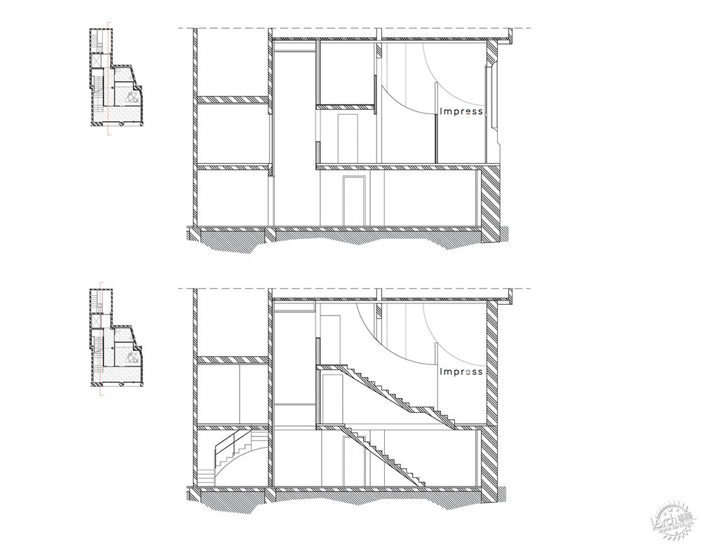
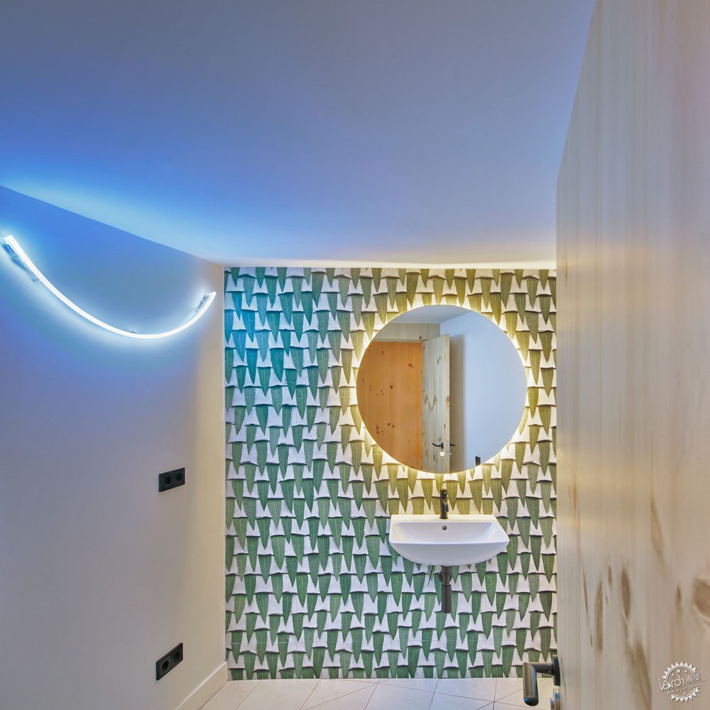
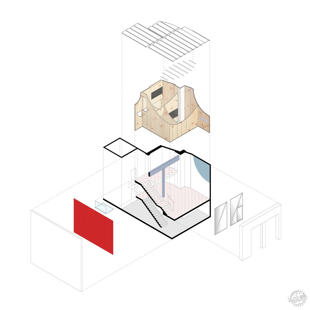
The design enhances the geometric characteristics of the premises, which, although reduced in depth, has a generous height. In this way, we propose to reinterpret the Impress logo, a smile-like curve, to generate a set of interconnected partitions to form a large furniture assembly that meets functional needs: two studies, one on the ground floor and one in the mezzanine, and a toilet.
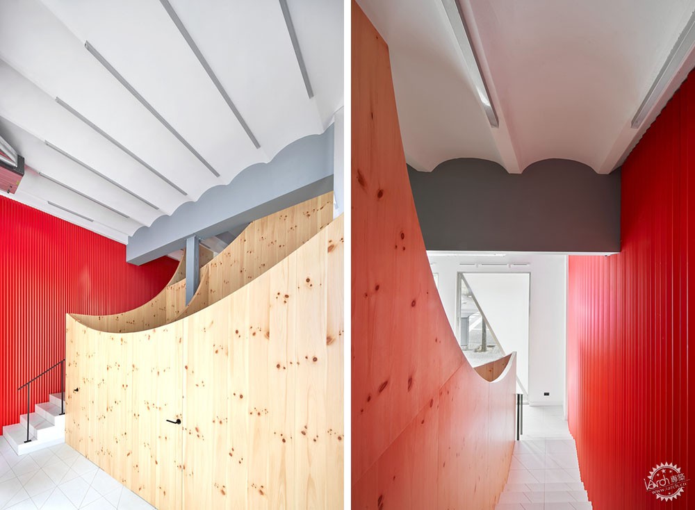
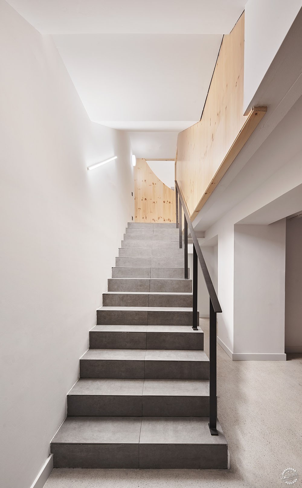
这一部分距离立面大约2米,建立了靠近街道的接待区,并且让内外通透一些,另外,这个区域也距离外部墙壁有一定的距离,给楼梯间留出位置,这个楼梯可以通往夹层和地下池。这些部分的几何形态以曲线为基础,它螺旋上升到一个高度,在空间中构成了进深感和空间感。实际而言,整个室内空间独立开放,但是通过不同的高度和视线,让各个部分拥有相应的隐私性,也给每面墙体的另一侧构成了惊喜与期待的感受。
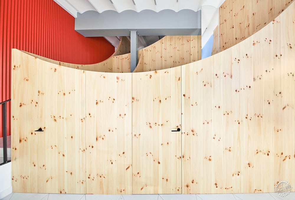
This set moves two meters away from the façade to establish a reception area in close contact with the street, allowing the interior to be appreciable from the outside; and likewise it moves away of one of the boundary walls to allow access to staircase to mezzanine and basement. The geometry of these partitions is based on circumference curves that go up to take the height of the upper floor, increasing the sense of depth and space by creating different ‘curtains’ in space. While virtually the entire interior is a single open space, the necessary visual privacy is respected by controlling the heights and views from each space, what also creates expectation and surprise about what is on the other side of each wall.
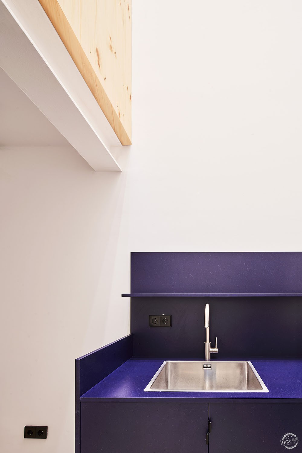
在后侧,三层通高的空腔将自然光引入地下室,这里主要用于储藏、办公、烹饪。在空腔的另一个是X光室,人们可以通过玻璃廊道进入。
At the rear, a triple-height void introduces natural light into the basement, dedicated to storage, locker, office and kitchenette. On the other side of the void, the X-ray room is accessed through a glass walkway.
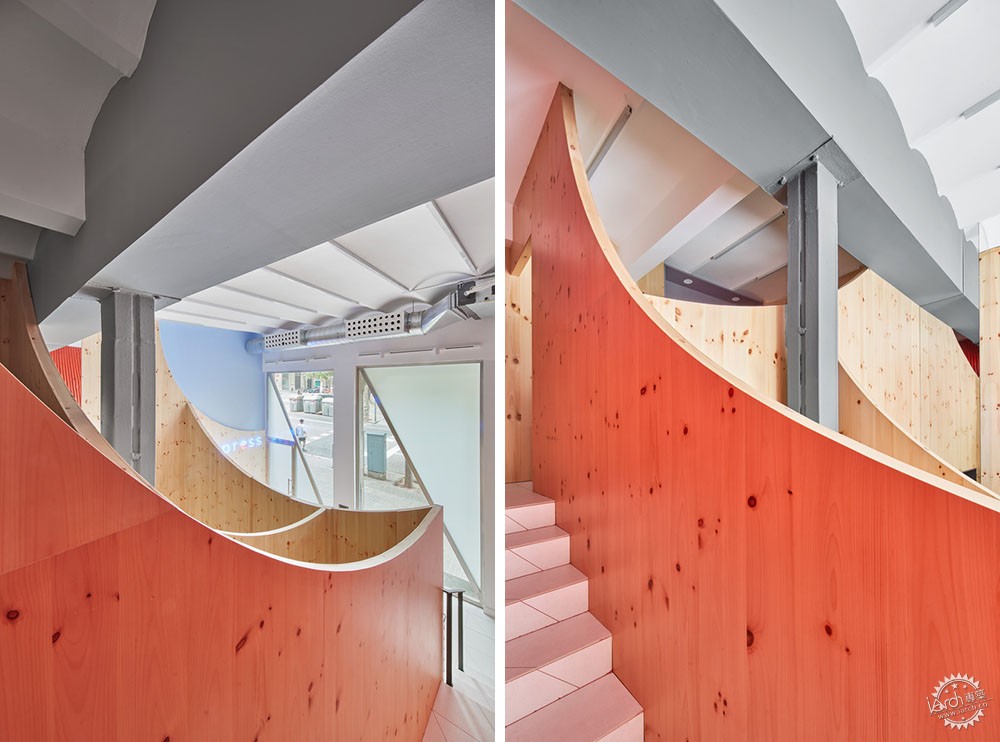
两扇大型的不锈钢窗户的外部结构遵循了自身的秩序,不会与内部的几何形态构成过于显著的对比,也不会和立面的轴线相互对抗。因此,框架位于墙体的内部,给人们带来了单一窗扇的感觉,两个对角杆构成了全新的角度和视觉轴线,创造了透明和不透明的不同效果,让外面的人对内部空间想要一探究竟。
The outer enclosure, two large stainless steel windows, follows its own order, not competing with the interior geometry, nor with the axial configuration of the facade. Thus, the frames are placed on the inside of the walls, giving the feeling of being a single window, and two diagonal crossbars introduce new directions and visual axes, creating a set of transparencies and opacities to increase the expectation of what is inside.

材料面板主要为室内的松木,给牙科诊所带来了温馨感受,现有的结构元素主要以灰色为主,大型红色金属面板覆层结合了上部夹层,而红色的高光也照亮了室内,霓虹灯图像构成了专属的空间角落,在上部,蓝色星星位于入口的曲线墙体上,陶瓷地面和金属墙体有着同样的红色接口,总体来说,室内的所有元素都统一于一种颜色和肌理,它们都有着Impress品牌的独特标志。
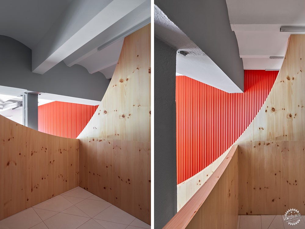
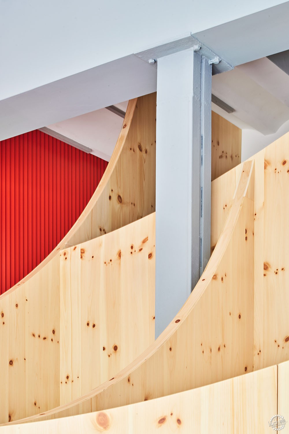
The material palette is dominated by the pine wood of the interior partitions, which adds an unusual warmth in a dental clinic; the existing structural elements stand out with the corporate gray color of Impress; a large corporate red-colored sheet metal cladding accompanies the ascent to the mezzanine and stains the interior with red highlights; a neon sign creates a required corner for instagram pics, and above, the corporate blue color stars the wall over the entrance curve; the ceramic flooring has the same red color joints of the metal wall. And in general, all the elements of the interior receive a color and texture treatment that obeys the Impress identity mark.
建筑设计:Raúl Sánchez
地点:西班牙 巴塞罗那
类型:牙科诊所/适应性再利用
面积:861平方英尺(约80平方米)
时间:2019年
摄影:José Hevia
制造商:41zero42, Duravit, Finsa, ICONICO, Living ceramics, Menu
建筑:Valentina Barberio, Albert Montilla
结构:Diagonal Arquitectura
工程设计:Marés ingenieros
客户:Smile2Impress
DENTAL CLINIC, ADAPTIVE REUSE
BARCELONA, SPAIN
Architects: Raúl Sánchez
Area: 861 ft2
Year: 2019
Photographs: José Hevia
Manufacturers: 41zero42, Duravit, Finsa, ICONICO, Living ceramics, Menu
Architecture: Valentina Barberio, Albert Montilla
Structure: Diagonal Arquitectura
Engineering: Marés ingenieros
Client: Smile2Impress
|
|
