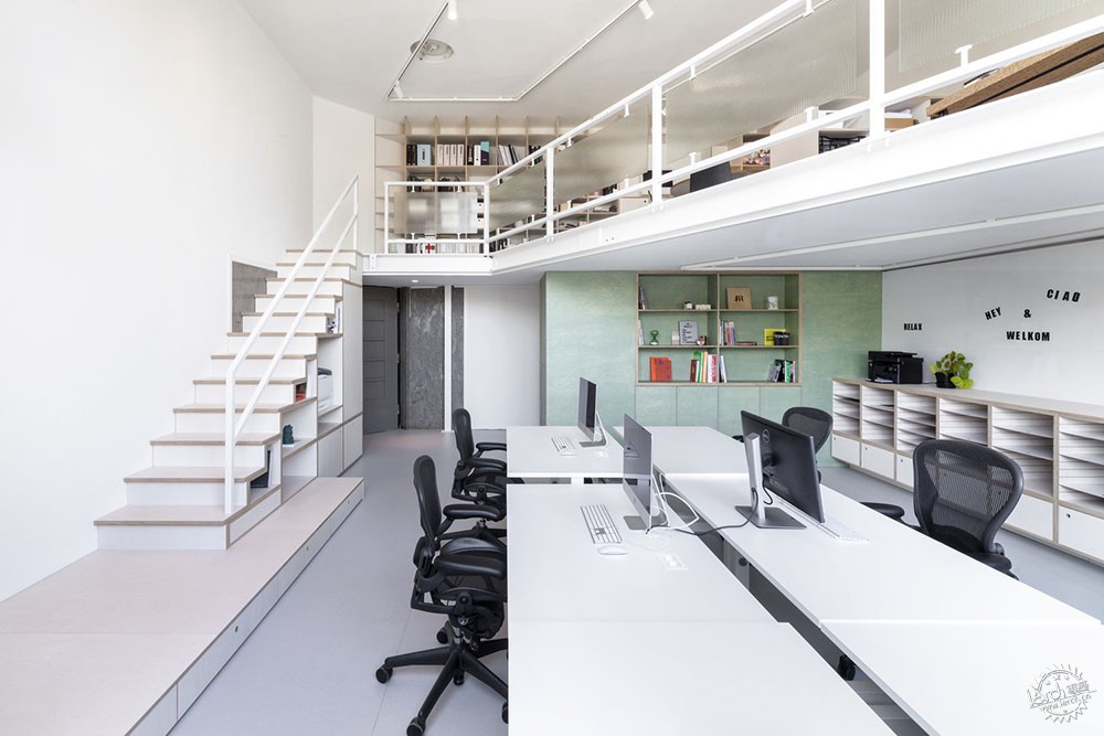
Ninetynine办公室
Ninetynine Office / Ninetynine
由专筑网邢子,小R编译
来自建筑事务所的描述:在设计自己的工作场所时,建筑师希望它能反映我们作为一个小型设计工作室的工作方式。通过绘制活动流线图并将这些内容在空间中进行划分,我们在“员工工作”区域和进行创作的区域之间进行了明确的划分,并设计了定制的家具物品,帮助建筑师组织好日常的事务,能够让建筑师在创造和组织、突破界限和实现事情之间进行平衡。
Text description provided by the architects. When designing our own workplace, we wanted it to reflect our way of working as a small design studio. By mapping our main activities and dividing them throughout the space, we created a clear division between the area where “stuff gets done” and the area where the creative process takes place. We designed bespoke furniture items to help us to organise the daily balancing act between creating and organising, pushing boundaries, and making things happen.

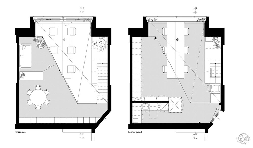
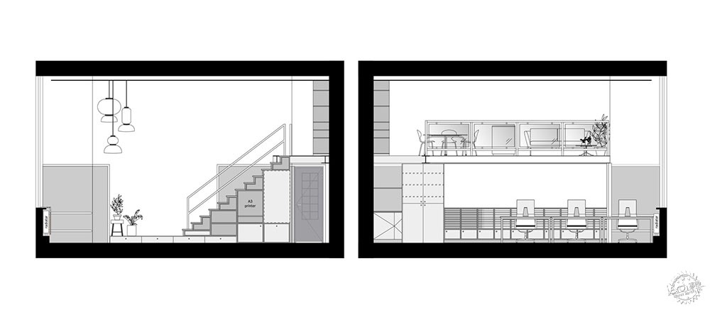
区域。办公室位于阿姆斯特丹市中心的一个大型前医院内,建筑本身有75平方米,包括一个30平方米的夹层,自然光充足。工作区位于底层,有一个6人工作岛,其中的Lensvelt Studio Duo办公桌由Marcel Wanders设计,而夹层的创作区则结合了材料库、会议桌和软座,其中的Artifort C683沙发由Kho Liang Ie设计。
Zones. The office is located in a large former hospital in the centre of Amsterdam. The unit itself is 75sqm, including a 30sqm mezzanine, and is flooded with natural light. The work zone is situated on the base level with a 6-person work island (Lensvelt Studio Duo desks by Marcel Wanders), while the creating area on the mezzanine combines the material library, meeting table, and soft seating (Artifort C683 sofa by Kho Liang Ie).
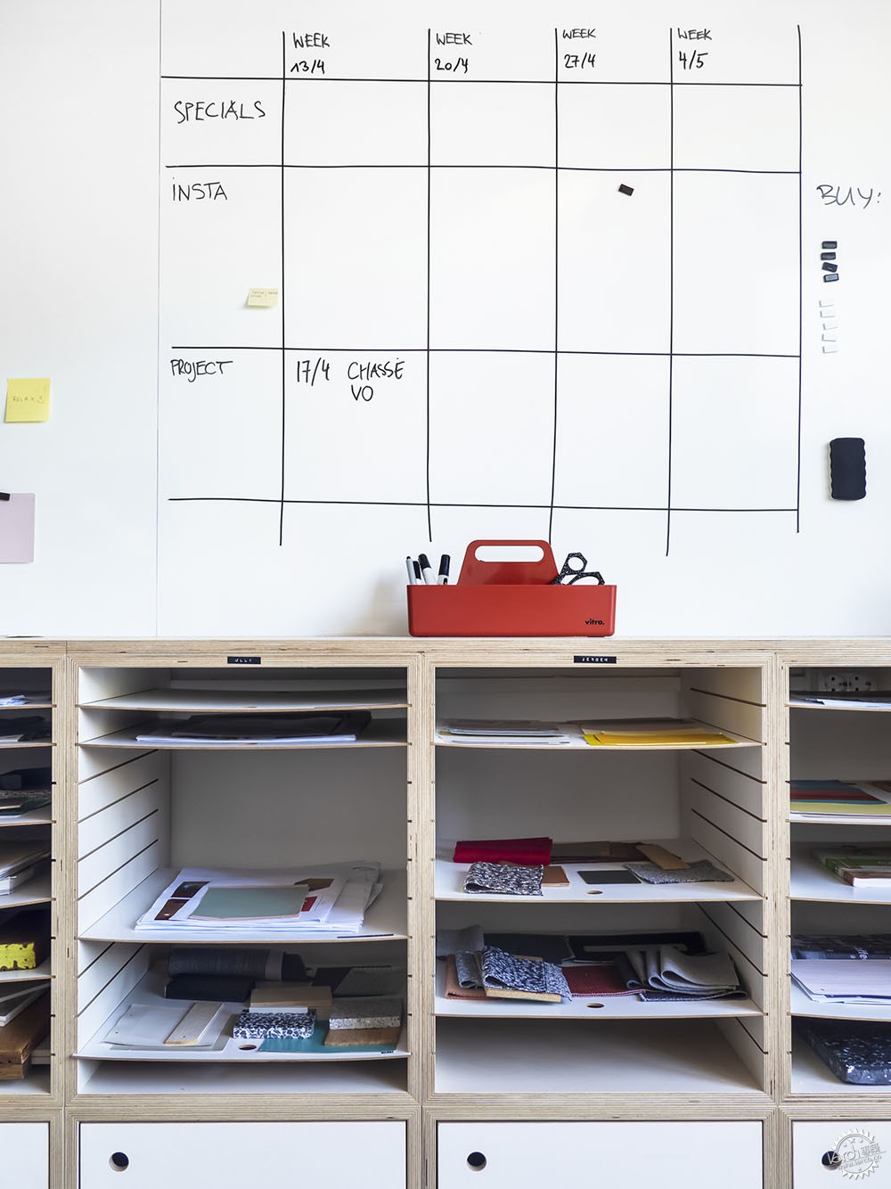
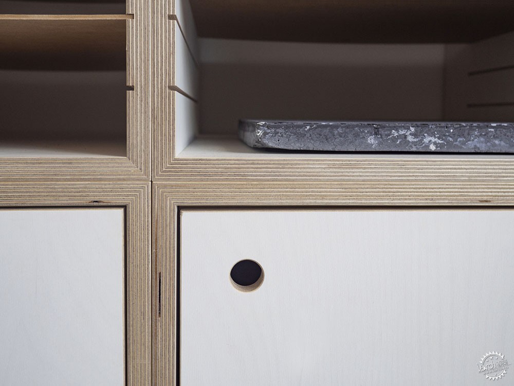
抽屉。沿着夹层地板下的墙面,有一个定制的文件柜,上面有100个抽屉,用来收纳和展示不断变化的材料色板和所有正在进行的项目图纸。薄薄的硬板抽屉承载着材料板,使其易于移动。
Trays. A bespoke sideboard with 100 trays along the wall underneath the mezzanine floor organises and displays evolving material palettes and drawing sets of all on-going projects. The thin hardboard trays carry the material boards, making it easy to move them around.
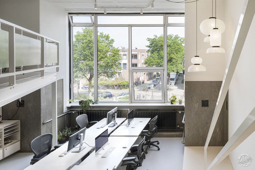
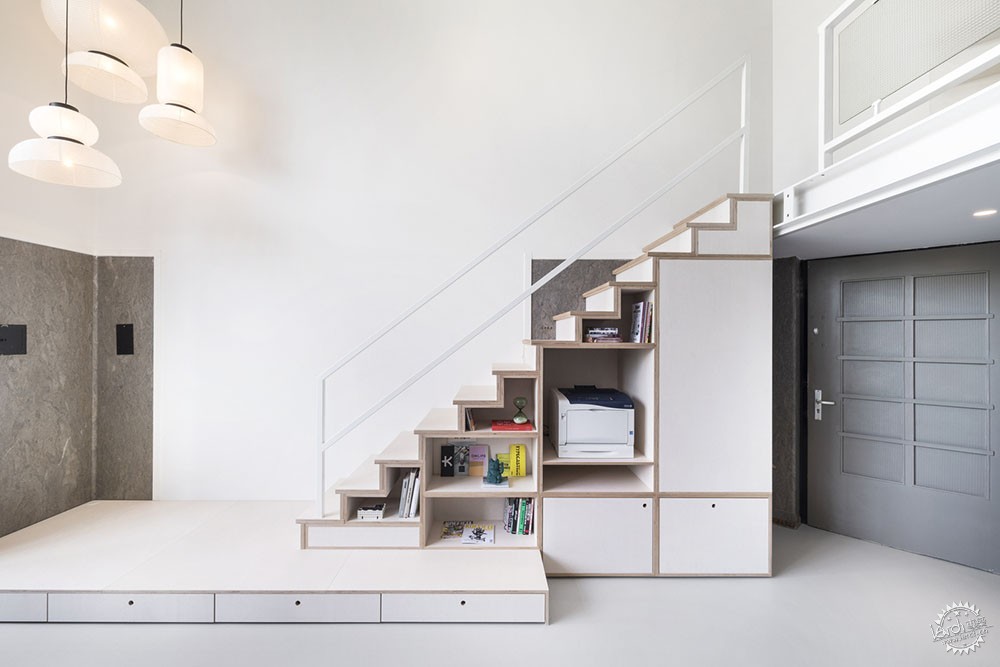
连接。夹层的钢结构是该单元建筑的一部分。新建的胶合板制成的楼梯不仅连接了两层楼,而且还结合了储藏室、壁橱和打印站等功能。连接楼梯雕塑与主空间的低矮平台,成为人们可以坐下来讨论的首选区域。
Connection. The mezzanine’s steel structure is part of the unit’s architecture. The newly built staircase made of plywood connects not only both levels but also combines functions such as storage, a closet, and the printing station. A low podium that connects the staircase sculpture to the main space has become our preferred area to sit and discuss.

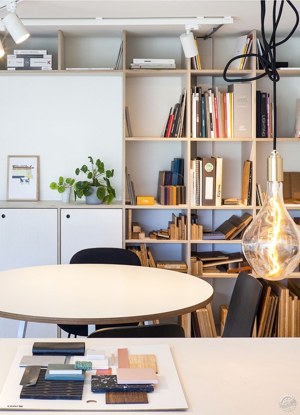
配色方案。设计的配色方案尽量以中性为主,从而作为类似尚待创作的白色画布。为了提亮灰色色调,建筑师引入了“绿色盒子”。位于夹层下方,包含了一个书架,用来展示灵感来源,同时又隐藏了主储藏室和茶水间等功能。为了避免过量的自然光,建筑师安排了一簇纸罩灯,其中传统的Formakami灯由Jamie Hayon设计,创造了温暖、有情调的灯光环境。
Colour scheme. The colour scheme of the design is as neutral as possible to act as a white canvas to the designs yet to be created. To brighten up the shades of grey, we introduced the “green box”. Positioned underneath the mezzanine it contains a bookshelf to display our sources of inspiration while hiding functions like the main storage and pantry at the same time. To counter the huge amount of natural light, we arranged a cluster of paper shade lamps (&tradition Formakami lamp by Jamie Hayon) that create a warm, moody light scheme.

建筑设计:Ninetynine
类型:办公建筑内部装修
地点:荷兰 阿姆斯特丹
面积: 75 m2
年份:2019年
摄影:Ewout Huibers Ewout Huibers
制造商:&Tradition、Lensvelt、Aeron、Forbo、Formakami、Hermann Miller、Studio Duo
承包商:Roord Binnenbouw
Offices Interiors • Amsterdam, The Netherlands
Architects: Ninetynine
Area: 75 m2
Year: 2019
Photographs: Ewout Huibers
Manufacturers: &Tradition, Lensvelt, Aeron, Forbo, Formakami, Hermann Miller, Studio Duo
Contractor: Roord Binnenbouw
City: Amsterdam
Country: The Netherlands
|
|
专于设计,筑就未来
无论您身在何方;无论您作品规模大小;无论您是否已在设计等相关领域小有名气;无论您是否已成功求学、步入职业设计师队伍;只要你有想法、有创意、有能力,专筑网都愿为您提供一个展示自己的舞台
投稿邮箱:submit@iarch.cn 如何向专筑投稿?
