- 项目委托
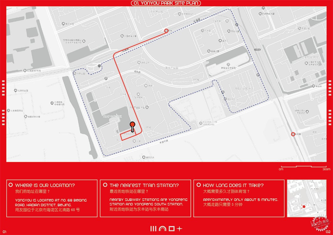
2022年3月,大观建筑收到了用友网络的邀请,改造一处位于北京市海淀区北清路68号用友软件园内,以满足园区内运动及商业销售为主要目的的体育馆。不同于传统的大型场馆建设,用友体育场馆展示出轻盈且简洁的形象。体育馆升级完成后将充分发挥园区配套设施的服务属性,以面向用友及园区企业员工使用为主,为多种运动项目提供场地,包括:篮球、羽毛球、乒乓球及多功能健身房。
In March 2022, DAGA Architects received an invitation from Yonyou Network to renovate a gymnasium located in Yonyou Software Park, 68 Beiqing Road, Haidian District, Beijing, for the main purpose of sports and commercial sales in the park. Different from the traditional large-scale stadium construction, Yonyou Stadium shows a light and simple image. After the completion of the upgrade, the stadium will give full play to the service attributes of the supporting facilities in the park, mainly for the use of Yonyou and enterprise employees in the park, and provide venues for a variety of sports, including: basketball, badminton, table tennis and multi-function gym.
▼平面分析图,Planar analysis diagram ©DAGA大观建筑
- 规划设计
- Planning design
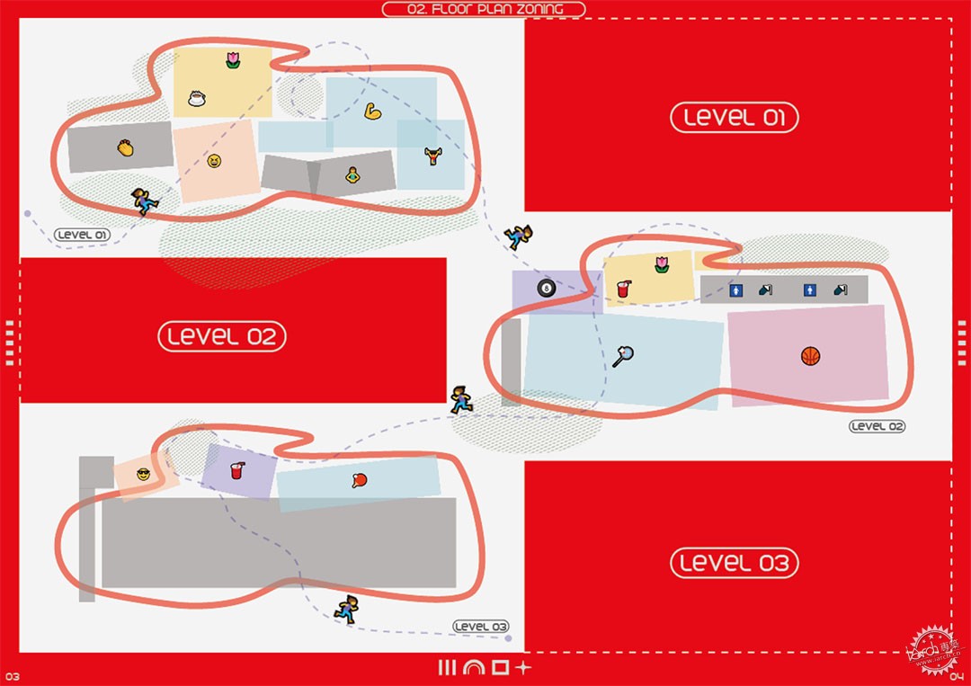
用友网络是全球领先的企业云服务与软件提供商。致力于用创想与技术推动商业和社会进步。规划前期我们统一了场馆中的视觉锤,以用友视觉形象规范中的用友红和用友灰作为空间主色调,体育场,健身房与跑道区并以橙色,蓝色与绿色的分区赋能,不同色温的多色墙面从一处区域过渡到另一处区域,相互渗透,形成和谐的连接。
Yonyou Network is the world's leading enterprise cloud services and software provider. Dedicated to using ideas and technology to drive business and social progress. In the early stage of planning, we unified the visual hammer in the venue, taking Yonyou red and Yonyou grey in the Yonyou visual image specification as the main color of the space. The stadium, gym and running track area were also enabled by the zoning of orange, blue and green, and the multi-color walls with different color temperatures transitioned from one area to another, permeating each other and forming a harmonious connection.
▼平面分析图,Planar analysis diagram ©DAGA大观建筑
- 立面改造
- Facade renovation
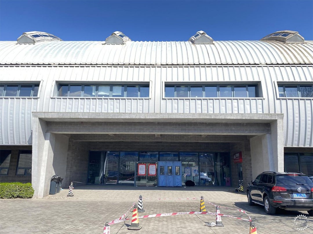
改造前外立面相对单一且陈旧,基于此,首先扩大了原本门头的大小,金属拉伸网材质从门头延伸到室内,当灯管从上往下照透过金属网的同时,折射使零散分布的碎片化构件变成一个独特的整体,带有强烈色彩情绪的红色天花在半透明之间制造了更多的层次。我们试图激发人们对改造后场地的的好奇心和对求知欲:就像孩子总想知道礼物盒子里装了什么一样。
The facade before the transformation is relatively single and old. Based on this, the size of the original door head is first expanded. The metal stretching net material extends from the door head to the interior. When the light tube shines through the metal net from top to bottom, the refraction makes the scattered fragmented components into a unique whole. We try to inspire curiosity and curiosity about the converted site: the same way a child always wants to know what's in a gift box.
▼主入口改造前,Main entrance before renovation ©DAGA大观建筑
▼主入口改造后,Main entrance after renovation ©UK STUDIO
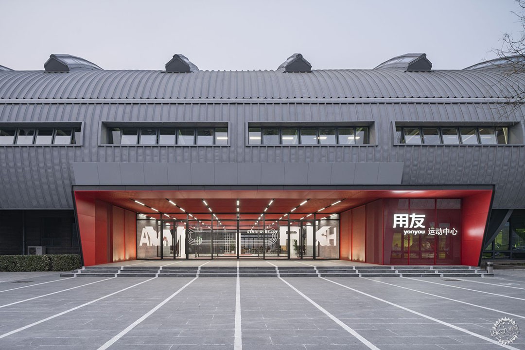
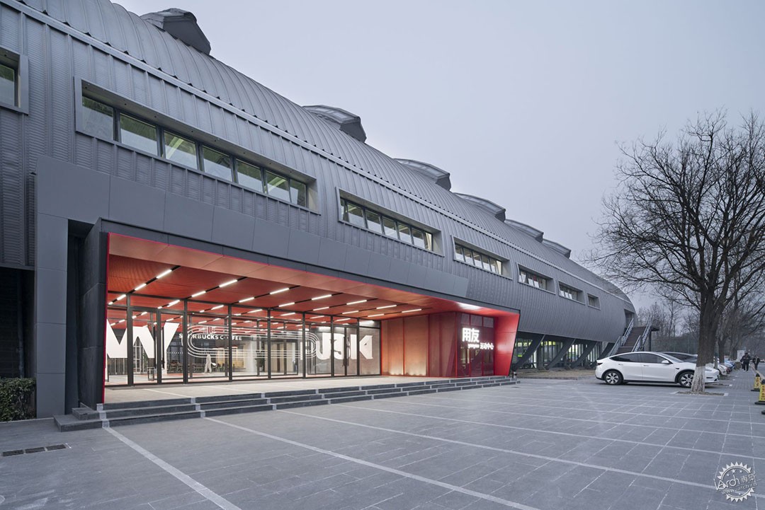
改造后的新体育馆的入口采用开敞式的斜切口造型迎向大众,柔化了原场域内外生硬的界限。颜色是空间指引的概念,也是装饰的一部分。
After the transformation, the entrance of the new stadium is open to the public with an oblique incision shape, softening the stiff boundary between the original field and the outside. Color is the concept of spatial guidance and is also part of the decoration.
▼门头细部,Entrance details ©UK STUDIO
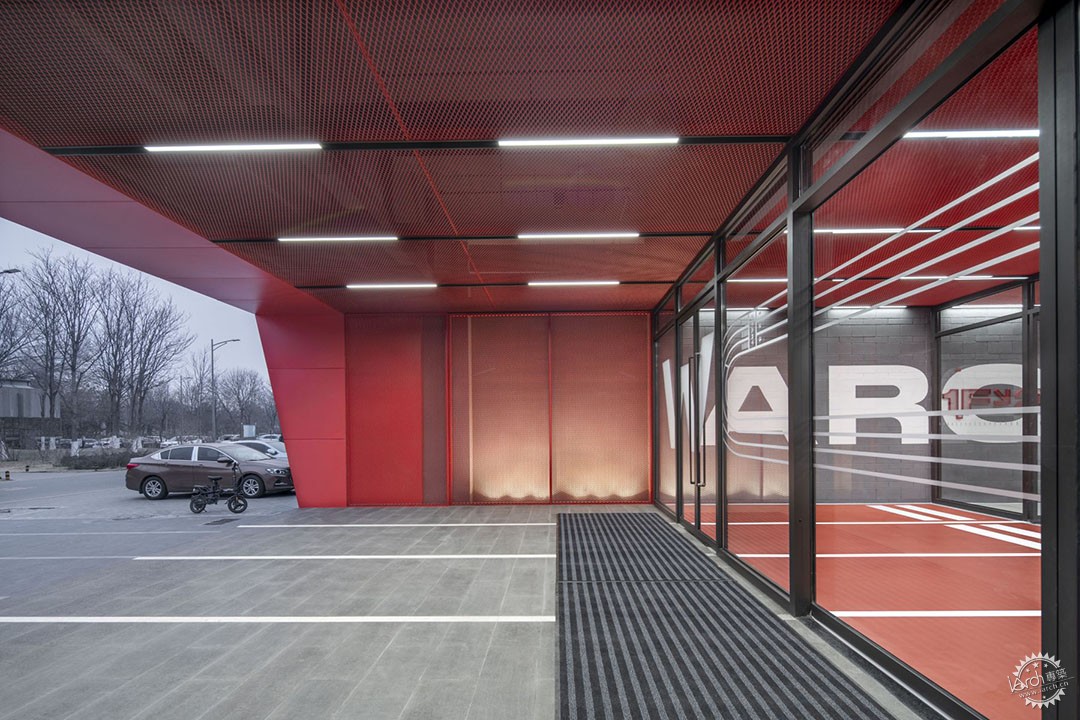
▼从外部看入口的视角,View of the entrance from the outside ©UK STUDIO
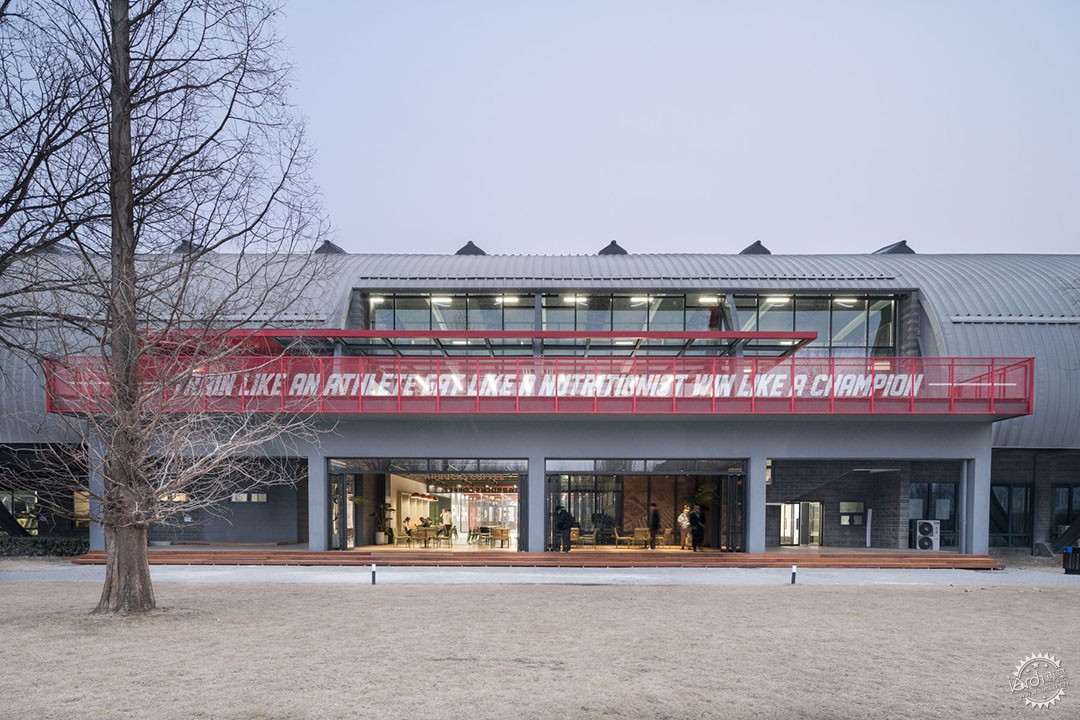
建筑北立面正对片大面积绿地作为空间运动性形态的延伸,入口与绿地相融,给人以宽敞和放松的感觉,而北入口增加的开放休闲区,吸引着人们走进并真正地去使用它的每个空间。
The north facade of the building is facing the large green space as an extension of the space movement form. The entrance is integrated with the green space, giving people a feeling of spaciousness and relaxation. The addition of open leisure area at the north entrance attracts people to walk into and really use every space.
▼建筑北立面正对片大面积绿地,The north facade of the building is facing a large green area ©UK STUDIO
·内部改造策略
-Internal renovation strategies
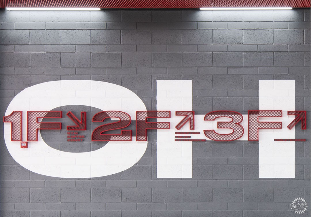
在成本受限的前提下,我们将运动风格的室内标识作为空间设计的亮点,特意设计了跑道风格的vi系统、金属拉伸网的导标系统、地面跑道等。
Under the premise of limited cost, we took sports style interior signs as the highlight of space design, and specially designed the vi system of runway style, the guide system of metal tensile mesh, the ground runway, etc.
▼标识系统分析图,Signage system analysis diagram ©DAGA大观建筑

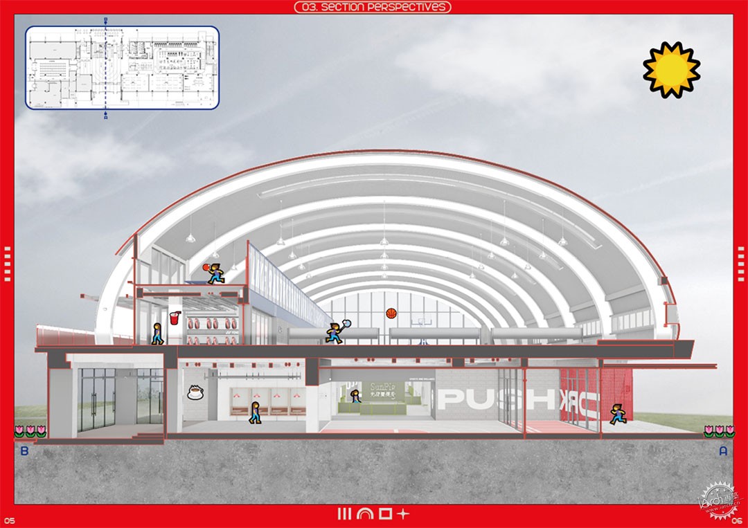
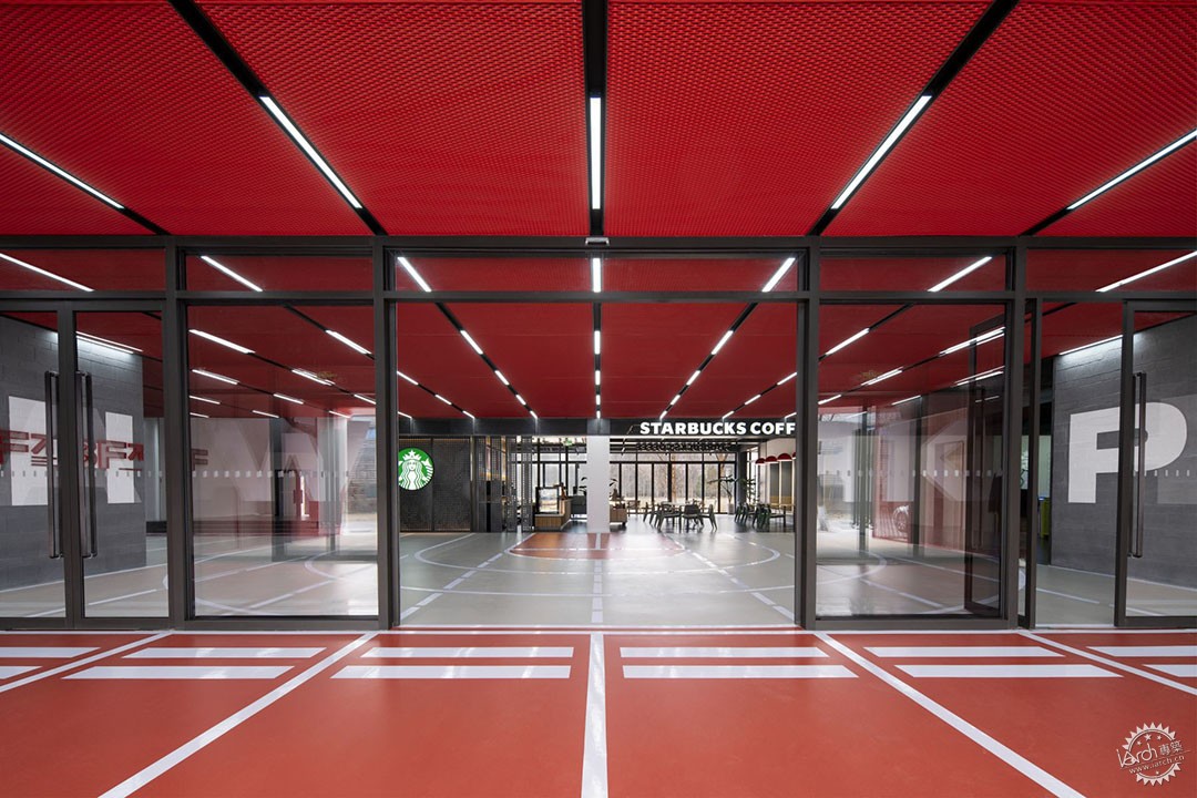
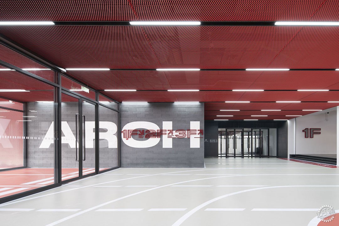
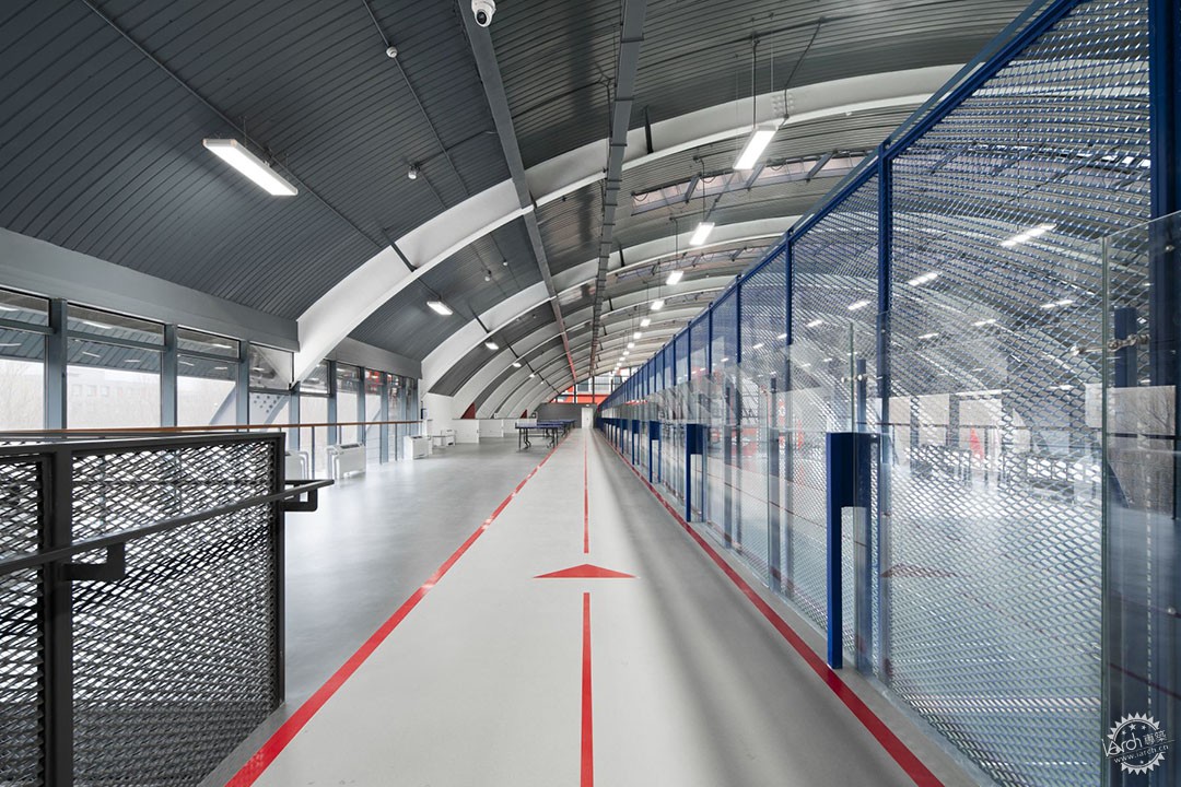
内部的功能区域围绕着宽阔的“跑道概念”分布,后者在接收和汇聚人流的同时,也连接了建筑内部的各种功能空间,从室外沿着“跑道”进入室内,通往一层的咖啡区与健身房;继续沿着“跑道”走上二层进入羽毛球篮球场;“跑道”一直延续到三层的乒乓球区。
The internal functional areas are distributed around the wide "runway concept", which not only receives and gathers people, but also connects the various functional Spaces inside the building. From the outside, the "runway" enters the interior, leading to the coffee area and gym on the first floor. Continue along the "runway" to the second floor to enter the badminton and basketball court; The "runway" continues to the table tennis area on the third floor.
▼场馆轴测分析图,Axonometric ©DAGA大观建筑
▼从室外沿着“跑道”进入室内,From outdoors along the "runway" into the interior ©UK STUDIO
▼主入口门厅通往多功能厅与楼梯间,The main entrance foyer leads to the multi-purpose room and stairwell ©UK STUDIO
▼主入口门厅金属导视标识标,Main entrance hall metal signage ©UK STUDIO
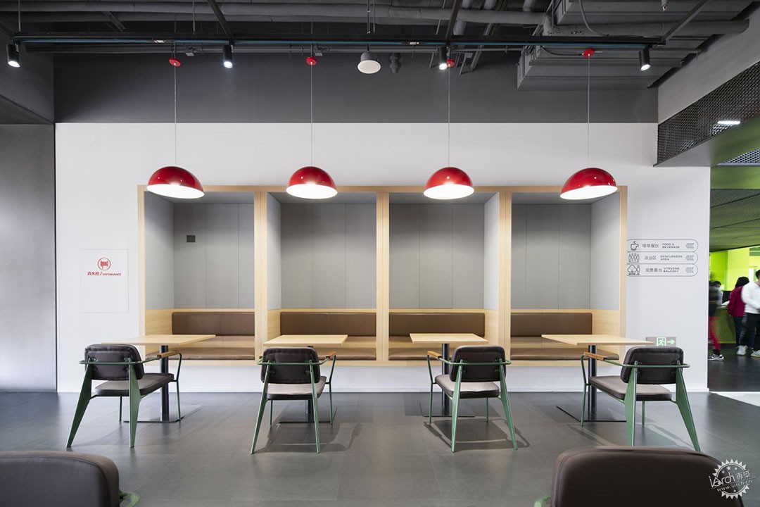
作为用友产业园区的自用运动场所,我们希望不仅为员工提供丰富的运动选择,同时也可以成为年轻人在工作之余进行社交的场所。
As the self-use sports venue of Yonyou Industrial Park, we hope to not only provide rich sports options for employees, but also become a place for young people to socialize after work.
▼主入口门厅通往健身区与咖啡区,The main entrance foyer leads to the fitness and coffee areas ©UK STUDIO
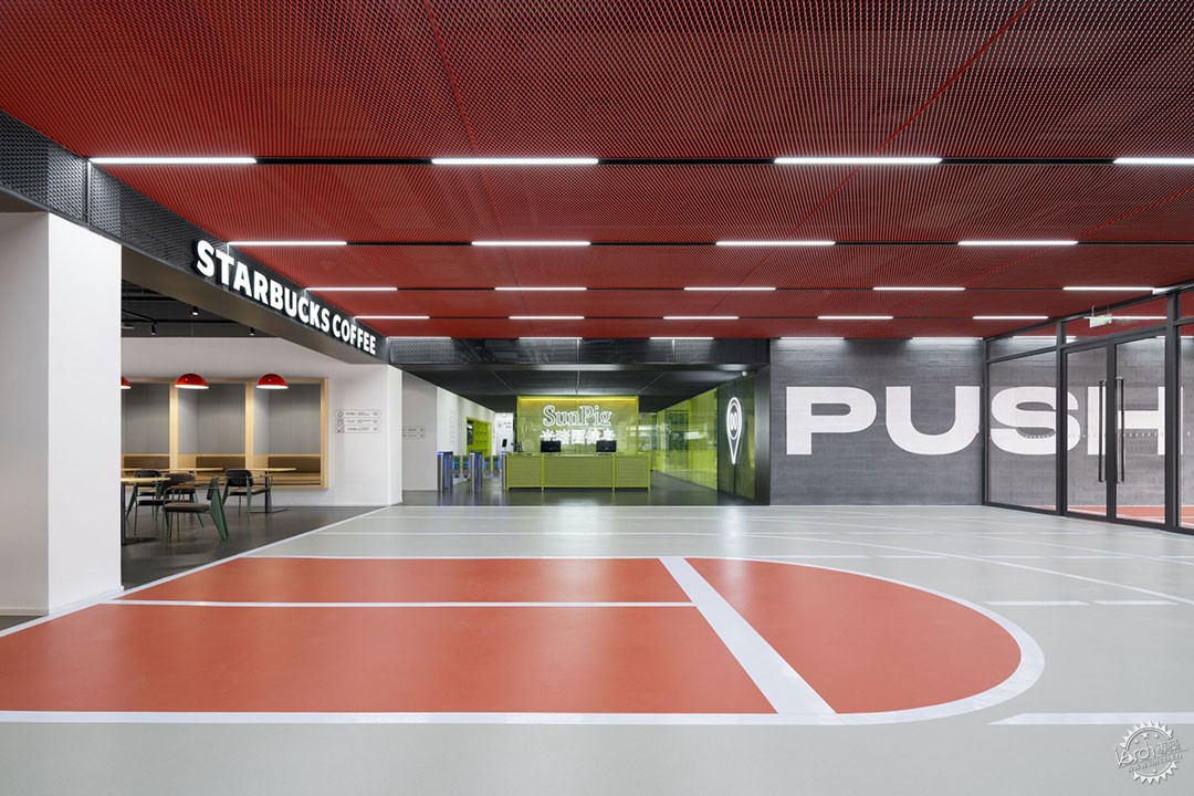
▼咖啡区,coffee areas ©UK STUDIO

▼咖啡区卡座,Coffee booth ©UK STUDIO
▼打开折叠门与户外草坪完全的融合,Open folding door to complete integration with outdoor lawn ©UK STUDIO

清晰简单的平面规划让来访者可以很快读懂建筑空间。场馆内包含了多种运动类型以及配套服务,在设计初期从不同角度考虑到使用者们在设定的场景中所需要的不同体验与可能发生的问题,特别订制的图标与导视选择得利于整个空间更舒缓的串联,利用颜色将划分场景,在颜色中寻找秩序,在材质的拼接与交叠中寻找运动规律。
The clear and simple plan allows visitors to quickly understand the building space. The venue contains a variety of sports types and supporting services. In the early stage of design, different experiences and possible problems needed by users in the set scene were taken into consideration from different angles. Specially customized ICONS and guides were selected to facilitate a more soothing series of the whole space, using colors to divide the scene and find order in colors. Look for the motion rule in the stitching and overlapping of materials.
▼开放的楼梯间通往二层与三层,An open stairwell leads to the second and third floors ©UK STUDIO
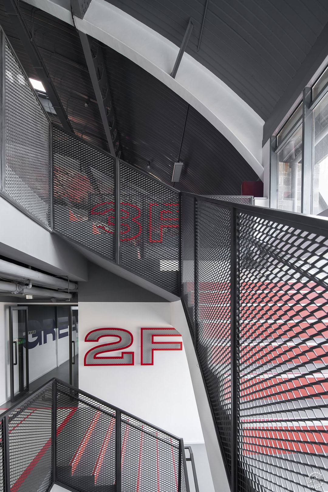
▼开放的楼梯间通往二层与三层,An open stairwell leads to the second and third floors ©UK STUDIO
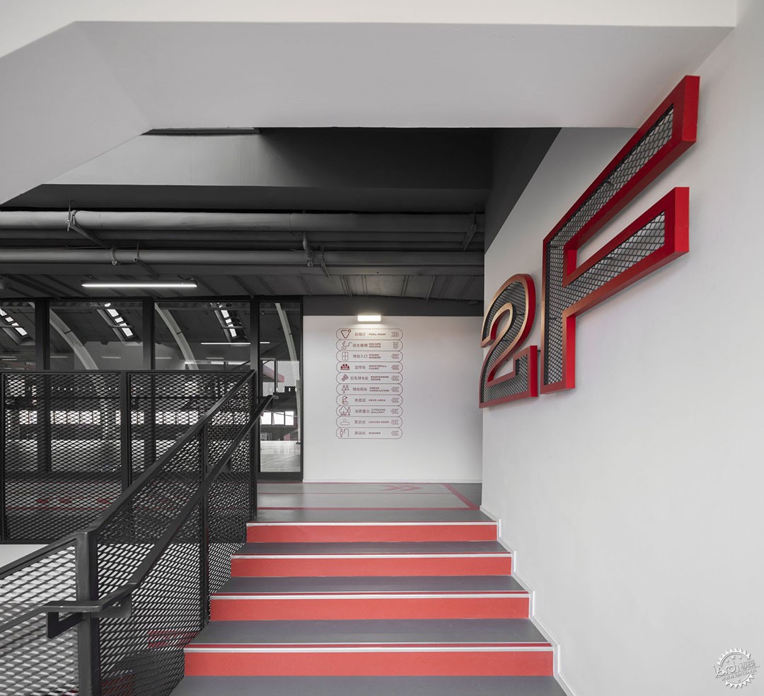
▼二层楼梯连通走廊,Second floor staircase connecting to the corridor ©UK STUDIO
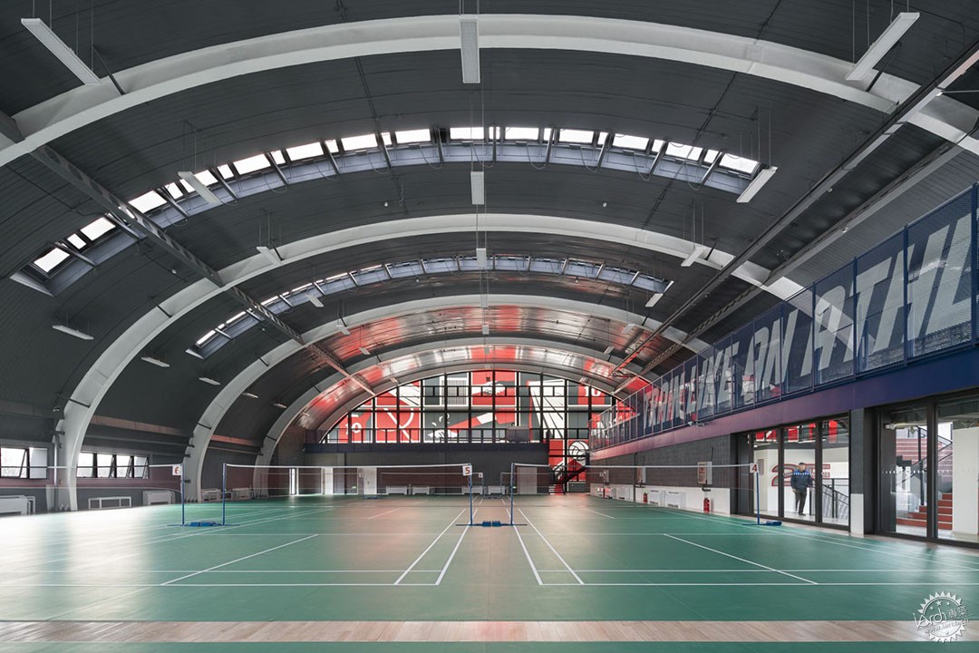
体育馆的拱形结构原有的采光天窗依旧保留,但是为了防止不可控的自然光对体育运动的影响,采取在玻璃内侧装透光膜的方式,既保证自然的采光又照顾到羽毛球运动的需要。
The original skylight of the arch structure of the gymnasium is still retained, but in order to prevent the influence of uncontrollable natural light on sports, the transparent film is installed on the inside of the glass, which not only guarantees the natural lighting but also takes care of the needs of badminton.
▼体育馆二层主运动空间,Main sports space on the second floor of the gymnasium ©UK STUDIO
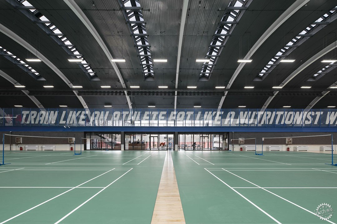
▼体育馆二层主运动空间,Main sports space on the second floor of the gymnasium ©UK STUDIO
▼体育馆三层乒乓球活动区,Table tennis activity area on the third floor of the gymnasium ©UK STUDIO
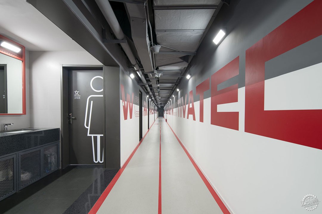
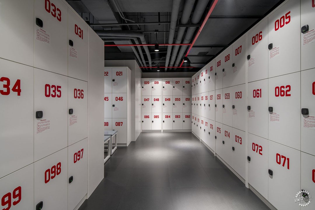
体育馆的卫生间更衣室等配套空间依旧延续红色与灰色的强对比,采用金属网定制的卫生间隔断与镜箱跳跃在空间中。裸顶的吊灯也安装在红色支架上,给深灰色的裸顶增加一条灵动的线条。
The supporting spaces such as the gymnasium's bathroom locker room continue the strong contrast between red and gray, with a metal mesh custom bathroom partition and mirror box jumping in the space. The pendant lights of the bare roof are also installed on red brackets, adding a dynamic line to the dark gray bare roof.
▼卫生间细部,Bathroom detail ©UK STUDIO

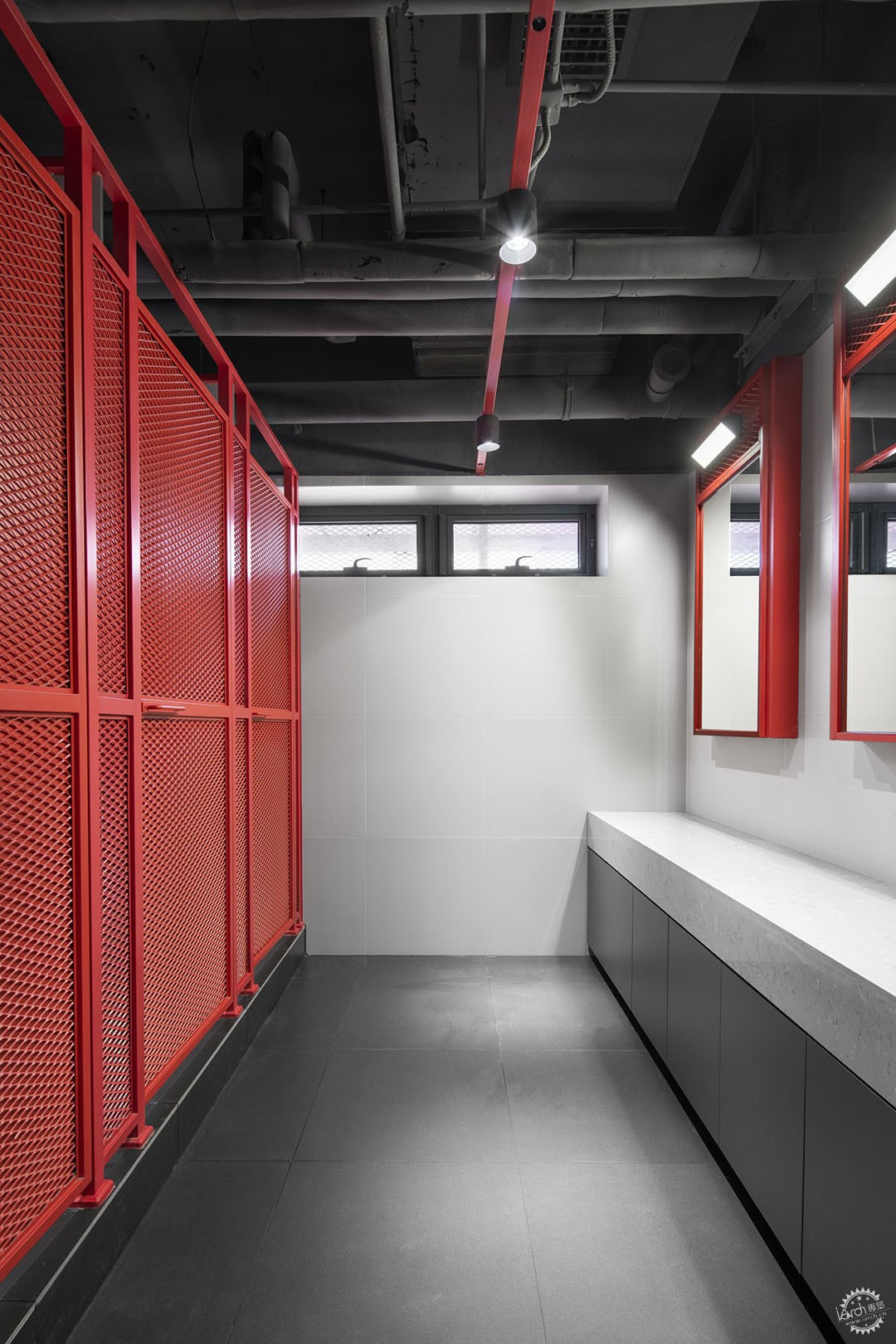
▼更衣室细部,Dressing room details ©UK STUDIO
·关于项目
最初我们从跑道出发,以它延伸的张力作为概念创造,最终完成时它同样也承载了整个三层空间我们所传达的精神理念,我们希望色彩可以唤醒运动场域精神,对场地中可能发生的情景进行构想,从而来运用这些建筑材料,通过设想人们怎样相见、互动还有与周围景观的呼应来创造空间。让运动开启未来的无限可能。
At the beginning, we started from the runway and used its extended tension as the concept creation. When finished, it also carried the spiritual idea conveyed by the whole three-story space. We hoped that the color could awaken the spirit of the playground and conceive the possible scenes in the site, so as to use these building materials. Create space by envisioning how people meet, interact and respond to the surrounding landscape. Let sports open up the possibilities of the future.
·平面图纸
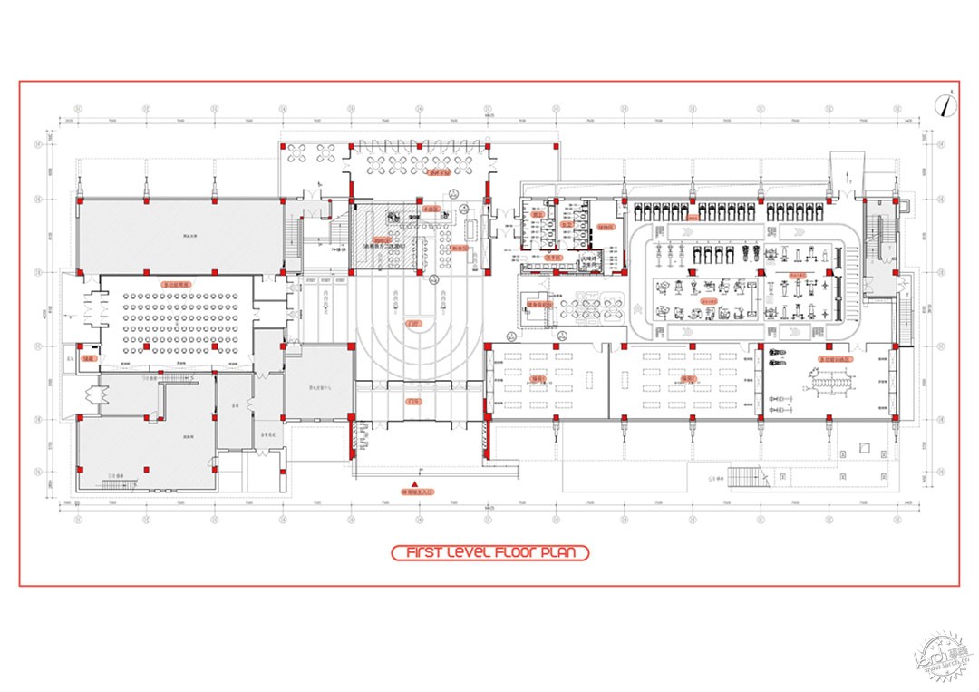
▼一层平面图,First floor plan ©DAGA大观建筑
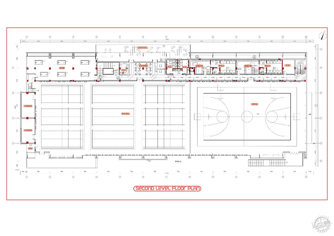
▼二层平面图,Second floor plan ©DAGA大观建筑
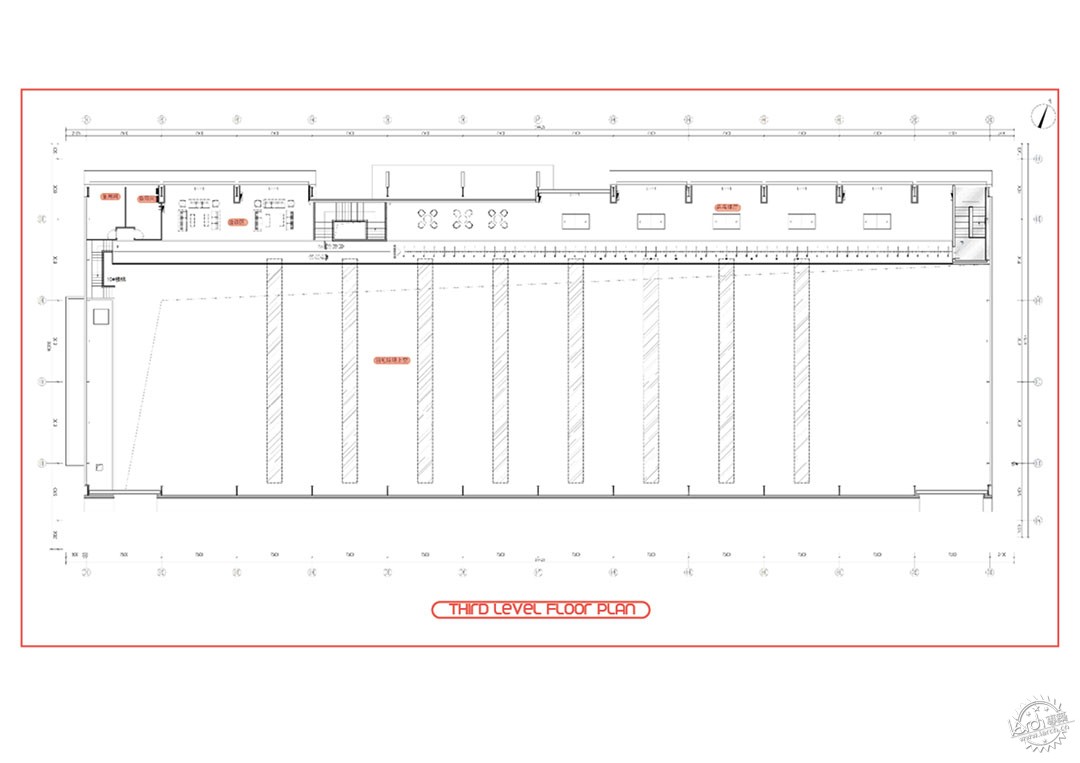
▼三层平面图,Third floor plan ©DAGA大观建筑
项目名称:用友运动中心
设计公司:DAGA大观建筑
设计团队:任晓伟、尹爱黎、陈赤阳、段爽、高星宇、李静,王宏阳
施工单位:北京颖兴装饰工程有限公司
项目类型:建筑改造、室内设计
建筑面积:3189平米
设计时间:2022年4月-2022年9月
建造时间:2022年9月-2023年3月
项目摄影:UK STUDIO©UK STUDIO
Project Information
Project name : Yonyou Gymnasium
Design company : DAGA Architects
Design Team : Ren Xiaowei, Ellie Yin, Chen Chiyang, Duan Shuang, Gao Xingyu, Li Jing, Wang Hongyang
Construction: Beijing Yingxing Decoration Engineering Co., LTD
Project type : Architectural renovation, Interior design
Project area : 3189 m2
Design time : Apr 2022 - Sep 2022
Construction time : Sep 2022 - Mar 2023
Photographer : UK STUDIO©UK STUDIO
来源:本文由DAGA大观建筑提供稿件,所有著作权归属DAGA大观建筑所有。
|
|
