
2012年 8月 02日
室内装饰,装修,住宅,选择,巴塞罗那,西班牙,格斯 Wüstemann
Bruno Helbling
建筑师:Gus Wüstemann
位置:西班牙巴塞罗那
项目年份:2009
项目面积:190.0平方米
照片:Bruno Helbling
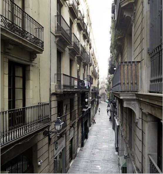
The project is our flat in Barcelona in the Gotico area, in the center of the historic part of Barcelona.
A challenge was the very heterogenic floor plan, which was interrupted by various light patios. The
other issue is little daylight in the old town of Barcelona, as the sun and the heat were considered
rather a burden in the old times. There is one major fa愀搀攀 facing the street Banys Nous, with big
windows and balconies. It was clear that we would have a big living space in this area. For the
connection, organization (circulation) and lighting up the back part of the apartment we had to come up with an invention.
这是我们在巴塞罗那 Gotico区的公寓项目,位于巴塞罗那历史的中心。项目的挑战之一是创
造出一个异质的平面,穿插各种各样光的庭院。另一个问题是巴塞罗那老城区较弱的日照条
件,中世纪开始这里的采光和制热已曾给人们带来不便。公寓的主要立面正对 Banys大街,有
着大的窗户和阳台。显然我们会在这儿设置一个大起居空间。而在公寓非沿街一侧的空间组织
和采光问题上,我们不得不另辟蹊径。
特别鸣谢 华南理工 ma 提供的翻译,译稿版权归译者所有,转载请注明出处。Thank you very much 华南理工 ma to provide the translation, and the copyright owned by the translator. For reprint please indicate the source.
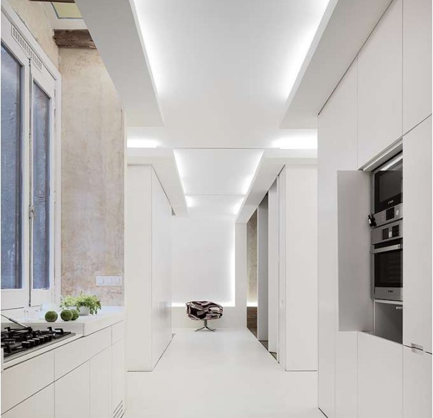
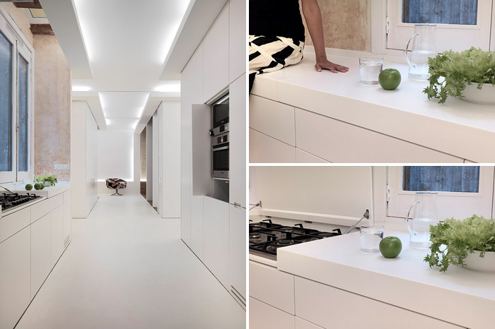
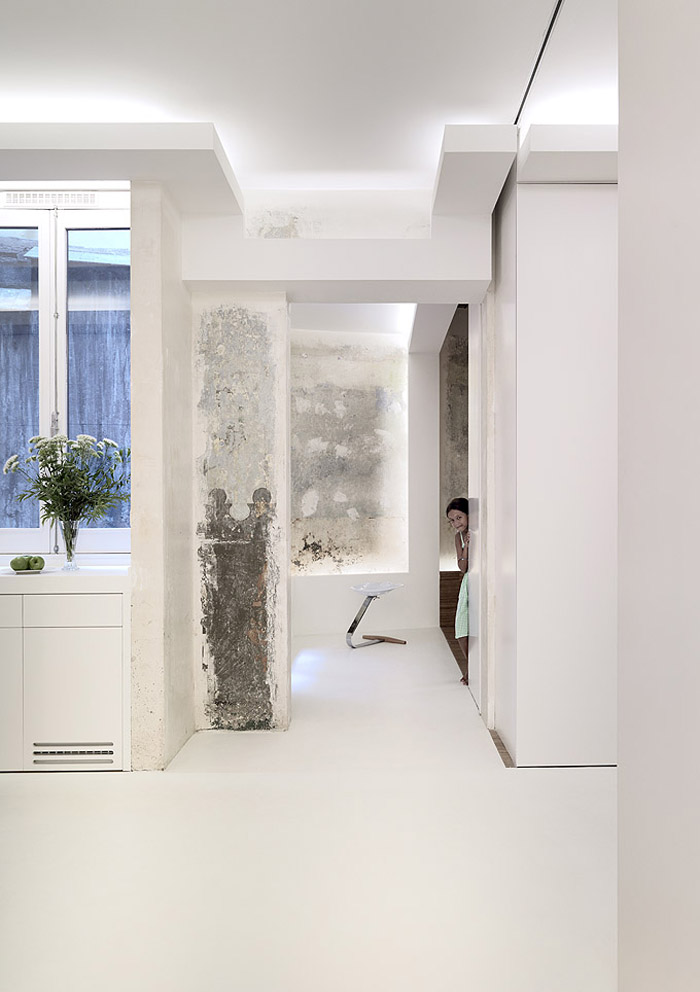
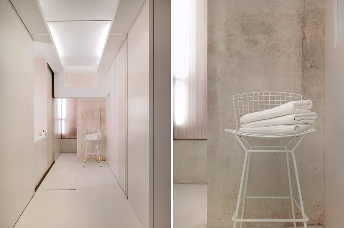
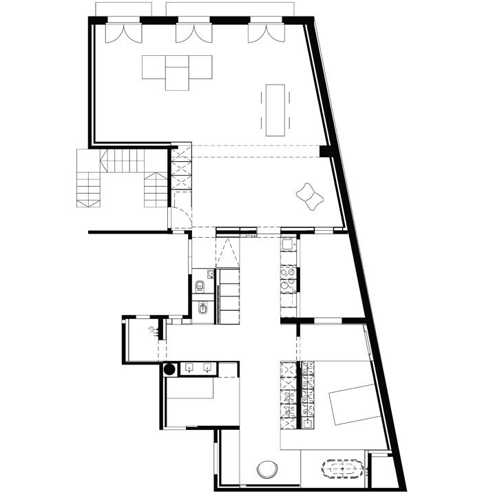
The invention was to cross two programs: the kitchen and the bathroom, two brightly light up white spaces, forming a white cross. The white cross we put between those medieval walls and created a bright center in the middle of these fragment spaces and light patios. The crusch alba (white cross) is a crossing of two programs, there is no circulation, no matter where, you are either in the kitchen or in the bathroom. The rest of the space, the walls and ceilings are left in its original state: raw stone walls, wall paintings and raw plaster finishes.
我们的创意是交叉两个空间:厨房和卫生间,两个被照亮的空间,形成一个白色十字架。在中世纪厚重墙体中放置的白色十字架,在这些片段的空间和光庭院中创造了一个明亮的中心。crusch Alaba(白十字)空间是两种性质空间的交叉,没有单一的交通空间,厨房和浴室一体性地镶嵌其中,不严格划分。而在白色十字之外的区域内,墙壁和天花板都保留其原始状态:粗粝的石墙,壁画和石膏饰面。
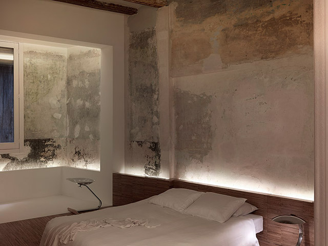
We implemented the white cross as a new volume in the existing space and created openings into
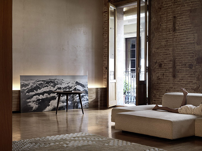
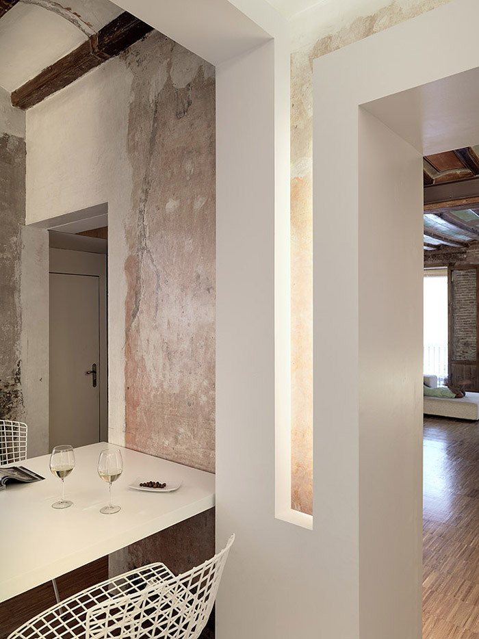
this white space. We light up the periphery: the border between old an new. In that respect, the layer outside of the white cross becomes the outer space, generating pictures of ‘the old times’ like looking outside a window into another landscape. By coincidence, real windows appear in these openings.
We left all the old surfaces in the original state, just varnished them: painted ceilings, painted
wallpapers, raw old stone walls of the Gotico and even raw plaster of the new building interventions.
The overlay of layers of old and new with light in between emphasizes the lack of hierarchy of old and new. It’s the feeling of not finishing; keeping it urban and letting the process and time be visible that gives a feeling of freedom.
我们将这个白色十字架作为旧有空间中插入的新元素,并在这个白色空间中开洞口。由此,我们点亮了周边:一个新与旧的边界。在这里,白色十字架之外的旧有空间成为了“外部”,由白色十字架中的开口向这些空间看去,犹如向窗外张望,如看一副中世纪的绘画。当然,这些开口中也有真正的窗口。我们尽量保留老建筑外覆面的原始状态,仅用漆涂刷:手绘的天花板,彩色壁纸,Gotico区粗粝的老石墙,甚至未经处理的石膏分割墙。新老元素之间的并置,在光线的干预下,强调出了新老建筑的均一性——这是一种未完成的感觉;保持他的公共性,以及使得建筑的建造过程和时间发展过程可经由视觉切身感受,从而给人创造出一种自由。
The apartment can be used as loft or as a three bedroom apartment. The white cross is physically and visually the center core of the back part of the apartment. The actual bedrooms and the bathroom can be divided by big sliding doors and are not defined by the cross itself. So the master bedroom space is part of in the white cross and part of the remaining old space (old layers). So the actual rooms are urban spaces, as they are part of various elements. There is a major structural wall
separating the living area from the white cross and the private areas of the apartment. Two door size openings and a window to a light patio are the only connection to the living area, dividing the flat in two parts. We dissolved the original wall into a sequence of elements, so that the openings become in between spaces of things touching, rather than holes in wall. So the separating element becomes the connecting element, an attractor brought to life by light. There are numerous options of how many bedrooms and niches we can create as bedrooms. The kids have foldable mattresses, so they can choose where they want to sleep. The kids are ‘camping’ in the apartment, with no fixed bedroom.
该项目可用作 loft公寓或当作一套三居室的公寓使用。白色的光十字架空间是公寓背街部分的体验和视觉中心。实际上,其中的卧室和浴室可通过大隔扇门分隔,并不是简单地被十字架所切分。因此可以说主卧室的一部分在白色十字架中,而其余部分为旧有空间。进一步地,客房可被定义为公共空间,因为它们由各种空间元素组成。
一个厚重的结构墙将起居部分从白色十字架和私密空间一侧分离出来。两个门洞,和通向光庭院的一个窗口,是与起居空间的唯一联系,将公寓划分为两部分。我们将这个墙面分解为一系列独立的元素,使墙上的开口成为过渡空间,而不是在墙上粗暴的开洞。这些独立的元素反而起到了连接的作用,在这里,光创造了生活的诗意。对卧室和壁龛的数量我们提供了许多选项。孩子有可折叠的床垫,所以他们可以选择他们想去的地方睡觉。他们在公寓中“露营”,没有固定的卧室。
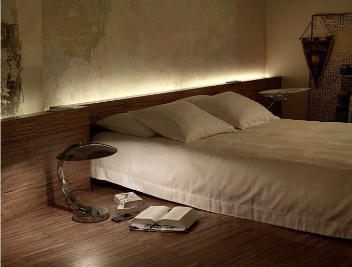
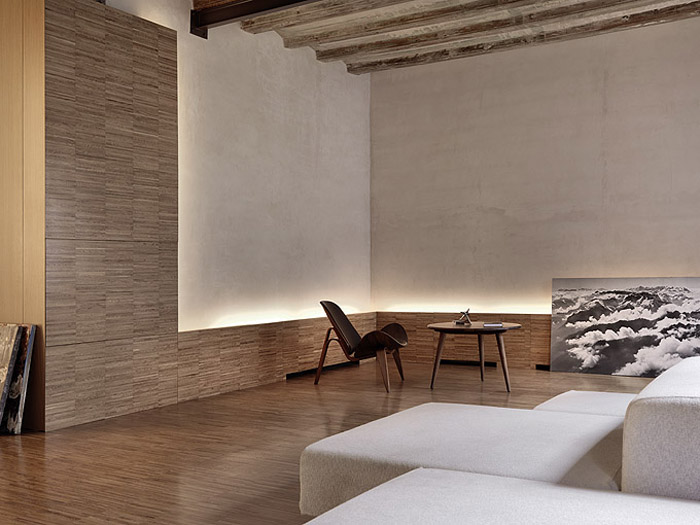
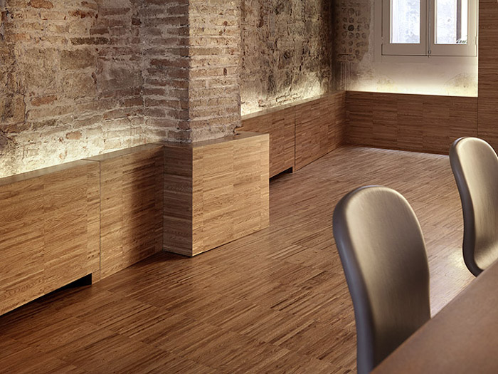
The wooden volume we implemented on top of the old structure, the historical stone structure of theGotico. Between the old layer and the new implementation there is always a horizon of light,
expanding the space where normally it is the end of a room (periphery, where walls and floor meet). By creating the wooden objects we have no ‘floor surface’ but are walking on a wooden volume. There are no defined surfaces like walls and floors, but urban elements and volumes that we can use freely.
在 Gotico的原始石材外面,设置有木材构件。房间的尽端,在旧建筑结构与新的构件之间常常设置一个水平光带,用来扩大空间效果。通过木制构件的排布,我们不是在“地板”上,而是在木材上行走。这里没有表面被明确定义为墙壁和地板,只有我们可以自由使用的公共元素和空间。
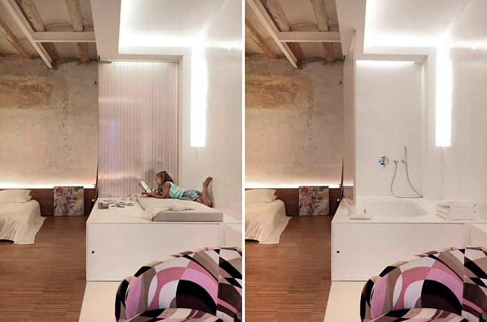
As usual we implemented our tool of ‘program free architecture’, so the kitchen is not visible, but is part of the white cross. The children’s lounge in the bedroom is actually a bath, if you take off the top. The main bathroom is hidden by a huge sliding wall and only appears when you need it. The shower is in a corner of the white cross. If a space is not used for a specific program, it is always available as living space or for whatever.
像往常一样,我们实践我们的“计划自由建筑”理念,所以作为白色十字架的一部分,厨房是隐藏的。如果你将天花板打开会发现,卧室里孩子们的休息室其实是洗澡间。主浴室隐藏着一个巨大的滑动墙,只有当你需要它时才将其拉出来。淋浴是在一个角落的白色十字架……如果一个使用空间暂时没有被利用,它将充当其他用途。



特别鸣谢 华南理工 ma 提供的翻译,译稿版权归译者所有,转载请注明出处。
Thank you very much 华南理工 ma to provide the translation, and the copyright owned by the translator. For reprint please indicate the source.
|
|

