由专筑网刘庆新编译
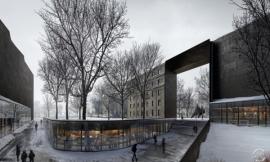
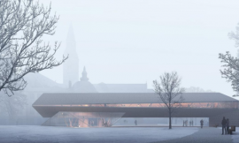
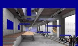
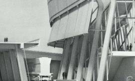
几周前,我发表了一篇老项目的渲染图,名为X光渲染图,这是我即兴发挥的项目。该项目也是我制作的第一个X光渲染图。看到最后的效果图,立刻产生兴奋之感。我非常喜欢这个风格,因为这样方式的渲染会呈现出尺寸、建筑构造和建筑内外关系。而且,这样风格的渲染图很容易复制的,3D模型制作起来也就非常简单。我有一个习惯,将3D模型全部分成组,这样我可以移动大块模型,方便建模和编辑。因为模型是分组的,当我对最终设计方案进行渲染时,可以有选择地“剥开”建筑的立面部分。下面是渲染图的分步操作,和将图组织起来的介绍说明。
A few weeks back I posted an x-ray illustration of one of my old projects as sort of a last minute idea. This was the first time I had ever done an “x-ray” illustration and I immediately became excited about the possibilities. I’m really drawn to this style because of the way it reveals scale, tectonics, and the relationship of inside to outside. The thing is, this style is really easy to replicate assuming the 3D model is built correctly. I have a habit of thoroughly grouping parts of my 3D models so that I am able to move large chunks out of the way for easier modeling and editing. Because of the way the model is grouped, I am also able to selectively “peel” away parts of the building facade when it comes to rendering the final design. Below is a break down of the illustration as well as a few tips for combining the images.
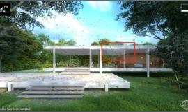
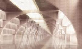
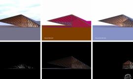
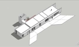
Above, the Sketchup model with the roof being removed/被移除屋顶的Sketchup模型
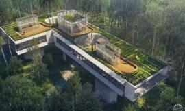
第一步包括将模型渲染多次。我完成了三个独立的渲染图,第一个展示完成的模型,第二个去掉了屋顶,第三个去掉了一些墙壁。模型中没有体现出材质,因为已经有很多几何图形需要堆积在一起。添加了材质将会开始使事情变得复杂,模糊了图的可读性。
The first step involves rendering the model multiple times. I did three separate renderings with the first one showing the complete model, the second with the roof off, and the third with some walls removed. I rendered the model without materials because there was already so much geometry being overlayed on top of each other. I was afraid adding materials would start to over complicate things and muddy the reading of the illustration.
Rendering 1: Model as is (Kerkythea)/渲染图 1:未变动的模型(Kerkythea)
Rendering 2: Roof removed (Kerkythea)/渲染图 2:屋顶被去掉(Kerkythea)
Rendering 3: Walls and some floors removed (Kerkythea)./渲染图 3:墙和一些地板被去掉(Kerkythea)
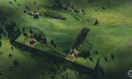
最后,我没有使用3D渲染,因为一些较低的地面不能完整地被建模,许多信息只能进行第二次渲染。
三个渲染图完成后,我开始将它们平铺在PS中。我以第一张作为开始,将其作为基础图。然后在调色板中,将第一个没有屋顶的渲染图放在第一个渲染图之上,将混合模式设置为“叠加”。我在第二个渲染图中添加了一个图层,开始有选择性地擦除我不想呈现出来的区域。
Ultimately, I didn’t use the 3rd rendering because some of the lower floors were not fully modeled and much of the information was repetitive with the second rendering.
With all three renderings completed, I began layering them in Photoshop. I started with rendering 1 and used that as the base image. I then took rendering 2 with no roof and moved it above rendering 1 in the layers pallet and set the blend mode to “Multiply”. I added a layer mask to rendering 2 and began selectively erasing areas that I didn’t want showing through.
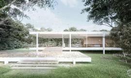
保持外部形式的透明很重要。在前面的过程中,我不断返回去查看整个图,确保外部形式仍然清晰透明,不会由于内部图层的添加变得模糊。达到这种关系的一种方式可以通过集中于外部的转角和边缘来达到效果。
It’s important to maintain the clarity of the exterior form. Throughout post processing, I’m constantly pulling back and looking at the whole image to make sure the exterior form still reads well and isn’t getting lost within the interior layers. One way to manage this relationship is by focusing on the corners and edges of the exterior. With the layer mask still active, I selected the areas I wanted to define, and began erasing parts of the interior (rendering 2 layer).
在设计中,通过将外部转角和边缘表现的更加具体,外部和内部的双重解读更容易被理解。
By giving the exterior corners and edges of the design more definition, the dual reading of exterior and interior is much easier to understand.
最后几步就是花时间添加纹理和背景元素,使周围环境充满生机。当一张图像像这样复杂时,我倾向于默认最少的材质。在我看来,更多的材质会对形式的理解变得更困难。我更着眼于用纹理来区别建筑形式和软硬景观。
The last few steps involve me spending time adding textures and background elements to liven up the surrounding site. I tend to default to minimal materials when the complexity of an image such as this is so extreme. More materials in my opinion would make it more difficult to understand the forms. Instead, I focus more on texture to differentiate between built form, hardscape and landscape.
最后,我调整了颜色和图层,使图呈现出HDR效果。
Finally, I tweaked the color/ levels and gave the image an HDR effect.
出处:本文译自visualizingarchitecture.com/,转载请注明出处。
|
|
专于设计,筑就未来
无论您身在何方;无论您作品规模大小;无论您是否已在设计等相关领域小有名气;无论您是否已成功求学、步入职业设计师队伍;只要你有想法、有创意、有能力,专筑网都愿为您提供一个展示自己的舞台
投稿邮箱:submit@iarch.cn 如何向专筑投稿?