© Federico CairoliArchitects: Pablo Anzilutti
Location: Santa Fe, Santa Fe Province, Argentina
Project Year: 2012
Photographs: Federico Cairoli 建筑师:pablo anizilutti 地点:阿根廷圣达菲省,圣达菲 竣工年份:2012 摄影:Federico Cairoli
Project Area: 320.0 sqm
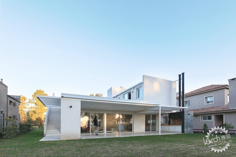
Engineers: Javier Pérez, Ezequiel Rigiardi 工程面积:320㎡ 工程师:Javier Pérez, Ezequiel Rigiardi The project is developed in a plot whose bottom coincides with the perimeter of closure of a private neighborhood and beyond the limit, extends sown fields, allowing having a broader vision of the surrounding landscape and also having more privacy in the rear. Coincidentally, the rear facade is oriented to the north, so the most private part would have the best orientation. 本项目地基的周边是围和的私人住宅,地基外是农田,所以场地的景观视野开阔,并且背面部分有着更强的私密性。巧合的是,背立面是朝北的,所以在最私密的部分有着最好的朝向。

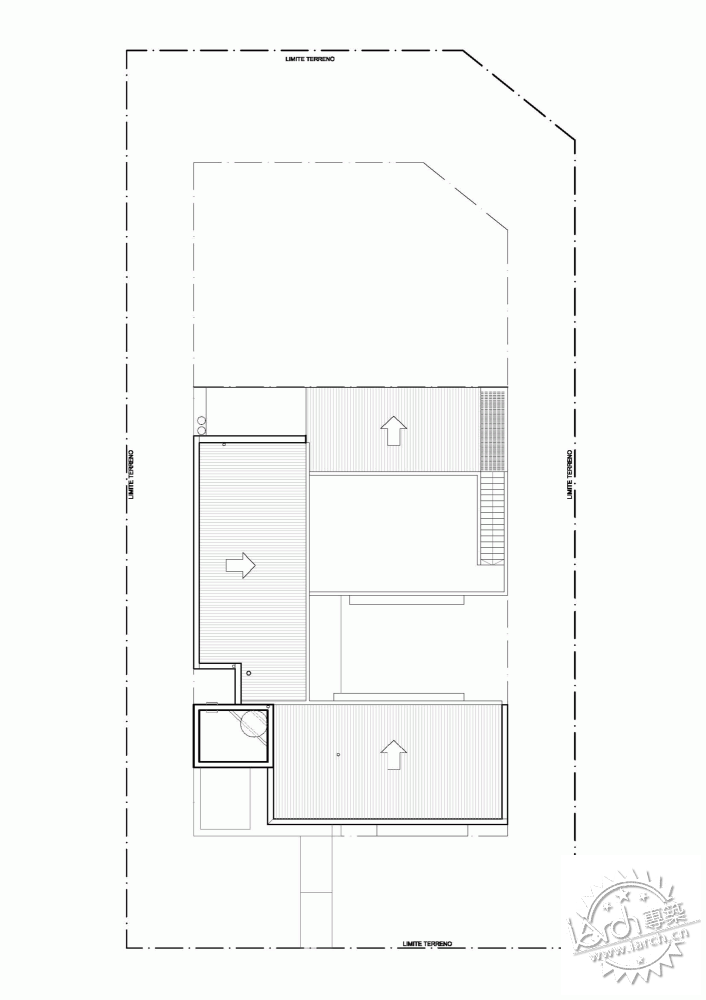
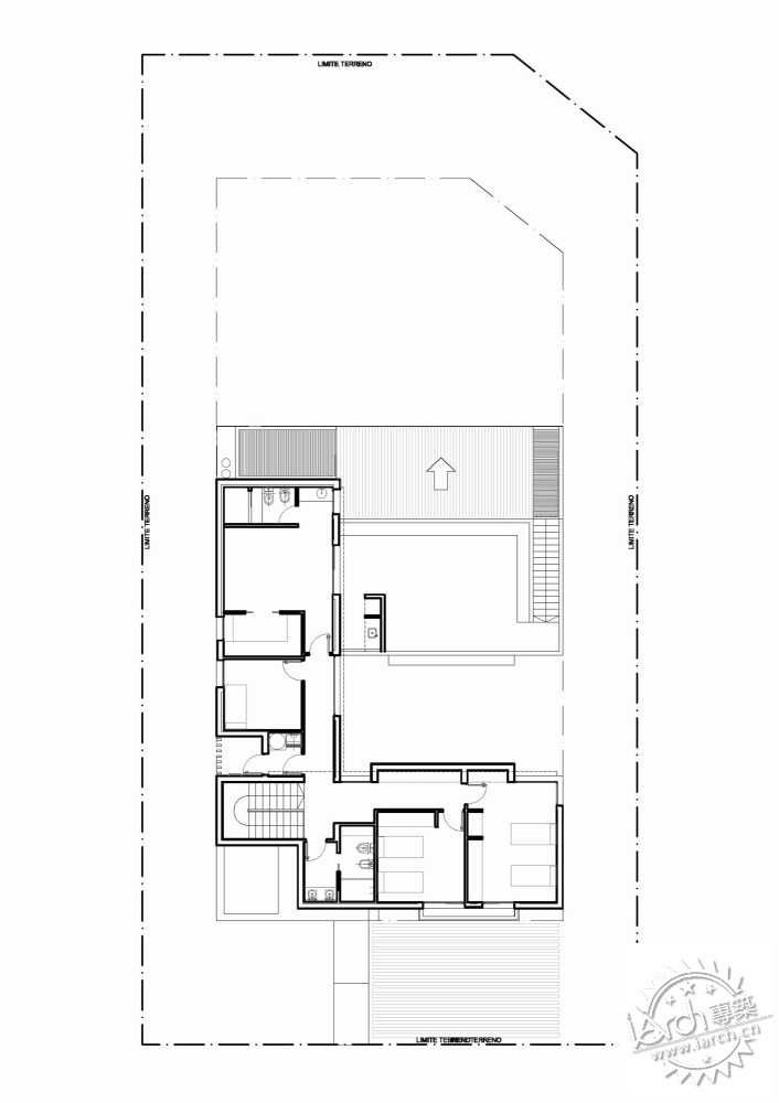
Plan From the very beginning, the owners made special emphasis on a living-room wide and directly related to the courtyard and the gallery, while the bedrooms and the most private part would be located on the top floor. Furthermore, the possibility of parking required two cars. 平面 一开始,业主特别要求,起居室面宽要宽并且直接与院子和走廊联系。卧室和最私密的部分最好安排在顶层。还有,希望有2个停车位。
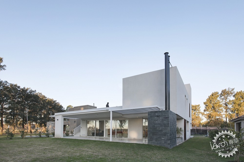
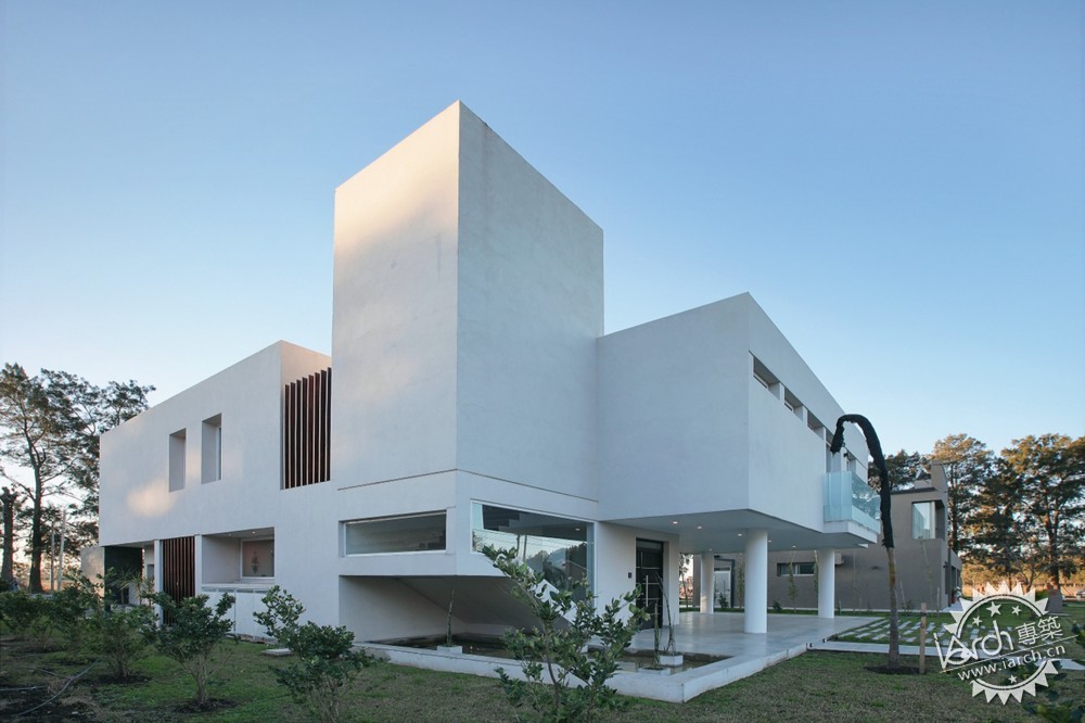
© Federico Cairoli With these premises and as a result of the lot dimensions and determinants of lateral separations, it was decided to place the entire width of the living room area with the gallery, located toward the bottom and raise the volume of the bedrooms of children in the front, creating a garage intern with the requested capacity. This simple movement releases the facade on the ground floor and serves as a framework that enhances the visuals throughout the project from the front to the back yard and at the same time take advantage of better orientation. To make this more powerful visual influence, the whole of the bedrooms, is supported by just four points. 有了这些前提,在对该地段的尺寸和横向进行划分后,我们决定把整个起居室的宽面与檐廊放结合放在一层,架空前方儿童房的体量,在架空层来安排停车。这个简单的举措解放的一层的立面,提高了建筑从前部到后院的视觉通透性,同时也充分利用的相对较好的朝向。为了达到更有冲击力的视觉效果,整个卧室只用4根柱子支撑。
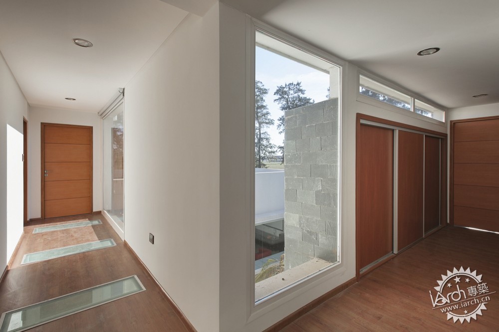
The continuous floor L-shaped, which distributes laundry, a guest room and master bedroom that opens onto a terrace. Morphologically the project is assembled with 3 simple volumes, which are set by the verticality of the stairwell, which also functions as a patella that organizes the internal functions. On the living room stands a terrace, which can be accessed independently from the outside, with the idea that you can use to maximize the visual environment. 连续的L形地板,把洗衣房,客房和带露台的主卧区分开来。在形式上,方案由3个简单的体量组成,并用竖向的楼梯间加以统一。楼梯间同时也作为组织内部功能的核心。在起居室有个大露台,可以独立的从外部出入,这么做是为了最大程度的利用视觉景观。
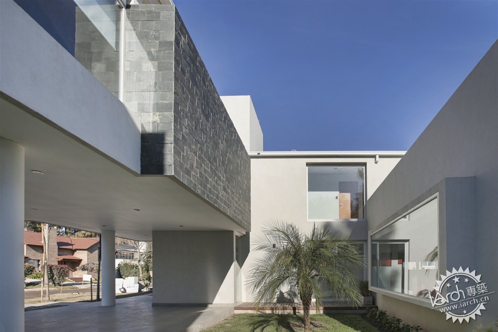
The use of contemporary language, pure and simple lines are complemented by the use of a single color for the siding, leaving the stones covering the specific elements that seek to highlight. 设计使用了现代设计语言。纯净、简洁的线条和单色的运用相互补充,石材被用在一些特殊的需要强调的部位。

| 