Architectural Drawings: 10 Office Plans Rethinking How We Work
由专筑网郑善廷,李韧编译
这些项目展示了设计师对当代办公的畅想。
开敞办公还是隔间办公?这似乎成为了永恒的话题。由于工作空间的潮流在不断演变,建筑师在为不断变化的工作人员、工作模式和文化设计新办公空间。建筑师们渴望创造舒适的功能和空间,模糊家和办公室之间的界限,正是这种渴望在推动着办公空间的演变。全世界的公司都持续关注着建筑对于工作的塑造,从品牌环境和社交空间到聚焦区和协同团队区,从开放的平面布局到叶式休息室,随后的几个项目会展示设计师对当今办公空间的多种设想。
These projects show the diverse ways in which designers are imagining the office of today.
It’s the eternal debate: open office or cubicle? As workplace trends continue to evolve, architects are designing new offices that reflect the changing conditions of labor, remote work and culture. These are underpinned by a desire to create amenity spaces and programs that blur the boundary between home and office. Companies around the world are continuously looking at how architecture shapes our work, from branded environments and social spaces to focus zones and collaborative team areas. From open floor plans to leafy lounge areas and hot desks, the following projects show the diverse ways in which designers are imagining the office of today:

Wieden+Kennedy/WORKac/美国,纽约曼哈顿
把工作位于核心位置是WORKac事务所为Wieden+Kennedy广告公司纽约办事处所做的设计提出的理念,就是为了挑战传统办公模式。就像团队所说,公司高度协作的工作流要求高密度的工作场所,最大化协同空间。因此,WORKac设计了一系列协同空间以适应不同规模,例如持续的会议,可以从站立会议桌到电话会议室,再到传统会议室,亦或是几个更大的有着不同分隔形式的集合空间。
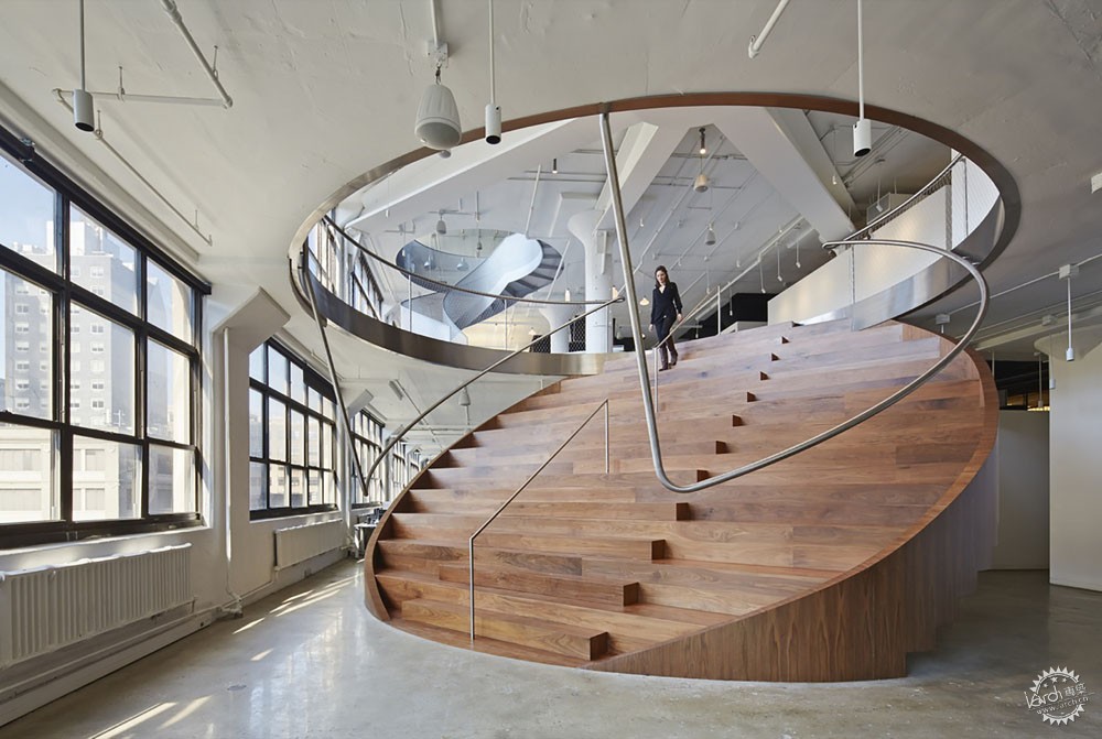
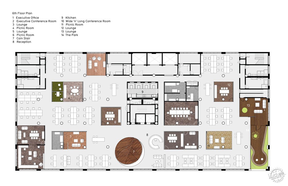
在办公平面的中心区,有一个圆形的“硬币楼梯”作为露天看台,贯通了六层和七层。在另一边也有一个连接七层酒吧和八层图书馆的穿孔金属螺旋楼梯。除此自外,办公立面局部收进生成了两层高的室外庭院,让这个办公空间从立面上凸显出来。
Wieden+Kennedy by WORKac, Manhattan, New York, NY, United States
Placing “work” back at the heart of creative work, WORKac’s New York office for the advertising agency Wieden+Kennedy was designed to challenge the fad of the office-as-playground. As the team states, the company’s collaborative workflow allowed for increased density, with individual spaces shrinking in order to maximize the collective spaces. The design focused on creating a range of typologies of collaborative places for meetings of different sizes and durations, from tables for stand-up meetings to “phone booth” meeting rooms, to traditional conference rooms, to several larger collective spaces that involved carving the building in various ways.
As the centerpiece of the office plan, a circular “coin stair” doubles as bleacher seating and cuts between the sixth and seventh floors. Nearby, another cut, with a perforated metal spiral staircase, connects the seventh-floor bar to the eighth-floor library. In addition, a double height courtyard creates an outdoor garden by moving the façade one bay within the building, marking the office and its program from the exterior façade.
复合办公室/Edward Ogosta Architecture/ 美国,洛杉矶
Ed Ogosta事务所为一个30人团队的创意媒体代理公司设计了这个复合办公空间。这个办公设计包括“集合复合类型空间”,这个空间形成了独特的室内空间。设计师探索建筑和家具之间的关系时,在空间内部设计了一系列复合物件,意在体现自然和整座城市。设计师通过抽象的手法,让空间拥有新象征,各个元素整合在一起,孕育了创新的灵魂。
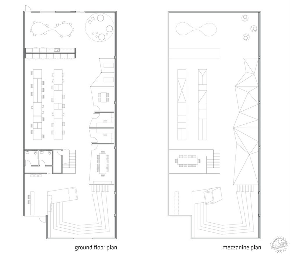
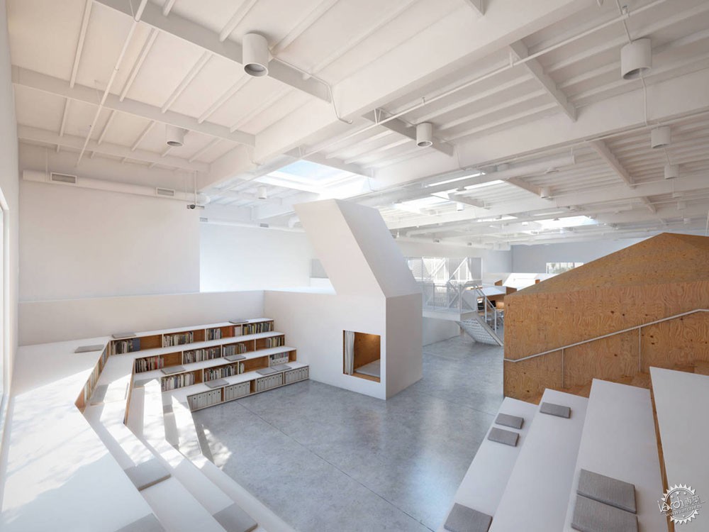
项目空间是560平米的混凝土仓库。设计师将两种不同的元素结合在一起,举例而言,书架的设计综合了舞台的形式,构成台阶状书架,既可以作为储藏也可以作为会议的座位。其他的融合还有树椅、山形办公室、房屋桌,以及洞穴床。家具通过贴面胶合板和白色的纤维板制作而成。许多小型私人空间和大型团队空间面向所有员工开放。
Hybrid Office by Edward Ogosta Architecture, Los Angeles, CA, United States
Ed Ogosta designed the Hybrid Office for a creative media agency of thirty workers. As he states, the office design contains “a menagerie of typological hybrids, which together engender a unique interior world.” Exploring the relationship between architecture and furniture, a series of hybrid-objects are designed throughout the space that reference nature and the surrounding city. Through abstraction, the objects are given a new iconographic presence, and collectively, they are made to foster a spirit of creativity.
An existing 6,000 square foot tilt-up concrete warehouse provided the container into which the hybrids were deployed. Each hybrid synthesizes essential traits from two “parents” of differing typologies; for example, a set of bookshelves combined with the stepped form of an arena results in the book-arena, which doubly functions as storage and seating for office-wide meetings. Other hybrids include the tree-chair, mountain-offices, house-table, and cave-bed. Each is constructed from simple veneered plywood and white painted fiberboard. In turn, a variety of micro-scaled individual spaces and group-sized collective spaces are available to workers throughout.
Hechingen工作室/Whitaker Studio/德国
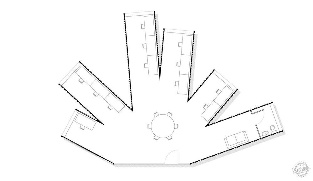
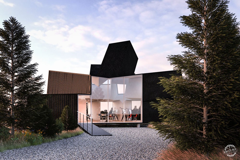
这个为德国广告代理公司设计的低成本工作室,最一开始的选址位于黑森林地区。客户喜欢使用集装箱,同时控制造价。他们希望通过小型办公室来激励公司的发展。这个项目从晶体的生长和Hechingen城堡的尖塔中得到灵感,11个集装箱呈辐射状排列。上层的集装箱跟随着太阳的轨迹,下层的集装箱则提供一系列安静的工作场所,都向着中心办公区开放。
这个项目进展的过程中,这片绿色的场地成为这个集装箱办公项目众多可选的基地之一。由于不受基地的影响,这个设计的初衷是再利用集装箱,并且对金属工艺有一些新认识。制作完成后,这些单元会被运输到基地。最终的部分会从场地中升起,位于混凝土柱的顶端,成为整个项目的亮点。
Hechingen Studio by Whitaker Studio, Hechingen, Germany
Designed for a German advertising agency, this low-cost workplace was first envisioned as a project in the Black Forest. The client was keen to use shipping containers to keep costs low and needed a small office that would encourage the growth of their company. Taking inspiration from crystal growth and the soaring towers of Hechingen Castle, 11 containers were arranged in a radial form. The upper containers trace the sun’s path through the sky while the lower containers provide an array of quiet working spaces that all open onto the central heart of the office.
As the project developed, the green field site became one of many possible location for deploying the shipping container office. Independent of the location, the design was created to reutilize existing containers already in production, and the project was made to be realized through a series of metal fabrications. After fabrication, the modules would be transported to site where they would be bolted together. The final project would sit on top of concrete columns rising from the foundations.
Pinterest HQ/IwamotoScott Architecture/美国,旧金山
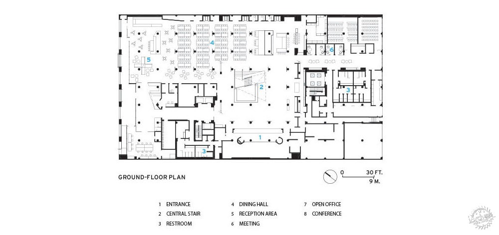
全新Pinterest总部位于旧金山,这个方案从公司网页平台的设计中获得灵感。这是一座四层混凝土结构的建筑,曾经是工厂。整个项目围绕着中心的中庭和楼梯组织,一楼是餐饮区,开敞办公区位于上面三层,此外还有很多会议室、团队办公区、休息区、静室、手工坊、咖啡吧,以及设计工作室。这个设计的核心在于让原本两层通高的中庭延伸至底层,构成贯通四层的空间,再通过楼梯相互联系,成为空间上和视觉上的焦点。
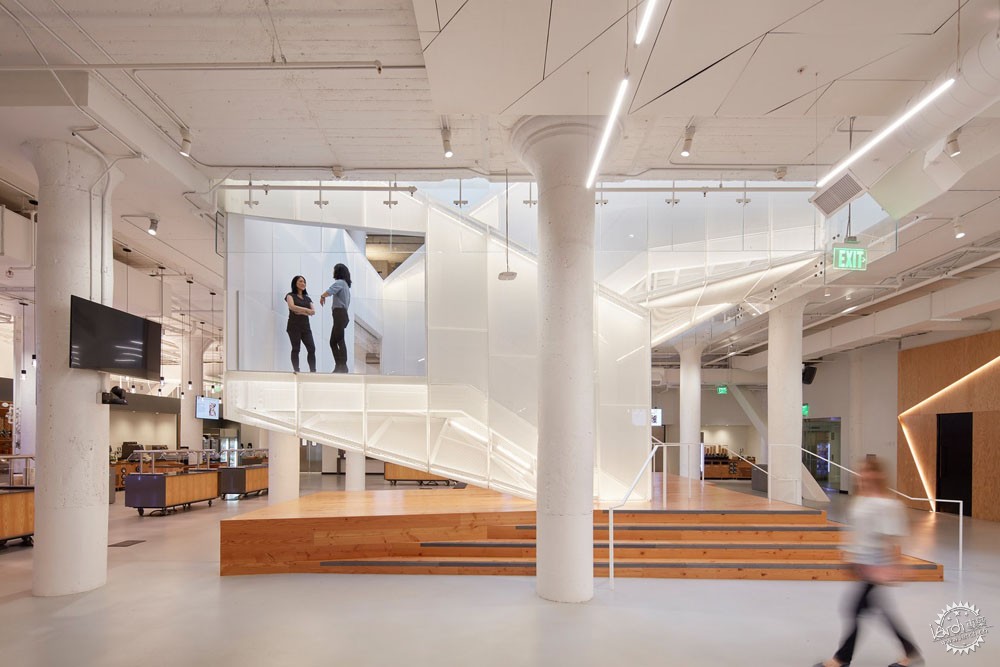
中心楼梯是整个空间的组织体系。就如同公司的的理念一样,这个楼梯采用了穿孔金属板,通过反向折叠并在中间的位置进行穿插形成体量。这种交叉给上行和下行的人不期而遇的视线交流。楼梯的设计和材质为整个空间的核心区营造了明亮并且不断变化的氛围。
Pinterest HQ by IwamotoScott Architecture, San Francisco, CA, United States
The new Pinterest headquarters in San Francisco is inspired by the redesign of the company’s web platform. The building is a four story concrete structure that previously housed a John Deere factory in San Francisco’s SOMA district. The program is organized as porous, concentric layers around a large, central interconnecting atrium and stair. The program includes: large all-hands /dining space on the ground floor, expansive open workspace on the upper three floors, and numerous meeting rooms, team rooms, lounge spaces, quiet room, maker lab, coffee bar, and design studio. A key aspect of the design involved extending the existing two story atrium to the ground floor, creating a central void at the building’s center that visually connects all four floors— into which was inserted the main communication stair.
The stair acts as the central organizing figure to the space at all levels. This central stair — referred to as the Knitting Stair in reference to the company’s collaborative ethos represented by the act and product of knitting — takes the form of a perforated steel clad volume that doubles back and intersects itself at its midpoint. The intersection allows people unexpected glimpses between two flights of people moving up and down within the stair’s interior volume. The stair’s design and materiality produces the effect of a bright, ever-changing heart at the center of the company.
Facebook HQ/Menlo Park by Gehry Partners/美国
Gehry Partners事务所近期完成了Facebook MPK 21项目,它属于Menlo Park园区项目,扩大了公司已有的范围,是高度可持续建筑,它只用了18个月就修建完成。这个项目被一片十多米高的红树林围绕,室内外环境相互交融。一座露天剧场庭院将MPK 20以及MPK 21连接起来。
3.6英亩的屋顶花园有200多棵树以及半英里长的漫游步道,MPK 21大楼通过连接室外空间来提升团队合作的效果。更重要的是,这个设计减少了对环境的影响,并提升了人们的生活品质。在内部,开放的工作空间与贯穿整座建筑的走廊相连。这个走廊内部有艺术家设计的15个艺术作品,分布于住宅区,另外还有五间餐厅以及一间可以容纳2000人的活动室。
Facebook HQ, Menlo Park by Gehry Partners, Menlo Park, CA, United States
Gehry Partners recently completed Facebook’s MPK 21 building as part of its larger Menlo Park campus project. Expanding the company’s existing footprint, the design was built in less than 18 months as a highly sustainable building. Formed to bring the outdoors into the office space, the project centers on a sheltered green space with 40-foot-tall redwood trees and an amphitheater-style courtyard that connects to the original Gehry-designed MPK 20 building.
Featuring a 3.6-acre rooftop garden with over 200 trees and a half-mile meandering pathway, MPK 21 connects to the outdoors and was designed to promote teamwork. The larger development was designed to reduce impact on the environment and enhance employee well-being. Inside, an open workspace connects to a single pathway that runs the length of the building. The path features 15 art installations commissioned through an artist in residence program, five dining options, and a 2,000-person event and meeting space.
未来办公室/Killa Architectural Design/沙特阿拉伯,迪拜
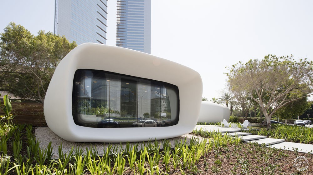
这座展馆是世界第一个功能齐全并且永久落地的3D打印建筑。作为“未来办公室“,这座建筑既是迪拜未来基地的临时建筑,也是展示空间和未来新技术的孵化器。整个结构使用了工艺添加技术,用混凝土”打印“出来。这是该技术首次完全建成的落地项目。项目使用了大型3D打印机,将混凝土一层一层地叠起来,它使用计算机控制的电枢完成整个打印的过程。
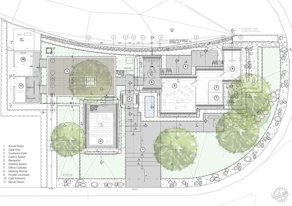
这座建筑的设计旨在提高沙特阿拉伯炎热地区的能源效率。在这里,温度经常会超过45°C (113°F),这座建筑中采用800毫米厚的隔热幕墙来隔绝热量。这座展馆为创意交流、静思工作反省以及随机会议提供了便利,这种方式也促进和支持了团队工作。为了实现这个想法,办公室以辐射状排列,围绕着树荫下的庭院,室内外空间自由切换,为灵活的工作提供了便利的空间。
Office of the Future by Killa Architectural Design, Dubai, United Arab Emirates
This pavilion is the world’s first fully functional and permanently occupied ‘3D printed’ building. As an ‘Office of the Future’, the building acts as temporary home for the Dubai Future Foundation as well as an exhibition space and incubator for future emerging technologies in Dubai. The entire structure was ‘printed’ in concrete using an additive manufacturing technique. It is the first fully occupied building in the world to be constructed using such techniques. A large scale 3D-printer was used to print the building in layers of reinforced concrete. The printer features a computer controlled armature to implement printing process.
The design of the building is intended to improve energy efficiency in the hot climate of the UAE, which commonly experiences temperatures that rise above 45°C (113°F) and makes use of 800mm thick insulating cladding. The pavilion has been designed to facilitate a mix of creative interactions, quiet reflective work and serendipitous meetings. This approach supports the work of flexible teams and fluid partnerships. To achieve this, the Office radiates around a tree shaded cafe courtyard.
Intuit Marine Way大楼/WRNS Studio and Clive Wilkinson Architects/美国,加利福尼亚山景城
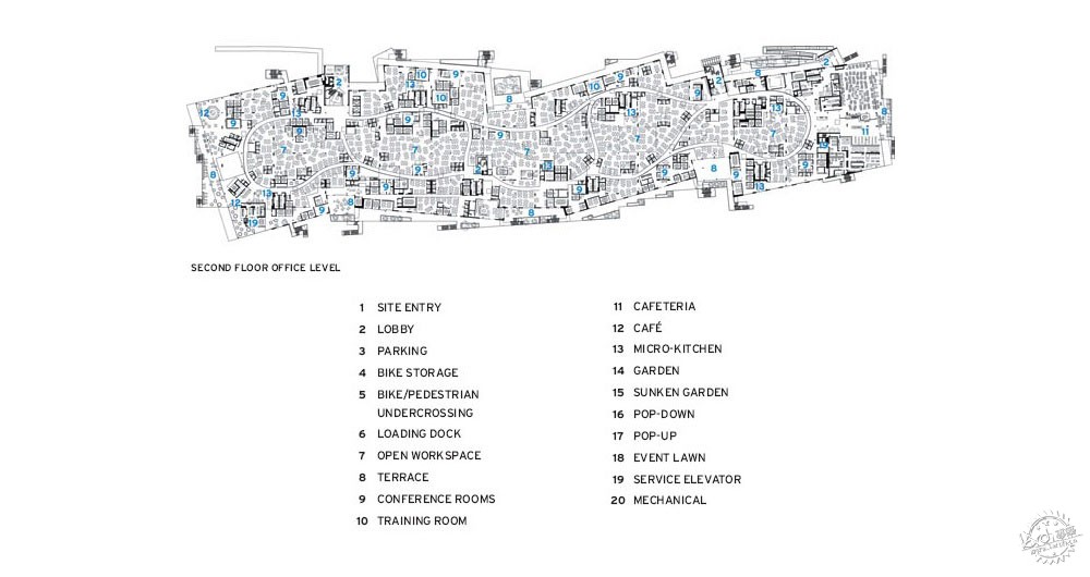
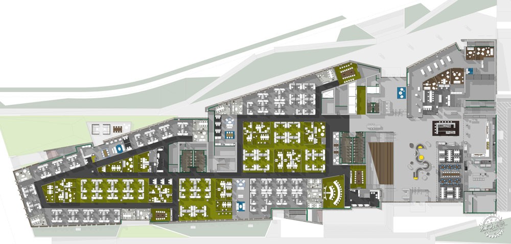
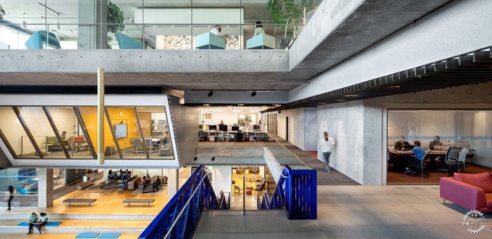
由于硅谷的不断发展,并开始与周边邻近的创新中心相竞争,Intuit公司的Marine Way大楼(MWB)为当地的办公设计提供了新模式。Intuit公司希望用新的工作环境让职员们感到骄傲,同时表达公司文化。MWB大楼总面积超过17000平方米,整体的规划和形式体现了低调、宽广和灵活的特点。宽敞的平面容纳了许多满足团队合作,专注,社交和反思的空间,它们相互交融,通过清晰的流线组织在一起。
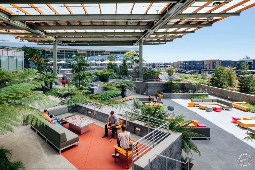
那些相对亲切的休息空间应用了软装布置,为职员们提供了多种工作的方式,鼓励他们充分利用整座大楼,主要的工作空间则位于中庭的周围。在中庭周边布置多样化的功能为整个空间带来了持续的活力。为了利用当地温和的气候,整座大楼将公共区对自然开放。延伸出去的露台一方面提供了完美的海湾景色,一方面提供了亲近自然的工作空间,同时也连接了整个园区。建筑就像从场地中生长出来,而这座大楼也为校园主要的步道和主干道创造了充满活力的边界。
Intuit Marine Way Building by WRNS Studio and Clive Wilkinson Architects, Mountain View, CA, United States
As Silicon Valley evolves to compete with growing innovation centers in walkable, networked areas, Intuit’s new Marine Way Building (MWB)—the continuation of a larger update to their Mountain View campus—models a new kind of workplace design for the region. Intuit wanted to honor their employees with new workplace environments that support their strong culture. The planning and geometry of the MWB, with 185,400 sq. ft. on four floors, can be understood as low, wide, connected, and flexible. The large floor plates, which accommodate a variety of places for people to collaborate, concentrate, socialize, and reflect, are organized into human-scaled neighborhoods and connected by clear circulation.
In addition to more intimate breakout spaces like balconies and casual soft-furniture settings, which offer a range of work opportunities to encourage users to take advantage of the whole building, full workspace neighborhoods are located at the edge of the atrium. This variety of programmatic functions along the perimeter of the atrium helps generate a consistent buzz of activity throughout the workday. Designed to embrace the mild climate of Mountain View’s North Bayshore Area, the MWB connects to both nature and the public realm. Extensive terraces with views to the bay offer an indoor/outdoor workplace experience and knit the campus together. The ground floor emerges from the landscape as a solid, textured base, and the MWB creates a dynamic new edge along the campus’s main pedestrian and vehicular spine.
乐平公益基金会办公总部/众建筑/中国,北京
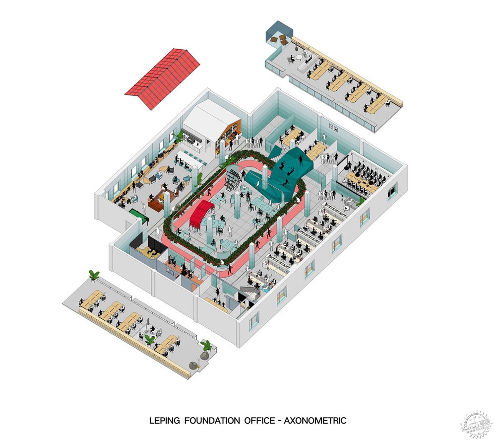
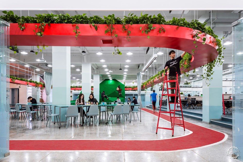
这个1100m2的乐平基金会总部表达的理念是关注健康。从职业培训和农业研究到学前教育和小额信贷,这个空间让不同的公司走到了一起。这些公司彼此之间相互交流,而中心活动区屋顶悬挂的绿植和地面相呼应的跑道就是它们交流的媒介。这个设计围绕着“运动有益大脑”这个理念,所以整个布局为员工们提供了工作时运动的机会,从而改变工作和休息的模式。
该公司需要不同团队成员、部门、公司之间的合作和交流。在工作站的设计中,设计师设计了一些亲切的社交空间,包括迷你厨房和休息区,在这里员工们可以自由地聊天与讨论。家具系统采用了桁架结构,这样可以使用上部空间用作储藏,节约了地面空间,为员工提供了更宽敞的场地。中心活动区内部有着灵活的活动空间,可以培养一些社会企业。办公区内部的桌子像俄罗斯方块一样,可以用作单独的办公桌,也可以拼合在一起组成不同的形状。而悬挂的帘幕也可以随着滑轨移动、拉开,分隔出多个独立的会议空间。
Leping Social Entrepreneur Foundation Headquarters by People’s Architecture Office, Beijing, China
Made as a 1100 sqm headquarters for the Leping Foundation, this office focuses on wellness. From job training for migrant workers and agricultural research to preschool education and microfinance, the space was made for people to come together. These distinct companies are tied together by a central activity loop of suspended vegetation mirrored by a running track underneath. The office is designed around the understanding that physical activity is good for the brain and the layout provides opportunities to move while at work, to vary modes of working, and to rest.
Leping’s work in social impact requires collaboration and interaction between team members, departments, and companies. The workstations are designed by our office and create small social spaces, including mini kitchens and lounge spaces, where spontaneous and informal conversation can take place. The furniture system uses a truss structure that allows storage to be suspended above, freeing up floor space for people to squeeze in for spontaneous discussions. In turn, the activity loop interior serves as an event space and a flexible space for incubating social enterprises. It’s populated with Tetris Tables, which can be used individually or combined into various configurations. A People’s Canopy can be moved around and expanded to create a separate meeting space within the central loop area.
施华洛世奇工作坊/Snøhetta/奥地利,瓦滕斯
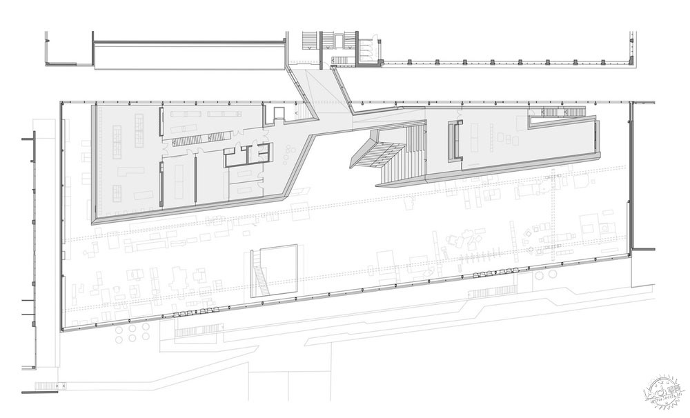
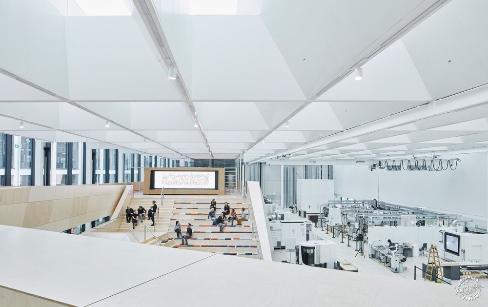
Snøhetta为施华洛世奇设计了水晶工作坊。这个工作坊是为了促进团队的创造、协作、交流。这个设计想要创造一种有吸引力,令人振奋的空间,从而鼓励创造,而不是专注于生产过程,这也正是整个设计的核心。设计中,建筑师对光的考虑也是一大亮点。
在工作坊里,施华洛世奇水晶的整个生产流程在一个小尺度的空间中得以呈现,主楼层放置着主要的机器,从而可以在最短的时间里生产样板或者小尺寸的水晶系列。当技术标准需要调整,主楼层提供了足够的空间来重新布置,从而达到最新的技术要求。此外,一片抬高的空间提供了放置必要技术设备和管线的场地。同时,一个通高的空间连接了主楼层和地下室,从而可以放置高达14米的样板来进行装配和测试。
Swarovski Manufaktur by Snøhetta, Wattens, Austria
Snøhetta created a crystal workshop for the 21st century for Swarovski. Swarovski Manufaktur is designed to facilitate innovative collaborations, inventive exchange and a rapid implementation of ideas. The design primarily focuses on creating an appealing and stimulating space that encourages creativity rather than focusing on the physical production processes which are a central part of the Manufaktur. A key focus for the architects was the incorporation of daylight.
At the Manufaktur, the entire production process of the Swarovski crystal is reproduced on a small scale: the main floor contains all the machines necessary to produce prototypes or small crystal series in the shortest possible amount of time. Should technical standards or specifications change, the flexibility of the main floor provides enough space to allow for production to be rearranged to meet the latest technological requirements. Throughout the facility, a raised floor provides flexibility and space for necessary technical equipment and cables. Moreover, a “chandelier hole“– an open space plunging from the main floor and down to the basement – allows for prototypes up to 14 meters high to be assembled and tested on-site.
康奈尔大学Tata创新中心/WEISS/MANFREDI/纽约,曼哈顿
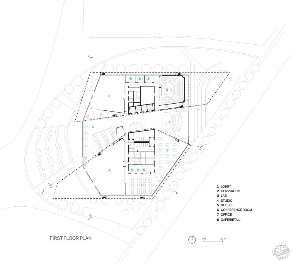
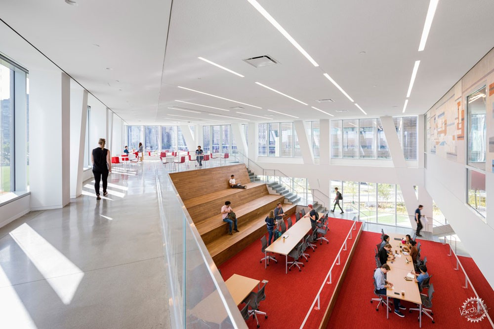
Weiss Manfredi的Tata中心设计的目的在于集合罗斯福岛上的工业和学术。这座七层楼高的结构会是当代研发中心,其中一部分是公司的办公区,另一部分是创新中心。整体的水晶几何造型和优雅的细部设计就像是学科中心和技术公司之间的碰撞和对话。Tata中心的可持续设计也大大推动康奈尔大学的发展,成为了世界最节能环保的校园。
这座2183平方米的大楼里,有1/3的空间是康奈尔工院的工作室,实验室,教室和活动室。高层区是技术办公区和启动区。所有工作人员共享一个中心的公共区,在那里可以看到全景的天际线,也可以促进交流合作。大楼的西南和东北区各有一个悬挑的灰空间,活跃了底层的商业和入口空间。
Tata Innovation Center at Cornell Tech by WEISS/MANFREDI, Manhattan, New York, NY, United States
Weiss Manfredi’s Tata Center was made to bring together industry leaders and academia on Roosevelt Island. The seven-story structure was imagined as a contemporary R&D hub that’s part corporate co-location building and part innovation center. Formed with a crystalline geometry and elegant detailing, the design fosters dialogue across disciplinary hubs and tech companies alike. Sustainable design at the Tata spearheads a larger push towards becoming one of the most environmentally-friendly and energy-efficient campuses in the world.
One-third of the 235,000-square-foot building hosts Cornell Tech studios, labs, classrooms, and event spaces, while the upper levels are dedicated to a mix of technology-focused companies and start-ups. All of the occupants share central, light-filled circulation spaces with panoramic skyline views and lounges that encourage social interaction and collaboration. The building’s cantilevered southwest and northeast wings shelter outdoor social spaces that animate the ground floor retail spaces and entry terrace.
|
|
